At the beginning of this research phase, a low-fidelity prototype was developed to evaluate whether users could understand the project’s context and purpose based on a very simple visual representation. Initial testing showed promising results, as all participants correctly identified the scenario as a train station environment. Based on these findings, I decided to continue working with the existing low-fidelity prototype while conducting further research and user testing.
Goal and approach
The primary objective of this study was to identify what additional information, guidance, and support users consider helpful when traveling by train and navigating railway platforms in Germany. The prototype was intentionally kept at an early stage of development to encourage creativity and open-ended feedback from participants. Rather than directing users toward predefined solutions, I aimed to provide a flexible testing environment that would allow for unexpected ideas and alternative approaches to emerge. Since the final form of the intended product had not yet been defined, maintaining openness to new insights and potential changes in direction was considered essential. The overall goal of the testing process was to gain a deeper understanding of user needs and to explore how these needs could be addressed through an effective design solution.
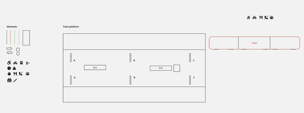
Prototype
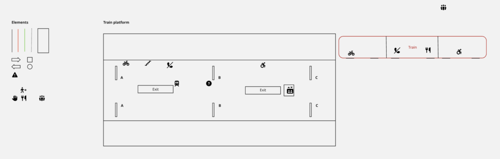
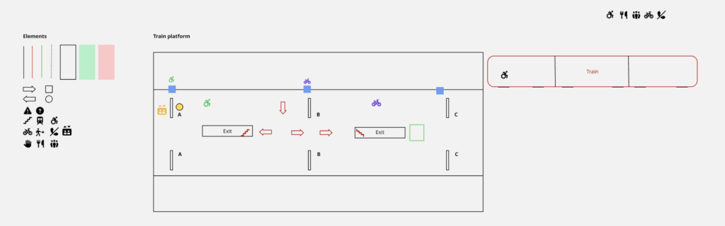
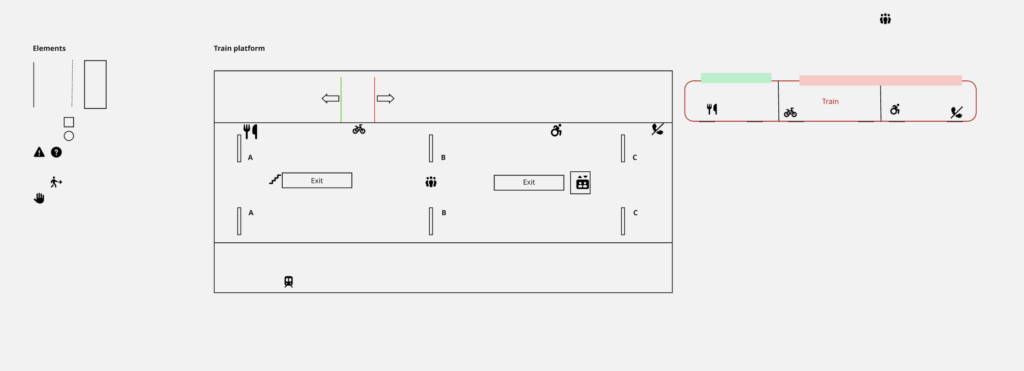
As this represented both the first prototype and the first round of user testing, the prototype remained in a low-fidelity state. The prototype was created and tested using Miro. The interface consisted of simple lines and geometric shapes forming the outline of a train platform with two tracks. A simplified train shape was positioned on the right side of the platform to represent an approaching train. To increase realism and improve orientation, platform sections labeled A, B, and C were included, reflecting common signage found on German railway platforms. Additional rectangles and squares were used to indicate stairways and elevators. Furthermore, a set of design elements was provided for participants to use during the testing session. These elements included icons, shapes, and lines that could be freely placed, modified, or expanded upon.
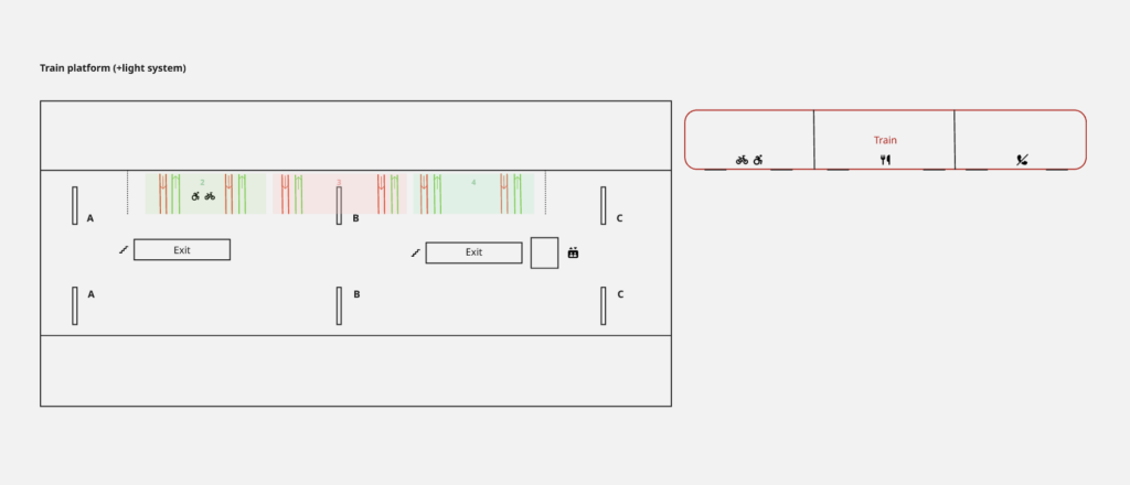
Prior to the testing sessions, I also created an example interface based on my own assumptions regarding what information might be useful for travelers. This served as a visual record of my initial design ideas and later enabled a comparison between my assumptions and the solutions proposed by participants.
Testing
To gather insights and evaluate initial design assumptions, the prototype was tested with five participants from my personal network. All participants were experienced train travelers in Germany. The testing sessions were conducted individually on a laptop, and each participant received the same initial prototype setup.
The first task required participants to position themselves on the platform by placing their cursor at the location where they would wait if they intended to board the arriving train. Most participants selected a position near the center of the platform. When asked about their reasoning, they explained that without knowing the exact stopping position of the train, standing in the middle would allow them to move efficiently toward either end of the platform if necessary.
The second task asked participants to use the provided elements to add information, guidance, or explanatory features to the train platform environment. Participants were informed that they could freely modify existing elements, create new ones, and place information either on the platform or on the approaching train itself. While participants could ask for clarification regarding the task, no further restrictions or guidance were provided. The resulting designs differed considerably in terms of creativity, visual language, use of elements, time invested, and overall outcomes.
Participant 1
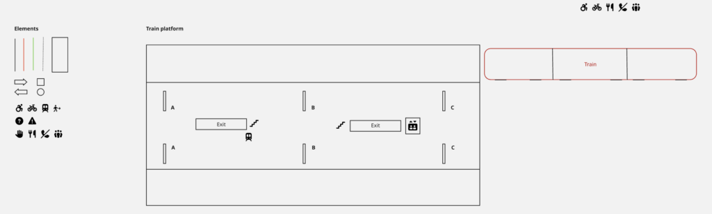
The first participant adopted a highly minimalist approach. Their primary focus was on platform exits and onward connections. Icons were added to indicate stairs, elevators, and transfer options such as subway and tram connections. No colors, shapes, or additional lines were used.
Participant 2
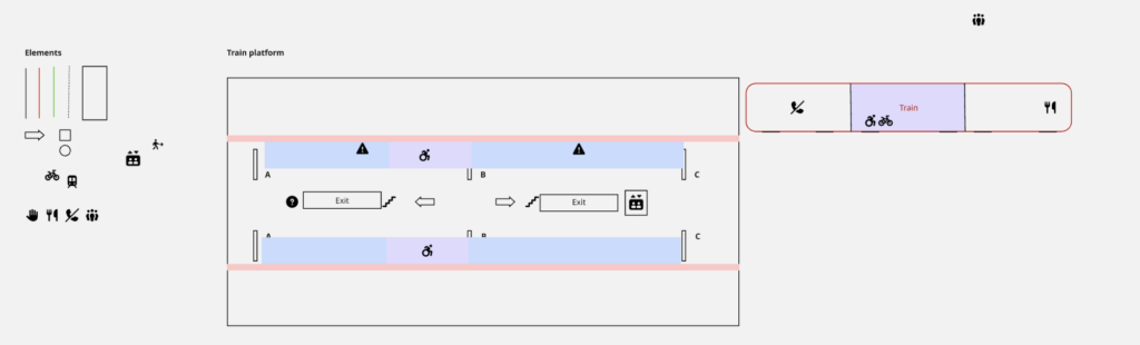
The second participant focused initially on differentiating train sections and communicating this information on both the train and the platform. Colored areas and icons were used for this purpose. Additional platform information, including stairs, elevators, walking directions, and information points, was also incorporated. Finally, safety markings were added along the platform edge to increase awareness of approaching trains. This participant made use of all provided design elements.
Participant 3
The third participant began by enriching the platform with informational icons. Particular attention was given to identifying different train entrances. Matching icons were then placed on both the train and the platform to establish a clear relationship between the two. This participant exclusively relied on icons and did not use colors or additional shapes.
Participant 4
The fourth participant also started by adding icons to communicate information about sections, exits, and designated areas. To improve differentiation between information categories, colors were introduced. One icon was added to the train, although not all platform icons were mirrored on the train itself. This participant made use of all available element types.
Participant 5
The final participant added icons to indicate exits, meeting points, and train sections. Corresponding icons were then placed on the train. Additionally, this participant considered the distinction between first-class and second-class compartments and represented these areas through color coding, arrows, and platform markings. Similar to Participants 2 and 4, all available design elements were utilized.
Results and consideration
A comparison of the resulting interfaces reveals significant differences in design approaches. In particular, the use of colors and shapes varied substantially among participants, ranging from no use at all to extensive integration throughout the interface. Despite these differences, one design element remained remarkably consistent: the use of icons. All participants relied on icons to communicate important information and to establish connections between platform locations and train sections. Comparing the participant-generated designs with the initial concept created prior to testing also provided valuable insights. Interestingly, none of the participants considered indicating the train’s exact stopping position or its start and end locations on the platform. Similarly, no participant suggested dedicated boarding and alighting guidance systems. Some similarities emerged regarding the use of colored areas to distinguish train sections. Furthermore, the use of corresponding icons on both the platform and the train appeared consistently across several solutions.
These findings provide valuable indications of user priorities, reveal which design ideas appear intuitive to users, and identify areas where further validation is required.
Information Gathered
Overall, this testing phase contributed significantly to my understanding of how experienced train travelers perceive navigation and information systems within railway environments. The study demonstrated that users approach the same problem in diverse ways and often propose solutions that differ considerably from the designer’s initial assumptions. At the same time, recurring patterns emerged, particularly regarding the importance of clear visual information and the use of icons as navigational aids. These insights provide a strong foundation for future design decisions and further development of the concept.
Next Steps
Based on the findings of this study, the next phase will focus on refining the product vision and defining the intended solution more precisely. Additional research into the technical feasibility of the identified concepts will be conducted, followed by the development of a higher-fidelity prototype that incorporates the most promising findings from this testing phase.