#6 The Designer as a storyteller

Storytelling plays a central role in Speculative Design. Through fiction, designers create imagined worlds that invite people to look at reality from a different perspective. But why is storytelling so effective at questioning the present? And what makes fictional worlds capable of making us reconsider things that normally seem obvious or unquestionable?

One reason is that stories allow us to imagine possibilities beyond our immediate reality. They help us generate mental images, explore alternative scenarios, and set the imagination in motion (Penati, 2013, p. 22). In this way, storytelling becomes a bridge between what exists and what could exist, giving access to what Penati calls «the plurality of possible worlds». As he writes: «In narrative we recognise the capacity to understand, interpret, and represent, giving the form of reality to worlds that are true or born of fantasy». What makes these worlds particularly engaging is that they rarely feel completely detached from everyday life. When confronted with a future scenario, we instinctively start asking practical questions. How would we live in that world? How would we work, eat, communicate, or move through our daily routines? Even the most radical futures become believable when they are connected to familiar human experiences. It is this combination of distance and familiarity that allows speculative narratives to resonate so strongly.

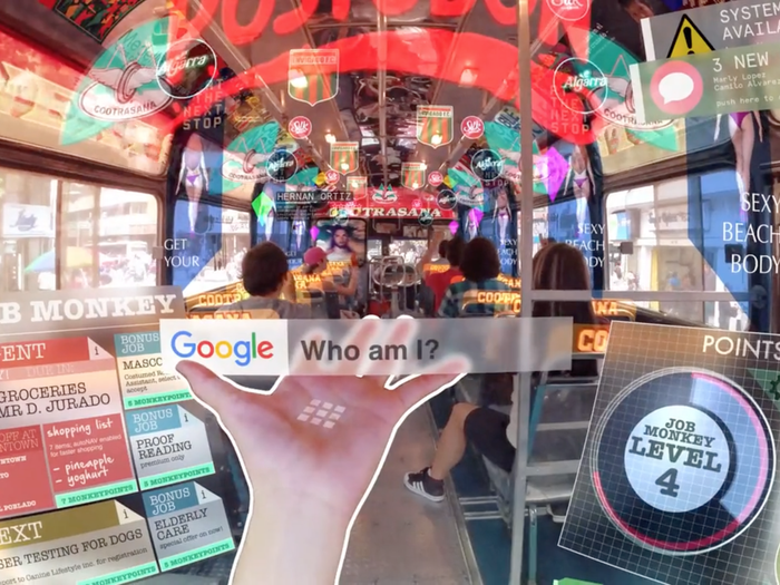
By building a narrative, designers do more than communicate an idea. They invite people to enter a scenario and experience it from within. The audience is not simply observing; it actively participates by interpreting the story and imagining its consequences. This temporary shift in perspective creates room for reflection and makes it easier to question assumptions that usually go unnoticed. As Dolezel (1998) observes: «Our actual world is surrounded by an infinity of other possible worlds. One only needs to move slightly away from reality to enter the spectrum of possibility and alternative».

Narrative is therefore not just a way of communicating ideas; it is also a way of thinking through them. Jonathan Gottschall describes human beings as homo fictus, creatures who constantly create, consume, and live through stories. Narratives are not merely entertainment. They are one of the main tools we use to understand ourselves and the world around us. This idea is echoed by the psychologist and novelist Keith Oatley, who compares stories to flight simulators for social life. Just as pilots can train for difficult situations without facing real danger, stories allow us to explore emotional, moral, and social challenges without experiencing their real-world consequences. They provide a safe space in which we can test reactions, consider alternatives, and imagine outcomes.

Speculative Design intentionally draws on this capacity. Its goal is not simply to illustrate a concept, but to create an experience that generates both emotional and intellectual engagement. As game designer James Wallis points out, human beings do not just enjoy stories; they are driven to create them. Narrative taps into something deeply rooted in the way we think and make sense of the world. As Jonathan Gottschall argues, every compelling story revolves around conflict: a tension, an obstacle, or a disruption that needs to be confronted. In Speculative Design, that conflict often emerges from the gap between what we know and what we are shown. The resulting sense of disorientation encourages reflection and opens the door to critical thinking. As the British playwright William Maugham once observed, fiction works like bitter medicine coated in sugar: the message is absorbed almost without notice because it arrives through an engaging story. This is what gives narrative its particular power within Speculative Design. Rather than simply explaining an idea, it stays with us, leaving an impression that explanation alone rarely achieves.

What Am I Actually Asking?

The plan is set. Three banal stories, two visual languages, two groups. But before building the test, I have to be precise about what I am actually asking. A questionnaire can only answer the questions that are put into it, so this post is about the questions themselves.

The main question of the semester is what each visual language does to the same message. That is too big to ask directly, so I broke it into three core questions.

The first is understanding. Did the message arrive? If someone looks at the images and cannot say what the story was, nothing else matters. This is the baseline of all communication design.

The second is feeling. Images carry mood before they carry information. The same simple action can feel warm, cold, funny, or official depending on how it is shown. I want to know what atmosphere each style creates, and whether the drawn version and the photorealistic version of the same story produce different feelings.

The third is trust. Which version feels more credible, more like something you would actually follow? This question has become especially interesting today, when photorealistic images can be generated without a camera ever being present. Does the photographic look still carry its old authority, or does a clear drawing feel more honest?

Around these three, I added four smaller lenses. Appeal: how much do people simply like what they see? Perceived effort: does the image feel easy or hard to read? Memorability: which version stays in the head after the form is closed? And one question that comes directly from my storyboarding semester: does the image make you want to see the next frame? A sequence only works if each image creates a pull toward the following one. Last semester I studied how sequences carry meaning. Now I can ask whether the visual language itself changes that pull.

One rule shapes how all of this will be asked. Since each group sees only one version, nobody can compare anything. So I can never ask which one is better. Every question must work on a single version standing alone: describe it, rate it, react to it. The comparison happens later, in my analysis, between the answers of the two groups. This is less comfortable than a side-by-side test, but cleaner. People judge the image in front of them instead of choosing a favorite.

Order matters too. The understanding question has to come first, as an open answer, before anything else. If I ask first how clear the instruction was, I have already told the participant that it was an instruction. A questionnaire can leak information through its own wording, so its sequence has to be designed as carefully as any other piece of communication.

Finally, the participants. The forms stay anonymous, but I will ask three things: age, whether the person has a design background, and which languages they speak. The last one matters most to me. My whole interest in wordless communication comes from living between languages. If people who move between several languages read these images differently from people who live in one, that is exactly the trace I want to follow in the next semester.

The next post will show the test itself: the three stories, and how the questionnaire is built so that seven questions do not turn into an exhausting form.

The Plan: Same Story, Two Visual Languages

In my last post I marked a turning point. The question of this semester is no longer how to master one medium, but what each medium actually does to a message. This post explains the plan and the goal behind it.

The goal is simple to say and hard to answer. I want to find out what kind of information each visual language suits best. When a story is told through illustration, what does it gain and what does it lose? When the same story is told through photographic imagery, what changes? I do not expect a single winner. My expectation, written down here before any testing, is that each language will be useful in different situations. I also know that illustration and photography are both enormous worlds. A technical line drawing and an expressive painting are both illustrations, but they behave completely differently, and the same is true for photography. So I will not compare the two worlds. I will compare one defined style from each: a flat, reduced illustrative style on one side, and a clean photorealistic style on the other. Whatever I find will only be true for these two styles, and I want to be honest about that limit from the start.

The plan looks like this. I will take three very simple, everyday stories. Stories so banal that nobody has to think about the content itself. This is intentional. When the content is trivial, the only thing left to react to is the image. Each story will be told twice, once in each style. The two versions will then go to two separate groups through an online questionnaire, and I will compare how each group understood the story and how they felt about it. Which stories I will use, and how the questionnaire works, will come in the next posts.

One decision needed the most thought: how to produce the images. My first idea was to draw the illustrations myself and to photograph the photographic versions myself. But the more I thought about it, the more problems appeared. My drawing skills and my photography skills are not on the same level, so the comparison would partly measure me instead of the medium. Photography also needs a person, a place, and time that I do not have this semester. And keeping three stories visually consistent across two media, alone, within a few weeks, is not realistic. So I decided to generate both versions with AI. This keeps the production conditions identical. Same maker, same tool, same amount of effort. The only variable left is the visual language itself. To be precise, this also means the photographic versions are not photographs. They are photorealistic images, and I will call them that. The decision also continues a thought from my first semester research on AI and storyboarding: the role of the designer is shifting from the one who draws to the one who directs, selects, and judges. This semester I will practice exactly that role.

So this is the plan. Three banal stories, two visual languages, two groups, one questionnaire. The next post will define the exact research questions I am trying to answer.

#5 Uncomfortable Futures

One project that clearly shows how design can engage with social issues is Plasticful Foods, developed by an interdisciplinary team from the University of Amsterdam and the Amsterdam University of Applied Sciences. Rather than simply informing people about plastic pollution, the project tries to unsettle them, disrupting familiar assumptions about waste and consumption just enough to trigger a shift in perspective. It does this by blending real data on plastic pollution with humor and marketing strategies borrowed from commercial advertising. The result is a near-future scenario in which plastic has become so widespread that it ends up in our daily diet. From this premise comes the deliberately provocative idea of Plasticful Foods: a line of “food products” made with recycled plastic, supposedly made digestible through a fictional enzyme called Plasteeze, styled like a dietary supplement.

The logic behind it is intentionally extreme: if microplastic consumption keeps increasing and waste management doesn’t improve, we might eventually have to adapt, not by reducing plastic, but by learning to digest it. It’s a disturbing thought, but that’s exactly the point. It pushes us to ask a simple question: Is this really the future we want? In this sense, the project moves beyond provocation and becomes a tool for critical reflection, asking us to confront the consequences of what we’re doing, or not doing, today.

Figure 4. Plasticful Foods, 2020

Moving away from sustainability but staying within the same speculative framework, technological development offers another rich area for exploration. As digital technologies become more pervasive, they are reshaping not only how we interact with the world, but how we perceive reality itself.

This is where Hyper-Reality comes in, a short conceptual film by Keiichi Matsuda that explores a future in which the boundary between physical and digital has completely collapsed. In this hyper-mediated everyday life, augmented reality, wearable devices, and constant streams of information create an environment saturated with digital stimuli. The result is both fascinating and overwhelming: a world full of possibilities, but also one where perception becomes fragmented and distorted. Matsuda doesn’t offer answers, he opens up a space for reflection, asking us to consider where this trajectory might lead and what it could mean for our sense of identity, control, and freedom.

Figure 5. Hyper Reality, 2024

A similar approach can be found in the work of Anthony Dunne and Fiona Raby, who often construct alternative worlds to explore the social, political, and technological implications of the future.

In Foragers, they imagine a scenario shaped by extreme overpopulation and food scarcity. If traditional food systems can no longer sustain the global population, what alternatives might emerge? Their answer takes the form of a speculative community equipped with wearable devices and biotechnological enhancements, capable of extracting and metabolizing nutrients directly from the environment. While the concept is visually striking, its real strength lies in the questions it raises, about adaptation, inequality, and the extent to which we might be willing to alter the human body in response to global crises.

Figure 6. Foragers, 2009

In Needy Robot, Dunne and Raby shift the focus to our relationship with technology, asking what might happen if machines began to exhibit emotions and desires of their own. The robots in the project display subtle but unsettling behaviors: one holds eye contact for too long, another appears anxious when someone gets too close. These small details make the interaction feel strangely human, and slightly uncomfortable. The project doesn’t try to predict the future, but to probe it, inviting us to consider what coexistence with increasingly “human-like” technologies might actually feel like and what kind of relationships we might end up forming.

Figure 7. Needy Robot, 2007

#4 The A/B Manifesto

Through prototypes, narratives  and fictional artefacts, Speculative Design does not set out to provide answers; instead, it encourages collective reflection. In Speculative Everything (2013), Anthony Dunne and Fiona Raby outline what can be understood as a manifesto for this approach, framing it through a direct comparison between two ways of thinking about design.

They present this comparison as a set of paired concepts: on one side, those associated with traditional design (A), and on the other, those that define Speculative Design (B). The aim is not to replace one with the other, but to open up an alternative perspective, a parallel lens through which to reflect on design and better grasp its critical potential.

Expanding on this framework, Leon Karlsen Johannessen from the Norwegian University of Science and Technology revisits the so-called “A/B Manifesto” in The Young Designer’s Guide to Speculative and Critical Design (2017). He suggests that the two sets of concepts should not be read as strict opposites, but as complementary viewpoints. Rather than excluding each other, they operate in tension: each element in “column A” is mirrored by one in “column B”, creating a contrast that helps clarify what Speculative Design is, and, just as importantly, what it is not.

Figure 3. The A/B Manifesto

#2 The future as a critical tool

In a context marked by profound instability and continuous change, the future takes shape as a fundamental tool for expanding the horizon of design. Not as something to be predicted, but as a reflective dimension that stimulates the imagination, opening the way to the construction of possible scenarios and to the definition of visions capable of guiding action in the present.
According to the writer H. P. Lovecraft, the unknown generates fear in human beings, an emotion that has played a crucial evolutionary role in survival, protecting us from potential dangers. However, the unknown does not represent only a threat, but also a generative resource: it is from what we do not know that new narratives, visions, and civilizations emerge.
As the anthropologist David Graeber states, it is precisely imagination that distinguishes humans from other animals: «…it differentiates humans from animals, a bee from an architect».
Even the simple question “What if?” becomes fundamental in shifting design toward the realm of hypothesis and the exploration of what could happen (Anthony Dunne & Fiona Raby, 2013).
The future, therefore, is not a fixed or abstract entity, but a complex human process that emerges from the interaction of multiple presents and generates just as many possibilities.

SS26_#02_How Can We Test Whether People Recognize AI Images?

In my previous blog post, I introduced the topic I will be exploring this semester and discussed the growing difficulty of distinguishing between authentic and AI-generated images. One question kept coming up during my research: are people really able to tell the difference?

Many people seem confident that they can spot an AI-generated image immediately. Common clues that are often mentioned include unrealistic hands, strange facial features, or unusual details in the background. However, image generation technology is improving rapidly, and many of these obvious signs are becoming less common. This made me wonder whether people are actually as good at identifying AI-generated images as they think they are.

To explore this question, I am planning a small experiment.

The experiment will consist of two different parts. The first part focuses on fully AI-generated images and authentic photographs. Participants will be shown a collection of images from different contexts, including everyday situations, animals, scientific topics, and news-related content. For each image, they will be asked to decide whether they believe it is authentic or generated by artificial intelligence.

I deliberately want to include different types of content because context may influence how people judge an image. A portrait of a person might be evaluated differently than an image of a rare animal or a news event. By using a variety of subjects, I hope to gain a broader understanding of how people make these decisions.

The second part of the experiment is the one I find particularly interesting. Instead of showing completely different images, participants will be presented with two almost identical versions of the same image. One will be the original photograph, while the other will contain a modification created with AI. This modification could involve adding an object, removing a person, or changing certain elements within the scene.

Participants will then be asked a simple question: Which image is the authentic one?

This part of the experiment is designed to investigate whether people find it easier to identify AI when they can directly compare an original image with a manipulated version. While fully generated images receive a lot of attention, AI is increasingly being used to alter existing photographs rather than create entirely new ones. Because of this, understanding how people perceive manipulated images may be just as important as understanding how they perceive generated ones.

Another aspect I would like to explore is the role of age. In addition to their answers, participants will be asked to indicate their age group. This will allow me to compare the results of different generations and examine whether younger participants are better at recognizing AI-generated or AI-manipulated content.

A common assumption is that younger people may perform better because they are more familiar with digital technologies and encounter AI-generated content more frequently. However, it is also possible that the differences between age groups are smaller than expected. The experiment may reveal whether this assumption is actually true.

Of course, this will only be a small-scale experiment and cannot provide definitive answers. Nevertheless, I hope it will offer an interesting insight into how people currently interact with AI-generated imagery and whether our confidence in recognizing artificial content matches reality.

The next step will be selecting and preparing the images that will be used in the survey. Only then will it become clear how difficult this challenge really is.

SS26_#01_Can We Still Trust Images?

This semester, I’ll be focusing on a different topic than I did last semester. At the time, I wasn’t completely sure where my research interests would lead me, so we were given the opportunity to adjust our topics later on if needed. Over the past few months, however, I found myself becoming increasingly interested in the way we perceive images and why we trust them. That curiosity eventually led me to change my focus and explore this topic in more depth.

Every day, we are surrounded by images. Whether we are scrolling through social media, reading the news, or simply browsing the internet, images are everywhere. Most of the time, we accept them without giving them much thought. We rarely stop to ask whether an image actually shows what it claims to show.

At the same time, the tools used to create images are becoming more powerful. The rapid development of artificial intelligence has made it possible to generate images that look surprisingly realistic. In many cases, it has become difficult to tell whether an image is a real photograph or something that was created entirely by AI.

Over the past few months, I have come across more and more examples of AI-generated images appearing outside of technology-related discussions. They show up on social media, in advertisements, and sometimes even alongside news stories. Seeing this made me wonder how much we can really trust what we see online.

For a long time, photographs were seen as evidence. Even though image manipulation has existed for decades, photographs still carried a certain sense of authenticity. A photo was often considered proof that something had actually happened. Today, that assumption feels less certain. With only a few prompts, AI can create convincing images of people, places, and events that never existed.

What I find particularly interesting is that many people believe they can easily spot AI-generated images. Common signs that are often mentioned include strange-looking hands, unusual facial features, or unrealistic lighting. However, image generation tools are improving at a remarkable pace, and many of these obvious clues are becoming less common.

During my initial research, I found several examples where people confidently identified AI-generated images as real photographs. At the same time, genuine photographs were sometimes accused of being fake. This suggests that distinguishing between real and artificial images may be much more difficult than we think.

What fascinates me most is not only whether people can correctly identify an image, but also why they trust it. Does the context matter more than the image itself? Are we influenced by familiar faces, personal experiences, or our own expectations? And what actually makes an image feel believable?

To explore these questions further, I plan to conduct a small experiment in one of my upcoming blog posts. I want to find out whether people are really as good at recognizing AI-generated images as they often claim to be. Before that, however, the next post will focus on explaining the methodology behind the experiment and how it will be carried out.

#3 The “Futures Cone” and the “Scenario Planning”

One of the most effective tools for visualizing different ways the future can unfold is the Futures Cone, also known as the 3P Model. It was developed by Anthony Dunne and Fiona Raby (2013), building on earlier work by Stuart Candy (2009) and introduced within the Design Interactions program at the Royal College of Art in London.
The model is structured as a series of cones that branch out from a shared starting point, the present, each representing a different category of future. The probable refers to what is most likely to happen, and it is the space where most designers typically operate. The plausible moves beyond simple prediction, exploring scenarios that are believable, even if not certain, an approach often used by companies preparing for unexpected developments. Then there is the possible, which includes everything that may seem unattainable today due to technological, cultural, or social limits, but could become achievable in the future, as suggested by Michio Kaku in Physics of the Impossible (2008).
Alongside these, we can also consider the preferable future, located at the intersection between the probable and the plausible. While it inevitably reflects subjective values, it also aligns with broader societal and market needs.

Figure 1. The Futures Cone (Candy, 2009).

For this reason, it becomes a key area for Speculative Design, which aims to guide change by proposing alternative, inclusive, and sustainable scenarios.
To better understand how these scenarios are actually constructed, it is useful to look more closely at what is known as Scenario Building, or Scenario Planning.
Scenario Planning originated in the pioneering work of Pierre Wack, a French strategist at Royal Dutch Shell, one of the world’s leading oil companies. His task was to monitor global events that might influence oil prices. Until the Second World War, prices had remained relatively stable and affordable, but from the 1970s onward the situation began to shift dramatically: U.S. oil reserves were declining, global demand was rising, and exporting countries, particularly Arab nations, were gaining increasing negotiating power. This combination of factors posed a serious risk to the company’s economic stability.
In response, Wack and his team developed a new planning approach that moved beyond linear forecasting. Rather than searching for a single “correct” prediction, they constructed multiple possible scenarios, each based on different political, economic and social variables. Two main scenarios stood out: a more optimistic one, in which oil prices would remain low and stable, and a more challenging but realistic one, which anticipated a sharp increase in costs.
The effectiveness of this approach became clear during the 1973–1974 oil crisis. Shell was the only major company that found itself prepared, as its leadership had already adjusted their strategies according to the most plausible scenario identified by Wack. This foresight allowed the company to navigate the crisis from a position of strength, further consolidating its role in the global market.
Building on this legacy, Peter Schwartz, who later succeeded Wack at Shell, defines a scenario in his book The Art of the Long View (1991) as «a tool for ordering one’s perceptions about alternative future environments in which one’s decisions might play out». He goes on to explain that «Scenario Planning is about making choices today with an understanding of how they might turn out». In this sense, Scenario Planning is fundamentally about making informed decisions in the present, with an awareness of their potential future consequences.
Within this framework, the role of the designer becomes central. It is no longer just about introducing new products to the market, but about contributing to the creation of more just and sustainable futures. Design can therefore take two different directions: a traditional approach, focused on problem solving, responding to concrete needs through efficiency, aesthetics, and ergonomics and a more critical and speculative one, focused on problem finding, which brings questions to the surface and opens up space for reflection on ethical, environmental and social issues.


Figure 2. Early Royal Dutch Shell scenario planning reports.

#1 Speculative Design: What if?

In the collective imagination, design is almost always seen as a problem-solving process. Even in its most artistic and expressive forms, it ultimately remains tied to the idea of fixing something, of providing an answer, whether aesthetic or functional. But what if design could instead become a tool for questioning the present, or even for imagining the kinds of futures we would actually want to live in?
This question lies at the core of Speculative Design, an approach that began to take shape in the early 2000s as a way of exploring alternative future scenarios, rather than simply addressing problems through rational or functional solutions.
In other words, Speculative Design presents itself as a practice that does not seek definitive answers, but new questions. It is a form of design that opens up scenarios, sparks dialogue, encourages exchange, invites critique, and fuels the imagination.
What truly matters here, however, is not so much predicting the future as using the idea of possible futures as a lens through which to better understand the present. These alternative futures, as mentioned earlier, do not provide solutions, they raise questions. One above all: “What if…?”
It is precisely within this suspended space that the possibility emerges to think the unthinkable, to explore alternatives that would otherwise remain invisible or unexpressed.