Death: An Honest Reflection

Honestly, I’m not entirely happy with how it turned out, but I learned a lot in the process, and sometimes that’s enough.

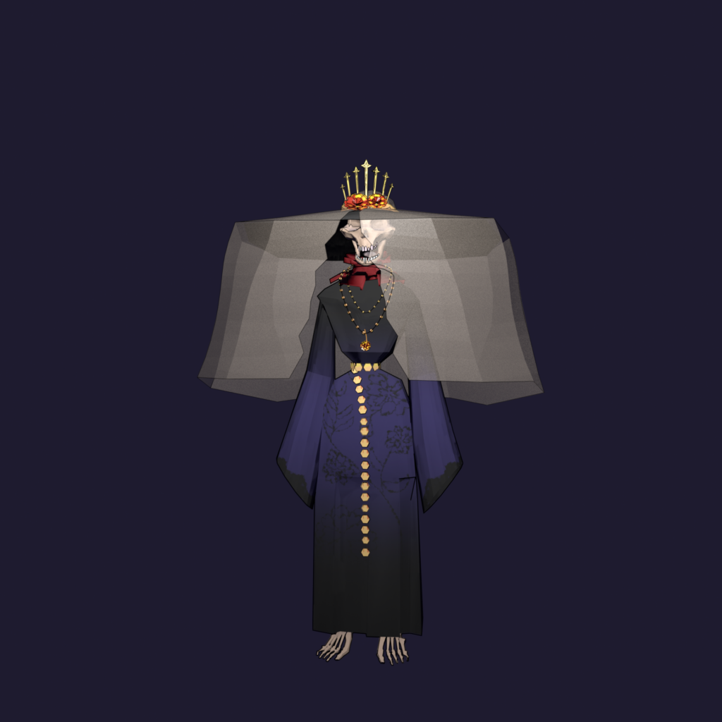
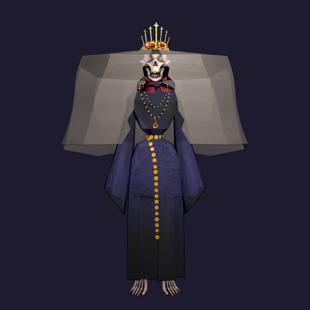
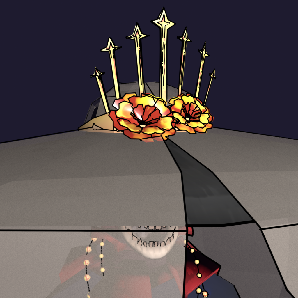
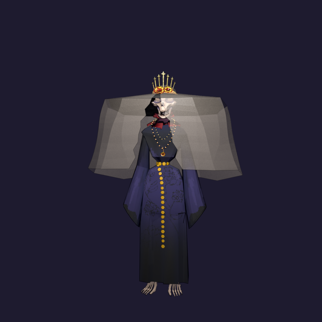
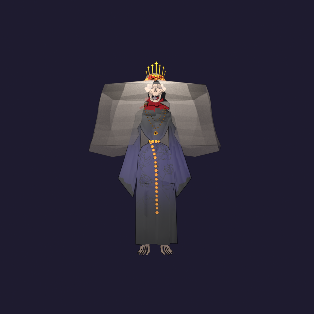
The Santa Muerte figure stands in a sparse environment – just a dark background and a single candle. The idea was to keep things minimal so the focus would be on the gesture of death itself: a slow, deliberate movement, almost meditative.

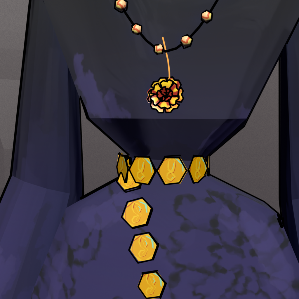
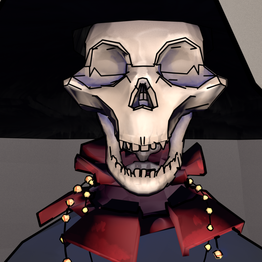
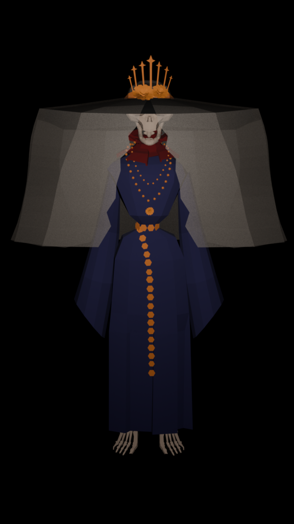
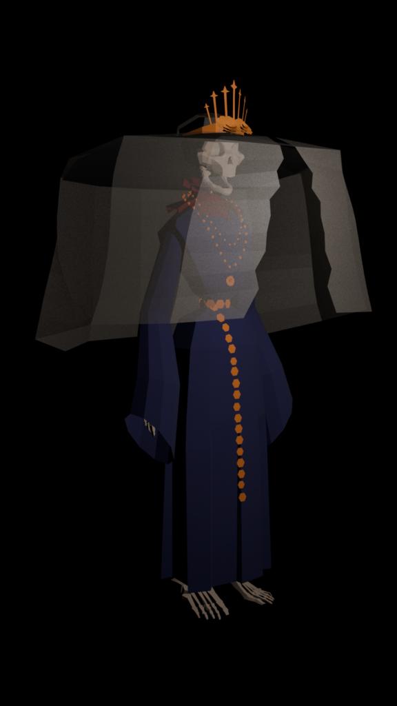
The design itself. I’m not happy with it, and I know why: I didn’t give myself enough time. The design reads as “Santa Muerte-adjacent” rather than a fully realised interpretation. The details don’t cohesively tell a story the way they should. I rushed through the refinement phase, and it shows.

I struggled with modeling from the start and then I combined that struggle by expecting myself to produce high-quality work in a short time. Because the character design didn’t fully land I dimmed the lights to hide what I wasn’t confident in. The single candle creates mood but drowns out form. A death ritual should feel intimate, yes, but not as a cover for incomplete work.

What I’d change: Give the design time. If I do this project again I’d give myself enought time just for the character design and iteration. Multiple rounds of sketches, feedback from others, reference gathering. No rushing to 3D. Model with intention, not speed. I’d spend more time blocking out the silhouette in 3D before detailing. Make sure the proportions feel right before committing to texture and rigging. Be realistic about scope. A fully realised 3D character with textures, rigging, and animation in one week is ambitious.

This project was always going to be about learning, not perfection. I came in wanting to explore death through visual language, informed by cultural research and ritual. I did that research. I grounded the character in Santa Muerte iconography. I created a moment of animation that (despite its flaws) communicates something about reverence and stillness.

This semester was busy, I expected too much from myself, I didn’t do enough research. All of this shows, but I learned. I may be disapointed with myself, but I hope to have grown through this project.

Roman, I hope you still accept my blog-posts. GLG Lay

Death: The rig and animation

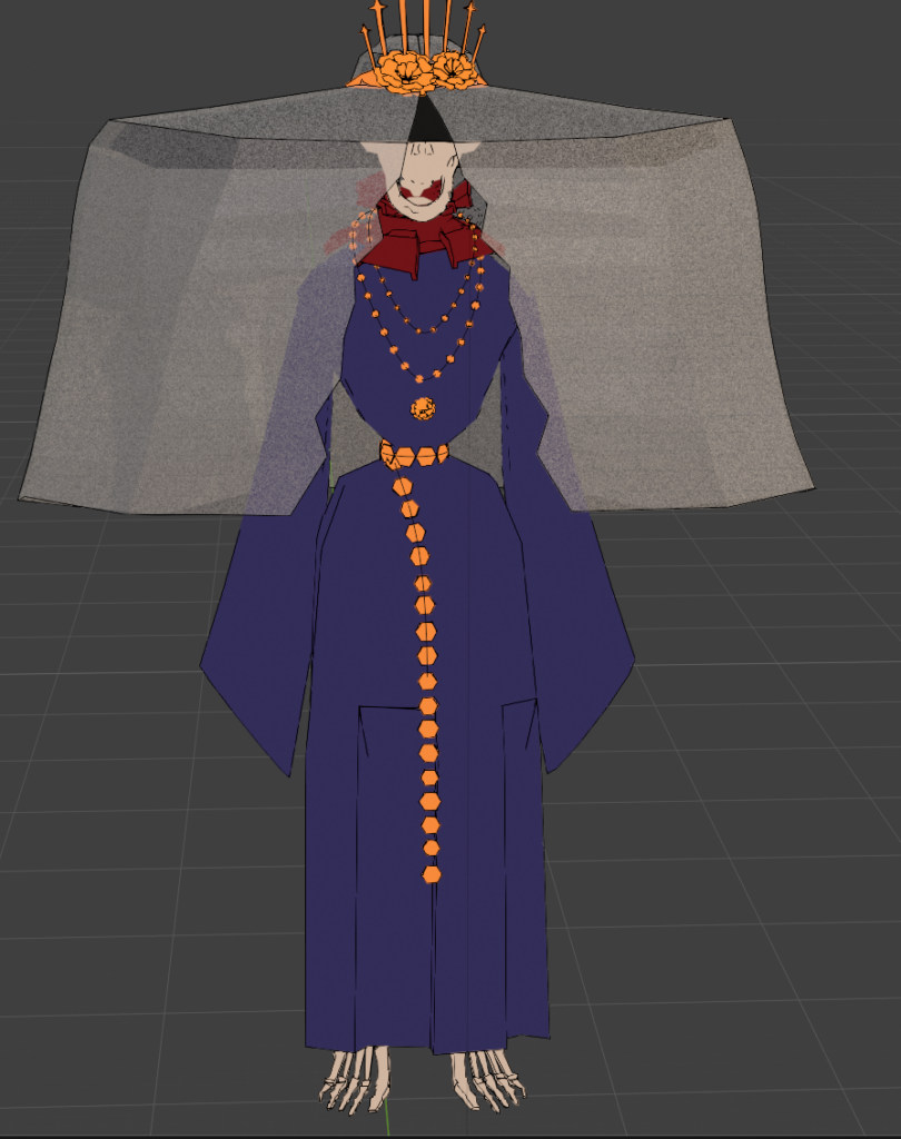
I decided to create a very simple (Rigify) rig just so that the model is pose-able.

Step 01: Activate the Add-on Rigify.

Step 02: Add > Armature > Rigify Meta-rigs > Human

Step 03: Go into Edit-Mode and move the rig to where it’s supposed to be.

Step 04: Apply transformations in Object-Mode for good luck.

Step 05: Select the model, the rig last.

Step 06: Press Generate Rig.

Step 07: Move your rig and find mistakes!

Step 08: Send it to Maria and she starts all over again because Rigify is messy. (see: her blogpost)

Step 09: Be shook as to how good the rig is.

(While the rig is amazing, the Grease pencil got lost along the way so I had to add it back in, which was harder than expected. I drew everything again bc it broke sosmehow.)
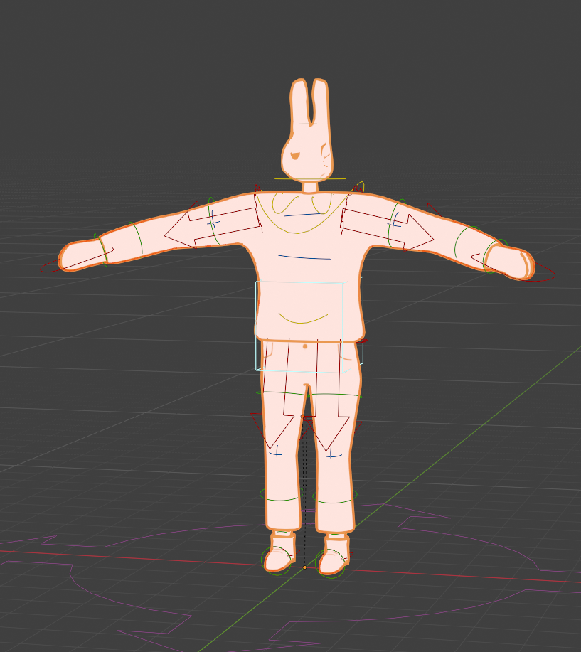
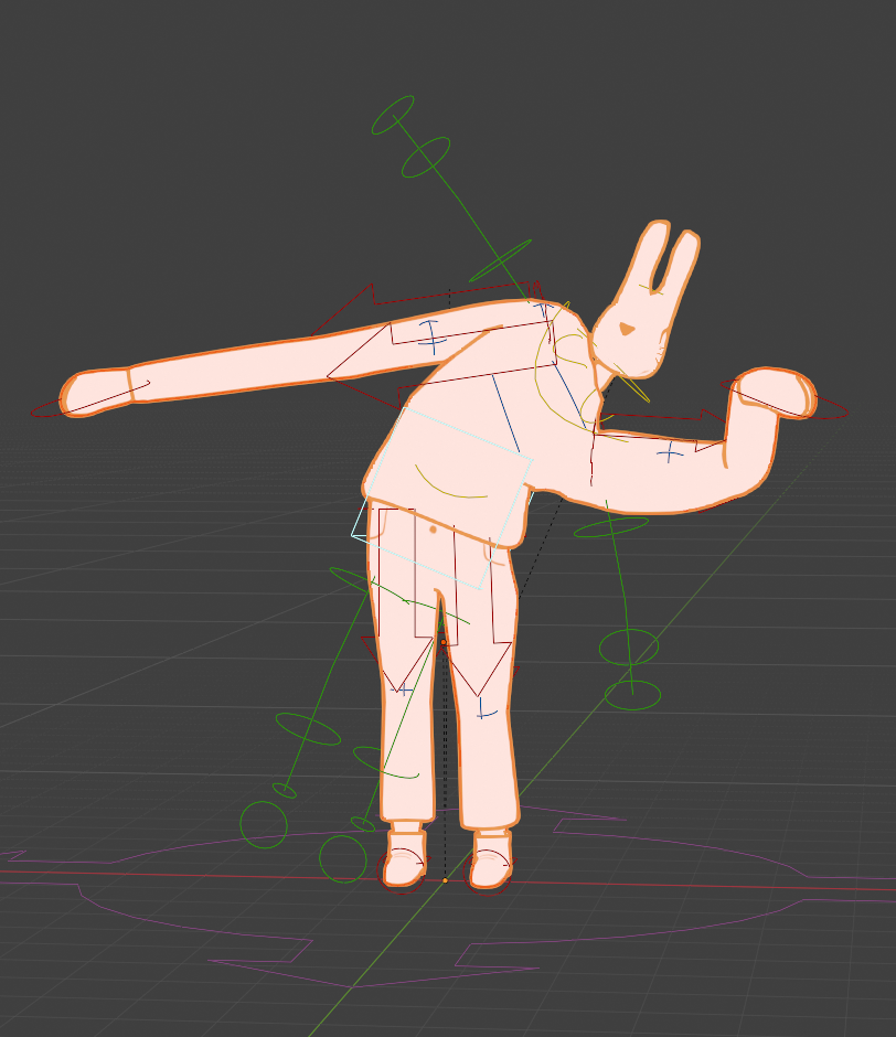
Step 10: create a small animation that’s vibey but no one can’t see the character design because you are unhappy with it!
Death: Grease Pencil Pt.2

My laptop is powerful enough, so I don’t know why it’s lagging so hard. But this is what I have to work with:

I also had to figure out how to Fill the hard way – I rage quit yesterday until I found this tutorial today https://youtu.be/ea8K9liJn3o?si=j0SM8niBWPJHzA1J where I learned that it’s just a simple button…

This is the result with GP teeth.

Now I want to figure out 1) how to change to color of the teeth and 2) how to not make it always be on top of the model.

Death: Grease Pencil Pt.1

For this blog post I want to add textures and grease pencil outlines to the model I made.

As a side note: I am currently not at my PC but on my laptop as I’m not home this week, and I am noticing how much power grease pencil demands as my laptop is lagging severely.

I added the basic grease pencil and don’t like how it looks at the robe. I gave them seperate Grese pencils with different settings to make it look better at the end.

As I am not home, I also don’t have my graphic tablet on hand so I had to paint everything with my mouse…great.

TO use my model in Substance Painter I have to prepare it first. I created UV maps, smoothed the model just for the .fbx export so that the edge artifacts don’t get baked into the maps while the actual model I use at the end is shaded flat.

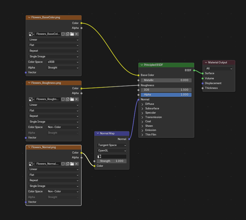
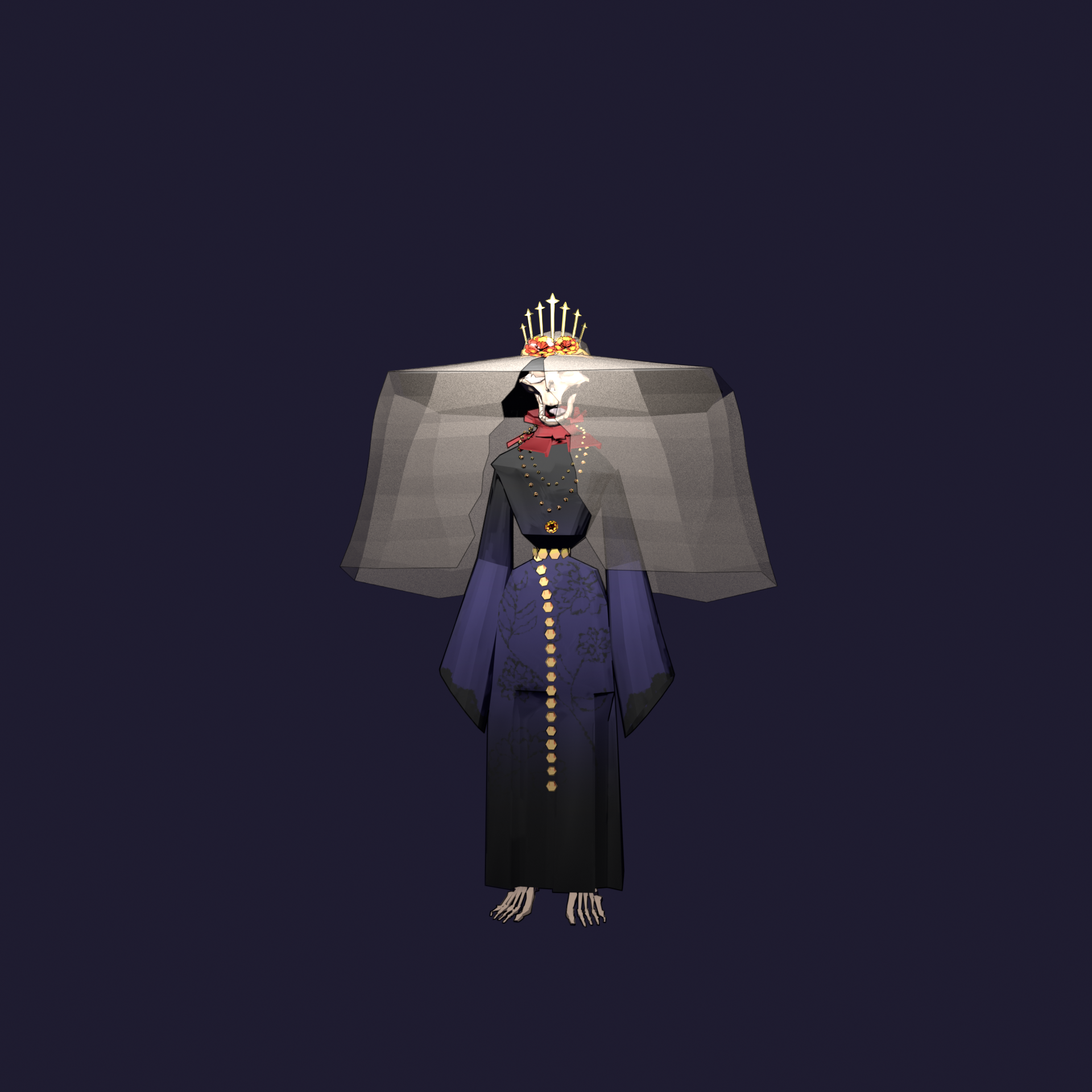
First look with the handpainted textures from Substance Painter in Blender, as per usual the colors look off compared to what it looks like in Substance.

I used the “Stylized” Filter on top of the other layers to create a stylized Normal Map.

The reason is the color space of the Texture maps, you have to change all texture maps that are not the BaseColor from sRGB to Non-Color and add a Normal Node after the normal map. It should look like this:

The background is one solid color, just like I learned it in the lessons.

Death: The 3D model

I’m very rusty at modeling I noticed. Or always have been? I always struggle with struggled with (at least the beginning of) modeling. But once I get into it or am past the hardest bit it’s alright. I still suck at making my vision reality, but this character went alright.

Here is a very short sped up video of my modeling, it’s not done yet but going well. The face looks still goofy but I’m hoping that my texturing and grease pencil fixes it. Some of the struggle I didn’t show is the clothes: my initial instinct was to make it in Marvelous Designer, I don’t have the license for it tho so I found an alternative: Style3D which essentially works the same, I did create a robe with it, but didn’t use it at the end due to the low-poly look I have to have.

(I sculpted the skull at the end okay)

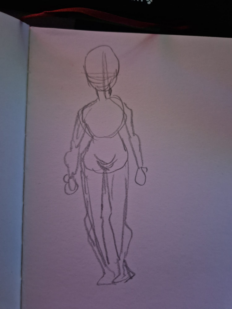
To make it easier for my brain I tried to make a more simplified sketch of the character design, somewhat inspired by Hades. Here’s a great video from them about their models: https://www.rockpapershotgun.com/supergiant-artist-goes-behind-the-scenes-on-building-a-god-in-hades

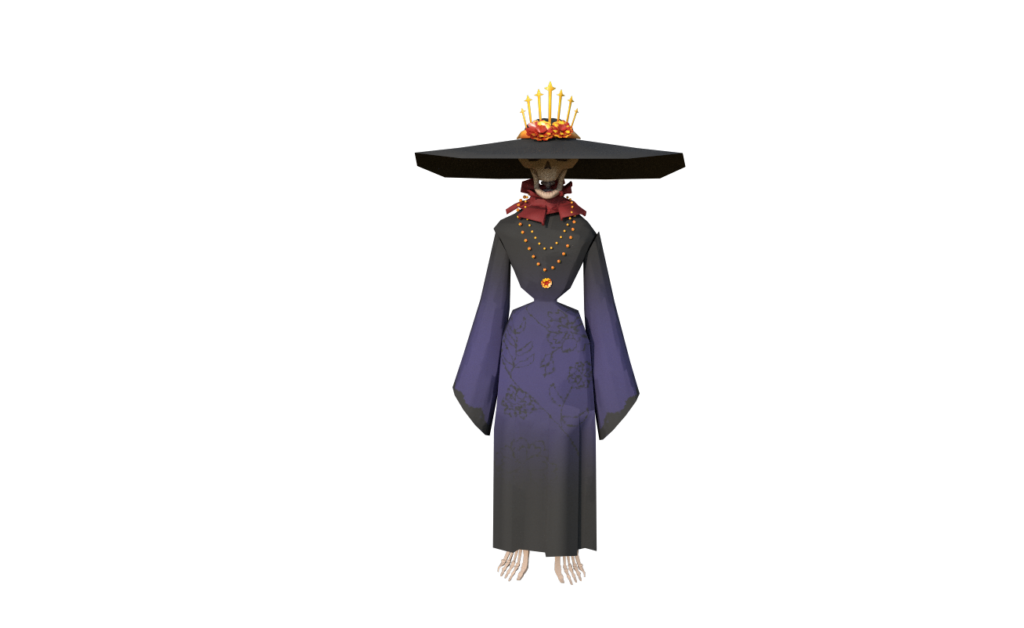
Here’s the first render of the model. The model may change a little over time, but I’m planning to change to look severely by adding textures and grease pencil.

Death: The character design

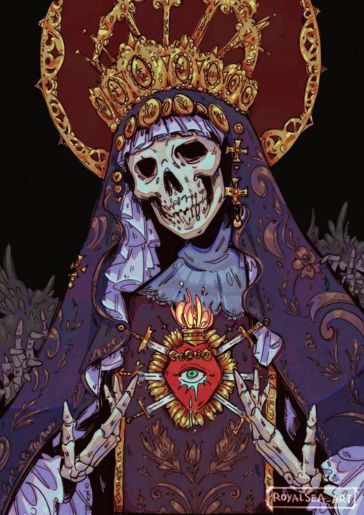
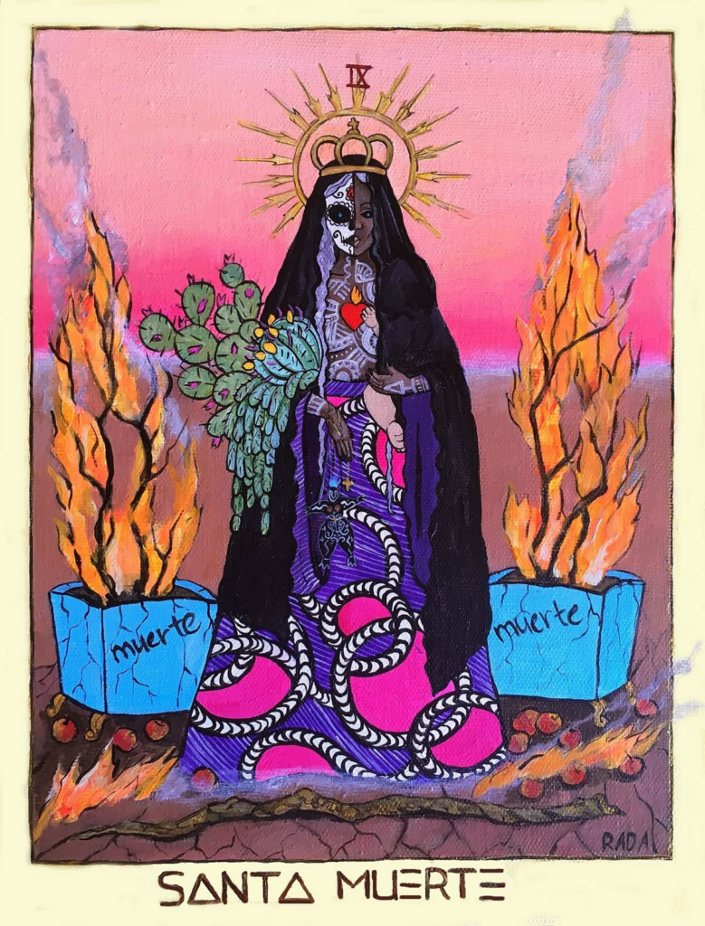
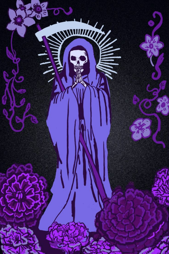
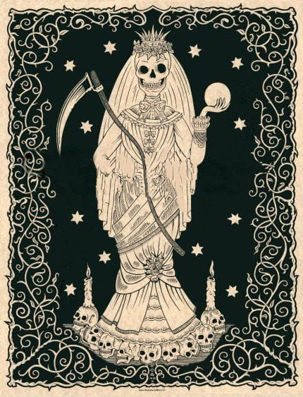
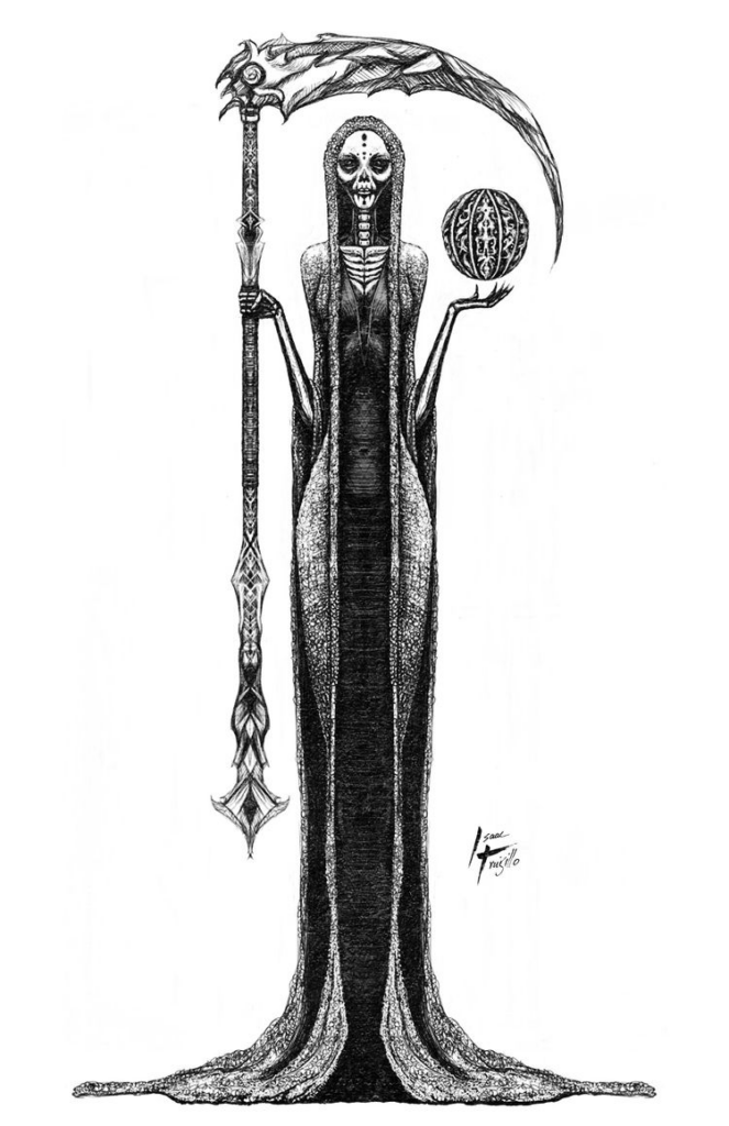
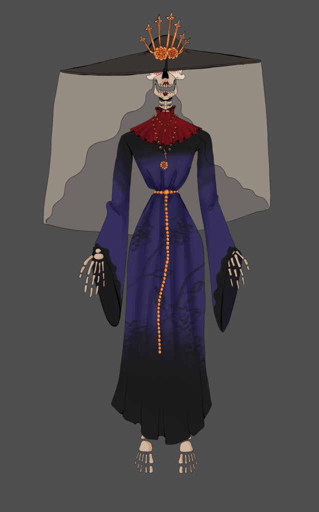
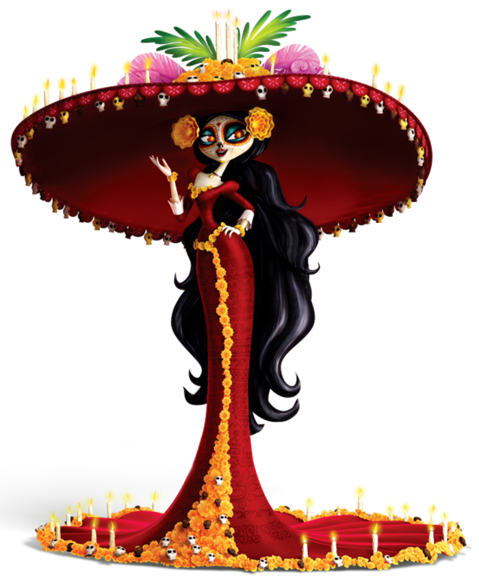
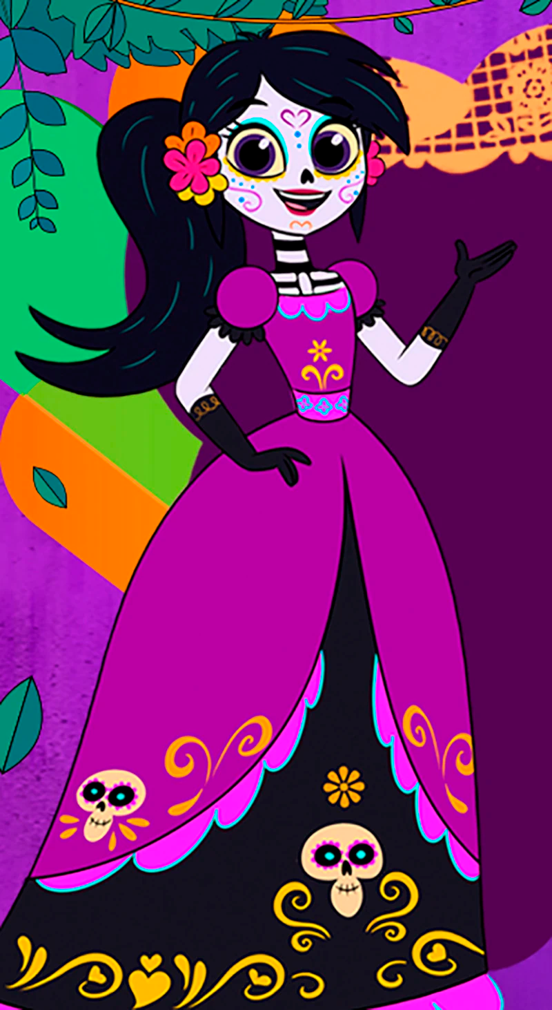
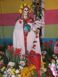
For the FINAL design, I selected some reference pictures for Santa Muerte, those are the ones I liked most:

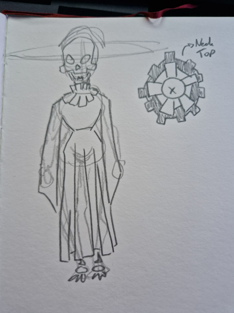
So….. *drumroll please* here is my final design! It’s…mediocre. But I do not have the time to perfect it more or redo it a fourth time.

4 hours of my life sped up to 30 seconds:

This may be a very short blog post, but it might have been the most work of them all. I will now start the 3D model.

Death: The character design…wait what?

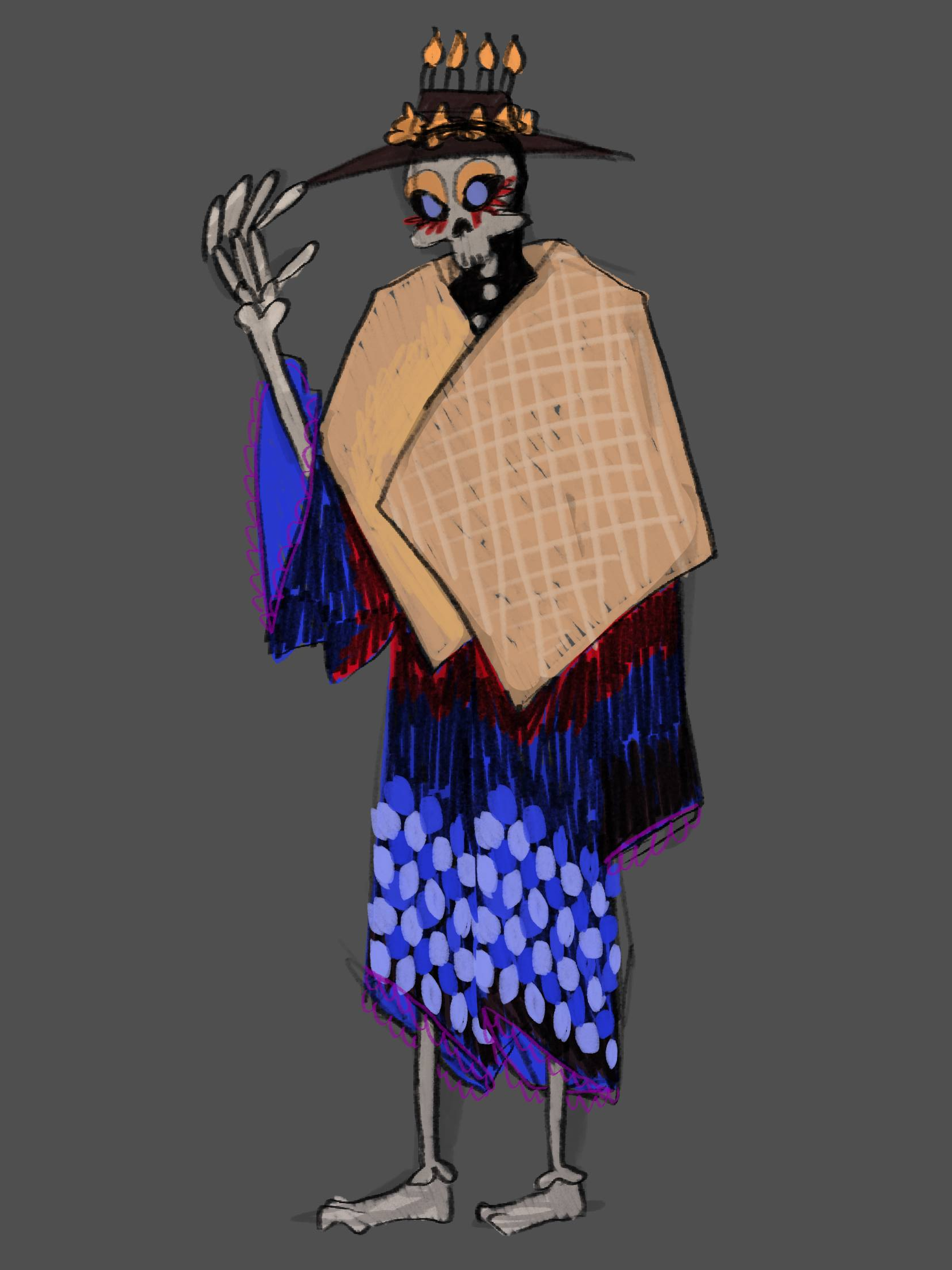
So…this chaper has been a struggle start to end. I need a character design to model it in 3D. But I can’t affort to put all the time to create a perfect design. So I want to be okay with a “mediocre” design, but I don’t want to be insensitive to different culture and fall into bad stereotypes. The first design I did was exactly that thogh.

The beige cloth represents Famadihana. It’s the plain cotton cloth the corpse gets wrapped in.

The skeleton and shape of the clothes are from the grim reaper. However the make-up and colors are inspired by Día de los Muertos and Día de los Difuntos.

The hat is also inspired by Día de los Muertos and All Saints day, as it has Cempasúchil (marigold) and candles on it.

I got input from Elizabeth Treviño as a “representative” for Día de los Muertos (thanks again!) and she said that this design feels a bit uncanny, because there is aspects from it but not really. Her feedback was that it would be better that I design a character for each culture and put my own spin to it because the designs are never the same anyway. I’m just worried about the fact, that those things already exist, so why do I even do it. However as for the time constrains I’ll put that thought on ice and design my character for Día de los Muertos (as I have someone from this culture on hand).

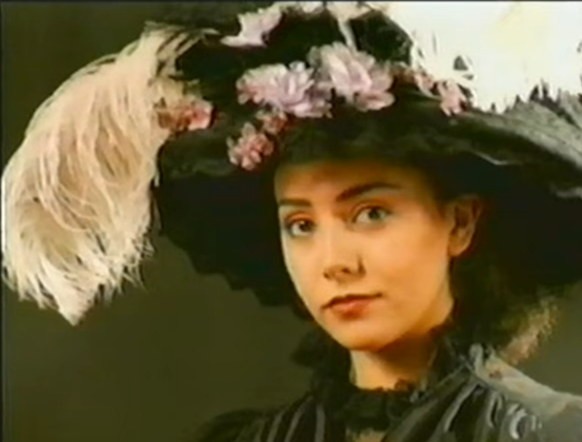
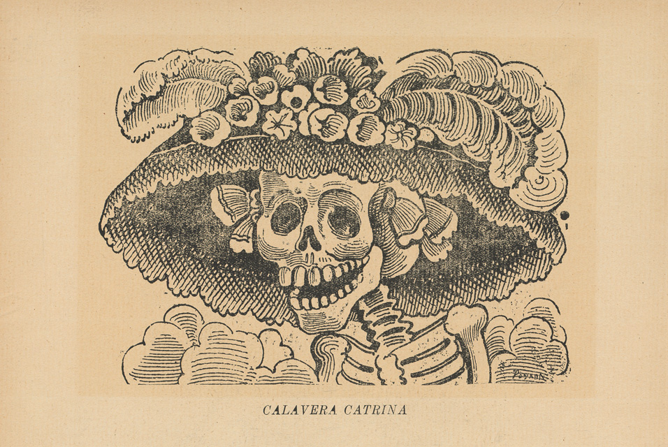
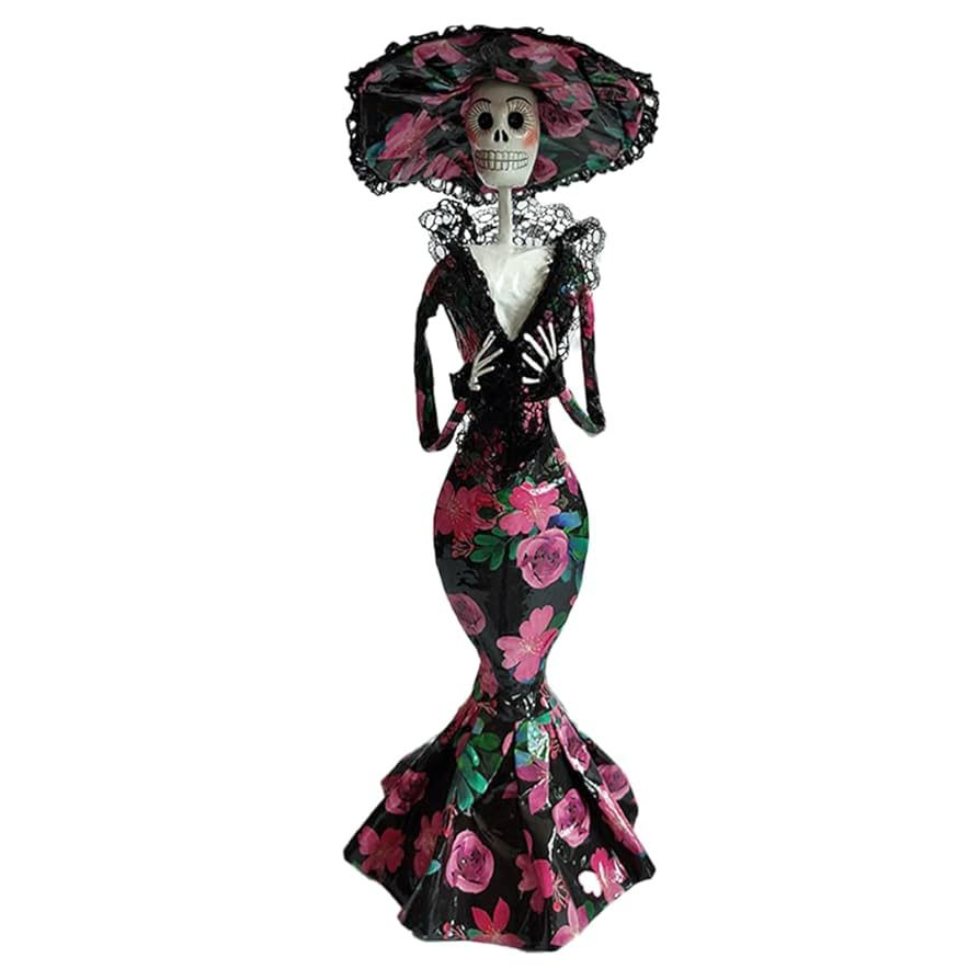
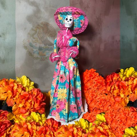
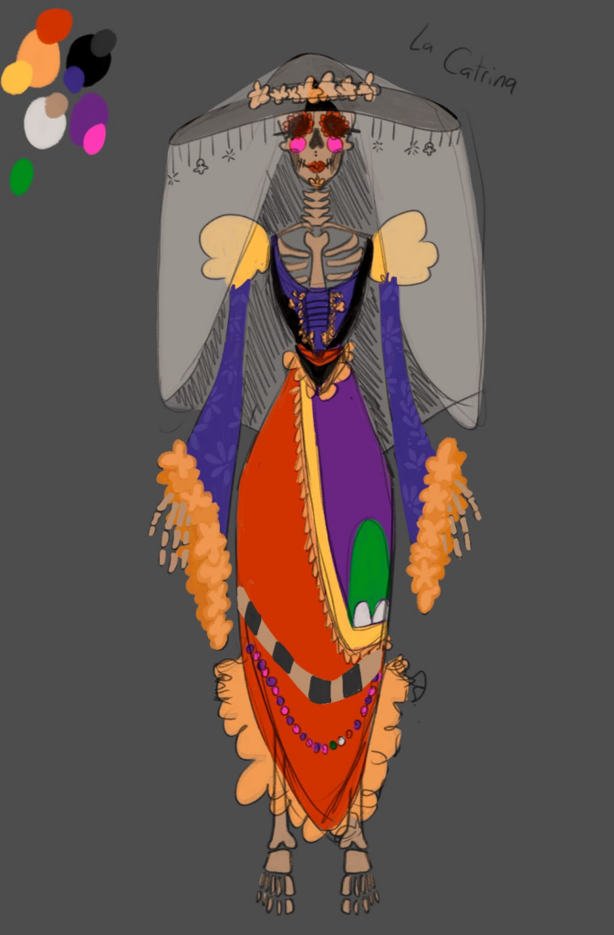
So I looked more into Día de los Muertos and especially La Catrina. Here are some inspo photos I found from other representations.

I then came up with this design and sent it to Eli again.

Combined with the questions I asked her she confronted me with the question “Do you even researched Día de los Muertos?”, which made me (embarassingly) realise that I didn’t do that enough.

So here is my (still too little but I ) research on specifically La Catrina.

Día de los Muertos and La Catrina…wait what?

Día de los Muertos has its roots in Pre-Columbian cultures and beliefs. Before the Spanish arrived in what is today Mexico, the Aztec gave offerings to their deceased ancestors as part of their death rituals. After the Spanish came, the celebration morphed to incorporate Catholic beliefs and practices, creating this deeply religious, syncretic tradition. The tradition has been largely associated with the Mexican working class, but the country’s middle class has rediscovered it in recent years for two major reasons: The celebration’s appearance in pop culture, and it’s popularity in the U.S.”

Dobrin, I. (2017, November 2). Día de los Muertos comes to life across the mexican diaspora. NPR. https://www.npr.org/2017/11/02/561527322/mexicos-celebrated-d-a-de-los-muertos-evolves-in-the-u-s

“Santa Muerte is generally portrayed as a skeleton wearing a Fanciscan monk’s cape, in a standing posture, or sometimes seated at a throne, with a scythe in her right hand and the earth or the scale in her left. She can also carry a candle, a book, or a spade, and is often accompanied by an owl, by seeds, and by coins. Variations to her outfit include a Virgin Mary-like robe and veil, a girl’s first communion dress, or bride’s gown, an “Aztec” Santa Muerte, and a seven- colored one, among others, depending on the occasion and petition. On some images, her scythe is portrayed in the form of a human spine. Offerings to Santa Muerte include veladoras (votive candles), statuettes, flowers, incense, fruits, sweets, smoking cigars and cigarettes, as well as alcohol. he colors are red for love, passion, and relationships, white–for purification, black—for and against black magic, the elimination of negativity and total protection, violet—for health and transmutation, gold or yellow—for money and prosperity, blue—for spiritual concentration and studies, and green—for legal problems and justice.”

Oleszkiewicz-Peralba, M. (2013). Representations of Death in Mexico: La Santa Muerte. The University of Houston Libraries, 1(1). https://uh-ir.tdl.org/handle/10657/3007

“Included in these fall festivals are two familiar faces whose skeletal visages afford them special attention during the season, despite the fact that neither one is historically connected to these holidays. Santa Muerte is a Mexican folk saint who personifies death in the form of a female skeleton. Whether as a gold medallion, or statuette, or votive candle she is typically depicted as a Grim Reapress, wielding the same scythe and wearing a shroud similar to that of the Grim Reaper, her male forebear. Unlike canonized Catholics, folk saints are believed to be spirits of deceased Latin American women and men considered holy for their miracle working powers. What really distinguishes the White Girl (another popular sobriquet), however, from other regional folk saints is that for most devotees she is the personification of death itself and not of a real woman that lived and died on Mexican soil. La Catrina, the Skeleton Dame, is often confused by the unfamiliar with the Skeleton Saint, Santa Muerte, but they are very different figures. While the former issued from a satirical drawing, the latter is a figure of spiritual reverence. La Catrina originated in 1910, from the pen of José Guadalupe Posada who is considered the father of Mexican print-making. La Catrina was one of thousands of sketches of skeletons garbed in European finery that derided the vanity and opulent lifestyles of the upper classes whose extravagances were at the expense of the suffering lower classes. The message Posada was conveying was that no matter one’s wealth or status, no one escapes death and indeed the phrase “todos somos calaveras” (we are all skeletons) is often attributed to the illustrator. In this manner, la Catrina resembles Santa Muerte in that she serves as a reminder of the inevitability of death, however beyond this there are no further similarities apart from that both are female skeletons.”

Chesnut, A. (2021, October). Representations of Death in Mexico: La Santa MuerteMeet the Mexican Death Trinity – Day of the Dead, Catrina Calavera and Santa Muerte [Online forum post]. The Global Catholic Review. Retrieved June 27, 2026, from https://www.patheos.com/blogs/theglobalcatholicreview/2021/10/meet-the-mexican-death-trinity-day-of-the-dead-catrina-calavera-and-santa-muerte/

My learnings

I learned that Santa Muerte…exists and is more the character I’d like to design. So in my next blog post I will design Santa Muerte, not La Catrina or any mixture of characters. I found lots of input about what colors to use and how it should look like in general.

I hope the fact that I was so unknowledgable at first and haven’t offended anyone. If I did or got anything wrong – please do contact me.

Grease Pencil 01

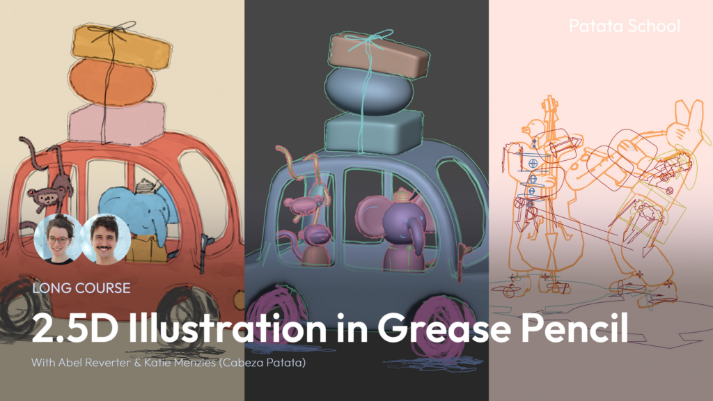
In this blog post I’ll be following the following course:

2.5D means taking the useful features of 3D (like moving in 3D space) and make it look handdrawn.

Lesson 1 | Cat Line Art

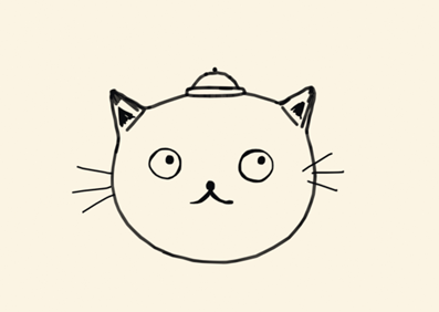
The first lesson was about creating this simple cat head. The rough workflow was modeling the head and hat with subdivided cubes and add them to a collection “OutlinesGeo”, add blank grease pencil for the outlines, add the lineart modifier to the grease pencil and change the source type to collection (OutlinesGeo). IMPORTANT: For the lineart to show up correctly you have to add a camera and set it up in a way where you always look though it. For some simple animation add the thickness and noise modifier.

To make the background one solid colour, go to the world settings and change the colour, then go to the render settings and change the “View” Settings (under Color Management) from AgX to Standard. For the object to be a solid colour go to the shading tab, delete everything but the “Material Output”, add the “Color” node and connect it into “Surface”.

The face is drawn on a new blank grease pencil. Go into draw mode, change the stroke placement to “Surface” and draw until satisfied. For the whiskers change the mode to “Origin” and go into the front view. To move them to the correct place go to Edit mode and select the whiskers and move them.

HOWEVER: I run into one issue I haven’t been able to resolve. When I try to render this scene, it looks a lot different than it does in the viewport.

Viewport
Render

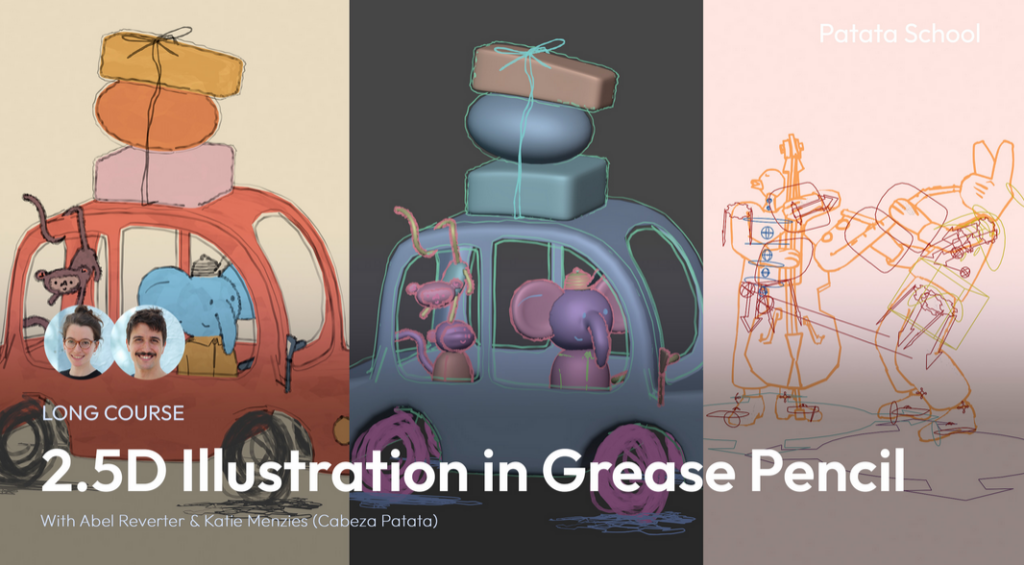
Lesson 2 | Elephant Car

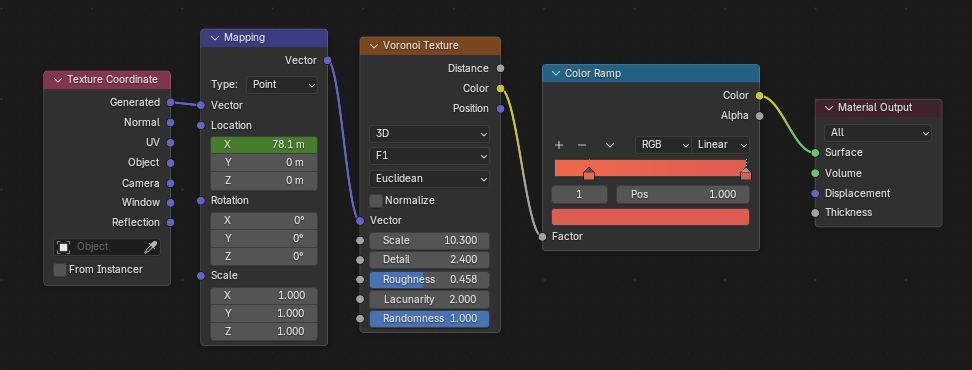
This project works the same as the cat head, just way more detailed. Model the objects, add outlines, model characters, draw details. However this project has colour, thus I created a shader that looks like paint by plugging a Voronoi Texture into a Color ramp, press “Ctrl+T” (activate Node Wrangler Plugin) on the Voronoi Texture, then animate location X in the Mapping.

This is the shader:

Instead of an elephant, I decided to make a cat driving the car…because cats are cuter not going to lie. Certain lines can be marked in the Editor Mode with “Mark as Freestyle Edge” and it’s going to show up like the outlines without having to hand-draw it.

The head was animated by parenting the head to an Empty with the “Track to” modifier. Then I keyed the head in real-time by playing the scene at the same time as I moved the empty while autokeyer was on. This however is still just a screenrecording – I still don’t know how to fix the render.

I’m a bit disappointed that the moneys and baggage is not part of the tutorial.

Lesson 3 | Rabbit Musician

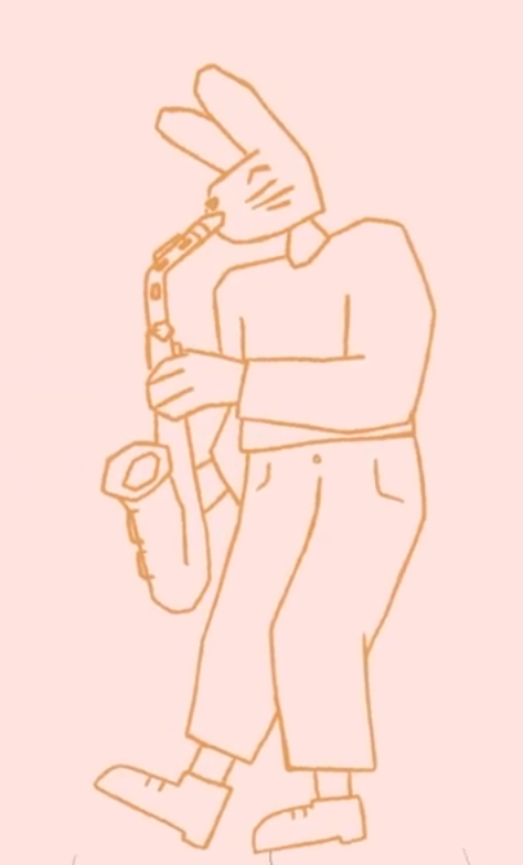
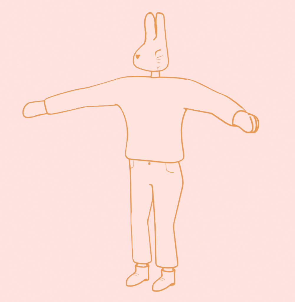
The character image isn’t in an A/T-pose, so it’s just used as a rough reference.

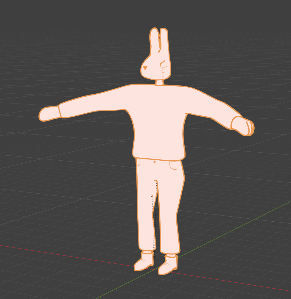
So…I finished this lesson, and the rabbit DOES look good. However at the end I ran into some frustrating problems. The pants are painted in the “Texture Paint” mode, and I did remove the “Mirror” modifier from the body, but it’s still mirroring everything. So I was not able to create the zipper detail. Also there were some paint splotches on the face (which is not connected to the body) and I was not able to remove them for some reason. And then the rig: It worked well at first. I created an Rigify Meta Basic Human Rig, set the bones in the correct place, pressed “Generate Rig”and then parented it by selecting the rig and then the body, using “With Automatic Weights”. The head was added seperately with the face paint bc selecting the head bone, then the face paint and then parenting it with “Bone”. However at some point the rig broke and the hands weren’t working correctly and it frustrated me so much that I stopped. Rigging is not the focus of my project so I will leave Lesson 4 – the Animation be and move on to more relevant things.

The return of Death: The Plan

For these semesters blog entries, I wanted to join some kind of course about either Grease Pencil, Shader creation or Sculpting. I researched a lot which course would be the best for me, considering price, topic and the way it gets thought. I stumbled upon Patata School, which is a membership-based program with different courses mainly about Blender. Some of which are about Grease Pencil and Shaders, both in a very stylized way which is perfect for me!

In this first blog post I wanted to set goals I want to achieve this semester.

The main course I will follow is “2.5D Illustration in Grease Pencil”. It has 4 Lessons, after which I want to create a 2.5D illustration based on the topic I did last semester. This project will let me translate those themes into visual art, using Grease Pencil’s dynamic tools to animate Death as both a mythic figure and a cultural mirror. For this, I will probably design a character, place it in one or more fitting environments and animate it.

As a small reminder what I wrote about last semester:

Fear and anxiety are fundamental psychological responses that connect perceived threats to subsequent behaviours. The brain’s amygdala initiates these reactions, while the prefrontal cortex regulates them. Culturally, death is rarely seen as a mere end but rather as a transition, reflected in global rituals. Mexico’s Día de los Muertos uses vibrant marigolds, sugar skulls, and altars to celebrate life’s continuity, while East Asian traditions employ white to symbolize purity and spiritual release. In the West, black attire codifies grief as a performative, socially structured process. These rituals demonstrate how colour semiotics and symbolic objects embody cultural attitudes – whether death is feared, embraced, or ritualized. For example, Madagascar’s Famadihana ceremony emphasizes kinship through the rewrapping of ancestors, while Guatemala’s giant kites during Día de los Difuntos blend art, politics, and ancestral communication.

Storytelling and media further explore these themes. Films like The Book of Life (2014) contrast the vibrant Land of the Remembered with the desolate Land of the Forgotten, reinforcing the idea that memory keeps the dead “alive.” The Halloween Tree (1993) reframes Halloween as an educational journey through global death traditions, linking seasonal colours to humanity’s ongoing dialogue with mortality.

Ultimately, fear and death are not just biological or emotional experiences but cultural constructs, expressed through colour, ritual, and narrative. Transforming terror into meaning, grief into celebration, and the unknown into a shared human story.

Otherwise the courses 2D to 3D: Grease Pencil in Blender, Grease Pencil in the Real World, Paintify | Digital Paint for Blender, 2D & 3D Typography in Blender and Cavalry, Pixel Art in Blender and PataClay | Blender Clay Materials & Brushes would interest me (so…almost all of them). I will have to discuss how many I can achieve in this semester.

Media about the festives

Those are the most relevant movies/media I could find – if anyone has other ones where the rites are a central part of the plot, don’t hesitate to tell me.

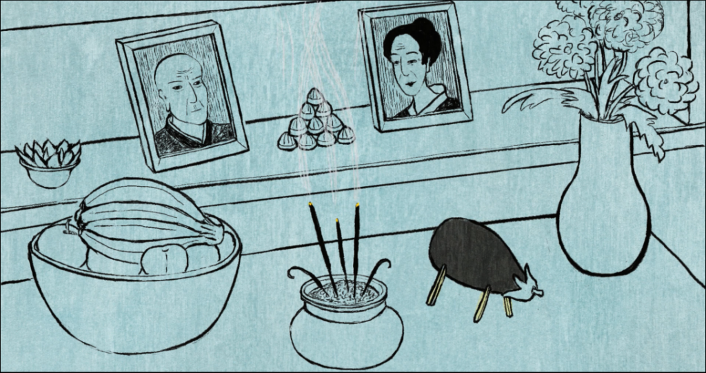
Obon (2018)

Obon is a 2D animated short-film documentary by André Hörmann and Anna Samo, drawn in a sumi-e Esque style. It depicts Akiko Takakura, one of the last remaining survivors of the atomic bomb attack on Hiroshima. She tells her life story during the Obon, doing traditional activities like building an eggplant cow, praying at the family altar, visiting her families grave, leaving flowers and candies and releasing a floating lantern. Akiko Takakura is one of only 10 people within a radius of 500 meters from ground zero to have survived the atomic bomb blast. While her colleague and friend Satomi Usami died from burns and a broken back, Ms. Takakura survived the catastrophe by sheer luck. She remembers extraordinary details and is able to bring them to life in her stories. The scenes described in the script are based solely on her experiences.

The present is rendered in cool blues while her memories are brown and earth‑toned; visually, this reverses the intuitive association of colour with life and grey with the past. The blue present is quiet, reflective, almost suspended while the brown flashbacks feel dense, scorched and grounded in the physical trauma of Hiroshima.

http://obonfilm.com/

https://vimeo.com/916775026

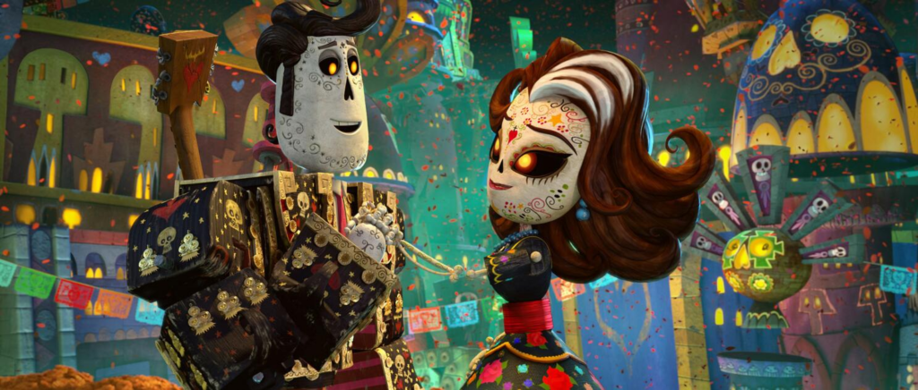
The book of Life (2014)

The story is told by Mary Beth, a museum tour guide, that takes a group of students serving detention on a secret tour, telling them the story of a Mexican town called San Angel from the Book of Life, which holds every story in the world. She uses wooden puppets to tell the story, which is why the story has the same style in the movie.

Manolo, a young man whose world shatters when Maria – his beloved – appears to die before his eyes. Consumed by grief, he makes a fateful choice: to follow her into the Land of the Remembered.

Mary describes the Land of the Remembered like this: “The land of the Remembered was vibrant and joyous. Everything was like the land above, but it was more colourful. It was more beautiful. It was more festive. And on the Day of the Dead, that place was bursting with endless parties and spectacular parades.”

The dead who are remembered live in saturated hues and perpetual fiesta; this aligns with the festival’s idea that remembrance keeps the dead socially “alive.” By contrast, the Land of the Forgotten is desaturated, rough and desolate, a world where colour has drained away because memory has failed. The binary between these two realms literalises a key idea from the festival: that the true death is to be forgotten.

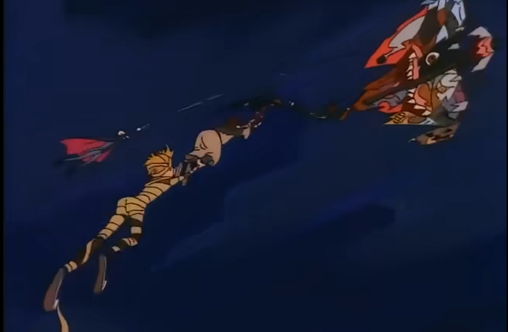
The Halloween Tree (1993)

Moundshroud explains to a group of kids what Halloween really is about while searching for their friend Pipkin, who’s suffering from appendicitis, which brings him to the verge of death. He shows them what their costumes symbolize.

The group builds a kite that sends them back in time, first to Ancient Egypt, where they learn about  the celebration “the Feast of the Ghosts” and about the significance of mummification. Then they arrive at Stonehenge in the Dark Ages in England. There, Celtic druids harvest straw to make into brooms, they discover a coven of witches chanting and celebrating the new year. Then in France, they arrive at Notre Dame in Paris where they learn about gargoyles and demons. Finally in Mexico, they learn about the significance of skeletons during “Día de los Muertos”.

As they travel, Halloween shifts from an evening of fun to a kind of educational rite of passage in which the children learn that their play is rooted in older, more serious practices of appeasing, honouring or understanding the dead.

Pipkin’s illness anchors these lessons in a concrete fear of losing a friend. The children’s journey, and the “bargain” they ultimately strike for his life, turns the festival into a negotiation with death rather than a simple celebration or a purely solemn vigil. Visually, the film uses seasonal colours to tie its global tour back to Halloween’s own palette: autumnal, liminal, tied to harvest and encroaching darkness.