Continuing my research on the topic of “Slowness”from last semester, I will be doing further work on this topic as part of the Design & Research II course with Birgit Bachler PhD.
For the final assignment, I will need to record a 2-minute video of the final prototype — in my case, I plan to use prototyping in Figma, which each of you will be able to test. The research will again focus more on contextual analysis, as well as user testing, bibliography, and heuristic evaluation.
Information design, maps and my app 🗺️
In this post, I want to connect my project to the topic of information design and to material from the “Commuting Cartographies” class. I found this PDF [1] very useful because it shows maps not just as a tool for finding your way, but as a way to understand, interpret, and even change our perception of the city. In the presentation, a map is defined as “a spatial representation of reality.” But another idea is particularly important for my project: maps don’t just show the world- they shape it.
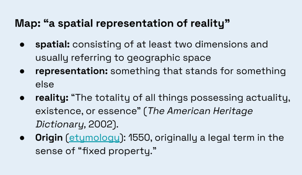
This is directly related to my idea for a “slow navigation app.” Usually, a map is perceived as a neutral tool: it shows where we are, where to go, and which route is the fastest. But in reality, a map always chooses what to show and what to hide. For example, a standard 2D map shows streets, buildings, and names. A 3D map adds a sense of scale and space. A bird’s-eye view helps you get a better visual feel for the city. Psychogeographic maps, on the other hand, may not show roads at all, but rather emotions, smells, sounds, or personal impressions of a place. This is clearly illustrated in the PDF using examples of different map types: top-down view, bird’s-eye view, 2D map, and 3D/extruded map.
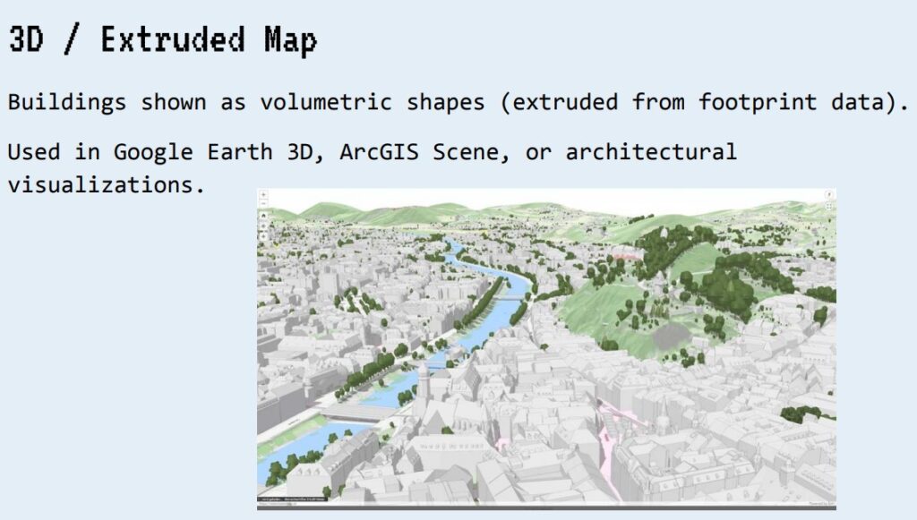
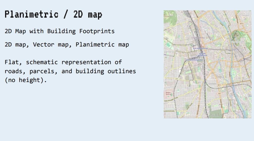
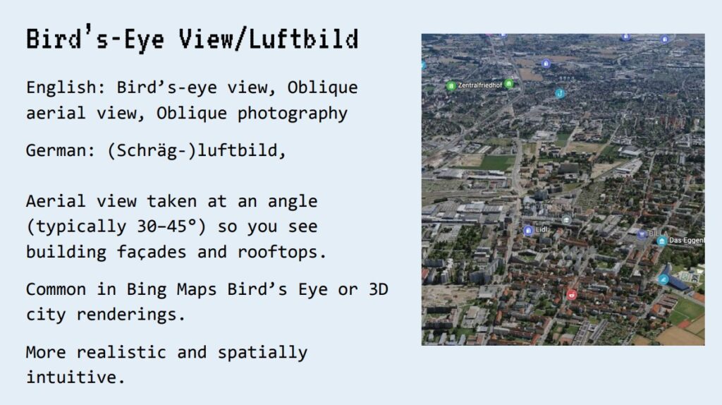
For my app, this means I don’t have to design the map exactly like Google Maps [3]. I can think of the map as a system of layers. For example, one layer could show the most peaceful route, another could show green spaces, a third could show places to stop, and a fourth could show the emotional or sensory characteristics of the route. This helps shift the focus from “getting there faster” to “experiencing the journey better.”
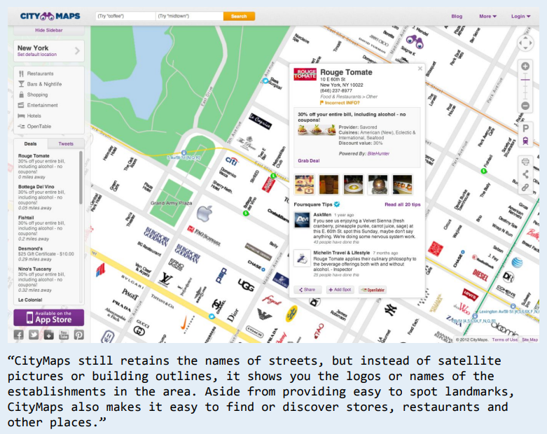
I also liked the CityMaps [4] example, where logos and place names are used instead of satellite images and building outlines. This shows that a map can be not only geographical but also social: people often navigate not by coordinates, but by cafes, stores, familiar landmarks, parks, or visual cues. This is important for my app because slow navigation should be closer to how people actually experience the city.
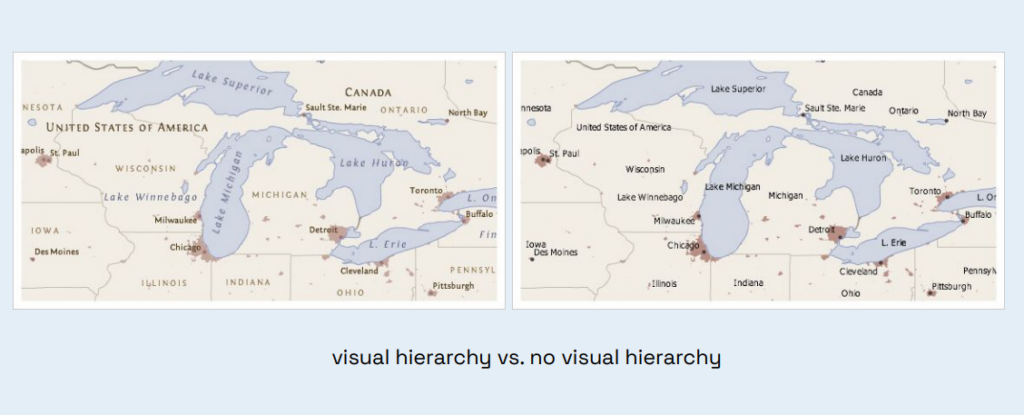
Another useful takeaway from the PDF is the importance of visual hierarchy. If everything on a map is equally important, it’s hard for a person to know where to look. In my interface, this means I need to carefully manage text, icons, colors, and layers of information. If I want to create a calm app, it shouldn’t overwhelm the user. On the contrary, it should gently guide their attention.
Thus, this material helped me realize that my project isn’t just a “map with pretty routes.” It’s an attempt to design a different kind of information system for the city. The map in my app should not only guide people but also help them notice, choose, stop, and build a more personal connection with the space.
Sources 🛈
[1] Bachler, B. Intro to Information Design – Session 5: Commuting Cartographies. FH JOANNEUM, 2025.
[2] Wood, D. Rethinking the Power of Maps. Guilford Press, 2010.
[3] Google Maps. Google LLC. Available at: https://www.google.com/maps
[4] Citymaps. Available at: https://citymaps.com
