Critical Evaluation: The Playground as a Co-design Lab

I chose Heloisa Rocha Rincon’s thesis The Playground as a Co-design Lab: An Exploratory Case Study of Elementary School Kids’ Role in Co-design because it is very close to my own research topic. The thesis focuses on children not only as end users of playgrounds, but as active co-designers who can contribute directly to the design of their own play environments. This immediately caught my attention because I am also interested in how children can be included in the early stages of playground design and how interaction design can help with it. The author also frames the wider issue as a wicked problem, which made the connection to my own research even stronger.

What I found strongest about the thesis was the way the design process was translated into real workshop activities. The children did not simply answer questions about what they wanted. Instead, they moved through different stages, such as remembering previous outdoor play experiences, observing other children, creating characters with different needs, and finally designing future play environments. This made the process feel much more thoughtful and participatory. The empathy-building activity especially stood out to me, because the children were encouraged to observe how others played and to think beyond their own needs.

The project also felt innovative, not because co-design itself is new, but because of how existing participatory methods were adapted to children and playground design. Open-ended materials, storytelling, character building, observation, and physical prototyping all gave children different ways to communicate. This is very relevant to my own work because it confirms that children do not always need to express themselves through interviews or written answers. The thesis also connects co-design with the Reggio Emilia philosophy, which sees children as capable, curious, and active participants who communicate through many different “languages,” such as drawing, movement, building, and dramatic play.

Another thing I appreciated was the independence and ambition of the project. The author built a collaboration with a school, prepared and facilitated several workshops, documented the sessions, analysed the material, and later translated the research into a practical case study report. At the same time, this made me realize how demanding a similar process would be for my own thesis. The study produced a very large amount of material, including hours of recordings, hundreds of pages of transcripts, and many photographs. That made me think that if I organize workshops myself, working alone might not be realistic. I would probably need someone else to help with documentation so I can focus on facilitation and the children.

The overall structure of the thesis was clear and logical. It moved from theory into the research process, then into workshops, data analysis, findings, and finally the practical report. I found the workshop preparation and implementation especially easy to follow because the author included room layouts, activity structures, photographs, and detailed explanations. The communication of the process was therefore very strong.

However, the findings were not always as easy to read. There was a lot of valuable material, but also many tables, codes, dialogue excerpts, and individual examples. I sometimes had difficulty understanding which findings were the most important and which were more supportive examples. For me, this was one of the weaker parts of the thesis. The depth of the analysis is impressive, but stronger visual summaries or clearer prioritization could have made the results more accessible.

The scope of the work is also quite large for a master’s thesis. It combines theoretical research, school collaboration, workshops, observation, audio and video documentation, children’s artifacts, qualitative coding, thematic analysis, and a final communication output. I found this impressive, but also slightly overwhelming. It made me reflect on the scale of my own project and whether I need to reduce the scope in order to make it realistic.

This is especially relevant because I would also like to collaborate with a school and organize workshops with children. Since I plan to work in Austria, one of my main concerns is language. I am not yet sure whether my German is strong enough to facilitate a complex workshop with children in a natural and flexible way. Reading this thesis made me understand that these workshops require a lot of improvisation, communication, and trust, so language could become an important factor in my own research design.

In terms of writing and accuracy, I found the thesis generally understandable and carefully documented. The methods, recruitment process, workshop structure, and analysis are described in a detailed way. Still, I noticed occasional wording, grammar, and formatting inconsistencies. These did not affect my understanding, but a final editing round could have made the thesis feel more polished.

The literature was very useful for me personally. The author connects co-design with Sanders and Stappers, Reggio Emilia, outdoor play, participation, design research, childhood studies, and materials. Because the topic is so close to mine, the bibliography gives me many new authors and concepts to follow up on. It also helped me see how my own topic could be positioned more clearly within participatory design and design research.

One of the most interesting parts for me was the activity where children were asked to observe other children in the playground and take notes about how they moved, played, and interacted. I had already been thinking about playground observation, but this made me consider a different possibility: children themselves could become observers and researchers. I found this idea especially powerful because it combines empathy, participation, and design thinking in a very simple way.

The thesis also made me think more about cultural context. The author discusses how little time many children in the United States spend outdoors and how access to free outdoor play has decreased. This made me curious about how the situation compares with Europe, and especially German-speaking countries. Since I am already considering narrowing my research to this context, a comparison between cultural attitudes toward outdoor play, risk, and playground use could become an interesting part of my own research.

Overall, I found this thesis extremely relevant and useful. It gave me practical ideas, but more importantly, it helped me understand the complexity of actually working with children in a participatory design process. My biggest takeaway is that involving children is not simply about asking for their opinions. The designer has to create the right conditions for them to observe, imagine, communicate, and make decisions while also knowing when to step back.
WS26/27_#01_Kritische Analyse einer Masterarbeit

Für diese Aufgabe habe ich mir die Masterarbeit „Künstliche Intelligenz im Designprozess – am Beispiel einer individuellen Mikromobilitätslösung für den Alltag“ von Matthias Stütz ausgesucht. Die Arbeit wurde 2026 an der Kunstuniversität Linz im Bereich Industrial Design verfasst und umfasst 297 PDF-Seiten.

Da ich mich in meiner eigenen Masterarbeit ebenfalls mit KI beschäftige, fand ich es interessant, mir anzusehen, wie jemand anderes an dieses Thema herangeht.

Stütz untersucht, wie KI in den Designprozess integriert werden kann. Nach einem ausführlichen Theorieteil entwickelt er mithilfe verschiedener KI-Tools eine Mikromobilitätslösung für den urbanen Alltag. Das Ergebnis ist ein Fahrzeugkonzept, dessen Entwicklung er anhand von Skizzen, digitalen Modellen und Visualisierungen dokumentiert.

Gestaltungshöhe

Gestalterisch gefällt mir die Arbeit sehr gut. Das Layout ist modern und übersichtlich, die Typografie klar und die zahlreichen Abbildungen lockern die längeren Textpassagen auf.

Auch das finale Fahrzeugkonzept finde ich gelungen. Wie gut es tatsächlich funktioniert, kann ich allerdings schwer beurteilen, da mir kein physischer Prototyp zur Verfügung steht.

Innovationsgrad

Das eigentlich Innovative an der Arbeit ist für mich weniger das Fahrzeug selbst, sondern die Art, wie KI in den Designprozess eingebunden wird.

Stütz experimentiert nicht nur mit Bildgeneratoren, sondern auch mit Sprachmodellen und eigenen KI-Agenten. Besonders seinen Versuch, einen Ideation-Agenten für die Konzeptentwicklung einzusetzen, fand ich spannend.

Allerdings hätte mich interessiert, wie sich seine Vorgehensweise im Vergleich zu einem klassischen Designprozess schlägt. Ob KI tatsächlich bessere oder einfach nur andere Ergebnisse liefert, bleibt für mich offen.

Selbstständigkeit

Im praktischen Teil wird deutlich, wie viel Eigenarbeit in der Masterarbeit steckt. Stütz führt eine Umfrage mit 134 Personen durch, sammelt Mobilitätstagebücher, untersucht bestehende Mobilitätslösungen und entwickelt eigene KI-gestützte Arbeitsabläufe.

Gut finde ich auch, dass er offen damit umgeht, wie er KI beim Schreiben eingesetzt hat. Auf Seite 20 erklärt er seine Vorgehensweise anhand konkreter Beispiele. Gerade bei diesem Thema halte ich diese Transparenz für wichtig.

Gliederung und Struktur

Die Aufteilung in einen theoretischen und einen praktischen Teil ergibt für mich Sinn. Allerdings fand ich den Theorieteil stellenweise ziemlich lang. Manche technischen Erklärungen gehen so sehr ins Detail, dass ich mich gefragt habe, ob das für das eigentliche Designprojekt wirklich alles notwendig ist.

Dadurch gerät die ursprüngliche Fragestellung für mich manchmal etwas aus dem Blick.

Kommunikationsgrad

Die Arbeit ist größtenteils gut verständlich geschrieben. Auch komplexere Themen werden mit Beispielen erklärt, sodass man ihnen ohne tiefere technische Kenntnisse über KI folgen kann.

An manchen Stellen schreibt Stütz allerdings ziemlich persönlich und umgangssprachlich. Einerseits macht das die Arbeit angenehm zu lesen, andererseits frage ich mich, ob bei einer Masterarbeit nicht eine konsequentere wissenschaftliche Ausdrucksweise angebracht wäre.

Umfang der Arbeit

Mit 297 PDF-Seiten ist die Arbeit wirklich umfangreich. Man merkt, dass sich der Autor intensiv mit dem Thema beschäftigt hat. Trotzdem glaube ich, dass man einige Inhalte hätte kürzen können, ohne dabei wichtige Informationen zu verlieren.

Orthographie, Sorgfalt und Genauigkeit

Die Arbeit macht auf mich insgesamt einen sorgfältigen Eindruck. Vor allem die Abbildungen und Diagramme sind übersichtlich aufbereitet.

Vereinzelt sind mir Tippfehler und etwas unfertige Formulierungen aufgefallen. Wobei ich sagen muss, dass ich das in unserer heutigen Welt voller KI-generierter Texte irgendwie auch sympathisch finde. Meinen Gesamteindruck beeinflusst das jedenfalls nicht wirklich.

Literatur

Stütz greift auf Literatur aus unterschiedlichen Bereichen zurück, darunter KI, Design und Mobilität. Gut finde ich, dass er neben wissenschaftlichen Quellen auch aktuelle technische Entwicklungen berücksichtigt. Gerade bei KI halte ich das für sinnvoll, weil sich in diesem Bereich unglaublich schnell etwas verändert.

Bewertung des Werkstücks

Die Dokumentation des Werkstücks ist für mich eine der größten Stärken der Arbeit. Ab Seite 164 beschreibt Stütz die Konzeptentwicklung und ab Seite 244 die gestalterische Ausarbeitung des Fahrzeugs. Durch die vielen Skizzen, 3D-Modelle und KI-generierten Visualisierungen kann man die Entwicklung gut mitverfolgen.

Auch die Verbindung zwischen Theorie und Praxis funktioniert meiner Meinung nach. Stütz probiert die zuvor beschriebenen Technologien selbst aus und zeigt dabei auch, wenn etwas nicht funktioniert. Auf Seite 193 beschreibt er beispielsweise Schwierigkeiten mit seinem Ideation-Agenten, dessen Bewertungen teilweise nicht nachvollziehbar waren.

Was mir fehlt, ist eine abschließende Überprüfung des Fahrzeugkonzepts mit tatsächlichen Nutzern. Ob das fertige Konzept deren Bedürfnisse wirklich erfüllt, bleibt für mich offen.

Gestalterisch und hinsichtlich der Dokumentation finde ich das Werkstück für eine Masterarbeit durchaus angemessen. Bei der Überprüfung der Ergebnisse hätte ich mir aber mehr gewünscht.

Fazit

Alles in allem finde ich die Masterarbeit gelungen. Besonders interessant ist für mich, wie intensiv Stütz die verschiedenen KI-Tools ausprobiert und seine Erfahrungen damit dokumentiert.

Mein größter Kritikpunkt ist, dass die Arbeit zwar viele Einsatzmöglichkeiten von KI zeigt, aber nicht ausreichend klärt, welchen konkreten Mehrwert diese gegenüber herkömmlichen Gestaltungsmethoden bieten.

Für mich liegt die Stärke der Arbeit deshalb vor allem darin, zu zeigen, wie KI im Designprozess eingesetzt werden kann, und weniger darin, nachzuweisen, dass dadurch tatsächlich bessere Ergebnisse entstehen.

Was ich für meine eigene Masterarbeit mitnehme

Was ich mir auf jeden Fall mitnehmen möchte, ist die ausführliche Dokumentation der Arbeitsschritte. Ich finde es wichtig, nicht nur die fertigen Ergebnisse zu zeigen, sondern auch, wie man überhaupt dorthin gekommen ist. Gerade wenn etwas nicht funktioniert, kann das ja auch eine interessante Erkenntnis sein.

Da ich selbst untersuchen möchte, inwieweit Menschen zwischen authentischen, KI-manipulierten und vollständig KI-generierten Bildern unterscheiden können, möchte ich deshalb darauf achten, dass ich am Ende auch wirklich eine Antwort auf meine Forschungsfrage geben kann. Und wenn meine Ergebnisse nicht so eindeutig ausfallen, wie ich es mir erhofft habe, dann gehört das eben auch dazu.

Analyse Masterarbeit

Ich beschäftige mich seit ein paar Monaten intensiv mit dem Thema Trauer, da ich selbst davon betroffen bin, daher hat es mich sehr gefreut auch eine designbasierte Masterarbeit zu diesem Thema von der Fachhochschule Potsdam zu finden. Die Arbeit ist von Giuliana Mei verfasst und heißt „On the Future of Grief: An Exploration on Mourning in the Digital Age.“ und ist im Jahr 2025 erschienen. Es geht darum, neue digitale Varianten zu erschaffen, um mit Trauer umzugehen.

Diese Arbeit besteht aus zwei Teilen: der theoretischen Ausarbeitung des Themas, sowie einem Prototypen für ein digitales Erinnerungssystem mit einem sensorischem Polster. Dieses System soll dabei helfen Trauer zu reflektieren, Erinnerungen zu archivieren und der Polster hilft dabei die Gefühle zu regulieren.

Während der Prototyp hohe gestalterische Qualität vorweist, scheint die Arbeit selbst teilweise in einem seltsamen Raster gestaltet zu sein, dass das Lesen manchmal erschwert. Das sieht man zum Beispiel auf Seite 90.

Der digitale Prototyp nutzt bereits bekannte Oberflächennavigation und Konzepte, stellt diese aber für den Bereich Trauer auf eine neue Art und Weise zur Verfügung und bleibt durch den sensorischen Polster nicht nur auf digitaler Ebene nutzbar, sondern verbindet die digitale und analoge Welt miteinander, um nicht nur ein visuelles, sondern auch ein spürbares Erlebnis zu schaffen.

Die vorgestellten Untersuchungen sind in ausreichendem Maße erforscht. Hier und da hätte man noch tiefgreifendere Analysen machen können.

Die Autorin hat eigene Fragestellungen entwickelt und diese durch Grundlagenliteratur, eigene Rückschlüsse und eine Umfrage beantwortet. Außerdem wurden gängige Konzepte grundlegender Theorien hinterfragt und ergänzt, siehe Seite 36-41.

Die Aufteilung der Themen ist plausibel und alle Bereiche bekommen ihren adäquaten Raum.

Die vorgestellten Konzepte sind nachvollziehbar und verständlich, bei manchen Verteidigungen auf Basis der Umfrage hätten tiefgreifendere Argumente mehr Sinn ergeben, siehe Kapitel 05, ab Seite 84.

Die Arbeit könnte besser kontrolliert werden, es befinden sich noch ein paar Rechtschreibfehler im Dokument. Ein Beispiel findet man auf Seite 53 im Titel, dort steht „Excersize“ statt „Exercise“.

Es wurde extensive Literaturrecherche betrieben und die gewählten Texte passen zum Kontext der Arbeit und werden gut mit der Praxis verknüpft.

Im Werkstück werden Forschungsfrage, Theorie und praktische Umsetzung verbunden und die gewählten Designideen werden begründet und sind nachvollziehbar. Außerdem wird auf Basis der Umfrage nochmal das ganze Design erklärt und mögliche Veränderungen für die Zukunft des Stückes werden angesprochen. Die Dokumentation des Werkstücks macht Sinn und ist ausreichend und die Qualität des Werkstücks entspricht einer Masterarbeit.

Zusammenfassend kann man diese Arbeit mit einem Gut (2) bewerten, da die Arbeit Theorie und Praxis gut miteinander verbindet und neue Erkenntnisse teilt. In einer immer mehr digitalisierten Welt braucht es genügend adäquate digitale Trauerorte, dieser könnte einer davon sein. Die minimalistische Grafik hilft durch die Farbgebung zu beruhigen und trotzdem kann der Ort personalisiert werden. Der Polster schafft eine Verbindung von der digitalen in die analoge Welt und macht den Ort dadurch noch persönlicher. Einige Begründungen könnten noch nachgeschärft werden und die Arbeit müsste etwas besser lektoriert werden, da noch ein paar Rechtschreibfehler vorhanden sind. Ansonsten ist die Arbeit gut.

Ich bin selbst am Überlegen eine Arbeit im Bereich Trauerdesign zu schreiben, dadurch hat mir das Thema schon ein wenig geholfen, um mehr über meine eigene Arbeit nachzudenken. Zudem habe ich gelernt, dass man eine Arbeit lieber mehr als weniger lektorieren lassen sollte, denn Rechtschreibfehler sind nicht zu unterschätzen und sie können auch den Lesefluss stören oder sogar zu Verständnisproblemen führen. Außerdem ist es wichtig eine klare und sinnvolle Aufteilung der Arbeit zu haben, um Leser*innen durch die Arbeit zu führen und nicht zu verlieren. Ich glaube auch, dass die Analyse und Bewertung dieser Arbeit mir geholfen hat noch genauer hinzuschauen und festzustellen, welche Details bei einer Masterarbeit wichtig sind.

IMPULSE #3 | 📓 Design Research 3

Another talk I attended at the World Usability Congress was “The UX Horror Show: Let’s Talk About Dark Patterns” by Vicky Pirker. This talk connects directly to another talk (Addiction vs. Control: How (not) to build habit-forming products), since deceptive patterns are used to make products that are habit-forming. Moreover these patterns are used to manipulate and deceive users. What I found most interesting was that Digital Service Act already prohibits these tactics yet few businesses adhere to them.

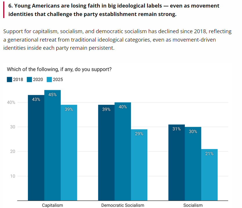
As Designers we understand how people think and therefore we have the power to either protect users or exploit them. I know that as Designers, we still depend on big corporations to make a living. And as both speakers mentioned we probably can’t change capitalism in an instant but we can make things better little by little through the design decisions we make. I would argue that many young people are also growing sceptical of businesses that are purely profit-driven and prefer companies that act more responsibly and socially. This is also reflected in the 51st edition of the Harvard Youth Poll, in which the share of young Americans who identify as capitalist fell by ten percent (from 29% in 2020 to 19% in 2025).

Source: https://iop.harvard.edu/youth-poll/51st-edition-fall-2025

3 Guidelines for Designers (Article 25(3) Digital Service Act)

The speaker mentioned some easy guidelines to adhere for Designers:

  1. Don’t give prominence to one option: This is most commonly used in cookie banners, where businesses often highlight the option that benefits themselves than the users.
  2. Don’t repeatedly ask the user to reconsider: Also called Nagging, which is used by businesses to upsell certain subscription plans or products. (e.g. choosing the Basic plan and then getting “Are you sure? You’ll miss these Pro features.”)
  3. Don’t make it harder to cancel than to sign up: Many businesses use this model called Roach Motel to keep users from unsubscribing from their service. (e.g. unsubscribing from a newsletter)

DATA Framework by Vicky Pirker

How can Designers make the right decisions? The speaker created a framework called DATA, which offers some pointers for making digital products less manipulative and exploitative.

  1. D (Dignity): Users should be respected and not shamed into making decisions.
    1. For example, pop-ups that try to upsell users at checkout, such as “Are you sure you want to continue with Basic? Get 5% off if you upgrade now.”
  2. A (Autonomy): User should be able to choose freely.
    1. One well-known example is the cookie banner, where the “Accept all” button is highlighted while the other options are barely visible. Thus, users often click whatever stands out, even if it isn’t in their best interest.
  3. T (Transparency): User should always know what is going on.
    1. One example is unsubscribing, which is often extremely complicated. Instead of simply confirming that everything has been turned off and the user is unsubscribed, many businesses add extra steps.
  4. A (Authenticity): Pressure placed on users should be real not fabricated.
    1. A common example might be fake urgency on hotel booking platforms, such as “20 people are looking at this hotel right now” or “only 3 rooms left.” A more honest version would be “3 rooms left on our platform,” which makes clear that the hotel itself possibly has more availability.

Related Links

Das Mysterium “BookTok”

Laut dem DWDS, dem digitalen Wörterbuch der deutschen Sprache, ist BookTok “das Genre bzw. Format auf der Plattform TikTok, bei dem Nutzer per Video Bücher besprechen und anderen Nutzern empfehlen”. Das Wort definiert sich durch seine Wortkreuzung aus dem englischen Wort für Buch und der Kurzform der Social Media Plattform “TikTok” eigentlich selbst. Über die letzten Jahre ist BookTok immer prominenter geworden und hat mittlerweile den Literaturmarkt vor allem in gewissen Genres revolutiioniert. 

Was ist BookTok? 

 “BookTok made me buy it” 

Social Media lebt von kurzen Videos – das ist klar. Auch gekaufte Produkte, wie eben beispielsweise Bücher, in diesen Videos zu bewerten, empfehlen und teilen ist nichts Neues und gibt es schon länger. 

BookTok war Anfangs nur ein Hashtag, unter dem Buch-Bewertungen gesammelt wurden. Mittlerweile ist es eine gesamte, riesige Community geworden. Dazu zählen nicht nur Leser:innen, sondern auch Autor:innen und Content Creators sowie Verläge (oder aber auch durch Buchverfilmungen Schauspieler:innen und die Filmbranche). Einige Influencer haben ihre Karriere erst durch TikTok gestartet und verdienen ihren Lebensunterhalt mit dem Reden über Bücher. 

Performed ein Buch gut in der BookTok-Community sind die Kauf- bzw. Erfolgschancen dieses stark gestiegen. Einige Autor:innen haben Social Media Plattformen und BookTok spezifisch dafür verwendet, ihr Buch zu promoten und so gegebenenfalls Verlagsdeals zu bekommen. 

Für jedes geschriebene Genre gibt es auf BookTok Creator, Influencer und eine Community. Allerdings gibt es einige Genres, die besser performen als andere. Die beliebtesten sind “Young adult fiction” und “Romantasy”. Dabei geht es auch oft nicht um die neuesten Bücher. Das beste Beispiel dafür ist “Wuthering Heights” von Emily Bronte, dass – nach der Buchverfilmung und dem Kinostart – wieder in den Trend kam. Dieses Beispiel zeigt auch, wie groß die Verbindung zwischen BookTok und der Filmindustrie ist. 

Die Geschichte von BookTok 

Niemand weiß genau, wer BookTok erfunden bzw. den Trend oder die Community gestartet hat. Seit 2019 gibt es Videos unter dem Hashtag. Vor allem während der Corona Lockdowns 2020 und 2021 stieg die Beliebtheit und die Zahl der Videos zu diesem Thema extrem an. 

Es gibt zwei Creator auf TikTok, die die Anfänge von BookTok prägten. Einer davon ist Cait Jacobs (@caitsbooks auf TikTok), die sich selbst als “accidental founder of booktok” beschrieben hat. Was für sie 2020 mit einem viralen Video startete, ist nun zu einem wahr gewordenen Traum gewachsen: Jacobs ist nun Autorin bei einem Verlag.

Unter dem Hashtag #BookTok sind auf TikTok 74 Millionen Posts zu finden (Stand März 2026). Auf Instagram ist diese Zahl sogar noch größer: Hier findet man unter dem #BookTok elf Millionen Posts und unter dem zweiten Hashtag #bookstagram bereits 124 Millionen Posts. 

Dabei gibt es BookTok in einer ähnlichen Form schon viel länger. Auf YouTube gibt es seit 2010 Videos, die sich nur mit den Bewertungen von Büchern beschäftigen. 

Wieso funktioniert BookTok so gut? 

Natürlich spielt der Algorithmus auf Social Media eine große Rolle und entscheidet viel darüber, was User:innen zu sehen bekommen. Allerdings spielt bei BookTok noch etwas anderes eine große Rolle: Storytelling. Bücher haben schon geschriebene, in Stein gemeißelte Stories. Geschichte machen viele Dinge mit Menschen und vor allem eines: Sie lasse sie alle Arten an Emotionen fühlen. Berührt das Ende eines Buchs ein:e Leser:in, ist es menschlich, diese Gefühle mit anderen zu teilen und darüber zu reden. Wurde dieses Buch bereits von mehreren Personen gelesen, ist es noch einfacher, darüber zu reden. So nimmt BookTok schnell seinen Lauf. 

Bereits 2021 war klar, dass BookTok den Büchermarkt revolutioniert hat. Auf der Bestseller Liste 2021 waren viele Bücher, die nicht neu erschienen sind. Normalerweise waren die Verkaufszahlen von Büchern direkt nach der Veröffentlichung am höchsten und nahmen danach mit der Zeit wieder ab. Verlage gingen der Sache 2021 auf die Spur und kamen zu dem Schluss, dass BookTok eine entscheidende Rolle bei den Verkaufszahlen von Büchern spielt. Das Verlagshaus “Bloomsbury” gab an nach dem Aufkommen von BookTok 220% mehr Profits zu haben als zuvor. Durch einen anfänglichen TikTok-Trend müssen Verlagshäuser und Marketingfirmen nun ihre Strategien überdenken. 

BookTok und Film 

Immer mehr Bücher, die beliebt auf BookTok sind wurden zu Filmen oder werden in (naher) Zukunft verfilmt. Einige Beispiele dafür sind: 

  • The Summer I turned pretty 
  • Off-Campus 
  • Heartstopper 
  • Fourth Wing 
  • The Love Hypothesis 
  • Maxton Hall 
  • Heated Rivalry 
  • Icebreaker 

und noch viele mehr. Allerdings sind Buchverfilmungen kein neues Konzept; es gibt diese schon seit vielen Jahren. Auch Fans haben schon lange eine große Rolle dabei gespielt, welche Bücher verfilmt werden. Beispiele dafür sind Twilight, Harry Potter oder The Hunger Games. Allerdings gibt es durch TikTok eine ganz neue Strategie, die Produktionen und Verlage verfolgen können. Bewertungen haben nun Zahlen und Gesichter. Social Media Videos lassen sich durch Views, Likes, Kommentare und Shares auswerten, belegen und analysieren. Durch BookTok können Filmproduktionen außerdem auf ganze Buchreihen zugreifen, die auf Social Media als erfolgreich gelten. 

Gleichzeitig gibt es auch negative Seiten von BookTok für die Filmbranche: Mitglieder der Community und Leser:innen haben viele Meinungen zu ihren Lieblingscharakteren. Vor allem Castings werden oft kritisiert oder unter einen großen Scheinwerfer gestellt. 

Quellen: 

BBC Bitesize. (März 2026). What is BookTok and how did it start? https://www.bbc.co.uk/bitesize/articles/z9cgnk7

Deutsches Textarchiv & Digitales Wörterbuch der deutschen Sprache. (22.10.2026). BookTok. DWDS. https://www.dwds.de/wb/Booktok

Raissa Sapardan. (2026, 18. Juni). From BookTok to the big screen: How readers have influenced Hollywood. Nyota Magazine. https://nyotamagazine.com/2026/06/18/from-booktok-to-the-big-screen-how-readers-have-influenced-hollywood/

Wiederhold, B. K. (2022). BookTok made me do it: The evolution of reading. Cyberpsychology, Behavior, and Social Networking, 25(3), 157–158. https://doi.org/10.1089/cyber.2022.29240.editorial

Das Literaturverzeichnis wurde mit der Hilfe von ChatGPT erstellt und von mir auf Richtigkeit geprüft.

Vom Buch zum Film: Eine Einführung 

„Adapting is a bit like redecorating” – Alfred Uhry 

Eine Verbindung zwischen Literatur und Film gibt es schon lange. Die allerersten Buchverfilmungen kamen bereits mit dem Aufkommen der Filmkamera in den 1890er Jahren. Das Verhältnis der beiden Medien ist intensiv diskutiert und stellt ein wichtiges Them der modernen Medienwissenschaften dar. 

Die Geschichte der Buchverfilmungen 

Das erste Buch wurde bereits 1895 verfilmt und handelte von dem Bestseller „Trilby“. Allerdings dauerte dieser „Film“ nur 45 Sekunden und das Filmmaterial ist über die Jahre verloren gegangen. 

Als erste bekannte Buchverfilmung gilt der 1899 von Georges Méliès veröffentlichte Stummfilm von Cinderella (bzw. Aschenputtel). Dieser basierte auf dem Märchen der Brüder Grimm. Noch im selben Jahr veröffentlichte Méliès bereits eine zweite Adaption: King John, was die erste bekannte Verfilmung eines Shakespear Werkes ist. Méliès verfilmte noch einige weitere bekannte Literaturwerke.

1936 erschien „Gone with the Wind“ nach dem gleichnamigen Buch von Margaret Mitchell. Diese Adaption hielt sich sehr trau an das literarische Werk. Mit über 1000 Seiten war dies jedoch ein ziemlich langes Buch, weshalb der Film fast vier Stunden lang geworden ist. Trotzdem ist „Gone with the Wind“ seiner Zeit weit voraus: Nicht nur durch die detailgetreue Adaption, sondern auch durch glamouröse Kostüme, Setdesign und Schauspieler:innen. 

Buchverfilmungen gibt es also schon lange. Aber auch heute noch werden vor hunderten Jahren geschriebene Bücher noch modern adaptiert. Ein Beispiel dafür ist einer der bekanntesten Romane der Welt: „Pride and Predjudice“ von Jane Austen. Das Buch ist klassische, englische Literatur, der Beginn der „Enemies-to-lovers-Trope“ und wurde bereits 1813 veröffentlicht. 1940 gab es davon die erste Verfilmung, damals noch in schwarz-weiß. 1980 brachte BBC eine Miniserie des Romans heraus; 15 Jahre später passierte dasselbe im britischen Fernsehen. Joe Wright verfilmte „Pride and Predjudice“ 2005 als Kinofilm und derzeit plant Netflix eine weitere Adaption des Romans. 

Ein weiteres Beispiel dafür sind die mehrfachen Verfilmungen des gleichnamigen, klassischen Romans „Little Women“. Zu den besten Verfilmungen von Büchern jemals zählen Harry Potter oder Fight Club.

Buchverfilmungen heute 

Auch wenn der Start der Verfilmung von Büchern schon viele Jahre zurückliegt, ist der Beliebtheitsgrad noch mehr gestiegen. In den vergangenen Jahren und auch in der nahen Zukunft soll es noch viele weitere Adaptionen geben.

Einige bekannte und beliebte Verfilmungen aus 2025 bzw. 2026 sind: 

  1. Project Hail Mary: Das gleichnamige Buch (bzw. auf Deutsch „der Astronaut“) wurde von Andy Weir geschrieben und 2021 veröffentlicht. Der Autor brachte bereits im Jahr 2014 ein Buch heraus, das verfilmt wurde: der Marsianer. Der Marsianer war mit zwei Golden Globes und sieben Oscar-Nominierungen ein voller Erfolg. Project Hail Mary kam 2026 in die Kinos und gewann bis jetzt bereits mehrere Auszeichnungen. Außer der langen Dauer von zwei Stunden und 36 Minuten war auch diese Buchverfilmung ein voller Erfolg. 
  2. Off-Campus: Die ebenfalls gleichnamige Buchreihe besteht aus fünf Büchern, die von der Autorin Elle Kennedy verfasst wurden. In der Buchreihe geht es um fünf Eishockeyspieler an einem amerikanischen College, die zwischen den viele Seiten ihre wahre Liebe suchen (und, Achtung Spoiler, finden). Auch wenn diese Serien den Büchern nicht 100%ig entspricht, war auch sie ein voller Erfolg. Das Publikum ging weit über die Leserschaft hinaus. 
  3. Maxton Hall: Maxton Hall basiert auf der „Save me“ Reihe von Mona Kasten und entspringt tatsächlich deutscher Natur. Trotzdem ist die Amazon Prime Serie ein internationaler Erfolg geworden. Tatsächlich gilt die Serie als die weltweit meistgestreamte internationale Original-Serie aller Zeiten auf Amazon Prime. Außerdem erreichte die Verfilmung in über 120 Ländern bzw. Regionen den ersten Platz der Charts. 
  4. The Love Hypothesis: The Love Hypothesis von Ali Hazelwood ist erst im September 2026 als Film veröffentlicht worden und damit ziemlich aktuell. Die Verfilmung ist ebenfalls auf Amazon Prime zu finden. Auch dieser Film war ein Erfolg, auch wenn die Kritiken als negativen Punkt anführen, dass wichtige Punkte des Buches bzw. der Storyline bei der Verfilmung weggelassen wurden. 
  5. IT: It bzw. „Es“ von Stephen King wurde bereits 1986 als Buch veröffentlicht. Es gibt bereits mehrere Verfilmungen des Buches: Die erste wurde bereits 1990 veröffentlicht. 2017 bzw. 2019 gab es dann den bekannten Kino-Zweiteiler und seit 2015 auch eine Prequel-Serie. Auch diese Verfilmungen gelten weitestgehend als erfolgreich. 

Zusammenfassung und Ausblick 

Im vorherigen Kapitel wurden nur einige wenige neue(re) Verfilmungen bzw. Serien-Adaptionen von Büchern genannt und kurz beschrieben. Allerdings gibt es unzählige weitere Beispiele: sowohl positive als auch negative. Vor allem bei den romantischen Verfilmungen von Büchern gibt es noch einen wichtigen Faktor, der eine große Rolle spielt: Booktok. Dies wird im nächsten Blogpost weiter erläutert und beschrieben. 

Quellen:

IMDb. (06.06.2024). „Maxton Hall“ ist erfolgreichste internationale Prime-Video-Original-Serie ever. https://www.imdb.com/de/news/ni64622113/

IMDb. (o. D.). Es.https://www.imdb.com/de/title/tt1396484/

IMDb. (o. D.). The Love Hypothesis. https://www.imdb.com/title/tt22526100/

IMDb. (o. D.). Der Marsianer: Rettet Mark Watney. Auszeichnungen. https://www.imdb.com/de/title/tt3659388/awards/

Kermode, M. (2017, 10. September). It review – enthusiastic, cine-literate retelling of Stephen King’s horror novel. The Guardian. https://www.theguardian.com/film/2017/sep/10/it-review-enthusiastic-cine-literate-stephen-king-adaptation

MotaWord. (2022, 18. August). Transformations of books all around the world: Film adaptations. https://www.motaword.com/de/blog/transformations-of-books-all-around-the-world-film-adaptations

Variety. (2026). Off campus review: Prime Video. https://variety.com/2026/tv/reviews/off-campus-review-prime-video-1236741630/

Impulse 3:

Experiencing Space Through Light: Inspiration from Tomás Saraceno at Haus der Kunst

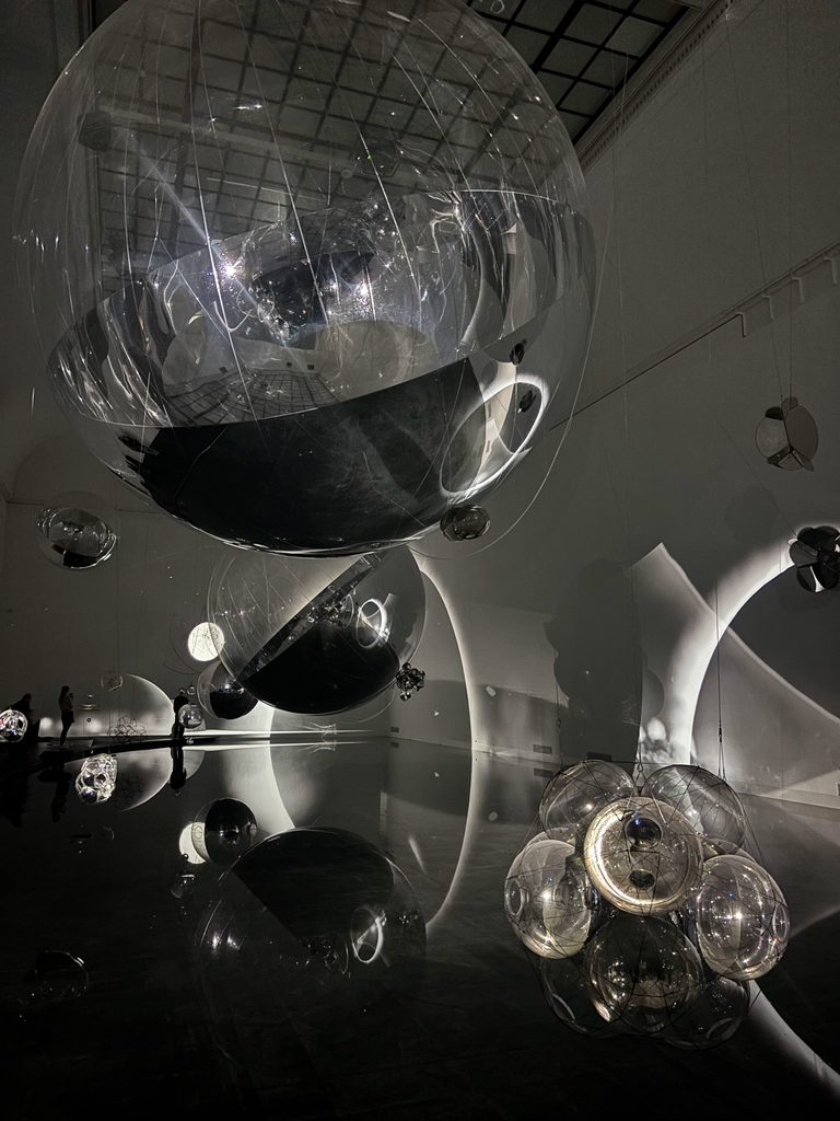
I visited the current exhibition by Tomás Saraceno at Haus der Kunst in Munich. The exhibition connects art, architecture and science through spatial environments and installations that invite visitors to perceive their surroundings differently. What made this experience particularly relevant to my Master’s thesis was the use of light, projections and interactive installations to influence how visitors experience and move through a space.

Since I want to focus on user experience design at German train platforms in my Master’s thesis, I’m particularly interested in exploring how light could be used to guide passengers through their environment. Although I have already spent considerable time researching this topic, I am still looking for inspiration beyond conventional wayfinding systems, such as signs, floor markings and digital displays. Visiting the exhibition allowed me to experience spatial design from a different perspective and consider how light could become an active part of an environment rather than simply illuminating it.

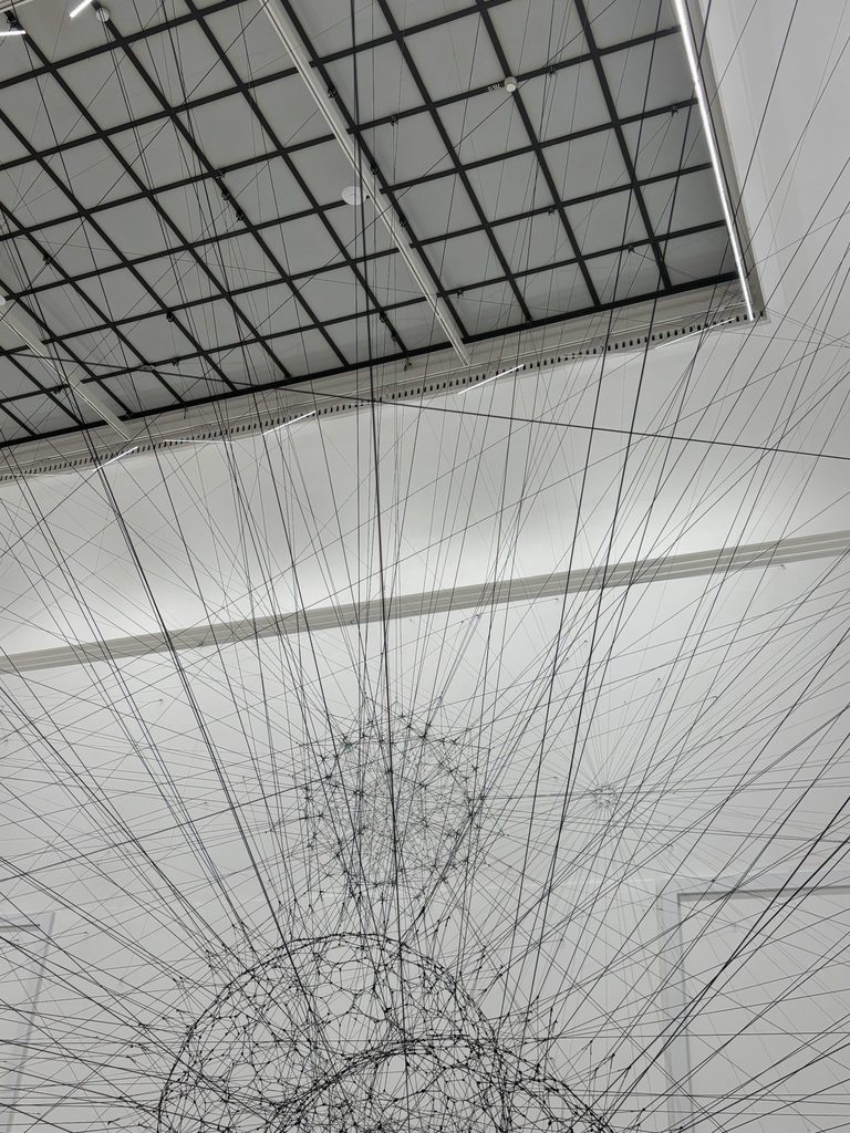
In my research, I have already explored ideas about how light could be used as part of a flexible and adaptable guidance system. However, I am still collecting new perspectives that could help me develop and question my existing ideas. A particularly interesting aspect of the exhibition was the way the rooms were kept dark, allowing the artworks to become the main sources of light. The installations were not only artworks but also served as visual reference points that helped visitors navigate the space and move from one area to the next.

Of course, a train platform does not offer the same controlled conditions as a carefully curated exhibition space. Nevertheless, this experience made me more aware of the importance of placing orientation points within a reasonable distance of one another. I started to think of them as stepping stones, with each point providing a visual reference that helps people find the next one and continue moving through the environment. Rather than expecting passengers to understand an entire space at once, a sequence of clearly positioned visual cues might help them navigate it step by step. This is an idea I find quite interesting and would like to investigate further in my upcoming research. At the same time, I recognise that an artistic installation and a practical wayfinding system have very different purposes. An art installation often aims to encourage exploration, evoke emotions or challenge how visitors perceive their surroundings. At a train platform, guidance needs to be clear, reliable and immediately understandable. Passengers may be in a hurry, carrying luggage, travelling with children or trying to navigate an unfamiliar station.

This difference is precisely what makes the exhibition valuable as an impulse for my research. Rather than trying to reproduce an artistic effect, I want to investigate which principles could be transferred into a practical design context. How does light attract attention, and how can it do so without distracting passengers from their surroundings? How many orientation points are needed to help people understand where to go next and at what distance should these points be placed to create a continuous and understandable route? Could light communicate direction without causing confusion? And how might its effectiveness change depending on the architecture, daylight conditions or the number of people on a platform? These questions could help me examine whether light-based guidance would be useful and usable in practice.

The exhibition did not provide a ready-made solution for my Master’s thesis, but it expanded the way I think about possible design approaches. It encouraged me to look beyond established transport design conventions and consider how light and spatial relationships could contribute to orientation via breaking information down into smaller steps and orientation points.

My main takeaway from this visit is that inspiration for design research can come from disciplines outside the immediate field of study. Although the exhibition was created within an artistic context, it gave me a new perspective on the relationship between light, architecture, movement and human perception. Most importantly, it helped me identify a specific aspect worth exploring further: whether a sequence of visual orientation points could support passengers in navigating train platforms more intuitively.

Links/Media:

https://www.hausderkunst.de/eintauchen/tomas-saraceno

https://www.toptal.com/designers/creative-direction/art-vs-design

https://mabiloft.com/en/blog/insights/ux-and-psychology-micro-steps-in-ux-to-motivate-users

Impulse 2:

When Accessibility Fails: The Impact of AI and Exclusive Design

On the second day of the World Usability Congress I attended a talk by Stefan Barac that became the most valuable learning experience of the entire conference for me. The talk focused on digital accessibility and the factors that continue to exclude people from digital products and services. Since I have been researching the topic of my Master’s thesis, user experience design at German train platforms, for over a year, I already have a broad understanding of the subject. However, I am still exploring how accessibility and inclusion should influence my design concept. I chose this talk in the hope of gaining new perspectives and challenging my existing assumptions, particularly by learning from a speaker with first-hand experience of disability.

The speaker used satire and practical examples to challenge common assumptions about accessibility. One approach was to imagine how an accessible service could deliberately be made inaccessible. By reversing the design process, it became easier to identify which decisions create barriers, which groups are affected and how those barriers could be prevented. I found this approach particularly effective because accessibility guidelines can sometimes feel abstract. Looking at design from the perspective of exclusion makes the consequences of individual decisions much more tangible and encourages designers to question choices they might otherwise take for granted. An important part of the talk addressed the continued presence of exclusionary design choices in digital products. Accessibility problems are not necessarily caused by a lack of technology or knowledge, but can also result from design decisions that overlook the needs of people with disabilities. For example, navigation that cannot be used effectively with a keyboard, unclear interaction patterns or interfaces that rely on only one way of receiving information can prevent people from accessing a service independently. The talk reminded me that a product can appear functional to its designers while still creating significant difficulties for some of its users. This highlighted the importance of looking beyond the intended design and examining how people actually experience and interact with it.

I see a strong connection between these insights and my research into the user experience at German train platforms. Travelling by train involves more than the physical platform itself. Passengers also rely on signage, digital departure boards, announcements and other information systems to orient themselves and make decisions. If information is difficult to find, understand or access, the overall travel experience can become stressful or confusing. This may be particularly challenging for passengers with visual or hearing impairments, mobility limitations or other individual needs. The talk encouraged me to consider accessibility not as a separate aspect of platform design, but as an essential part of the entire passenger experience, including the interaction between the physical environment and the information provided.

The part of the talk that challenged my thinking most was the discussion of artificial intelligence. AI is often presented as a tool that can make accessibility improvements easier and more efficient, for example by automatically identifying errors. However, the speaker explained how the uncritical use of AI can reinforce existing patterns of exclusion and potentially make accessibility worse. This made me reconsider the assumption that technological progress automatically leads to a better user experience. Technology alone cannot guarantee inclusion; its value depends on how it is developed, applied and evaluated. In the context of train platforms, this means that digital displays, information systems and potential technological interventions should be assessed according to whether they genuinely support passengers in real situations. Automated tools may be useful, but they cannot replace critical thinking, user research and testing with the people affected by design decisions.

The main impulse I will take into my Master’s thesis is the importance of identifying barriers before developing design solutions. Although I have already spent considerable time researching my topic, the talk encouraged me to look more critically at how accessibility is integrated into my concept. Rather than treating inclusion as an additional feature, I want to consider it from the beginning of the design process. I also want to explore opportunities to discuss and test my ideas with people with disabilities. Their experiences and feedback could reveal challenges I might not identify through research alone and help me develop a concept that responds more closely to the needs of different passengers.

Another aspect that made this talk particularly meaningful was the opportunity to speak with Stefan Barac after the presentation. I asked him questions about my Master’s thesis and explained some of the challenges I am currently considering in my research. He was open to staying in contact and meeting again at a later point to discuss my topic in more detail. This personal exchange was especially valuable because it offered the possibility of receiving further feedback from someone with expertise and first-hand experience in accessibility. It also showed me how attending a conference can contribute to research not only through the talks themselves, but also through conversations and connections that continue afterwards.

Overall, this talk gave me a new perspective on an aspect of my Master’s thesis that I am still working to define. It reinforced my understanding of accessibility as an ongoing responsibility rather than a final checklist and reminded me that inclusive design requires questioning assumptions, recognising different experiences and involving the people affected. Moving forward, I want to apply these insights to my research on German train platforms and investigate how the passenger experience can be improved through more accessible physical environments, clearer information and better-designed interactions. Most importantly, I want to ensure that the concept I develop is informed not only by my own perspective as a designer, but also by the experiences of the people who will use these spaces.

Links:

https://www.nion-digital.com/nion-next-2025/masterclasses/stefan-barac-und-claudio-zeni

https://www.uxtweak.com/podcast/stefan-barac-accessibility

Impulse 1:

Designing Inclusive Public Spaces Through Human-Centred Technology

Attending the World Usability Congress 2026 in Graz gave me the opportunity to explore how usability and human-centred design can be applied beyond digital products. One talk that particularly caught my attention was right away the first one I attended. It focused on the connection between user experience strategies, smart cities and the development of more inclusive communities. I chose this talk because I thought it sounded relevant for the topic I want to explore in my Master’s thesis, as it dealt with how public spaces can be designed and improved through technology while keeping the needs of different people in mind.

The talk discussed how established UX strategies, such as user research, clear roadmaps, iterative development and ethical considerations, can be applied to larger systems like cities. Instead of looking at usability only in the context of websites or applications, the talk encouraged thinking about how people interact with their entire environment. One of the main points was the idea of a human-centred smart city. Technology can help cities become more accessible, efficient and sustainable, for example through accessible traffic lights, smarter energy systems and improved public safety. Artificial intelligence and machine learning were also presented as tools that can improve access to data and support citizen engagement. However, what interested me most was not the technology itself, but the question of how these systems can genuinely improve people’s everyday experiences.

The talk also highlighted the importance of ethical principles such as fairness, transparency, privacy and inclusivity. I found this aspect especially valuable because technological improvements in public spaces can also create new challenges. For example, collecting data may help identify patterns in how a space is used, but it can also raise questions about privacy and who has access to that information. Similarly, a digital solution might make a service easier to use for some people while excluding others who have limited access to technology. These considerations reinforce the need to evaluate innovations not only by their efficiency, but also by their social impact.

The biggest impulse I took from this talk is the importance of starting with people and their needs rather than starting with a technological solution. For my Master’s thesis, I want to investigate how public spaces, especially train platforms, can be improved through thoughtful design and, where appropriate, supportive technology. The talk encouraged me to consider accessibility and inclusion as fundamental design requirements from the beginning, rather than as additional features introduced later. It also made me think more carefully about how the success of an intervention could be evaluated from the perspective of the people using the space. At the same time, I do not want to adopt every aspect of the approach presented in the talk. In particular, I do not intend to use AI to generate or develop the concept for my research. I want the concept to emerge from my own design process, supported by research, observation and an understanding of users’ needs. For me, it is important that the design decisions can be explained and traced back to the research findings. AI and other technologies may be relevant to the broader discussion of smart cities, but they will not be the tool I rely on to create my concept.

Overall, this talk helped me connect UX principles with the physical and social environment of a city. It strengthened my interest in exploring how design can make public spaces more inclusive, usable and responsive to people’s needs. I will use this impulse to guide my further research, especially when defining the problem, identifying the needs of different user groups and deciding which design interventions could create meaningful improvements.

Links:

https://www.academia.edu/73680489/Successful_User_Experience_Strategies_and_Roadmaps

https://www.repsol.com/en/energy-move-forward/innovation/smart-cities/index.cshtml

IMPULSE #2 | 📓 Design Research 3

The second impulse I got was at the World Usability Congress 2026. I listened to the talk: “Addiction vs. controll: How (not) to build habit-forming products” by Sebastian Castaneda.

Why companies build addictive products

According to the speaker the basis for companies designing interactions that are addictive lies in their business model (capitalism). Most companies goal is to create digital products that are as engaging as possible, because that creates value. In other words the more time a user spends in an app, the more ads they see and the more revenue the company generates.

Time management in social media apps

Additionally, the speaker was specifically talking about time-management features inside social media apps. In the past these apps genuinely tried to interrupt the user so they would stop using the app. Over the past few years this changed since most businesses are profit-driven.

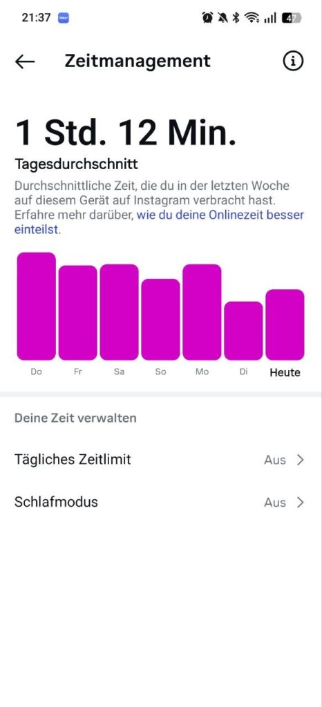
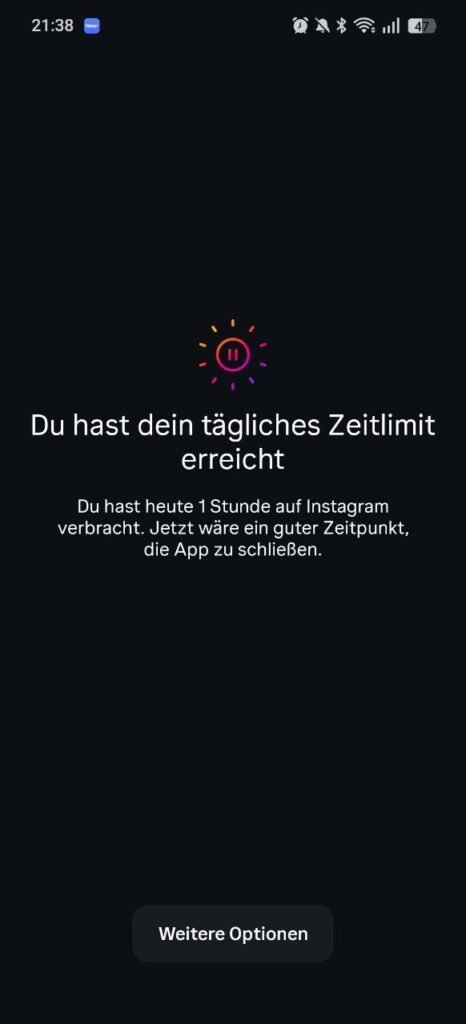
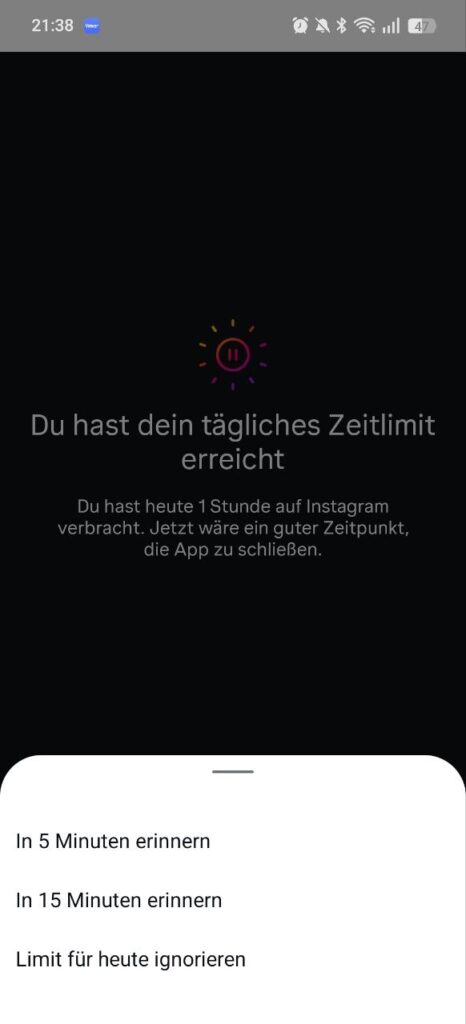
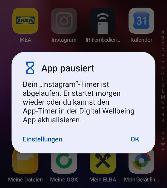
Until today I didn’t know that social media apps offered a time-management features. However, as shown in the previous images those features are not very effective. Why are there buttons for postponing the time limit but none for closing the app? At this point I want to mention that I use Android’s Digital Wellbeing feature, which actually works well for me. What helps me a lot through the day is that once I reach my time limit, the app icon gets grayed out. Even when I am searching for it I am having a trouble finding it. Besides that, adding more time is slightly more complicated, since I have to open the settings and click a few times.

Should we build habit-forming products at all?

One crucial question the speaker raised was: “Do we really need to build something that creates habits?”. He suggested that it sometimes makes sense to create habits. The following table shows a matrix for deciding whether it is ethical to build a habit-forming application.

the maker does not use itthe maker uses it
improves the users lifePeddlerFacilitator
doesn’t improve the users lifeDealerEntertainer

In brief, the Facilitator would be the ideal case. The creator (business) builds something that they believe in and would use themselves. The goal is to understand the user and their interests. In contrast, the Dealer (often social media platforms) is where the creator builds something that they do not use themselves and that does not help anyone, yet they still try to get people hooked on it.

What stood out to me

What stood out most to me were facts about the effects of social media. According to the speaker 45% of teen Instagram users find it difficult to manage their time on the platform. Studies show decreased cognitive capacity with the mere presence of a smartphone. Most importantly, people are two times as likely to get depression and anxiety if their social media use is more than five hours a day.

Accompanying links

Hooked: How to build Habit Forming Products – Book

James Clear – The Habbits Guide – Website

James Clear – Atomic Habits – Book