Over the last months, this project focused on researching the user experience at German train stations and identifying opportunities for improvement. The process combined research, design, prototyping, and user testing in order to better understand the needs, frustrations, and expectations of travelers.
A major part of the project were two prototypes, that were developed to explore possible solutions for improving the train station experience. They helped translate theoretical insights into practical concepts and allowed ideas to be tested in a more tangible way. Through the design process, it became clear how important accessibility, clarity, and intuitive navigation are within busy public transport environments. The prototypes were both tested with users to validate them. These sessions provided valuable feedback and revealed both strengths and weaknesses of the project vision. Observing users interact with the concepts helped identify usability issues and highlighted areas that required further refinement. The testing phase showed how essential direct user involvement is when designing for public spaces and services.
The final task of this research phase was the creation of a video documenting the progress made throughout the project. The video brought together the different stages of the process, from early research and observations to prototype development and user testing. It served not only as a summary of the work completed, but also as a reflection on the learning experience and the development of the project over time.
Overall, this part of the project provided valuable insights into user-centered design and the complexity of improving public transport experiences. It demonstrated the importance of continuous research, iteration, and testing in creating meaningful and practical design solutions.
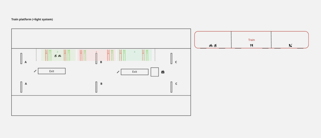
After the last iteration phase, the idea and plan for an experience prototype were developed in order to test the concept of a light-guiding system that could be implemented at German train stations through overhead projection. The prototype, together with the findings from the testing, was documented, analysed, and evaluated to draw conclusions for the next stages of the project.
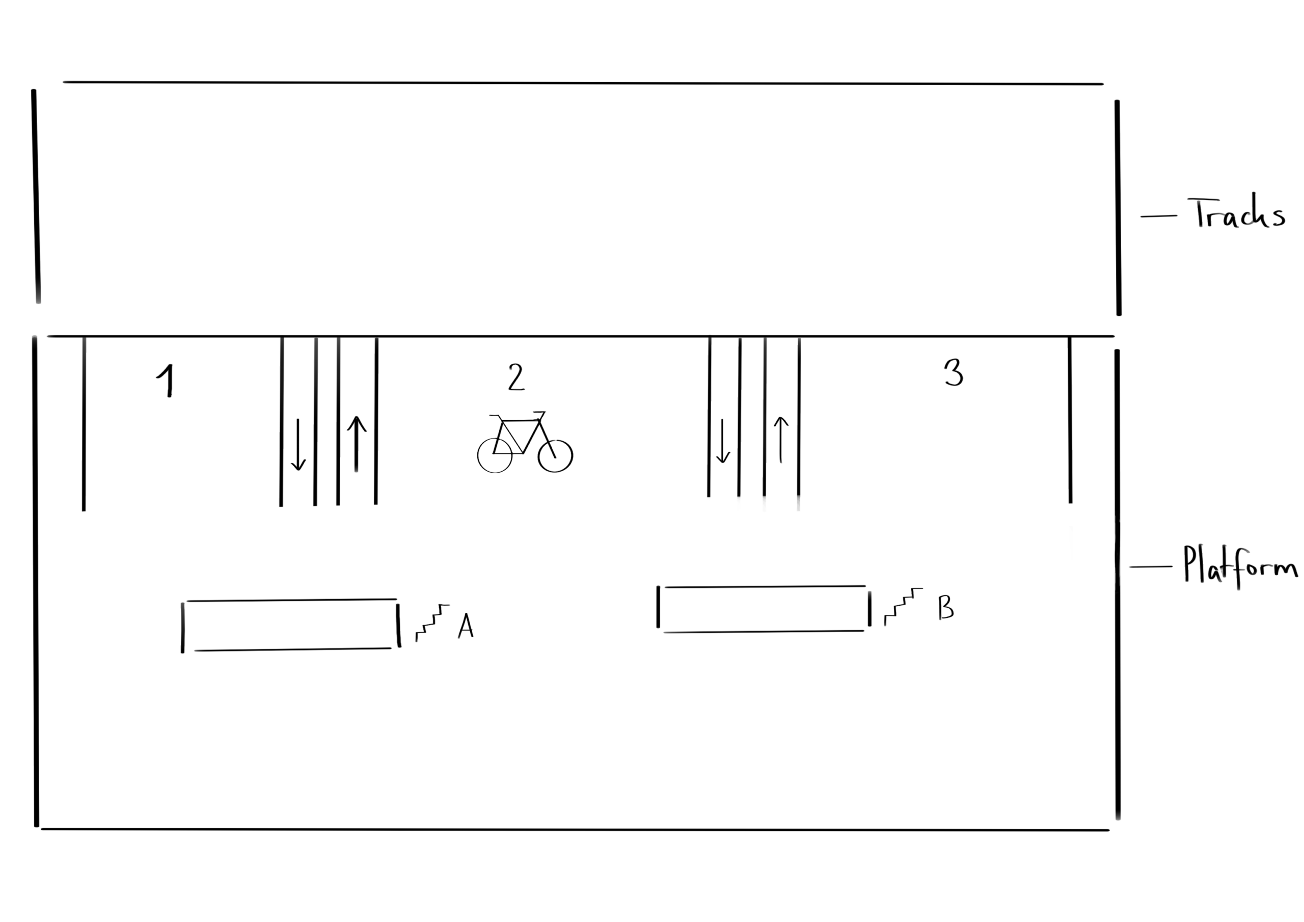
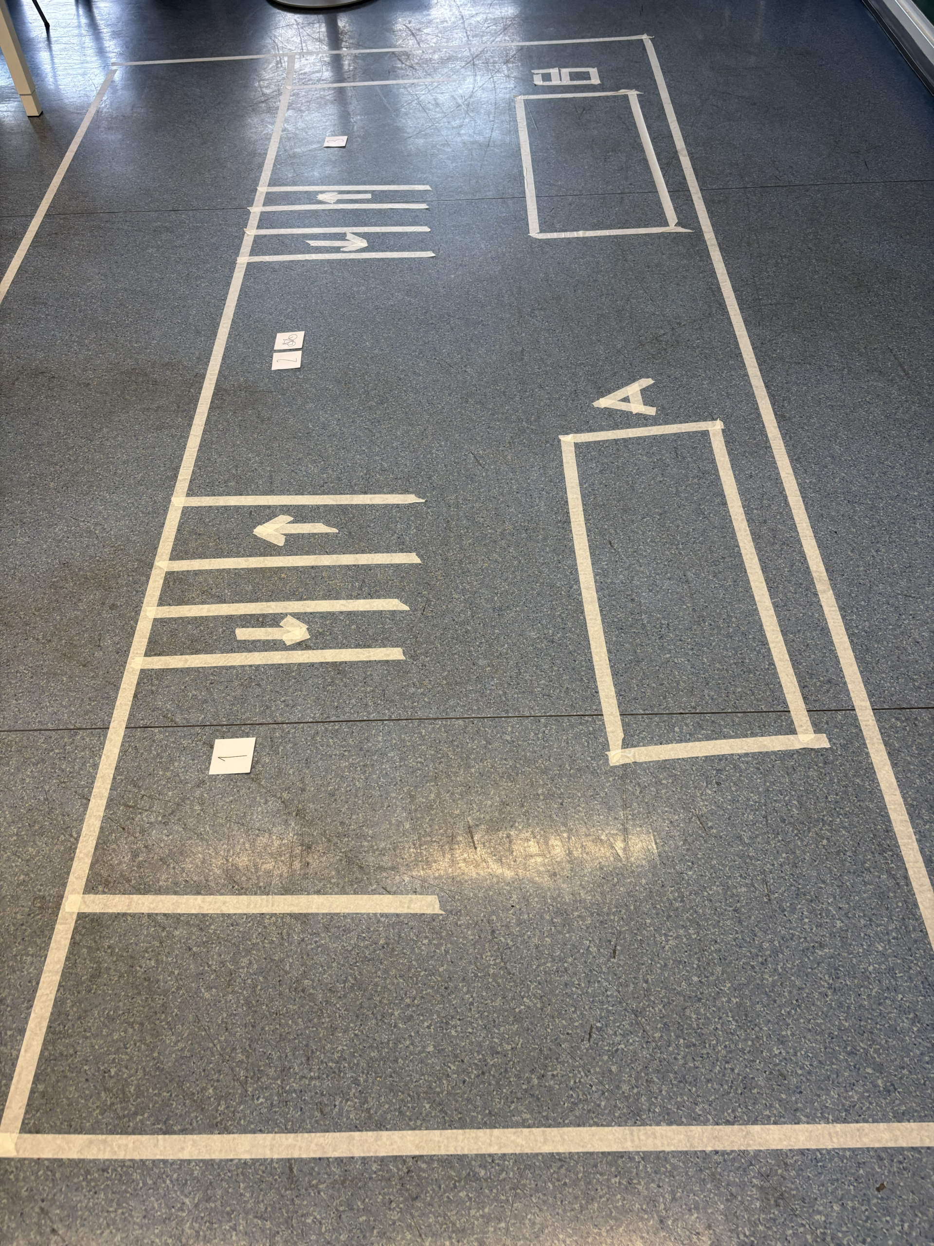
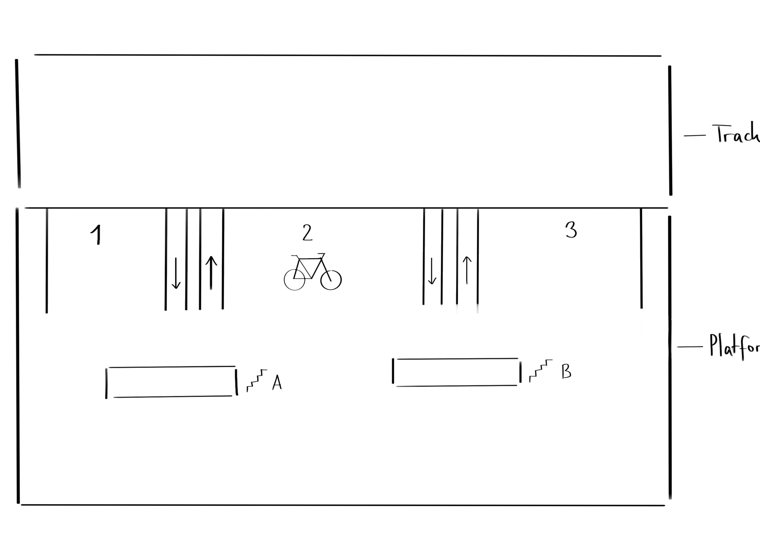
The environment in which the prototype was tested was an academic setting during a class focused on prototype testing. In preparation for the testing, the physical setup first had to be constructed within the space. For this purpose, a free area of the room was selected where the prototype could be outlined on the floor using prepared tape. Beforehand, a sketch of the site had been created, which could now be translated into the real environment. Using tape, two large rectangles were constructed to represent the train platform and the train tracks. Next, the exits were marked using smaller rectangles together with signs identifying them as exits. These elements reflected the basic structure commonly found on train platforms in Germany.
In addition to these existing platform elements, new components were introduced to represent the proposed intervention and demonstrate how the final product could improve the user experience. The first additions were two lines indicating the beginning and end of the arriving train. After this, the entrances were marked with four additional lines that created two corridors equipped with arrows to indicate the direction in which passengers should enter and exit the train. Another important part of the setup was the indication of carriage numbers through numerical markers, as well as the addition of a bicycle icon to represent the bike carriage. Finally, letters were added to the exits in order to distinguish different exit points leading towards different directions and destinations. With these elements in place, the setup of the physical prototype was completed.
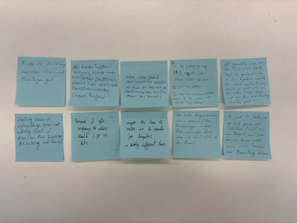
To document the testing sessions, a tripod and a smartphone were used to record videos of the interactions. Additional photographs were taken for further documentation purposes. To collect feedback after the testing, a station with sticky notes and pens was prepared where participants were invited to leave open feedback regarding their experience, including what they liked, what they found confusing, and what they believed could improve the prototype. The feedback was intentionally kept open-ended because the primary aim of the testing was to observe participants’ behaviour within the environment. The written feedback mainly served as an opportunity to gather additional ideas, comments, and perspectives. Since the product is still in the conceptual phase, changes and redirections are still possible, making further suggestions particularly valuable. With this setup completed, the first round of testing could be conducted.
Testing
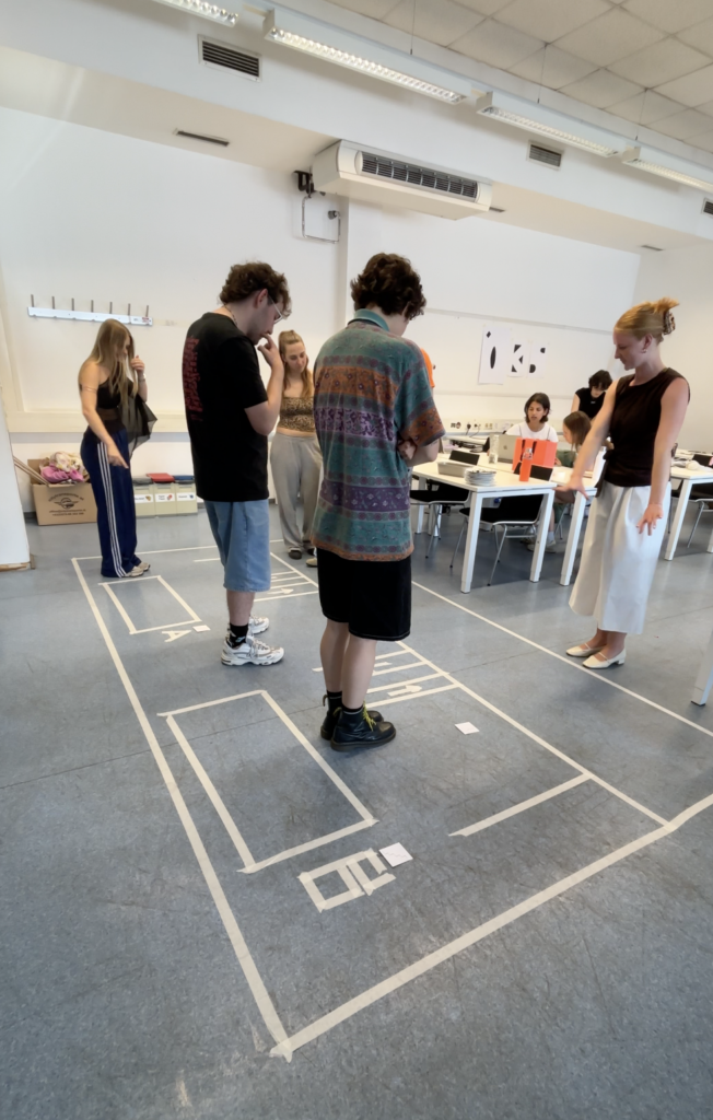
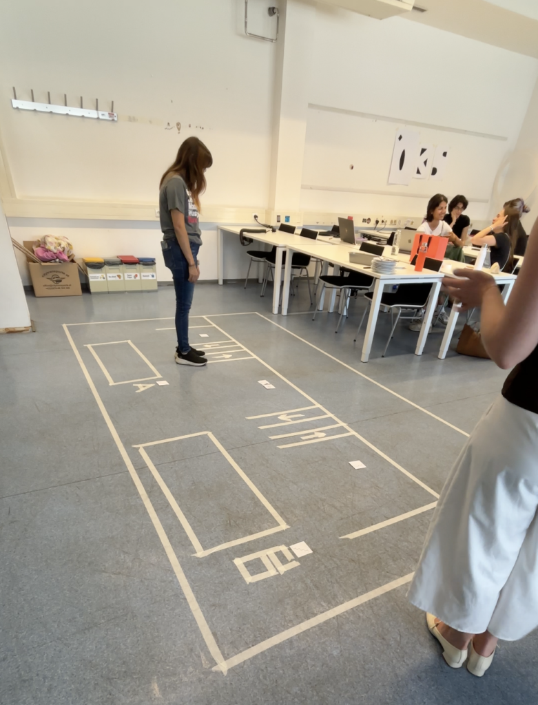
For the testing sessions, different participants were recruited, most of whom were students from a variety of academic subjects. The testing was conducted in four rounds with varying group sizes. This variation proved useful because it reflected different situations that can occur on real train platforms, where there are sometimes fewer and sometimes significantly more passengers present.
At the beginning of each session, the project and prototype were briefly introduced and the aim of the testing was explained. Afterwards, participants were divided into two groups: one group representing passengers on the platform and another group representing passengers inside the train. In cases where the participant groups were smaller, all participants took part in both scenarios one after another. Once divided, the platform group received three tasks that they were asked to complete freely within the marked platform area. Participants could position themselves and move throughout the prototype space according to the given tasks. After the first group completed their exercises, the second group was asked to position themselves within the area representing the train tracks and imagine that they were passengers inside a train arriving at the station. They were then given two tasks to complete within the prototype environment.
The instructions given to participants were intentionally kept relatively limited in order to allow users to interpret the situations independently and draw their own conclusions based on the information available within the setup. After the testing sessions, participants were invited to leave written feedback on sticky notes if they had further comments, questions, or suggestions. These feedback notes were later collected for analysis.
Result Analysis
The results of the testing, including the recorded videos, observational notes, and written feedback from participants, were reviewed and analysed in order to gain insights into user behaviour and experiences within the prototype environment.
One observation that stood out during the analysis was the influence of participant numbers on behaviour. Smaller groups were generally able to complete the tasks with fewer problems and less confusion. In contrast, the larger groups experienced greater difficulty following instructions and navigating through the tasks efficiently. This observation reflects real-life conditions, as train stations become increasingly complex and challenging when larger numbers of people occupy the same space at once. The conclusion here is, that the indications at the platform need to be clear enough so that all users can understand and interact with them, no matter how high the occupancy rate of the station is. Another important observation was that the directional lines indicating entrance and exit routes were too small in the prototype setup for many participants to actively follow during the exercises. However, the concept itself was generally understood and positively mentioned in the feedback. The carriage numbers also caused some confusion among participants, as some users were unsure whether the numbers referred to train classes or carriage numbers. This suggests that an alternative form of communication or visual representation may be necessary. A similar issue emerged with the bicycle icon intended to indicate the carriage for passengers travelling with bicycles or larger objects. Although participants understood the symbol itself, they were uncertain whether the carriage was exclusively intended for bicycles or if it could also accommodate strollers and similar items. The additional information provided at the exits was generally well understood. However, observations showed that clearer pathways towards the exits would be beneficial. It also became apparent that further consideration is needed regarding how boarding passengers and exiting passengers can move without obstructing one another.
Another piece of feedback that stood out was the suggestion to introduce designated waiting and boarding zones on the platform. Participants felt that this could reduce confusion and improve the organisation of the available space. This idea will therefore be considered further and may become an additional feature within the proposed guidance system. Overall, the testing results were highly valuable and insightful, providing many opportunities for further research, refinement, and development within the project.
Information Gathered
This testing process represented a completely new experience for me, as I had never previously worked with an experience prototype and therefore did not know what to expect from either the process or the results. However, the testing exceeded my expectations and provided a large number of insights that would not have been possible to gain from a purely digital prototype. Observing participants directly within the physical environment made the experience feel significantly closer to reality and helped reveal both possibilities and challenges that the final product could face within an actual train station setting. The testing therefore played an important role in improving my understanding of how users interact with the concept and how the idea could continue to develop in the future.
Next Steps
This testing phase marked the final step within this chapter of research and completed the first attempt at creating a functional and testable prototype for the intended project. The information gathered throughout this stage of the research process can now be carried forward into the next phase of development. The upcoming work will focus on exploring the technical feasibility in greater depth, making the final product concept more tangible and realistic, and continuing to test and refine future ideas and iterations of the project.
The next step in this project is to define my project outcome in greater detail and assess the feasibility of my idea. Once this direction has been established, the following phase of the prototype will focus on preparing and refining the testing process. The intended medium fidelity prototype will be the final step for this section of research and will hopefully provide new insights and results for the chapter of investigation surrounding this topic.
Solution Vision
Over the past year, I have explored the topic of train stations in Germany and investigated how the User Experience could be improved for travellers. This process has involved a combination of online research, surveys, prototyping, and user testing. Through these activities, I have gradually narrowed the scope of the project, shifting my focus from the broader train station environment to the more specific and manageable context of the platform itself. This refinement has allowed me to concentrate on a smaller physical space while still addressing a wide range of possible interactions. The first round of testing played a significant role in shaping the direction of the project. It provided valuable insights into the structure of the problem and highlighted the needs and expectations of participants. One of the key findings was the recurring desire for additional information and clearer guidance. Participants expressed that more support during moments of uncertainty would improve their experience and help them navigate the station environment more confidently. These findings encouraged me to explore solutions that respond directly to these needs and contribute to a more intuitive and supportive travel experience.
The vision for this project is to investigate how light can function as a flexible and adaptive orientation system on the platforms of German train stations. Through my research, I found that the information currently available on platforms often needs to be translated into forms of interaction that better respond to users’ changing needs. Rather than relying solely on fixed signs and static displays, this project explores how light itself could become a medium for communication and guidance. Light offers several characteristics that make it particularly suitable for this purpose. It can be switched on and off when needed, adjusted in brightness and opacity, directed towards specific areas, and adapted to different situations. This flexibility creates the possibility of an orientation system that is not tied to a single location but can change according to the circumstances of the station environment. In addition to its practical function, light can influence how people perceive and experience a space by contributing to atmosphere, increasing comfort, and enhancing the feeling of safety, particularly during the evening.
I imagine the concept as a series of lighting panels integrated into the ceilings above the train platforms. During regular operation, these panels could provide ambient illumination for the station. However, when additional information is required, they could transform into an active guidance system, communicating directly with passengers through dynamic visual cues. The lighting system could extend across the entire platform, offering invitations or directions tailored to different trains and routes. Rather than requiring travellers to search for static signs, information could appear exactly where it is needed. For example, the light could indicate where a train will arrive, guide passengers towards the correct boarding area, or highlight the most efficient path through the platform. It could also adapt to changes in real time, responding to delays, platform alterations, or varying passenger flows.
Technical Feasibility
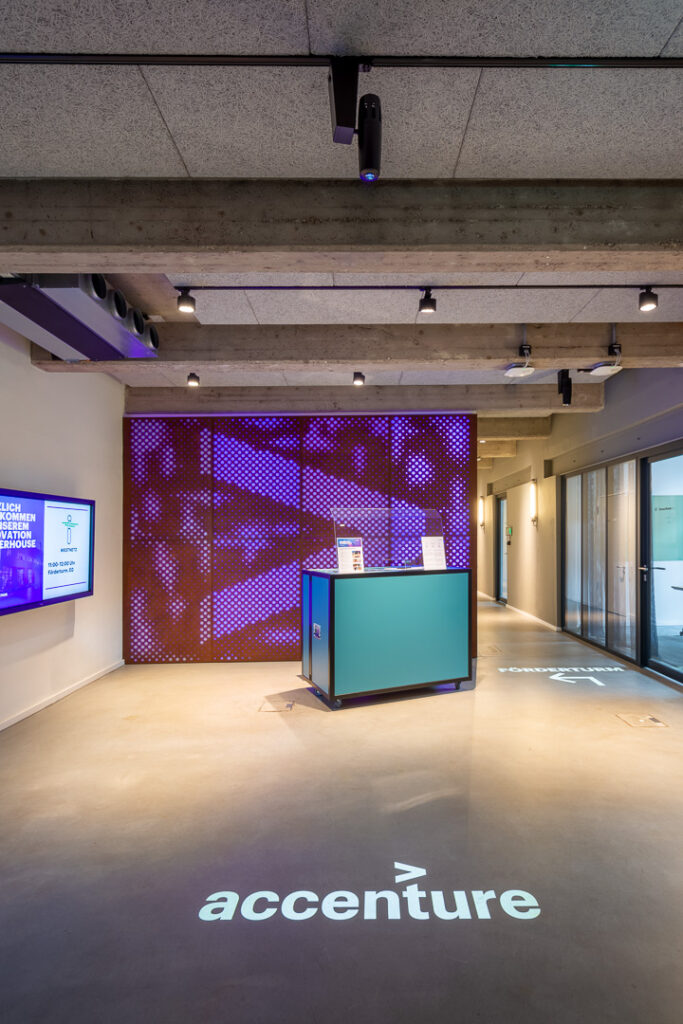
At this phase of the project, the technical feasibility can only be estimated and will require further investigation and planning at a later stage of the process. However, the proposed technical setup of using ceiling-mounted projectors to display objects and wayfinding systems onto the floor is not a new invention and has already been implemented in a variety of contexts. One example is the entrance area of Accenture Dienstleistungen GmbH at their location in Essen, Germany. In this project, projectors mounted on lighting tracks were used to display text and arrows on the floor in order to support orientation within the space (derksen lichttechnik, 2020). Another example is the development of personalised wayfinding and guidance systems for elderly people in private homes. This project, initiated by the University of Applied Sciences Vorarlberg in Austria in 2012, aimed to support elderly people in their spatial orientation and improve their independent mobility (Kempter, 2012).
Although these examples were implemented in environments very different from a train platform, they demonstrate that projector technology capable of displaying guidance systems already exists and is actively being used. They also illustrate that such systems can be customised and adapted to the needs of individual users. Furthermore, they show that relatively simple interventions can enhance a space and improve the experience of navigating through it.
Prototype Iteration
To test this idea not only through a digital prototype but also in a real-life setting, the development of an experience prototype is planned as the next step. This type of prototype makes it possible to move beyond testing interactions on a screen and instead simulate the user experience, including emotions, pain points, behaviours, and physical interactions (Medium, 2025).
Planning for Conduction
The prototype is planned to be tested within an academic setting using students as participants. This environment is not ideal, as it does not represent the full diversity of users found in German train stations. However, considering the opportunities currently available and the limitations of time and resources, this testing phase can still serve as a valuable first step in understanding users’ reactions to the proposed setup. At a later stage, the testing could be repeated with a broader and more diverse participant group in order to further validate the findings and gain a wider range of insights. Nevertheless, the planned study already provides an opportunity to test the concept at an early stage without requiring a significant investment of time or money, while allowing the prototype to be implemented quickly in a controlled environment.
Preparations for the testing include mapping the space that will represent the train platform, preparing the materials that will be provided to participants, writing the instructions for the testing procedure, and planning the camera setup used to document the sessions. To build the prototype environment, sticky tape, markers, and sticky notes will be used. A rectangle constructed from tape on the floor of the testing room will represent the train platform. A second rectangle positioned alongside it will represent the train tracks. Participants will be instructed to remain within the platform area and avoid entering the space representing the tracks. In addition to these spatial boundaries, the prototype setup will include coloured lines and symbols representing the projected light elements that would eventually be integrated into the platform environment. These elements will indicate where the train is expected to stop, where the train doors will be located, designated areas for boarding and alighting passengers, and the position of the bicycle carriage on the platform. Once participants enter the prototype environment, they will be given a number of tasks to complete within the setup. At the end of the testing session, they will receive sticky notes on which they can record their thoughts, identify problems, suggest improvements, and add any additional wishes or ideas they may have. If time allows, the prototype will be tested with two to three groups consisting of three to five participants each. This approach would make it possible to observe different group dynamics and collect feedback from a larger number of users, providing a broader range of opinions and ideas for future development.
Information Gathered
The process of defining the idea for the final outcome in greater detail has been an important step within this project. By examining both the concept itself and its technical feasibility more closely, I have gained a clearer understanding of the direction of the project and what I aim to achieve by its conclusion.
In addition, the planned experience prototype will provide valuable insights into whether the proposed idea can function within a real physical environment. It offers the opportunity to identify strengths and weaknesses early in the process and to assess how users respond to the concept before investing further resources into its development.
Next Steps
The next stage of the project will involve conducting the physical prototype testing, filming and documenting the sessions, and collecting feedback and suggestions for improvement from participants. Once the testing has been completed, the findings will be analysed, written up, and documented. The outcomes of this phase of the project will also be summarised in a video format. Both the written documentation and the video can then serve as a foundation for the next chapter of the project, supporting further research, additional testing, and continued development of the concept.
Bibliography
derksen lichttechnik. (29. September 2020). Guidance system and lighting design in the Accenture office. Von derksen lichttechnik: https://www.derksen.de/en/projekt/guidance-system-and-lighting-design-in-the-accenture-office/ abgerufen
Kempter, P. D. (01. May 2012). GUIDING LIGHT. Von AAL: https://www.aal-europe.eu/projects/guidinglight/ abgerufen
Medium. (2. July 2025). Experience Prototyping: Blending Physical, Digital & Spatial Elements. Von Medium : https://medium.com/@harsh.mudgal_27075/experience-prototyping-blending-physical-digital-spatial-elements-74a7257bfbc9 abgerufen
At the beginning of this research phase, a low-fidelity prototype was developed to evaluate whether users could understand the project’s context and purpose based on a very simple visual representation. Initial testing showed promising results, as all participants correctly identified the scenario as a train station environment. Based on these findings, I decided to continue working with the existing low-fidelity prototype while conducting further research and user testing.
Goal and approach
The primary objective of this study was to identify what additional information, guidance, and support users consider helpful when traveling by train and navigating railway platforms in Germany. The prototype was intentionally kept at an early stage of development to encourage creativity and open-ended feedback from participants. Rather than directing users toward predefined solutions, I aimed to provide a flexible testing environment that would allow for unexpected ideas and alternative approaches to emerge. Since the final form of the intended product had not yet been defined, maintaining openness to new insights and potential changes in direction was considered essential. The overall goal of the testing process was to gain a deeper understanding of user needs and to explore how these needs could be addressed through an effective design solution.
Prototype
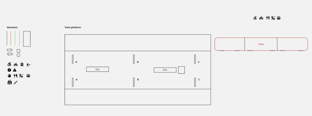
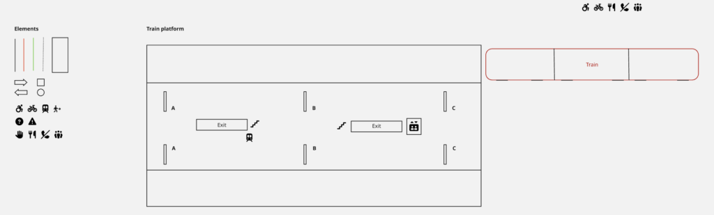
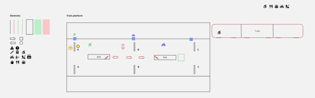
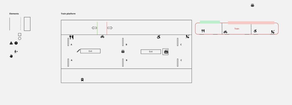
As this represented both the first prototype and the first round of user testing, the prototype remained in a low-fidelity state. The prototype was created and tested using Miro. The interface consisted of simple lines and geometric shapes forming the outline of a train platform with two tracks. A simplified train shape was positioned on the right side of the platform to represent an approaching train. To increase realism and improve orientation, platform sections labeled A, B, and C were included, reflecting common signage found on German railway platforms. Additional rectangles and squares were used to indicate stairways and elevators. Furthermore, a set of design elements was provided for participants to use during the testing session. These elements included icons, shapes, and lines that could be freely placed, modified, or expanded upon.
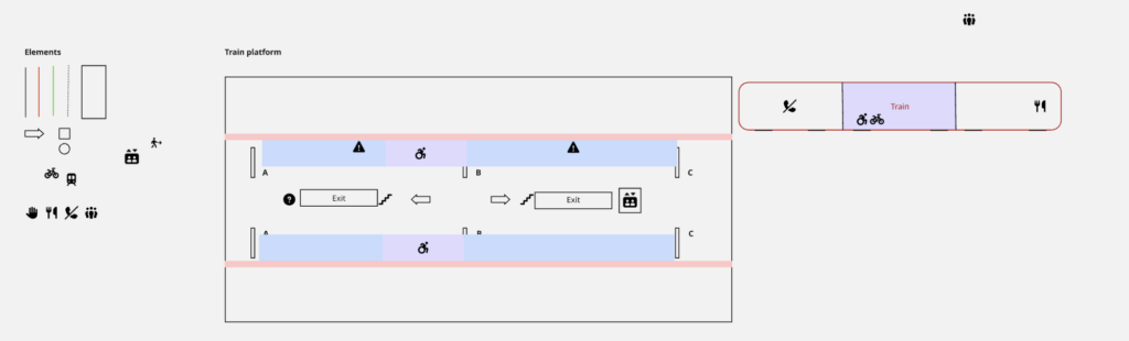
Prior to the testing sessions, I also created an example interface based on my own assumptions regarding what information might be useful for travelers. This served as a visual record of my initial design ideas and later enabled a comparison between my assumptions and the solutions proposed by participants.
Testing
To gather insights and evaluate initial design assumptions, the prototype was tested with five participants from my personal network. All participants were experienced train travelers in Germany. The testing sessions were conducted individually on a laptop, and each participant received the same initial prototype setup.
The first task required participants to position themselves on the platform by placing their cursor at the location where they would wait if they intended to board the arriving train. Most participants selected a position near the center of the platform. When asked about their reasoning, they explained that without knowing the exact stopping position of the train, standing in the middle would allow them to move efficiently toward either end of the platform if necessary.
The second task asked participants to use the provided elements to add information, guidance, or explanatory features to the train platform environment. Participants were informed that they could freely modify existing elements, create new ones, and place information either on the platform or on the approaching train itself. While participants could ask for clarification regarding the task, no further restrictions or guidance were provided. The resulting designs differed considerably in terms of creativity, visual language, use of elements, time invested, and overall outcomes.
Participant 1
The first participant adopted a highly minimalist approach. Their primary focus was on platform exits and onward connections. Icons were added to indicate stairs, elevators, and transfer options such as subway and tram connections. No colors, shapes, or additional lines were used.
Participant 2
The second participant focused initially on differentiating train sections and communicating this information on both the train and the platform. Colored areas and icons were used for this purpose. Additional platform information, including stairs, elevators, walking directions, and information points, was also incorporated. Finally, safety markings were added along the platform edge to increase awareness of approaching trains. This participant made use of all provided design elements.
Participant 3
The third participant began by enriching the platform with informational icons. Particular attention was given to identifying different train entrances. Matching icons were then placed on both the train and the platform to establish a clear relationship between the two. This participant exclusively relied on icons and did not use colors or additional shapes.
Participant 4
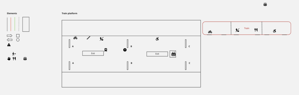
The fourth participant also started by adding icons to communicate information about sections, exits, and designated areas. To improve differentiation between information categories, colors were introduced. One icon was added to the train, although not all platform icons were mirrored on the train itself. This participant made use of all available element types.
Participant 5
The final participant added icons to indicate exits, meeting points, and train sections. Corresponding icons were then placed on the train. Additionally, this participant considered the distinction between first-class and second-class compartments and represented these areas through color coding, arrows, and platform markings. Similar to Participants 2 and 4, all available design elements were utilized.
Results and consideration
A comparison of the resulting interfaces reveals significant differences in design approaches. In particular, the use of colors and shapes varied substantially among participants, ranging from no use at all to extensive integration throughout the interface. Despite these differences, one design element remained remarkably consistent: the use of icons. All participants relied on icons to communicate important information and to establish connections between platform locations and train sections. Comparing the participant-generated designs with the initial concept created prior to testing also provided valuable insights. Interestingly, none of the participants considered indicating the train’s exact stopping position or its start and end locations on the platform. Similarly, no participant suggested dedicated boarding and alighting guidance systems. Some similarities emerged regarding the use of colored areas to distinguish train sections. Furthermore, the use of corresponding icons on both the platform and the train appeared consistently across several solutions.
These findings provide valuable indications of user priorities, reveal which design ideas appear intuitive to users, and identify areas where further validation is required.
Information Gathered
Overall, this testing phase contributed significantly to my understanding of how experienced train travelers perceive navigation and information systems within railway environments. The study demonstrated that users approach the same problem in diverse ways and often propose solutions that differ considerably from the designer’s initial assumptions. At the same time, recurring patterns emerged, particularly regarding the importance of clear visual information and the use of icons as navigational aids. These insights provide a strong foundation for future design decisions and further development of the concept.
Next Steps
Based on the findings of this study, the next phase will focus on refining the product vision and defining the intended solution more precisely. Additional research into the technical feasibility of the identified concepts will be conducted, followed by the development of a higher-fidelity prototype that incorporates the most promising findings from this testing phase.
Picture the situation: You’re at a train station and there’s so much going on. You may be at the wrong part of the platform or it’s crowded and getting in and out of the train is very complicated. You may be limited physically so you cannot even board the train or you have heavy luggage or a bike with you. That’s a problem that occurs on many train stations around Europe but especially in Germany. There are missing cues for communication and support for stress-free and efficient structure.
The idea that I have to solve this problem is a leading system that would be integrated into the platform that would make orientation, understanding and a barrier-free use much easier. The USP is very simple, it’s not there yet. There is information and a leading system happening at the moment but it’s often handled with signs which can be insufficient or wrong. The information is there but it’s normally more in an app or on paper and not in a physical space visible.
And why I want to take on this problem is because I am also going on trains a lot of the time, traveling a lot via train and I want to solve this problem because it would help a lot of people and also an interaction designer and a media designer that wants to take on this challenge.
Designing for complex public environments requires more than addressing isolated user interactions. It demands an understanding of the broader system in which these interactions occur. Therefore, I decided to conduct further research in relation with the help of a university lecture and five different strategic methods, that aim to provide further clarity and a more structured insight into the different parts of this project.
System Mapping
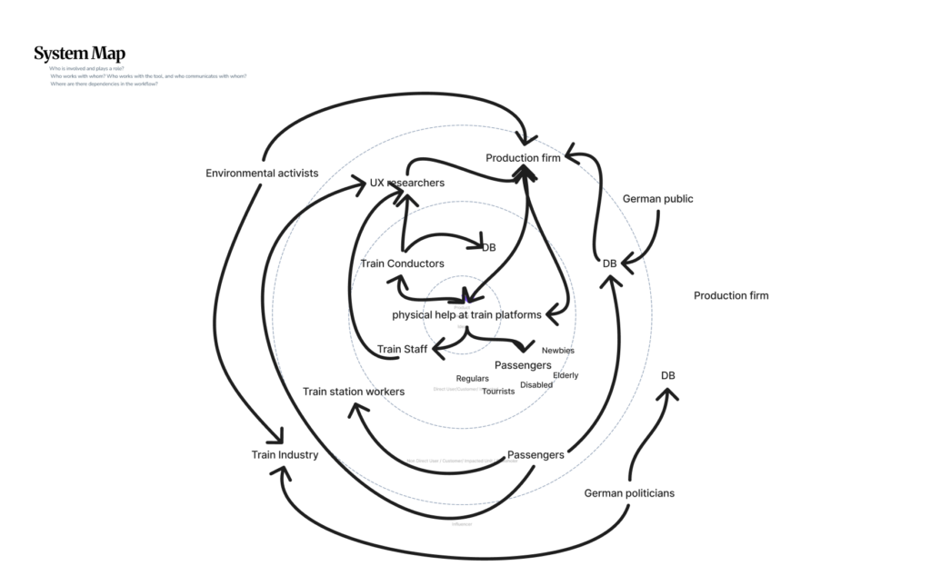
The first of those approaches is system mapping. It is used within design research to visualize relationships between actors, infrastructures, and external influences. Rather than focusing on single touchpoints, system maps enable designers to identify interdependencies, power structures, and flows of information, and uncover opportunities for more systemic and sustainable interventions (zero360., 2026). In this project, system mapping serves as the starting point for investigating the experience of German train platforms. These environments are characterized by high density, time pressure, and diverse user groups, making them inherently complex.
At the center of the system map lies the proposed design intervention: a physical guidance system intended to improve orientation and interaction on platforms. Placing this concept at the core allows for a structured analysis of how it connects to and influences the surrounding system. The layer around the focal point consists of direct stakeholders, including passengers, train staff, and Deutsche Bahn (DB). Passengers represent the primary user group, yet they are far from homogeneous. Commuters prioritize efficiency and speed, tourists require clarity and guidance, while elderly users or individuals with disabilities depend on accessibility and physical support. Train staff and conductors, on the other hand, are concerned with operational efficiency and safety. By mapping these different perspectives, it becomes clear that improving the platform experience requires balancing multiple, and sometimes competing, needs. Expanding outward, the system includes indirect stakeholders such as station personnel, UX designers, engineers, and production teams. These actors are responsible for implementing, maintaining, and iterating the proposed solution. Their inclusion highlights that design outcomes are not only shaped by user needs but also by technical feasibility, organizational structures, and economic constraints. On an even broader level, societal actors, such as the general public and environmental stakeholders, introduce additional layers of influence, shaping long-term priorities such as sustainability and public acceptance.
The relationships between these actors are visualized through a network of connections, illustrating flows of communication, influence, and dependency. The density of these connections reveals a highly dynamic system in which changes to one element can have cascading effects across others. This insight directly informs the next step of the design process: evaluating how an intervention might alter the system.
Discovered Change & Impact
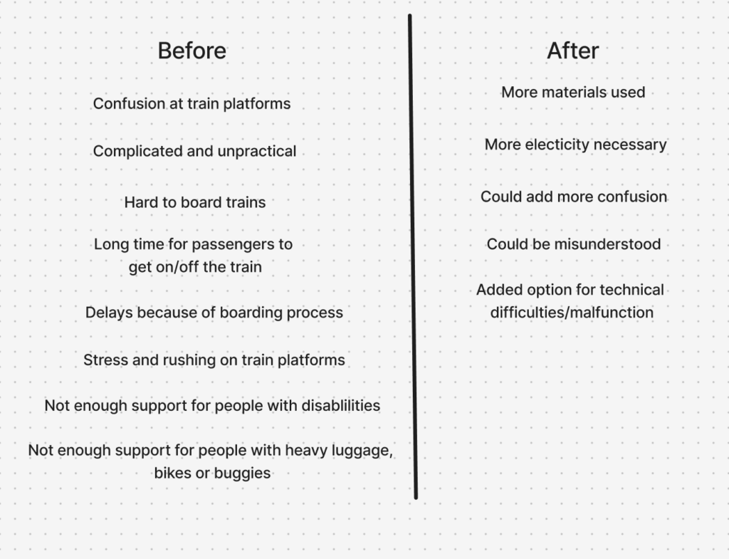
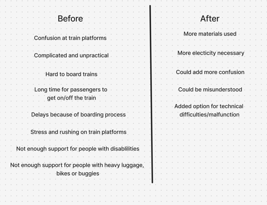
To address this, a Change and Impact map was developed. Building directly on the system map, it introduces a temporal dimension by comparing the current state (“Before”) with a projected future scenario (“After”). The “Before” perspective synthesizes the key issues identified in the system analysis, including disorientation, overcrowding, inefficient boarding processes, and limited accessibility. These challenges are not isolated but interconnected, reinforcing one another and contributing to an overall stressful experience (Mural, 2025).
The “After” perspective explores how the proposed physical guidance system could transform these conditions. For example, improved orientation may reduce passenger uncertainty, which in turn can streamline movement flows and support more efficient boarding. However, the map also critically considers potential trade-offs, such as increased reliance on technological systems, maintenance requirements, or unintended behavioral changes among users. This step is crucial, as it ensures that the design is not evaluated in isolation but as an active component within a complex system. The logical progression from system mapping to impact evaluation demonstrates how insights are translated into informed design decisions.
Inclusion & Accessibility
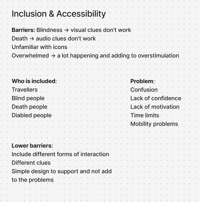
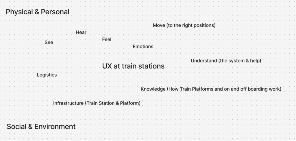
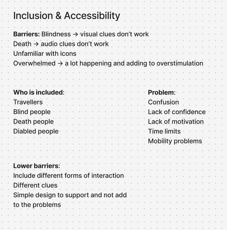
In parallel, the project integrates inclusion and accessibility as fundamental design principles. Inclusive design research emphasizes that accessibility should be embedded from the beginning, rather than later along the design process (Figma, 2026). To operationalize this, two additional mapping approaches were used. The first identifies the physical, cognitive, and social requirements necessary for users to fully experience the product. The second focuses on barriers, analyzing which user groups may be excluded and why.
This analysis revealed that physical guidance systems, while potentially beneficial, can also introduce new barriers, particularly for individuals with visual, auditory, or cognitive impairments. As a result, the design strategy prioritizes multimodal interaction, ensuring that information is communicated through multiple sensory channels. At the same time, a minimal and clear design language is emphasized to avoid adding complexity to already dense environments. These considerations are directly linked back to the system map, reinforcing the idea that inclusive design is not a separate concern, but an integral part of the overall system.
Value Proposition Canvas
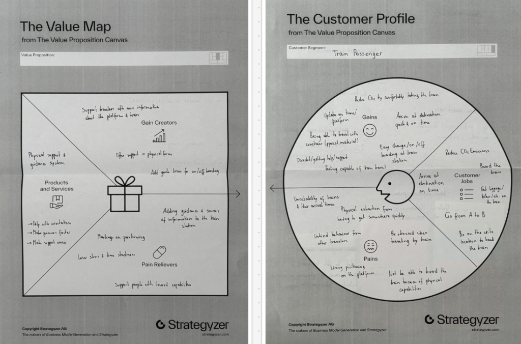
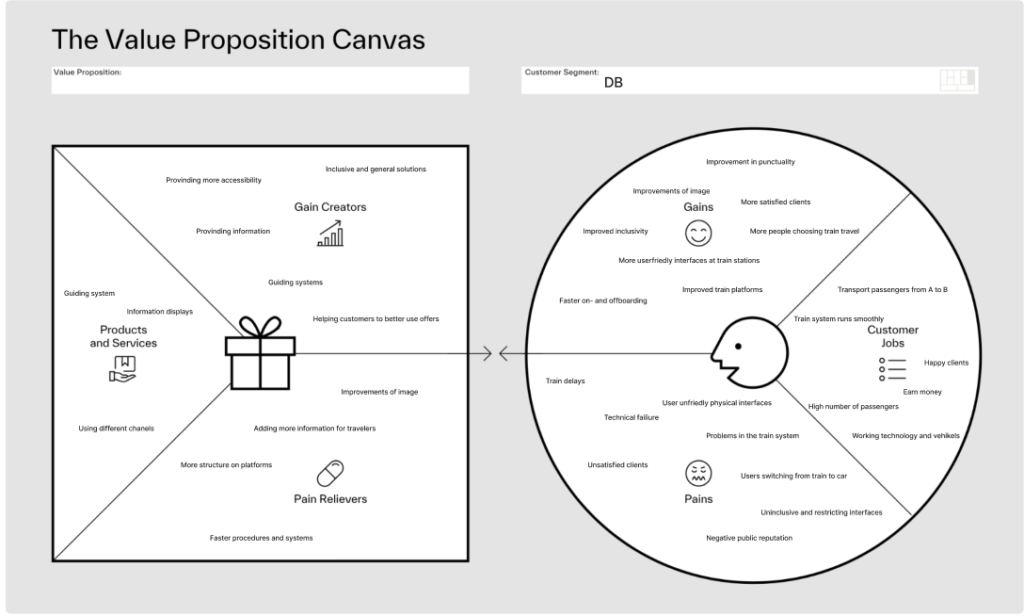
To further refine the concept, the Value Proposition Canvas (Strategyzer, 2026) was applied. This tool builds on previous analyzes by explicitly linking user needs to design solutions. The Customer Profile identifies key user goals, such as navigating efficiently and reducing stress, alongside pains like confusion and overcrowding.
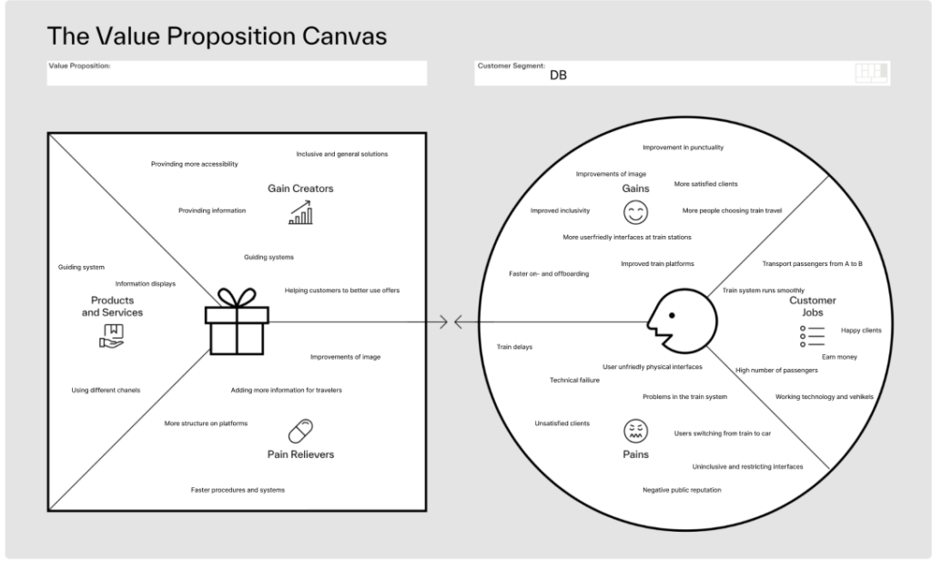
The Value Map translates these insights into concrete design features, including intuitive guidance systems and improved information structures. To get a second view point, the canvas was also applied to Deutsche Bahn as an organizational stakeholder, highlighting goals such as operational efficiency and customer satisfaction. This dual perspective ensures that the proposed solution aligns both with user expectations and institutional objectives.
Product Idea
The outcome of this interconnected process is a product concept for a physical guidance system integrated into train platforms. While still in the brain-storm phase, the current direction explores the use of light-based elements, such as illuminated pathways or dynamic signals, to guide passengers intuitively. The concept directly responds to the insights generated through the system mapping, the impact analysis, and the user-centered frameworks.
Information Gathered
In conclusion, the use of system mapping, Change and Impact analysis, inclusive design methods, and value-driven frameworks were valuable methods to create valid connections and help get a clearer picture of the problem at hand and what factors have to be considered, when designing for a complex and challenging physical space. Each method builds upon the previous one, creating a logical progression from understanding complexity to proposing targeted interventions. This showed me how important it is to view design not as isolated problem-solving, but as a practice to deeply understand complex interactions and interconnected systems.
Next Steps
With the added insights and findings, the prototypes that were already developed can be refined and tested. After that I want to work on defining the end product narrower through more in-depth research and prototyping with higher fidelity.
Literaturverzeichnis
Figma. (2026). Accessibility and inclusion in design. Von Figma: https://www.figma.com/resource-library/creating-accessible-and-inclusive-design/ abgerufen
Mural. (2025). Change impact assessment template. Von Mural: https://www.mural.co/templates/change-impact-assessment abgerufen
Strategyzer. (28. January 2026). The Value Proposition Canvas. Von Strategyzer: https://www.strategyzer.com/library/the-value-proposition-canvas abgerufen
zero360. (2026). Was ist: System Mapping. Von zero360.: https://zero360.de/glossar/system-mapping/ abgerufen
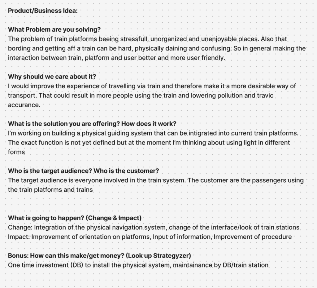
A product or business idea is a structured proposal that identifies a specific problem, outlines a solution, and defines how value is created for users and stakeholders. In design-driven innovation, such ideas are grounded in real user needs and aim to create both functional and experiential improvements.
Understanding the underlying idea of a product is the first and most important step in its development. For the idea of a guiding system at German train stations the exact paraments for the final product are not yet defined. But a closer look at the product idea is still a valuable step towards more clarity and understanding.
The core problem lies in the current experience of train platforms, which are often perceived as stressful, unorganized, and confusing environments. Boarding and exiting trains can be physically demanding, especially during peak times or for individuals with limited mobility. This creates friction in the interaction between passengers, trains, and the platform itself, ultimately reducing the overall quality of the travel experience.
Addressing this issue matters because improving the usability and comfort of train travel can make it a more attractive mode of transportation. A better experience could encourage more people to choose trains over cars, contributing to reduced traffic congestion and lower environmental impact.
The proposed solution is a physical guiding system integrated directly into train platforms. While still in development, the current idea is the use of light-based elements, such as illuminated pathways, signals, or dynamic indicators, to guide passengers intuitively. This system would enhance orientation, communicate real-time information, and support smoother boarding and alighting processes without adding visual clutter.
The target audience includes all users of the train system, with a primary focus on passengers. At the same time, organizations like Deutsche Bahn act as key stakeholders and customers, investing in and maintaining the system. The expected impact includes improved navigation, more efficient passenger flow, and a more structured and user-friendly platform environment.
From a business perspective, the model could involve an initial infrastructure investment by railway operators, followed by ongoing maintenance.
Ultimately, the idea combines user-centered design with systemic impact, aiming to transform train platforms into more intuitive, accessible, and enjoyable spaces.
The Value Proposition Canvas is a strategic tool used in design and innovation to ensure that a product or service aligns closely with user needs. It consists of two main components: the Customer Profile and the Value Map. The Customer Profile focuses on understanding the user by identifying their jobs (what they want to achieve), pains (challenges or frustrations), and gains (desired outcomes or benefits). The Value Map, on the other hand, outlines how a product or service responds to these needs through products and services, pain relievers, and gain creators. Together, these tools help designers create solutions that are both relevant and impactful. (Strategyzer, 2026)
To get a better understanding of the anticipated product and its purpose for the user, two canvases were produced for two different players. The first one focuses on the train passenger as an end user. Their Customer Profile emphasizes practical goals such as arriving on time, navigating platforms easily, and boarding trains without stress. Gains include comfort, clarity, and reliability, while pains involve confusion, overcrowding, physical strain, and lack of accessible information. The Value Map responds with a physical support and guidance system, clearer information structures, and inclusive design features to accommodate diverse user needs.
The second example represents the Deutsche Bahn (DB) as a customer. Here, the Customer Profile highlights organizational goals such as transporting passengers efficiently from A to B, ensuring smooth system operations, and maintaining profitability. The identified gains include improved punctuality, enhanced public image, and increased customer satisfaction. However, DB also faces significant pains, such as technical failures, delays, and negative public perception. The corresponding Value Map proposes solutions like improved guidance systems, better information displays, and more structured platforms, all aimed at reducing inefficiencies and enhancing the overall service experience.
Overall, these two profiles demonstrate how the Value Proposition Canvas can bridge organizational objectives and user experiences, enabling more targeted and user-centered design solutions.
Inclusion and accessibility are essential considerations in contemporary design and innovation. Considering diverse user groups and varying physical and cognitive abilities should not be an afterthought, but rather an integral part of the design process from the very beginning. By doing so, designers can develop solutions that are inclusive by default, rather than needing later adjustments. One useful method to support this approach is the creation of a map that outlines what is required for users to fully experience a product, considering not only personal and physical aspects, but also social and environmental factors. Such a map was developed for this project, which focuses on improving the UX design of German train platforms. It highlights the various conditions that must be met to ensure an optimal and inclusive user experience.
Building on this, a second mapping method was used to specifically analyze inclusion, problems, and barriers. This map takes a closer look at potential obstacles the design might create, identifies which user groups are included or excluded, and explores the problems that arise from these barriers. Most importantly, it also considers possible solutions to reduce or eliminate them. In this project, many of the identified barriers particularly affect people with disabilities or impairments, who may not be able to fully perceive or interact with certain elements of a physical design.
To address this, the goal is to provide multiple ways for users to experience and understand the design, ensuring accessibility for as many people as possible. At the same time, a clear and minimal design approach is prioritized to avoid adding further complexity or confusion to already busy train platform environments.
Overall, inclusion has been explored through these mapping methods as a foundational step in the design process. While further refinement is necessary, this work provides valuable insights into user needs and establishes a strong basis for developing more inclusive solutions moving forward.
The Change and Impact map I developed is structured around two key perspectives: “Before” and “After.” These two sides represent the situation prior to and following the introduction of the proposed product. This comparative approach is intended not only to highlight the potential improvements the design aims to achieve, but also to critically reflect on any negative consequences or challenges that may arise as a result of its implementation. By placing both aspects side by side, the map encourages a balanced and realistic evaluation of the design intervention.
In my project, the “Before” section focuses on the current issues experienced at German train platforms. These include challenges faced by passengers, such as confusion, lack of orientation, or limited accessibility, as well as difficulties encountered by train conductors and Deutsche Bahn (DB), including time inefficiencies and operational constraints. This side of the map serves as a diagnostic tool, clearly outlining the pain points within the existing system and establishing a foundation for targeted improvements.
The “After” section, in contrast, explores the potential outcomes following the introduction of a physical UX solution at train platforms. It considers possible side effects, including shifts in user behavior, increased reliance on technological systems, additional resource requirements, or the emergence of technical issues. This ensures that the proposal is not viewed in an overly idealistic way, but rather as part of a complex system with both benefits and trade-offs.
When analyzing the map, it becomes evident that the “Before” side contains more negative aspects than the “After” side. This imbalance can be interpreted as a positive indicator, suggesting that the proposed solution has strong potential to improve the current situation.
Overall, the Change and Impact map provides a valuable framework for assessing both the opportunities and limitations of the design, supporting more thoughtful and responsible decision-making.