Diesen letzten Blogbeitrag möchte ich dazu nutzen, um die Posts dieses Semesters noch einmal zusammenzufassen und die wichtigsten Aspekte zu sammeln. Es wurde viel analysiert, recherchiert und skizziert, um schlussendlich einen Gestaltungsvorschlag für eine Szene aus dem Buch The ABC Murders von Agatha Christie präsentieren zu können.
In meinem anfänglichen Konzept habe ich meine Pläne für die Herangehensweise geschildert und meine Ziele für dieses Semester offengelegt. Ein Großteil davon konnte wie geplant umgesetzt werden. Ein paar der Vorhaben wurden jedoch etwas umgestaltet beziehungsweise gänzlich fallen gelassen. Dazu gehört unter anderem der Vergleich meines Set Designs mit dem einer bereits produzierten Filmfassung der Geschichte. Hierzu möchte ich jedoch kurz anmerken, dass in der neuesten Adaption aus dem Jahr 2023 gewisse Aspekte des Mordes teilweise anders dargestellt werden als im Buch, weshalb der Vergleich wahrscheinlich einige Unterschiede gezeigt hätte.
Abgesehen davon habe ich mein Konzept relativ gut eingehalten und bin unter anderem genauer auf die Geschichte eingegangen, habe die wichtigsten Aspekte analysiert und in meine Skizzen einfließen lassen. Außerdem wurde viel recherchiert und Referenzen zur visuellen Gestaltung der 1930er Jahren gesucht, welche einen großen Einfluss auf die Gestaltung des Set Designs hatten. Hierbei wurde mehrfach erwähnt, dass jedes Detail zählt und zur Authentizität der Filmwelt beiträgt. Dies ist besonders wichtig im Genre des Kriminalfilms, da hier ohnehin ständig nach Hinweisen gesucht wird und somit jedes unpassende Element hervorsticht.
Nachdem die finale Skizze angefertigt wurde, ging es dann daran, die Umsetzbarkeit und Nachhaltigkeit zu hinterfragen. Ideen zur nachhaltigeren Produktion wurden aufgelistet, wie etwa die Entlehnung gewisser Objekte aus Filmfundi oder die Beschaffung durch Secondhandkäufe. Allgemein zeigte sich, dass dieses Set im Großen und Ganzen relativ gut nachhaltig umgesetzt werden kann.
Zur Visualisierung wurde außerdem mit KI experimentiert, welche auf den ersten Blick einigermaßen gute Ergebnisse lieferte, bei genauerer Betrachtung jedoch einige Fehler enthielt. Im Allgemeinen konnte sie meine Vision oberflächlich, jedoch nicht genau treffen. Und wie vorhin bereits erwähnt wurde, sind es gerade die Details, die ein gutes Set Design ausmachen. Aus diesem Grund sollte die KI nur unterstützend und nicht als primäres Tool für die Gestaltung eingesetzt werden.
Mein eigenes Fazit
Ich persönlich muss sagen, dass ich mit der Gestaltung im Großen und Ganzen zufrieden bin und beinahe ein bisschen enttäuscht bin, dass dieser Plan nun nicht umgesetzt wird. Schließlich steckt der halbe Spaß in der tatsächlichen Umsetzung, wo gebaut, gebastelt und dekoriert wird. Trotzdem fand ich das Projekt sehr spannend und konnte einiges dazulernen.
In den bisherigen Blogbeiträgen ging es vorwiegend um die Gestaltung des Sets. Nun stellt sich jedoch die Frage: „Wie kann das geplante Set umgesetzt werden?“ und „Kann es exakt so umgesetzt werden, wie es geplant wurde?“
Was die zweite Frage betrifft, kann diese sofort beantwortet werden: Es kommt auf das Budget und auf das gewünschte Pensum an Nachhaltigkeit an. Ist sowohl der finanzielle Aspekt als auch der Nachhaltigkeitsaspekt kein Problem, so kann fast alles gebaut und erzeugt werden. Handelt es sich jedoch um eine Green Production, oder wird generell Wert auf eine nachhaltigere Produktion gelegt, so wird man wohl oder übel Kompromisse eingehen müssen. Bei einer guten Planung sollte dies jedoch keinen großen Einfluss auf die Qualität des finalen Sets haben. Am einfachsten ist es in diesem Fall, bereits von Anfang an den Nachhaltigkeitsgedanken im Kopf zu behalten und das Set dementsprechend zu planen, um am Ende unerwartete Probleme zu vermeiden.
Die Umsetzung des Sets
Für die Beantwortung der zweiten Frage muss etwas recherchiert werden. Ganz im Sinne der Green Production sollten für diese Produktion so viele Elemente wie möglich geliehen, oder secondhand beschafft werden. Da es vor allem in Wien Filmverleihe gibt, die einige der gewünschten Elemente lagernd haben, würde es Sinn machen, das Set in einem Studio in Wien aufzubauen. Auf diese Weise können etwa die Transportwege minimiert werden. Natürlich wäre die nachhaltigste Variante, einen bestehenden Tobacco Shop zu verwenden, doch da dieser sowohl einen englischen Stil als auch das Jahr 1935 darstellen soll, ist es in Wien vermutlich eher schwierig, eine passende Location zu finden.
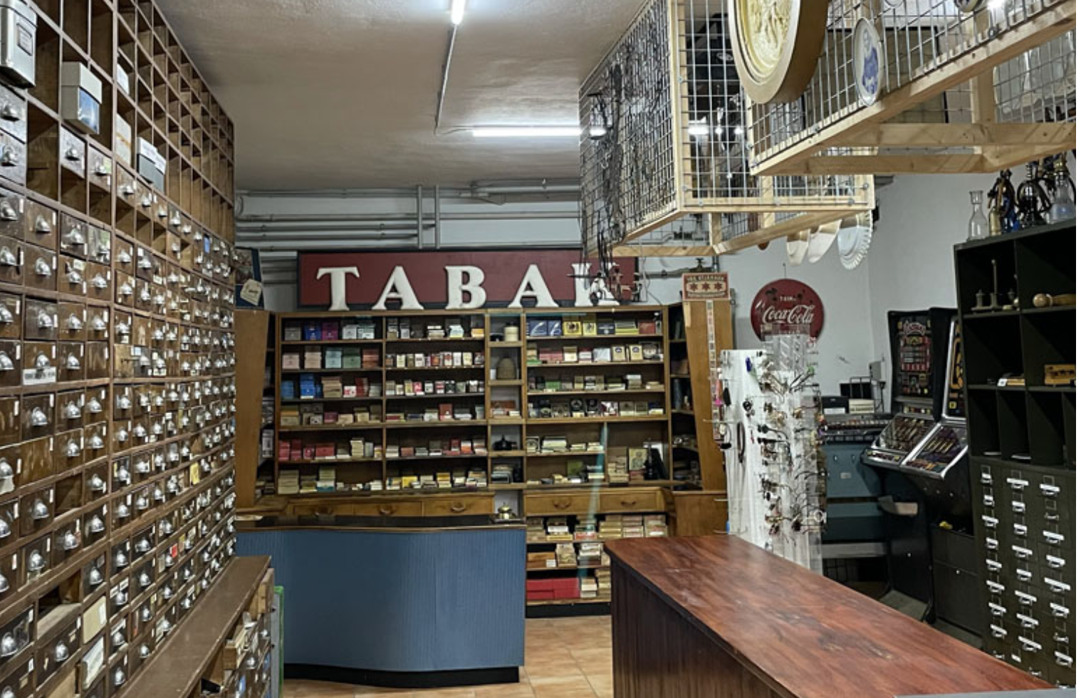
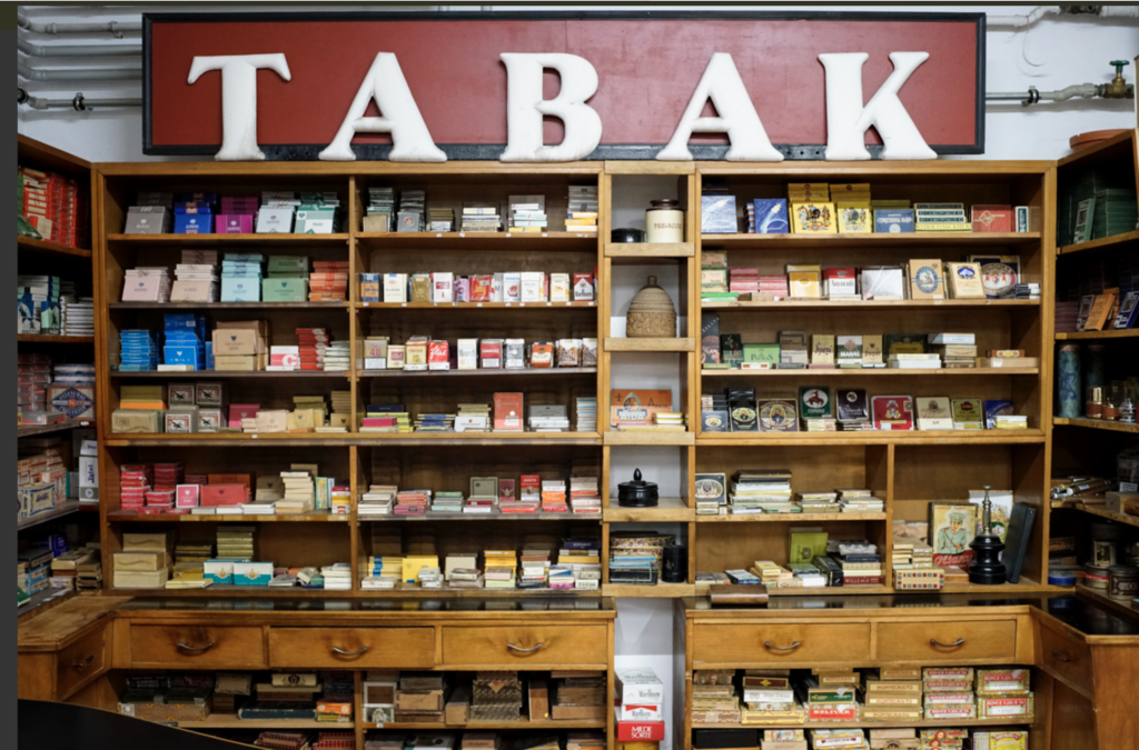
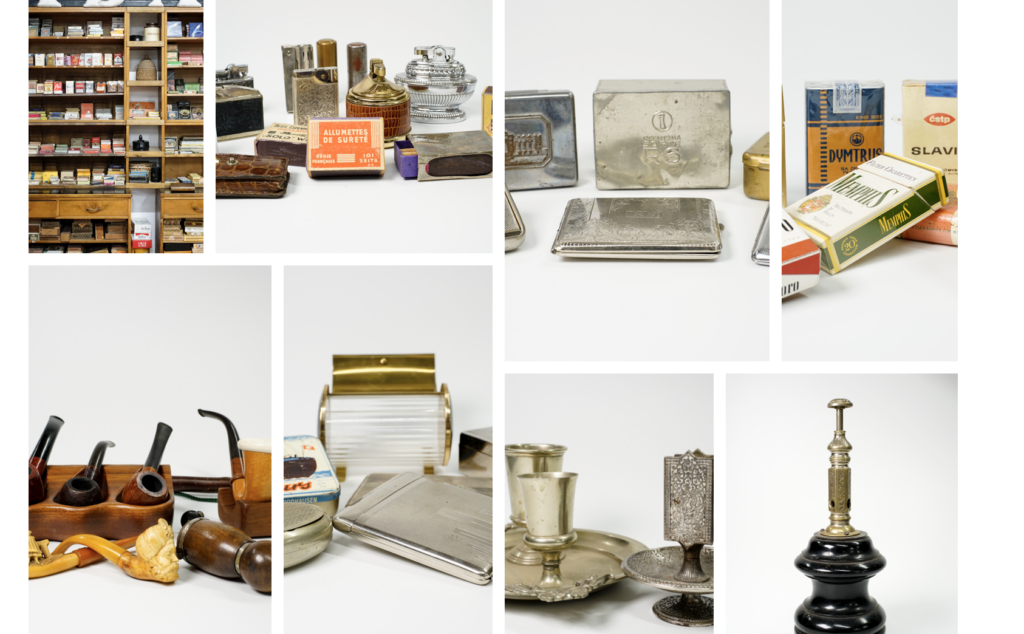
Für die Ladeneinrichtung bestehen zwei Möglichkeiten, wie man mehr oder weniger nachhaltig an die Gestaltung herangehen kann. Die umweltbewusstere Variante umfasst die Entlehnung der benötigten Möbel aus einem Fundus. Beispielsweise gibt es in Wien den props.co Film- und Theaterfundus, der passende Ladeneinrichtungen anbietet (siehe Bilder).
Sowohl Tresen als auch Regale stehen zur Verfügung. (Ladeneinrichtung 1)Auch Tabakwaren sind hier zu finden. (Tabakwaren 1)
Bei der zweiten Variante werden die benötigten Elemente eigenhändig gebaut und dem Set entsprechend angepasst. Dabei wird darauf geachtet, so umweltbewusste Materialien wie möglich zu verwenden. Beispielsweise könnten die Einbauregale aus Holz gebaut und mit einem umweltfreundlicheren Lack (im Vergleich zu anderen Lacken) eingestrichen werden. Da die Schubladen nicht funktionsfähig sein müssen, würde es auch reichen, nur die Schubladenfront zu erstellen und diese fest an dem Regal zu fixieren. Auf diese Weise muss kein weiteres Material für Elemente aufgewendet werden, die gar nicht verwendet werden. Das Motto „Fake it till you make it“ würde diese Situation gut beschreiben. Die zweite Variante ermöglicht eine größere kreative Freiheit, ist jedoch weniger umweltbewusst als die erste Variante und bringt auch ein höheres Arbeitspensum mit sich.
Das Set Dressing
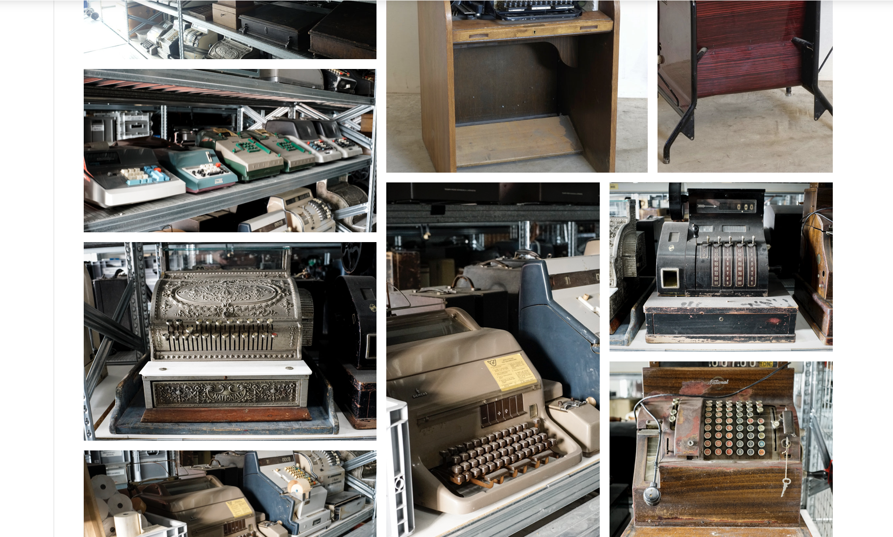
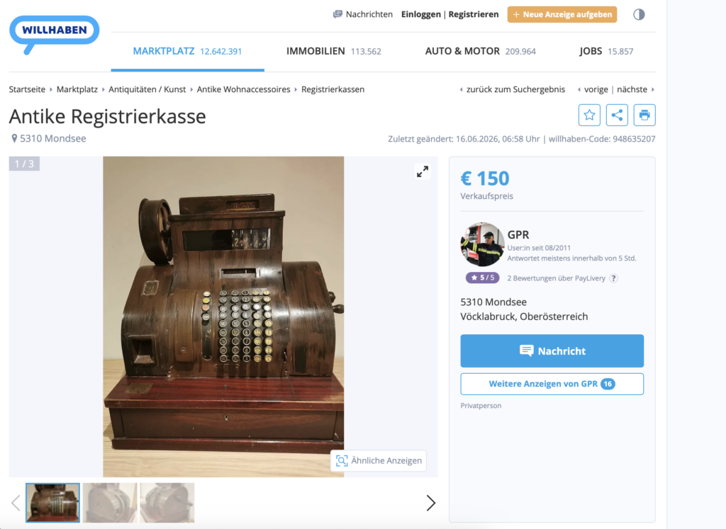
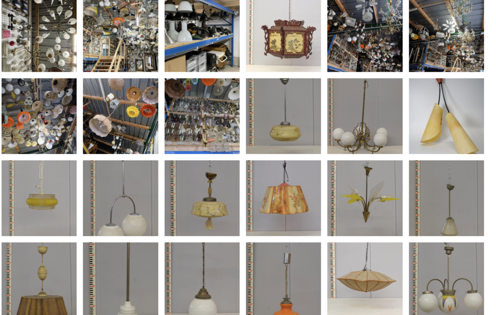
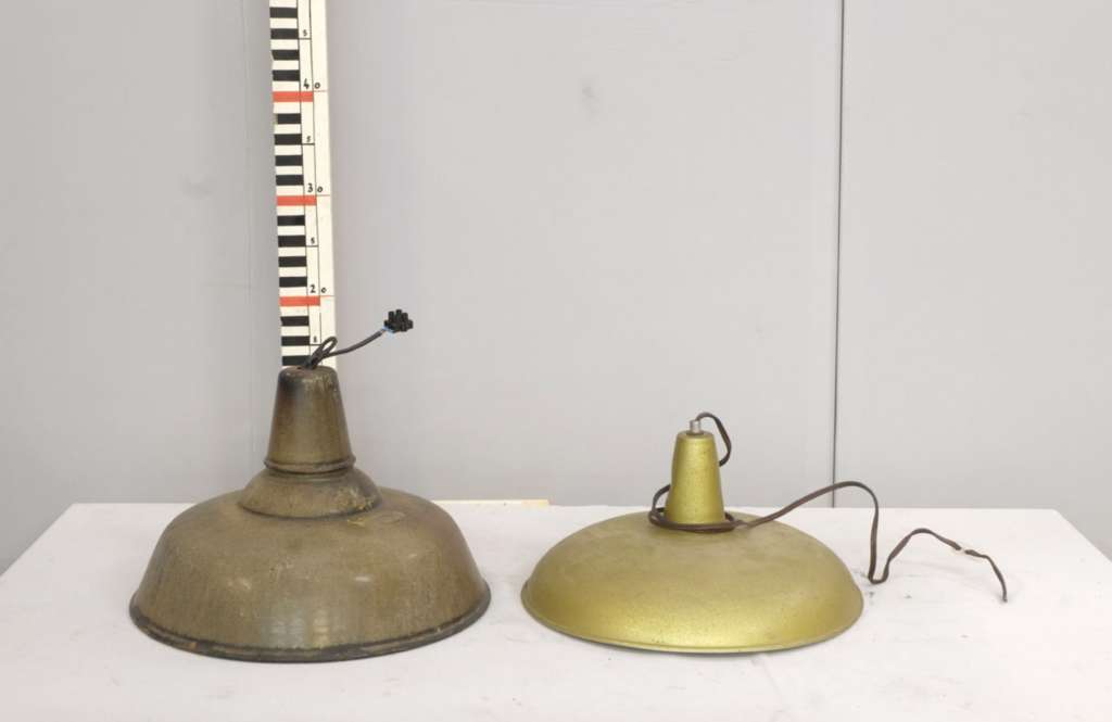
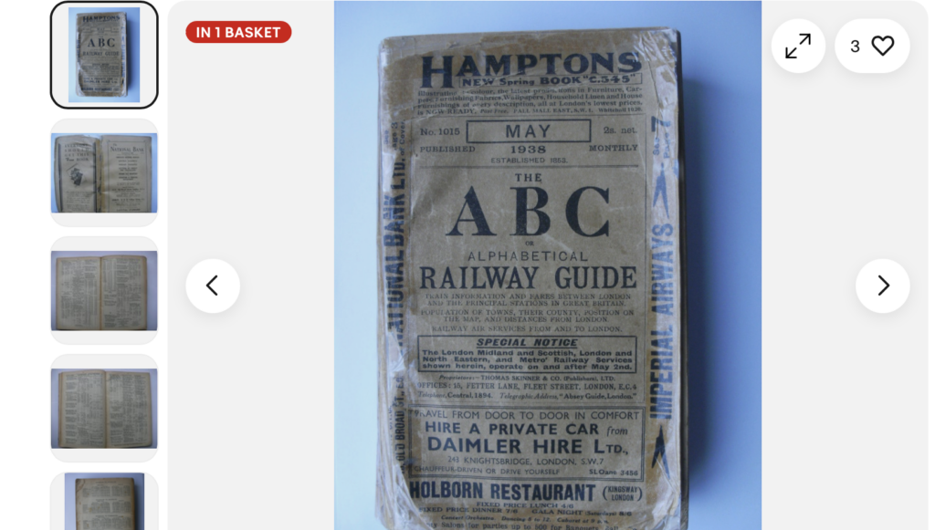
Auch bei den Set-Dressing-Elementen, wie etwa den Tabakwaren, gibt es mehrere Möglichkeiten. Diese können entweder (1) selbst hergestellt werden, (2) ebenso aus einem Fundus entlehnt werden, oder (3) secondhand beschafft werden. Sowohl bei der Entlehnung aus einem Fundus als auch bei der Secondhand-Beschaffung müssen gewisse Kompromisse bezüglich des Aussehens eingegangen werden. Diese beiden Varianten sind jedoch um einiges nachhaltiger als die Eigenproduktion. Die nachfolgenden Bilder zeigen einige Objekte, die für das geplante Set verwendet werden könnten und aus einem Fundus stammen, oder secondhand beschafft werden können.
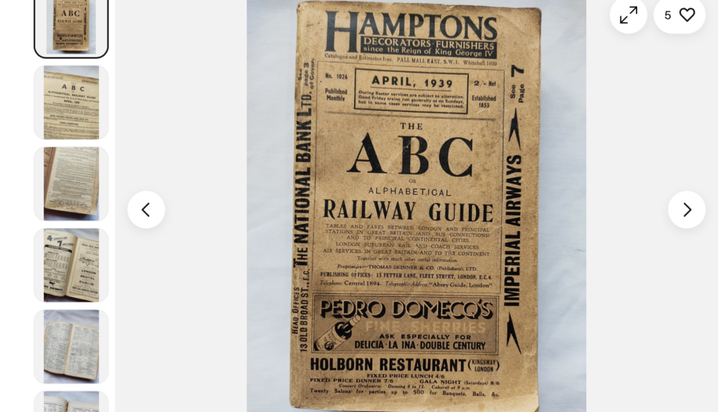
Auf Onlinemarktplätzen gibt es einige ABC Railway Guides zu kaufen, jedoch sind diese meist nicht aus der passenden Zeit, oder bereits sehr abgegriffen. Hier macht es vermutlich am meisten Sinn, den Railway Guide selbst zu gestalten und zu produzieren.
Fazit
Das im Zuge dieser Blogbeiträge erstellte Set Design kann relativ gut nachhaltig umgesetzt werden, da ein Großteil der benötigten Elemente aus hiesigen Film- und Theaterfundi entlehnt oder secondhand beschafft werden kann. Dennoch werden auch manche Objekte in Eigenproduktion erstellt, oder neu angeschafft werden müssen. Abschließend kann gesagt werden, dass die Umsetzung eines Set Designs viele Hürden bietet, diese jedoch mit guter Planung gut gemeistert werden können.
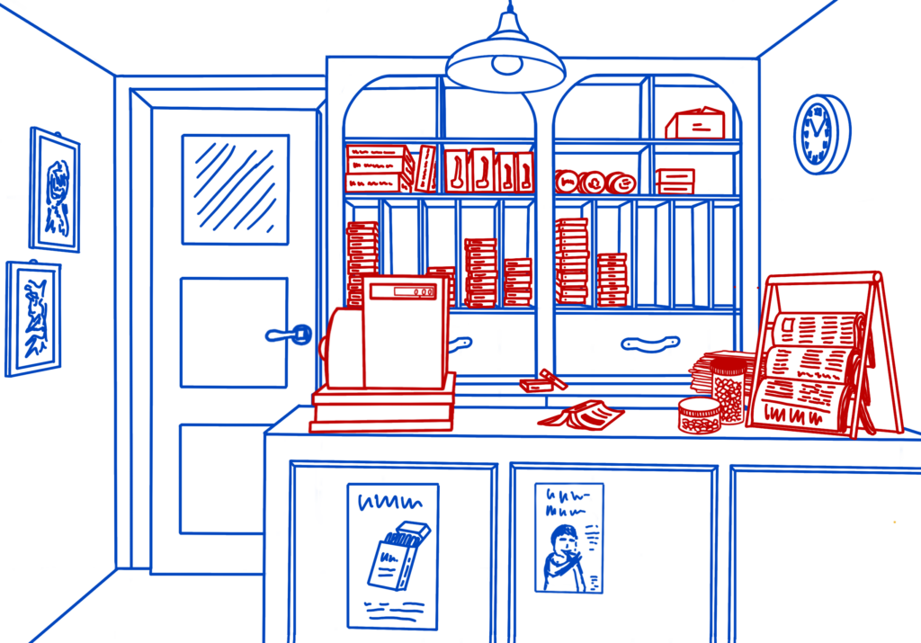
Nachdem der Plan für das Set Design einigermaßen erstellt und durchdacht wurde, ist es nun an der Zeit, die groben Skizzen in klarere und genauere Skizzen umzuwandeln.
Die Skizziereigenheit
Lustigerweise habe ich in meinen bisherigen Projekten eine eigene Art entwickelt, wie ich an diese finale Skizze herangehe. Aus irgendeinem Grund hat es sich bei mir eingebürgert, dass ich Einrichtungsgegenstände und teils auch unwichtige Dekoelemente in Blau darstelle und die Requisiten und die für die Szene wichtigeren Set-Dressing-Elemente in Rot hinzufüge. Das gibt mir selbst während der Gestaltungsphase einen besseren Überblick, was bereits vorhanden ist und wie wichtig es für die Szene ist.
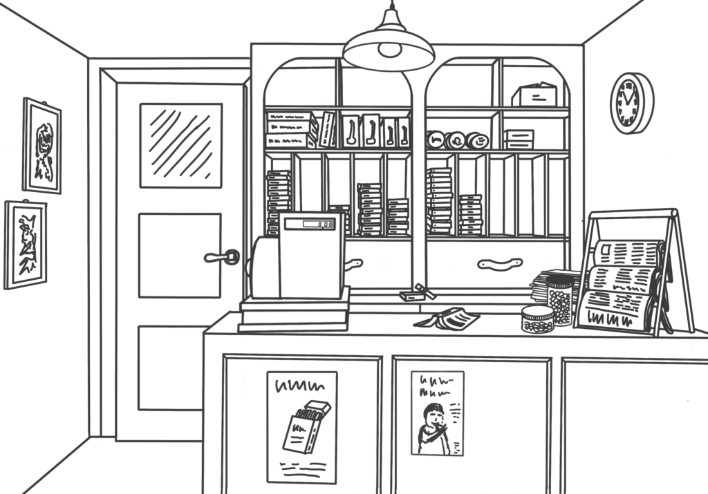
Im zweiten Schritt wird dies dann für gewöhnlich in Schwarz umgewandelt, damit die Gesamtheit der Szene und der von Farben unbeeinflusste Eindruck erkennbar wird.
Neue Elemente
Wie auf den fertigen Skizzen zu sehen ist, sind im Vergleich zu den ersten Zeichnungen noch einige weitere Elemente dazugekommen. An der linken Wand wurden noch Bilder hinzugefügt, um das Gleichgewicht der Szene ein bisschen auszupendeln. Davor war die Gestaltung sehr rechtslastig. Durch diese beiden kleinen Bilderrahmen wird die Balance wieder etwas hergestellt.
Auf der gegenüberliegenden Wand wurde außerdem eine Uhr angebracht und an der Vorderseite des Tresens finden sich zwei Plakate wieder. An und für sich hätten noch einige weitere Dekorationselemente hinzugefügt werden können, doch ich habe mich dazu entschieden, den Raum so zu belassen, da ich nicht denke, dass Mrs. Ascher das Geld und die Muße für eine weitere Gestaltung ihres Shops gehabt hätte.
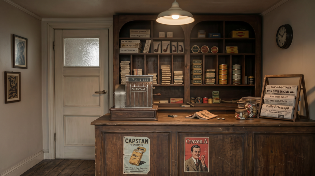
Die Visualisierung
Nachdem die finale Skizze fertiggestellt wurde, stellt sich die Frage, wie dieser Raum nun in Echt aussehen könnte. Da etwa der Bau eines 3D-Modells den Rahmen dieses Projektes sprengen würde, habe ich mich dazu entschieden, die Möglichkeiten des 21. Jahrhunderts zu testen. Mithilfe des AI Tooklits von Artlist.io wurde somit meine Skizze zum Leben erweckt (der Prompt ist am Ende angefügt).
Ich muss ehrlich sagen, dass ich mir nicht besonders viel erwartet habe, doch ich muss zugeben, dass das Ergebnis einigermaßen gut an meine Vorstellung herankommt. Die gewählten Materialien weichen etwas von meiner Vision ab (bei der Farbe des Holzes beispielsweise). Auf den ersten Blick scheint auch die Gestaltung des Set Dressings passabel ausgeführt, doch auch hier schießt die KI an einer guten Umsetzung vorbei. Sowohl die Zeitungen als auch die Plakate weisen teilweise wilde Wortkombinationen auf. Außerdem wurden die Schubladen im Regal nicht erkannt, weitere Waren hinzugefügt und die Gläser mit den Süßigkeiten wurden mit in Plastik vorverpackten Bonbons gefüllt, was in den 1930er Jahren noch nicht so üblich war. Dennoch entsteht ein erster Eindruck, wie der Raum im Film wirken könnte.
Conclusio
Es zeigt sich, dass auch im Bereich des Set Designs KI hilfreich sein kann, um einen ersten Eindruck davon zu vermitteln, wie der Raum im Film wirken wird. Dennoch sollte sie nicht die Planung des Raumes übernehmen (schließlich wäre in diesem Fall ja auch der ganze Spaß für die Set Designer:innen weg 🙂 ) und auch bei der Visualisierung im Zusammenhang mit eigenhändig erstellten Skizzen muss beachtet werden, dass Ungenauigkeiten und Abweichungen immer wieder vorkommen.
KI-Prompt:
Das ist die Skizze eines englischen Tobacco Shops aus dem Jahr 1935. Zu sehen sind Regale mit Zigaretten, Pfeifen sowie sonstigen Tabakwaren. Im linken hinteren Bereich des Bildes ist eine Tür mit einem kleinen Glasfenster im oberen Drittel zu sehen. Auf dem Tresen befinden sich eine alte Registrierkasse, ein aufgeschlagener ABC Railway Guide, Gläser mit Süßwaren sowie ein Zeitungsaufsteller. Die Einrichtung wirkt alt und abgestoßen. Das Licht ist schwach. Erstelle ein realistisches Bild und halte dich dabei vollständig an die dargestellten Elemente sowie die Aufteilung der Skizze.
Insgesamt habe ich meine Ziele weitgehend erreicht: Ich wollte Color Grading nicht nur theoretisch verstehen, sondern praktisch an einem eigenen Video lernen, und genau das ist mir gelungen. Besonders wichtig war für mich dabei, dass ich am Ende nicht nur ein fertiges Video habe, sondern auch deutlich besser nachvollziehen kann, was die einzelnen Einstellungen im Bild bewirken.
Was ich gelernt habe
Am meisten gelernt habe ich darüber, wie stark einzelne Einstellungen die Wirkung einer Videodatei verändern können. Vor allem Helligkeit, Kontrast, Sättigung und Farbstimmung sind für mich jetzt viel greifbarer als vorher. Ich verstehe jetzt besser, dass kleine Änderungen große Auswirkungen haben können und dass man beim Grading sehr bewusst arbeiten muss.
Ein besonders wichtiger Lernschritt war für mich auch die Waveform. Am Anfang war sie für mich eher verwirrend, aber inzwischen verstehe ich viel besser, wie ich sie lesen und für meine Korrekturen nutzen kann. Dadurch arbeite ich nicht mehr nur nach Gefühl, sondern kann meine Entscheidungen viel genauer kontrollieren.
Zusätzliche Fähigkeiten
Neben dem eigentlichen Color Grading habe ich auch organisatorisch und technisch dazugelernt. Ich bin sicherer im Umgang mit Schnitt und Vorbereitung geworden und weiß jetzt besser, wie wichtig ein sauberer Workflow ist. Auch das genaue Beobachten von Bildwirkung, Licht und Farbzusammenhang ist für mich viel stärker geworden.
Außerdem habe ich gelernt, geduldiger mit einem Projekt umzugehen. Gerade am Anfang wollte ich zu viel auf einmal ausprobieren, was zwar interessant war, aber auch viel Zeit gekostet hat. Durch diese Erfahrung habe ich verstanden, dass kreative Arbeit nicht nur aus Experimenten besteht, sondern auch aus klaren Entscheidungen.
Was ich heute anders machen würde
Wenn ich das Projekt heute noch einmal beginnen würde, würde ich mir früher einen klaren Plan machen und dann auch konsequent dabei bleiben. Genau dieses viele Hin und Her hat mich am meisten Zeit gekostet. Ich habe zwar dadurch viel ausprobiert, aber ich habe auch gemerkt, dass zu viele Richtungswechsel den Arbeitsprozess unnötig erschweren.
Heute würde ich also früher entscheiden, welche Story ich erzählen will, welchen Look ich anstrebe und wie ich das Projekt technisch umsetzen möchte. Dann würde ich diesen Plan auch durchziehen, statt immer wieder neu anzufangen. Das würde mir wahrscheinlich mehr Ruhe geben und das Ergebnis noch klarer machen.
Nächste Schritte
Als Nächstes möchte ich mich noch tiefer mit Color Grading beschäftigen. Besonders spannend finde ich für mich die Idee, eigene Color Themes oder bewusstere Looks zu entwickeln. Ich möchte lernen, wie man bestimmte Stimmungen gezielter aufbaut und nicht nur technisch korrekt arbeitet, sondern auch stilistisch sicherer wird.
Außerdem möchte ich mich insgesamt mehr trauen. Durch dieses Projekt habe ich gemerkt, dass Color Grading nicht nur aus Regeln besteht, sondern auch viel mit persönlichem Geschmack und kreativen Entscheidungen zu tun hat. Genau da möchte ich weiterkommen: mutiger werden, mehr ausprobieren und gleichzeitig ein besseres Gefühl für Wirkung entwickeln.
Persönliches Fazit
Für mich war dieses Semesterprojekt sehr wertvoll, weil ich nicht nur ein Thema bearbeitet, sondern wirklich etwas gelernt habe, das ich in zukünftigen Projekten weiterverwenden kann. Ich sehe jetzt Farben, Bildwirkung und technische Zusammenhänge viel bewusster. Vor allem habe ich verstanden, dass gutes Color Grading aus Geduld, Beobachtung und klaren Entscheidungen besteht.
Auch wenn am Anfang vieles chaotisch war, war dieser Prozess für mich wichtig. Ich habe Fehler gemacht, Zeit verloren und viel ausprobiert, aber genau daraus habe ich am meisten gelernt. Am Ende nehme ich vor allem mit, dass ich mich im Bereich Color Grading deutlich weiterentwickelt habe und dass ich jetzt eine viel bessere Grundlage habe, um weiterzumachen.
Nachdem ich das Video fertiggestellt hatte, war für mich besonders spannend zu sehen, wie sich die gesamte Arbeit vom ersten Konzept bis zum finalen Ergebnis zusammenfügt. Das fertige Video ist ein einfacher Vlog geworden, der meinen Morgen und meinen Weg in die FH zeigt. Genau diese Schlichtheit war für mein Projekt wichtig, weil ich nicht nur ein Video machen wollte, sondern vor allem das Color Grading an einem alltagstauglichen Material lernen und ausprobieren wollte. Der fertige Look unterstützt diese Idee gut, weil das Video ruhig, persönlich und unaufgeregt wirkt.
Vorstellung des fertigen Videos
Mein fertiges Video zeigt keine große Geschichte im klassischen Sinn, sondern begleitet mich durch einen normalen Ausschnitt aus dem Alltag. Es beginnt mit morgendlichen Szenen und führt dann weiter auf den Weg in die FH. Gerade weil das Video nicht überladen ist, wirkt es nahbar und authentisch. Für mich war das ein guter Rahmen, weil ich mich dadurch stärker auf Bildwirkung, Farbgestaltung und Stimmung konzentrieren konnte.
Ich habe mich bewusst für diese einfache Form entschieden, weil ein Vlog Raum für Beobachtung lässt. Die Kamera begleitet den Alltag, statt ihn komplett neu zu erfinden. Dadurch entsteht eine ruhige Atmosphäre, die gut zu meinem Semesterprojekt passt. Das Video soll nicht spektakulär sein, sondern ehrlich und visuell stimmig.
Analyse des Color Gradings
Beim Color Grading habe ich versucht, einen natürlichen und eher zurückhaltenden Look zu entwickeln. Das Bild wirkt nicht extrem bearbeitet, sondern eher sauber, ausgeglichen und leicht filmisch. Genau das war mein Ziel, weil ein zu starker Look bei einem Alltags-Vlog schnell unpassend wirken kann. Stattdessen wollte ich die vorhandene Stimmung leicht betonen, ohne sie künstlich zu verändern.
Besonders wichtig war mir, dass das Bild nicht zu bunt oder zu hart wirkt. Die Farben bleiben insgesamt ruhig und angenehm, während Kontrast und Helligkeit dem Bild mehr Klarheit geben. Dadurch wirkt die Szene nicht flach, aber auch nicht überstilisiert. Ich finde, dass gerade diese Zurückhaltung dem Video gut tut, weil sie den dokumentarischen Charakter des Materials unterstützt.
Auch die Lichtstimmung spielt eine große Rolle. Die Aufnahme wirkt durch das Grading bewusst klar und kontrolliert. Helle Bildbereiche sind sichtbar, aber nicht überstrahlt, und dunklere Bereiche behalten ihre Form. Das sorgt dafür, dass das Bild trotz seiner Einfachheit professioneller wirkt. Für mich war genau das ein wichtiges Ziel: ein Look, der nicht auffällt, weil er extrem ist, sondern weil er gut zum Inhalt passt.
Vorher-Nachher-Vergleich
Der Unterschied zwischen dem Rohmaterial und dem fertigen Bild liegt vor allem in der technischen und visuellen Ordnung. Vor dem Grading wirkt Material oft unruhiger, flacher oder weniger zusammenhängend. Nach der Bearbeitung entsteht ein Bild, das klarer und bewusster gestaltet ist. Besonders bei einer Szene wie dieser sieht man, wie wichtig Helligkeit, Kontrast und Farbabstimmung für die Gesamtwirkung sind.
Der Vorher-Nachher-Vergleich zeigt für mich vor allem, dass Color Grading nicht nur „schöner machen“ bedeutet. Es geht darum, aus vorhandenem Material eine stimmige Bildwelt zu formen. Schon kleine Änderungen können viel ausmachen, wenn sie gezielt eingesetzt werden. In meinem Video sorgt das Grading dafür, dass die Szene ruhiger und kontrollierter wirkt, ohne dabei ihre Alltagstauglichkeit zu verlieren.
Was besonders gut gelungen ist
Besonders gut gelungen ist meiner Meinung nach die Balance zwischen Natürlichkeit und Gestaltung. Das Video sieht immer noch aus wie ein echter Alltag, aber es wirkt trotzdem bewusst bearbeitet. Genau diese Mitte war für mich wichtig, weil ich keinen übertriebenen Filmlook wollte. Das Endergebnis passt dadurch gut zu meinem Konzept eines einfachen Vlogs.
Auch die Bildkomposition trägt viel zur Wirkung bei. Die Person im Vordergrund, das Gebäude im Hintergrund und das klare Stadtbild ergeben eine ruhige, gut lesbare Szene. Dadurch entsteht ein Bild, das visuell ordentlich wirkt und gleichzeitig genug Raum für Stimmung lässt. Das Color Grading unterstützt diese Struktur, statt sie zu überdecken.
Was noch verbessert werden könnte
Trotzdem sehe ich im fertigen Video auch noch Dinge, die ich beim nächsten Mal verbessern würde. Ein Punkt wäre die noch genauere farbliche Angleichung zwischen den einzelnen Szenen. Gerade wenn man an verschiedenen Orten oder zu unterschiedlichen Lichtzeiten dreht, können kleine Unterschiede im Bild stärker auffallen. Mit noch mehr Feinarbeit könnte das Video insgesamt noch homogener wirken.
Außerdem würde ich beim nächsten Projekt vielleicht gezielter mit einzelnen Farbnuancen experimentieren, ohne den natürlichen Stil zu verlieren. Für dieses Video war die einfache Gestaltung richtig, weil sie zum Inhalt passt. Trotzdem habe ich beim Arbeiten gemerkt, dass im Bereich Color Grading immer noch mehr Tiefe möglich wäre, wenn man einzelne Details noch bewusster ausarbeitet. Das ist für mich aber kein Nachteil, sondern eher ein Hinweis darauf, wie viel man in diesem Bereich noch lernen kann.
Was ich aus dem Ergebnis mitnehme
Das fertige Video zeigt für mich sehr gut, wie wichtig es ist, dass Inhalt und Farbe zusammenpassen. Ein Vlog braucht keinen aufwendigen Look, sondern eine klare und stimmige Gestaltung. Genau das habe ich bei diesem Projekt gelernt. Das Grading soll den Inhalt nicht überdecken, sondern ihn unterstützen.
Für mich ist dieses Ergebnis deshalb ein wichtiger Schritt im Lernprozess. Ich habe gesehen, dass selbst ein schlichtes Video durch gezieltes Grading an Wirkung gewinnen kann. Gleichzeitig habe ich verstanden, dass es nicht darum geht, ein Bild maximal zu verändern, sondern es passend zu gestalten. Das fertige Video ist damit für mich nicht nur ein Abschluss eines Arbeitsschritts, sondern auch ein sichtbarer Lernfortschritt.
Am Anfang meines Color-Grading-Projekts habe ich sehr viel ausprobiert, und genau das hat auch zu vielen Fehlern geführt. Ich habe mir von unterschiedlichen Tutorials ganz verschiedene Techniken abgeschaut, ohne zuerst zu prüfen, ob sie überhaupt zusammenpassen. Dadurch sahen manche Ergebnisse uneinheitlich aus oder ergaben farblich einfach keinen klaren Sinn.
Welche Fehler mir passiert sind
Der größte Fehler war für mich, zu viele unterschiedliche Vorgehensweisen gleichzeitig zu testen. Viele Tutorials arbeiten nämlich mit einer eigenen Logik, einer bestimmten Reihenfolge oder einem ganz eigenen Stil. Wenn man diese Methoden einfach mischt, ohne sie zu verstehen, kann das Bild schnell unruhig oder überladen wirken.
Ich habe dadurch gemerkt, dass Color Grading nicht nur aus einzelnen Effekten besteht. Es braucht ein klares Grundverständnis, damit die Bearbeitung zusammenhängend wirkt. Am Anfang habe ich oft eher nach Gefühl gearbeitet, statt systematisch vorzugehen.
Was nicht funktioniert hat
Nicht alles, was ich ausprobiert habe, hat am Ende gut funktioniert. Manche Looks waren zu stark, andere zu schwach, und manchmal passten die Farben einfach nicht zum Inhalt des Videos. Vor allem bei meinem Vlog war das wichtig, weil ein zu intensives Grading schnell künstlich wirkt.
Auch das ständige Wechseln zwischen verschiedenen Methoden hat nicht geholfen. Ich habe dabei gemerkt, dass man sich leicht verzetteln kann, wenn man zu viele Tutorials gleichzeitig nachmacht. Deshalb musste ich lernen, zuerst eine Richtung festzulegen und dann dabei zu bleiben.
Welche Tutorials mir geholfen haben
Besonders hilfreich waren für mich die Tutorials von Cullen Kelly auf YouTube. Seine Erklärungen haben mir geholfen, Farben und Bildanpassungen besser zu verstehen und nicht nur blind Einstellungen zu verändern. Ich fand gut, dass seine Herangehensweise ruhig, klar und technisch nachvollziehbar ist.
Auch manche Instagram-Beiträge von @marcoherbst.work waren für mich sehr hilfreich. Dort habe ich oft kurze, visuelle Beispiele gesehen, die mir gezeigt haben, wie bestimmte Farbentscheidungen wirken können. Gerade solche kurzen Inspirationen waren nützlich, weil ich dadurch schneller verstanden habe, wie ein Look insgesamt aufgebaut ist.
Wie sich meine Fähigkeiten verbessert haben
Mit der Zeit bin ich sicherer geworden. Am Anfang habe ich noch vieles ausprobiert, ohne wirklich zu wissen, warum ich etwas verändere. Später habe ich besser verstanden, dass jede Farbentscheidung eine bestimmte Wirkung hat. Dadurch bin ich bewusster mit Helligkeit, Kontrast, Sättigung und Farbstimmung umgegangen.
Ich habe auch gelernt, geduldiger zu arbeiten. Statt sofort ein perfektes Ergebnis zu erwarten, habe ich begonnen, Schritt für Schritt vorzugehen. Das hat mir geholfen, meine Änderungen besser zu kontrollieren und Fehler schneller zu erkennen.
Vergleich der ersten und letzten Versuche
Wenn ich meine ersten Versuche mit den letzten vergleiche, sehe ich einen großen Unterschied. Die ersten Versionen wirkten oft unruhig, weil ich zu viele Dinge gleichzeitig verändern wollte. Die letzten Versuche waren dagegen viel ruhiger, klarer und stimmiger.
Vor allem habe ich gelernt, wann ich ein Bild besser nicht weiter überarbeite. Am Anfang dachte ich oft, mehr Veränderung würde automatisch zu einem besseren Ergebnis führen. Inzwischen weiß ich, dass Zurückhaltung oft sinnvoller ist, besonders bei einem einfachen Alltags-Vlog.
Was ich über Farben gelernt habe
Durch das Projekt habe ich gelernt, dass Farben nicht nur schön aussehen sollen, sondern eine Wirkung erzeugen. Sie beeinflussen, wie ruhig, warm, kalt, freundlich oder distanziert ein Bild wirkt. Selbst kleine Anpassungen können deshalb einen großen Unterschied machen.
Ich habe auch verstanden, dass Farben immer im Zusammenhang mit dem Inhalt gesehen werden müssen. Ein Look, der für einen Musikclip gut funktioniert, passt nicht automatisch zu einem Vlog. Genau diese Verbindung zwischen Bild, Stimmung und Inhalt war für mich eine der wichtigsten Erkenntnisse.
Was ich aus dem Prozess mitnehme
Der Lernprozess war für mich wichtig, weil ich nicht nur technische Fähigkeiten aufgebaut habe, sondern auch gelernt habe, Fehler als Teil des Arbeitens zu sehen. Gerade weil am Anfang vieles nicht funktioniert hat, habe ich am Ende besser verstanden, wie Color Grading wirklich funktioniert. Die Mischung aus Ausprobieren, Vergleichen und Korrigieren hat mir gezeigt, dass man mit jedem Versuch dazulernt.
Am meisten hat mir geholfen, dass ich mit der Zeit einen klareren Blick für Farben entwickelt habe. Ich sehe jetzt besser, wann ein Bild harmonisch wirkt und wann es noch Korrekturen braucht. Genau das war für mich der wichtigste Fortschritt in diesem Projekt.
Nachdem die technischen Korrekturen abgeschlossen waren, begann für mich der kreativere Teil: das eigentliche Color Grading. Dabei ging es nicht mehr nur darum, das Bild „richtig“ aussehen zu lassen, sondern darum, einen Look zu entwickeln, der zum Inhalt meines Videos passt. Da mein Projekt ein einfacher Alltags-Vlog ist, habe ich mich bewusst für einen eher zurückhaltenden Stil entschieden.
Entwicklung eines eigenen Looks
Bei der Entwicklung des Looks war mir wichtig, dass das Video nicht künstlich oder überladen wirkt. Ich wollte keinen starken Kinolook oder extreme Farbverfremdung, sondern einen ruhigen, natürlichen Stil. Das passte für mich besser zu einem Vlog, der einen normalen Morgen und den Weg in die FH zeigt.
Deshalb habe ich den Look eher schlicht aufgebaut. Mir ging es darum, dass das Bild angenehm aussieht und trotzdem eine klare Stimmung hat. Ich wollte die Realität nicht komplett verändern, sondern sie nur etwas bewusster gestalten.
Farbtheorie
Auch wenn ich meinen Look einfach gehalten habe, spielte die Farbtheorie trotzdem eine Rolle. Farben beeinflussen die Wirkung eines Videos stark, selbst wenn man nur kleine Anpassungen vornimmt. Schon minimale Veränderungen bei Farbton, Sättigung oder Kontrast können den Eindruck eines Bildes verändern.
Für mich war dabei wichtig zu verstehen, dass Farben nicht nur dekorativ sind. Sie lenken auch die Aufmerksamkeit und erzeugen eine bestimmte Atmosphäre. Deshalb habe ich mich nicht nur gefragt, welche Farben schön aussehen, sondern welche Farben zu meinem Video passen.
Warme und kalte Farben
Besonders interessant fand ich den Unterschied zwischen warmen und kalten Farben. Warme Farben wirken oft freundlicher, weicher und näher, während kalte Farben eher ruhig, sachlich oder distanziert wirken können. Für meinen Vlog wollte ich keinen extrem kalten oder extrem warmen Look, sondern etwas dazwischen.
Ich habe mich also eher für eine natürliche Balance entschieden. Das Video sollte alltagstauglich und ehrlich wirken, nicht zu künstlich oder dramatisch. Gerade bei einem persönlichen Vlog finde ich es passender, wenn die Farben den Moment unterstützen, statt ihn zu stark zu verändern.
Farbkontraste
Auch Farbkontraste spielen eine wichtige Rolle beim Grading. Sie helfen dabei, bestimmte Bildbereiche stärker hervorzuheben und das Bild interessanter zu machen. Trotzdem wollte ich diese Kontraste bei meinem Projekt nicht zu stark einsetzen.
Mein Fokus lag mehr auf einer ruhigen Gesamtwirkung als auf auffälligen Gegensätzen. Das bedeutet nicht, dass ich keine Kontraste benutzt habe, sondern dass ich sie eher dezent eingesetzt habe. So bleibt das Bild natürlich, aber trotzdem nicht langweilig.
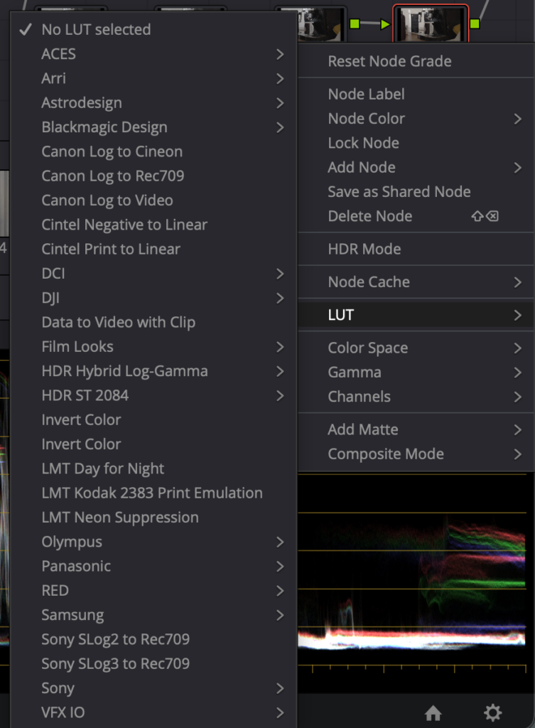
Einsatz von LUTs
LUTs können beim Color Grading sehr hilfreich sein, weil sie schnell einen bestimmten Stil erzeugen oder als Ausgangspunkt dienen können. Für mein Projekt habe ich sie aber nicht als Hauptmittel verwendet, sondern eher als Orientierung oder Vergleich. Da ich meinen Look bewusst einfach halten wollte, war mir wichtig, dass das Ergebnis nicht zu stark von einer voreingestellten Stimmung abhängt.
Ich fand es interessant zu sehen, wie LUTs den Charakter eines Bildes sofort verändern können. Gleichzeitig habe ich gemerkt, dass ein Vlog nicht unbedingt einen großen Look braucht, um zu funktionieren. Manchmal ist eine einfache, saubere Farbgestaltung passender als ein stark bearbeitetes Bild.
Vergleich verschiedener Looks
Beim Ausprobieren habe ich verschiedene Looks miteinander verglichen. Dabei wurde schnell klar, dass nicht jeder Stil zu meinem Projekt passt. Manche Looks wirkten zu hart, zu kühl oder zu filmisch für die einfache Vlog-Struktur. Andere waren zu neutral und hatten zu wenig Stimmung.
Durch diesen Vergleich habe ich besser verstanden, wie stark der Look die Wirkung eines Videos beeinflusst. Ein und dieselbe Szene kann je nach Farbgestaltung ganz anders wirken. Genau deshalb war es für mich wichtig, bewusst einen Stil zu wählen, der zum Inhalt passt und nicht gegen ihn arbeitet.
Warum ich mich für diesen Stil entschieden habe
Ich habe mich schließlich für einen sehr einfachen, alltäglichen Look entschieden, weil das am besten zu meinem Video passt. Mein Projekt ist kein aufwendiger Kurzfilm, sondern ein Vlog aus dem Alltag. Deshalb wollte ich auch beim Grading keine künstliche Distanz schaffen, sondern die persönliche und echte Stimmung des Videos erhalten.
Außerdem war mir wichtig, dass der Look zum Lernprozess passt. Da ich Color Grading erst besser kennenlernen wollte, erschien mir ein reduzierter Stil sinnvoll. So konnte ich mich auf die Grundlagen konzentrieren, ohne mich in zu vielen Effekten oder komplizierten Farbrichtungen zu verlieren.
Was ich daraus gelernt habe
Durch diesen Schritt habe ich verstanden, dass ein guter Look nicht zwangsläufig auffallen muss. Manchmal ist gerade die Zurückhaltung die richtige Entscheidung. Für mein Projekt war es wichtiger, dass das Video stimmig wirkt, als dass es besonders spektakulär aussieht.
Ich habe außerdem gelernt, dass Color Grading immer auch mit dem Inhalt zusammenhängt. Ein Vlog braucht keinen übertriebenen Stil, sondern einen Look, der alltagstauglich und ehrlich bleibt. Genau deshalb habe ich mich für eine einfache Farbgestaltung entschieden, die das Video unterstützt, ohne im Vordergrund zu stehen.
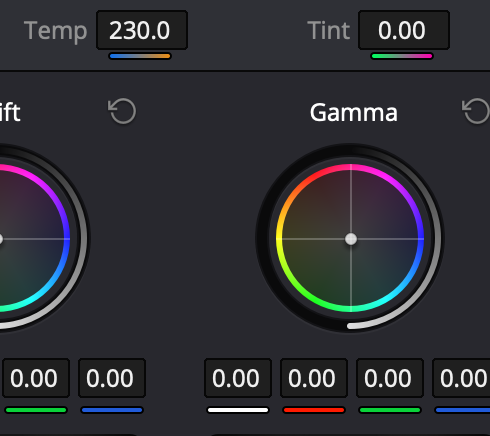
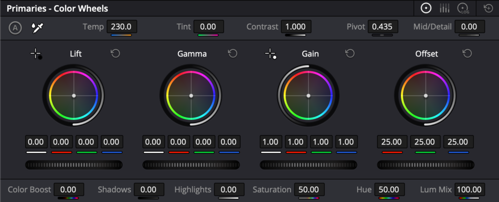
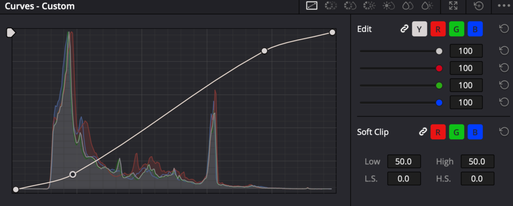
Nachdem Schnitt und Vorbereitung abgeschlossen waren, ging es für mich an den technischsten Teil des Projekts: die Color Correction. In DaVinci Resolve habe ich dabei immer in einer ähnlichen Reihenfolge gearbeitet: zuerst die Helligkeit, dann den Kontrast, danach die Sättigung und erst danach die feineren Farbwerte. Diese Reihenfolge hat mir geholfen, strukturierter zu arbeiten und das Bild Schritt für Schritt zu verbessern.
Was Color Correction bedeutet
Color Correction ist für mich der Teil, in dem ein Bild erst einmal technisch „richtig“ gemacht wird. Es geht noch nicht um einen kreativen Look, sondern darum, dass die Aufnahme natürlich, ausgeglichen und einheitlich wirkt. Besonders bei verschiedenen Clips aus einem Vlog war das wichtig, weil nicht jede Szene unter denselben Bedingungen aufgenommen wurde.
Ich habe schnell gemerkt, dass Color Correction die Grundlage für alles Weitere ist. Wenn ein Bild zu dunkel, zu hell oder farblich unausgeglichen ist, wirkt auch das spätere Grading unruhig. Deshalb musste ich zuerst die technische Basis herstellen, bevor ich überhaupt an einen Look denken konnte.
Weißabgleich
Ein wichtiger erster Schritt war der Weißabgleich. Dabei habe ich darauf geachtet, dass Weiß wirklich weiß aussieht und keine ungewollte Farbstichigkeit im Bild bleibt. Gerade bei Aufnahmen mit unterschiedlichem Licht kann das schnell passieren, zum Beispiel wenn eine Szene wärmer und die andere kühler wirkt.
Für mich war der Weißabgleich besonders hilfreich, weil er das Bild sofort sauberer und natürlicher wirken lässt. Erst wenn die Grundfarbe stimmt, kann man das Material sinnvoll weiterbearbeiten. Sonst bleibt das Bild trotz guter Ideen immer leicht „falsch“ oder unausgeglichen.
Belichtung korrigieren
Danach habe ich die Belichtung angepasst. In DaVinci habe ich dafür zuerst die allgemeine Helligkeit überprüft und das Bild so eingestellt, dass es weder zu dunkel noch zu ausgebrannt wirkt. Gerade bei einem Vlog ist das wichtig, weil die Zuschauer die Szenen schnell und klar lesen können sollen.
Die Belichtung ist für mich einer der wichtigsten technischen Schritte, weil sie sofort Einfluss auf die Bildwirkung hat. Wenn ein Clip zu dunkel ist, gehen Details verloren. Wenn er zu hell ist, wirken Gesichter und Flächen schnell flach oder überbelichtet. Durch die Korrektur konnte ich meine Aufnahmen insgesamt viel ausgeglichener machen.
Kontrast anpassen
Nach der Helligkeit kam bei mir der Kontrast. Das war ein sehr wichtiger Schritt, weil Kontrast dem Bild Tiefe und Form gibt. Ohne Kontrast wirkt ein Bild oft flach oder leblos, selbst wenn die Farben eigentlich schon stimmen.
Ich habe beim Kontrast gemerkt, dass es oft nur kleine Veränderungen braucht, um das Bild klarer wirken zu lassen. Gerade bei Alltagsszenen kann ein bisschen mehr Kontrast schon helfen, damit das Bild definierter und filmischer aussieht. Gleichzeitig durfte ich es nicht übertreiben, weil das Material sonst schnell hart oder unnatürlich wirkt.
Highlights und Schatten
Ein weiterer wichtiger Bereich waren die Highlights und Schatten. Damit konnte ich feiner steuern, welche Bildteile heller und welche dunkler erscheinen. Das ist besonders nützlich, wenn man Details retten oder einzelne Bildbereiche gezielter hervorheben möchte.
Für mein Projekt war das hilfreich, weil manche Aufnahmen sehr unterschiedliche Lichtverhältnisse hatten. Durch die Anpassung von Highlights und Schatten konnte ich das Bild besser ausbalancieren und störende Unterschiede etwas reduzieren. So wurde das Material insgesamt harmonischer.
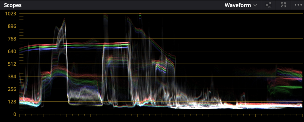
Waveform, Histogramm und Vectorscope
Bei der technischen Arbeit habe ich auch angefangen, mich stärker an den Scopes zu orientieren. Besonders wichtig waren für mich Waveform, Histogramm und Vectorscope, weil sie zeigen, was im Bild wirklich passiert, statt nur auf das eigene Auge zu vertrauen.
Die Waveform hilft dabei, Helligkeit und Bildverteilung zu kontrollieren. Sie zeigt mir, ob das Bild zu dunkel, zu hell oder ausgewogen ist. Das Histogramm gibt einen Überblick über die Verteilung der Tonwerte im Bild, also ob viele Bereiche eher dunkel, hell oder mittig liegen. Das Vectorscope ist vor allem bei Farben wichtig, weil es zeigt, wie stark die Farbsättigung ist und in welche Richtung die Farbtöne gehen.
Diese Werkzeuge fand ich am Anfang etwas kompliziert, aber sie waren sehr hilfreich, um objektiver zu arbeiten. Gerade wenn man mehrere Aufnahmen angleichen will, ist es besser, sich nicht nur auf das eigene Gefühl zu verlassen.
Schwierigkeit beim Angleichen
Eine der größten Herausforderungen war das Angleichen verschiedener Aufnahmen. Obwohl die Szenen alle zu einem Projekt gehören, sehen sie nicht automatisch gleich aus. Unterschiedliche Lichtquellen, unterschiedliche Tageszeiten und verschiedene Kameraeinstellungen führen schnell dazu, dass Clips nicht zusammenpassen.
Ich habe gemerkt, dass das Angleichen nicht nur eine technische, sondern auch eine geduldige Aufgabe ist. Man muss sehr genau schauen, welche Unterschiede wirklich wichtig sind und welche man mit kleinen Anpassungen ausgleichen kann. Besonders bei einem Vlog ist das relevant, weil die einzelnen Szenen zwar zusammengehören, aber trotzdem an unterschiedlichen Orten und unter verschiedenen Bedingungen aufgenommen wurden.
Was ich dabei gelernt habe
Durch die Color Correction habe ich verstanden, wie wichtig eine saubere technische Grundlage ist. Erst wenn Helligkeit, Kontrast, Schatten, Weißabgleich und Sättigung stimmen, kann das eigentliche Grading funktionieren. In DaVinci hat mir die Reihenfolge geholfen, Schritt für Schritt vorzugehen und nicht alles gleichzeitig verändern zu wollen.
Für mich war dieser Teil des Projekts sehr lehrreich, weil ich gesehen habe, wie viel Einfluss kleine technische Anpassungen auf das gesamte Bild haben. Color Correction ist zwar weniger kreativ als Color Grading, aber ohne sie würde das Endergebnis nicht stabil wirken. Genau deshalb ist sie für mich der wichtigste technische Schritt vor dem eigentlichen Look.
With the fundamentals out of the way in the first session, the second one was where things got noticeably more technical. I opened with three concepts that tend to trip people up if they’re never explained properly: vector versus pixel-based graphics, the differences between color spaces, and bit depth. None of these are exotic ideas, but they’re the kind of thing people absorb by osmosis rather than by being taught directly, which usually means there are gaps, and those gaps tend to surface at the worst possible moment, like when someone exports a file and can’t figure out why it looks wrong on a different screen.
I made a point of explaining these concepts with real consequences attached rather than as abstract theory. Vector versus pixel matters the moment you try to scale a logo without it turning to mush. Color space matters the moment a print comes back looking nothing like what was on screen. Bit depth matters the moment a gradient starts banding instead of looking smooth.
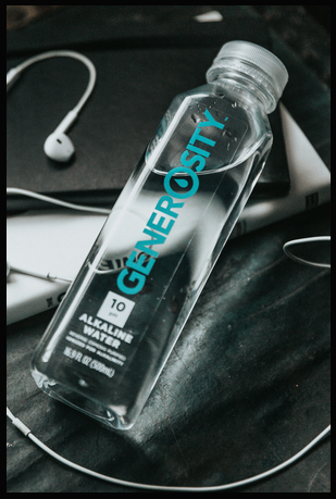
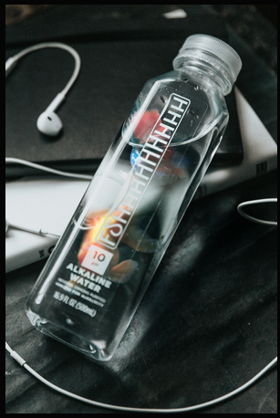
The Task: Fish, Bottle, Logo
The exercise for this session was to insert an image of a fish into a water bottle and replace the bottle’s existing logo with something new. It’s a deceptively dense task for something that sounds simple. To pull it off convincingly, students had to work through smart objects and smart filters, layer masks, clipping masks, blend modes, warp transforms, Gaussian and lens blur, adjustment layers, and color and tone matching between the fish and the bottle’s existing lighting. On top of that, replacing the logo meant bringing SVG import and handling into the mix, since the original branding needed to be swapped out cleanly rather than just painted over.
Each piece of that list earns its place for a specific reason. Smart objects and smart filters keep the whole composite editable, so a filter applied early on can still be tweaked after the fact instead of forcing a redo. Clipping masks are what let the fish’s texture sit believably inside the bottle’s silhouette rather than floating on top of it. Warp transforms handle the fact that a bottle is curved and a flat logo image is not, so the replacement graphic needs to bend along the same contour the original packaging does. And the blur work – Gaussian for general softness, lens blur for anything that needed to respect depth – is what keeps the inserted elements from looking pasted in at full sharpness against a photo that has its own natural softness.
That’s a lot of separate skills stacked into one exercise, but that was intentional. Session one was about isolated fundamentals; session two was about combining them into something that actually resembles real client work, where you rarely get to use just one technique at a time.
How It Went
Unlike the first session, this one used almost the entire two-hour slot to get through the task. That wasn’t a bad sign – it meant people were engaged enough to work through problems rather than rushing past them. I wasn’t just standing at the front demonstrating either; there were real questions coming from the room, people getting stuck on specific steps and asking for help rather than silently falling behind. That’s honestly the moment teaching starts feeling worthwhile – not when people follow along smoothly, but when they get stuck on something specific enough to ask about it.
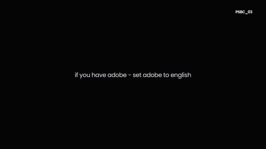
One thing caught me off guard: a handful of new faces showed up who hadn’t been at the first session. I’d assumed the intro material – the DPI/PPI, RGB/CMYK, file format rundown -would only be relevant once, but that assumption didn’t hold. As a result, I decided to bring a short version of the introductory slides back for the third session, just to make sure nobody starting fresh would be missing context the rest of the group already had.
The other realization from this session was smaller but stuck with me: switching Photoshop’s interface language to English matters more than it seems. Most tutorials, forum posts, and search results default to English menu names, and trying to follow along or troubleshoot with a German interface actively works against you – you end up hunting through translated menu labels that don’t match what any guide online is telling you to click. It’s a five-second setting change that saves people real frustration down the line, so it became something I started mentioning explicitly rather than assuming people would figure it out on their own. It’s a small piece of advice, but it’s the kind of thing that only becomes obvious once you’ve watched someone struggle to find a menu item that’s been renamed in translation. By the end of session two, the shape of the course was becoming clearer – not just as three isolated lessons, but as a progression where each session built directly on the muscle memory from the last one. Students weren’t relearning selections from scratch in session two; they were applying them without thinking, which freed up mental space for the new material layered on top. That compounding effect is exactly what I’d hoped for when planning the sequence, and it set up the third and final session to be more ambitious than either of the first two, since I could now assume a baseline of comfort that didn’t exist going into session one.
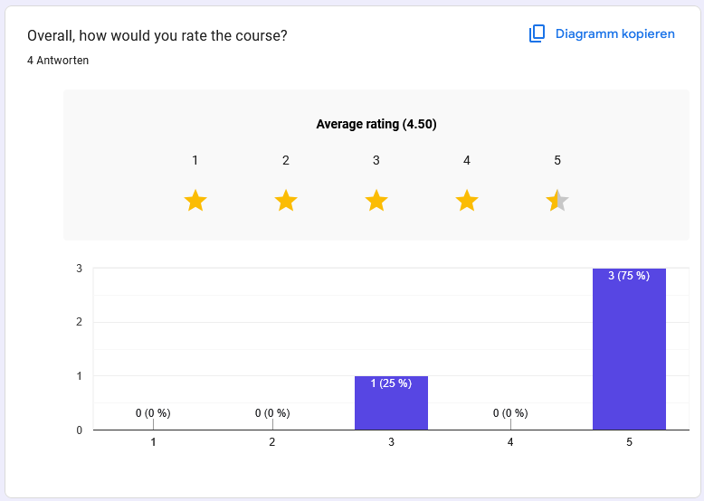
Each session ran with somewhere between 5 and 10 people – not a large group, which matters for how much weight to put on what follows. Out of that group, I got 4 responses to the feedback survey. That’s a small sample, and I’m treating the results accordingly, with a healthy grain of salt. But small or not, it’s the first real signal I’ve had on how the course landed, and after two sessions of getting nothing back at all by email, even a handful of honest answers felt like a meaningful upgrade.
The Numbers
The average rating came out to 4.5 out of 5 – three people rated it 5 stars, one rated it 3. That one 3-star rating is worth sitting with rather than averaging away; without more written context from that specific respondent, I can’t say exactly what fell short for them, and that’s a small blind spot in a four-person sample that a larger survey would have filled in.
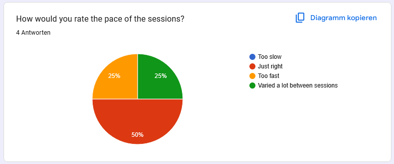
On pace, two people said it was “just right,” one said “too fast,” and nobody flagged it as too slow or inconsistent, which suggests the difficulty curve across the three sessions was reasonably well judged. That “too fast” answer lines up with something I noticed myself in session two, when the fish-in-a-bottle task pulled in more techniques than any single exercise really should – so that data point tracks with my own read of the sessions rather than coming as a surprise.
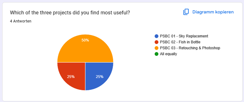
Asked which of the three projects they found most useful, the split leaned toward the final session: one vote each for the first and second sessions, and two votes for the third. Nobody selected “all equally,” which I read as a good sign – it means the sessions were distinct enough from each other that people had a real preference rather than defaulting to a neutral answer. The lean toward session three also makes sense given it was the most varied session, covering both retouching and mockup work rather than a single combined exercise.
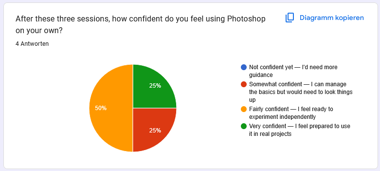
On confidence using Photoshop independently after the course, the results were more spread out: nobody said they felt “not confident yet,” one person landed on “somewhat confident,” two on “fairly confident,” and one on “very confident.” Given this was three two-hour sessions and not a semester-long course, having the majority land in the upper half of that scale feels like a reasonable outcome, and having nobody land at the bottom of the scale suggests the pacing didn’t leave anyone behind entirely – which was one of my bigger worries going in.
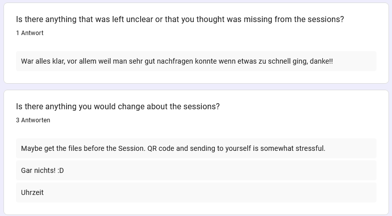
What People Wanted Changed
The open feedback was short but useful. One response asked for the files ahead of the session, noting that scanning a QR code and emailing yourself the material mid-session felt unnecessarily stressful – which lines up almost exactly with the file-transfer frustration I ran into myself from the presenting side, so it’s reassuring in a way to see the same friction point show up independently from the student side. Two people wrote some version of “nothing” – happy with the format as is, which I take as a decent sign the overall structure doesn’t need a rework, just refinement. One simply flagged the time slot itself as the thing they’d change, which is useful to know but not something I can fully control given it’s tied to the FH’s own scheduling rather than anything I decide.
The Real Takeaways
Numbers aside, two practical lessons stood out from running the course. The first is that file transfer needs to be smoother – the FH SharePoint QR code system worked maybe one out of every three times, and having that fail live in front of a room is not a great use of anyone’s patience. Between that and the student feedback asking for files ahead of time, the fix is fairly obvious: send the material out in advance rather than relying on an in-room QR scan that may or may not cooperate that day.
The second lesson was less about Photoshop and more about equipment: always carry a backup adapter. The final session nearly didn’t happen because my adapter stopped working for the beamer with no warning, and the only reason the session went ahead on time was that a friend happened to have one I could borrow. That’s not a mistake I plan on repeating – a spare adapter is going in my bag permanently from now on.
Taken as a whole – the ratings, the specific feedback, and the operational hiccups – I’d call the course a genuine success, with clear, specific things to improve before running it again. Nothing in the feedback pointed to a structural problem with the course itself; the issues were all around the edges – logistics, timing, hardware – rather than the actual teaching or the content. That combination is exactly what you want from a first attempt: proof the format works, plus a concrete list of what to fix next time, rather than having to question the fundamentals of the approach itself.