To the survey: https://docs.google.com/forms/d/e/1FAIpQLSfujaTdkiyrwagGO4Cv_JjGQ_IIWt9v4tO54aVBSiF7J6a_pw/viewform?usp=header
When I started my pilot study, I mainly wanted to find out whether my survey worked well. I expected to make a few small changes before starting the main study, but I didn’t expect the pilot study to change the way I think about my research. But if I am honest, I feel that it did much more than test my questionnaire. It gave me new ideas, new questions and a much clearer direction for the next step of my project.
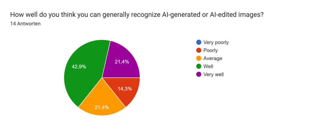
One thing I learned very quickly is that research rarely gives you simple answers. Instead, every answer seems to lead to another question. At the beginning, I only wanted to find out whether people can recognise authentic, AI-edited and fully AI-generated images. Now I find myself asking something different: Why do people trust some images but not others? I think this has become one of the most interesting questions in my research.
The pilot study also helped me develop a few assumptions that I would like to investigate in the main study.
- I expect that highly photorealistic AI-generated images will continue to be much harder to recognise than authentic photographs.
- I believe that people’s confidence does not always match their actual performance.
- I think that our judgement is influenced less by whether an image is objectively real or fake and more by specific visual details that make an image appear trustworthy.
- I now suspect that AI-generated images may have a second effect that I had not considered before: they might slowly reduce our trust in authentic photographs as well.
This last assumption is probably the most interesting outcome of the pilot study for me. When I started this project I wanted to understand whether people can recognise AI-generated images. But after analysing the pilot study, I began wondering if the real issue is something bigger. Could AI-generated images slowly make us trust authentic photographs less? If people start doubting real images because they look “too perfect”, then AI is not only changing how images are created. It may also be changing how we decide what we believe.
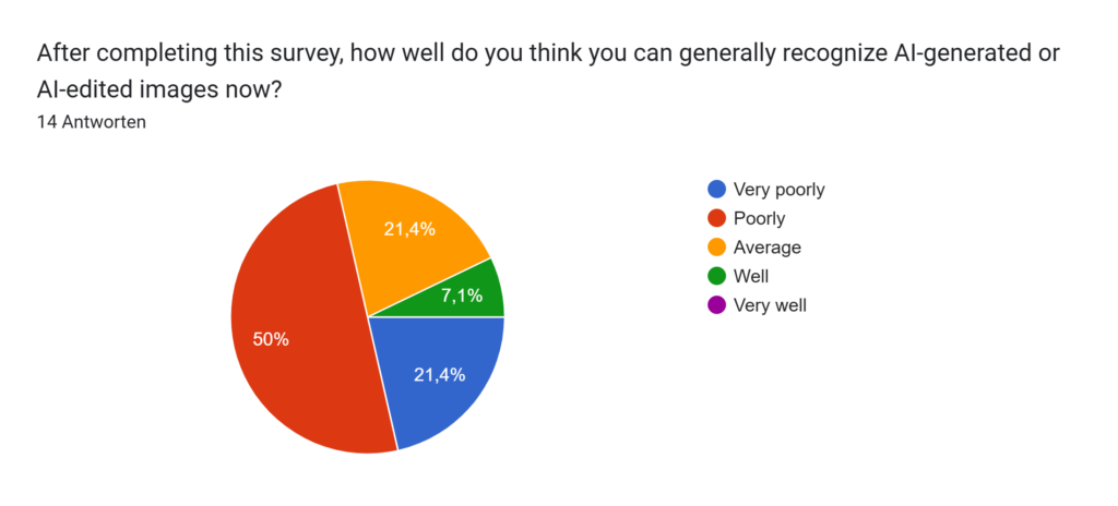
The pilot study also made me rethink the design of my main study. For the pilot survey, I intentionally selected mostly very realistic AI-generated images because I wanted to create a situation that reflects how AI could actually be used in the real world. Several participants told me afterwards that the images were “too good” and that people would normally not see such difficult examples online. I understand this opinion, but I personally see it differently. If someone wanted to spread misinformation using AI-generated images, they would most likely choose the most convincing image available, not one with obvious mistakes. For this reason, I still believe that the image selection represents a realistic scenario.
However, the feedback also gave me an idea for improving the main study. Instead of using only highly realistic AI-generated images, I now want to include images with different levels of difficulty. Some images will contain obvious AI artefacts, while others will be almost impossible to distinguish from real photographs. I hope this will make it easier to compare different age groups. My current assumption is that younger participants, especially those between 25 and 34 years old, may recognise the more obvious AI-generated images more easily than older participants because they are generally more familiar with AI tools and digital media.
Looking back, I feel that the pilot study has given me much more than I expected. It helped me improve my survey, but it also changed how I think about my research question. I now have a clearer idea of what I want to investigate and which questions I find most interesting. At the same time, I know that there is still a lot to discover. I am excited to continue this project and see whether these first ideas are confirmed when I conduct the main study with a larger and more diverse group of participants.