Design Activism Experiments Final Thoughts

For this semester, I wanted to show a different side of design activism, namely, design activism through analogue experiments. I did that by first researching what kinds of experiments I was going to focus on and deciding on a certain topic that I wanted to focus on, since the whole area of design activism would’ve just been too vast. I thought about doing something on sustainability, but this would’ve asked different questions and it would’ve been tough to show sustainability in different ways than it is already shown. I also thought about doing something on fashion, since that is one of the main fields that I have knowledge in, but this was actually a field that I have already researched so many times and I wanted to get out of doing the same thing in all aspects of my life over and over again.

Therefore, I decided on the topic of food. Specifically the phrase: “Food is political” and the aspects of showing certain cultures or talking about problems certain cultures are facing today through fruits or vegetables as symbols. This turned out to be the right topic for these experiments, since I love working with food or showing different kinds of foods. However, it also turned out to be quite difficult to work with this, because it is such a political topic on many different layers. Food politics have been with us throughout the history of mankind. There was always some sort of dependence of people that put their livelihood on producing and cultivating different kinds of foods for other people that had more power than them. Wars were fought over food and some of the biggest panics that arised were, when food was scarce and there was not enough there for everyone. That is all still the case nowadays, even if we privileged people like to forget these aspects usually.

I may not have made the most of my experiments, but what I can say is that even though my life is currently really difficult and I didn’t have the time to do all of this, which is why all of my posts are now coming at once. I really did some experiments and I also did everything myself and put all of my own thoughts into these blog posts without using AI for any of it. I hope that it is still appreciated, because I just want to keep the skills that I have of writing texts. In times of AI writing is something that happens so fast and so easily, so it is easy to forget that it is a process that takes time, but it is also a process that gets the brain going and enriches us. So, in times of complicated AI texts writing in ways that people would never write themselves and everything becoming much more similar and much more artificial by the second, I hope there’s still people out there that appreciate people for trying and for being authentic with their own experiences. Thank you for the opportunity of doing these experiments, even though it was much more stressful for me than it should’ve been. Thank you for coming on this journey with me. Looking forward for the directions that I really will go in the future with this thesis.
Design Activism Play-Doh

I have already done quite many experiments for my research, this time I decided to activate another childhood memory and do something with play-doh. I had many ideas on how to approach this topic, since it makes certain playing aspects possible, so I’m sure that it would’ve been nice to also use some other tools than just plain play-doh. In the future, I would definitely try to also include using some stencils to make the whole object more patterned in the end. To add to that, it would’ve worked well to combine some of the colours and really mix them so that the different colours mix at some points and some others show up in streaks in the patterns, of course this method can only be done once, since the colours will then be mixed together and cannot fully be taken apart anymore. However, I think that in this case it would work out well to just form some abstract shapes with it and then use this type of structure for future projects.

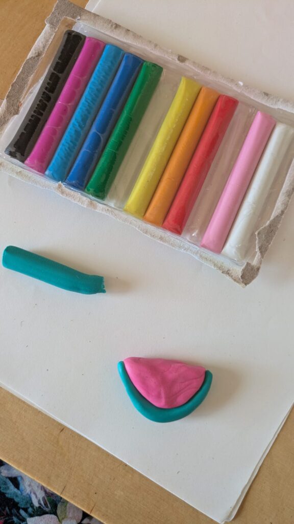
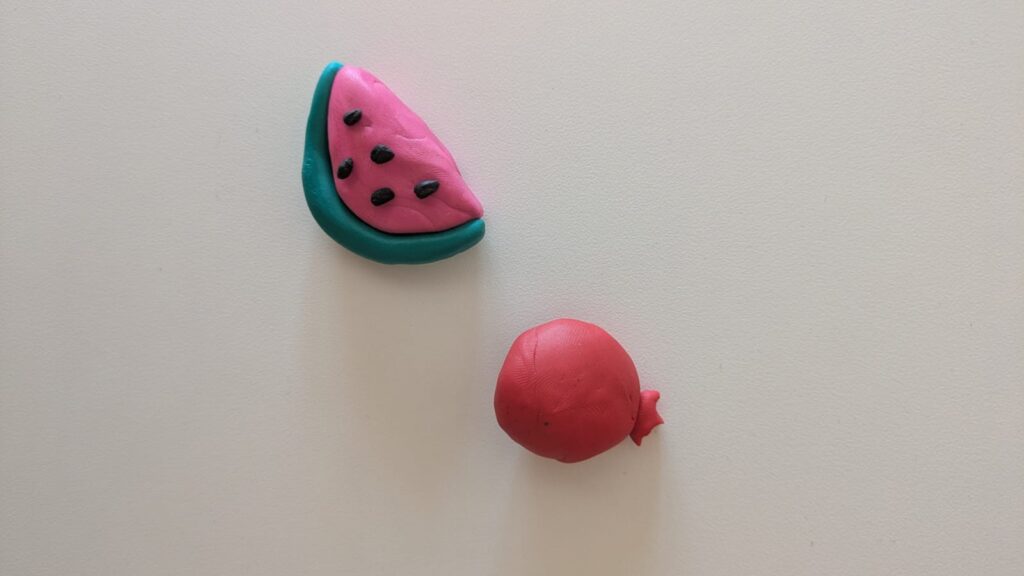
The play-doh I used was of lesser quality, therefore it tended to stick to the hands more than it did other things. It was really hard to form and I think it would’ve also been harder to mix. When I started the process I already wanted to get it off my hands, because it was really uncomfortable to work with. Since this was still my experiment and I had to make at least something out of it, I decided to work on two simpler shapes that I had done before in some of my other experiments. The watermelon and the pomegranate. I only had little play-doh, so I had to make them quite small, which was fine, since this experiment was just supposed to get me started and help me try out different materials. To start, I chose the colours that matched best with the result I was going for, started to make the play-doh smoother by rolling it in my hands for a bit and then decided on doing simple shapes to just show the fruits for what they are. The pomegranate was just made out of red play-doh in two pieces, a ‘crown-like’ piece for the top and the round body of the fruit. The watermelon was done by using, emerald, black and pink play-doh and creating a watermelon slice, by making its distinct shape in a pink moon-like shape, the outer part in a similar shape but much thinner in emerald and the seeds in black. First I wanted to add just three seeds, but I decided it would look better with five seeds.

In the following pictures you can see my final outcome. Again I chose to stay with the same topic as all of my other blogposts, so the pomegranate stands for Iranian culture, while the watermelon stands for Palestinian culture.

Design Activism Fabric Collage

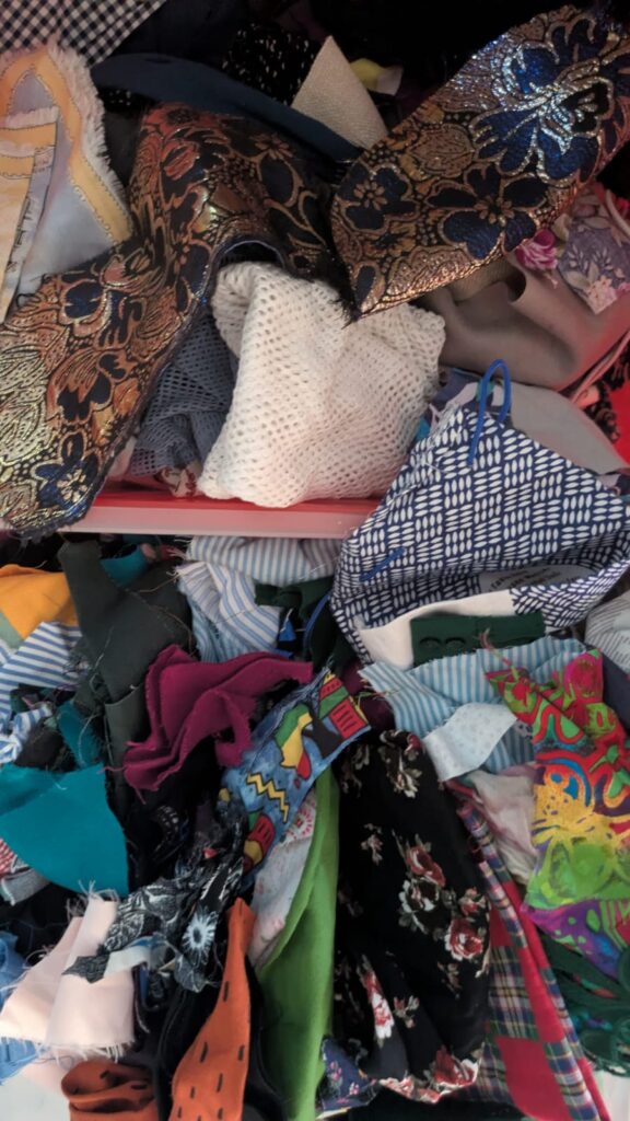
One of my earlier experiments was making a collage out of paper scraps, so this time I decided to try it out with fabrics. Since I have been working a lot with fabrics in fashion school and I have so many leftover fabric scraps, I decided that I could at least give this a try. My plan was to be much more detailed than I was in the end, also because I found out that I didn’t have too much of the colours that I wanted to have and I didn’t want to use new fabrics, because this was supposed to be a project that uses up some of my fabric scraps. It started out with chaos. The chaos of rummaging through all of the fabric scraps that I still have at home. Then I chose some that fit the colour and topic scheme that I was focusing on for this part of the experiment.

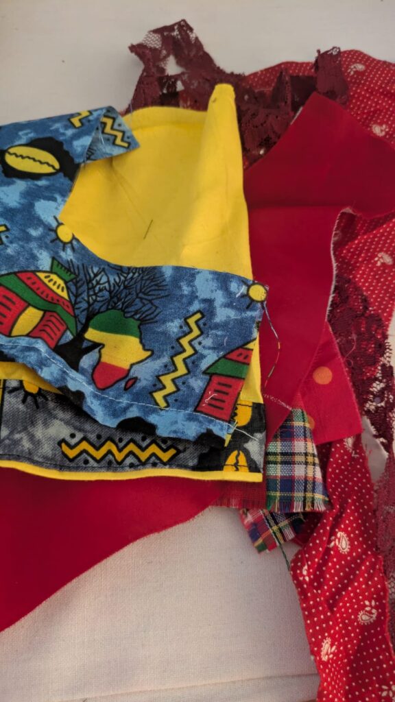
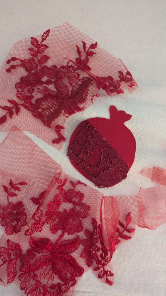
The next step was to try to choose which of the coloured fabrics to use for which motive and cut it out, while trying to focus on which kind of fabric to use for what part of the project and what structures to combine for the right outcome. For the first part I worked solely with red fabrics and decided to just use the fancier ones, since the others just didn’t seem to work for this pattern-wise. I ended up choosing an old fabric of a ballgown and some lace to cut out a pomegranate, again standing for Iran, as well as some lace detail, to make it more interesting structure-wise. We are still on the same topic of using food as a political symbol for a certain culture.

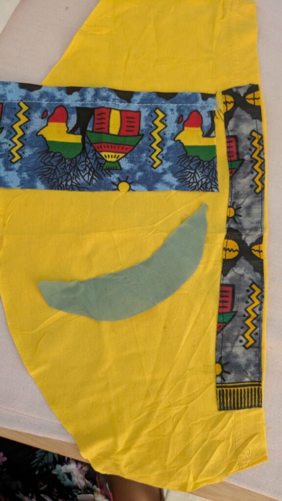
The second idea was to use more yellow and light green colours, as well as, other Ghanaian fabrics that were leftover of some t-shirts to create a plantain and some colourful background representing Ghanaian culture a little bit. Luckily I still had a few fabrics left that made this composition work, otherwise it would’ve been harder to achieve.

In general I tried to find some more fabrics for other compositions, but since I didn’t find the right colours, for instance for another watermelon or for some other fruits or vegetables that algined to my chosen topics, I decided to just stick with the ones that I could make more easily. In the following pictures you can see my end-results for these types of experiments. I recommend you to give this technique a go as well, since it is a more crafty approach and includes some materials that some people tend to not work with that often. The goal of this process would be to then also really put it on a different kind of fabric and make a full collage out of it by sewing everything onto the base fabric. But I just wanted to try out the main idea for this experiment.

Design Activism Origami

Last time, I did an experiment with sun printing or cyanotype. I also decided to do a similar thing through origami and focus again on political symbols or sometimes also possible political symbols for certain cultures. This time I tried to find some origami patterns that matched the ideas of the symbols I had and tried them out. I even inspired my mom to join me and also try out origami again, which was a really nice activity to do together. So I hope that something similar also happened for all of you with your experiments, because activities like this can bring people together, similarly as activism can bring people together.

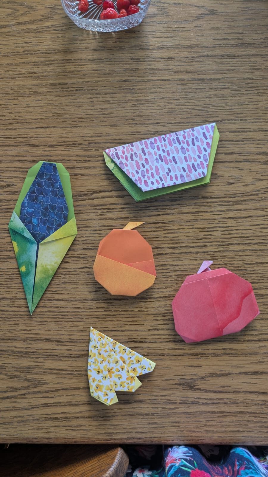
Firstly, I focused on doing a few different foods that came to mind and in the end most of them turned out to be fruit. The only different one was again the corn, in this case blue corn, since this type of corn is supposed to refer to Native Americans again (similar to my last post) that faced and are still facing a lot of injustice. I like that the scale pattern of the origami paper that I chose perfectly matches the structure of corn and makes it look even better through this.

Secondly, I did a watermelon, or tried to do one anyways, for this project it was much harder to find the right paper, since I didn’t have the right pinkish colour in my repertoire, so I chose a more purple one that at least had the structure of some of the kernels. Again, as already mentioned a few times the watermelon stands for Palestine.

Thirdly, I decided to do an orange, again as a symbol for Palestine, because I remembered that there is a book called “Oranges from Jaffa”, which discusses the issues that Palestine had and still has with Israel.

Fourthly, I made something that is difficult to distinguish, it should be three plantains, but they look more like bananas, if one can even identify them. I think those are more difficult to put to a certain country or culture, since many African countries and cultures use them a lot and identify with them. I only really have experiences with Ghanaian culture, so, therefore, I would attribute it to them, at least for the moment. I’m always also happy to change my mind and learn something new and better about them.

Fifthly, my mom made an apple. I actually wanted a pomegranate, but apparently there are not really any patterns that are not 3D. The pomegranate would’ve stood for Iran, but I didn’t manage to make one in the end. I don’t know if the apple can work as a symbol for a certain culture, since many cultures cultivated the apple, so at the moment I don’t have an answer for that. In the following picture you can see how it went. I forgot to take process pictures, so I can just show you my final result.

Design Activism Sun Printing

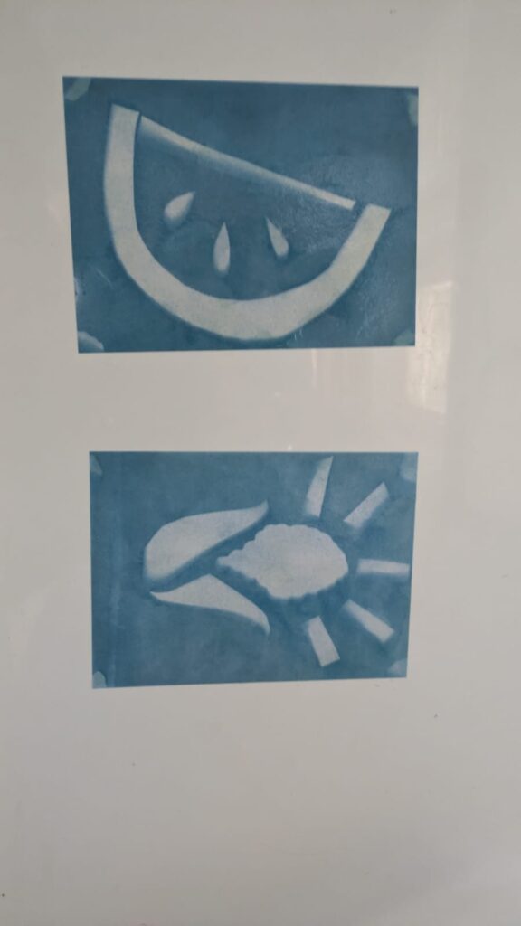
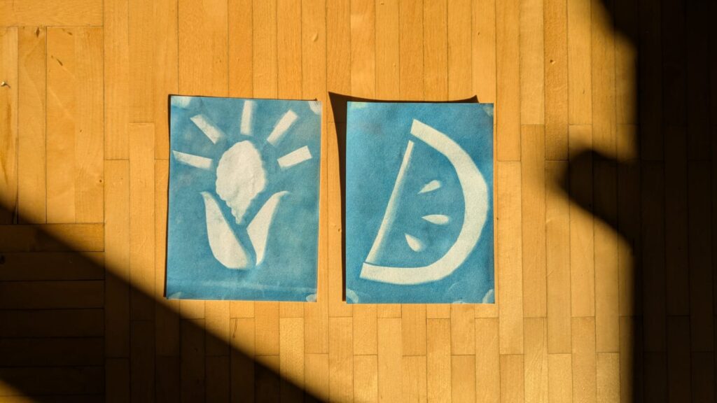
Last time, I did an experiment with ironing beads or ‘Bügelperlen/Steckperlen’, this brought me right back to my childhood. But since I have been doing many things for my Print Production submission, I thought that trying out a printing technique would nicely fit my experiments, since I’m trying to do more different analogue work. I decided on doing sun printing, because this was shown as a technique that is also a fun experiment for children, so I thought if they can do it then surely I can do it too. Since I had never done this technique before I thought that I would do it in a fairly simple way, but of course for future experiments I might be able to try out a few more complex things in this direction.

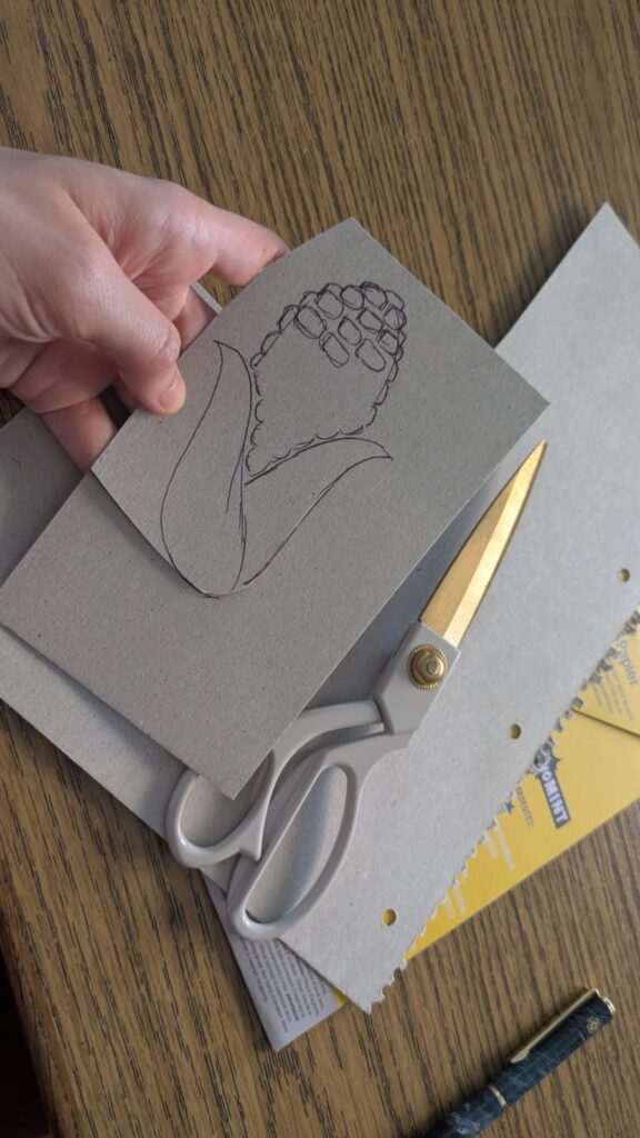
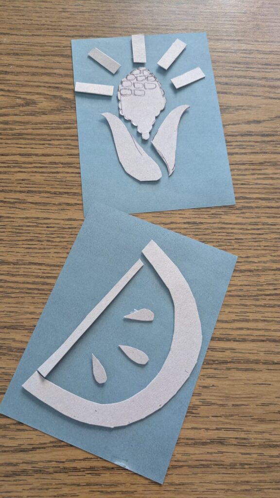
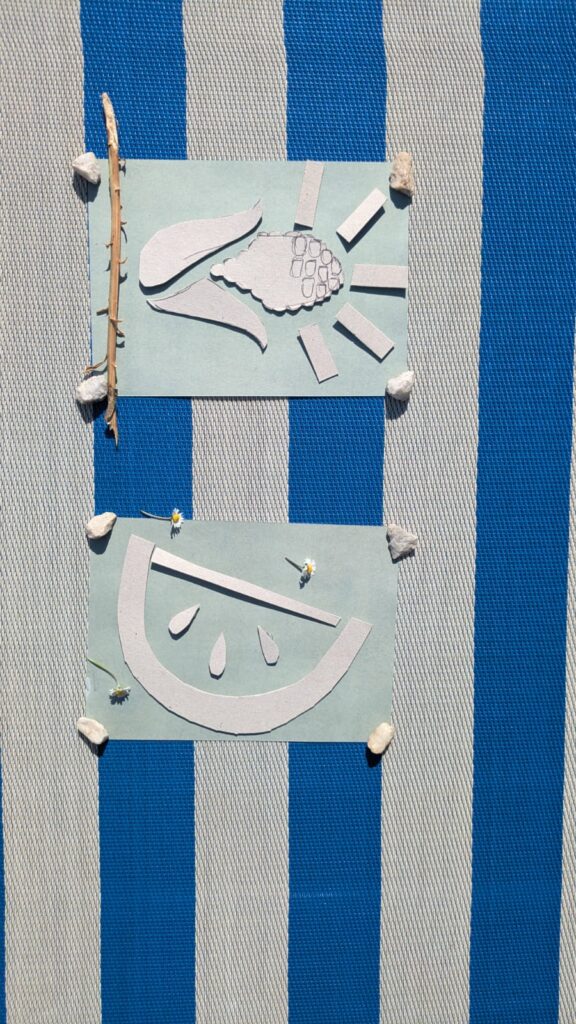
So, without further ado, I will explain how sun printing works, what the challenges were and show you how my own process went. Basically the kind of sun printing that I chose (there are several different types and options to choose from) is cyanotype. However, as I already mentioned, I did the simple version of it and just bought some pieces of paper that were already chemically treated. I had to take the piece of paper out of its light-proof packaging, there is one side that is slightly blue, this is the side that you’re supposed to work with, since this is the side with the chemicals. Then you take some bits and pieces, it can be natural materials like plants or any other material that you can think of. The important thing is to tape the pieces in place so they don’t move too much, when you put the piece of paper outside. Then you leave it there for a while around 30 mins, you take all of the pieces off and wash the paper. The colour turns into a darker blue and the part where the pieces were turns into a negative image due to the UV-rays. Then the paper dries and you have your final print.

This was a very fun process for me and I also learned a few things on what to really do ideally. I chose to just work with cutting out pieces from a piece of cardboard and then stick it to the paper with tape. When I put it outside I decided to put some stones in the corners of the paper, even though it would show up on the print, because otherwise my project would have been blown away by the wind. Then I decided to spontaneously try out putting some small natural materials on top, like a stick and some daisies, for instance. However, I was too lazy to also tape them to the paper, therefore they moved and they don’t really show up on my print, even though, some of them were still on the paper in the end. It was a nice process, I will definitely do it again and try out some more things. I again decided to stick with the topic of food as a political symbol for certain cultures. This time I chose some corn as a symbol for native americans that were and still are brutally driven out of their own lands and I chose the watermelon as a symbol for palestine again.

Design Activism “Bügelperlen/Steckperlen”

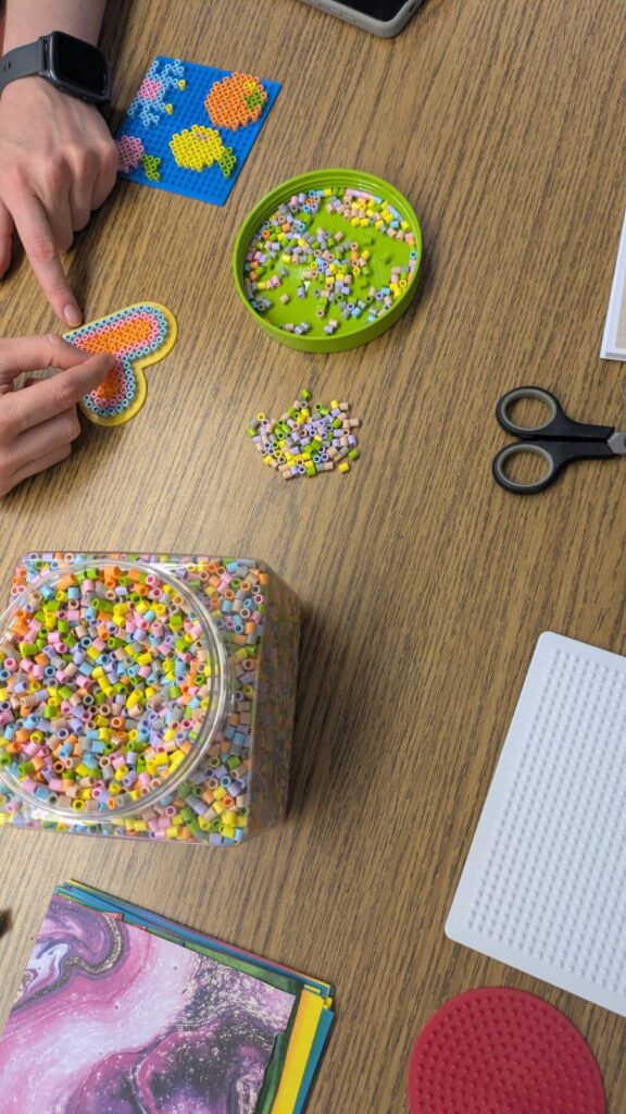
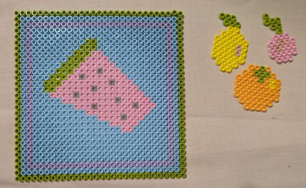
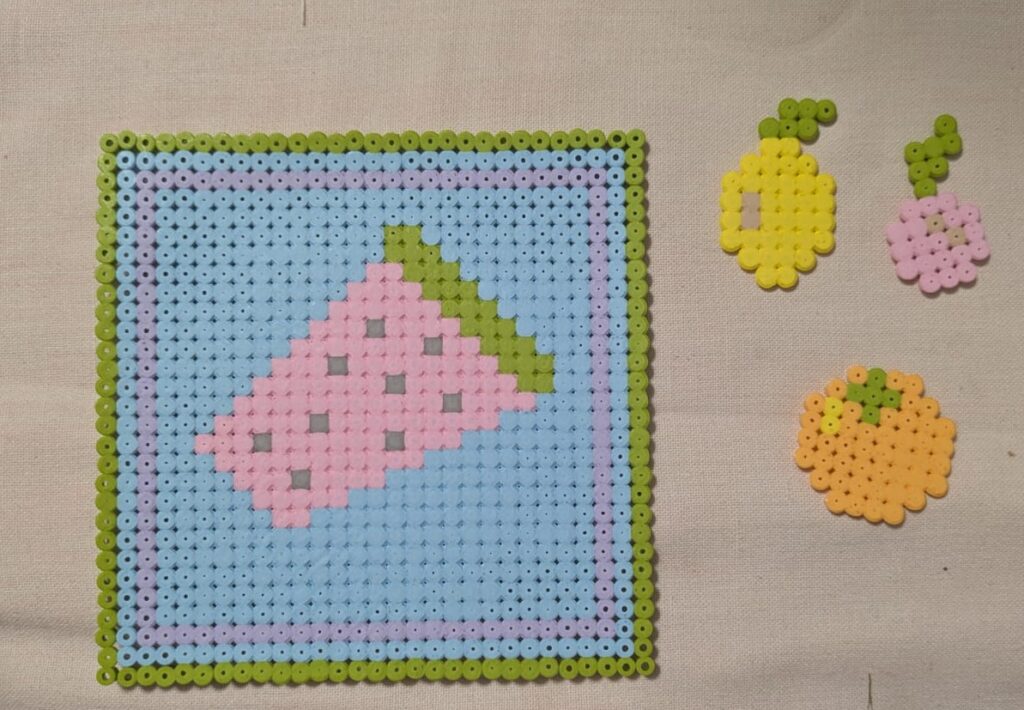
Since I wanted to try out some very different methods for this process of experimenting with different things, I decided to take a trip back down to memory lane and experiment with “Bügelperlen/Steckperlen”. I couldn’t really find the right english equivalent for this word, but maybe it is ironing beads or something similar. These are small plastic beads coming in different colours that you can form shapes with and then put some paper between them and the iron and iron them flat so that they melt together. With this technique you can make coasters out of them or charms or anything that is flat and comes to mind really.

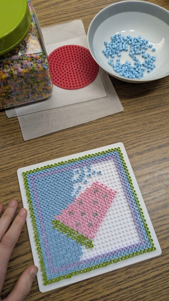
The process is quite simple and repetitive, depending on the motive that you’re trying to make and the size that you want to make it in. You have a plate that is specifically made for these beads that has several elevated areas. The beads are not round, but cylindrical and have a hole right through the middle. This hole is supposed to be put on the elevated area in the plate so that the motive stays in place when you’re building it and especially also when ironing later on. Then you can either think about how to make something on your own or try to find some examples in the internet. I tried both methods, in order to see how each one works. The more creative approach is of course trying out how to create your own motive. It is a simple process, but it can take a while and needs a lot of patience, when the pattern that you want to make is quite big. Below you can see two pictures of my process. However, I also had to seperate the beads by colour since the packages that you can buy are always mixed. This added even more time to the process. But it is still fun and takes me back to my childhood, you might also want to retry some things that you’ve done in your past, it is quite fun.

The topic that I’m working on for these experiments is still the same as you can see: “food is political”. I decided to stay with the watermelon motive from the free palestine mouvement and also made some other fruits, an orange, a lemon and a cherry. The crab and the heart was just something I added for fun. The longest of these was the watermelon, which took ages and also shows some of the limitations of this medium. It looks quite pixel based, since you also only have limited ways to place the beads and filling large areas can take quite a while and be tedious, since the beads are small and you need to be able to work very precisely if you don’t want all the other beads to fall.

The last step in the process is the ironing and this ties it all together, since the beads melt into a flat mass that can later also be hanged on a window or used as a coaster, for instance, as I’ve already mentioned in the beginning. See below how my pieces turned out, front and back view.

Design Activism Silkscreen Printing

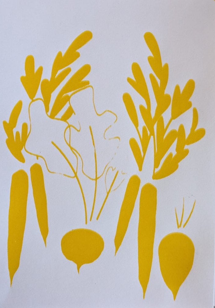
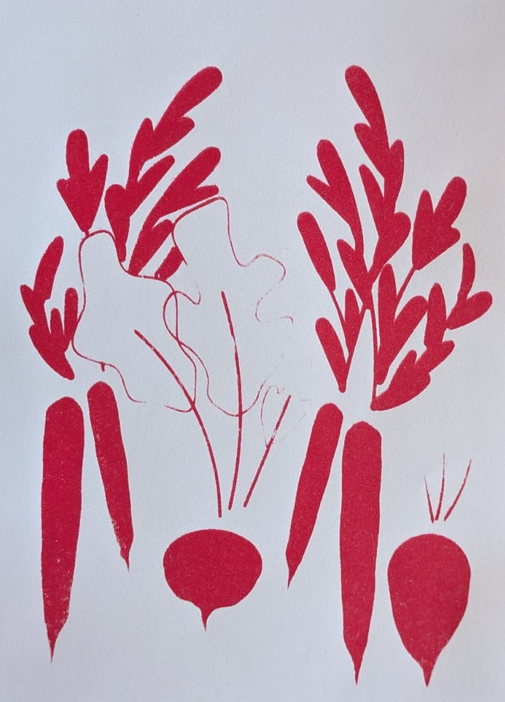
I had the chance to join a silkscreen printing workshop and decided that it would be a nice addition to my experiments. I was only able to do one print, since you have to prepare the silkscreen accordingly and I only had the option to use one screen, therefore I really had to think about how I could get the best out of it.

In the beginning, we were told how the process works. On the first day we had to prepare a black and white image or text that we wanted to print and then we had to start prepping the screen. Each one of us were given a screen according to the size of our image. It was already prepared and had a paste on it that was reactive to light. We then placed our images on top and went into the dark room, where we exposed it to light. She mentioned that it needed at least 8 hours, so we had to start the rest of the printing process on the next day.

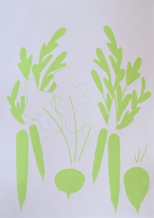
Therefore, when we came back in the morning, we took our screen and washed it carefully with a pressure washer, so that our motifs became visible, since the paste only stayed in the areas without the image. When we were done with this part everyone got to mix some colours I decided on doing a light green, a red, a yellow and a dark blue, to get some different print options in the end.

Then we were able to start printing, all of us got a ‘Rakel’ (the tool that you use for the printing) and she explained the process once more. First, you put some colour just above your image, but you have to be careful that it is not too much and then you use the Rakel in the right angle and put a certain amount of pressure on it while filling the whole image with colour. Once you are finished, you take the rest of the colour that is left on your screen and put it back into the container. If you want your images to look well-made and clean it is advised to wash the screen after each print or after two prints in a row. This is a little tedious, but the results really showed the difference. I also realized that it will take a bit of time to get the hang of it, since you can easily tell when you’ve used too much colour and when you’ve not washed the screen enough, since the colour that is still on it then dries.

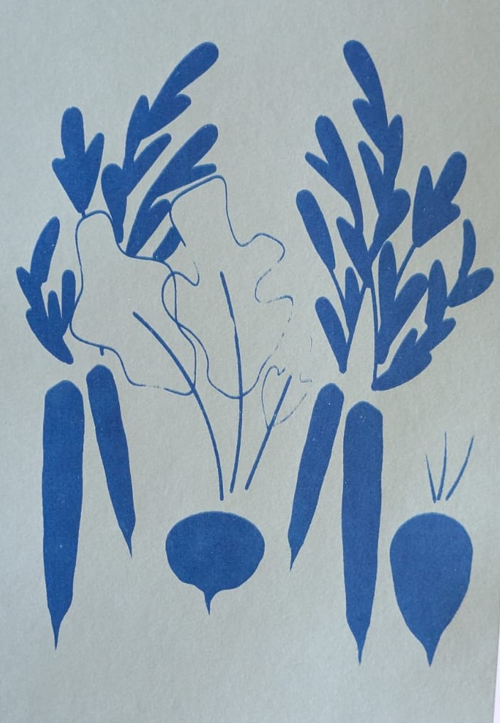
I decided to use make a similar print to what I’ve already tried out with the collage experiment. I made a vegetable print that featured carrots, a beet and a radish (on the topic of “food is political” as I’ve already mentioned in the blogposts before). The dark blue ended up on a mint green paper since the colour came out much nicer in this combination. Below you can see my results. Even though the process was sometimes a bit tedious it was a lot of fun and I also learned that the lines should not be too thin when doing silkscreen printing.

Design Activism Collage Part 2

If you’ve been reading my blog posts you know that my last experiment was focused on doing collages on the topic: “food is political”. In my last post I got a bit into how my process started and talked mainly about how I was able to find my topic and which factors make the sentence true on several different levels. I focused on privileges and the accessibilty of food, as well as how food is tied to survival and can be tied to cultural identity. To add to that, I already started mentioning that food has been used either as a symbol for political mouvements or as a way of dealing with historical pieces of art or statues of questionable people, when vandalizing these with food.

As I’ve already mentioned in my last blog post, my process was rather messy, but I think with collages this is mostly the case anyways. I started to search my box of scraps to find some things that might be used for food, first I started to search for certain colours that remind me of specific vegetables. But I also searched for pieces of food and things associated with food. In the following picture you can see just how messy my process really was.

I decided to focus on doing three collages that were focusing on different aspects of “food is political”. In one of them I wanted to show different types of vegetables as a symbol for farmers implying the different accessibilty of food over time. In the second one I wanted to show how charged it has become to see objects that are associated with watermelons, and how easily the Free Palestine Mouvement can be implied, when adding a view conceptual changes to it. In the last one I tried to show that food connects people and is also a symbol of identity, people tend to identify themselves through food, especially in Europe a table full with different types of foods shows wealth that isn’t only measurable in money.

As I’ve already mentioned, with the collage you can see on the left below, I was trying to find ways to show vegetables without cutting them out as finished versions already. I searched for different colours and thought about whtat they reminded me of and then proceeded to find the leaves or other parts that might match and make sense for the composition. In the collage you can see a tomato, an aubergine, a carrot, a beet and a zucchini all perched upon a cutting board. These are supposed to show an everyday situation, implying the accessibility of food, as well as, the history of farming.

The poster in the middle is focusing on palestinian identity, as well as the free palestine movement. The watermelon set of tableware just came at the exact right time, to clearly show that it is supposed to make sense in a palestinian context, I added some tiles that reminded me a bit of the palestinian fabrics that also show elaborate patterns. To add to that, the stars above showase freedom and to fight for freedom usually some tools are needed, in this case the cutlery.

Finally, the poster on the right explores cultural identity through food. It showcases a table filled with food, and adds some botanical details reminding that food always somehow comes from nature. This again features the question of accessibilty and that in certain areas of the world having a table filled with food can be considered normal, even if it shows great privilege.

All in all, this experiment was a really fun process and it opened my eyes to making collages in a simpler way that is really fun and also creates outcomes that really make sense and work for certain projects.

Design Activism Collage Part 1

In my second experiment for my Design Activism topic I decided to go for the classic approach of trying out some collages. For this I first had to decide on a topic, since Design Activism can come in many different forms and it would’ve been harder to work on several different topics at once. So for this first try in collage, because I haven’t done them in a while and I also haven’t liked my previous tries at collage very much, I have to say that I’m quite happy with my process, as well as, the outcome.

Firstly, I gathered some materials, luckily since I cannot seem to throw away stuff easily, I’ve already been preparing for doing collages for years, in case I someday want to do them. Therefore, I had a big box full of magazine scraps and textured papers that I wanted to scour for some useful things that I might be able to integrate in my collages. To add to that, I prepared some differently coloured papers as a background for my collages.

It took me quite a while to think about what kind of topic might be the right approach for these experiments that I’m doing, therefore I decided on trying it with the topic: “food is political”. Food is something important to every human being, since it is necessary for survival and, therefore, one of the central topics of life, whether we want it to be or not. Some people eat food to have energy to do the things they enjoy or have to do in life and some see food as something that can be enjoyed and does not only serve to keep the body functioning. As we all know, food is something that can put countries in crisis since it is so very necessary for our survival, this means that food has always been and will always be political, even if many people might not want to see it that way. Even in earlier times, farmers could not freely decide, who gets their food, because there was always someone else they had to listen to and they had to serve to even be able to afford having their own fields. Nowadays, access to food is also not certain for everyone. Depending on how privileged you are, in which country you live and what kind of work you are able to do already changes the accessibility that you might have to daily goods for survival. Usually it also depends on how much money you have, whether you can afford to make healthier choices or have to stick to whatever is available for cheaper prices. To add to that, many cultures build their identity based on typical foods, which makes different types of vegetables or grains culturally loaded and also victims to colonization, as can be seen by researching African plants, for instance.

Food has also been used as a symbol for several different political mouvements. Whether it is by throwing different kinds of food at pieces of art or vandalizing statues of people that have been doing questionable things during history or just using a certain type of food for a certain mouvement, e.g. watermelon for Palestine. These are all things that I have kept in mind during my collaging process. If you’re interested and want to follow along and see what kinds of collages I made, there will be a part two of this long process. 🙂

Design Activism Interview

I know I am quite late to be starting with my blogposts for this semester, but I’m trying. I’m currently in one of the hardest periods of my life so far, so please, bear with me.

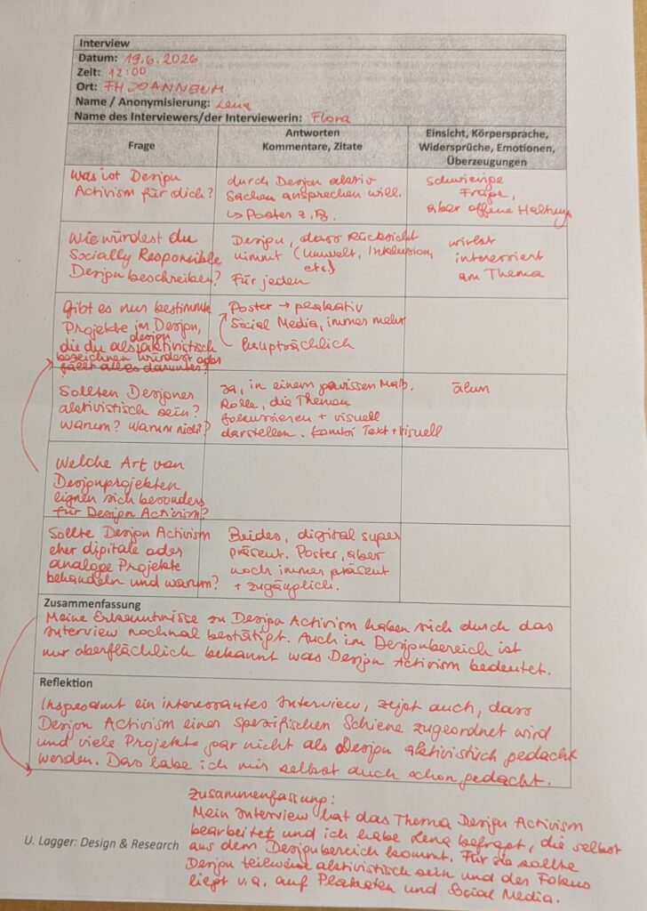
I decided to do an interview for my topic of Design Activism, but since I’m still missing my research question, finding interview questions turned out a little harder than I thought. For this exact reason, I currently only interviewed one person, because I wanted to find out if the questions would work and what results I could get. For my master’s thesis I will probably be reworking the interview, in order to make it more specific and accurate for my future research question. I decided to focus on how Design Activism is viewed by people within the Design industry. For this I decided to interview Lena, who turned out to be a really good interviewee and confirmed many of the thoughts that I had about designers dealing with Design Activism, so thank you for that.

In the beginning I instantly wanted to start with some hard questions, because it gives me a better idea what designers might know about Design Activism without having spent time researching it in-depth. So my first two questions were: What is Design Activism for you and how would you describe Socially Responsible Design? Lena told me that Design Activism is when someone actively talks about things through design, while Socially Responsible Design is design that takes things into consideration (for instance, environment, inclusion, accessibility, etc.) it is Design that is for everyone.

In the next step I asked her which types of design projects she would describe to be design activist and she said that she mainly thinks posters and social media are platforms people use to show design activist work. This showed me that, as I thought, the main idea of activist work nowadays (excluding demonstrations, of course) is being presented and spread throughout social media or posters. Lena mentioned that although many things happen on social media nowadays, posters still have a lot of power and are sometimes even more accessible to people than social media. This is also why she thinks that both the digital and the analogue space are important for Design Activism, since they are accessible for different people and the message can be spread in numerous ways depending on the area, where it is shared.

Last but not least, I wanted to know if designers should show activist work or not and Lena answered that to a certain degree designers should add activist works, because they are responsible for focusing on and showing certain topics in a visual and easily understandable manner, so people might be able to understand some causalities better.

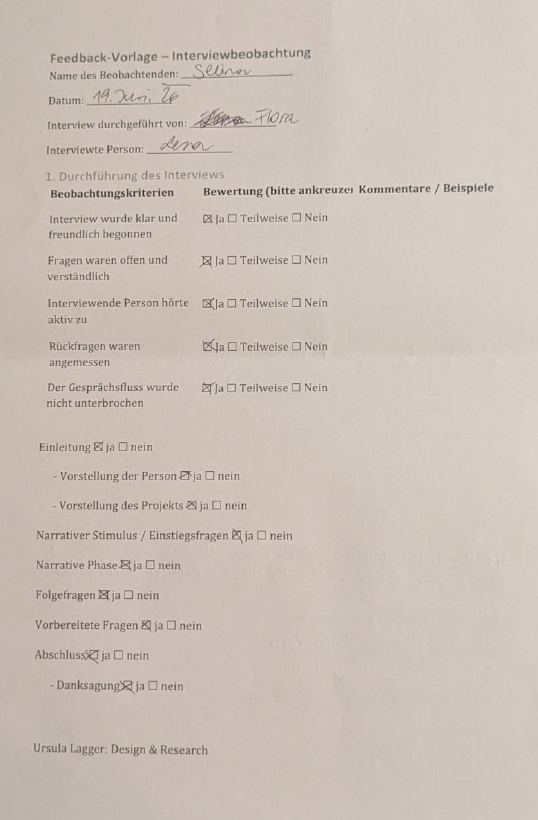
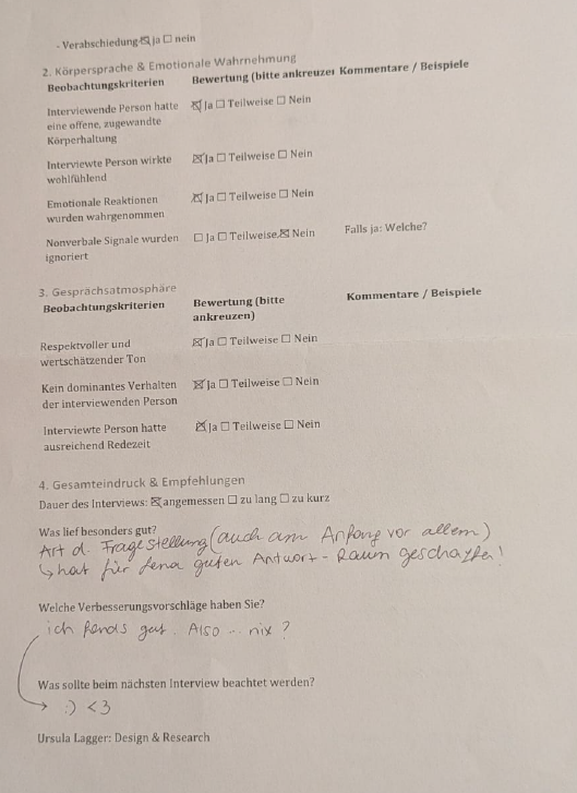
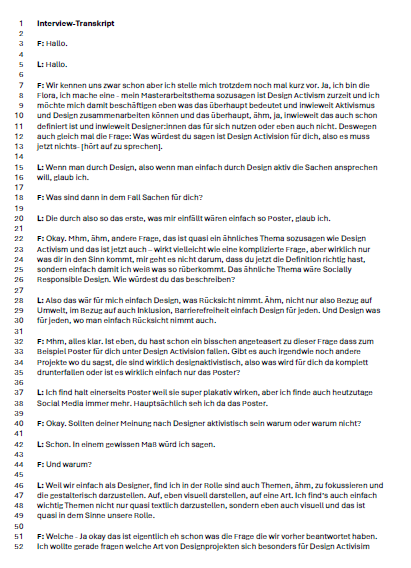
Thank you Lena for the interview and for the experience of professionally creating and conducting an interview! And thank you Selina for the observations concerning my interview. Below this blogpost you can see my interview notes, a short summary and reflection on the interview, the observation sheet from Selina, a Feedback from Lena and the transcript of the interview. Keep in mind that it was conducted in German so all the mentioned documents are in German too, sorry.