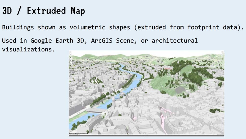
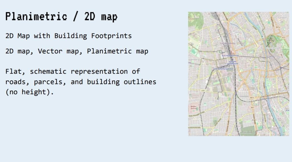
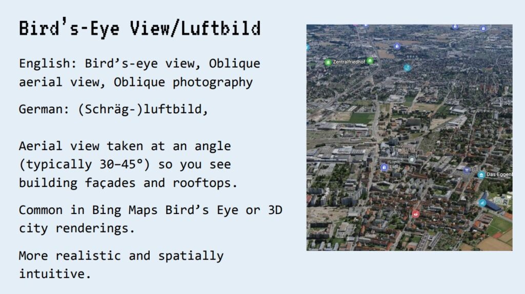
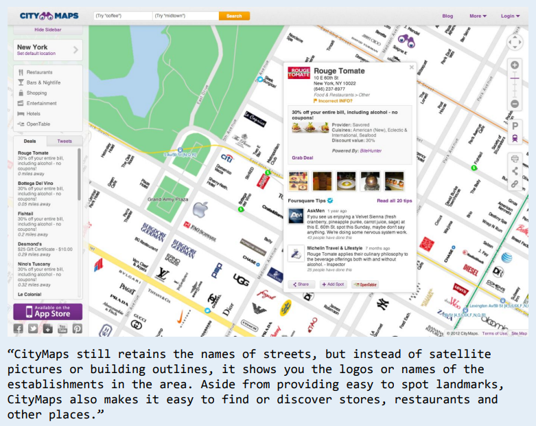
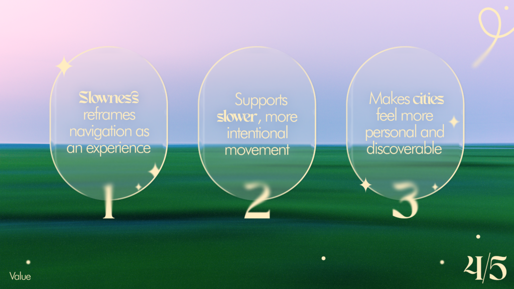
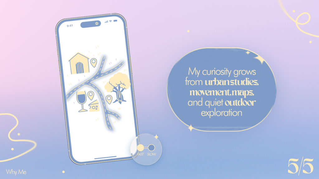
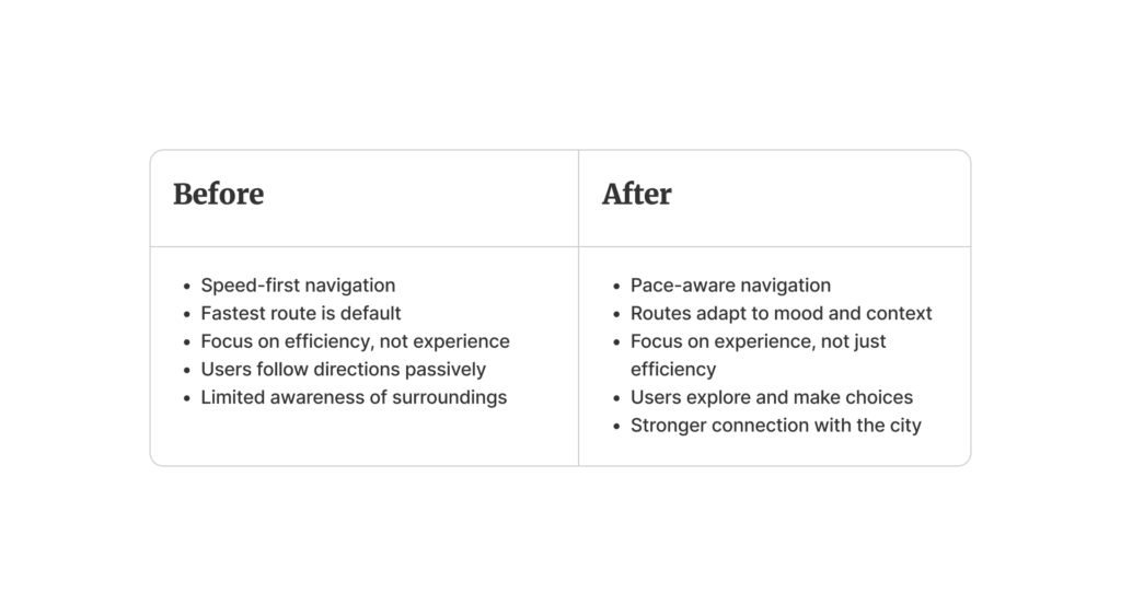
Continuing my research on the topic of “Slowness”from last semester, I will be doing further work on this topic as part of the Design & Research II course with Birgit Bachler PhD.
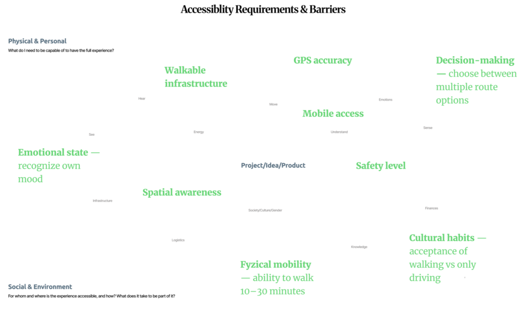
For the final assignment, I will need to record a 2-minute video of the final prototype — in my case, I plan to use prototyping in Figma, which each of you will be able to test. The research will again focus more on contextual analysis, as well as user testing, bibliography, and heuristic evaluation.
Comparing default routes and experience-based routes 🛣️
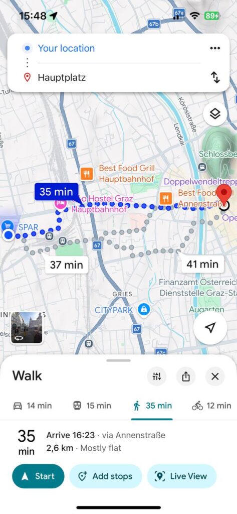
For this post, I decided to conduct a small practical experiment and compare a standard navigation route with one that more closely resembles the concept behind my future app. I chose the same route: from my current location to Hauptplatz in Graz. It was important to me to look not only at the time and distance, but also at how the walking experience itself changes.
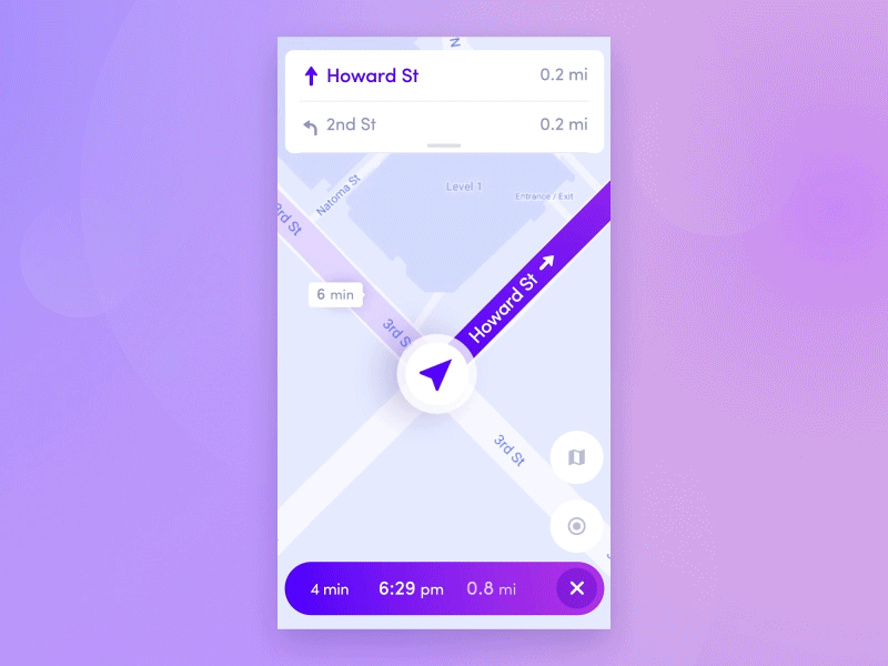
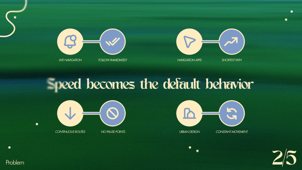
On Google Maps [1], the standard route looks very straightforward and functional. The app suggests the fastest option: 35 minutes, 2.6 km, mostly along Annenstraße. This is convenient if the goal is simply to get to your destination. But with this option, the walk feels more like a task: follow the line, don’t get distracted, and reach your destination.
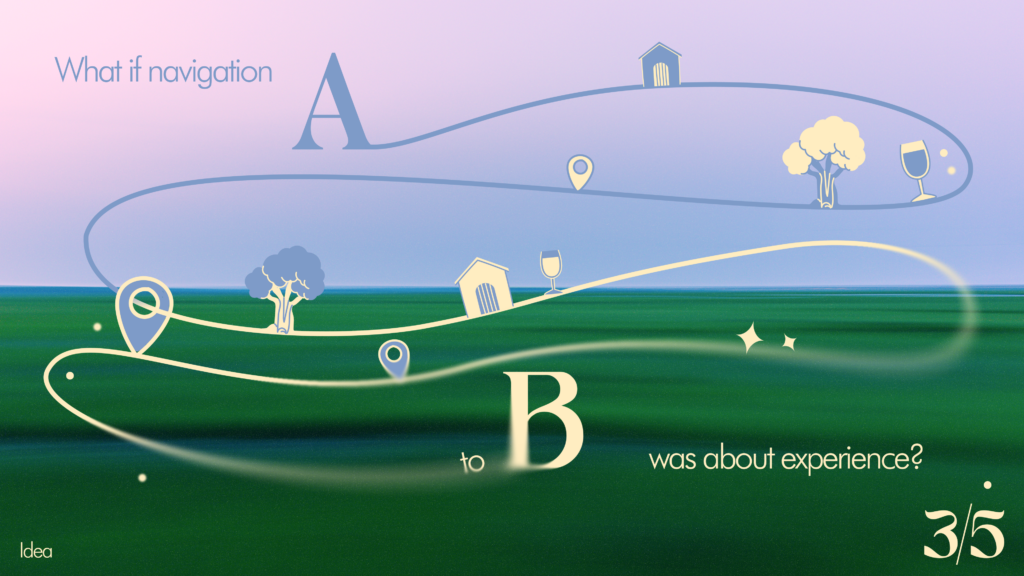
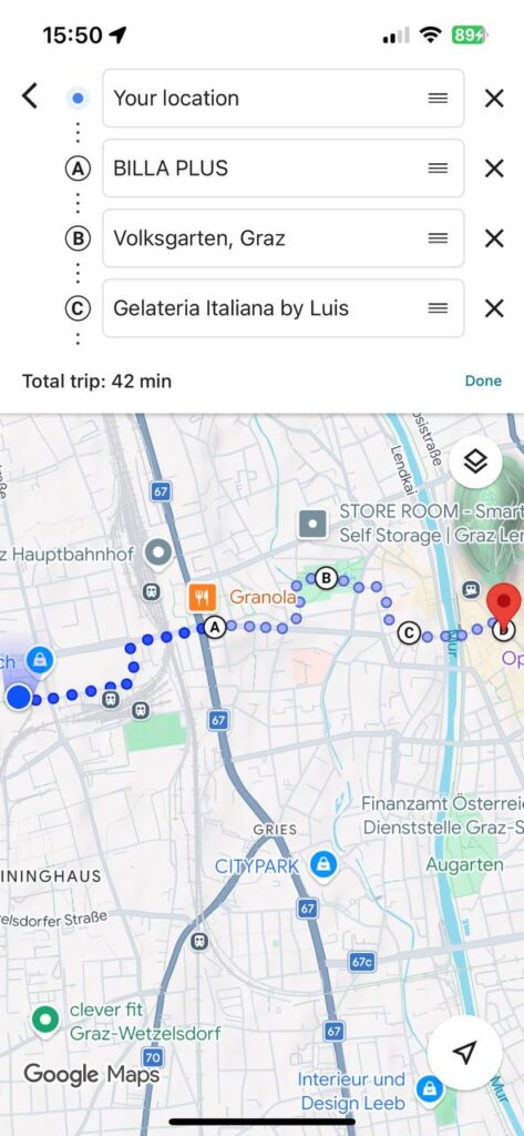
Then I manually created a second route in Google Maps and added stops: BILLA PLUS, Volksgarten, and Gelateria Italiana by Luis, and only then—Hauptplatz. The time increased to 42 minutes, but the route itself became completely different. It’s no longer just a path from point A to point B, but a little walking itinerary: pop into a store, walk through the park, buy some ice cream, and only then head to the center.
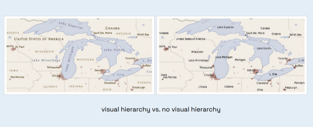
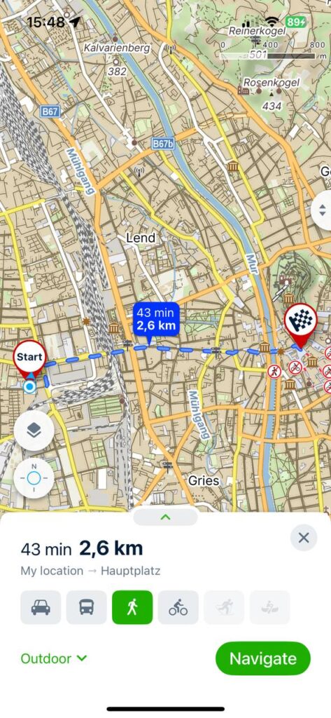
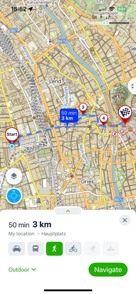
I also ran the comparison on Mapy.cz [2]. The direct route is shown there as 43 minutes, 2.6 km, while the route with additional stops is about 50 minutes, 3 km. What I especially liked about Mapy.cz is that the urban environment itself is much easier to make out. You can see parks, green spaces, paths, the terrain, the river, and the neighborhood’s layout. The map looks more detailed and “outdoor-oriented.” Visually, it’s not as minimalist as Google Maps, but for my purposes, that’s actually a plus because it helps me not just walk, but understand the space around me.
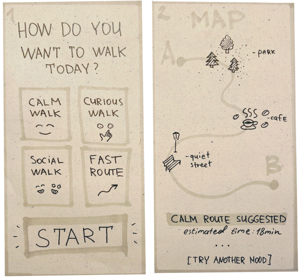
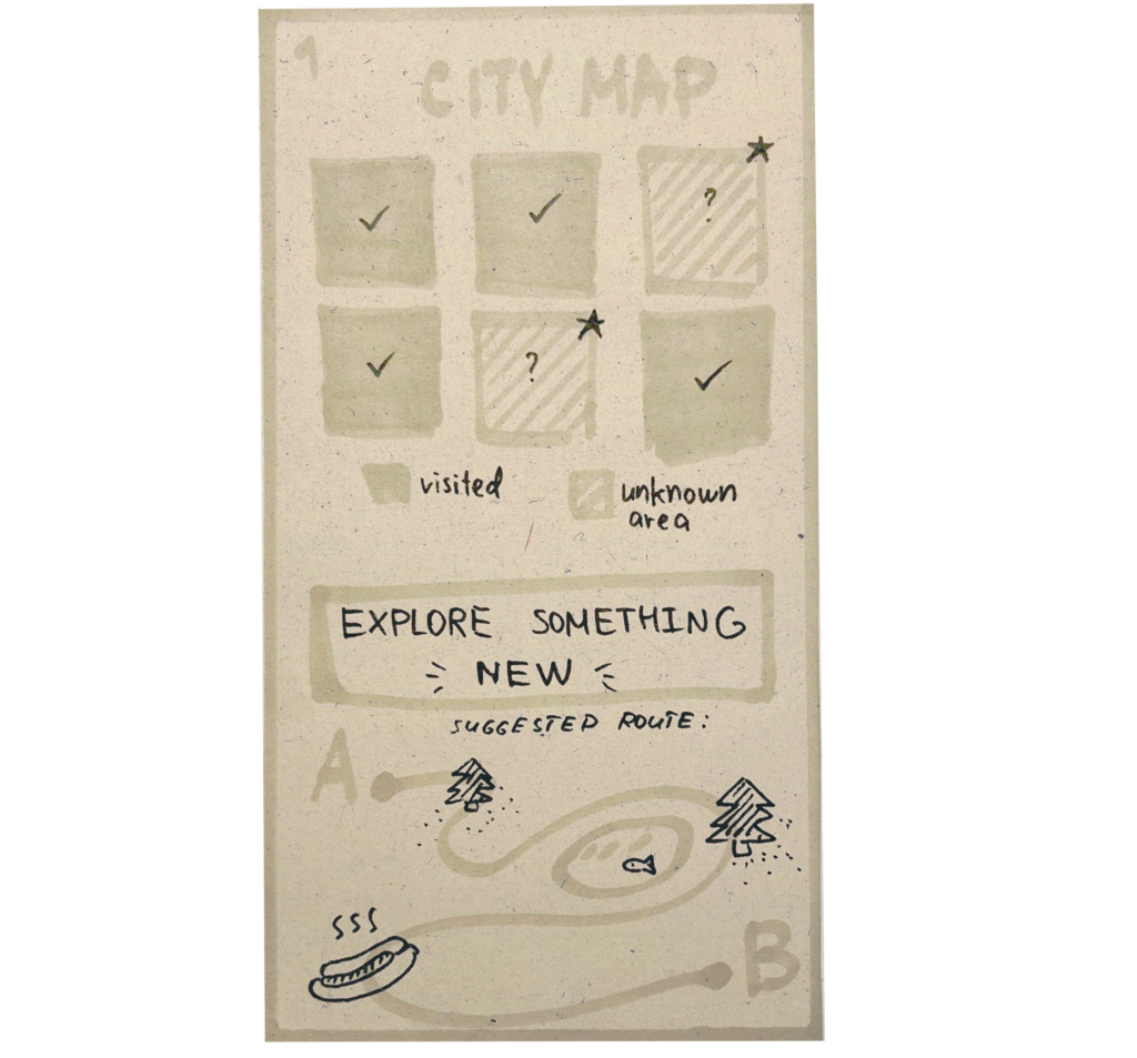
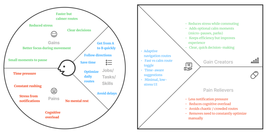
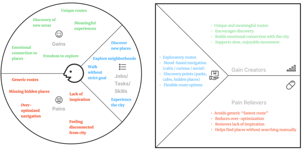
This experiment helped me better understand the concept behind my app. I don’t just want to make routes longer. The idea is for users to be able to choose not only their destination but also the type of route: fast, leisurely, green, adventurous, social, or with short stops.
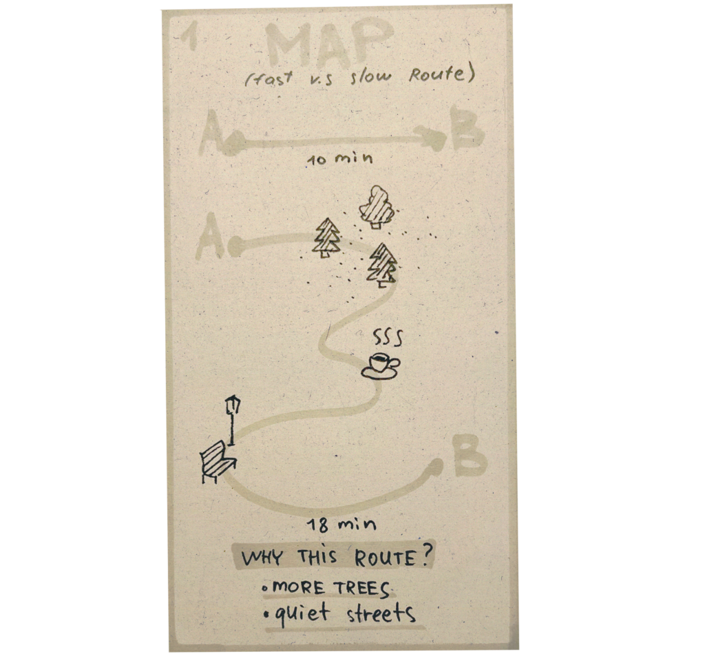
In the next prototype, I want to develop this logic further. For example, if a user selects a “slow route,” the app could automatically suggest a path through a park, a quiet street, a café, or a spot for a short stop. In other words, the map becomes not just a navigation tool, but also a tool for planning a walk.
This test showed me one simple thing: navigation doesn’t have to be just about the shortest route. Sometimes an extra 5–10 minutes can make a route much more enjoyable, personal, and memorable.
Sources 🛈
[1] Google Maps. Google LLC. Available at: https://www.google.com/maps
[2] Mapy.cz. Seznam.cz, a.s. Available at: https://mapy.cz