Blog Post 10: Starting from the Exhibition

At this point, I do not want to close the topic too quickly or pretend that I already have all the answers. What feels more realistic, and more useful for my future master’s thesis, is to treat this phase as the beginning of a longer process. Instead of ending with a final conclusion, I want to move toward a format in which the research can continue through practice.

One direction that feels especially right to me is to use an exhibition as the starting point of the thesis. I imagine it as a space built around different kinds of illusion, perception shifts, hidden meanings. But the exhibition would not function only as a final presentation of work. It would also become part of the research itself. What interests me is not only how to create these visual situations, but how people move through them, where they stop, what confuses them, what attracts them, what they remember, and what kind of emotional response they produce.

This feels important because it gives me a way to connect theory and practice more honestly. Until now, I have been researching attention, memorability, ambiguity, emotional response, and viewer participation mostly through writing, references, and examples. The exhibition could become the point where these questions are tested in a direct way. It would allow me to observe reactions, collect impressions, and continue the research based on actual experience rather than only assumptions.

For that reason, I see the next step not as finishing the topic, but as building the conditions to study it further. I want the master’s thesis to begin with making, observing, and then writing from that material. The practical work would come first, but not as something separate from research. It would become the source from which the next questions emerge. In that way, the project can stay open, but also become more precise through the responses it provokes.

Blog Post 9: Reflecting on the Methods

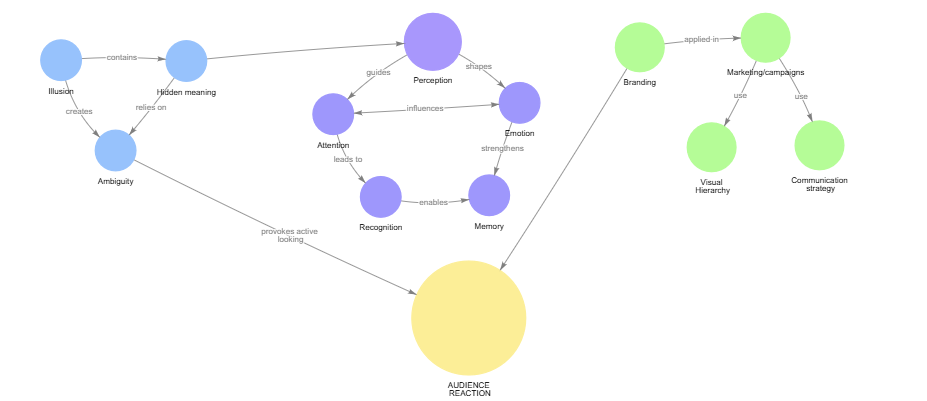
What helped this project most was starting to structure it through actual methods instead of only reflection. The concept map made the relationships between the key terms clearer and showed that the topic is no longer centered on illusion alone, but increasingly on audience reaction, attention, and guided perception.

The interview was important for a different reason. It tested these ideas through an actual viewer’s response and made the topic less abstract. Lorenzo’s point that ambiguity can either create fascination or turn into visual chaos was especially useful, because it made the role of structure much clearer.

Together, these methods helped narrow the project in a more grounded way. Instead of only collecting ideas, I was able to see which concepts are central, how they connect, and which direction feels worth developing further.

Blog Post 8: Artistic Illusion vs Commercial Illusion

A useful distinction in my research is the difference between artistic and commercial illusion. Although both use ambiguity, layered meaning, and delayed recognition, they are built around different intentions. Commercial illusion is outcome-oriented: it has to support brand recall, clarify identity, and direct the viewer toward a specific message. Artistic illusion does not carry the same obligation. It can remain open, unresolved, and more dependent on the viewer’s own interpretation.

This distinction is important because it clarifies the split between the theoretical and practical parts of my project. The theoretical part is moving toward a more structured question: how visual form directs attention and emotional response. The practical part, however, will not try to imitate branding logic. I am more interested in building an experience in which meaning is not fixed in advance, but develops through the viewer’s own reading.

That is why, in the practical outcome, I want to work closer to artistic illusion. I want to leave space for uncertainty, projection, and multiple interpretations instead of leading everyone to the same conclusion. The value of the work, for me, lies precisely in that openness. If the viewer immediately arrives at one closed answer, the experience becomes shorter and less personal.

Blog Post 7: The Viewer as Participant

A clear conclusion from the research so far is that the viewer cannot be treated as a passive receiver. Hidden meaning, ambiguity, delayed recognition, and visual surprise only function when the viewer actively completes the message. What matters, therefore, is not only what the design contains, but what kind of action it demands from the person looking at it.

This participation is not limited to physical interaction. It can be perceptual, when the viewer searches for structure or a second reading; cognitive, when meaning has to be interpreted; and emotional, when recognition produces curiosity, tension, or satisfaction. These are not secondary effects. They are part of the communicative mechanism.

This is an important shift in the project, because it moves the focus away from illusion as an end in itself. The stronger question is how design creates the conditions for participation without losing control of the message. From this point onward, the viewer’s role becomes central to the thesis, not as a general idea, but as a concrete design problem.

Blog Post 6: How Form Directs Feeling

After focusing on attention and memory, I started looking more carefully at the formal side of visual response. If some images hold us longer than others, that cannot depend only on hidden meaning. It also depends on how the image is built. Shape, contrast, scale, spacing, and hierarchy do not simply organize information. They shape the emotional and perceptual conditions in which information is received.

One of the clearest findings I came across concerns shape. Studies repeatedly show a general preference for curved forms over angular ones, while sharper forms are more often associated with tension, alertness, or even threat. That is important to me because it means that visual response begins before conscious interpretation. Form already sets a tone. The same is true of hierarchy. Eye-tracking research shows that viewers do not move through an image evenly. Their attention is guided by contrast, scale, grouping, and placement. In other words, design does not just communicate meaning. It directs the path through which meaning becomes visible.

This makes me think differently about ambiguity. A hidden meaning is not effective on its own. It depends on whether the rest of the composition leads the viewer toward discovery or leaves them lost. Surprise becomes stronger when it is structured. Ambiguity becomes engaging when it is supported by control. What initially seemed to me like a question about illusion now starts to look more like a question about visual guidance.

Blog Post 5: Why Some Images Stay With Us

At this point in the research, I am becoming less interested in illusion as a category and more interested in what it does to the viewer. Some images disappear almost immediately, while others remain in the mind long after the moment of looking has passed. What seems to matter is not only what is shown, but how the viewer is made to encounter it. The more I read, the more I see that attention, surprise, and memory are closely tied together.

Research in visual memory suggests that people are capable of remembering a surprisingly large number of images in detail, especially when those images are distinctive and meaningfully processed. This makes delayed recognition particularly important. When an image does not reveal itself all at once, it creates a short cognitive pause. That pause is not empty. It becomes part of the experience, and perhaps part of the reason the image is remembered more strongly. In this sense, ambiguity may work not because it hides meaning, but because it turns recognition into an event.

I also found that surprise plays an important role here. Unexpected visual information tends to interrupt routine perception and can strengthen encoding, especially when the viewer has to resolve or reinterpret what they are seeing. This gives more structure to something I had mostly understood intuitively before: the moment of “getting it” is not just satisfying, it is cognitively active. Curiosity, tension, and reward are not side effects of visual communication. They may be part of its mechanism.

This is beginning to change the center of my project. I am no longer asking only how illusion works as an effect, but why certain visual experiences stay with people while others do not. That shift feels important. It suggests that the stronger topic may not be illusion itself, but the relationship between perception, attention, and memorability.

Blog Post 4: From Hidden Meanings to Public Spectacle

At this stage in my research, I feel the need to move away from speaking about illusion only in theoretical or artistic terms and begin testing it through real commercial examples. If illusion, ambiguity, and layered meaning are truly relevant to contemporary visual communication, then they should be visible not only in galleries, installations, or experimental design, but also in branding systems, advertising campaigns, product packaging, and promotional strategies that compete for attention in everyday life.

What interests me here is not simply whether commercial design can be clever, but whether visual cleverness actually does something. Does it make people remember a brand more easily? Does it reward attention in a way that strengthens emotional connection? Or does it sometimes stop at the level of spectacle, creating visibility without meaning? These questions have led me to look more closely at examples in which illusion or layered perception is used not as decoration, but as part of communication itself.

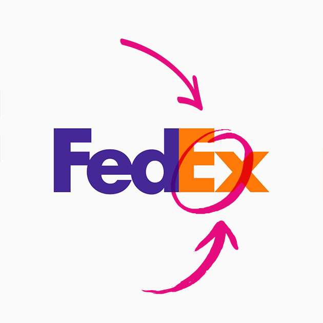
Some of the most well-known logo examples suggest that hidden meaning can be effective when it is both subtle and conceptually aligned with the brand. The FedEx logo is perhaps the most obvious example. Its hidden arrow, formed in the negative space between the “E” and the “x,” has become iconic because it communicates movement and direction without interrupting clarity. It works not because the viewer notices it immediately, but because it remains there as a quiet second layer, one that feels satisfying once discovered. The same can be said for the Toblerone logo, where the mountain contains a hidden bear that refers to Bern. In this case, the image does not simply function as a visual trick. It ties geography, identity, and storytelling together in a compressed and memorable form.

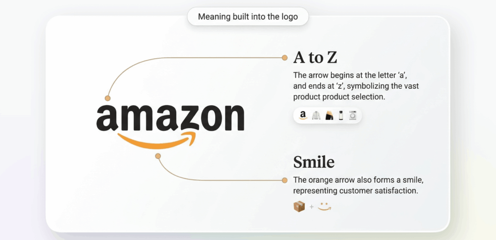
Other brands operate in a similar way, though with slightly different intentions. Amazon’s arrow connects the “A” to the “Z” while doubling as a smile, combining range and customer satisfaction in a single gesture. The older Formula 1 logo famously created the number “1” through negative space, showing how speed and reduction could work together. What links all of these examples is that they do not use ambiguity to confuse. They use it to deepen the message without sacrificing legibility.

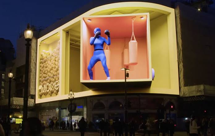
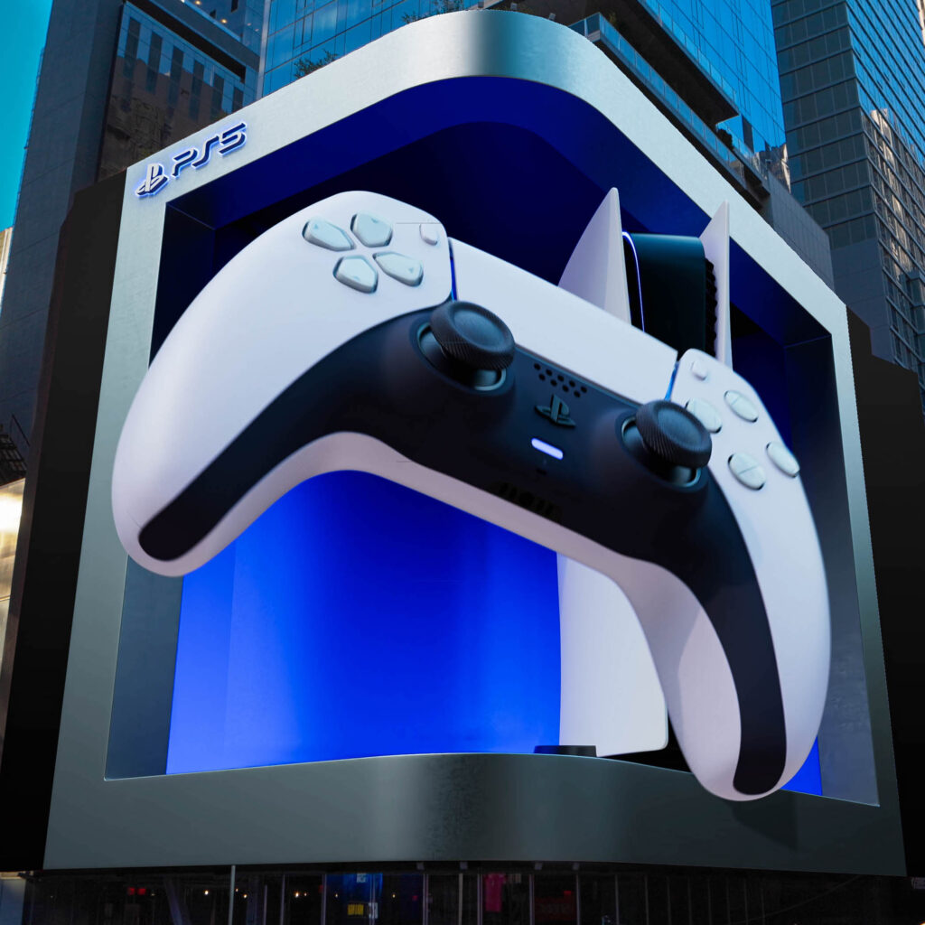
What becomes even more interesting is what happens when illusion leaves the logo and enters space. Anamorphic billboards and large scale 3D out of home campaigns have turned visual surprise into a public event. Their success depends on perspective, scale, and digital illusion, but also on something more social: people stop, film, share, and circulate them. In that sense, illusion here is not just about perception. It becomes a strategy for attention and participation. The campaign exists both in physical space and in the secondary life it gains online.

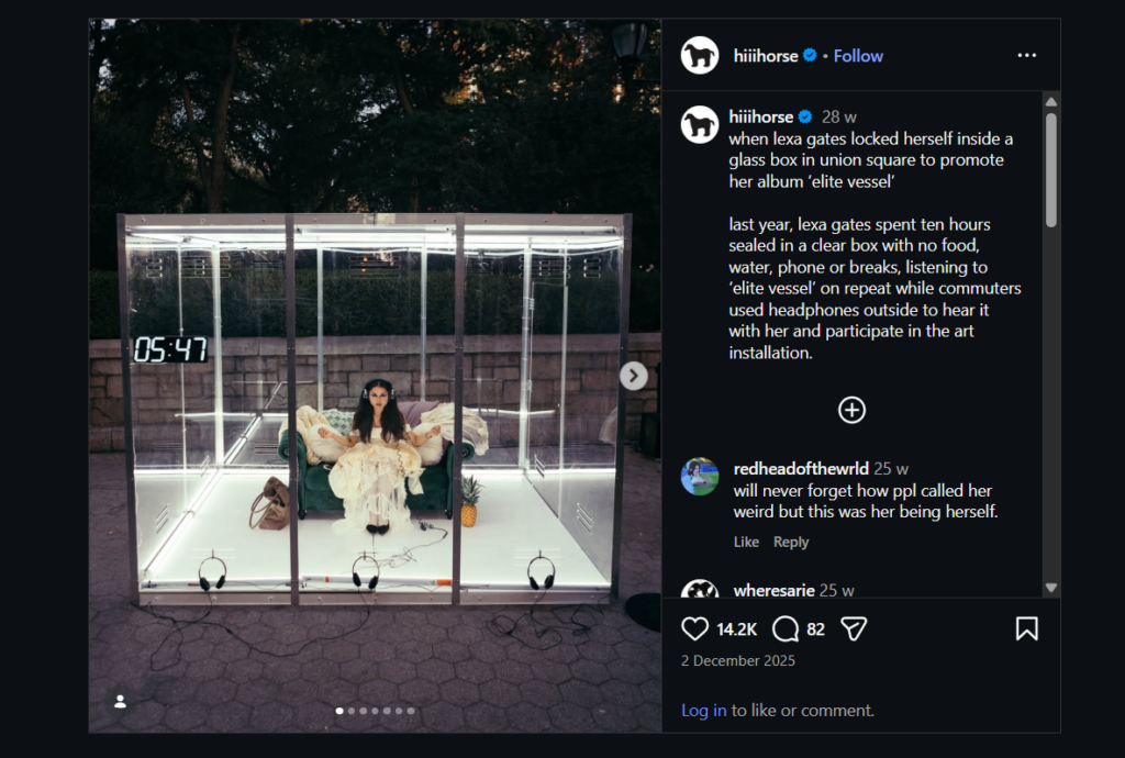
This is where more performative promotional work also becomes relevant. A case that stayed with me is Lexa Gates’ transparent box listening stunt in Union Square, where she placed herself inside a clear box for hours while people gathered around, watched, and engaged with the performance. What makes this especially interesting is that it is not an illusion in the classic visual sense, yet it still relies on spectacle, framing, containment, and public curiosity. These examples push the research into a broader territory, where visual surprise is no longer only about hidden forms, but also about staged visibility and controlled public attention.

Blog Post 3: From Perception to Persuasion

As my research develops, I find myself moving from a more artistic and perceptual understanding of illusion toward a question that feels increasingly relevant within contemporary design practice: what happens when these same mechanisms enter the fields of branding, marketing, and visual identity? If illusion can hold attention, invite interpretation, and create emotional engagement, then its role may not end in the gallery or installation space. It may also operate powerfully in commercial and communicative design.

This shift in my thinking does not mean abandoning the earlier questions. On the contrary, it grows directly out of them. If people are naturally drawn to images that contain more than one layer, then it seems important to ask how this functions in visual systems that are meant to communicate quickly and memorably. In a world overwhelmed by messages, perhaps what stays with us is not always what is most direct, but what gives us something to discover.

Branding is full of such moments, even if we do not always name them as illusions. Hidden meanings in logos, unexpected uses of negative space, double-image packaging, and visual metaphors in advertising all rely on a similar principle – they reward attention. They ask the viewer to complete something mentally, and that small act of participation can make communication feel more intelligent, more satisfying, and often more memorable. In this sense, illusion may not simply decorate a message, it may strengthen the relationship between the message and its audience.

What interests me here is the possibility that ambiguity can function strategically. We often assume that effective branding must be immediate and fully transparent. Yet some of the most recognizable visual identities are built on subtlety, suggestion, and layered communication. A logo that reveals something more upon closer inspection creates not only recognition, but also a sense of discovery. A campaign that uses visual surprise can interrupt routine perception in a way that feels fresh rather than forced. These are not only aesthetic choices, they are communicative decisions.

This has made me curious about the border between perception and persuasion. How much do visual ambiguity and illusion influence decision-making? Can a brand become more memorable because it asks more from the viewer? Does surprise generate trust, curiosity, or emotional attachment? And where is the line between meaningful visual intelligence and empty cleverness? These questions feel especially relevant today, when attention has become one of the most contested spaces in design.

Some designers and artists offer useful points of reference here. Shigeo Fukuda’s work, for example, demonstrates how with reduction, and visual misdirection can produce images that are both playful and conceptually sharp. Even artists such as Erik Johansson, whose manipulated scenes belong more to constructed image-making than branding, reveal how impossible visuals can remain persuasive when they are emotionally coherent. In different ways, these examples suggest that visual complexity can communicate with force when it is purposeful.

For now, I remain in the research phase, following the thread wherever it becomes most alive.

Blog Post 2: Why Illusion Holds Our Attention

The more I think about illusion, the less I understand it as a separate category of visual play and the more I begin to see it as something deeply connected to the way human perception works. What first appeared to me as an artistic and spatial device now seems to touch something more fundamental: our need to search for coherence, to resolve uncertainty, and to make meaning out of what is not immediately clear.

Perhaps this is why illusion has such a lasting power. It does not simply present an image, it stages a relationship between what is visible and what is withheld. It creates a small instability in perception, a moment in which the viewer cannot remain passive. Something does not fully make sense at first glance, and that very hesitation becomes compelling. In a visual culture saturated with instant readability, this interruption feels important. It makes us stop.

I have started to wonder whether the strength of illusion lies precisely in this delay. Instead of offering immediate clarity, it asks for attention, and in doing so, it changes the quality of looking. The eye becomes slower, more investigative. Perception turns into interpretation. This transition feels central to my research, because it suggests that illusion is not only about misseeing, but about deeper forms of engagement.

This has led me to questions that move beyond formal experimentation. Why are we drawn to images that reveal themselves gradually? What happens emotionally when something is hidden, fragmented, or double-layered? Is the pleasure of illusion only intellectual, or can it also be emotional? I find myself increasingly interested in the possibility that illusion can carry feelings such as curiosity, discomfort, wonder, nostalgia, or even tension. In that sense, it may operate not only as a visual strategy, but also as a symbolic one.

Many artists and designers have approached perception in ways that go far beyond mere trickery. Looking at the work of M. C. Escher, for example, one encounters worlds built on visual contradiction, but also on a profound questioning of logic and reality. Bridget Riley’s optical fields do not simply confuse the eye, they activate the body and generate a physical sensitivity to rhythm and movement. James Turrell and Olafur Eliasson, in very different ways, use light and space to destabilize certainty and make perception itself the subject of the work. These practices suggest that illusion can be immersive, psychological, and even philosophical.

I am particularly drawn to the idea that ambiguity might have depth rather than weakness. In many contexts, clarity is treated as the highest goal of communication. Yet some of the most memorable visual experiences are not the ones that explain themselves immediately, but the ones that remain partially open. Ambiguity leaves room for projection. It allows the viewer to participate, to bring memory, emotion, and association into the act of seeing. This makes the encounter with the work more personal, and perhaps more lasting.

At this stage of my research, I am trying to resist the temptation to define illusion too narrowly. I do not want to reduce it to a category of optical phenomena alone. I am beginning to think of it more broadly, as a condition in which appearance becomes unstable and meaning is produced through active perception. This could include distortion, hidden images, layered forms, spatial transformation, or even symbolic visual language. What connects these approaches is not only surprise, but the invitation to look twice.

I still do not know where this line of inquiry will lead me. But I am increasingly convinced that illusion matters not because it fools us, but because it reveals something about us: about how we search for meaning, how we tolerate uncertainty, and how much of seeing is shaped by expectation, memory, and desire.
Blog Post 1: From Seeing the Invisible to Questioning What We See

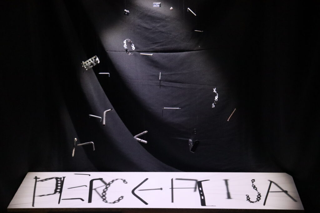
My bachelor’s thesis began with a sentence that stayed with me long before I fully understood its depth: Vision is the art of seeing the invisible. At the time, I was drawn to it intuitively. I was interested in illusion, in the strange and beautiful moments when the eye does not simply register what is in front of it, but actively participates in constructing meaning. What initially fascinated me was the visual effect itself: the possibility that something could appear, disappear, transform, or reveal itself only from a certain position, under a certain light, or through a certain act of attention.

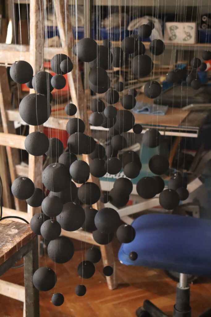
As the project developed, that fascination became material. I explored different types of illusion and translated them into installations, allowing visual ideas to become spatial experiences. What had started as a conceptual and aesthetic interest gradually became something more complex once it entered the space of public encounter. The work no longer belonged only to me. It was confronted by viewers, by expectations, by doubt, and by reaction.

One of the most important parts of that experience was the response it provoked. At first, many people approached the idea with skepticism. Some did not immediately understand where it was leading, and others seemed unsure whether illusion could carry enough conceptual weight to become a serious field of inquiry. I remember this clearly, not as discouragement, but as part of the work’s life before completion.

But once they were finished, something shifted. The same hesitation that had surrounded the project seemed to turn into curiosity. People stopped longer. They looked again. They asked questions. What interested me most was not that everyone reacted positively in the same way, but that each reaction was different. Some viewers were intrigued by the technical aspect, others by the surprise of recognition, and some seemed affected by the experience in a more emotional or reflective way. It became clear to me that illusion does not simply deceive the eye. It creates a pause. It interrupts automatic perception. It asks the viewer to become active.

That moment stayed with me. It made me wonder whether illusion should really be understood only as a visual trick, or whether it might be part of a much broader language of communication. Why do people become so engaged when an image or object withholds its meaning for a moment? Why does ambiguity invite attention instead of pushing it away? And why does the act of “finally seeing” something produce such a strong reaction?