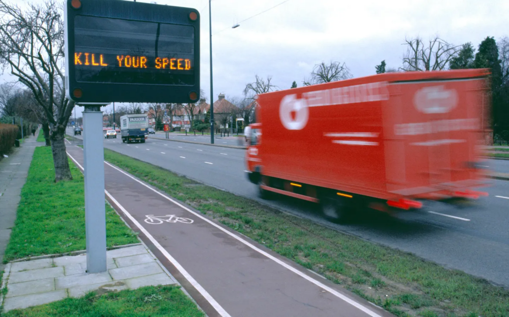
Most modern navigation tools are optimized for one goal: efficiency. The fastest route. The shortest time. The fewest obstacles.
But cities are not just systems for getting around. They are places to experience, observe, and gradually build relationships with. And our movement through them shapes our sense of connection — or alienation.
I imagine a different type of navigation. One that adapts not only to geography, but also to people.
What if a map asked not only where you want to go, but also how you want to feel along the way?
🗺️ A map that takes into account:
⭐ your mood (calm, curious, tired, sociable); ⭐ your time (a quick walk or a day off); ⭐ your preferences (parks, cafes, quiet streets, shops, dog-friendly routes etc.); ⭐ and your familiarity with the city.
💡 Instead of constantly directing you along the same optimized routes, the system could gently suggest alternatives:
👉 a longer route through the park when you need to slow down; 👉 a street you’ve never walked down before; 👉 a neighborhood you usually pass by, but never visit; 👉 a café along the way when the time seems right.
This wouldn’t remove choice — it would expand it. Multiple routes. Different rhythms. Clear intentions.
*Video is AI generated
Research by Gregory D Clemenson already shows that the way we navigate affects how we remember places and how focused we are on what is happening. Clear step-by-step instructions can reduce spatial awareness and personal engagement with the environment, while more exploratory or sensory forms of navigation promote cognitive mapping and concentration. [2]
Urban theorists such as Jan Gehl have long argued that cities should be designed with human experience in mind—for walking, stopping, observing, and staying—rather than solely for high throughput and speed. However, digital navigation often pulls us in the opposite direction. [3]
In large cities such as Vienna, London, New York, or Moscow, it is easy to live in a very small personal world:
🏠 home → 🖥️work → ☕favorite café → 🛍️supermarket
Entire neighborhoods remain unknown, even after many years of living there. A slow, adaptive navigation system could gently open up these worlds. Not by forcing detours, but by inviting them.
I want to explore this idea in more detail: to develop a navigation interface that prioritizes quality of movement over speed, awareness over automation, and choice over control.
A map that doesn’t rush you to your destination, but helps you build a relationship with the city along the way.
💚Thank you!💚
Sources 🛈
[1] Mobile photo: Movement. 35AWARDS Photography Contest. Best of Contest, Viewer’s Choice, Top 35. Photographer: Margo Aleksandrovna Vorobeva. Available at: https://35awards.com/page/contests/num/743
Most navigation tools are built around one promise: get me there fast. The “best” route is usually the shortest, fastest, or most efficient. And, as with many digital products, this default value subtly trains us to behave in a certain way: we start moving through places rather than being in them.
This article looks at maps as interfaces that design movement. Not just in apps, but in cities too. When a system optimizes speed, it changes what we pay attention to, how we feel while traveling, and what we remember afterward.
🤔 Why this matters (beyond convenience)
❗ Your attention narrows: you follow instructions rather than your surroundings. ❗ Exploration slows down: you stop noticing landmarks, textures, narrow streets, and “micro-attractions.” ❗ Stress builds up: constant updates and the “keep moving” logic can feel like pressure—similar to how notifications increase the sense of urgency in digital life.
🚶➡️ Maps as “pace setters”
When using turn-by-turn navigation, you delegate some of the tasks of orientation and decision-making. Research in the field of navigational assistance has raised concerns that clear directions may reduce the effectiveness of spatial learning (you reach your destination, but remember less information about the route).
This is the key question of “slow living” in navigation:
Do we need a tool that simply takes us from point A to point B, or one that helps us connect with the place?
“…current GPS apps (based on turn-by-turn navigation) promote a passive form of navigation that does not support learning or the formation of cognitive maps.” — Microsoft Research, Redmond (2021) [1]
🗺️ Comparing map logics (what each app “optimizes for”)
1. Google Maps[2]
👉 Key principle: efficiency + accessibility for all
Advantages: ➕Extremely efficient A→B routing, multimodal options, reliable POI database.
Designed for quick decision-making: “best route,” “fastest route,” “leave now.”
Disadvantages: ➖The “fastest” approach may dominate, even if you have time. ➖Research is present, but it is secondary to speed (you can explore, but the interface pushes you toward achieving your goal).
Advantages: ➕ Often very detailed dense urban development: entrances, public transport logic, accurate location determination. ➕ The feeling of “the city as a system”: created for everyday travel in difficult conditions.
Disadvantages: ➖ As a rule, it supports a functional rhythm focused on daily travel: fast, straightforward, problem-solving.
Advantages: ➕ Great for hiking as an activity, not just a means of transportation. ➕ Offline-oriented logic and detailed route information encourage exploration and the creation of longer routes.
Specific example:Mapy.cz emphasizes offline maps and convenient route planning as a key set of features (especially useful for hiking, trekking, and traveling).
Disadvantages: ➖ The product “expects” you to wander. This expectation alone changes the pace.
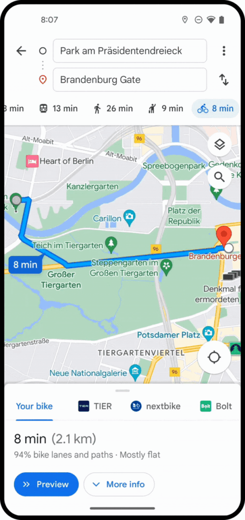
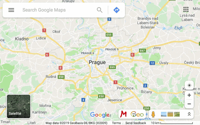
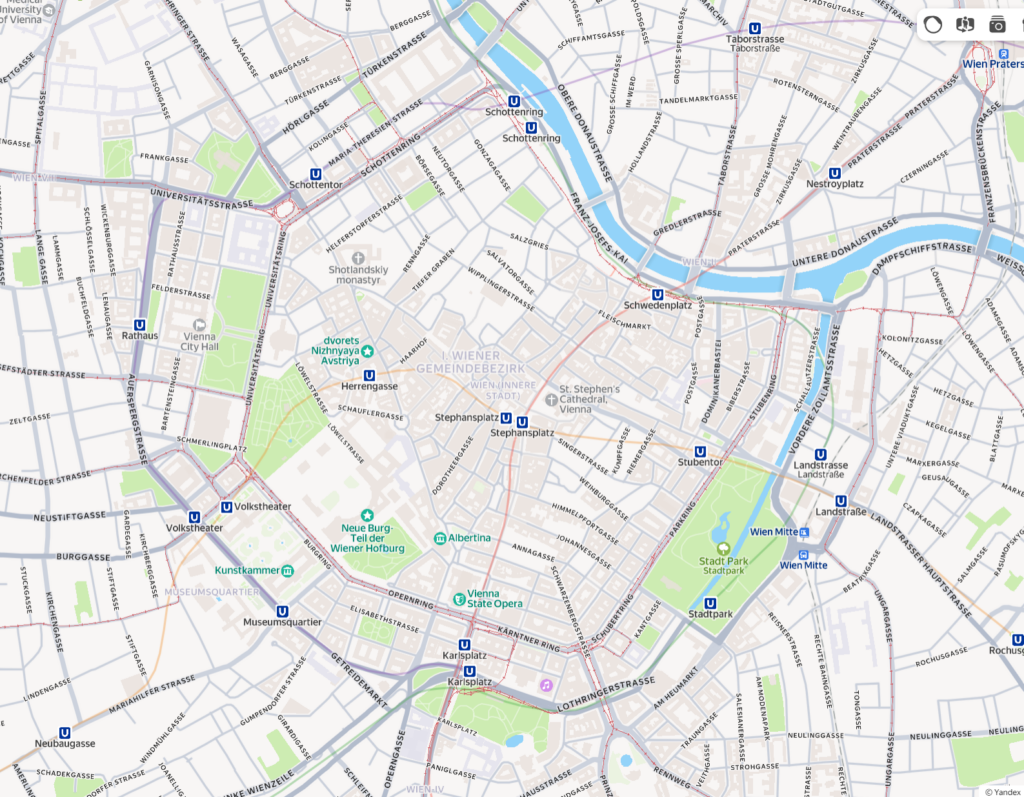
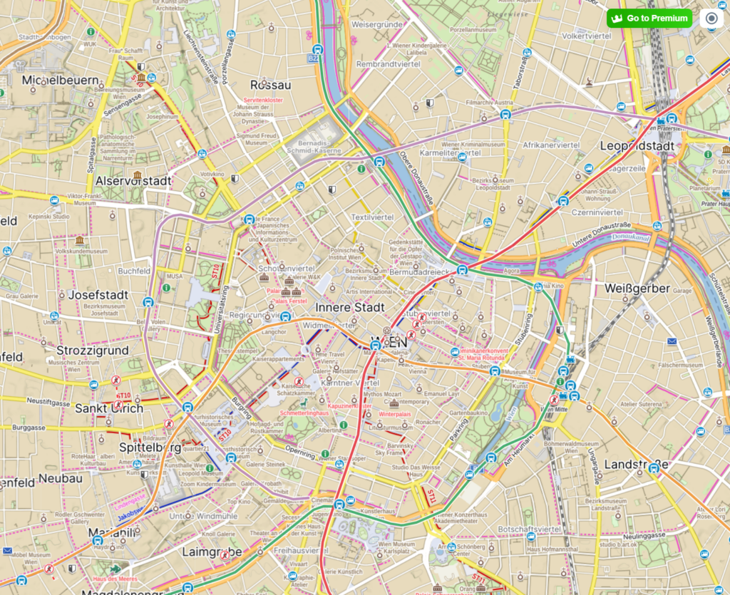
Let’s compare the same place — the city center of Vienna — across different map interfaces:
Google maps
Yandex maps
Mapy.cz
🙋 Why would “slow navigation” be optimized?
If we rewrite the criteria for success, we get a different interface:
Instead of: the fastest route Try: a peaceful route / an interesting route / a safe route / an accessible route / a shaded route / a scenic route
Slow navigation could purposefully include: 👉 landmarks (parks, observation decks, cafes) as key elements of the route 👉 rest stops (benches, quiet places, small squares) as part of the journey 👉 a gentle choice instead of one “best” route (3 moods, not 3 minutes)
This is directly related to the city: if streets are shared spaces, design should not only serve drivers and speed.
In my last three blog posts, I want to focus more on the city and the human experience in the city, the moments when we slow down and speed up, why this happens, and how design can shape our experience. In the last 10th blog post, I will describe an idea that came to me while using maps for traveling, hiking, and using maps in the three countries where I have lived.
Cities often have a default sense of urgency. We rush through the streets, quickly moving between buildings and rarely stopping unless there is a clear reason to do so. This feeling of acceleration is usually associated with modern lifestyles or digital technologies. However, long before the advent of smartphones and notifications, the city itself was already shaping the speed at which we move.
🏛️ Architecture as an Invisible Script
“First we shape the cities — then they shape us.” — Jan Gehl, Life Between Buildings (2011)[1]
Urban planning determines not only where we can go, but also how we get there. Wide, straight streets encourage continuous movement. Narrow sidewalks discourage lingering. Long building facades with minimal variation encourage visual scanning rather than observation. Even the absence of benches, ledges, or secluded corners suggests that stopping is not expected.
[2] Vester Voldgade, Copenhagen.
🤳🏾 Cities as Interfaces
From an interactive design perspective, a city can be viewed as an interface consisting of physical components:
👉 streets as navigation paths; 👉 intersections as points of interaction; 👉 buildings as visual landmarks; 👉 public spaces as potential places to pause — or missed opportunities.
As in digital systems, default settings matter. When urban space is designed primarily for efficiency, throughput, and movement, speed becomes the implicit norm. There is little friction, but also little invitation to linger.
Urban planner Kevin Lynch in his book “The Image of the City” emphasized how spatial clarity aids orientation and movement, but also warned that excessive legibility can turn a city into a mere transportation environment rather than a place where new experiences can be had.
[3] Urban Planning Elements: Kevin A. Lynch.
🏃♀️ Designing for Flow, Not Staying
Modern cities are increasingly optimizing flows: transportation efficiency, pedestrian capacity, visibility,and safety. While these goals are valid, they often result in spaces that are difficult to inhabit at a leisurely pace. Transitional areas—entrances, plazas, underpasses—are designed to move people through, not allow them to linger.
This logic stands in sharp contrast to alternative urban models such as the Cittaslow movement. The Cittaslow manifesto explicitly challenges acceleration as a default urban value, proposing a city designed not primarily for throughput, but for quality of everyday life. [4]
🦥 What is a Slowcity:
The Cittaslow manifesto contains seventy recommendations and obligations, the main ones being the following :
Enhancement of the historic urban heritage by avoiding the construction of new buildings.
Reduction of energy consumption.
Promotion of ecological technologies.
Multiplication of green spaces and leisure areas.
Cleanliness of the city.
Priority to public transport and other non-polluting transport.
Reduction of waste and development of recycling programs.
Increase in the number of pedestrian areas.
Development of local shops.
Development of community infrastructures and equipment adapted to the disabled and the various ages of life.
Development of a genuine participatory democracy.
Preservation and development of local customs and regional products.
Exclusion of GMOs.
🏎️ Pace as a Design Outcome
[5] Making Cities Slower… And Safer For All.
Speed in the city is rarely a personal choice. It is determined by structural decisions: street width, building density, visibility, and the presence or absence of places to rest. These elements together determine the rhythm of the city.
Understanding the city as a designed system helps shift the focus away from blaming individuals for driving too fast. Acceleration is often not a mindset—it is an architectural condition.
Speed in the city is rarely a personal choice. It is shaped by structural decisions embedded in street design and urban layout. When movement is prioritized over presence, speed becomes the default — even in spaces meant to be shared.
“City streets aren’t the sole domain of cars and their drivers. They’re also home to pedestrians of all ages, to cyclists, mobility scooter and wheelchair users, to groups of playing children, and mass transit passengers. They are shared spaces, which means they need to provide safety to all.” — Making Cities Slower and Safer for All, Forbes (2024) [6]
As I started researching product examples that demonstrate how interactions could be designed in a calm and respectful way, I came across the Calm Tech Institute Awards. Through this initiative, the Calm Tech Institute recognizes products, services, and technologies that are designed according to the principles of calm technology. Products are evaluated through a 81-point criteria covering categories such as:
attention: Products are evaluated on how they work with (or against) human attention.
periphery: How does the product engage other senses through peripheral attention?
durability: How does the product break down? Does it offer support to customers in some way?
light: Does the product use warm lighting or harsh, blue lights?
sound: How does the product sound? For products with moving parts, what actions have been taken to prevent excess noise?
materials: What kinds of materials are used?
The award spans a wide range of product and service domains, including:
Smart Appliances
Transportation
Electronics
Artificial Intelligence
Automotive
Health
Homes
Vacation Rentals
Museums
Education
Websites and Apps
This framework shifts the focus away from novelty and constant engagement, instead emphasizing thoughtful, human-centered design.
In this and the next blog entry, I want to take a closer look at some of the products that have received this award and explore how they translate calm technology principles into real-world design.
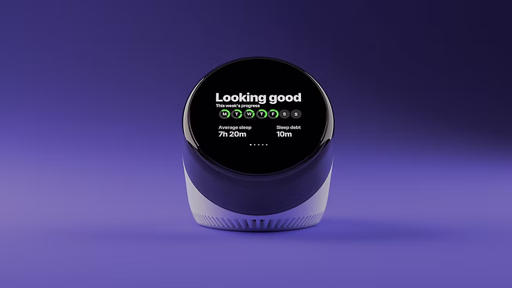
“Dreamie” by Hello Ambient
Last year’s highest certified product is a bedside sleep companion called Dreamie. The device is designed to reduce phone usage in the bedroom. A space that should ideally be reserved for rest and recovery. Looking at sleep behavior research from the American Academy of Sleep Medicine (AASM), it quickly becomes clear why this is such a relevant use case for calm technology.
ccording to the AASM, 87% of adults keep a phone in their bedroom, and the majority of them report not getting enough sleep due to phone usage. Other studies show that just one hour of screen time after going to bed increases the likelihood of insomnia symptoms by more than 50%. Screen use at night is also associated with an average loss of 24 minutes of sleep. These numbers highlight a clear opportunity for a device that keeps technology present, but firmly in the background—supportive rather than disruptive.
Based on their research, the AASM recommends several habits to improve sleep quality:
Disconnect from devices at night
Leave your phone in another room
Follow a relaxing nighttime routine
Have a sleep schedule
Turn off push notifications
Dreamie, developed by Hello Ambient, directly addresses these recommendations and turns them into design requirements. Instead of asking users to rely on willpower alone, the device offers an alternative that fits naturally into existing bedtime routines.
At its core, Dreamie is more than a smart alarm clock—it is a carefully considered design solution. Recognizing how hard it can be to resist media consumption before sleep, the device provides calm, sleep-focused audio content. This creates a gentle alternative to scrolling through a bright, distraction-filled phone screen, helping users wind down rather than stay engaged.
In addition, Dreamie tracks sleep patterns without requiring wearable devices, reducing friction and discomfort. It also features a daylight-based alarm, which is widely considered to be a more natural and less jarring way to wake up compared to traditional sound alarms. Interactions are handled through tactile, physical controls, allowing for eyes-free adjustments in the dark—an intentional design choice that avoids bright screens and supports a calm, sleep-friendly environment.
Taken together, these features strongly align with calm technology principles. Dreamie avoids competing for attention, supports healthy sleep habits, and stays in the background when not needed—showing how research-driven insights and calm interaction design can address a widespread problem.
References:
Front. Psychiatry, 31 March 2025: “How and when screens are used: comparing different screen activities and sleep in Norwegian university students“
UX and UI design is often viewed as a visual or cognitive discipline: layout, flows, clarity, usability.
However, every interaction with a digital service is also a physical experience. Users hold devices, move their fingers, adjust their posture, pause, breathe, and repeat gestures hundreds of times a day. The body is not an external factor, but the environment through which digital interaction takes place.
In the context of physical interaction, the main focus is on the physical layer of the user experience. This is especially important in “slowness”, as slowing down is not only perceived mentally or visually. It is felt through movement, tension, rhythm, and physical effort. Interfaces shape the behavior of the body — and, consequently, how time is perceived.
🤹♂️ The Body Inside Everyday Digital Services
Most everyday applications implicitly train the body to move quickly. Social media feeds encourage rapid scrolling, messaging apps reward instant responses, and productivity tools favor quick taps and minimal friction. These models may optimize efficiency, but they also accelerate the body’s rhythm:
Fingers move faster, attention shifts more frequently, and interactions become reactive.
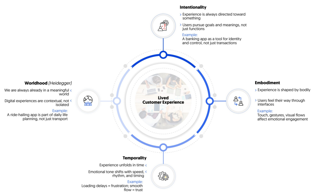
[1] Lived Customer Experience
👋 Slow Gestures as UX Decisions
Gesture design is a powerful time management tool. When interaction is based on slow or prolonged gestures, it naturally discourages impulsive use.
Examples:
👉Long press instead of instant tap — requires a decision, not a reflex. 👉Holding to confirm actions — prevents accidental behavior. 👉Gradual unfolding of interactions — unfolds over time rather than ending instantly.
“A delayed button press is not just about waiting — it’s about signalling intention and providing feedback that connects the user’s body to the system. It creates a moment for the user to feel the interaction, rather than skim through UI elements without awareness.”— Lodestar Design [2]
👻Tactile interaction and physical presence
Touch is not just a means of input, it carries emotional and temporal meaning. Touching, pressing, sliding, or holding are felt differently by the body, and interfaces that take this difference into account create a greater sense of stability.
Meditation and journaling apps often use this approach, avoiding aggressive touch navigation in favor of smooth transitions and prolonged touchscreen interaction.
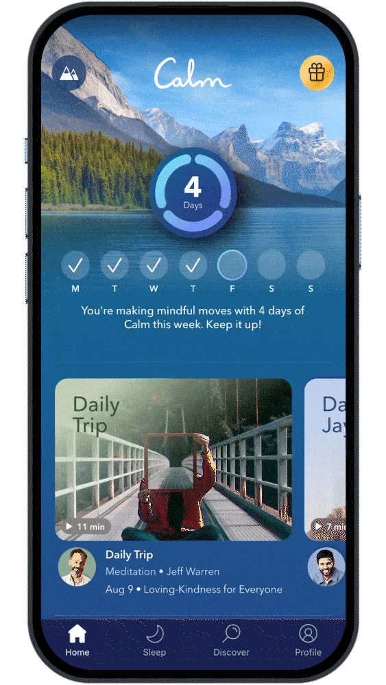
A good example is the Calm [3] app, where respond smoothly to touch duration and pressure, that creates a stronger sense of presence. Instead of treating input as abstract commands, they treat it as physical engagement.
🏃 Movement-based feedback and body rhythm
Movement plays a key role in how the body interprets digital feedback. Abrupt animations signal urgency and demand attention. Smooth, gradual movements better match natural physical expectations.
Calm motion-based feedback:
👉 reduces startle response; 👉 supports continuity rather than interruption; 👉 mirrors the dynamics of physical processes in the real world.
Apple’s Human Interface Guidelines emphasize motion that feels “natural and respectful of user focus”, especially in transitions and state changes. This approach helps interactions feel less mechanical and more embodied.
“Aim for brevity and precision in feedback animations. When animated feedback is brief and precise, it tends to feel lightweight and unobtrusive.”— Apple Human Interface Guidelines, Motion [4]
⏸️ Pauses, Stillness, and Physiological Effects
Continuous interaction keeps the body in a state of readiness. Interfaces that never pause encourage shallow breathing and constant micro-movement. In contrast, designs that allow stillness — screens that wait, moments without animation, interactions without immediate feedback — create space for physiological regulation.
Some focus and writing tools deliberately avoid real-time notifications or visual noise, allowing users to remain physically settled for longer periods.
Good example is iA Writer, which minimizes interface elements to reduce physical and cognitive agitation.
📢 Why Embodied Interaction is important in UX/UI design
Without taking the body into account, slow design risks becoming superficial—calm visual effects are superimposed on fast, demanding interaction models. True slowness arises when visual, cognitive, and physical rhythms are aligned.
Designing with embodiment in mind means designing with how services are actually used, not just how they look on screens.
Even if an interface is designed to be “fast,” it still actively influences the perception of time: as pressure, flow, anticipation, boredom, or calm. Users don’t perceive milliseconds — they perceive moments. In this sense, every interface is also a temporal system.
From a technical perspective, time is rather an objective parameter. Loading takes a certain number of seconds, animations have a fixed duration, and interactions can be measured and optimized. From a human perspective, time is definitely subjective and variable. The same interaction can be perceived as rushed or relaxed depending on how it is structured, presented, and built. UX design is not just a process that occurs over time — it creates a sense of time.
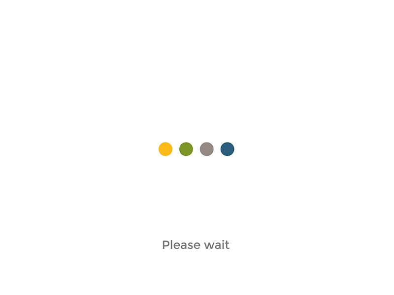
Waiting Is a Designed Experience
Waiting is often treated as a failure state, something to hide or minimize. Yet waiting is one of the most emotionally charged temporal moments in UX.
The loading moment may sometimes feel:
👉 stressful and uncertain; 👉 neutral and unnoticeable; 👉 or calm and exciting.
This depends not so much on duration as on meaning. Progress indicators, language, movement, and visual rhythm all influence whether waiting is perceived as wasted time or purposeful preparation. When waiting is well structured, users tolerate it better—sometimes they hardly notice it.
“Show people what’s taking so long and they’ll be more satisfied. Sometimes they even *prefer a longer waiting time with information over a bland progress bar that is twice as fast because they know what to expect.”—Sanne Eikelboom [1]
Micro-Interactions Create Temporal Rhythm
“Micro-interactions are small but crucial elements that enhance user experience (UX). They offer intuitive cues and turn routine tasks into enjoyable moments. Learn about their significance in modern UX design through examples and best practices. Understand how these subtle interactions contribute to more engaging and intuitive digital environments.”[2]
[3] Micro-interactions to delight your users: what, when and how.
Micro-interactions shape our perception of the interface:
👉reactive or thoughtful; 👉hasty or deliberate; 👉demanding or forgiving.
Temporary perception arises not from a single animation, but from the accumulated rhythm of interaction.
Compression and fragmentation of time
Many digital products compress time by eliminating pauses and natural stopping points. Infinite scrolling, autoplay, and algorithmic sequencing contribute to continuous movement.
“The infinite scroll is just another one of these addictive design features … I often find myself … scrolling through recommended feeds on YouTube and Netflix for minutes on end, only to give up and not watch anything because nothing seems interesting. … You scroll. And scroll and scroll and scroll.” — Grant Collins [4]
The result is not only faster consumption, but also a disruption of the sense of time:
👉 users feel constantly active; 👉 but rarely feel present in the moment; 👉 and time passes without a clear memory of how it was spent.
Speed here does not equal efficiency — the opposite, it often leads to fatigue.
Making Time Visible Again
Some interfaces take the opposite approach: time is displayed rather than hidden. When users see the duration, progress, or boundaries of a session, they regain awareness and control over the situation.
“Showing elapsed time … accentuates the passing of each and every second and minute. When we show elapsed time, psychologically it is a bit of torture for the user and it accentuates the passing of each and every second and minute.” — Chris Kiess [5]
Examples include:
👉 a clear beginning and end; 👉 a summary of events or reflections on time; 👉 explicit pauses instead of endless continuation.
Visuality transforms time from something fleeting into something users can interact with and control.
When time becomes visible, interaction shifts from passive consumption to purposeful engagement. Users are no longer absorbed by a continuous default stream—they are given the opportunity to decide whether to continue, pause, or stop. Visibility transforms time from an invisible resource consumed by users into a shared reference point that they can understand and manage.
In this part of my research, I would like to review apps and digital products that, in my opinion, practice the basic principles I discussed in my previous article, or that align with the ideology of “slowness” and promote it to the masses. I have tried all of these apps myself, and I will try to draw objective conclusions and also point out my observations while using the app.
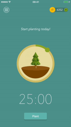
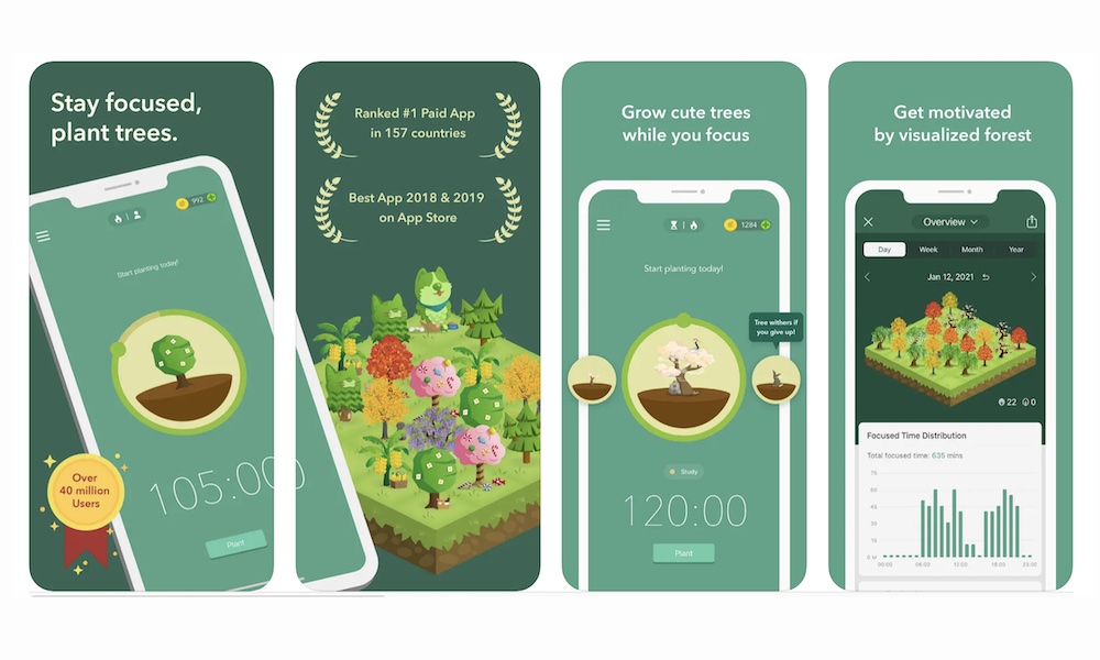
🌳 Forest: Stay Focused
The app was created in 2014 in Taiwan by the Seekrtech team. The team was inspired by digital overload and the habit of constantly checking our phones. Unlike strict blockers, including iPhone blockers, Forest offers a beautiful, metaphorical approach to managing our attention, namely through the idea of growing and caring for a tree.[1]
How does it work ❔
The user plants a virtual tree, and the tree grows for a set period of time. If you exit the app or use your phone while the tree is growing, it will immediately die. In this way, attention is transformed into a process that requires time, patience, and consistency. The interface is minimalistic and visually calm—almost nothing happens during a session in the app, which reduces cognitive load and supports slow and steady concentration.
Forest makes pausing and waiting a valuable experience rather than an interface flaw. The app demonstrates that slowness can be not an obstacle, but a conscious design tool that supports user attention and well-being.
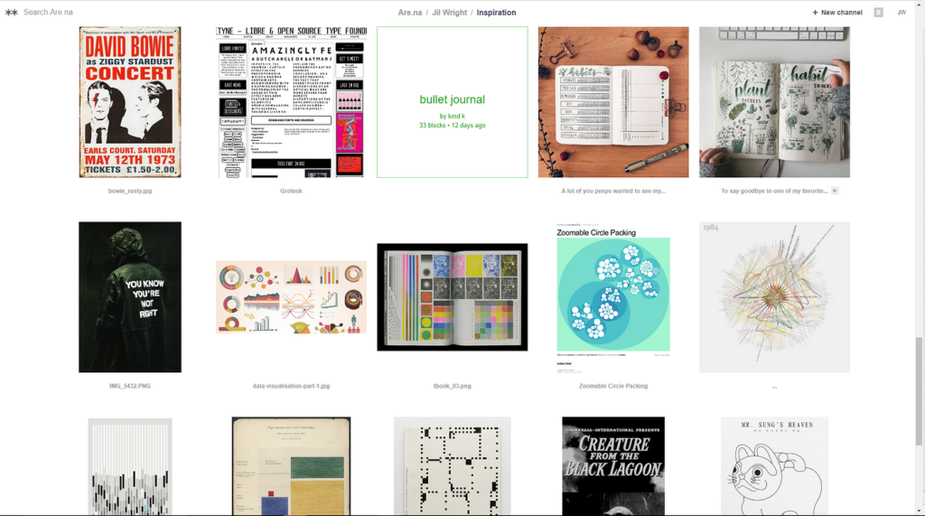
🌟🌟Are.na (knowledge & research platform)
Are.na is an online social networking community and creative research platform founded by Charles Broskoski, Daniel Pianetti, Chris Barley, and Chris Sherron. Are.na was built as a successor to hypertext projects like Ted Nelson’s Xanadu, and as an ad-free alternative to social networks like Facebook, forgoing “likes,” “favorites,” or “shares” in its design. Are.na allows users to compile uploaded and web-clipped “blocks” into different “channels,” and has been described as a “vehicle for conscious Internet browsing,” “playlists, but for ideas,” and a “toolkit for assembling new worlds.[2]
How the slowness is practised ❔
⭐There is no endless feed or algorithmic content delivery. ⭐Users curate channels manually, gradually and consciously. ⭐There are no likes, ratings, or engagement metrics.
Why it matters❔: The platform encourages slow accumulation and rethinking of information, rather than rapid consumption.
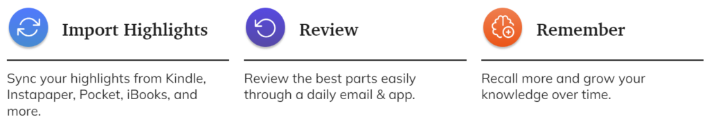
📖Readwise Reader (reading & reflection tool)
Readwise is a digital tool designed to help you retain and organize the most valuable insights from your reading. Readwise leverages powerful techniques like spaced repetition and active recall to supercharge your memory. Through Daily Reviews, Readwise ensures you regularly revisit key insights from your reading material, perfectly timed to enhance retention. This prevents knowledge from slipping away and keeps your memory sharp.[3]
How does it work ❔[4]
How the slowness is practised ❔
Readwise has a very calm, understated interface: there are no notifications, endless feeds, or visual tricks that encourage rapid scrolling. Instead, the app encourages thoughtful, sequential reading. An important feature of Readwise is the ability to return to texts over time: saved fragments and notes periodically reappear, inviting you to reread and rethink them. As a result, reading ceases to be a one-time activity and becomes a longer, slower process of reflection, where understanding and memorization are more important than speed and quantity.
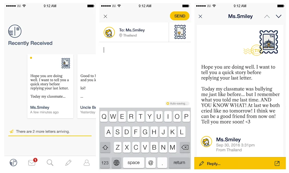
📩 Slowly (intentional communication app)
Slowly is created for those who yearn for the meaningful conversations that are lacking in the era of instant messaging. It connects people around the world at a slower but better pace.
Meet a new pen pal, seal your letter, and stamp it—start connecting with the world on Slowly![5]
I love this app! I meet the most wonderful people in a longer format, more curious, more meaningful context. I’ve met people who live across the river and across the ocean from me, and we are all so similar.—Paula Anderson [6]
How does it work ❔
Unlike instant messengers, messages do not arrive instantly: delivery time depends on the distance between the correspondents and can range from several hours to several days. This deliberate slowdown changes the very attitude towards communication — letters are written thoughtfully, not impulsively, paying attention to wording and meaning rather than speed of response.
This approach reduces the pressure of constant availability and the expectation of immediate responses. Communication becomes more conscious and emotionally rich, and the pause between messages ceases to be “empty time” and becomes part of the experience. Slowly shows that digital products can support depth and trust not through acceleration, but through rhythm and anticipation.
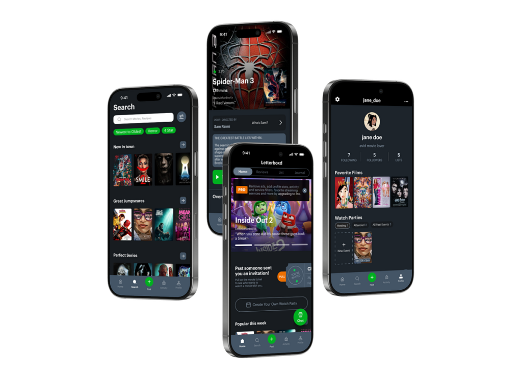
🎞️ Letterboxd (platform for mindful viewing and reflection on cinema)
Letterboxd— is not just a service for marking watched movies, but a space for a slow approach to media. Instead of clip consumption, it encourages users to record their impressions after viewing: users write notes, return to movies, and build their own history of taste over time. There is no pressure to rush — you can’t “scroll through” a movie, and feedback only appears after the experience is complete.[6]
How the slowness is practised ❔
⭐Interaction occurs after watching the film, not during. ⭐The emphasis is on reflection and forming an opinion, not on instant reaction. ⭐No endless consumption or autoplay. ⭐The profile functions as a personal archive of experiences, not as a quick content feed.
Sources 🛈
[1] Forest App. Forest: Stay Focused — About the App. Seekrtech Co., Ltd. Available at: https://www.forestapp.cc/
In my last blog post, I introduced the idea of calm technology. But what actually makes a technology feel calm? In their 1996 paper, Mark Weiser and John Seely Brown suggest that technology becomes calming when it:
Places information in the periphery, letting us stay aware without being overloaded.
Allows smooth movement from the periphery to the centerof attention, giving us control when action or response is needed.
This balance increases awareness while keeping users in control, rather than dominating their attention. Designing for the periphery is therefore a key part of creating calm technology that genuinely supports people.
Weiser and Brown define calm technology through three characteristics:
Smooth transitions between the center of attention and the periphery
Expansion or Enhancement of peripheral perceptionand awareness
“Locatedness”, which creates calm by fostering a connection to the environment enabling to act confidently within it
Technology feels calm when it works with, rather than against, the way human attention naturally functions. It empowers our periphery by quietly supporting awareness, giving more context and control without demanding attention. This creates a feeling of comfort, familiarity, and “being at home” in our environment. Technology achieves this calmness when it blends seamlessly into its surroundings and aligns with our expectations, allowing attention to flow uninterrupted. Just as grammar mistakes pull us out of a text or a rearranged kitchen disrupts the act of cooking, intrusive or poorly aligned technology breaks our focus. When technology preserves our flow of attention, it naturally feels calm.
How is Calm Technology connected to Ubiquitous Computing?
Both concepts are firstly introduced by Mark Weiser (and John Seely Brown). The early research on Ubiquitous computing inevitably led to the concept of calm technology. So both concepts are closely intertwined. Let me explain why:
Ubiquitous computing enables and requires calm technology at the same time. Once computers are everywhere, it will be crucial to consciously design interactions to ensure they do not overwhelm users. Calm technology is the design philosophy that ensures ubiquitous computing remains unobtrusive and supportive. At the same time, the fact that interactions with digital information can now take place anywhere creates an opportunity to design them in a more supportive way.
This means that ubiquitous computing is the technological vision, and calm technology is the human-centered design principle that guides how that vision should interact with people. They are intertwined because one sets the stage, and the other ensures it’s usable and fits with human needs.
How do Ubiquitous Computing and Calm Technology relate to Today’s field of User Experience Design?
Human Computer Interaction has evolved alongside the evolution of computing, which can be summarized in three stages. In the mainframe stage, computers were rare, expensive, and shared by multiple users. Interaction during this stage was driven primarily by technological possibilities rather than human capabilities. As computers became more accessible, the personal computing stage emerged, establishing one-to-one relationships between individuals and their machines. This shift brought technology closer to people and made user experience a central concern, moving the focus of interaction from the technology itself to the user.
In the following ubiquitous computing stage, people interact with numerous embedded computers throughout their daily lives, making calm technology not just desirable but necessary. The Internet has accelerated this evolution, raising questions about how pervasive technology may impact our environment and everyday experiences. In the state we are currently in, technology constantly competes for our attention. New technology is developed in a high speed and to keep up the pace user-tests are often skipped, resulting in bad user experience and usability (Monse-Maell, 2018). In response, many contemporary design trends have emerged, all based on the same underlying concept: Calm Technology. Within the design field, this idea is commonly framed in terms of attention and presence (Calm UX, Quiet UX, Mindful UX), simplicity and reduction (Minimalist UX, Effortless UX, Invisible Design), spatial and peripheral interaction (Ambient UX, Peripheral Interaction), and human well-being and pace (Well-being UX, Slow Technology).
Sure you already heard of some of those terms and are familiar with the ideas behind it. They all come down to the same main idea. They take the philosophy of Calm Technology and translate them into concrete design practices. Calm Technology gives designers a philosophical and ethical grounding. The specification into one of those terms usually provides concrete methodologies, patterns, use cases and heuristics. That’s why it makes sense to engage with these fundamental ideas, as they form the basis for current design trends and shape much of today’s interaction design thinking.
Now that we’ve covered these fundamentals, I want to take a closer look at human–computer interaction and what types of interactions we can use to achieve calmer, more effortless technologies. In the next blog entry, I’ll explore how we intuitively understand how to use objects, how information is perceived in our periphery, and what this means for designing interfaces.
References:
Weiser, M., Seely Brown, J. (1996): “The Coming Age of Calm Technology“, Xerox PARC
Weiser, M. (1991): “The Computer for the 21st Century”, Scientific American.
Norman, D.A. (1988): “The Psychology of Everyday Things”
Designing with slowness in mind does not mean slowing down or reducing the functionality of technologies. It is about creating interfaces that feel calmer, more understandable, and less demanding. Slow and calm interaction helps reduce digital stress and gives users more space to reflect, observe, and enjoy the moment.
Below are a few simple principles that demonstrate how you can incorporate slowness into everyday applications and digital interactions.
⏸️ Meaningful Pauses
Pauses allow users to understand, reflect, or simply take a breather between actions. These pauses don’t disrupt the experience, but rather structure it.
❔ How to apply: ⭐ Introduce short pauses before irreversible actions (e.g., deleting elements). ⭐ Add micro-delays to animations that create a natural rhythm to the interface instead of an instant transition. ⭐ Use loading states intentionally, providing small contextual cues instead of distracting spinning indicators.
A well-placed pause can transform interactions from reactive to intent-driven.
🐢 Gentle Transitions
Quick, sharp transitions create a sense of speed and urgency. Smoother transitions reduce cognitive strain and make interfaces more tactile.
“Your brain loves continuity. Abrupt changes? Stressful. Jerky movement? Distracting. Our minds crave flow. And transitional elements, when done right, smooth out the experience…” — Marco Mazzurrana [1]
❔ How to apply: ⭐ Replace instant screen switches with smooth transitions, slides, or dissolves. ⭐ Use easing curves that simulate physical motion rather than mechanical jumps. ⭐ Allow UI elements to appear gradually, rather than all at once.
Even a transition lasting 150–250 ms can change the feel of the interaction.
😵 Low information density
Screens with high information density overload working memory. Low density creates space for attention.
“High information density places heavy demands on user cognition, forcing the brain to process too many signals at once. In contrast, a leaner information layout reduces cognitive load and allows the mind to focus and make sense of content more easily.”—Poulami Chakraborty [2]
❔ How to apply: ⭐ Prioritize one task on each screen. ⭐ Ensure gradual disclosure of information: show only what is necessary at the moment. ⭐ Reduce the number of simultaneous notifications, icons, and visual competition.[3]
A calm interface communicates information only when necessary.
👂 Embodied interaction
Slowness can come from the body: breathing, posture, pace, and gestures shape how we interact with technology.
“Touch, sound, and vision are the primary senses apps use to influence how we behave. These sensory channels shape how we feel and respond before we even think about it.” — Harrish Murugesan [4]
❔ How to apply: ⭐ Use gestures that encourage slower, smoother movements (long press, drag, explore). ⭐ Integrate tactile feedback that mimics physical softness rather than sharp impulses. ⭐ Encourage interfaces that respond to movement — walking, pausing, turning — rather than just touch.
This principle brings interaction closer to real human rhythm.
Fast interfaces speed up the selection process, often increasing cognitive fatigue.[5]
❔ How to apply: ⭐ Provide clear recommendations instead of overloaded menus. ⭐ Limit the number of options available at once; use structured instructions. ⭐ Offer “later” or “not now” options to reduce urgency.
Reducing pressure creates psychological space.
⌛ Temporal consistency
A slow interface should not switch unexpectedly between fast and slow modes; its rhythm is predictable.
❔ How to apply: ⭐ Maintain a consistent animation speed. ⭐ Align the timing for different functions. ⭐ Avoid mixing abrupt transitions with slow ones.[6]
Modern interfaces seem fast not only because they are optimized, but also because they were designed that way from the outset — visually, cognitively, and, most importantly, emotionally.
“Did you ever notice that some apps seemed faster even though your internet connection remains the same?” — Ayman Abdallah, 2025 [1]
The author explains that the perception of speed depends not only on metrics but also on design decisions such as smooth animations, instant feedback, and placeholders during loading—all of which create that “feeling of speed” regardless of the actual loading time.
Today, fast interfaces have long become the norm. In this article, I want to examine and discuss the key patterns of “fast UX” that define our digital experience.
1️⃣ Instant Feedback — instant reaction as an illusion of control
Instant Feedback is a so-called seamless reaction: you like something, and the heart immediately turns red; you swipe right, and the screen changes instantly without any smooth animation. This pattern reinforces the feeling that the app is always “ready” and sometimes even faster than you are.
Examples:
⭐Instagram: likes, saves, animations — instant, even if the request has not yet reached the server. “Visual simulation of action.” ⭐TikTok: swipe to the next video with zero delay, even if the video is loading in the background. ⭐YouTube Shorts: reactions and swipes are also instantaneous. The feeling of an endless stream.
❔ How does this speed things up?Instant Feedback suppresses the moment of pause, thought, and reflection. Even the slightest delay could allow you to realize what is happening.
2️⃣ Endless scroll — no beginning and no end
One of the most fashionable inventions of digital content consumption culture.
Examples:
⭐TikTok: swipe to the next video with zero delay — even if it is loading in the background. The platform has also recently introduced the ability to automatically scroll through the feed.
«Are we truly ready for it to be the white noise in the background of our daily lives?» — Jordan Hart [2]
This is a great example of how one seemingly insignificant feature can fundamentally change the core concept of the TikTok platform.
“Autoscroll makes TikTok — an app that people use to dissociate, and which already has to remind its users to take a break because they’ve been scrolling for hours — into an even more passive experience. And I’d argue you get the most out of TikTok when you engage with it, going down that rabbit hole on a new topic that caught your interest or reading the back-and-forth in the comments section about a hot-button issue.” [3]
Endless scroll provides an infinite amount of content without a stop signal, without a bottom line, and even without a pause. The only pause is when you go to the comments and try to socialize a little. This is a difficult task with an unknown outcome, which, from a psychological point of view, forces the user to continue in an attempt to find the end, which does not exist.
⭐We are also all familiar with Instagram Reels, Threads, Pinterest, and X feeds.
“As a result, the feed is a ubiquitous interface — an infinite stream of content, a list that goes on forever.” — Alexis Lloyd [4]
3️⃣ Notification Loops — as a trigger for acceleration
Notifications are a kind of rhythm in which we live. They form an accelerated cycle of checking:
⭐Instagram: notifications that “someone has started a live stream,” “you’ve been tagged,” “new post” ⭐Facebook: notifications for every random action ⭐TikTok: push notifications about “trending videos you might like” ⭐Snapchat: the same streaks
❔ Why does this speed things up? Notifications create a certain time frame that dictates when we need to act, without giving us a chance to think. We don’t choose the moment — it chooses for us.
4️⃣Micro-Acceleration Patterns
Modern applications use micro-movements that create the illusion of speed, even if the actual work of the system takes longer. This is one of the key mechanisms of “fast UX.”
Examples:
⭐LinkedIn, Airbnb, Uber, Notion: use of Skeleton Leaders — so-called low-fidelity gray blocks that mimic the structure of future content. This way, the brain is already loaded and sees movement, it seems that everything is about to happen, but the loading is still in progress. This keeps the user engaged. ⭐Spotify, Google, Gmail: use the technique of movement towards the result. Interfaces use animation before the data is ready. Animation of the transition to the player, a pop-up map, opening a letter. ⭐Instagram, YouTube, Duolingo: auto-advance behavior. Content plays and switches automatically — without the user’s decision. The video switches to the next one based on a recommendation, the same endless feed, or a transition to the next task without indicating it.
🔚Conclusion
Finally, I would like to mention that all these patterns are effective, but not from the point of view of human experience.
For humans, this creates:
📌a feeling of rush; 📌an inability to stop; 📌short, superficial attention; 📌an accumulation of cognitive noise; 📌digital fatigue; 📌destroy the sense of time by accelerating the internal rhythm.
Fast UX is more than just speed. It is the aesthetics of acceleration built into every movement: swipe, like, notification, update. These patterns shape the pace of our lives.
I can also recommend a relevant video on this topic by a blogger who highlights the problems of digital noise and, based on her own experience, talks about how to clear it up and turn it to your advantage:
“Our brain processes approximately 10 billion bits per second through our senses—sight, hearing, and touch. At the same time, our prefrontal cortex, which is our attention, can only process 10 bits per second of what it allows into our consciousness.
This ratio is not really new. Even in the days of the telegraph, people complained of being overwhelmed. I love reading historical commentary on new technologies because what we now consider unique to our time has actually been described in the same words by people in the past.” [5]