✿1 Design & Research 2

Step 0 – 1st March 2026

The next two weeks will be focused on developing three different prototypes. My main goal is to explore how interfaces can be designed to better support older adults, especially those who didn’t grow up with digital technology. But before diving into design, I need to ask myself some questions: what is the real problem here? What do older users struggle with the most? Is it that apps and websites are simply too complex, with too many steps and features? Or is it that digital interfaces don’t match the way they expect things to work? Or perhaps it’s not the design at all, but a broader question of digital literacy, understanding how devices, apps and online systems actually function.

Step 1 – 8th March 2026

At the beginning I thought the main challenge would be designing intuitive, accessible interfaces. But as I began talking to people, I realized the picture is much bigger. Many of the people I asked weren’t just struggling with specific apps, they were struggling with digital literacy itself.

This opened my eyes to an important distinction: while good design can make apps easier to use, it can’t replace the need to teach fundamental digital skills. Tasks like navigating menus, understanding security warnings, or even recognizing phishing emails require guidance and practice.

I focused on brainstorming what the digital learning platform should actually teach and how it should support older adults in learning digital skills. Instead of starting directly with the design, I tried to map out the most important areas of digital literacy that the platform could cover. These include basic device skills such as navigating smartphones or adjusting settings, understanding common apps and websites, learning fundamental digital concepts like cloud storage or files, as well as topics related to online security, communication and everyday digital tasks.

While collecting these topics, it also became clear that the platform should not only provide information but guide users through learning in a structured way. One idea that was to create a “Today’s Lesson” feature. Instead of presenting users with many options at once, the platform could suggest one small learning session per day. This approach could help reduce decision fatigue.

Prototype 1

Prototype 2

Prototype 3 – Final Prototype

With the last prototype I tried to move away from the “dashboard” layout a bit and instead focus on something much clearer. Rather than showing lots of different options right away, the interface tries to guide the user through what to do next.

The “Today’s Lesson” feature became the main focus of the layout. It’s the first full-width card right after the hero section and noticeably larger than everything else on the page. The idea is that the most important action of the day should require zero searching. Many older users don’t scan pages the same way younger users do. Instead, they read from top to bottom.

Another element I tried out is a progress tracker with color-coded topics. Each topic has its own color instead of everything looking the same. The idea behind this is that color can become a kind of memory anchor. Over time users might remember something like “orange was the security lessons” without needing to read every label again.

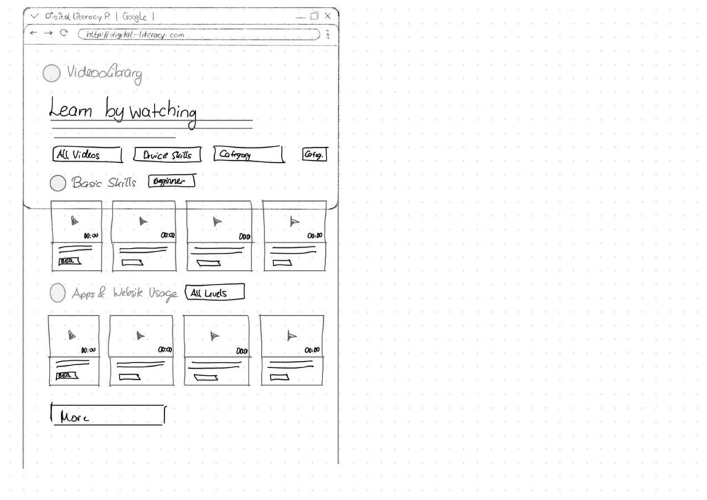
For the lesson library I created video cards that show the duration and difficulty level right away.

Another thing I want to add is an accessibility toolbar directly in the Navigationbar. Instead of hiding text size or contrast settings somewhere deep in a settings menu, the controls (A / A+ / A++ and a contrast toggle) are always visible. My thought here was: if someone needs larger text, they probably need it immediately, not after navigating through several menus they might already struggle to read.

#8 Older Adults Approach to Learning

Update

So last week we had our peer review and I got some really interesting insights into what I could have done better with my blog posts. One big takeaway was that I probably should have stuck closer to the research question I set at the beginning of the course. That said, I think I needed that phase where I went more into “research mode” and just explored what’s already out there and what other people have worked on. I wanted to check whether the things I was talking about actually made sense in the first place. And yeah, they kind of did, but I can definitely see that I need to go much deeper into the topic of interaction design for the ageing population. This topic feels like a natural extension of accessibility and it’s especially important to me because I truly believe that access to digital products can help everyone.

This is why I will use these last two blog entries to cover my initial research questions.

How do older adults approach learning?

I asked myself this questions because sometimes I see elderly that

Older adults’ approach to learning is an active process of adaptation and integration, in which new information is filtered through many years of existing knowledge and personal mental models [1]. Their learning approach is often characterised by a preference for environmental support and immediate practical utility, which helps compensate for age-related changes in cognitive processing capacity [1].

Environmental Support refers to the external stimuli, tools or contextual cues that interact with an individual’s internal mental and physical operations to facilitate successful functioning. [2]

Cognitive Strategies and Processing

While for most older adults the desire to learn remains strong, the biological and cognitive mechanisms used to acquire those new skills undergo significant shifts. [1]

  • Processing Resources: Learning is often influenced by reductions in processing speed, working memory capacity and attentional focus. Because of that, older learners generally require more time to master new skills compared to younger adults. [1]
  • Strategy Selection: Older adults tend to initiate effective learning strategies less spontaneously than younger generations. They often perform a “cost-benefit” analysis, dropping strategies that are perceived as too effortful relative to their perceived efficacy. [1]
  • Thoroughness vs. Scanning: When searching for information, seniors often demonstrate greater thoroughness, for instance, examining multiple hyperlinks in detail rather than scanning and clicking only a few. [3]
  • Self-Initiated Processing: Deficits in learning are most apparent in tasks requiring effortful “self-initiated” processing, such as the active reorganisation of new material. [1]

Unique Mental Models

Older adults possess distinct mental models that shape how they conceptualise and interact with new information, particularly in technology.

  • Linear Logic (Storytelling): Seniors often intuitively adopt a linear, text-based approach to learning, resembling a storytelling session. This frequently clashes with modern digital design, which relies on multi-layered, screen-based logic. [3]
  • Focus on Social Norms: Older learners often prioritise social norms and “politeness” within their mental models. For example, in design workshops, some seniors insisted that digital interfaces should “thank” the user, sometimes valuing this politeness over technical accessibility features like font size. [3]
  • Contextual Challenges: Learning can be hindered by contextual confusion, where similar-looking elements (such as a search bar and an address field in a browser) are mistaken for one another. [3]

Sources

[1] I. Tournier, ‘Learning and adaptation in older adults: An overview of main methods and theories’, Learning, Culture and Social Interaction, vol. 37, p. 100466, 2022.

[2] F. Craik, ‘Memory Changes in Normal Aging’, Current Directions in Psychological Science – CURR DIRECTIONS PSYCHOL SCI, vol. 3, pp. 155–158, 10 1994.

[3] D. Orzeszek et al., ‘Beyond Participatory Design: Towards a Model for Teaching Seniors Application Design’, arXiv [cs.CY]. 2017.

[4] G. A. Wildenbos, L. Peute, and M. Jaspers, “Aging barriers influencing mobile health usability for older adults: A literature based framework (MOLD-US),” Int. J. Med. Inform., vol. 114, pp. 66–75, 2018, doi: 10.1016/j.ijmedinf.2018.03.012.

#3 Testing and Research

Background

This week I had a situation that perfectly illustrated why I chose this topic. I was explaining some functionalities of a new app to my grandfather. He has always been very tech-savvy, he still works on his own website but even he struggles with certain concepts from time to time. He often tells me that everything takes him much longer than it used to and even when I show him a quicker or easier way to do something, he still sticks to the method he already knows. I believe this is partly a matter of habit and partly a reluctance to change something that “still works.”

What surprised me most was watching him interact with the app after my explanation. I assumed that once I had shown him how the app worked, it would be straightforward. But when he tried it on his own, he had to stop and ask for help at many points. It made me realize how much prior knowledge and digital literacy designers unconsciously expect from users, even when the interface seems simple to us.

This small moment showed exactly why designing for older adults matters: even motivated users with experience and interest in technology can struggle when interactions are not intuitive, forgiving or aligned with their mental models.

But here comes the real question: Is the problem rooted in the design of digital products or in the mental models that older adults bring with them? In other words, should we focus on improving the interfaces or on helping older people build the conceptual frameworks they need to understand how technology works in the first place?

Research

Problems older adults face with technology usually come from two sides: the design of the technology and the way older people understand and process information. When these two sides don’t match, it leads to confusion and mistakes. [1][3]

Many digital products simply aren’t designed with older adults in mind. This creates barriers that make technology hard to use.

  • Interfaces that feel cluttered or complicated: When apps have too many features or unclear layouts, older adults struggle to find what they need.[3]
  • Physical design that clashes with age-related changes: Small buttons, close-together touch targets or gestures like pinching and swiping can be difficult due to reduced vision, motor skills or dexterity.[3]
  • Unclear icons: Small, abstract or unfamiliar icons can be hard to recognize. Older adults often expect bigger, more descriptive labels instead of symbolic icons. [3]
  • Inconsistent design: If the interface doesn’t behave in predictable ways, it breaks the user’s expectations. This lowers trust and makes people feel unsure about what will happen next. [5]

(Planned) Sources

[1] D. Orzeszek et al., ‘Beyond Participatory Design: Towards a Model for Teaching Seniors Application Design’, arXiv [cs.CY]. 2017.

[2] L. Kane, “Usability for Seniors: Challenges and Changes,” Nielsen Norman Group, Sep. 08, 2019. https://www.nngroup.com/articles/usability-for-senior-citizens/

[3] G. A. Wildenbos, L. Peute, and M. Jaspers, ‘Aging barriers influencing mobile health usability for older adults: A literature based framework (MOLD-US)’, International Journal of Medical Informatics, vol. 114, pp. 66–75, 2018.

[4] J. Nielsen, “Usability for Senior Citizens: Improved, But Still Lacking,” Nielsen Norman Group, May 28, 2013. https://www.nngroup.com/articles/usability-seniors-improvements/

[5] Thefinchdesignagency, “Building User Trust in UX Design: Proven Strategies for Better Engagement,” Medium, Feb. 05, 2025. https://medium.com/@thefinchdesignagency/building-user-trust-in-ux-design-proven-strategies-for-better-engagement-c975aa381516

#1 Informal Research

Interview

This week I started working on some research. I talked to a few people, just an informal interview, so I could get a feeling of the topic. I wanted to know if they would do more on their smartphones if they felt it was easier to use and also what makes some digital products hard to use. I also asked if there is a particular app they feel really confident with and why they feel that way.

One example that stood out to me was WhatsApp. Everyone was using WhatsApp. Someone also told me that she felt safe using it because she understands how the app works and that it feels more like a finite system they could oversee. What was more interesting to me was that she mentioned that the app is more understandable and feels more secure to use because it is linked to her phone number. She mentioned that only people who have her number, that are usually people she already met in real life, are able to contact her or see what she posts. This is what makes the app feel more predictable to her.

I found this really interesting, because its not just about usability, it is more about the feeling in control and having a familiar structure that connects to her real world experiences. “Giving someone the your phone number is something she always done, long before smartphones existed.”

Mental Models

I think this was a great example for mental models. When a digital product works in a way that feels familiar, it’s easier to understand and trust. In this case, WhatsApp builds on an old habit (not sure if on purpose), which helps users feel safe and capable in a digital environment.

A cycle depicting how our mental models shape our expectations, predictions, and decisions, while being simultaneously reshaped by what actually occurs.
Source: nngroup.com: https://www.nngroup.com/articles/mental-models/

After talking to a few people, I noticed that them using digital products depends on how much they trust them. Some felt unsure about what happens in the background or who can see what they do online.

At the same time, I think usability plays an important role. It was mentioned that digital products should be easy to use and that this would encourage them to engage with these products more often. In connection with this, one person said, “I’d use apps more if someone showed me how,” which highlights the idea that either the app itself needs to provide guidance, or a person needs to take on that role.

For my next steps, I would like to explore this concept of ease of use and the guidance aspect further. I want to research what makes a system feel simple enough to use and what kind of support helps people feel confident when trying something new.

References

M. Chan, “Mental Models and User Experience Design,” Nielsen Norman Group, Jan. 26, 2024. https://www.nngroup.com/articles/mental-models/

“Jakob’s Law of Internet User Experience,” www.youtube.com. https://www.youtube.com/watch?v=wzb4mK9DiHM (accessed Apr. 29, 2022).