D&R2 Lo-Fi prototyping

Going into this prototyping session, I was a little unsure if I wanted to continue with my theme from Des&Res1, so I created prototypes in three different areas.

Scroll prevetion:

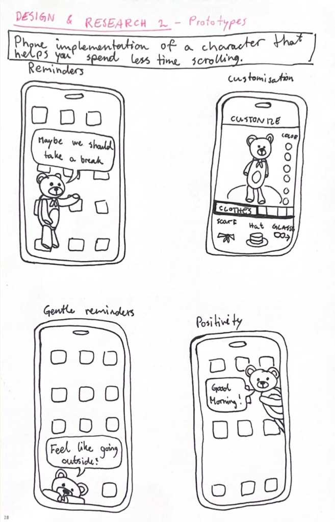
The first one was a continuation of my work with doomscrolling prevention from last semester. The idea is to implement a customizable character into your phone that pops up on your screen from time to time to remind you to take breaks from scrolling and encourage you to do other things. The character’s appearance and personality would be fully customizable so that it feels personal and gives you a sense of care for it. During the peer feedback session in class, I received feedback expressing concern that the character might become annoying over time, and that users could grow to dislike it if it keeps appearing at inconvenient moments. I agree with this, so I think it would be a good idea to make the frequency and persistence customizable as well, giving the user full control over how pushy the implementation is. The idea received a lot of positive feedback, and several people said they would consider using it.

Reuse website:

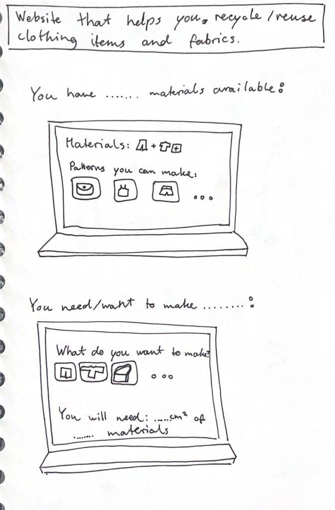
My second prototype is not as well developed yet, but I think it is my favorite so far. I am passionate about recycling and reusing old clothes and fabrics, so I wanted to create something within that theme. I made a rough prototype of wireframes for a website that helps users reuse their old materials. It can be used to input the materials you have available and then generate ideas for what you can make from them, including patterns you can use. It could also be used the other way around: you specify what you want to make, and it provides suitable patterns along with information about which materials are needed and how much is required. The feedback I received on this prototype was also very positive. I got a recommendation to include different filters to make it more manageable—for example, filters for which tools you have available, or how skilled and experienced you are in sewing and crafting.
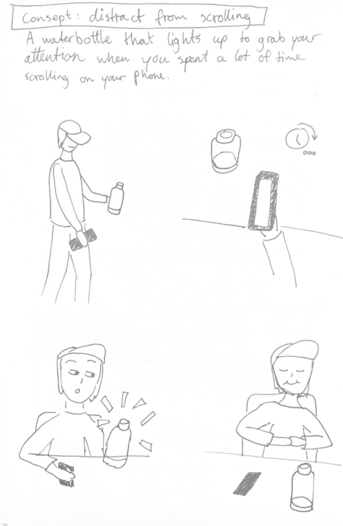
Scroll distraction:

My third and final prototype returns to the idea of preventing doomscrolling. It is a water bottle that connects to your phone and lights up to distract you when you have spent a lot of time scrolling. I thought it could be interesting to have the preventative element exist as a physical object rather than within the device itself. Sometimes, a reminder of the outside world can help break the scrolling cycle and bring you back to “real life.”The water bottle distracts you by lighting up or even making a sound to make you aware of your scrolling behavior. One downside to this product is that you would have to keep the bottle with you at all times, but for people who already do that, it could be an effective tool.

✿1 Design & Research 2

Step 0 – 1st March 2026

The next two weeks will be focused on developing three different prototypes. My main goal is to explore how interfaces can be designed to better support older adults, especially those who didn’t grow up with digital technology. But before diving into design, I need to ask myself some questions: what is the real problem here? What do older users struggle with the most? Is it that apps and websites are simply too complex, with too many steps and features? Or is it that digital interfaces don’t match the way they expect things to work? Or perhaps it’s not the design at all, but a broader question of digital literacy, understanding how devices, apps and online systems actually function.

Step 1 – 8th March 2026

At the beginning I thought the main challenge would be designing intuitive, accessible interfaces. But as I began talking to people, I realized the picture is much bigger. Many of the people I asked weren’t just struggling with specific apps, they were struggling with digital literacy itself.

This opened my eyes to an important distinction: while good design can make apps easier to use, it can’t replace the need to teach fundamental digital skills. Tasks like navigating menus, understanding security warnings, or even recognizing phishing emails require guidance and practice.

I focused on brainstorming what the digital learning platform should actually teach and how it should support older adults in learning digital skills. Instead of starting directly with the design, I tried to map out the most important areas of digital literacy that the platform could cover. These include basic device skills such as navigating smartphones or adjusting settings, understanding common apps and websites, learning fundamental digital concepts like cloud storage or files, as well as topics related to online security, communication and everyday digital tasks.

While collecting these topics, it also became clear that the platform should not only provide information but guide users through learning in a structured way. One idea that was to create a “Today’s Lesson” feature. Instead of presenting users with many options at once, the platform could suggest one small learning session per day. This approach could help reduce decision fatigue.

Prototype 1

Prototype 2

Prototype 3 – Final Prototype

With the last prototype I tried to move away from the “dashboard” layout a bit and instead focus on something much clearer. Rather than showing lots of different options right away, the interface tries to guide the user through what to do next.

The “Today’s Lesson” feature became the main focus of the layout. It’s the first full-width card right after the hero section and noticeably larger than everything else on the page. The idea is that the most important action of the day should require zero searching. Many older users don’t scan pages the same way younger users do. Instead, they read from top to bottom.

Another element I tried out is a progress tracker with color-coded topics. Each topic has its own color instead of everything looking the same. The idea behind this is that color can become a kind of memory anchor. Over time users might remember something like “orange was the security lessons” without needing to read every label again.

For the lesson library I created video cards that show the duration and difficulty level right away.

Another thing I want to add is an accessibility toolbar directly in the Navigationbar. Instead of hiding text size or contrast settings somewhere deep in a settings menu, the controls (A / A+ / A++ and a contrast toggle) are always visible. My thought here was: if someone needs larger text, they probably need it immediately, not after navigating through several menus they might already struggle to read.