#slowness #slowliving #slowinteraction #digitalcalm #calmtechnology
Designing with slowness in mind does not mean slowing down or reducing the functionality of technologies. It is about creating interfaces that feel calmer, more understandable, and less demanding. Slow and calm interaction helps reduce digital stress and gives users more space to reflect, observe, and enjoy the moment.
Below are a few simple principles that demonstrate how you can incorporate slowness into everyday applications and digital interactions.
⏸️ Meaningful Pauses
Pauses allow users to understand, reflect, or simply take a breather between actions. These pauses don’t disrupt the experience, but rather structure it.
❔ How to apply:
⭐ Introduce short pauses before irreversible actions (e.g., deleting elements).
⭐ Add micro-delays to animations that create a natural rhythm to the interface instead of an instant transition.
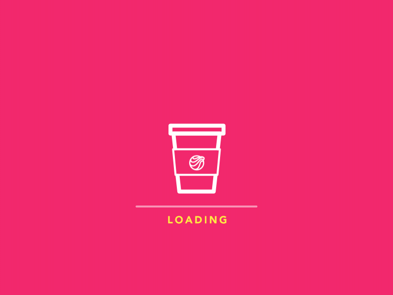
⭐ Use loading states intentionally, providing small contextual cues instead of distracting spinning indicators.
A well-placed pause can transform interactions from reactive to intent-driven.
🐢 Gentle Transitions
Quick, sharp transitions create a sense of speed and urgency. Smoother transitions reduce cognitive strain and make interfaces more tactile.
“Your brain loves continuity. Abrupt changes? Stressful. Jerky movement? Distracting. Our minds crave flow. And transitional elements, when done right, smooth out the experience…” — Marco Mazzurrana [1]
❔ How to apply:
⭐ Replace instant screen switches with smooth transitions, slides, or dissolves.
⭐ Use easing curves that simulate physical motion rather than mechanical jumps.
⭐ Allow UI elements to appear gradually, rather than all at once.
Even a transition lasting 150–250 ms can change the feel of the interaction.

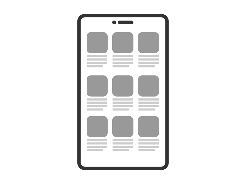
😵 Low information density
Screens with high information density overload working memory. Low density creates space for attention.
“High information density places heavy demands on user cognition, forcing the brain to process too many signals at once. In contrast, a leaner information layout reduces cognitive load and allows the mind to focus and make sense of content more easily.” — Poulami Chakraborty [2]
❔ How to apply:
⭐ Prioritize one task on each screen.
⭐ Ensure gradual disclosure of information: show only what is necessary at the moment.
⭐ Reduce the number of simultaneous notifications, icons, and visual competition.[3]
A calm interface communicates information only when necessary.

👂 Embodied interaction
Slowness can come from the body: breathing, posture, pace, and gestures shape how we interact with technology.
“Touch, sound, and vision are the primary senses apps use to influence how we behave. These sensory channels shape how we feel and respond before we even think about it.” — Harrish Murugesan [4]
❔ How to apply:
⭐ Use gestures that encourage slower, smoother movements (long press, drag, explore).
⭐ Integrate tactile feedback that mimics physical softness rather than sharp impulses.
⭐ Encourage interfaces that respond to movement — walking, pausing, turning — rather than just touch.
This principle brings interaction closer to real human rhythm.

⚡️ Reducing pressure when making decisions
Fast interfaces speed up the selection process, often increasing cognitive fatigue.[5]
❔ How to apply:
⭐ Provide clear recommendations instead of overloaded menus.
⭐ Limit the number of options available at once; use structured instructions.
⭐ Offer “later” or “not now” options to reduce urgency.
Reducing pressure creates psychological space.

⌛ Temporal consistency
A slow interface should not switch unexpectedly between fast and slow modes; its rhythm is predictable.
❔ How to apply:
⭐ Maintain a consistent animation speed.
⭐ Align the timing for different functions.
⭐ Avoid mixing abrupt transitions with slow ones.[6]
Temporal consistency builds trust.
Sources 🛈
[1] Marco Mazzurrana. Designing the Pause: How Transitional Elements Shape User Experience. maerco.framer.ai, 2024. Available at: https://maerco.framer.ai/blog/designing-the-pause-how-transitional-elements-shape-user-experience
[2] UX Collective. Designing for Information Density. UX Design, 2021. Available at: https://uxdesign.cc/designing-for-information-density-69775165a18e
[3] Fresh Consulting. Manage Data Density: High-Level to Low-Level. Insights Blog, 2021. Available at:
https://www.freshconsulting.com/insights/blog/ui-ux-principle-52-manage-data-density-high-level-to-low-level/
[4] Harrish Murugesan. “Psychology Behind UI/UX Design.” TEDxUTA, 2021. Available at: https://www.youtube.com/watch?v=fdXI9yznzz8
[5] Jayasurya P. Understanding Decision-Making in Terms of UX: Dual Theory Insights. Medium, 2022. Available at:
https://medium.com/design-bootcamp/understanding-decision-making-in-terms-of-ux-dual-theory-insights-e66ef7432b2b
[6] Nielsen Norman Group. Consistency and Standards. NN/g Articles, 2020. Available at:
https://www.nngroup.com/articles/consistency-and-standards/