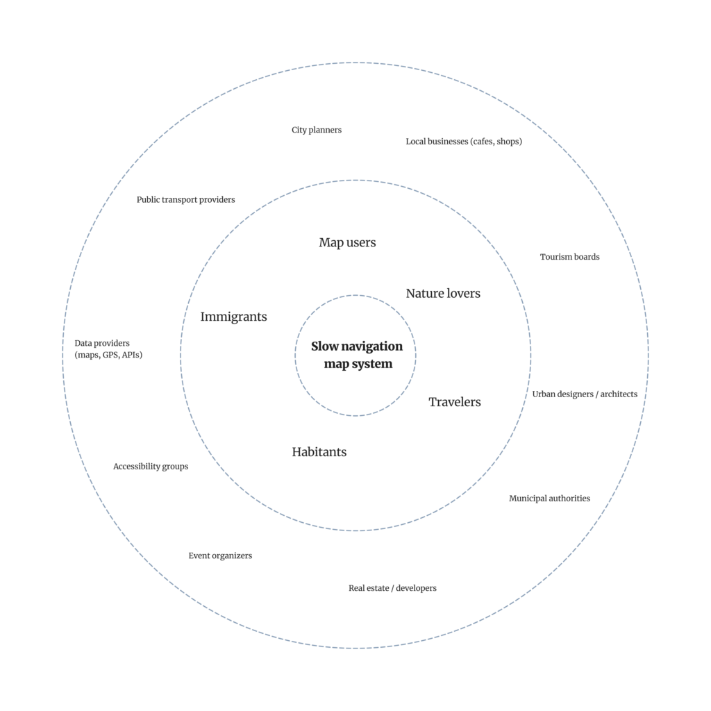
Continuing my research on the topic of “Slowness”from last semester, I will be doing further work on this topic as part of the Design & Research II course with Birgit Bachler PhD.
For the final assignment, I will need to record a 2-minute video of the final prototype — in my case, I plan to use prototyping in Figma, which each of you will be able to test. The research will again focus more on contextual analysis, as well as user testing, bibliography, and heuristic evaluation.
In this first blog post, I want to show you three quick lo-fi prototypes for a future app. The task was to create 3 scenarios, and I’ll be presenting each of them today. All of them were put together and thought through quickly, in no more than 20–30 minutes.
*Also, during the second session with Birgit, we did a speed dating exercise, and at the end I’ll go over some notes and discuss the issues my classmates encountered.
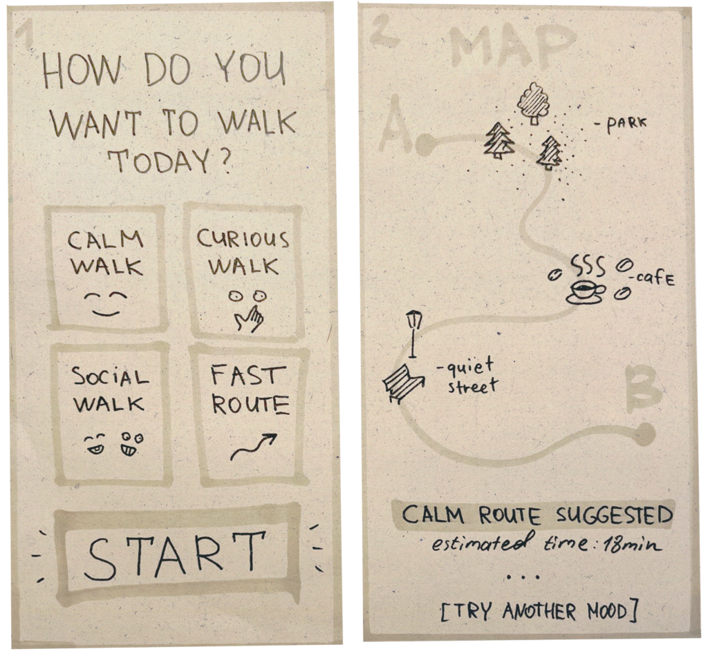
Prototype 1: Mood-based navigation 😁
In this scenario, the user first selects their mood or intention (calm, curious, social, fast), and then receives a route that matches that mood.
The route includes different types of spaces — parks, cafes, quiet street, depending on the user’s chosen mood.
The goal is to demonstrate how navigation can adapt to the person, rather than just to the geographical task.
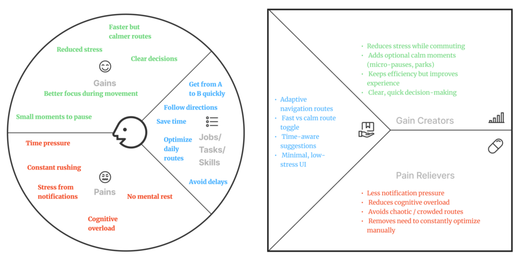
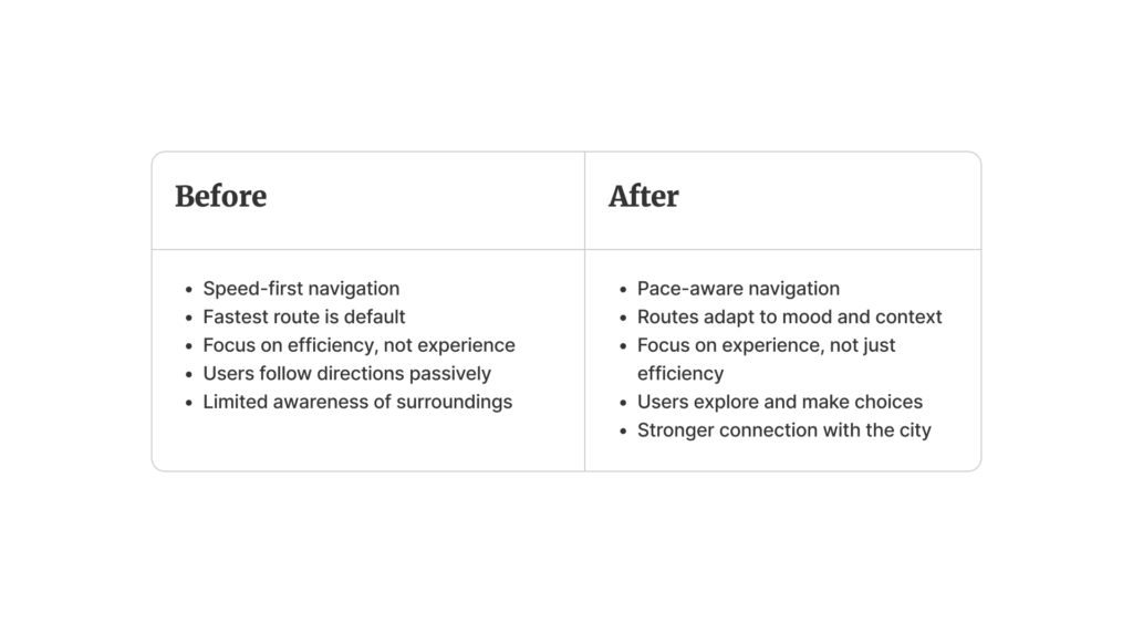
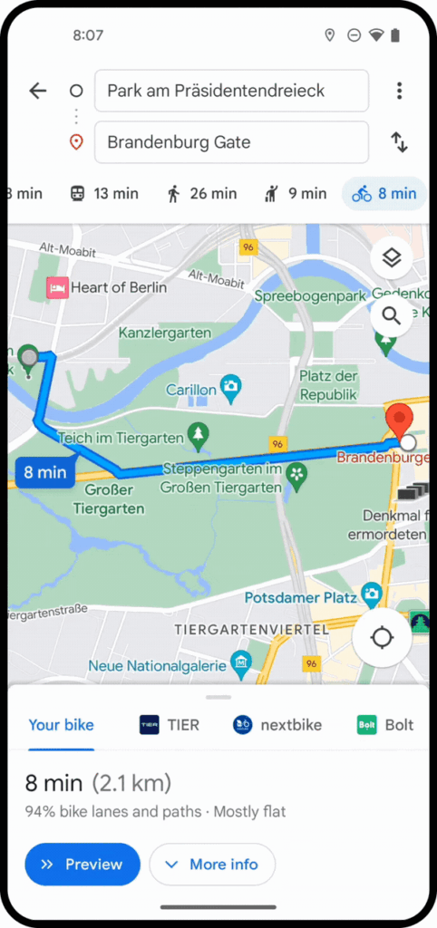
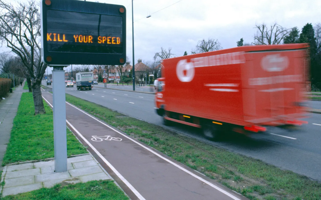
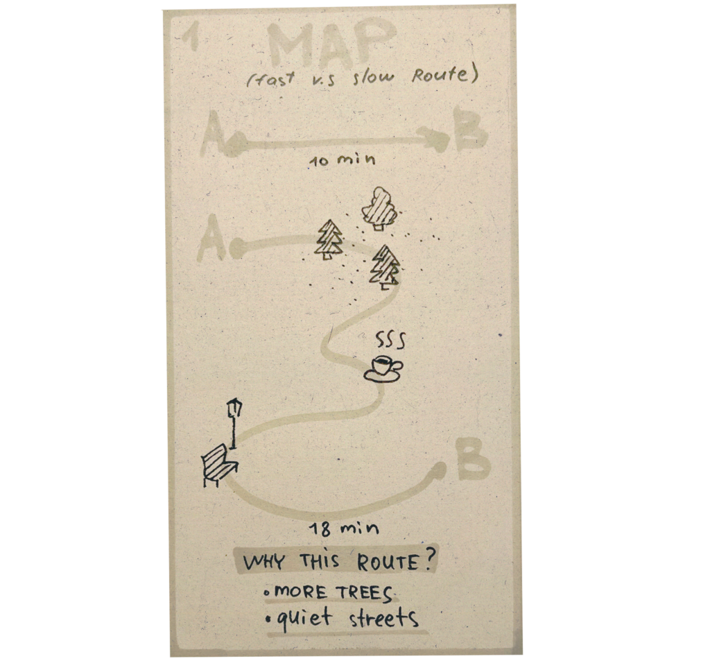
Prototype 2: Fast vs. Slow Route 🏃♀️
This scenario compares two approaches to navigation: “fast” and “slow”.
It shows the user that a longer route can be a better experience—it passes through green spaces, quiet streets, and places to stop (such as cafes or shops).
The goal is to shift the focus from efficiency to the experience of the route and a conscious choice.
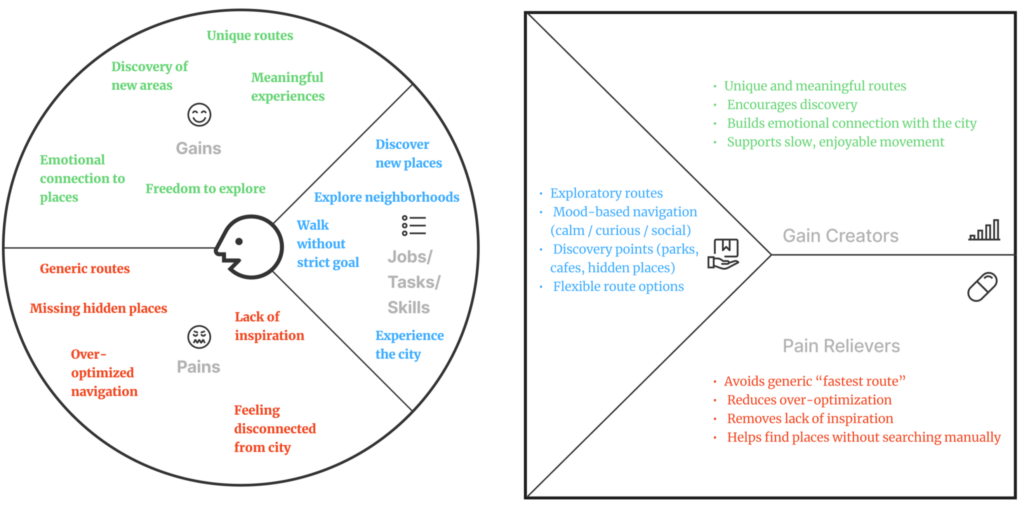
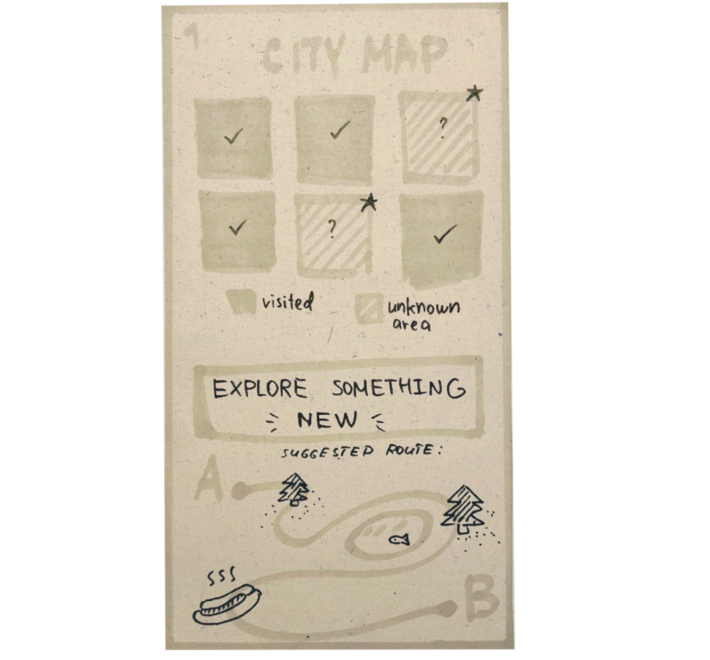
Prototype 3: Explore unknown areas 🤷♀️
Here, the navigation system encourages users to explore unfamiliar parts of the city.
The map is divided into “known” and “unknown” zones, and users can choose a route that takes them through new places.
The goal is to encourage exploration, step outside of familiar routes, and foster a personal connection with the city.
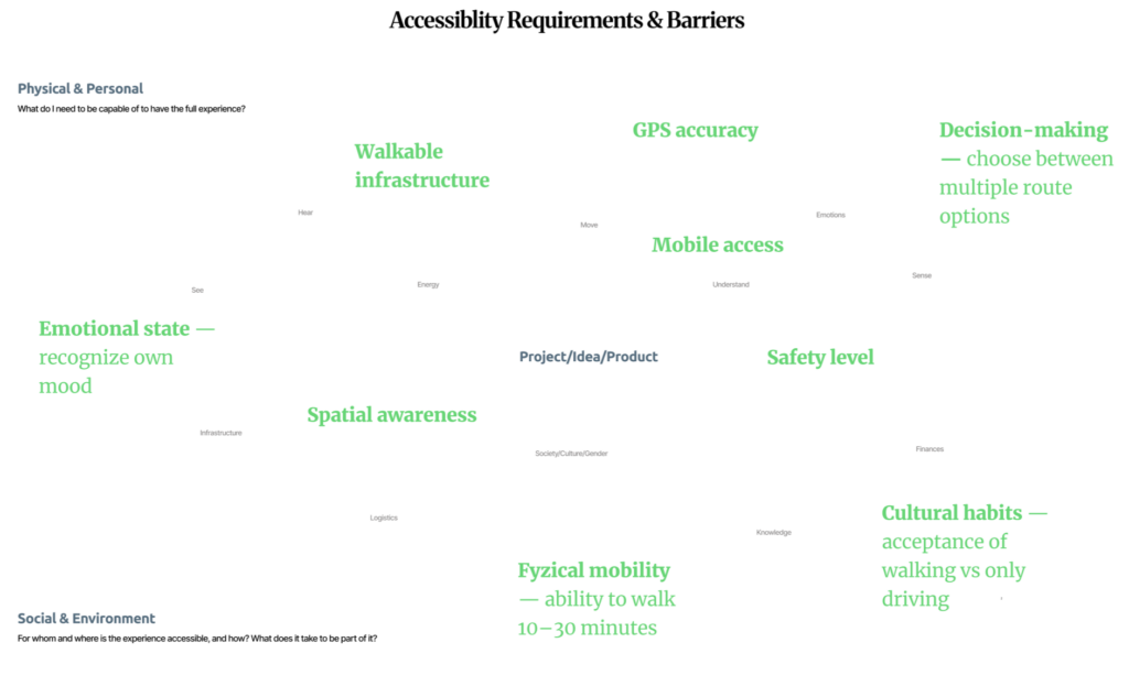
🗨️ Speed Dating notes:
During testing, additional scenarios emerged that are not covered by the current logic:
- First, a safe route is important, especially at night — taking into account street lighting, the presence of people, and the overall sense of safety.
- Second, the issue of data collection arose: to implement such routes, we need to understand where to source information, for example, regarding lighting, traffic, locations, and user behavior.
- There was also a request for budget-friendly routes, paths that take cost into account (like avoiding expensive locations or suggesting affordable spots), which adds another layer of personalization.