D&R2 SED D2 – Business Idea 2/2

What Problem are you solving?

Most game interfaces are static and cluttered, creating massive legibility and navigation barriers for visually impaired players. Designers often lack the time or specialized tools to implement complex WCAG-like standards and multi-sensory feedback.

Why should we care about it?

Accessibility isn’t just a “feature”, it is a fundamental right to play. When games like Black Myth: Wukong launch with unreadable text, it excludes millions of players and hurts the game’s reputation and reach.

What is the solution? How does it work?

An interactive design engine that acts as a “Canva for Game UI.” It allows designers to drag-and-drop modular HUD elements and automatically checks them against accessibility rules while providing a library of haptic and audio logic.

Who is the target audience/customer?

The target audience is the visually impaired gaming community who needs better tools to play. The paying customer is the UX/UI Designer and Game Studio looking to streamline their workflow and meet professional standards.

What is going to happen? (Change & Impact)

We will move from a “one-size-fits-all” UI to a Modular Era where games are playable by everyone from day one. This shift reduces “design guesswork” for studios and replaces frustration with independence and mastery for players.

Bonus: How can this make money?

The platform will operate on a Freemium SaaS model, offering a free basic toolkit for students and indies, while charging Enterprise Subscription fees to large studios for advanced simulation tools and custom haptic libraries.

D&R2 SED – Inclusion & Accessibility 3/3

On a functional and sensory level, creating inclusion requires identifying exactly where the barriers are. For a player to be truly included, the design must look beyond just visuals and incorporate haptic feedback/vibration and audio cues to support those with different sensory abilities. As seen in the exploration of colorblindness, a major barrier is often a reliance on a single channel of information (like color) to communicate vital game data.

Identifying these barriers makes it evident that participation in a game world is shaped by how much information is “translated” across different senses. The “Who and How” of inclusion depends on moving away from a “one-size-fits-all” visual approach and instead providing multi-sensory tools—like vibration and sound—that allow players to navigate the game regardless of their visual or physical constraints.

D&R2 SED – Change and Impact 2/3

In the “before” scenario, Game UI is often static, cluttered, and not completely accessible. Design decisions are frequently made without a standardized framework, resulting in interfaces that annoy or confuse players of differing experience levels. These “standard” UIs look “bad” in the sense that they fail to meet the functional needs of everyone, leading to a disconnected and frustrating user experience.

In contrast, the “after” scenario highlights a shift toward a more scientific and flexible approach. By adapting and checking designs against WCAG (Web Content Accessibility Guidelines), the UI becomes a tool for education as well as interaction. The impact is a “Modular and Flexible” UI that uses minimal requirement guidelines to reduce clutter. This shift ensures the player is no longer fighting the interface but is instead empowered by a system that adapts to their specific level of experience and physical needs.

D&R2 SED – System Map 1/3

At the center of the system is the Game UI Modular Builder. This is the core tool or framework designed to bridge the gap between static design and player needs. Surrounding this center are the primary creators—UI/UX Designers and Game Designers—who directly build and implement the interface elements. The next layer includes the active users: Gamers, Students, and Visually Impaired Players, whose diverse needs and feedback loops drive the modularity of the system. On the outermost edge, the Game Company acts as the broader stakeholder, providing the professional and institutional context that allows the system to exist.

The map highlights the “stitched” connections between these groups, showing that a modular builder is not just a piece of software, but a meeting point for professional design and lived user experience. It reveals that accessible UI is a collaborative ecosystem where the designer’s tools must directly respond to the player’s specific barriers.

D&R2 – Lo-Fi Prototypes 1/6

Continuing on with my theme of User Interfaces in Video Games, I developed 3 quick and dirty prototypes for the Design & Research 2 course kick-off.

This prototype that I will most likely bring to class is the sticky UI kit. I want to see how people who might not have preconceptions (but also those that do) would naturally arrange different UI elements when put on the spot. User expectations are pretty important when it comes to interfaces so that’s why I decided to play around with that idea, where people could tangibly display their expectations and intuitions in a setting where I could also document it.

It consists of:

  • piece of paper with a background
  • 10 pieces of paper with UI elements with tape on the back

This prototype is based on diving in and out of menus and the information hierarchies associated with them. It’s made with folded papers which would be flipped up depending on which button is clicked. The task would, for example, be finding how to change subtitle sizes, as they are often in video settings under accessibility. The confusing part is also that its also sometimes under audio settings so this could serve as sort of cart sorting test as well. Traversing complex tree menus that just keep going in and in can be frustrating.

It consists of:

  • 3 folded pieces of paper with 6 different menus

This prototype is about my biggest pet peeve with games, which is subtitles. It’s uses a piece of paper with scribbles to simulate complex backgrounds that acts as the background and a strip with different subtitle styles. I would simulate different situations (e.g. placing the paper further away) and slide the subtitle styles and ask what was written. This could open a discussion about what is necessary and what works in situations like a game where a lot of mental power could be being used.

It consists of:

  • piece of paper that acts as a background with a cutout
  • strip of paper with different subtitles

ID1 – NIME Article

The paper I chose to read on the NIME archive was:

Bubble Drum-agog-ing: Polyrhythm Games & Other Inter Activities by Jay Alan Jackson

The reason I chose this paper is because it had something to do with games, which was my very open research topic so far. The whole thing is about using big exercise balls as drum kits.

As seen on the picture, this project wanted to re-imagine drum kits capable of input. Regular drums are loud and can damage hearing, but provide a steady exercise value. Rubber drum kits for practicing with input also exist in the form of Guitar Hero or Rock Band.

What the author wanted to achieve was to eliminate the feeling of no feedback and thus no feeling when it comes to hard rubber kits. The data is captured using an accelerometer, microphone and camera inputs, to make it possible to play rhythm games. There are microphones placed closely to the bubble drum and they use Drumagog to replace the drum samples, while replicating the original performance responsively and accurately.

The paper also mentions that both aural and visual feedback are provided, but this is within the games themselves. The game that was developed by the author was a simple flash game “Polynome”. The objective and challenge is for the player to perform polyrhythmic patterns to existing songs, using the drums as controllers. The drum samples are using different elements depending on the song, in order to create unique remixes of rhythm and sound.

Figure 2: Polynome Screenshot

What’s interesting to me is the UI shown, the circles with the lines inside them are a reoccurring motif that is, I assume, meant to be the main indicator of what to do within this game. I’m not very well versed with music theory, but I am well versed with rhythm games, so I would have to wonder what these symbols mean and how this game actually makes things clear to the player. Unfortunately, these aspects aren’t described or analysed in this paper.

Overall, I find the idea fun because I like rhythm games and unique interaction methods acting as controllers. However, I find the paper to be a bit shallow and lacking more technical information. I can’t fully imagine the interaction, how the game would work, or how this entire thing would provide a “rigorous workout” (as stated many times in the text).

  • [1] J. A. Jackson, “Bubble Drum-agog-ing: Polyrhythm Games & Other Inter Activities,” in Proc. 12th Int. Conf. on New Interfaces for Musical Expression (NIME), Ann Arbor, MI, USA, May 22, 2012, exhibit.

User Interfaces in Video Games 10/10

User Interfaces in Video GamesThe quest for genre-appropriate and usable game UI

Over the last nine blog posts, I’ve went from the oscilloscope screens of 1958 to visual representations of game UI to the modular, accessible hardware of today. Now I’d like to wrap up my journey with a short reflection.

This research diary started with a fairly open topic that I had no idea how to navigate. After my research, I can safely say that I’ve learned a lot about games, their interfaces and the interaction design behind it.

I learned that game UI has a history worth respecting. Going back to the oscilloscope screens of the 50s and the early arcade days of Space Invaders was interesting because I realised that the simple high score was an innovation at the time and was the start of the complex feedback loops we have now.

I learned how to categorise the visual representations of game UI. Breaking down the four types of UI completely changed how I look at game screens. I now see how a UI can either be overlayed on top of a game or be woven directly into the world, with the player character being aware of it.

I learned that style can actually drive usability. Exploring the Aesthetic-Usability Effect showed me that when a game aesthetic, it isn’t just for show. I learned that if a menu feels like it belongs in the game’s world, players are more likely to find it intuitive and engaging, which holds water with my personal gaming journey.

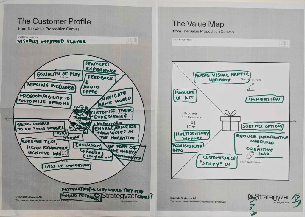
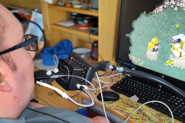
I learned that accessibility is a fundamental responsibility. From my struggle with tiny subtitles to the impact of the QuadStick, I learned that game UI design isn’t just an aesthetic choice but also about inclusion. This coincides with the fact that I’d like games to be enjoyed as many people since they made my life much better.

In the end, through all these learnings and this, to be honest, hard journey I realised that designing a game user interface is a way, way, way, way more complicated and diverse topic than I anticipated. When I picked this topic I was mostly just focusing on the simple thought of “cool, stylish UI that also respects users” and kept a narrow focus on the visual part, the user interface design of it all.

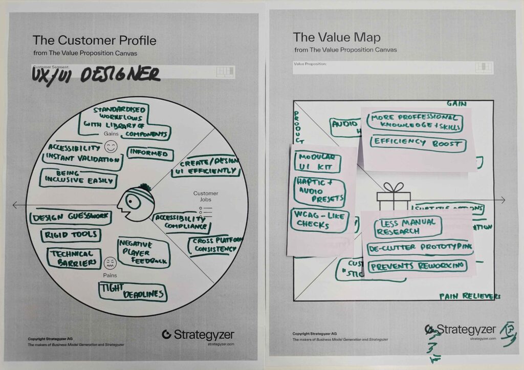
However, through this research diary and through a conversation with the Senior UX/UI Designer at Bongfish, I’ve realised that game user interface designers are responsible for way more than the graphical menus and HUDs. The 60 accessibility options of The Last of Us Part II kind of blew me away with the use haptics, audio cues and difficulty settings.

If I continued with this (now daunting) topic, I’d have to consider narrowing down the research to specific devices (PC, console, mobile or VR/AR etc.). Placing emphasis on just the visuals doesn’t really work for this topic, as evidenced by this extensive journey of many sub-topics, so finding a focus area could be hard. Either way, I’d say it was a valuable journey and I’ve collected some actual knowledge on my newfound love: games.

User Interfaces in Video Games 9/10

User Interfaces in Video GamesThe quest for genre-appropriate and usable game UI

To continue with the accessibility topic of my last blog post, in this one I would like to dive deeper into how this complex interaction of playing video games is for people with disabilities.

Beyond the screen and graphical user interface, we have to consider the physical interface players control the game with. While reading the Saunders and Novak book Game Development Essentials: Game Interface Design, I was really moved by the story of Robert Florio, a quadriplegic artist. He uses a “mouth stick” to play games like Devil May Cry 3, a fast paced action game with complex combos [1]. It made me realise that an accessible interface isn’t just about ease of use, but it’s also about giving someone control over a world they can’t physically interact with anymore. When a designer adds the option of remappable buttons, they aren’t just making a “setting”, they’re opening doors for people who wouldn’t be able to interact with the product at all otherwise.

The “mouth stick” in question was an early model of the QuadStick, pictured on Figure 1. This is a mouth-operated controller produced by an independent manufacturer. It acts as an “add-on” to existing consoles or PCs, using sip-and-puff sensors to translate breath and lip movements into complex game inputs [2].

Figure 1:
Quadstick
Source: [3]

A major sign that the industry is finally taking this seriously is that console manufacturers are now building these solutions themselves. The PlayStation Access Controller is a modular kit designed specifically to be accessible out of the box. It moves away from the “fixed” shape of a standard controller, allowing players to create a layout that works for their specific hand strength or range of motion. This further emphasises the importance of customisable and remappable inputs in games.

Figure 2: Playstation 5 Access Controller
Source: [4]

This is where one really sees how interacting with games goes beyond the user interface. It’s also about the user experience and overall interaction design. I already mentioned The Last of Us Part II in my last blog post, focusing on the vast variety of subtitle adjustment options. This is just one out of over 60 different accessibility options [5].

Their design philosophy follows a “sensory redundancy” model. This means that if a player can’t see the path, Navigation Assistance uses haptic pings and 3D audio cues to guide them. If a player can’t hear an enemy, Awareness Indicators and Combat Vibration Cues translate sound into visual and tactile data. This really showed me how expansive this theme can get once we look at the broader spectrum of the interaction between the game and the player.

User Interfaces in Video Games 8/10

User Interfaces in Video GamesThe quest for genre-appropriate and usable game UI

The question proposed in my last blog post is a big can of worms that has many aspects influencing it. One big aspect of interfaces being usable is accessibility, which I took a look at in this blog post.

In my research, I’ve found that many people treat accessibility as a “bonus feature,” but as Saunders and Novak point out in Game Development Essentials: Game Interface Design, it’s a fundamental responsibility. Since there are no strict government regulations for games, it’s up to developers to self-regulate to meet the needs of those with disabilities [1].

In my introductory blog post, I mentioned the frustration of games having subtitles but them being too small to read, often with bad contrast. Subtitles are a perfect example of where game UI often has issues. In many modern AAA games, the text is optimised for someone sitting in front of a high-resolution monitor. But for a console player sitting on a couch 3 meters from a TV, that text becomes unreadable.

I noticed this in many games but want to point out Black Myth: Wukong as an example, pictured on Figure 1. The text is so tiny that even at my monitor I could barely read it, especially on white backgrounds where it lacked contrast in addition to it’s small size. It really dampened my experience because I played the game with the Chinese dub, but this would be an even worse experience for someone who’s, for example, deaf.

Figure 1: Black Myth: Wukong
Source: [2]

To combat this, the choice of typeface is important. Sans Serif fonts (like Arial or Verdana) are preferred for difficult viewing conditions because they don’t have the tiny “cross strokes” (serifs) that can blur together at low resolutions [1]. Simply testing the legibility on different devices and positions during development would already make a huge difference.

A best practice example for dealing with subtitles can be seen in The Last of Us Part II. They provide incredibly adjustable subtitle options where players themselves can massively increase the text size, change the color of the names to identify speakers, and add a dark semi-transparent backing box behind the text. This means that no matter how bright the game world is, the text is still legible.

Figure 1: The Last of Us Part II
Source: [3]

Another aspect to consider is colour-blindness. Around 8% of men (1 in 12) and 0.5% of women (1 in 12) are affected [4]. Considering this data, its vital to never use color as the only way to give information. A health bar shouldn’t just change from green to red; it should also change in length so a color-blind player can still read the state of the game [1]. Likewise, if a game uses only red and green to signal “enemy” versus “friend”, a significant portion of the audience is excluded.