#20 Eat, Pray, Thesis: Using the Next Three Months for the Basis of my Thesis

As this semester comes to an end, I have started to think more seriously about how I want to use my summer. Usually, summer feels like a break between two busy phases. It is a time to slow down, recover, travel, work, or simply not think too much about university for a while. This year, however, I want to approach it differently. I still want to have some time to rest, but I also want to use the next three months in a focused way. My main goal is to make real progress on my thesis, so that I can enter the fourth semester with more clarity and more space for applications.

The fourth semester already feels like it will be an important phase. There will be pressure to finish everything, but also to think about what comes after the study program. I know that applications, portfolios, interviews, and future plans will take time and energy. Because of that, I do not want to leave the main thesis work until the last possible moment. Instead, I want to use the summer as a preparation phase. My aim is not necessarily to finish everything perfectly, but to build a strong foundation.

Looking back at this semester, I realized that many of the projects and blog posts I worked on already point toward useful lessons for the thesis process. Even when the topics were different, they all had something in common: they taught me how important it is to plan research carefully, stay flexible when things do not work out, and reflect on the methods I use.

One of the clearest examples was the eye tracking test I wanted to do at the poster exhibition Critical Imagination. The original plan was to use an eye tracker to understand how visitors looked at posters. I wanted to find out which parts of the posters attracted attention, what people noticed first, and whether the design guided the viewer in the intended way. In theory, this would have been a strong method, because eye tracking can create visual data such as heat maps and gaze paths.

However, the eye tracker did not work on the day of the exhibition. At first, this felt like a failure, because the main tool I wanted to use was suddenly unavailable. But after reflecting on the situation, I realized that the technical problem was not the only issue. Even if the eye tracker had worked, there were not enough people from the needed target groups at the exhibition. That means the data would probably not have been strong enough anyway.

This was an important lesson for me. A research method can look very professional, but it only works if the whole research setup makes sense. It is not enough to have a good tool. The participants, the context, the question, and the amount of data also need to fit together. This is something I want to remember while working on my thesis. I do not want to choose a method only because it sounds interesting or advanced. I want to choose methods that actually help me answer my research question.

The failed eye tracking test also taught me the value of backup plans. If one method does not work, that does not mean the whole project has to fail. In that blog post, I thought about other ways of studying attention manually. For example, I could observe how long people stand in front of a poster, create a manual attention map with sticky dots, ask visitors what they noticed first, or use short interviews after they viewed the posters. These methods may not produce the same type of data as eye tracking, but they can still offer useful insights.

This is also relevant for my thesis. During the summer, I want to plan my research in a way that includes alternatives. If I decide to do interviews, I need to think about what happens if not enough people are available. If I want to test something with users, I need to consider how to recruit them early enough. If I want to analyze design examples, I need to make sure I have enough material. The more realistic I am now, the less stress I will have later.

Another important finding from this semester came from the interview exercise about analog and digital media consumption. The interview itself went well because the atmosphere was relaxed and the conversation felt natural. Since both sides were interested in the topic, it was easy to talk about personal media habits, such as reading printed materials, using digital platforms, watching videos online, or switching between analog and digital formats.

At the same time, the interview showed me how difficult it can be to balance a natural conversation with a structured research situation. Because the interviewee was a friend, the discussion sometimes became very informal. This made the atmosphere comfortable, but it also made it harder to stay focused on the main questions. I had to guide the conversation without making it feel too strict.

This was another useful lesson for future research. Good interviews need preparation, but they also need openness. If the questions are too rigid, the conversation can feel unnatural and interesting details may get lost. If the conversation is too open, the interview can lose direction. For my thesis, I want to find a good balance between both. I want to prepare clear questions, but also leave enough space for unexpected answers.

The interview also showed me how challenging it is to listen actively, pay attention to the interviewee, and take notes at the same time. This sounds simple before doing it, but during the interview I noticed how much concentration it requires. For longer interviews, recording would probably be helpful, because then I could focus more on the conversation instead of trying to write everything down immediately. This is something I want to include in my thesis planning as well. If I conduct interviews, I should think about consent, recording, transcription, and how I will organize the material afterwards.

The topic of analog and digital media consumption itself also connects to a bigger theme that has followed me throughout the semester: how people interact with media in everyday life. Whether it is a poster in an exhibition, a digital platform, a printed magazine, or an interview about personal habits, media is never only about the object itself. It is also about attention, context, memory, habits, and interpretation.

This is one of the main findings I want to carry into the summer. I have become more aware that design and media are experienced differently depending on the situation. A poster in a gallery is not seen in the same way as a poster on Instagram. A printed text is not read in the same way as a digital article. A person may say they prefer analog media, but still use digital media every day because it is faster and more convenient. These contradictions are interesting because they show that media consumption is not always logical or consistent. It is shaped by routines, emotions, access, time, and social habits.

This semester also taught me that reflection is part of the research process. Not everything has to work perfectly to become useful. Sometimes a failed test, a difficult interview, or an unexpected result can lead to better questions. Before, I may have seen these situations mainly as problems. Now I see them more as material to learn from. This is important for the thesis because I know that not everything will go exactly as planned. There will probably be moments where I feel stuck, where the topic feels too broad, or where I need to change direction. Instead of seeing that as failure, I want to treat it as part of the process.

For the summer, I want to turn these findings into a concrete plan. My first goal is to define my thesis topic more clearly. At the moment, I know the general direction, but I need to narrow it down. A broad topic can be interesting, but it can also become overwhelming. I want to formulate a question that is focused enough to work with, but still open enough to allow meaningful research. This will probably be one of the most important steps at the beginning of the summer.

After that, I want to collect and organize relevant sources. Instead of reading randomly, I want to build a small structure. I want to separate sources into themes, for example media consumption, visual attention, analog and digital practices, design research, and user testing methods. This will help me understand what has already been written and where my own work could fit in. It will also make the writing process easier later, because I will not have to start from zero.

Another goal is to decide on possible research methods. Based on this semester, I know that I should not rely too much on one method only. If my thesis includes interviews, I want to prepare them carefully and think about how many people I need. If I use observation or testing, I want to plan how the data will be collected and what I can realistically analyze. I also want to think about backup options from the beginning. This does not mean planning every detail perfectly, but it means being prepared for possible problems.

I also want to use the summer to start writing earlier than I usually would. Often, writing is treated as the final step after all the research is done. But I think it would help me to write throughout the process. Even short notes, reflections, summaries, or rough chapter drafts can make the thesis feel more manageable. Writing early can also show me what I already understand and where I still need more research.

To make this realistic, I want to divide the summer into phases. The first phase will be orientation and narrowing down the topic. This means reviewing what I already have, looking back at the semester’s findings, and deciding what direction feels strongest. The second phase will focus on reading and research. During this time, I want to collect sources, write summaries, and understand the theoretical background better. The third phase will focus on structure and first writing. By the end of the summer, I would like to have a clearer thesis outline, a first version of the research question, notes on possible methods, and maybe even draft sections of the introduction or theory chapter.

At the same time, I know that the plan has to stay realistic. Summer should not become three months of constant pressure. I need breaks as well, because creative and academic work also needs distance. If I plan too much, I might end up feeling guilty instead of productive. So I want to create a routine that is steady but not extreme. A few focused hours several times a week may be more useful than trying to work all day and losing motivation after two weeks.

The biggest goal is to enter the fourth semester with less uncertainty. I want to be able to focus more on applications, portfolio work, and future opportunities without feeling like my thesis is still completely undefined. Starting now gives me more control. It also gives me more time to make mistakes, change ideas, and improve the work before the final deadline becomes too close.

Looking back, this semester has shown me that research is not only about results. It is also about preparation, flexibility, and reflection. The eye tracking project taught me that a method is only useful when the whole setup supports it. The interview about analog and digital media consumption taught me how important it is to balance structure and openness. Both experiences showed me that people’s attention, habits, and interpretations are complex, and that research needs to be designed carefully to understand them.

That is why this summer feels like an opportunity. It is not just empty time between semesters. It is a chance to take everything I learned and turn it into a clearer direction for my thesis. I want to use these three months to build a foundation that will make the next semester less stressful and more focused.

By the end of the summer, I do not expect everything to be finished. But I want to know where I am going. I want to have a topic that feels clear, a structure that feels possible, and a research plan that is realistic. Most importantly, I want to feel ready for the fourth semester, so that I can focus not only on completing my thesis, but also on preparing for what comes after.
#19 When the Eye Tracker Didn’t Track: Rethinking Poster Testing at Critical Imagination

As you know, I originally planned to test eye tracking during the poster exhibition Critical Imagination. The idea was simple: visitors would look at the posters, the eye tracker would record what caught their attention, and afterwards I would compare the data to the design intentions behind the posters. Which elements were seen first? Did people read the text or only scan the visuals? Did the composition guide the viewer, or did important information disappear into the background?

In theory, it would have been a very useful setup. Poster exhibitions are all about visual attention. A poster has only a few seconds to invite someone in, communicate an idea, and make them stay long enough to understand more. Eye tracking seemed like the perfect method because it can show gaze paths, fixations, heat maps, and areas of interest. Instead of only asking people what they remembered, I wanted to see how they actually looked.

But on the day of the exhibition, the eye tracker did not work.

At first, this felt like a failed test. The whole method depended on the device, and without it there was no automatic data, no heat map, and no clean visual proof of attention. However, after the initial frustration, the situation turned out to be more interesting than expected. Even if the eye tracker had worked perfectly, the testing would still have had a major problem: not enough people from the intended target groups attended the exhibition. That means the collected data would probably not have been representative enough to support strong conclusions.

In that sense, the technical failure exposed a bigger methodological issue. A working tool is not the same as a good study. Eye tracking can produce impressive-looking data, but that data only becomes meaningful when the research setup is strong: the right participants, a clear task, a controlled process, and enough observations to compare patterns. Without that, a heat map can look scientific while still saying very little.

This made me rethink what “testing” a poster can actually mean in an exhibition context. A gallery is not a lab. Visitors arrive with different motivations. Some come because they know the designers, some because they are interested in the topic, and some may simply pass through. They talk to each other, move unpredictably, stand at different distances, and may spend more time in front of one poster because a friend is standing there. These behaviours are not errors; they are part of the exhibition experience.

So instead of seeing the failed eye tracking test only as a problem, I started thinking about alternative ways to understand attention manually.

One option would be timing and tracking observation. This method is often used in museum and exhibition research. A researcher discreetly follows or observes a visitor and records where they go, where they stop, and how long they stay. For the poster exhibition, I could have created a simple floor plan of the space and marked each visitor’s route. Every time someone stopped in front of a poster, I could record the approximate dwell time. This would not show exact eye movement, but it would show which posters attracted people enough to physically stop.

Another option would be a manual “attention map.” After viewing the posters, visitors could be asked to mark the area of a poster they noticed first, the part they found most memorable, and the part they found confusing. This could be done with transparent overlays, sticky dots, or printed miniatures of the posters. It would not be as objective as eye tracking, because it depends on memory and interpretation, but it would create a participatory version of a heat map. In some ways, that might even fit the theme Critical Imagination better, because visitors would actively reflect on their own perception.

A third option would be short think-aloud sessions. Instead of silently looking at a poster, participants would be asked to describe what they notice while viewing it: “I see the image first,” “I am trying to understand the headline,” or “I do not know where to look next.” This method is not perfect, because speaking changes the viewing experience. Still, it can reveal confusion, expectations, and design interpretation in a way that eye tracking alone cannot. Eye tracking might show that someone looked at a title for five seconds, but a think-aloud comment can explain whether they were interested, confused, or trying to decode the message.

Video observation could also be useful, as long as it is done ethically and with permission. A camera placed at a distance could record visitor movement, posture, and stopping behaviour. For example, it could show whether people leaned closer to read small text, whether they skipped certain posters, or whether groups discussed specific works. This would not track the eyes, but it would track bodily attention. In a physical exhibition, that kind of attention matters.

The most realistic future approach might be a mixed method. Eye tracking could still be used, but only in a smaller, more controlled session outside the exhibition. Participants from the intended target groups could be invited separately, shown selected posters, and asked to complete a structured viewing task. Then, the exhibition itself could be studied through observation, dwell time, informal interviews, and visitor mapping. Together, these methods would give a fuller picture: eye tracking for precise visual behaviour, observation for real exhibition behaviour, and interviews for interpretation.

The failed test also reminded me that research methods should not become more important than the research question. I wanted to know how people engage with posters. Eye tracking is one way to approach that, but it is not the only way. In fact, the absence of the technology made the human side of the exhibition more visible. Who attends? Who does not attend? Who feels addressed by the posters? Who walks past? Who stops, reads, discusses, or ignores?

Those questions may be harder to measure than gaze points, but they are just as important.

In the end, the eye tracker not working did not completely ruin the project. It changed the direction of the reflection. It showed that testing visual communication is not only about capturing where people look. It is also about understanding the conditions under which looking happens. A poster does not exist in isolation. It exists in a room, in a social situation, in front of real people with different backgrounds, expectations, and levels of attention.

Next time, I would still like to use eye tracking. But I would not rely on it as the only method. I would prepare a backup observation sheet, define target groups more clearly, recruit participants in advance, and combine technical data with manual and qualitative methods. That way, even if the device fails again, the research does not fail with it.

Maybe that is the most useful insight from Critical Imagination: sometimes a broken tool forces a better question.

Sources

Tobii. “Understanding Tobii Pro Lab’s Eye Tracking Metrics.”

Tobii. “User Testing with Eye Tracking Goes Mobile.”

Nielsen Norman Group. “Thinking Aloud: The #1 Usability Tool.”

Nielsen Norman Group. “Usability Testing 101.”

Yalowitz, S. S., & Bronnenkant, K. “Timing and Tracking: Unlocking Visitor Behavior.” Visitor Studies, 2009.

University of Cambridge Museums. “Visitor Observation: Impact Evaluation Resources.”

Yuan, S. “An Eye-Tracking Study of Attention Capture Efficiency in Commercial Poster Design.” Applied Sciences, 2025.

MeasuringU. “Essential Eye-Tracking Visualizations and Metrics.”

#18 Critical Imagination as a Living Laboratory: Preparing Neurodesign Research Through Interactive Exhibition Design 

On 18 June, our work will be exhibited at Eggenberger Allee 15, as part of the exhibition Critical Imagination

The exhibition brings together a variety of projects exploring speculative futures, digital culture, participation, technology, and human experience. Visitors will encounter interactive installations, animated visual systems, experimental media, and immersive environments that challenge traditional ways of experiencing design. 

Unlike conventional exhibitions, many of the works react to their audience. Movement, proximity, curiosity, and interaction become part of the artwork itself. Every visitor contributes to the experience and shapes how the exhibition unfolds. 

For anyone interested in design, media art, technology, or creative experimentation, Critical Imagination offers an opportunity not only to view projects but to actively participate in them. 

What makes this exhibition particularly exciting for me is that it also provides a unique opportunity to continue the research journey that began with previous eye tracking experiments and behavioural analyses. 

From Posters to Interactive Experiences 

Throughout this semester, I have explored different methods of understanding how people engage with visual communication. 

The first workshop focused on analog printing techniques including linocut printing and LEGO pixel printing. Eye tracking analysis revealed how contrast, texture, colour, and composition influence visual attention. 

The second project investigated participatory design through a poster about artificial intelligence. Instead of simply observing visual attention, the project analyzed how children physically interacted with a designed artifact. Unexpectedly, participants respected the visual hierarchy and used negative space as an invitation for collaboration. 

The Sound & Vision project expanded this research even further. Rather than focusing on static visuals, the project explored responsive environments created with TouchDesigner. Movement tracking, behavioural mapping, and interaction logging became new tools for understanding engagement. 

Critical Imagination now combines elements from all three approaches. 

The exhibition contains posters, moving visuals, animations, interactive installations, and immersive environments. As a result, it offers an ideal environment for comparing different forms of audience behaviour. 

Why This Exhibition Matters for Neurodesign Research 

Neurodesign investigates the relationship between design decisions and human perception, cognition, attention, and emotion (Barden and Butler, 2022). 

Traditional design research often focuses on what designers create. 

Neurodesign asks a different question: 

How do people actually experience what designers create? 

This distinction becomes increasingly important when working with immersive and interactive media. 

Unlike a printed poster, an interactive installation evolves continuously through user behaviour. Visitors become active participants rather than passive observers. 

The exhibition therefore presents an opportunity to examine several neurodesign questions simultaneously: 

  • What attracts attention first? 
  • How long do visitors engage with individual works? 
  • Which visual elements create the strongest engagement? 
  • How does animation influence viewing behaviour? 
  • Does interactivity increase dwell time? 
  • How does sound affect visual attention? 
  • How do visitors navigate through immersive environments? 

These questions form a valuable foundation for future thesis research. 

Proposed Research Methods 

1. Eye Tracking Analysis 

The most direct continuation of previous projects would be eye tracking. 

A student-accessible solution such as a Tobii Eye Tracker 5 could be used to investigate: 

  • First fixation points 
  • Visual hierarchy 
  • Scan paths 
  • Areas of interest 
  • Dwell time 

Particular attention could be given to comparing static posters with animated posters. 

A key research question would be: 

Does motion strengthen visual attention or distract from core content? 

2. Movement Heatmaps 

Interactive installations generate behavioural information beyond gaze data. 

Using TouchDesigner and webcam tracking, visitor movement can be translated into heatmaps. 

These visualizations reveal: 

  • High engagement zones 
  • Dead zones 
  • Preferred pathways 
  • Areas that encourage interaction 

This method provides insight into spatial behaviour rather than purely visual behaviour. 

3. Dwell Time Mapping 

Dwell time measures how long participants remain near individual artworks. 

Longer viewing times are often associated with increased interest and engagement (Bitgood, 2016). 

Each exhibition piece could be assigned a specific observation zone. 

The resulting data would reveal which works maintain attention most effectively. 

4. Behavioural Observation 

Simple observation remains one of the most effective research tools. 

Questions could include: 

  • Do visitors return to specific works? 
  • Do they interact alone or collaboratively? 
  • Which installations generate conversations? 
  • Which works encourage physical participation? 

These observations provide context that quantitative data alone cannot capture. 

5. Emotional Response Documentation 

After engaging with selected works, visitors could answer brief questions regarding: 

  • Enjoyment 
  • Curiosity 
  • Surprise 
  • Confusion 
  • Memorability 

This creates a connection between measurable behaviour and subjective experience. 

Research Timeline 

Before the Exhibition 

Preparation Phase 

  • Define research questions 
  • Select artworks for analysis 
  • Configure TouchDesigner tracking 
  • Prepare observation sheets 
  • Test data collection systems 

During Installation 

Pilot Testing 

  • Test tracking reliability 
  • Identify blind spots 
  • Adjust observation zones 
  • Verify recording quality 

Exhibition Day 

Data Collection 

  • Eye tracking sessions 
  • Movement heatmaps 
  • Dwell time observations 
  • Visitor interviews 
  • Behavioural documentation 

After the Exhibition 

Analysis 

  • Compare interaction patterns 
  • Evaluate visitor pathways 
  • Identify successful engagement strategies 
  • Connect findings to neurodesign theory 

Potential Thesis Direction 

One of the most interesting outcomes of this research could be the comparison between different levels of audience participation. 

The semester projects already provide three distinct categories: 

Static Design 

Linocut and pixel print posters. 

Measured through: 

  • Eye tracking 
  • Visual attention 
  • Scan paths 

Participatory Design 

AI poster experiment with children. 

Measured through: 

  • Physical interaction 
  • Contribution patterns 
  • Spatial usage 

Interactive Design 

TouchDesigner and Critical Imagination installations. 

Measured through: 

  • Movement behaviour 
  • Dwell time 
  • Interaction frequency 
  • Spatial engagement 

Together, these projects create a progression from passive viewing to active participation. 

This could become the foundation of a neurodesign thesis investigating how different forms of interaction influence attention, engagement, and memory. 

Conclusion 

Critical Imagination represents more than an exhibition. 

It offers a living laboratory for studying how people experience contemporary design. 

The previous eye tracking experiments demonstrated how viewers engage with printed media. Participatory poster projects revealed how audiences contribute to visual outcomes. Interactive installations introduced entirely new behavioural dimensions. 

By combining these approaches, Critical Imagination provides an opportunity to investigate the relationship between attention, movement, emotion, and participation within a real exhibition environment. 

For a neurodesign researcher, this makes the exhibition more than a showcase of creative work. 

It becomes an opportunity to understand how design influences human behaviour and how human behaviour, in turn, shapes design. 

References 

Barden, O. and Butler, C. (2022) Neurodesign: Insights from Neuroscience to Design Better Experiences. London: BIS Publishers. 

Bitgood, S. (2016) Attention and Value: Keys to Understanding Museum Visitors. London: Routledge. 

Duchowski, A.T. (2017) Eye Tracking Methodology: Theory and Practice. 3rd ed. Cham: Springer. 

Norman, D. (2013) The Design of Everyday Things. Revised Edition. New York: Basic Books. 

Sanders, E.B.N. and Stappers, P.J. (2008) ‘Co-creation and the New Landscapes of Design’, CoDesign, 4(1), pp. 5–18. 

Manzini, E. (2015) Design, When Everybody Designs: An Introduction to Design for Social Innovation. Cambridge, MA: MIT Press.

#17 Drawing in the Gaps: What Children Taught Me About Participation, Design, and AI 

Design discussions surrounding artificial intelligence often focus on efficiency, automation, and replacement. Creative industries in particular are frequently confronted with the question of whether AI will eventually replace human designers. 

This poster project emerged as a response to that conversation. 

The central idea was simple: design is not only the production of visual outcomes. It is a process shaped by personal experiences, cultural context, emotion, empathy, and interaction. While artificial intelligence can generate visual results, it cannot genuinely share experiences, form memories, or develop human relationships. Design is ultimately a social practice. 

The poster itself originated from an unexpected discovery. While experimenting with typography in Adobe Illustrator and exploring different type manipulations, a small smiling face emerged accidentally from the forms of the number “3”. Rather than refining the composition into a polished graphic, I became interested in what this simple character represented. The smiley felt approachable, unfinished, and open for interpretation. 

Instead of asking how AI could generate better posters, the project shifted toward a different question: 

Can design become a space for human participation rather than passive consumption? 

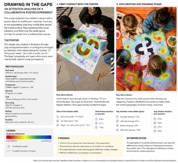
To investigate this idea, an A1 poster was printed and presented to children between the ages of 5 and 13. The goal was to observe how they interacted with the composition and whether their behaviour would challenge assumptions about visual hierarchy and poster design. 

Concept and Research Question 

The poster consisted of a large typographic composition dominated by the number “3”. A small smiling face was embedded within the design and accompanied by the phrase: 

“do it with a smile, not AI.” 

The composition intentionally contained large areas of negative space surrounding the main graphic elements. 

Before conducting the experiment, I developed a clear hypothesis. Based on common assumptions about children’s drawing behaviour, I expected participants to draw across the entire poster surface. I assumed that the established visual hierarchy, typography, and spacing would have little influence on where marks were placed. In other words, I expected visual structure to be ignored. The experiment was designed to test whether this assumption was correct. 

Methodology 

Participants 

The study involved children aged between 5 and 13 years

Rather than observing the poster individually, participants interacted with it collectively. The poster remained accessible throughout the activity and children were free to add drawings wherever they wanted. 

Materials 

  • A1 printed poster 
  • Markers and pencils 
  • Observation documentation through photography 
  • Informal behavioural analysis 

Unlike the previous eye tracking study, the focus here was not on gaze behaviour but on participatory interaction. The children’s drawings effectively became visual traces of attention and decision making. Every mark added to the poster represented a conscious choice about where to engage with the composition. 

Results 

An Unexpected Outcome 

The results contradicted my expectations almost immediately. Rather than drawing over the typography, the smiley face, or the central composition, participants overwhelmingly chose to draw within the empty white areas surrounding the existing design. Across multiple sessions and different age groups, a remarkably consistent pattern emerged. The original poster remained largely untouched. Instead, children appeared to interpret the white spaces as invitations to contribute. The visual hierarchy was not destroyed. It was respected. 

Reading the White Space 

In graphic design, negative space is often understood as an organizational tool that creates balance and clarity (Lidwell, Holden and Butler, 2010). What emerged during this experiment suggests an additional function. The children seemed to perceive the empty areas not as unfinished design but as available territory. Rather than competing with the existing content, they expanded it. Small characters, landscapes, robots, rainbows, animals, and abstract doodles gradually appeared around the typography. The poster transformed into a collaborative environment rather than a static object. Thelarge black typography continued to function as a visual anchor while the surrounding drawings created a growing ecosystem of contributions. 

Participation Instead of Consumption 

One of the most interesting observations was that the children did not treat the poster as something to be consumed. They treated it as something to join. This behaviour aligns with theories of participatory design, which emphasize collaboration, contribution, and shared authorship rather than one directional communication (Sanders and Stappers, 2008). The poster effectively became a conversation. Each child responded not only to the original design but also to drawings added by previous participants. New characters appeared next to existing ones. Storylines emerged. Relationships formed between otherwise unrelated drawings. The final outcome could not have been planned by a single designer. It was collectively authored. 

AI, Authorship, and Human Connection 

This unexpected result became highly relevant to the original topic of artificial intelligence. Current generative AI systems can produce images, layouts, and illustrations at remarkable speed. However, they do not participate in the social processes that give meaning to creative work. The value of this poster was ultimately not the graphic itself. The value emerged through interaction. Children interpreted the design, reacted to it, built upon it, and left visible traces of their own experiences. The poster became a record of collective engagement rather than a finished artifact. This reinforces a key distinction between image generation and design practice. 

Design is not simply about creating visuals. 

Design is about creating relationships. 

Discussion 

The experiment suggests that even young participants demonstrate a sophisticated understanding of visual structure. Contrary to expectations, the children recognized the hierarchy of the composition and chose not to interfere with it. Instead, they identified opportunities for contribution within the negative space. This behaviour transformed the poster from a fixed message into a participatory platform. The findings also highlight the importance of leaving room for interpretation. Designers often focus on what should be added to a composition, but this project demonstrates that what is left empty can be equally important. In this case, the white space became the most active part of the design. 

Conclusion 

What began as a poster about artificial intelligence ultimately became a study about human creativity. 

The experiment revealed that children did not ignore visual hierarchy. They understood it. They worked with it rather than against it. The poster’s most successful feature was not the typography, the slogan, or the smiley face discovered through experimentation in Illustrator. It was the space left open for others. The project demonstrates that meaningful design does not always end when the designer finishes working. Sometimes the most valuable part begins when other people are invited to participate. And perhaps that is precisely where human creativity continues to differ from artificial intelligence. Not in the ability to generate images, but in the ability to create connections. 

References 

Lidwell, W., Holden, K. and Butler, J. (2010) Universal Principles of Design. Beverly, MA: Rockport Publishers. 

Norman, D. (2013) The Design of Everyday Things. Revised and Expanded Edition. New York: Basic Books. 

Sanders, E.B.N. and Stappers, P.J. (2008) ‘Co-creation and the New Landscapes of Design’, CoDesign, 4(1), pp. 5–18. 

Manzini, E. (2015) Design, When Everybody Designs: An Introduction to Design for Social Innovation. Cambridge, MA: MIT Press. 

#16 Drawing in the Gaps: What Children Taught Me About Participation, Design, and AI 

Design discussions surrounding artificial intelligence often focus on efficiency, automation, and replacement. Creative industries in particular are frequently confronted with the question of whether AI will eventually replace human designers. 

This poster project emerged as a response to that conversation. 

The central idea was simple: design is not only the production of visual outcomes. It is a process shaped by personal experiences, cultural context, emotion, empathy, and interaction. While artificial intelligence can generate visual results, it cannot genuinely share experiences, form memories, or develop human relationships. Design is ultimately a social practice. 

The poster itself originated from an unexpected discovery. While experimenting with typography in Adobe Illustrator and exploring different type manipulations, a small smiling face emerged accidentally from the forms of the number “3”. Rather than refining the composition into a polished graphic, I became interested in what this simple character represented. The smiley felt approachable, unfinished, and open for interpretation. 

Instead of asking how AI could generate better posters, the project shifted toward a different question: 

Can design become a space for human participation rather than passive consumption? 

To investigate this idea, an A1 poster was printed and presented to children between the ages of 5 and 13. The goal was to observe how they interacted with the composition and whether their behaviour would challenge assumptions about visual hierarchy and poster design. 

Concept and Research Question 

The poster consisted of a large typographic composition dominated by the number “3”. A small smiling face was embedded within the design and accompanied by the phrase: 

“do it with a smile, not AI.” 

The composition intentionally contained large areas of negative space surrounding the main graphic elements. 

Before conducting the experiment, I developed a clear hypothesis. 

Based on common assumptions about children’s drawing behaviour, I expected participants to draw across the entire poster surface. I assumed that the established visual hierarchy, typography, and spacing would have little influence on where marks were placed. 

In other words, I expected visual structure to be ignored. 

The experiment was designed to test whether this assumption was correct. 

Methodology 

Participants 

The study involved children aged between 5 and 13 years

Rather than observing the poster individually, participants interacted with it collectively. The poster remained accessible throughout the activity and children were free to add drawings wherever they wanted. 

Materials 

  • A1 printed poster 
  • Markers and pencils 
  • Observation documentation through photography 
  • Informal behavioural analysis 

Unlike the previous eye tracking study, the focus here was not on gaze behaviour but on participatory interaction

The children’s drawings effectively became visual traces of attention and decision making. 

Every mark added to the poster represented a conscious choice about where to engage with the composition. 

Results 

An Unexpected Outcome 

The results contradicted my expectations almost immediately. Rather than drawing over the typography, the smiley face, or the central composition, participants overwhelmingly chose to draw within the empty white areas surrounding the existing design. Across multiple sessions and different age groups, a remarkably consistent pattern emerged. The original poster remained largely untouched. Instead, children appeared to interpret the white spaces as invitations to contribute. The visual hierarchy was not destroyed. It was respected. 

Reading the White Space 

In graphic design, negative space is often understood as an organizational tool that creates balance and clarity (Lidwell, Holden and Butler, 2010). What emerged during this experiment suggests an additional function. The children seemed to perceive the empty areas not as unfinished design but as available territory. Rather than competing with the existing content, they expanded it. Small characters, landscapes, robots, rainbows, animals, and abstract doodles gradually appeared around the typography. The poster transformed into a collaborative environment rather than a static object. Thelarge black typography continued to function as a visual anchor while the surrounding drawings created a growing ecosystem of contributions. 

Participation Instead of Consumption 

One of the most interesting observations was that the children did not treat the poster as something to be consumed. They treated it as something to join. This behaviour aligns with theories of participatory design, which emphasize collaboration, contribution, and shared authorship rather than one directional communication (Sanders and Stappers, 2008). The poster effectively became a conversation. Each child responded not only to the original design but also to drawings added by previous participants. New characters appeared next to existing ones. Storylines emerged. Relationships formed between otherwise unrelated drawings. The final outcome could not have been planned by a single designer. It was collectively authored. 

AI, Authorship, and Human Connection 

This unexpected result became highly relevant to the original topic of artificial intelligence. Current generative AI systems can produce images, layouts, and illustrations at remarkable speed. However, they do not participate in the social processes that give meaning to creative work. The value of this poster was ultimately not the graphic itself. The value emerged through interaction. Children interpreted the design, reacted to it, built upon it, and left visible traces of their own experiences. The poster became a record of collective engagement rather than a finished artifact. This reinforces a key distinction between image generation and design practice. Design is not simply about creating visuals. Design is about creating relationships. 

Discussion 

The experiment suggests that even young participants demonstrate a sophisticated understanding of visual structure. Contrary to expectations, the children recognized the hierarchy of the composition and chose not to interfere with it. Instead, they identified opportunities for contribution within the negative space. This behaviour transformed the poster from a fixed message into a participatory platform. The findings also highlight the importance of leaving room for interpretation. Designers often focus on what should be added to a composition, but this project demonstrates that what is left empty can be equally important. In this case, the white space became the most active part of the design. 

Conclusion 

What began as a poster about artificial intelligence ultimately became a study about human creativity. The experiment revealed that children did not ignore visual hierarchy. They understood it. They worked with it rather than against it. The poster’s most successful feature was not the typography, the slogan, or the smiley face discovered through experimentation in Illustrator.  It was the space left open for others. The project demonstrates that meaningful design does not always end when the designer finishes working. Sometimes the most valuable part begins when other people are invited to participate. And perhaps that is precisely where human creativity continues to differ from artificial intelligence. 

Not in the ability to generate images, but in the ability to create connections. 

References 

Lidwell, W., Holden, K. and Butler, J. (2010) Universal Principles of Design. Beverly, MA: Rockport Publishers. 

Norman, D. (2013) The Design of Everyday Things. Revised and Expanded Edition. New York: Basic Books. 

Sanders, E.B.N. and Stappers, P.J. (2008) ‘Co-creation and the New Landscapes of Design’, CoDesign, 4(1), pp. 5–18. 

Manzini, E. (2015) Design, When Everybody Designs: An Introduction to Design for Social Innovation. Cambridge, MA: MIT Press. 

#15 From Print to Perception: An Eye Tracking Analysis of an Analog Printmaking Workshop 

How do people actually look at a poster? This question became the starting point for a workshop hosted by  Jana Klammer and myself, where eight participants explored two different forms of analog printmaking: LEGO pixel printing and linocut printing. While both techniques share the same principle of transferring ink onto paper, they differ significantly in their visual language, material qualities, and level of detail. We had this idea after a course held by Jelena Donko, where the briefing was supposed to be to design something without any digital interference, so our goal was to research different approaches of analog techniques.  

Rather than ending the workshop once the prints were finished, i wanted to understand how viewers interact with the resulting works. Which elements attract attention first? Which areas are explored for longer periods of time? And how does the printing technique itself influence visual perception?  To investigate these questions, the finished prints were analyzed using eye tracking methods after the drying process and exhibition setup.

WORKSHOP STRUCTURE

The workshop was divided into four phases. 

1. Introduction to Analog Printing 

The session began with a short introduction to relief printing techniques. Participants were introduced to the historical background of printmaking and the role of reproduction, texture, and repetition in graphic design. 

Particular attention was given to the differences between highly structured pixel based imagery and handcrafted carved forms. 

2. LEGO Pixel Printing 

The first exercise focused on pixel printing using LEGO bricks. 

Participants used LEGO plates and bricks as modular printing matrices. Similar to digital pixel art, images were constructed through a grid system where every element occupied a defined position. Ink was applied directly onto the assembled surface before transferring the image onto paper. 

This technique encouraged participants to think about reduction, abstraction, and visual communication through limited resolution. 

3. Linocut Printing 

The second exercise introduced linocut printing. 

Participants transferred sketches onto linoleum plates before carving away negative space using gouges and cutting tools. Ink was rolled onto the remaining raised surfaces and transferred by hand onto fluorescent paper stocks. 

Unlike LEGO printing, linocut allows for more organic shapes, irregular textures, and expressive mark making. The resulting prints displayed visible traces of the production process, including carving marks, pressure variations, and ink inconsistencies. 

4. Exhibition and Eye Tracking 

After printing, the works were left to dry and were installed as a temporary exhibition. The posters were then photographed and presented to viewers for eye tracking analysis.

Eye Tracking Setup 

To keep the experiment accessible within a design education context, a Tobii Eye Tracker 5 was chosen as the reference system. Video based corneal reflection eye trackers are among the most widely used and accessible eye tracking technologies in research and education (Duchowski, 2017).

Eight participants viewed the posters individually while gaze data were recorded. 

The analysis focused on: 

  • First fixation 
  • Fixation duration 
  • Areas of interest 
  • Heatmap distribution 
  • Scan path behaviour 

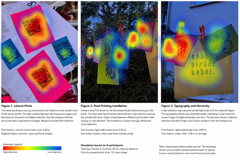
The visualizations shown in Figures 1 to 3 are simulated representations based on the collected observations. 

Results 

Figure 1: Linocut Print on Fluorescent Paper 

The first poster generated the most concentrated fixation pattern. 

Participants consistently directed their first gaze toward the dark central motif. The contrast between the fluorescent pink paper and the black printed form created a strong visual hierarchy. The eye shaped elements within the lower section of the print attracted particularly long fixation durations. The heatmap shows a dense concentration around the central image while the outer areas remained largely ignored. This behaviour aligns with saliency research suggesting that high contrast regions attract visual attention more rapidly than surrounding elements (Itti, Koch and Niebur, 1998). Interestingly, participants spent additional time examining imperfections in the print. Small variations in ink coverage and carving marks appeared to encourage closer inspection. 

Key finding: Organic forms and strong contrast generated the longest sustained attention. 

Figure 2: Hanging Pixel Print Installation 

The second image produced a significantly different viewing pattern. Unlike the linocut poster, participants did not focus exclusively on the printed works. Instead, attention shifted between the hanging prints and the illuminated light bulbs integrated into the installation. The blue pixel heart attracted the highest number of first fixations among the printed elements. However, the warm light source often received attention before the artwork itself. The scan paths reveal a continuous movement between graphic content and environmental context. Rather than reading the installation as a single poster, viewers appeared to explore it as a spatial composition. This finding highlights  an important aspect of exhibition design: presentation can become just as visually influential as the artwork itself. 

Key finding: Bright light sources competed directly with graphic content for visual attention. 

Figure 3: Typography and Image Hierarchy 

The third image introduced typography into the composition. 

Participants initially focused on the illuminated bulb and the red pixel figure before moving toward the text positioned below. The typographic message functioned as a secondary information layer rather than the primary focal point. Although the text occupied a large physical area within the composition, viewers tended to process the image first and the wording second. The heatmap indicates a gradual transition from image based exploration toward textual interpretation.  This result reflects established principles of visual hierarchy where colour contrast, brightness, and image complexity often guide attention before textual content is processed. 

Key finding: Imagery consistently outperformed typography in attracting initial attention. 

Discussion 

The comparison between LEGO printing and linocut printing revealed notable differences in viewing behaviour. 

The pixel based works were processed quickly. Viewers recognised symbols such as hearts and character like forms almost immediately. Their gaze moved rapidly across the compositions, suggesting efficient recognition. The linocut works generated slower and more concentrated viewing patterns. Participants spent more time investigating textures, carved edges, and irregular forms. This suggests that handcrafted visual complexity may encourage deeper visual exploration, while highly structured pixel graphics support rapid recognition. Furthermore, the exhibition environment itself played a crucial role. The hanging light bulbs repeatedly attracted attention and influenced how the surrounding prints were perceived. 

Conclusion 

The workshop demonstrated how traditional printmaking techniques can be combined with contemporary research methods to gain insights into visual communication. While LEGO printing and linocut printing produced distinctly different aesthetic outcomes, both successfully captured viewer attention in unique ways. The eye tracking analysis revealed that contrast, symbolism, texture, and exhibition context all influence how viewers engage with printed work.  Perhaps the most valuable takeaway was that visual attention does not always follow the designer’s intentions. Eye tracking offers a powerful method for making these invisible viewing patterns visible and provides designers with evidence based insights into how their work is experienced by others. 

References 

Duchowski, A.T. (2017) Eye Tracking Methodology: Theory and Practice. 3rd ed. Cham: Springer. 

Itti, L., Koch, C. and Niebur, E. (1998) ‘A Model of Saliency Based Visual Attention for Rapid Scene Analysis’, IEEE Transactions on Pattern Analysis and Machine Intelligence, 20(11), pp. 1254-1259. 

Itti, L. and Koch, C. (2001) ‘Computational Modelling of Visual Attention’, Nature Reviews Neuroscience, 2(3), pp. 194-203. 

Tobii (2025) Eye Tracking Technology and Product Information. Available at: https://www.tobii.com (Accessed: 25 April 2026).

#14 All Eyez On Me

Eye-tracking sounds deceptively simple: you track where someone looks, and suddenly you “understand” perception. Unfortunately (or fortunately, depending on your tolerance for complexity), it is not that straightforward. There isn’t just one way to track eyes. There are multiple methods, each producing different kinds of data, each shaping what you think you are observing. So before interpreting gaze behaviour, it is essential to understand how that gaze was captured in the first place

1. Screen-Based Eye-Tracking 

Screen-based eye-tracking represents one of the most established and controlled methods for analyzing visual attention. Often referred to as the “lab classic,” it provides a highly precise way of measuring how users engage with visual content on a screen. In this setup, participants are positioned in front of a stationary device that tracks their eye movements while they observe a digital stimulus. This could be anything from a website interface to a poster layout or typographic composition. The controlled environment allows researchers to isolate visual variables and focus specifically on how attention is distributed across a given design.

Technically, the system operates through infrared light, which is projected onto the eye and reflected off the cornea. Cameras capture this reflection and calculate the direction of the gaze. This data is then mapped onto a two-dimensional surface, allowing researchers to reconstruct exactly where and for how long a participant looked at specific elements within the design. The strength of this method lies in its precision. It allows for detailed analysis of visual behavior, making it particularly suitable for areas such as graphic design, UI and UX interfaces, as well as typography and layout studies. Designers can identify whether key elements such as headlines, images, or navigation structures are effectively capturing attention, or whether they are being overlooked entirely.

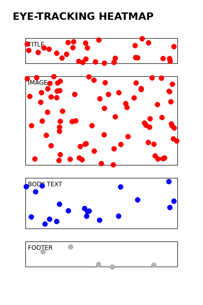
However, this level of control also introduces certain limitations. The artificial nature of the lab setting reduces real-world context. Participants remain stationary, and natural body movement is restricted. As a result, the findings reflect focused screen-based interaction rather than more dynamic, environmental forms of perception. To visualize how this data is typically interpreted, heatmaps are often used. These maps translate gaze data into areas of intensity, highlighting where attention is concentrated and where it fades.

In this example, the viewer’s gaze is primarily drawn to the image and title, while the body text receives significantly less attention. The footer is nearly ignored. This kind of visualization makes it immediately clear how hierarchy, scale, and placement influence perception. To extend this further into a more dynamic visualization, gaze sequences can also be mapped as a path across the layout:

START → Title → Image → Image → Text → Image → (exit)

This sequence reflects not just where attention occurs, but how it moves over time. It reveals patterns such as repeated focus on dominant elements or skipping behavior across less engaging areas. Ultimately, screen-based eye-tracking becomes a tool for making the invisible visible. It translates subconscious visual behavior into measurable data. If the goal is to understand whether a design communicates effectively at first glance, or whether certain elements fail to engage, this method offers a direct and reliable way of observing that interaction.

It answers a very specific question with clarity: where do people actually look?

2. Mobile Eye-Tracking Glasses 

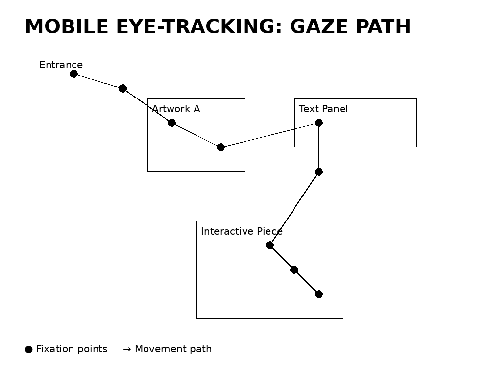
Mobile eye-tracking glasses represent a shift from controlled laboratory conditions to real-world observation. Instead of viewing static stimuli on a screen, participants move freely through physical environments while their gaze behavior is recorded in real time.In this setup, participants wear lightweight glasses equipped with multiple cameras. A forward-facing scene camera captures the surrounding environment, while inward-facing eye cameras track pupil movement. The collected data is then combined, allowing gaze points to be overlaid onto a continuously moving field of view. This method is particularly well suited for contexts where spatial interaction plays a central role. These include exhibitions, spatial design environments, wayfinding systems, and retail spaces. Unlike screen-based setups, it captures how attention unfolds dynamically in relation to movement, orientation, and environmental context. However, this increased realism comes with certain trade-offs. Compared to stationary eye-tracking systems, the level of precision is lower. The data itself is also more complex to analyse, as it combines movement, shifting perspectives, and changing visual stimuli. In addition, calibration requires careful setup and can introduce variability into the results. To visualize this type of data, gaze paths are often mapped within a spatial layout.olds in space and time, not just on a flat surface. 

3. Fixation Mapping vs. Gaze Plotting 

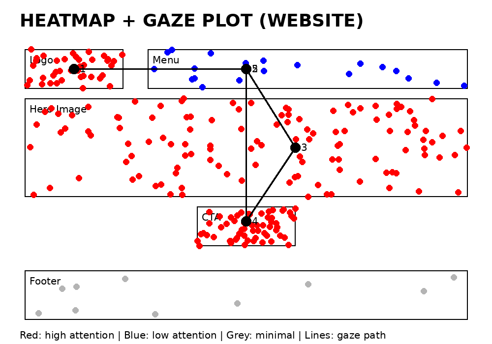
Once eye-tracking data has been collected, the focus shifts from observation to visualization. The central question becomes how this data can be translated into a format that reveals meaningful patterns of visual attention. Two primary methods are commonly used for this purpose: fixation maps and gaze plots. Fixation maps, often referred to as heatmaps, display the intensity of attention across a visual surface. They aggregate data from multiple users and highlight areas where gaze is concentrated over time. Warmer zones indicate higher levels of attention, while cooler areas suggest that elements are either overlooked or only briefly viewed. This type of visualization is particularly useful when evaluating the overall effectiveness of a design, as it reveals which components consistently attract attention across a group of participants. In contrast, gaze plots, also known as scanpaths, focus on the sequence of eye movements. Instead of showing intensity, they map the order in which visual elements are explored. Individual fixations are numbered, and connected by lines that represent the movement of the gaze from one point to the next. This allows for a more detailed understanding of how a design is navigated over time.issing structure or missing behaviour. 

In this representation, the numbers indicate the order of attention, while the connecting lines illustrate the direction of gaze movement. Each method answers a different question. Heatmaps reveal what is seen, highlighting areas of focus and neglect. Gaze plots, on the other hand, explain how attention unfolds, showing the path users take as they move through a design.

For a comprehensive understanding of visual behavior, both approaches are necessary. Heatmaps provide an overview of attention distribution, while gaze plots introduce temporal structure. Without one, the analysis remains incomplete, either lacking insight into sequence or missing the broader patterns of engagement.

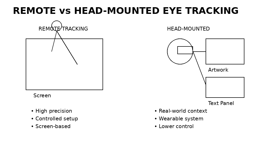
4. Remote vs. Head-Mounted Tracking 

A fundamental distinction in eye tracking lies between remote systems and head mounted approaches, each offering different advantages depending on the research context. Remote eye tracking is non intrusive and typically screen based. Participants remain stationary while their gaze is recorded with a high level of precision. This setup allows for controlled conditions, making it particularly effective when detailed and accurate measurements are required. In contrast, head mounted eye tracking involves wearable devices that participants use while moving through real world environments. This approach captures visual behavior within natural contexts, where movement, surroundings, and situational factors influence perception. While this increases ecological validity, it also reduces the level of control and precision compared to lab based systems.

Understanding this distinction is essential when designing experiments. A poster observed in a controlled laboratory setting may produce very different results than the same poster experienced within a crowded exhibition space, where distractions, movement, and environmental complexity shape how attention is distributed.

Choosing the Right Method (or: It Depends, Obviously) 

Each method answers different questions: 

Method Strength Best For 
Screen-based Precision UI, graphic design 
Mobile glasses Real-world behaviour Exhibitions, spatial design 
Gaze plots Sequence of perception Understanding navigation 
Dynamic tracking Temporal behaviour Motion design, video 

Final Thought 

Eye-tracking does not show you everything. It shows you where attention is directed, which is only one layer of perception but a crucial one.  And perhaps the most important realisation: The method you choose does not just measure reality it frames it. 

Sources:

  • Holmqvist, K. et al. (2011) Eye Tracking: A Comprehensive Guide to Methods and Measures. Oxford University Press. 
  • Duchowski, A.T. (2017) Eye Tracking Methodology: Theory and Practice. Springer. 
  • Wedel, M. & Pieters, R. (2008) Eye Tracking for Visual Marketing. Foundations and Trends in Marketing. 
  • Poole, A. & Ball, L.J. (2006) Eye tracking in human-computer interaction and usability research
  • Goldberg, J.H. & Wichansky, A.M. (2003) Eye tracking in usability evaluation: A practitioner’s guide
  • Holmqvist, K. & Andersson, R. (2017) Eye Tracking: A Comprehensive Guide to Methods and Measures (2nd ed.)

#13 Structuring the Chaos: Integrating the Double Diamond into a Neurodesign Research Process

After establishing a general research direction around neurodesign and eye-tracking, the next step is less glamorous but significantly more important: structure. Or, more precisely, preventing this project from turning into an endless collection of “interesting observations” without a clear outcome. Following a strong recommendation from Prof. Baumann, I am integrating the Double Diamond model (Design Council, 2005) into my research process—adapting it to fit an empirical, neurodesign-driven approach. The goal is to align creative exploration with methodological rigour, especially in preparation for the exhibitions taking place in early June. The Double Diamond framework divides the design process into four phases: Discover (diverging) , Define (converging), Develop (diverging), Deliver (converging). While traditionally used in design practice, it is increasingly applied in research contexts to structure problem framing and solution validation (Design Council, 2005). 

    For a neurodesign project, this is particularly useful because the field itself sits between disciplines. Without a clear framework, it is very easy to: 

    • read everything, 
    • test everything, 
    • and conclude… nothing specific. 

    Trust me, I’ve been there…

    Phase 1: Discover

    The objective at this stage is to build a broad theoretical and contextual foundation.

    To do so, the research begins with an extensive review of existing literature across multiple fields. This includes neurodesign and cognitive processing (Posner, 1980; Auerhammer, 2020), offering insight into how visual information is received and interpreted in the brain. In parallel, methodologies such as eye tracking (Holmqvist et al., 2011) provide a measurable way of observing attention in real time. Further perspectives on visual attention and cognitive load (Sweller, 1988; Spinks & Mortimer, 2016) help frame how and why certain elements are noticed, ignored, or cognitively processed. Alongside this theoretical groundwork, existing exhibition formats and visual environments are analyzed to understand how design operates within spatial and contextual settings. These observations help translate abstract concepts into applied scenarios.From this, a set of initial variables begins to emerge. Among them, the distinction between viewer expertise, comparing designers and non designers, becomes particularly relevant, as well as the type of visual stimuli presented. At this stage, the focus remains intentionally broad. The aim is not immediate clarity, but rather to create a state of informed confusion, an expanded field of understanding from which more precise questions can later develop.

    Phase 2: Define

    The objective at this stage is to narrow the research focus into a testable direction before the exhibitions begin. This process is guided through continuous refinement of the research question, supported by weekly discussions with Prof. Baumann. These conversations help translate broader interests into a more precise and actionable framework. Based on this, key parameters are defined. This includes identifying the target groups, as well as establishing clear measurement criteria such as fixations, gaze paths, and areas of interest. In parallel, a structured experimental setup is developed, specifically adapted to exhibition contexts, where environmental factors play a significant role in how visual information is perceived. To ensure feasibility, initial pilot tests are conducted. These include calibration processes and technical validation, allowing potential issues to be identified and resolved early on. This phase is critical because it transforms the intention to study neurodesign into a research approach that can be systematically observed, tested, and measured in practice.

    Phase 3: Develop

    The objective at this stage is to collect and expand empirical data within real world contexts. Eye tracking studies are conducted during exhibitions, with early June marking a key milestone in the data collection process. Participants are drawn from both designers and non designers, allowing for a comparative perspective on how visual information is processed across different levels of expertise. The experimental setup remains flexible throughout this phase. Adjustments and iterations are made where necessary in order to respond to practical challenges and ensure the reliability of the collected data. In addition to quantitative measurements, observational notes are recorded to capture contextual factors that may influence participant behavior but are not directly measurable through eye tracking alone. This phase represents the core stage of data generation. While grounded in a defined structure, it remains intentionally exploratory, balancing controlled conditions with the variability of real world environments.

    Phase 4: Deliver

    The objective at this stage is to consolidate the findings and translate collected data into meaningful outcomes. The process begins with the analysis of eye tracking data, including heatmaps, fixation durations, and gaze sequences. These metrics provide insight into how visual attention is distributed and how information is processed over time. Based on this, comparisons are drawn between different participant groups, particularly between designers and non designers. This allows patterns in visual attention and perception to emerge, highlighting both similarities and differences in how visual stimuli are interpreted. The identified patterns are then translated into research insights, forming a foundation for further reflection. In addition, potential implications for design practice are developed, connecting empirical findings back to applied design contexts. At this stage, the project shifts from collecting data to actively interpreting and applying it, turning observations into structured knowledge.

    The exhibitions in early June function as a fixed point within the process. Instead of treating them as just another data collection opportunity, they become: A deadline for having a functional methodology . A contextual test environment for real-world perception. A transition point between defining and developing phases. In other words, if the setup is not ready by then, the entire timeline politely collapses. This structured approach also aligns with key ideas in neurodesign research. Auerhammer (2020) emphasises the importance of linking design decisions to measurable cognitive and emotional responses, rather than relying on subjective interpretation. 

    Similarly, attention research highlights that perception is: selective (Posner, 1980), capacity-limited (Sweller, 1988)  and expertise-dependent (Lohmeyer et al., 2014). By embedding these principles into the Double Diamond framework, the process becomes not just structured, but scientifically grounded

    The Double Diamond does not reduce complexity—it organises it. And for a project dealing with neurodesign, eye-tracking, and human perception, that is probably the closest thing to control we are going to get. 

    Sources: 

    • Auerhammer, J. (2020) Neurodesign: Perspectives on an emerging discipline
    • Design Council (2005) The Double Diamond: A universally accepted depiction of the design process
    • Holmqvist, K. et al. (2011) Eye Tracking: A Comprehensive Guide to Methods and Measures. Oxford University Press. 
    • Lohmeyer, Q., Matthiesen, S. & Meboldt, M. (2014) Task-dependent visual behaviour of engineering designers – an eye-tracking experiment. DESIGN Conference. 
    • Posner, M.I. (1980) Orienting of attention. Quarterly Journal of Experimental Psychology, 32(1), pp. 3–25. 
    • Spinks, J. & Mortimer, D. (2016) Lost in the crowd? Using eye-tracking to investigate information processing in choice experiments. BMC Medical Informatics and Decision Making. 
    • Sweller, J. (1988) Cognitive load during problem solving: Effects on learning. Cognitive Science, 12(2), pp. 257–285. 

    .

    #12 Building a Research Practice Around Eye-Tracking in Design

    Design education often trains us to justify decisions conceptually or aesthetically. However, across my earlier work, a recurring question has emerged: How reliable is our intuition about where people look? We are holding on to principles that have been established, way before technological advancements took off. So how can we truly know how our eyes and brains experience our designs?

    Eye-tracking offers a way to approach this question empirically. By recording gaze behaviors, specifically fixations, it becomes possible to reconstruct how viewers navigate visual material in real time (Scene Grammar Lab, 2023). This allows for a shift from speculative reasoning to evidence-based analysis of perception. Visual attention is not arbitrary, it is shaped by task, context, and prior knowledge (Eisma, Eijssen & de Winter, 2022). This suggests that design cannot be understood independently of its viewers. Or, put less diplomatically: a design without an audience is just a very confident arrangement of pixels. 

    Expertise and the Problem of “Seeing Differently” 

    Another key aspect I want to research further is the distinction between designers and non-designers as viewing groups. Existing research indicates that expertise significantly influences visual behaviour. Designers, due to training, tend to process layouts more strategically, while non-experts rely more on saliency and immediate visual cues (Lohmeyer et al., 2014). This in return raises an uncomfortable but necessary question for all design practice: Are we designing for ourselves, or for the people who will actually engage with the work? Because if these groups fundamentally see differently, then evaluating design solely within expert circles risks missing how it functions in real-world contexts. Giving that Personas and Target Groups are ofcourse researched, there is still a barrier we simply can not forsee and that is: the individuality of each person viewing a design. Circling back to the fact that we all live in constant progress. Meaning each age-, social- and targetgroup adapts differently to trends, animations or context. o build a structured research foundation, I will focus on eye-tracking in applied design contexts, particularly exhibitions and curated visual environments.

    Planned approach: 

    • Conduct observational studies using eye-tracking technology 
    • Compare two primary groups: 
    • Designers (trained visual literacy) 
    • Non-designers (general audience) 
    • Analyse: 
    • Fixation duration 
    • Gaze paths 
    • Areas of interest (heatmaps) 

    The aim is to generate empirical data on how different audiences engage with design, rather than relying on assumptions or post-rationalised explanations. Alongside data collection, I will have weekly consultations with Professor Baumann to refine the research direction. At this stage, the topic is intentionally broad, perhaps too broad. The goal of these meetings is to iteratively narrow the focus into a clearly defined research question. Because right now, the working title could easily be:  “Everything About Eye-Tracking, Everywhere, All at Once.”

    Semester Plan & Why This Matters

    To keep this project from dissolving into beautifully organised chaos, I am going to need a more narrow downed timetable. Since the beginning of the semester can turn slightly hectic, I will start my research a month after the start. So I propose the following structure:

    Weeks 4–6:  Methodological framework and technical setup (including inevitable calibration struggles) 

    Weeks 7–10: Data collection in exhibitions and design environments 

    Weeks 11–12:  Data analysis (heatmaps, gaze plots, mild existential doubt) 

    Weeks 13–14:  Synthesis and refinement of research focus 

    This project is ultimately about repositioning design as an evidence-informed practice. By integrating eye-tracking data, we can begin to understand not just what design communicates, but how it is actually perceived

    Because if design is a form of communication, then attention is its most fundamental currency. 

    Sources:

    • Eisma, Y.B., Eijssen, D. & de Winter, J.C.F. (2022) What attracts the driver’s eye attention as a function of task and environment. Information (Switzerland), 13(7). 
    • Lohmeyer, Q., Matthiesen, S. & Meboldt, M. (2014) Task-dependent visual behaviour of engineering designers – an eye-tracking experiment. DESIGN Conference. 
    • Rodemer, M. et al. (2022) Dynamic signals in instructional videos support students to navigate through complex representations. Applied Cognitive Psychology. 
    • Scene Grammar Lab (2023) Eye-tracking research overview
    • Spinks, J. & Mortimer, D. (2016) Lost in the crowd? Using eye-tracking to investigate information processing in choice experiments. BMC Medical Informatics and Decision Making. 

    #11 Let’s catch up!

    This semester, my research is not just about design itself, it’s about how the brain processes what we see and how we can actually visualize this data. Do people visually engage with design differentley?

    Since a lot of you might not be familiar with my research, I thought it would be nice to do a quick catch up, on the matter.  In the last semester I have spent my time further deepening my understanding for neurodesign. Neurodesign sits at the intersection of design, cognitive science, and neuroscience. So instead of evaluating design purely through aesthetics or intention, we as designers ask:

    What happens in the brain when we experience design?  

    This includes processes such as attention, perception, and decision-making, all of which influence how visual information is interpreted. Importantly, these processes are largely automatic and unconscious (Posner, 1980). This means that, what we think we see and what we actually process can differ significantly. For designers this practice could create a shift: From designing based on intuition, to designing based on measurable cognitive responses. In a world where artificial intelligence becomes more and more advanced, it could mean immense progress for designers, to dive deeper into human cognitive responses, in order to make designs more relateable. Users being abled to experience designs, that feel tailored specifically to them, could mean a new way of connecting.

    In neurodesign research, perception is understood as context-dependent and shaped by prior knowledge (Eisma, Eijssen & de Winter, 2022). This directly connects to my central comparison: Designers (trained visual literacy, pattern recognition) & Non-designers (intuitive, less structured viewing behaviour). Research suggests that expertise fundamentally alters how visual information is processed (Lohmeyer et al., 2014). Designers often scan strategically, while non-experts rely more on visual salience. 

    Attention, Cognitive Load, and Ignored Design

    Another important concept within neurodesign is cognitive load. As we all know by now, the brain has limited processing capacity, which means not all visual information receives equal attention. When designs become too complex, users may engage in selective attention, ignoring parts of the visual field entirely (Spinks & Mortimer, 2016). At the same time, research shows that guiding attention meaning through hierarchy, contrast, or motion, can significantly improve comprehension (Rodemer et al., 2022). 

    More design ≠ more understanding 

    However, this raises an important question: if attention can be guided, to what extent can perception actually be controlled? While design strategies such as hierarchy and contrast allow designers to direct visual flow, they do not guarantee uniform interpretation. Individual differences such as prior experience, cultural background, and emotional state, continue to influence how information is processed. This suggests that design operates within a space of probability rather than certainty. Designers can increase the likelihood that specific elements are noticed or understood, but they cannot fully determine how a visual message will be received.

    This becomes particularly relevant when considering the role of artificial intelligence in contemporary design processes. AI systems are highly effective at optimizing visual output based on existing data patterns. They can predict where users are likely to look, which compositions perform best, and how to structure information for maximum clarity. In this sense, AI aligns closely with principles of cognitive efficiency, often reducing cognitive load by streamlining visual complexity. However, optimizing for efficiency does not necessarily equate to optimizing for experience.

    From a neurodesign perspective, engagement is not solely driven by clarity or ease of processing. Elements such as ambiguity, surprise, and even minor inconsistencies can capture attention and sustain interest. These factors introduce a level of cognitive tension, encouraging deeper processing rather than immediate recognition. While AI tends to minimize such irregularities in favor of optimized outcomes, human designers may intentionally incorporate them as part of a more nuanced design strategy. This highlights a fundamental distinction: AI operates primarily through pattern recognition and prediction, whereas human designers integrate interpretation, intuition, and contextual awareness. As a result, the integration of AI into design workflows does not eliminate the need for human input, but rather shifts its focus. Designers are no longer only responsible for producing visual outcomes, but increasingly for evaluating, selecting, and contextualizing them.

    In this evolving landscape, understanding cognitive processes becomes even more critical. By grounding design decisions in knowledge about perception, attention, and cognitive load, designers can engage more deliberately with both human users and computational systems. This creates the potential for a hybrid approach, where AI supports efficiency and scalability, while human designers maintain responsibility for meaning, relevance, and experiential quality.

    Ultimately, neurodesign does not seek to replace intuition with data, but to expand it. By making cognitive processes more visible and measurable, it allows designers to reflect on their decisions in new ways, bridging the gap between subjective experience and objective analysis. In this sense, the future of design may not lie in choosing between human or machine-driven approaches, but in understanding how both can operate together within the same cognitive and perceptual frameworks that shape how we see, interpret, and connect with the world.

    Sources:

    Eisma, Y.B., Eijssen, D. & de Winter, J.C.F. (2022) What attracts the driver’s eye attention as a function of task and environment. Information (Switzerland), 13(7). 

    Lohmeyer, Q., Matthiesen, S. & Meboldt, M. (2014) Task-dependent visual behaviour of engineering designers – an eye-tracking experiment. DESIGN Conference. 

    Posner, M.I. (1980) Orienting of attention. Quarterly Journal of Experimental Psychology, 32(1), pp. 3–25. 

    Rodemer, M. et al. (2022) Dynamic signals in instructional videos support students to navigate through complex representations. Applied Cognitive Psychology. 

    Scene Grammar Lab (2023) Eye-tracking research overview. 

    Spinks, J. & Mortimer, D. (2016) Lost in the crowd? Using eye-tracking to investigate information processing in choice experiments. BMC Medical Informatics and Decision Making.