Adding onto my previous post, I will continue to analyze some design activist posters to show that there are different topics out there and what the consensus is about interesting and impactful activist posters.

This poster shows a clever usage of typography. Barbara Galinska wants to inspire action against war. The message is clear: Stop war! The continuos outlines fusing the message together shows that one of the words cannot be without the other. The red and black colours make an aggressive combination to show the importance of the message and refer to the topic of war the explosions, burning, blood as well as, death and darkness that comes with war. The sharp edges of the outlines leave no room for doubt, this is a serious matter. The end of the ‘S’ and the space between the ‘P’ and the exclamation mark seem to have extremely sharp ends, similar to scalpels. This design has not only been used as a poster, but also as a base for murals and demonstration signs.
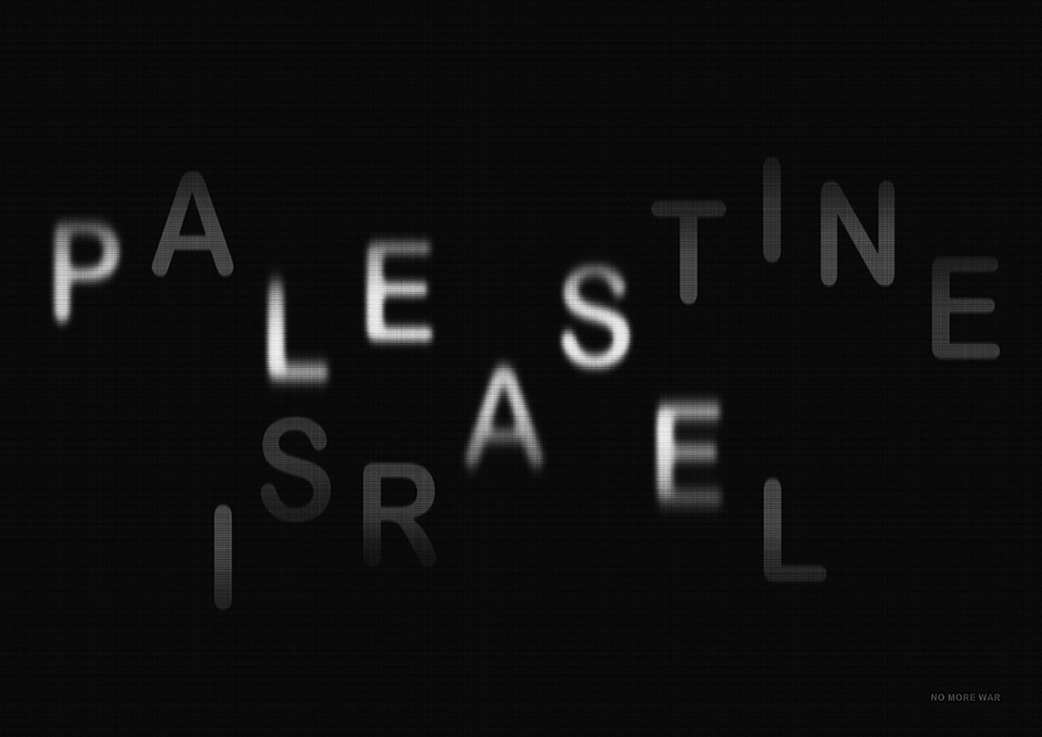
This poster shows a similar approach, also just through typography, but focuses on the war between Israel and Palestine. It shows that both names together create the word please and very small in the right hand corner the small print states “NO MORE WAR”. This already clearly transports the plea of designer Hoon-Dong Chung. To be able to read both the names Palestine and Israel, as well as, the word ‘please’ the transparency effect has been used. While the first two are transported into a second layer by being barely visible, the word please is highlighted by having more opacity. Therefore, the first thing one reads is ‘please’. Afterwards the words Palestine and Israel come into focus and if the message is not clear enough already, then only when analyzing the poster closely the rest of the message becomes visible.

In this poster the main message also comes from typography. This time the text can be interpreted in several ways. The message is: “war does not determine who is right only who is left”. In this case one can either interpret it in the way that during war it can be seen, which people advocate for right parties and which for left ones. Or you can see that, even though someone might be ‘right’ in war (meaning to have the correct opinion), the only thing that matters in the end is who is left after the war (so who is still here in the end). Interestingly, the background shows clouds and a sunny day and the last row of text becomes slightly transparent, showing that not much is left after the war. This poster was designed by Emerson, Wajdowicz Studios.
These three posters summarize well that there does not have to be a lot going on in a design to get a message across. Usually typography is enough if it is applied in a creative way, by combining different words and meanings to get the point across.
Sources:
Chung, Hoon-Dong: Please. In: Graphis Online, 2018. URL: https://graphis.com/entry/90a92688-82b0-4373-81c3-ddd335508222. Accessed 2026, Jan. 26.
Emerson, Wajdowicz Studios: War. In: Graphis Online, 2025. URL: https://graphis.com/entry/d0422e34-4b2e-11e2-a2c9-f23c91dffdec. Accessed 2026, Jan. 26.
Galinska, Barbara: Stop War! In: Graphis Online, 2025. URL: https://graphis.com/entry/6f14135a-c44a-4c46-bfc3-0af957710a61. Accessed 2026, Jan. 26.