In my last post I have analyzed some mainly typographic posters about war. In this post I will be focusing on racism and the black lives matter movement, since there are still so many different topics out there that add to the variety and diversity of activist topics.
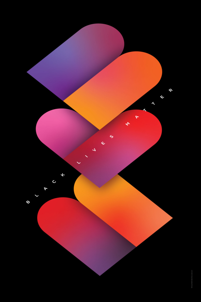
This poster by Arnaud Ghelfi was created for the Black Lives Matter Movement. The structure of the letters BLM is especially round, which creates the illusion that the ‘L’ is a heart. The colours help this notion, because the ‘L’ is mostly red and pink, the typical colours associated with graphics of hearts. The black background adds to the fact that this is about Black people. To add to that the shapes of the three letters seem to be built out of the same two components. The colour gradients within the type show that Black people are diverse as well and this diversity adds flavour to society, which is why they are as important as everyone else. (cf. Ghelfi, 2021)
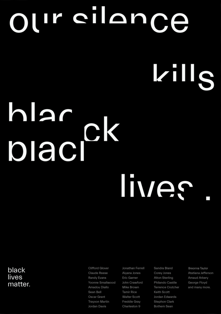
In this second poster about the Black Lives Matter Movement Anna Sera Garcia shows how white space can be used to show reactions of people. The typography is cut out by empty space to show that when white people (that are the majority group) do not speak up about injustice, their silence makes them complicit in the killing of Black people, since they have the power, but do not do anything about these injustices. Other than the whole sentence the word ‘black’ gets not only erased, but torn apart as well, this shows the brutality Black people have to face, by being killed without doing anything wrong. To add to that the sentence ends with a single point, this shows that it is a fact and also emphasizes the finality of the statement. At the bottom of the page the names of Black people that have been killed during this time are listed to not let them be forgotten and show that it is not just an individual case, but a pattern.
This poster by Underline Studio shows the same problem that the previous one did. The two words ‘silence’ and ‘violence’ are merged, by showing their similarities. The whole construct shows the visual of an hourglass, making evident that each second of silence adds to the violence that is happening.

Last but not least, Selcuk Ozis has created a typographic poster showing again that racism kills. The letter ‘i’ stands for black people as can easily be seen. This shows that racism as a construct is fueled by white people, one white person seems to be killing the Black person as is depicted by the ‘s’ that seems to be kneeling on top. The other white people ‘r’, ‘a’, ‘c’, ‘m’ just seem to be watching or are probably silent as they see the scenario unfold. The three colours used remind us of the Nazi flag and show that racism is timeless and, therefore, has to be fought by the roots.
In this blog post I have analyzed some posters about racism, focusing especially on the Black Lives Matter Movement. This shows again how much is possible using just typography.
Sources:
Ghelfi, Arnaud: Black Lives Matter. In: Graphis Online, 2021. URL: https://graphis.com/entry/7815cc37-e773-4e6b-937a-52ac9de4d663. Accessed 2026, Jan. 26.
Ozis, Selcuk: Racism. In: Graphis Online, 2021. URL: https://graphis.com/entry/a9aa38c8-850b-45b6-a1d3-3252fee54a43. Accessed 2026, Jan. 26.
Sera Garcia, Anna: Our Silence Kills Black Lives. In: Graphis Online, 2021. URL: https://graphis.com/entry/caa83c12-41bb-4709-91b4-c99515a11718. Accessed 2026, Jan. 26.
Underline Studio: Silence is Violence. In: Graphis Online, 2021. URL: https://graphis.com/entry/a5b2b40c-9f0d-484a-8cf8-162682ffffbc. Accessed 2026, Jan. 26.