8. From Theory to Practice

After writing several blog posts about the theory of emotional design, I slowly got a bit tired of only talking about concepts and explanations. Of course, the theory helped me understand why emotions are important in design, but at some point I wanted to do more than just describe ideas. I wanted to try applying them.

So, for my last three blog posts I decided to focus on a practical example. Coincidentally, a friend of mine recently asked me if I could maybe help with the branding for their future IT-security podcast. The podcast is meant to help “normal “people better understand IT-security topics that often feel confusing or intimidating. I liked this idea very much, so I decided to use it as a small challenge for myself.

In the following posts, I want to explore how emotional design could be applied to a branding concept for an IT-security podcast. This is not about creating a finished design, but about thinking through design decisions consciously and reflecting on the emotions they might create.

So this first post focuses on understanding the context and defining an emotional direction. At this point, I am not designing visuals yet. I am trying to understand what kind of emotional experience the podcast should offer.

IT-Security as an Emotional Topic

For many people, IT-security is not an easy or familiar topic. It often feels very technical, abstract, and far away from everyday life. At the same time, it is connected to things like data breaches, hacks, or online scams. Because of this, research suggests that cybersecurity-related situations can trigger strong emotional reactions such as anxiety or fear, especially when people feel uncertain about their own ability to understand or respond to such threats. (Vgl. Preuschen et al. 2023)

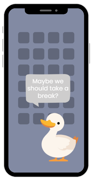
Since the podcast is meant for people without a technical background, these emotional reactions are especially important. If the branding feels too cold, technical, or alarming, it could create even more distance. Instead of helping people feel informed, it might make them want to avoid the topic even more.

Now I think this is where emotional design becomes relevant, because as we already know, design can influence whether a topic feels approachable or overwhelming before someone even listens to the first episode.

Thinking About the Audience

Of course, if I were doing this project in real life, it would be very necessary for me to research my audience properly. But for this concept, I just assume that the main audience consists of people who simply want to understand IT-security better in their everyday lives, and that they are probably not looking for deep technical knowledge, but for clear explanations and practical orientation.

So emotionally, this audience likely wants to feel supported and taken seriously. They should not feel stupid for not knowing certain things. I figured that feeling calm, respected, and guided is more important here than feeling impressed by expertise.

Defining Emotional Goals

Based on this context, the next step would be to define clear emotional goals.

In my opinion, for this IT-security podcast, the most important emotional goal would be trust. Listeners should feel that the information is reliable and that the hosts have proven competence in this area.

But besides trust there are also some other emotional goals that would be important as well.
The visuals of the podcast should give the impression that the topic is approachable and not intimidating, that the podcast itself will provide clarity about this complex topic, and maybe it should also look calming, because this topic is often linked to stress and fear.

So when we have our emotional goals set, I think it would also be important to know which emotions should not dominate the experience.
As fear, urgency, or alarm might already be part of the topic itself, they should not shape the overall feeling of the branding.

Looking Ahead

I think at this stage, emotional design works as a guiding framework. It helps define what the branding should feel like before deciding how it should look like.

However, in the next blog post, I will explore how these emotional goals could be translated into concrete visual design choices, such as colour, typography, and visual language, for an IT-security podcast focused on non-technical listeners.

Literature

Preuschen, A. et al. (2023). How do you Feel about Cybersecurity? A Literature Review on Emotions in Cybersecurity. Zürich: ETH Zürich.

7. Emotional Design: My Personal Perspective

After writing several blog posts about emotional design, theory, tools, and examples, I noticed that my view on this topic has slowly shifted. At the beginning, emotional design felt like something you could define, explain, and apply through clear principles. But the more I worked with it, the more personal it became.

For me, emotional design is no longer just a design approach or a research topic. It has become a way of looking at design in general.

One thing I keep coming back to is the idea that design is never neutral. Even when designers try to be “objective” or purely functional, emotions still slip in. Through colour, typography, structure, tone of voice, or even what is left out. I personally believe that emotional design is not something you either do or don’t do. It happens anyway. The only question is whether it happens consciously or accidentally.

What fascinates me most about emotional design is how subtle it often is. It does not need big gestures or dramatic visuals. Sometimes it is a small detail that makes a difference: a calm layout that makes me feel less overwhelmed, a friendly microcopy that reassures me, or typography that feels balanced instead of aggressive. These moments are easy to overlook, but they strongly influence how I feel during an interaction.

At the same time, emotional design also makes me uncomfortable sometimes. When emotions are used too strategically or manipulatively, the design starts to feel dishonest. I often catch myself asking:
Is this design trying to support me, or is it trying to push me into a decision?

This question has become very important to me. I don’t see emotional design as a tool to control users, but rather as a responsibility. Designers influence moods, expectations, and sometimes even self-perception. That can be empowering, but it can also be overwhelming or excluding if done without care.

Another personal realisation is that emotional design starts with the designer’s own mindset. I noticed that when I am stressed or impatient, my design decisions tend to reflect that. Things become cluttered, rushed, or overly complex. When I slow down and think about how someone else might feel when using or seeing my design, the outcome often feels calmer and more intentional.

For me, emotional design is closely tied to empathy, but not in a kitschy or superficial way. It is not about making everything “nice” or “happy”. Sometimes it is about acknowledging frustration, seriousness, or complexity. I think good emotional design does not avoid negative emotions at all costs, but handles them honestly and respectfully.

I also don’t believe that designers can fully control how people feel. Everyone brings their own experiences, expectations, and emotions. What designers can do, in my opinion, is create spaces that feel considerate. Spaces that don’t shout, don’t confuse unnecessarily, and don’t assume too much.

Looking back at my earlier blog posts, I notice that I often searched for explanations and frameworks. Now, emotional design feels less like something I need to define and more like something I need to practice consciously. It is a mindset I want to carry into my future work, rather than a checklist I want to follow.

If emotional design means anything to me personally, then it is this:
Designing with awareness that there is always a human on the other side. Someone who feels, reacts, remembers, and carries those experiences with them long after the interaction is over.

And maybe that is what makes emotional design so challenging and so meaningful at the same time.

5. How Design Shapes Focus: Visual Strategies to Combat Digital Fatigue for Video Editors

In an age of perpetual connectivity, digital fatigue has become one of the biggest silent obstacles to creative performance — especially for video editors. While software and devices enable powerful workflows, constant visual stimulation and interruptions slowly erode deep focus. The more time we spend in interfaces that demand our attention, the less capacity we have for sustained creative effort. But what if the solution isn’t just working harder, but designing smarter?

Visual design isn’t just about aesthetics — it’s about cognitive load, workflow clarity, and the brain’s ability to sustain attention. For video editors, understanding how digital environments shape focus is essential to performing at a high level.

Visual Clutter = Cognitive Overload

Every open panel, bouncing notification, and highlighted icon competes for attention. Cognitive load theory tells us that the human brain has a limited capacity for processing information at any moment; when interfaces demand too much, working memory becomes strained and creative judgment falters. Editors often juggle timelines, effects panels, bins, preview windows, and plugin panels — and each visual element adds to the load.

Designers of professional editing software recognize this: many tools now offer collapsible UI panels, custom workspace layouts, and distraction-free modes so editors can minimize what’s visible in critical moments. These design choices aren’t just cosmetic — they directly reduce the amount of visual information the brain must process, preserving mental energy for creative decisions.

Temporal Design: When You See Matters

[1]„It’s not just what you see, but when you see it. Micro-interruptions — pop-ups, alerts, animated icons — break focus continuously and fragment attention. Research shows that it takes an average of 23 minutes and 15 seconds to regain full concentration after an interruption“ (“The Cost of Interrupted Work,” University of California, Irvine, 2008).

Designing temporal buffers — such as batching notifications or scheduling uninterrupted focus sessions — helps reduce these context switches. When editors enter deep work, disabling or hiding non-essential UI components can safeguard focus.

The Power of Well-Designed Focus Tools

Editors who understand how visual design influences attention often turn to focus-blocking apps. These tools aren’t just silencers — they are experience designers that shape how we interact with the digital world. Good focus apps use visual feedback and simple interfaces to support attention, rather than just punish distraction.

Take Forest, for example. In this app, you plant a virtual tree and it grows as you stay focused — if you leave the app, the tree dies. By turning focus into a visual story of growth rather than a strict prohibition, Forest makes sustained attention feel rewarding.

Other apps like Freedom or AppBlock let users define schedules for blocking distracting sites or apps across devices, reducing visual noise during workflow sessions.

Research supports the effectiveness of these tools. Studies on digital distraction apps show they can train focused attention by structuring uninterrupted periods and minimizing habitual phone checking behavior, leading to improved task performance.

Gamification vs. Deep Focus: A Design Balance

Many focus apps incorporate gamification elements — points, levels, badges — to make concentration feel fun. These visual rewards can increase positive engagement and encourage sustained use. However, research and UX critiques warn that if gamified elements become the focus itself, they may distract from the real goal: deep work. Designers must balance motivational visuals with support for intrinsic motivation to concentrate without external reward.

Notifications Aren’t the Enemy — Poor Timing Is

Notifications aren’t inherently bad. They can help us keep commitments, communicate quickly, and respond to emergencies. But automatic, poorly timed alerts fragment attention and interrupt creative states. As researchers have noted, [2]“Notifications are not inherently bad or good: they can help us get to our meetings as much as they can derail them.”

Good design lets you choose when to receive these alerts — often by grouping them or pushing them to scheduled breaks. This preserves mental momentum rather than shattering it.

Designing Your Workspace for Cognitive Rest

True recovery from digital fatigue doesn’t come from scrolling while on break. Attention Restoration Theory explains that the brain recovers best through environments that require “soft fascination” — activities that gently engage attention without demanding effort, like nature walks or sketching without screens.
Link: Kaplan & Kaplan, The Experience of Nature, 1989.

If breaks are still spent on phones, the mental state remains one of stimulation rather than rest. Thoughtfully designed break rituals — physical movement, analog tasks, or screen-free activities — help restore focus and reduce burnout.

Practical Steps for Editors

  1. Minimize Visual Clutter: Customize your workspace; hide panels you don’t need.
  2. Batch Notifications: Use app settings or focus tools to limit alerts during editing blocks.
  3. Use Visual Focus Tools: Choose apps with simple, rewarding designs that support attention.
  4. Create Break Rituals: Step away from screens; use soft-fascination activities to rest the brain.
  5. Reflect on Interface Design: Evaluate how your tools either support or drain your attention.

Conclusion

Digital fatigue isn’t just a feeling — it’s a design problem. The way information is presented, interrupted, and sequenced affects your cognitive performance more than most editors realize. By embracing thoughtful visual design — both in your tools and your environment — you can shape focus instead of losing it. Creativity thrives not in constant connectivity, but in intentional, distraction-designed workflows.


Sources:

[1] https://www.ics.uci.edu/~gmark/chi08-mark.pdf

[2] https://www.ad-hoc-news.de/news/ueberblick/ki-apps-der-intelligente-kampf-gegen-digitale-ablenkung/68194317

4. Temporal Design: Managing Attention Over Time

It’s not only what you see, but when you see it. Micro-interruptions — pop-ups, alerts, or even animated icons — break focus repeatedly. Designing “temporal buffers,” such as batching notifications or scheduling focus sessions in editing software, reduces context switching. Some professional tools now allow editors to hide nonessential UI elements during critical cuts — a subtle but powerful design intervention against fatigue.

When editors for example, are in a deep work state they make sure most of the distractions are turned off or removed from their sight. Designing a tool or an app for blocking notifications for example became necessary. Most creators are visual types and like something that is appealing to their eye. Apps that block distractions make it easy and fun to use. The design of the app is mostly simple to minimize the entertainment and maximize productivity. I have tried an app and it was designed to relax me and make me think about my actions. I had the option to activate my session that will block apps that are taking my attention. They made it into a game. With each session that is completed without you using the apps you level up and collect crystals that break out of a stone (pretty fun if you ask me). There is also an option to use breaks if you need to get into an app but your maximum limit is 15 minutes. First it asks you to breath in and breath out before you get the option to pause the session.

We respond and react to notifications immediately which can be good and bad at the same time. In case of an emergency it helps us or someone else. But it can distract us from important tasks that need doing. By distracting I mean looking at least important things like who broke up with whom.  [1]“Notifications are not inherently bad or good: They can help us get to our meetings as much as they can derail them. But because we typically attend to them within minutes, they regularly interrupt ongoing activities”

This is where design matters: the when and how of notifications. Good focus‑blocking tools don’t just silence alerts — they design the interruption flow so users become aware of their habits before reacting. Some modern focus apps use subtle psychological design to make blocking distractions engaging. [2]For example, Forest gamifies focus by rewarding sustained attention with a growing digital forest — if you leave the app, your tree dies. This visual, game‑like feedback turns resisting distraction into an achievement, not a chore.

Other tools like Freedom and AppBlock let users define rules and schedules that block websites and apps across devices, reducing the visual noise that triggers reflexive checking. These design choices aren’t accidental — they take advantage of how visual systems and reward loops drive behavior. Instead of only punishing distraction, they reward focus and progress.

However, gamification isn’t a silver bullet. Recent commentary on focus apps warns that playful mechanics can improve engagement yet sometimes shift attention to the game‑like rewards instead of actual deep work. If designers rely too heavily on dopamine loops (points, visuals, badges), intrinsic motivation to concentrate may suffer over time.

Research on digital distraction tools supports this nuanced view: apps that monitor and limit phone use help train focused attention by creating structured periods where the user is encouraged to avoid habitual checks. These apps often include timers, subtle feedback, and even background sound or noise options to sustain attention over blocks of time.

The design implication is clear: blocking distractions is as much a UX challenge as a productivity strategy. Tools that smartly integrate visual cues, time‑based rules, and user feedback can help editors enter deeper focus states without relying on sheer willpower alone. The goal isn’t merely silence — it’s designing a digital environment that supports intention over impulse.

Sources:

6. Typography and Emotion

In my last blog post, I focused on colour as a powerful tool of emotional design. Colours work fast and intuitively, often without conscious interpretation. But colour is not the only visual element that shapes how a design feels.
Typography also plays a crucial role in emotional design.

Typography is often seen as purely functional: text has to be readable and clear. While this is essential, it overlooks an important aspect. Letterforms themselves communicate emotion. They create first impressions, set expectations, and influence whether something feels trustworthy, playful, serious, or personal.

Typography on the Visceral Level

It is important to note that it is still not fully clear, from an empirical point of view, which typefaces reliably evoke which specific emotions. (Vgl. Ho 2025, S. 56)

Nevertheless, typographic choices still matter. Even if emotions are not directly caused by a typeface itself, different typefaces can contribute to certain impressions. A bold and heavy typeface, for example, may be perceived as loud or dominant, while a thin serif font can appear calm and elegant. Handwritten typefaces are often associated with warmth and personality, but they may also be perceived as messy depending on the context. (Vgl. Quispillo Parra 2025)

Pan et al. (vgl. 2024, S. 5–6) describe typography as part of graphic language that communicates emotion through visual form. Letter shapes, spacing, and contrast act as expressive signals. Even when the content stays the same, changing the typeface can completely change the emotional tone.

Typography on the Behavioural Level

Once we start reading, typography affects how we experience the interaction. On the behavioural level, emotions are closely connected to usability (vgl. Norman 2004, S. 23).

Poor typography can cause frustration: long lines, small text, low contrast, or confusing hierarchy make reading exhausting. Even a visually attractive design can feel unpleasant when reading becomes difficult.

Clear structure, readable text, and consistent hierarchy create feelings of ease and orientation. Triberti et al. (vgl. 2017, S. 3-4) emphasize that emotions are part of cognitive processes. When interaction feels fluent, emotional experience improves. Typography therefore shapes how comfortable an experience feels.

Typography on the Reflective Level

On the reflective level, typography gains meaning over time (vgl. Norman 2004, S. 38). Typefaces are associated with memories, contexts, and identities. Serif fonts may feel traditional or academic, while sans serif fonts often appear modern and neutral. Decorative fonts can signal creativity or playfulness.

These associations are not universal. Desmet (vgl. 2002, S. 108-111) explains that emotions arise through interpretation, shaped by culture and personal experience. Typography does not contain emotion by itself; people create meaning through their own perspective.

Consistent use of typography, for example in branding, can strengthen emotional attachment. Over time, letterforms become part of a story and trigger memories and feelings automatically.

Typography, Empathy, and Responsibility

Emotional design requires empathy. What feels friendly to one audience may feel childish to another. That is why typographic decisions should be guided by emotional goals, not personal taste.

Roth and Saiz (vgl. 2022) highlight that emotional design is also about responsibility. Typography can include or exclude, calm or overwhelm. Even small typographic choices influence how welcome or understood someone feels.

A Personal Thought

While working on this topic, I noticed how often typography shapes my own emotional reactions. Sometimes I trust a website more simply because the text feels calm and structured. Sometimes I feel stressed before reading a single word, just because the typography feels chaotic.

Typography is quiet, but it is never neutral.

In my next blog post, I will take a closer look at emotions themselves and explore whether designers can intentionally design for specific feelings.

Literature

Desmet, P. (2002). Designing Emotions. Delft: University of Technology.
Ho, A. / Chau, R. (2025). Emotional Impact of Typeface Design on Communication Design. In: Human Factors in Communication of Design. Bd. 177 S. 44-57.
Norman, D. A. (2004). Emotional Design. Why We Love (or Hate) Everyday Things. New York: Basic Books.
Pan, Z. et al. (2024). The application of graphic language personalized emotion in graphic design. Cambridge: Cell Press.
Quispillo Parra, M. C. (2025). Typographic strategies to reflect the personality of a brand in
different industrial sectors. In: Ñawi Arte, Diseño, Comunicación. Bd. 9, S. 1, 189-201.
Triberti, S. et al. (2017). Developing Emotional Design. Frontiers in Psychology.
Roth, M. & Saiz, O. (2022). Emotion gestalten. Strategie und Methodik für Designprozesse.

3. The Hidden Cost of Smartphones for Video Editors: Focus, Productivity, and Health

In the modern creative world, smartphones have become both a blessing and a curse. For video editors, filmmakers, and digital creators, the phone is often a tool of inspiration, connection, and convenience. However, as with most modern technologies, its constant presence has quietly begun to affect focus, efficiency, and physical health — especially among those who spend long hours editing videos or working on visual projects.

Phones have revolutionized the way we work. They allow instant communication with clients, access to tutorials and editing forums, and the ability to monitor social media trends. In theory, this should make the life of a video editor easier and more productive. Yet, in practice, it often does the opposite. Constant notifications, messages, and the irresistible urge to scroll can break concentration and disrupt the flow state that is essential for any creative professional. According to a study published by the University of California, Irvine, “it takes an average of 23 minutes and 15 seconds to get back to a task after being interrupted.” This means that every quick glance at your phone may cost nearly half an hour of lost productivity.

In video editing, where precision, rhythm, and timing are everything, such interruptions can be devastating. Editors often work with layers of audio and video that require deep focus and attention to micro-details. When that concentration is broken, not only does the editing process slow down, but the overall quality of work may suffer. Moreover, the creative flow — that rare and valuable state where ideas seem to come naturally — becomes harder to achieve. As researcher Mihaly Csikszentmihalyi described, “Flow is being completely involved in an activity for its own sake. The ego falls away. Time flies.” Smartphones, unfortunately, are one of the biggest barriers to entering that state.

Beyond focus, the physical effects of smartphone use are another major concern. Many video editors already spend long hours in front of screens, sitting in positions that strain the neck, back, and eyes. Add to that constant phone checking — often done by bending the neck forward — and you get what experts call “tech neck.” According to the Cleveland Clinic, “Neck muscles, in their proper position, are designed to support the weight of your head, which is about 10 to 12 pounds. But for every 15 degrees you flex your neck forward from a neutral position, the load on your neck muscles nearly doubles in weight. So, if you’re looking down at your smartphone with your chin near your chest, it can put about 60 pounds of force on your neck.” Over time, this leads to chronic pain, stiffness, and fatigue, all of which negatively impact focus and motivation.

For editors, this physical strain can be particularly harmful. The combination of prolonged sitting, repetitive mouse movements, and poor posture already puts stress on the musculoskeletal system. The frequent act of checking phones amplifies that strain. This discomfort can turn into distraction — it’s hard to focus on color grading or audio balance when your neck is aching or your eyes are dry. Over time, such habits not only slow work down but also lead to burnout and decreased enthusiasm for the craft.

The problem is that smartphones have become so integrated into the workflow that it’s hard to separate work-related use from mindless scrolling. A message from a client can appear right next to a notification from Instagram, and without discipline, both get the same amount of attention. This blurred boundary between work and leisure creates mental clutter. A report from Harvard Business Review notes that “the mere presence of one’s smartphone reduces available cognitive capacity,” even when it’s not being actively used. Simply having your phone nearby — face down on the desk — can make you less focused.

So, what can video editors do to regain their focus, health, and energy? The first step is awareness. Recognizing that smartphones, though essential, can harm productivity and posture is crucial. Setting strict boundaries helps: turning off non-essential notifications during editing sessions, scheduling phone breaks, or keeping the device in another room while working. Some professionals even use the “Pomodoro technique” — 25-minute focused sessions followed by 5-minute breaks — to stay productive without constantly reaching for their phones.

Physically, small changes make a big difference. Maintaining a neutral neck position, stretching between editing sessions, and using ergonomic furniture can reduce strain. Apps that remind you to take breaks or limit screen time can also be useful allies in developing healthier habits.

Ultimately, creativity thrives in focus, and focus requires intention. The phone, while a tool of connection and creativity, must not control the rhythm of our attention. For video editors, the key lies in finding balance — using technology as a means, not a master. Because at the end of the day, a focused mind and a healthy body produce not just better work, but also a more fulfilling creative life.


Sources:
1. University of California, Irvine. “The Cost of Interrupted Work: More Speed and Stress,” Gloria Mark et al., 2008. [https://www.ics.uci.edu/~gmark/chi08-mark.pdf](https://www.ics.uci.edu/~gmark/chi08-mark.pdf) 
2. Cleveland Clinic. “The Weight of Text Neck,” 2023. [https://health.clevelandclinic.org/text-neck](https://health.clevelandclinic.org/text-neck) 
3. Harvard Business Review. “Having Your Smartphone Nearby Takes a Toll on Your Thinking,” 2017. [https://hbr.org/2017/04/having-your-smartphone-nearby-takes-a-toll-on-your-thinking](https://hbr.org/2017/04/having-your-smartphone-nearby-takes-a-toll-on-your-thinking)

2. Digital Fatigue and the Creative Brain: How Constant Connectivity Affects Video Editors’ Cognitive Performance

In today’s hyperconnected world, creative professionals such as video editors face a new form of exhaustion that goes beyond physical tiredness — digital fatigue. The constant connectivity enabled by smartphones, editing software, and online communication platforms can severely affect cognitive performance, focus, and creativity. While smartphones and digital tools have revolutionized modern workflows, they have also created an environment of perpetual distraction, impacting not only productivity but also mental health.

For video editors, the job often demands long hours of concentration, decision-making, and creative flow. Yet, this focus is continuously interrupted by digital stimuli — from messages and notifications to algorithm-driven feeds that are designed to capture attention. According to research from the University of California, Irvine, it takes an average of 23 minutes and 15 seconds to regain full concentration after an interruption (“The Cost of Interrupted Work,” 2008). When multiplied by the countless micro-distractions that occur in a single workday, it becomes clear how connectivity can slowly erode productivity.

This constant switching between tasks, also known as “context switching,” places immense strain on the brain’s prefrontal cortex — the region responsible for decision-making and creative problem-solving. Neuroscientists have found that multitasking doesn’t make us more efficient; instead, it lowers overall productivity by up to 40% (American Psychological Association, 2016). For editors who rely on precision and timing, even small lapses in attention can disrupt creative momentum and lead to inconsistent results.

Beyond attention loss, digital fatigue also alters the reward system in the brain. Every time a notification appears or a message is received, the brain releases a small amount of dopamine — the neurotransmitter associated with pleasure and motivation. Over time, this creates a feedback loop where the brain begins to crave constant stimulation, making it harder to sustain long periods of focus without external input. As Dr. Anna Lembke, a psychiatrist at Stanford University, explains, “We’ve turned the world into a digital dopamine casino, and our brains are paying the price” (Lembke, *Dopamine Nation*, 2021).

For creative professionals, this phenomenon can be particularly harmful. The creative process depends on deep work — a term popularized by author Cal Newport to describe periods of undistracted focus that allow for meaningful output. However, the culture of “always online” work threatens this state by promoting responsiveness over reflection. In video editing, where artistic choices require both technical skill and intuitive timing, the inability to enter deep focus can drastically affect the quality of the final product.

The problem is not simply the amount of screen time, but the *type* of attention being used. According to attention restoration theory, our brains can recover from mental fatigue through exposure to activities that require soft fascination — such as nature walks, creative sketching, or listening to music without screens (Kaplan & Kaplan, *The Experience of Nature*, 1989). Yet, for many editors, even breaks are spent scrolling through social media or watching short-form videos, keeping the brain in a constant state of stimulation and preventing true cognitive rest.

This digital overload doesn’t only impact creativity; it also takes a toll on emotional well-being. A 2022 study from the University of Gothenburg found that individuals who frequently use digital devices for work reported higher levels of stress, sleep problems, and symptoms of anxiety (Thomée, *International Journal of Environmental Research and Public Health*, 2022). For editors working under tight deadlines, these symptoms can quickly escalate into burnout — a state where both creativity and motivation collapse.

Fortunately, there are practical ways to mitigate digital fatigue. The first step is awareness: recognizing that multitasking and constant connectivity come with hidden costs. Setting boundaries, such as defining phone-free editing hours or using focus apps that block notifications, can help preserve mental energy. Many editors also find success in scheduling “analog breaks” — moments spent away from screens that allow the brain to recharge naturally.

The concept of *digital minimalism*, proposed by Cal Newport (2019), suggests a conscious effort to use technology only when it truly supports one’s values and goals. For video editors, this might mean using digital tools purposefully — for creation, collaboration, or learning — rather than mindless consumption. Incorporating mindfulness techniques, short meditations, or physical activity during breaks can also enhance focus and reduce stress.

Ultimately, creativity flourishes when the mind is rested, focused, and free from constant digital noise. The path to better video editing, therefore, isn’t found in new software or faster computers, but in reclaiming the mental space needed for deep, meaningful work. The challenge for today’s creative professionals is not just to master technology, but to master their relationship with it.


Sources:
1. Mark, Gloria et al. “The Cost of Interrupted Work: More Speed and Stress.” University of California, Irvine, 2008. [https://www.ics.uci.edu/~gmark/chi08-mark.pdf](https://www.ics.uci.edu/~gmark/chi08-mark.pdf) 
2. American Psychological Association. “Multitasking: Switching Costs.” 2016. [https://www.apa.org/research/action/multitask](https://www.apa.org/research/action/multitask) 
3. Lembke, Anna. *Dopamine Nation: Finding Balance in the Age of Indulgence.* Dutton, 2021. 
4. Kaplan, Stephen & Kaplan, Rachel. *The Experience of Nature: A Psychological Perspective.* Cambridge University Press, 1989. 
5. Thomée, Sara. “Mobile Phone Use and Mental Health: A Review of the Research That Takes a Psychological Perspective.” *International Journal of Environmental Research and Public Health*, 2022. [https://www.mdpi.com/1660-4601/19/5/2815](https://www.mdpi.com/1660-4601/19/5/2815) 
6. Newport, Cal. *Digital Minimalism: Choosing a Focused Life in a Noisy World.* Portfolio, 2019.

1. Die süße Falle des Internets: Was steckt hinter ‚Accept Cookies‘?

Wenn wir über Cookies sprechen, geht es nicht nur um „kleine Textdateien“, sondern um Technologien, die genutzt werden, um Informationen auf dem Gerät eines Nutzers zu speichern oder auszulesen.[1] Sie merken welche Seite wir besuchen und was uns interessiert. Wann wir auf den „Accept Cookies“ klicken geben wir win bissen von unseren Privatsphare auf. Viele leute sehen das nicht als ein gefarlich. Zum beispiel TikTok kann deine aktivitat an andere seite sehen. „TikTok tracking pixels are small 1-pixel x 1-pixel invisible image files that are used to track website pages, visited by users. Tracking pixels allow to know, if the user visited specific pages.“[2] Ich finde das gefarlich veil wir haben kein privat leben mehr und alles was wir machen ist uberwacht. In Europa sprechen sie von Accept Cookies limit. Wen wir zu viel Genehmigungen geben haben wir kein Genehmigungen mehr. Wir lessen nicht mehr was auf die Seite stehet. „…make sure users can set their preferences on cookies once (for example, in their browser settings) instead of every time they visit a website.“[3] In die ende mochte ich sagen das wir sollen reden was wir akzeptieren und aufpassen welche Apps oder Seiten wir nutzen

AI Video generation

In todays world there is a lot of tools that can help you with everyday tasks specially in a digital surrounding. Video editors use specific tools and not a lot of tools are good enough for complex tasks. One tool that is getting better day by day is AI video generator. A loto f people are saying it is going to change the business completly and it will take video editors jobs. As it is said in Zaiper article, “The best AI tools for video creation help you increase your production quantity and value without increasing the time spent working on it. They cut the time it takes from script to final result by providing templates, tools to speed up editing, and shortcuts to polish audio and video.”[4]. The point of AI is to help you and make you more productive not take your spot in any job. A lot of people tought the same for the Internet or the computer and most of the jobs adapted to the change. To conclude this topic I would like to add that in my expirience AI helped me with other things from video editing. Everytime it was a tool and I had to do most of the work by my self. The difference between a human and AI is still easily recognizable.

Text Neck: How Your Phone Habits Are Harming Your Neck

As we all know phones are the addiction of modern time. Everyone ha sit and it is on every step. Phones have a good and a bad side to them as most things do. Good sides are mostly why people use them. For example phones connect people from around the world in seconds, it is a knowledge base in your pocket and it has tools most people do not need in everyday life. The bad sides of the everyday phone use are lack of concentration, lack of social skills and headache. Those problems are really bad but I want to focus on a specific problem that I have not heard being talked about. Iti s the position of your neck during the usage of a phone. Somtimes after long phone usage I feel a lot of pain in my neck, why is that?. At the Clevland Clinic they said: “Neck muscles, in their proper position, are designed to support the weight of your head, which is about 10 to 12 pounds. But for every 15 degrees you flex your neck forward from a neutral position, the load on your neck muscles nearly doubles in weight. So, if you’re looking down at your smartphone with your chin near your chest, it can put about 60 pounds of force on your neck. That takes a toll.”[5]. Poor posture from prolonged device usage can also lead to rounded shoulders and upper back issues, further exacerbating musculoskeletal problems. The problem is compounded by frequent and long durations of smartphone use in daily life. Concluding this topic I think we should be aware of the risks that can affect our health and we will realize it too late.


[1] https://www.hurra.com/cookies?gad_source=1&gad_campaignid=22768440862&gbraid=0AAAAAD-TDUBH8BB4EFHI_4tB-8Vas48wM&gclid=CjwKCAjw_-3GBhAYEiwAjh9fUBhDnOIsw1_uYGIrfgMvVh6tlMO4sZ8FeUuoMUIX94_TsVrtNe2b4xoCJl8QAvD_BwE (01.10.2025.)

[2] https://cookie-script.com/blog/tiktok-data-privacy-fines (01.10.2025.)

[3] https://www.politico.eu/article/europe-cookie-law-messed-up-the-internet-brussels-sets-out-to-fix-it/ (01.10.2025.)

[4] https://zapier.com/blog/best-ai-video-generator/ (07.10.2025.)

[5] https://health.clevelandclinic.org/text-neck-is-smartphone-use-causing-your-neck-pain (07.10.2025.)

Recap and final presentation prep

To refresh, domscrolling is defined as: The compulsive habit of spending excessive time online scrolling through negative news or content that causes feelings of sadness, anxiety, or anger, even when it’s disheartening. And my main research question starting this project was: Can ethical and intentional design help decrease peoples doomscrolling habits?

How design promotes doomscrolling

through my secondary research i found that there are three main categories of ways design leads to an increase of doomscrolling.

1: Interface Features that Reduce Friction. For example infinite scroll, autoplay, and constant content availability.

2: Algorithmic Personalization and Content Curation. Algorithms prioritize content that maximizes engagement, often selecting emotionally intense, sensational, or negative material.

3: Persuasive Design and Reward Mechanisms. Notifications, social feedback, rewards, and habit-forming triggers.

My Personal Expriments

Did three personal experiments to try to decrease my own doomscrolling and screentime.

1: No phone in the morning. The one that worked out best for me

2: Time limit on apps. Worked to some extent, but too esy to ignore as is does not feel urgent at the moment. This method is the one that has do anything to do with the actual innterface design, having a notificatio pop up, maybe there is a better way to execute this?

3: 30 min deddicated scroll time. Did not work for me at all.

I did manage to decrease my wn screentime a little bit after a while, but I am not sure wether is is due to the exersises in my experiments or just by doing so much research and becomming more aware of the issue.

Interviews

I held 6 interviews with people between the age of 10 and 70. The most Interesting finds relevant to design were the fact that the most common hook that drives people to start doomscrolling was notifications from news, social media apps an such. Also that the type of content mostly consumed while doomscrolling is short-form videos with autoplay settup.

I also found that 4/6 wanted to reduce their own doomscrolling, so there is a wish and hopefully a maket for trying to solve this problem.

Posible design solutions

I also found three posible solutions designers can follow to decrease doomscrolling:

1: Introducing Design Frictions. For example manual content loading giving natural stopping points instead of infinite scroll

2: Regulating Addictive and Manipulative Design. For example transparency requirements, or restrictions on exploitative design.

3: Alternatives to Algorithmic Platform Designs. For example chronological feeds instead of algorithmic and user-controlled recommendation systems.

Future vision

I find this topic very interesting but I will probably not choose this as my masters topic as i am most interested in product design.

However, one posible outcome I have thought of is to elevate the time limit restricting notifications. This tool had did not work very well for me because it did not seem important or urgent to follow the notifictions nudging as i could easily ingnore it. I think that it would be more effective to impliment some sort of character that you could feel emathy for, or propose the break from screentime as a team effort.

Du musst HEULEN, um zu lernen.

Reißerischer Titel, ich weiß. Worum geht es in diesem Blogeintrag?

Wie bereits mehrmals in meinen anderen Blogbeitragen erwähnt lernt es sich besser, wenn man den Lernstoff mit Emotionen verbinden kann. Das Prinzip wollte ich weiter erforschen. Hierfür habe ich mir ein paar Erklärvideos angeschaut und diese nach ihrem emotionalen, sowie wissenschaftlichen Faktor bewertet.

Doch warum lernen wir besser mit Emotionen? Und ist das wirklich immer von Vorteil?

Jetzt wird’s scientific

Die Neurowissenschaft hat schon längst bewiesen, dass Emotionen unser Gehirn beeinflussen und in diesem Zuge auch das Lernverhalten beeinflusst. Der präfrontale Kortex – das ist die Hirnregion, die für die Emotionsregulation, das Arbeitsgedächtnis, die Planung ua verantwortlich ist – sowie andere Hirnregionen werden aktiviert, je nach Emotion, die wir erleben. Sprich: Sind wir ängstlich wird eine andere Region aktiviert, als wenn wir Freude empfinden. All diese Bereiche sind an der Regulation von Emotionen, jedoch auch an der Entscheidungsfindung und dem Gedächtnis beteiligt. Die Amygdala (ganz wichtig für emotionale Aktivität) ist ganz eng verknüpft mit dem Hippocampus, der besonders wichtig für das Abspeichern von Erinnerungen ist. Diese eng miteinander verknüpften Hirnstrukturen führen also dazu, dass Emotionen und Lernen in einer totalen Abhängigkeit zueinanderstehen. Werden Emotionen getriggert, werden Erinnerungen erzeugt. [1]

Die „University of Wollongong Australia” veröffentlicht einen Artikel über „Affective learning“ [2] (affective = affektiv, gefühlsbetont lt. PONS.com). Affective learning beschreibt einen Lernprozess, bei dem Wissen durch emotionales Engagement gewonnen wird. Affective learning schafft eine Lernumgebung, in der positive Emotionen wachsen, wie Neugierde oder Enthusiasmus, wodurch größere Lernerfolge entstehen. [2] Für Designer:innen wie mich ist dies eine gute Nachricht: Möchten wir Wissen verbreiten, so haben wir nicht bloß Visuals und Interfaces zu gestalten, sondern ein emotionales Erlebnis.

Doch… ist emotionales Lernen wirklich IMMER besser?

Um besser zu veranschaulichen, was ich damit meine, habe ich mehrere Erklärvideos herausgesucht. Manche davon sind eher trocken gehalten und erklären das Notwendigste, manche davon arbeiten bewusst mit emotionalen Erzählstrukturen. Ich habe mich, ohne weitere Begründung, für das Thema Immunsystem des menschlichen Körpers entschieden und die erstbesten Vorschläge auf YouTube angeschaut, ohne weitere Auswahlkriterien.

Video 1:

Zero To Finals (30.12.2017): Understanding the Cells of the Immune System

Dieses Video ist eine klassische Whiteboard Animation. Die Betrachter:innen beobachten den „Lehrer“ beim Zeichnen, während ein Voiceover die Inhalte weiter erklärt. Dadurch ist es leicht den Informationen zu folgen. Die Stimme des Lehrers ist emotional wenig aufgeladen, eher recht faktisch. Generell ist das ganze Skript sehr faktisch. Die Erklärungen sind klar und leicht verständlich, jedoch unspannend. Dies ist ein klassisches Video, das sich Schüler:innen ansehen, die für die nächste Prüfung lernen. Es ist nicht für Unterhaltungszwecke gedacht.

Meine Bewertung:

1/5 Emotionaler Faktor

5/5 Wissenschaftlicher Faktor

Video 2:

CrashCourse (08.12.2015): Immune System, Part 1: Crash Course Anatomy & Physiology #45

Dieses Video ist eine Kombination aus Live Action und 2D Animation. Der Erzähler sitzt in einem „Klassenraum“ und spricht direkt zum Publikum. Einige seiner Erklärungen werden durch 2D Animationen ergänzt. Diese Animationen sind recht bunt, Zellen werden mit Gesichtern dargestellt. Die „bösen“ Zellen haben fiese Gesichtsausdrücke, die „guten“ Zellen schauen freundlich drein. Hier soll ein emotionaler Bezug zu den Visuals hergestellt werden. Kombiniert mit dem teilweise sehr reißerischem Erklär-Stil des Lehrers wirkt das gesamte Video emotional sehr aufgeladen. Erklärungen sind voll mit kleinen Storytelling-Elementen. Es werden viele beschreibende Adjektive verwendet. All das regt Emotionen an. Ein Beispielsatz aus dem Video zur Veranschaulichung:

„Like a wall around a fortress, your skin does a fantastic job of keeping out all manner of malevolent microorganisms.”

Hintergrundmusik und Soundeffekte tragen auch stark dazu bei.

Ich muss in meiner Bewertung jedoch Punkte beim Lern Faktor abziehen. Das Video ist sehr unterhaltsam und legt wert auf viele Visuals und Storytelling-Elemente. Diese lenken jedoch ab und an von den wissenschaftlichen Fakten ab. Das rasante Erklärtempo macht es einen fast unmöglich sich jede Information zu merken. Dieses Video ist mehr dafür geschaffen zu unterhalten und Basiswissen zu verbreiten, als dass Schüler:innen oder Studierende damit für eine Prüfung lernen könnten.

Meine Bewertung:

4/5 Emotionaler Faktor

2/5 Wissenschaftlicher Faktor

Video 3:

Dinge Erklärt – Kurzgesagt (15.08.2021): Das Immunsystem erklärt

Videos von Kurzgesagt arbeiten mit viel Storytelling, sei es in der 2D Animation, dem Sprechertext, der Sprecherstimme oder der Hintergrundmusik. Im Video „Das Immunsystem erklärt“ wird die Immunabwehr dramatisiert. Anstatt dass Zellen „abgebaut“ werden, wie man in der Zellbiologie darüber spricht, werden hier Zellen „getötet“. Die Zellen des Immunsystems werden als Soldaten, Geheimagenten und Selbstmordbomber bezeichnet. Die Immunabwehr ist ein dramatischer Kampf um Leben und Tod, Zellen „opfern“ sich für das Überleben anderer Zellen.

Das Video ist damit höchst unterhaltsam und erzählt eine äußerst emotionale Geschichte. Der:die Betrachter:in fiebert mit den kleinen Soldaten-Zellen in ihrem Kampf gegen die „bösen“ Bakterien mit.

Faktisch lässt das Video dabei jedoch nach. In den anderen Videos werden komplexe Bezeichnungen eingeblendet, das fehlt hier vollkommen.

Meine Bewertung:

5/5 Emotionaler Faktor

1/5 Wissenschaftlicher Faktor

So, das war jetzt viel Analyse, was haben wir daraus gelernt?

Die Videos haben gezeigt: Emotion kommt vor allem durch Storytelling. Und je mehr Storytelling, desto unterhaltsamer war das Video. Ich habe jetzt keinen Prä- und Post-Wissenstest gemacht, nehme jedoch an, dass der Unterhaltungs-Faktor mit dem Erinnerungs-Faktor zusammenhängt. Was mir jedoch auffiel: Je unterhaltsamer die Videos, desto weniger Fokus lag auf dem eigentlichen wissenschaftlichen Inhalt. Hier müsste man ebenfalls Prä- und Post-Wissenstests durchführen, doch ich nehme an, dass all das Storytelling oftmals vom eigentlichen Lerninhalt ablenken kann.

Erstellt man also ein Erklärvideo, muss man sich dafür entscheiden, was man damit erzielen will: Soll dieses Video der Unterhaltung dienen, oder soll das Video Schüler:innen und Studierenden als Lernhilfe für den nächsten Test dienen? Geht man zu weit in die Richtung der Unterhaltung, geht der Fokus auf die Fakten verloren. Geht man zu weit in die Richtung der Fakten, wird das Video langweilig.

Ich denke nicht, dass es unmöglich ist ein Lernvideo zu erstellen, das sowohl unterhaltsam als auch höchst faktisch ist, doch es bedarf viel Fingerspitzengefühl den Fokus nicht zu verlieren und auf eine der beiden Seiten zu schwappen.

Quellen:

  1. Silva, Clarice Gomes da/ Nóbrega, Manassés Pereira: A neuroscientific approach to the importance of emotions for the meaningful learning process In: Navigating through the knowledge of education. o.O.: Seven Editora 2024, S. 690-702
  2. Nepal, Rabindra/Mahadeo, Jyoti Devi(10.10.2023): Using affective learning to foster engagement and critical thinking. In: University of Wollongong, https://www.uow.edu.au/media/2023/using-affective-learning-to-foster-engagement-and-critical-thinking.php (zuletzt abgerufen am 21.01.2026)