Life before us, life after us, life on other planets – we’ve explored what this might look like, both in reality and media. So what conclusions are we able to draw here?
What We Know
Yesterday: While extinct life might be far away from our documented history, there are a lot of things we can conclude about them from fossil findings. Diet, size, life cycle, habitat, all these can be inferred about from well-enough preserved fossils.
Tomorrow: Evolution is not a simple, easy process – it has no steady progression, happens rather in fits and starts. Life adapts where it can or just perishes. New species rise to the top while others quietly fade away.
Elsewhere: Despite the sheer vastness of the universe, earth-like planets are incredibly rare. So rare in fact, that we have yet to find a planet that would be suitable or even habitable for humans without artificial interference. And even if we would find a planet that’s technically habitable it’s not a guarantee for life. The conditions needed to form life might not be able to sustain it in the long-term.
What We Can Guess
Yesterday: Life doesn’t exist in a vacuum, it’s possible to draw conclusions about extinct animals when comparing them to ones currently alive. Similar features are likely to have served a similar purpose and can be studied today to find out more about what advantage they had in the past.
Tomorrow: It’s unlikely that us humans will ever undergo another major step in evolution. We’re too wide-spread, too robust to ever truly need to change. If anything, we will die out rather than change. Though this will not necessarily mean the end of life itself.
Elsewhere: Using earth as basis, we can infer what conditions are needed to support life. Conditions like the availability of water, energy and carbon are key to make a planet habitable. We can also draw conclusions about alien life using life on earth – if the nature of the universe is the same everywhere, life elsewhere should abide the same rules. This of course assumes that any planet with the ability to sustain life will contain it.
What We Make Up
Yesterday: Unfortunately, science can only bring us so far when it comes to reconstructing extinct animals. Body parts like soft tissue as well as integument, colouration rarely get preserved. Behaviour, too, will never be able to be predicted with absolute certainty. We might be able to fill in the blanks but will never know if we were right.
Tomorrow: We can’t know for sure who will come after us. Which species would survive the sixth extinction and become the next rulers of the world. Or if that will be a possibility at all, if earth will ever host intelligent life again or go back to being a savage planet.
Elsewhere: We should try not to fall into a human-centric view when making depictions of alien life – it might not look like anything we’re familiar with. Or anything we can even imagine.
In web-based 3D visualization, file format plays a big role, impacting performance, compatibility and efficiency in the workflow. That is why choosing the wrong file format can be catastrophic for the project, increasing load times, putting a lot of strain on system resources and creating incompatibilities with software tools. Apart from the standard 3D file formats such as obj and fbx, there are formats specifically designed for usage in game development and the web. Those two are glTF and GLB. Both of these serve as containers for 3D models but they differ in use cases.
glTF
glTF (Graphics Library Transmission Format) is a text-based, JSON(JavaScript Object Notation)-encoded standard specifically designed for the efficient transmission of 3D scenes and models. The text-based nature of the file enables humans to be able to read it and thus, be able to easily edit and debug the files. This transparency is especially advantageous during development, as that is the stage where small adjustments can be made directly in the file instead of having additional editing steps.
Compared to GLB, glTF produces a slightly higher file size as it relies on JSON. However, the modularity glTFs provide allow developers to reference external assets such as textures and animations. This flexibility makes glTF very suitable for large projects that reuse assets across multiple scenes. The increased file size needs to be accounted for when planning such a project, but this drawback is often outweighed by the ease of customization within these big projects. This is why glTF is often chosen for complex web applications that need more flexibility with updates.
GLB
GLB represents the binary version of the glTF file format. It combines all the model data (geometry, materials, textures and animations) into a single binary file. This structure enhances machine readability and thus, significantly improves loading time. Browsers can read the files directly instead of needing to interpret the JSON text.
This is why the GLB is typically smaller and loads faster, leading to a big advantage in environments that require high performance such as augmented reality applications. The unified structure of the GLB also simplifies file management, since everything is embedded into a single file. This unification reduces the risk of textures going missing or references being mismatched.
Requirements for Web Based 3D
With the knowledge of the different methods how 3D environments can be rendered on the web and the special file formats for 3D files, creating these web based 3D applications comes with additional platform specific requirements. For example, even though WebGPU represents the future of browser based graphics, it is currently limited to a certain set of browsers and computers. Mobile browsers for example do not have WebGPU support, which is why WebGL is still used so much today. Optimizing for mobile ensures that performance stays stable and responsive interactions are maintained, even under constrained resources. Another limiting factor is bandwidth, as large files can become bottlenecks for load time, especially on slower network connections. That is why file compression and small file sizes are so important in web development in general.
3D Model Optimization
Effective 3D model optimization is extremely important in web design. Unoptimized assets can severely reduce performance regardless of hardware or bandwidth availability. Assets that have been optimized have much faster load times, reduced bandwidth usage and improved user interaction. Smaller models are also easier to animate and integrate.
An important concept in model optimizations is LOD (Level of Detail). The same object often has several LODs, that represent the models complexity based on the distance of the viewer. For example when the camera is within 10 meters of the model, the full resolution is shown. But at 10-50m the full resolution model is replaced by a simplified version with, for example, 50% less polygons. Sometimes the reduction in LOD goes so far as to replace the whole model with a static image at great distances. The distances and transitions between LODs have to be chosen very carefully though as to avoid loading artifacts or noticeable changes in detail.
Simplifying the geometry is another major optimization technique. It is also needed for LODs, but the full resolution model for example should still be as optimized as possible. Mesh simplification tools can automatically remove unnecessary vertices and faces that might be duplicates or not even visible to the camera. Manual retopology is another very powerful but time extensive method that allows artists to craft low poly versions of the models.
In the previous blocks, I have explored how storyboards can function as communication tools in group projects or in presenting complex topics to clients with simpler visuals. I have also discussed that storyboards are usually not the final product; they are simple sketches that help think faster, test ideas, or troubleshoot potential issues before investing more time and resources. I have reflected on the structure of storyboard blocks and how scenarios, personas, and annotations work together to make the sequence understandable and functional.
But reflecting on all of this raises a personal question: as designers, we naturally aim to produce the final project in the best way possible, and that is always our main goal. Yet, is it worth spending time developing a new system or refining the storyboard step when it does not appear directly in the final outcome? Could that time be better spent focusing on the finished design or another system? Storyboarding is a step that exists mostly behind the scenes, and its impact is often indirect, visible only in the quality of decisions, clarity of communication, or avoidance of mistakes.
Engaging with this question requires balancing two impulses. On one hand, investing in storyboarding can lead to better-informed choices, clearer communication with collaborators or clients, and a more deliberate design process. It allows for experimentation, supports problem-solving before resources are committed, and can reveal possibilities that are not immediately apparent. On the other hand, creating a new system or spending excessive time refining provisional sketches carries the risk of delaying the actual design work, without producing a tangible, visible outcome.
For me, the value of storyboarding lies in treating it as an investment rather than an extra task. Even if it remains invisible in the final project, it can shape the design in meaningful ways, clarify thinking, and prevent costly errors. The challenge is to recognize when developing a storyboard—or even a new form of visual language—is truly necessary, and when existing methods suffice. Not every project requires extensive experimentation, but at the same time, skipping this step entirely can mean missing insights that improve the final result.
Ultimately, this reflection raises further questions: when is the investment in storyboarding justified? How can we ensure that this behind-the-scenes work meaningfully contributes to the visible outcome? And how do we balance the desire to experiment and explore with the practical goal of producing the final project efficiently? These are questions I continue to consider in my own practice, as I weigh the unseen effort of storyboarding against the impact it can have on the design itself.
As a continuation of the last blog post, I would like to explain my findings about what works for advanced students, regarding the central research question of: How can we use interaction design to assist in the training of aerial silks, especially in enhancing people’s proprioception?
Besides what was already explained as best practices for beginners (which can also help some advanced students), the other strategies that I’ve found to be beneficial are as follows.
3D model miniature
Some teachers utilize novel methods such as 3D miniatures to explain figures and sequences, eliminating the need to go up in the silk, which when done repeatedly, takes a lot of physical energy from the teacher.
Real-time communicator (through video or speech)
When up in the air, advanced aerialists find it helpful to have a second person (or even a video projection) to keep track of what the next move is, and either be able to communicate it through shared language (if there’s a second person), or through observational learning (if it’s a video).
Reference to base knots and common language
Since advanced aerialist now have learned the names of the base knots and basic figures (footlock, kneelock, hip key, catcher’s pose, porter, star drop, etc.), when building new knowledge it’s more beneficial to fall back on this past knowledge, instead of relying on the beginner’s explanation methods.
Analogies to other figures
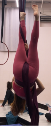
In a similar manner to the past point, when learning a new skill in aerial silks, advanced students find themselves unconsciously relating them to past knowledge. For the figure shown in the picture, the unmethodological approach would be to explain it as “go upside down, hug one silk with one leg, keep grabbing it, and now use the hand that’s not on the wrapped silk to grab it from below and put it over your other leg, so that the silk is hanging in between your legs and toward the back.” Obviously, this unmethodological approach to explaining the knot is not sustainable, so advanced aerialist would translate it as follows:
Go upside down = invert
Hug one silk with one leg = make a half angel
Everything else = make a catcher’s pose / as if you were doing a star drop
Or, even simpler, a more advanced aerialist would just explain it as “make a catcher’s wrap on one silk” (since it’s assumed that to do a catcher’s wrap you must either invert and make a half angel, or invert and hook).
In communication design, storyboards have never been mere illustrations of an idea. They function as hypotheses: assumptions about how a message will unfold over time, how users will perceive it, and how meaning will be constructed through sequence and context. The influence of artificial intelligence on storyboarding becomes most relevant precisely at this level. Rather than improving the act of storytelling itself, AI primarily changes how storyboards can be tested before they are translated into real-world communication.
Traditionally, testing a storyboard required time, discussion, and often external feedback after a concept had already taken a relatively fixed form. AI shifts this testing phase earlier in the design process. By enabling the rapid generation of variations, AI allows designers to examine how the same storyboard behaves under different conditions. Changes in tone, pacing, visual emphasis, or assumed user behavior can be explored without committing to a single narrative path. This transforms the storyboard from a representation of intention into a space for evaluation and stress-testing.
This testing function is particularly important in communication design, where meaning is unstable and interpretation varies widely. Messages are not received in a neutral or uniform way; they are filtered through attention, emotion, prior knowledge, and context. AI makes this variability visible. By producing alternative versions of a storyboard, it exposes points where communication may become ambiguous, where instructions may be misread, or where emotional cues fail to align with intention. The value of AI, in this sense, lies not in producing better images, but in revealing where a storyboard may not work as expected.
However, the speed and visual sophistication of AI-generated material also introduce a new challenge. When a storyboard appears complete too early, it can create a false sense of certainty. In such cases, testing gives way to confirmation, and critical reflection is reduced. To counter this, designers must consciously frame AI-generated storyboards as provisional tools rather than finished artifacts. Their purpose is not to convince, but to question. They are prompts for discussion, comparison, and doubt.
As AI takes over parts of visual and narrative generation, the designer’s role shifts toward interpretation and judgment. Designers decide which variations are meaningful, which differences reveal real communicative risks, and which outcomes can be disregarded. Testing is no longer external to the storyboard; it is embedded within its production. The storyboard becomes a living structure that exposes assumptions instead of hiding them behind polished visuals.
Ultimately, AI reinforces the storyboard’s function as a critical tool in communication design. It does not determine meaning, nor does it replace authorship. Instead, it allows designers to test narrative clarity, perceptual flow, and potential misinterpretations at an early stage. By doing so, AI supports a more reflective design process, one that acknowledges uncertainty and treats communication as something to be examined rather than controlled. In this way, AI returns storyboarding to its core purpose: not to present final answers, but to test whether a message truly communicates.
This block was developed through a collaborative process between the author and ChatGPT, based on an extended conversational exchange on this topic.
Throughout the whole semester, I’ve been conducting field research in order to try to answer the question of: How can we use interaction design to assist in the training of aerial silks, especially in enhancing people’s proprioception?
In these last 2 blog posts, I would like to expose my findings, divided by what works for beginners and what works for advanced students. Moving forward, I expect these 2 to be protopersonas for testing future prototypes and validating my results next semesters.
Now, on to what works for beginners:
Naming figures
Even though there are no international or national standards for naming sequences or figures, each studio should have their own set of naming conventions to facilitate shared language.
Directory of figures
Since new students can join a studio at any time, and to lower the cognitive load of remembering previously learned sequences or figures, studios should follow Nielsen’s heuristic of Recognition rather than Recall, and document the names and pictures (or ideally, videos) of the sequences and figures in a directory accessible to all students.
2-colored unitard / specific accessories
For students who struggle differentiating their left from their right, teachers could provide the option to tailor a custom unitard with half a side in one color and the other half in another. This would help students clearly see and understand the relationship between each side of their body in the air, whether it be through observational learning or through own practice with a real-time communicator.
If there’s not enough budget for this, however, students could also wear a big bracelet on one hand and a big anklet on the respective leg, in order to help in differentiating left from right.
2-colored silk
For even more directionally challenged students, silks where each tail is a different color could be helpful, since it would be easier to explain to them “grab the red silk” instead of relying on “grab one silk … no not that one, the other one.”
Floorial work
Learning a new wrap and understanding how it feels is not an easy task. As such, it’s always easier to simulate the silk wrapping process while on the floor, to be able to wrap your mind around where each silk and part of your body must go in order to complete it.
Limb position references relative to our body, not the world
When communicating a new sequence or figure, teachers must not use world-relative references. It’s easier for students to understand relationships between body parts when they’re being explained to them in a way that they can see (eg. Explaining directions of turns with either “towards your pinky toe” or “towards your big toe”).
Analogies to everyday experiences
When teaching new moves, it’s also helpful to relate the physical movements to other, everyday movements students are already used to. For example, one specific type or grip (depicted in the image), can be explained as “look at your watch, and then straighten your arm” / “move your hand to your temple as if you had a fever, and then straighten your arm” / “imagine you were a flamenco dancer, now do the typical move” — this helps the student more easily learn and remember the direction of the grip, instead of needing advanced spatial awareness.
Another popular board game is “Who Was It?”, in which players must search a castle for a magical ring that has been stolen by one of the castle’s inhabitants. Only the magical ring can save the kingdom from the evil wizard, who will reach the castle at 6 p.m. With the help of an interactive treasure chest, which also lets time run down and puts the players under pressure, the animals can be questioned as witnesses. Each animal demands a specific type of food that the players must find in the castle. Once they have found the food, they can give it to the animal, which then provides a clue in return, such as: “The thief is wearing black shoes.” In this way, the castle inhabitants who are not suspects can gradually be eliminated.
The game is made more challenging by a ghost that moves from room to room and chases the players back to the children’s bedroom, where they must start over, as well as by trapdoors, failed magic spells, and a thieving raven that steals food.
If the thief is caught before time runs out, the players can open the thief’s chest and the kingdom is saved.
Why is “Who Was It?” so well suited for physical education classes?
It requires a high level of cooperation and communication: players must coordinate with one another about which animals have already been questioned, in which rooms keys or food are hidden, and who can be ruled out as the thief. In addition, players do not compete against each other but work together toward a common goal: saving the kingdom. The time frame is particularly suitable for PE lessons, as the length of the game can be adjusted individually. The number of castle inhabitants and animals can also be adapted. In the original game, there are three different difficulty levels, which can be selected according to the students’ age and transferred to the real-life version of the game.
How the game could be adapted for physical education:
The animals or rooms of the castle are distributed across different stations in the gym or on the sports field. Simply running back and forth between the stations already gets the students moving. To perform actions such as searching, feeding, or asking, physical exercises must be completed. These could be detected by a Kinect sensor, which would then trigger the corresponding action in the interface. For this, each station would need a sensor and a device that enables interaction and provides audio feedback. At a central station, the food items are stored and the clues about the thief are collected.
Let’s take a look at how to raise awareness on light pollution through gamification.
The installation of new lighting by the DARKER SKY Project, photo: Burmann/NPorts
Nienke Aal, wildlife management student at Van Hall Larenstein University of Applied Sciences did an internship at the DARKER SKY Project. It is an Interreg North Sea project, funded by the European Regional Development Fund, which aims at reducing light pollution and increasing biodiversity and ecological connectivity. In her report about the experience, Nienke describes the creative and collaborative approach of the project. In fact, it involved designers, ecologists, and storytellers, who all contributed to create a nature-friendly night.
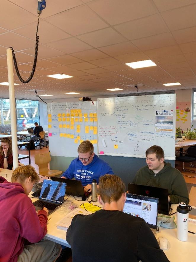
Students of the minor Design for Complex Problems from NHL Stenden, the Netherlands developed interactive sessions with stakeholders to inform and encourage reflection and behavioural change. They showed them different pictures of artificial lighting and asked them to rate them as either “good” or “bad”. They approached the activity with an open mind and showed that listening is equally important as designing.
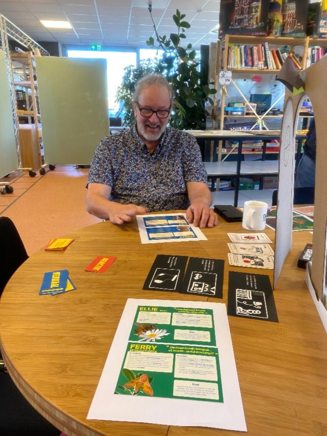
Students from the course Communication and Multimedia Design (CMD) also from NHL Stenden created a board game and an animation to raise awareness about light pollution. The game took players through four different habitats, each with a different light. Light was the villain in the game, causing difficulties to players and ultimately leading them to lose. The animation on the other hand showed the effects of light pollution on animals, but translated to humans. With light, the character felt more and more exhausted. At the end, the curtains close and the relief can be felt with the help of music. After watching the animation, five out of nine people who had not worried about light pollution before admitted that they felt concerned about the future of biodiversity.
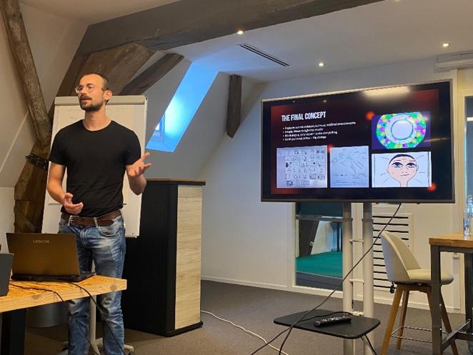
These photos were all taken by Nienke Aal for DARKER SKY. Unfortunately I could not find any close-up pictures. Nevertheless, reading about them was inspiring and made me realise that design, interdisciplinarity and non-formal education can really tackle complex issues.
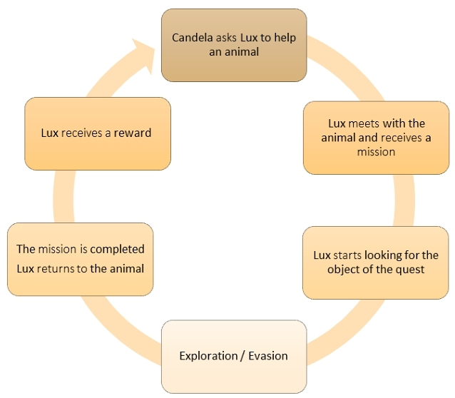
Another example of interaction design for awareness I found is the videogame Lux, developed at the University of Quebec at Chicoutimi in Canada. It is designed to promote better lighting practices among the population and show the impact light pollution has on animals. Although games about light pollution are not very common, they are usually educative and serious, while this one wants to give a playful twist to the issue.
The story is set in a North American city plagued by light pollution. In the game, the player is Lux, a cat that has the mission to save small animals incapacitated by the dazzle. Lux performs different tasks, including replacing blue light bulbs with warmer ones and correcting their orientation. A drone, which represents the enemy, emits a light that disorients the protagonist.
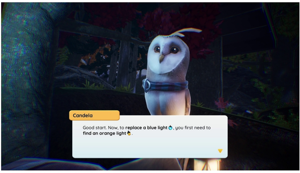
The description gives us detailed information about the UI, the design method used and character design. The UI introduces icons and bold words in the text bubbles to help the player skim through the speech bubbles. The Lux game was developed using a user-centered design approach and the Agile method, where playtesting had an essential part.
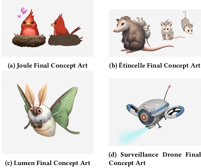
All animals are native to the northern American environment and are named after light or energy references, such as Candela, Joule, Étincelle and Lumen.
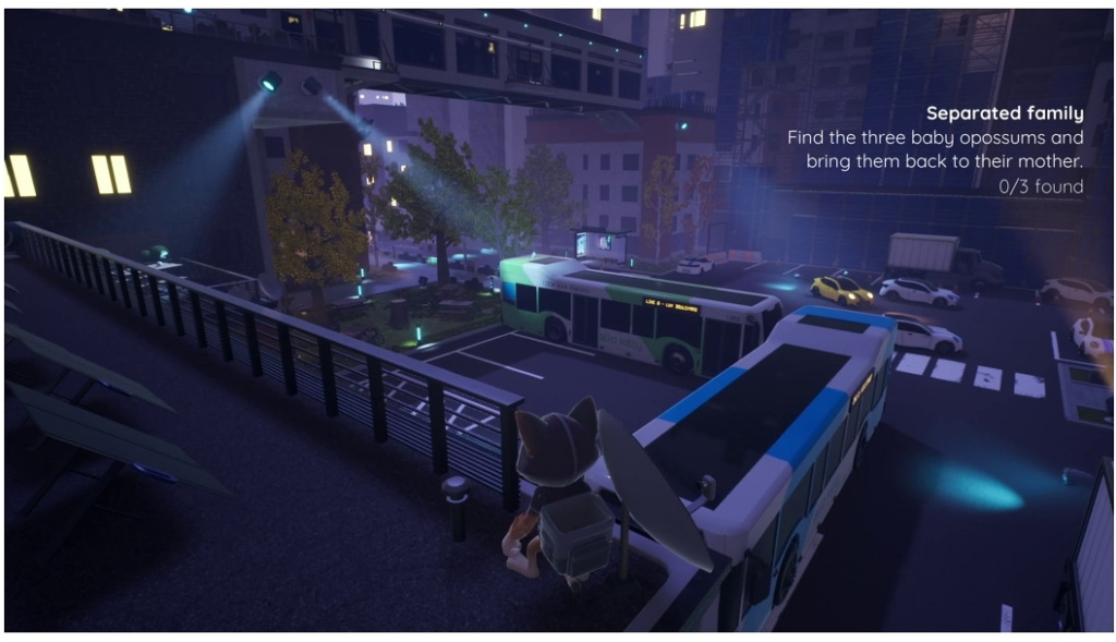
Candela, the barn owl, gives instructions to the player. The UI introduces icons and bold words in the text bubbles to help fast reading and improve accessibility, LuxSome of the characters with light and energy inspired names, LuxIn level 2 the player has to locate and bring back three opossum babies, after their mother almost gets hit by a truck with blinding headlights and loses them, Lux
Lux wants to play with contrast: light seems necessary for humans, but it can be harmful for animals. Through this game, players can easily learn good practices that are friendly to fauna and can recognise problematic lighting in their environment.
I really recommend you to read the whole game description, I think it is a masterpiece because every detail is carefully selected, plus the characters are adorable.
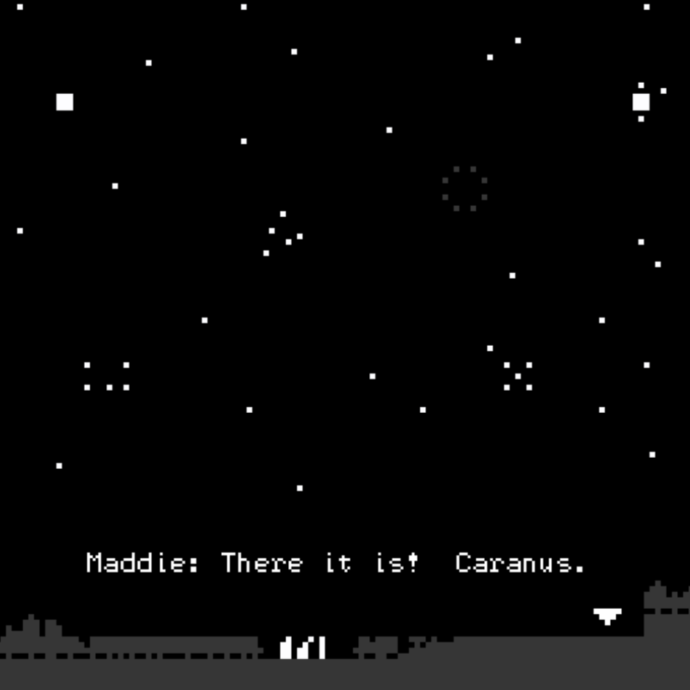
I also found a short game that depicts a quiet moment, Growing Light by Space Owl. In it, some campers observe the stars at night. The player can use arrow keys or the touch screen to search the night sky with the telescope and follow the campers’ conversation. The author’s motivation behind this minigame is showing that we are missing out on a chunk of the human experience if we’re deprived of our view of the night sky. It is very short and simple: as a player, you only move the telescope and make the characters speak. Still, the simplicity of the plot, the minimal interaction and the dark colours were able to transmit me serenity.
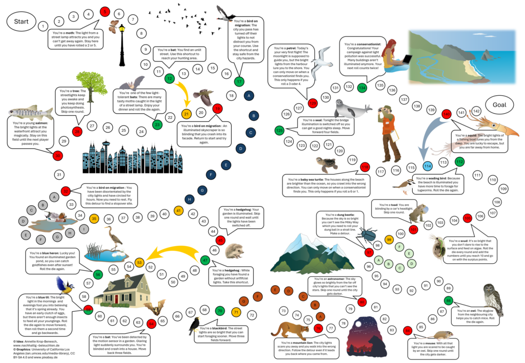
I am ending this article about gamification with an analogue example called Journey through a Bright Night. It is a board game developed by a mother and her two children, who wanted to educate their classmates about light pollution. It is an open source game that can be downloaded, printed on a sheet of paper and played with just a dice and playing pieces. While moving forward on the path, players face the same challenges that animals of different species encounter due to light pollution. The game’s format already exists, but it is educational thanks to detailed explanations.
Researching games about light pollution has been fascinating. I discovered a whole genre that I did not know existed. Unfortunately they are not very popular because environmental causes rarely are a reason for profit and this one is still a niche. I hope some day light pollution will get as much attention as plastic in the oceans, fast fashion, greenhouse emissions and deforestation, and maybe design can help make that happen.
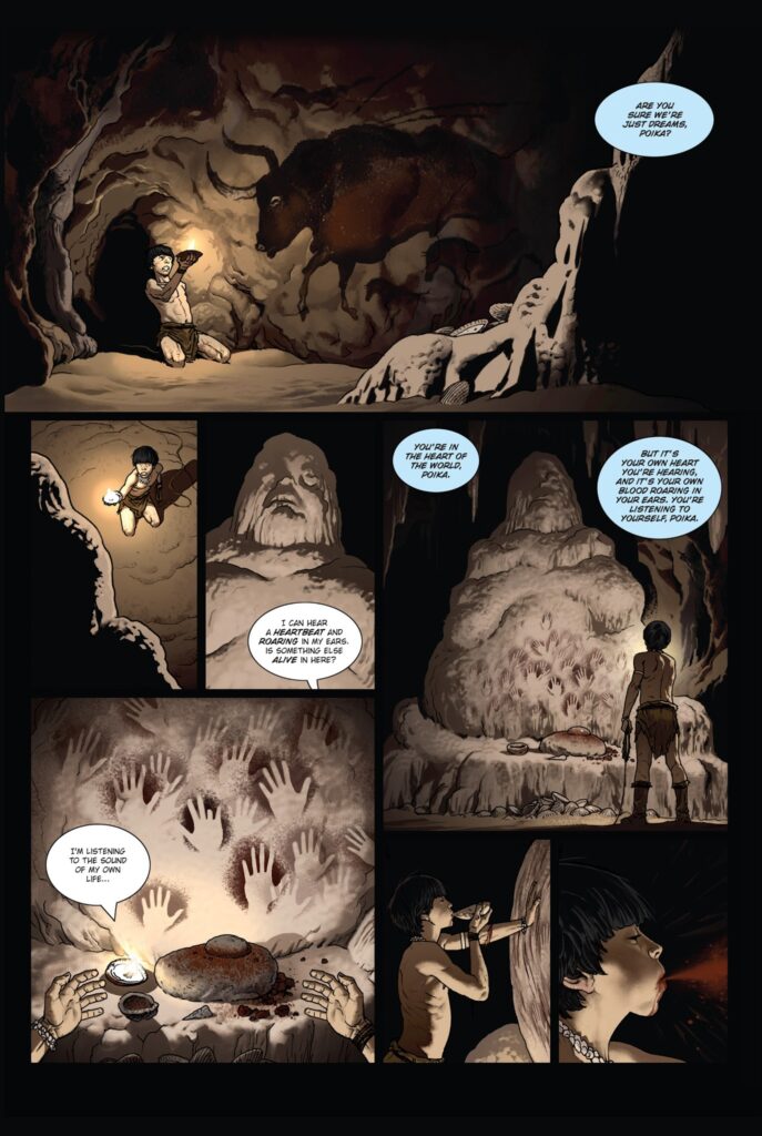
Mezolith is a duology of British graphic novels, written by Ben Haggarty and illustrated by Adam Brockbank. Book One was released in February 2016, Book Two in September of the same year.
Plot
The story takes place about 10,000 years ago, during the Mesolithic. It centres the Kansa tribe, who lives on the eastern shores of Stone Age Britain, and tells about their trials and tribulations as they try to survive through winters and summers.
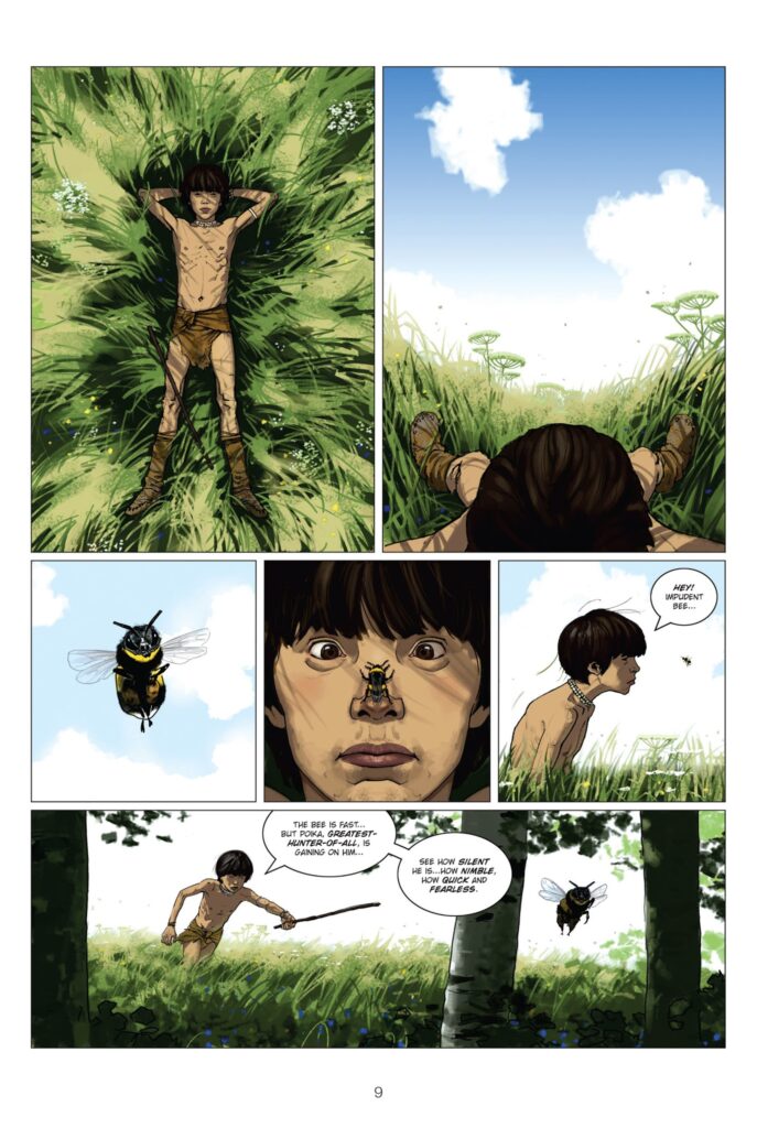
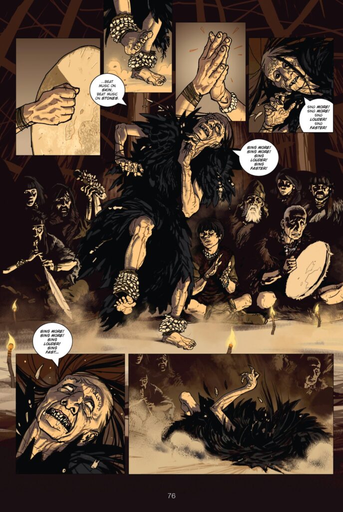
The protagonist is Poika, a young boy on the verge of adulthood. He gets wounded during a hunt because he was trying to prove himself to the others. He nearly dies, only being saved through the intervention of Korppi Velho, a shaman woman, who was raised by ravens. He survives, though he will have a limp for the rest of his life.
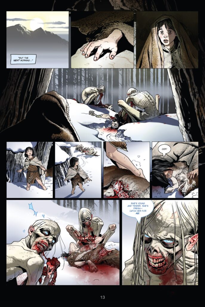
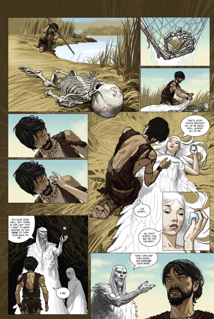
He goes on to make his way through the struggles of adulthood, of survival, of hunts, of conflict, of rituals and love. These struggles are often interspersed with mythology – stories of strange creatures, monsters and gods alike. Either as he experiences them face to face or listens to the tales told by his elders.
Themes
Mezolith is a Coming-of-Age story that explores themes of identity and belonging as Poika tries to find his way in the world. He’s also forced to confront his destiny as his shamanistic abilities become more apparent. This leads to certain responsibilities being thrust upon him. For example, standing up to his elders when he knows they’re doing wrong and helping to keep a balance between their tribe and nature.
Between History and Fantasy
Mezolith plays with the border between reality and fiction. The story is placed in a real part of our history, an era recorded through cave paintings and archaeological findings. There are things we know for certain, and things we can only infer about this time through hypothesis.
This very real past is interspersed with mythology, stories we’ve carried through history to make sense of a world we didn’t yet understand. Stories that felt very near and real to the people living in this time. To them, spirits inhabited the world around, magic was real, be it benevolent or harmful.
Mezolith uses what we know of this past world and contrasts it with the world our ancestors believed in. It reflects on how we use stories to create meaning – to teach, to record, to entertain one another.
Sources
Haggarty, Ben. Brockbank, Adam: Mezolith. Stone Age Dreams and Nightmares. Book 1. Los Angeles: BOOM! Studios 2016
Haggarty, Ben. Brockbank, Adam: Mezolith. Stone Age Dreams and Nightmares. Book 2. Los Angeles: BOOM! Studios 2016
In my last three blog posts, I want to focus more on the city and the human experience in the city, the moments when we slow down and speed up, why this happens, and how design can shape our experience. In the last 10th blog post, I will describe an idea that came to me while using maps for traveling, hiking, and using maps in the three countries where I have lived.
Cities often have a default sense of urgency. We rush through the streets, quickly moving between buildings and rarely stopping unless there is a clear reason to do so. This feeling of acceleration is usually associated with modern lifestyles or digital technologies. However, long before the advent of smartphones and notifications, the city itself was already shaping the speed at which we move.
🏛️ Architecture as an Invisible Script
“First we shape the cities — then they shape us.” — Jan Gehl, Life Between Buildings (2011)[1]
Urban planning determines not only where we can go, but also how we get there. Wide, straight streets encourage continuous movement. Narrow sidewalks discourage lingering. Long building facades with minimal variation encourage visual scanning rather than observation. Even the absence of benches, ledges, or secluded corners suggests that stopping is not expected.
[2] Vester Voldgade, Copenhagen.
🤳🏾 Cities as Interfaces
From an interactive design perspective, a city can be viewed as an interface consisting of physical components:
👉 streets as navigation paths; 👉 intersections as points of interaction; 👉 buildings as visual landmarks; 👉 public spaces as potential places to pause — or missed opportunities.
As in digital systems, default settings matter. When urban space is designed primarily for efficiency, throughput, and movement, speed becomes the implicit norm. There is little friction, but also little invitation to linger.
Urban planner Kevin Lynch in his book “The Image of the City” emphasized how spatial clarity aids orientation and movement, but also warned that excessive legibility can turn a city into a mere transportation environment rather than a place where new experiences can be had.
[3] Urban Planning Elements: Kevin A. Lynch.
🏃♀️ Designing for Flow, Not Staying
Modern cities are increasingly optimizing flows: transportation efficiency, pedestrian capacity, visibility,and safety. While these goals are valid, they often result in spaces that are difficult to inhabit at a leisurely pace. Transitional areas—entrances, plazas, underpasses—are designed to move people through, not allow them to linger.
This logic stands in sharp contrast to alternative urban models such as the Cittaslow movement. The Cittaslow manifesto explicitly challenges acceleration as a default urban value, proposing a city designed not primarily for throughput, but for quality of everyday life. [4]
🦥 What is a Slowcity:
The Cittaslow manifesto contains seventy recommendations and obligations, the main ones being the following :
Enhancement of the historic urban heritage by avoiding the construction of new buildings.
Reduction of energy consumption.
Promotion of ecological technologies.
Multiplication of green spaces and leisure areas.
Cleanliness of the city.
Priority to public transport and other non-polluting transport.
Reduction of waste and development of recycling programs.
Increase in the number of pedestrian areas.
Development of local shops.
Development of community infrastructures and equipment adapted to the disabled and the various ages of life.
Development of a genuine participatory democracy.
Preservation and development of local customs and regional products.
Exclusion of GMOs.
🏎️ Pace as a Design Outcome
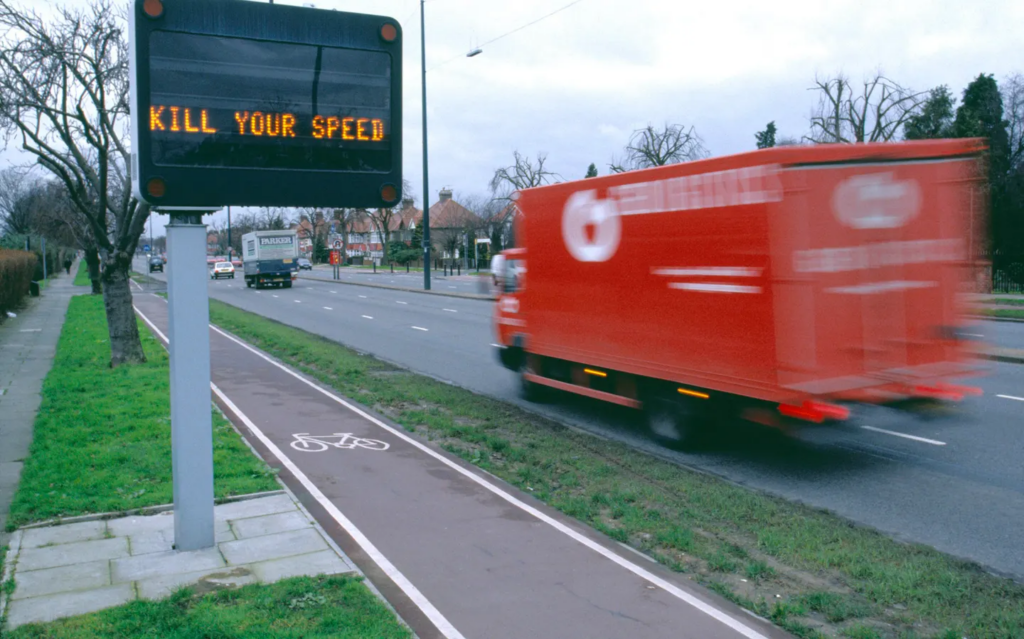
[5] Making Cities Slower… And Safer For All.
Speed in the city is rarely a personal choice. It is determined by structural decisions: street width, building density, visibility, and the presence or absence of places to rest. These elements together determine the rhythm of the city.
Understanding the city as a designed system helps shift the focus away from blaming individuals for driving too fast. Acceleration is often not a mindset—it is an architectural condition.
Speed in the city is rarely a personal choice. It is shaped by structural decisions embedded in street design and urban layout. When movement is prioritized over presence, speed becomes the default — even in spaces meant to be shared.
“City streets aren’t the sole domain of cars and their drivers. They’re also home to pedestrians of all ages, to cyclists, mobility scooter and wheelchair users, to groups of playing children, and mass transit passengers. They are shared spaces, which means they need to provide safety to all.” — Making Cities Slower and Safer for All, Forbes (2024) [6]