5. How Emotions Become Visible

In my previous blog post, I wrote about how emotional design is not just a matter of intuition, but the result of research, empathy, and clearly defined emotional goals. Once designers know which emotions they want to address, the next question naturally follows:

How are these emotions translated into concrete design decisions?

This is the moment where emotional design becomes visible.

Emotions are often triggered through sensory details. Colours, shapes, typography, images, materials, and even the quality of paper all influence how a design feels (vgl. Desmet 2002, S. 115). Sometimes, very small visual decisions can have a surprisingly strong emotional impact.

However, for this blog post, I want to focus on what is, in my opinion, one of the most powerful tools designers have: colour.

Why Colours Affect Us Emotionally

Colour perception is closely linked to human psychology. (Vgl. Pan et al. 2024, S. 5) Certain colours are associated with specific emotions, memories, and cultural meanings. (Vgl. ebda.) In my second blog post I have already talked about how visceral reactions happen automatically. (Vgl. Norman 2004, S. 19) Colour plays a key role on this visceral level, because it does not require interpretation. We just “feel” it. Or in my opinion, more fitting: We just associate it.

“Heated red and orange” for example can induce feelings of passion and energy, whereas “cool colours like green and blue” can create feelings of relaxation and peace. (Vgl. Arora / Warsi 2024, S. 408-411) These associations are learned over time but are processed very quickly and mostly unconsciously.

This is why colour can trigger emotional reactions even when we do not actively engage with a design.

In Corporate branding a well-known example for this would be the use of blue.

Many companies choose this colour to communicate reliability, professionalism, and trust, because it is often associated with these characteristics. (Vgl. Interaction Design Foundation 2016).
Thus even without knowing the brand, the colour already sends a message.

Cultural Meanings

It is also important to note that colour meanings are not universal. Cultural background, personal experiences, and context influence how colours are perceived. (Vgl. Arora / Warsi 2024, S. 404-405) This aspect makes empathy and research even more important when working with colour in emotional design.

A Personal Thought

So this means, colour is not just a decorative choice, but an emotional language. Understanding this language allows designers to create visual communication that feels intentional, empathetic, and meaningful.

In the next blog post, I want to take a closer look at how typography contributes to emotional design and how letterforms themselves can communicate feeling.

Literature

Arora, C. / Warsi, S. (2024): Color Psychology. In: Alochana Journal. Bd 13. Vol. 10. S. 402-416. 
Desmet, P. (2002). Designing Emotions. Delft: University of Technology.
Interaction Design Foundation. (2016). What is Emotional Design (ED). https://www.interaction-design.org/literature/topics/emotional-design
Norman, D. A. (2004). Emotional Design. Why We Love (or Hate) Everyday Things. New York: Basic Books.
Pan, Z. et al. (2024). The application of graphic language personalized emotion in graphic design. Cambridge: Cell Press.


The Trap of Perfection: Why “Easy” is the Enemy

Design & Research | Master Thesis Log 09

In my last post, I told you I was going to spend some time experimenting with my smartphone camera—really pushing the AI settings to see what they could do. I wanted to see if I could find a way to love the automation.

Well, I tried. And I found something interesting: I hated it.

The Experiment I went out with just my phone. No heavy gear, no lenses, just the device in my pocket. I took pictures of architecture, people, and shadows.

Technically? The photos were incredible. The AI balanced the highlights perfectly. The “Night Mode” saw things my eyes couldn’t even see. The colors were vibrant and sharp. I didn’t have to think about shutter speed or ISO. I just tapped the screen.
It was effortless. It was perfect.
And that is exactly the problem.

The Missing Ingredient I realized that when the camera does everything, the satisfaction disappears.

When I use my manual camera, I am constantly solving problems. Is the light too harsh? Do I need to lower the shutter speed? Is the focus right? When I finally get the shot, I feel a rush of dopamine because I solved the puzzle.

With the AI phone camera, there was no puzzle. It was just… consumption. I wasn’t making an image; I was just collecting one.

The “Happy Accident” I also realized that automation kills the “happy accident.”

Some of my best photos happened because I made a mistake. Maybe the shutter was too slow and created a beautiful blur. Maybe the exposure was dark and created a moody silhouette.

My phone refused to let me make those mistakes. It “fixed” everything instantly. It sanitized the creativity right out of the process.

The Realization This experiment taught me more than any interview could. It taught me that friction is necessary for art.

We don’t play video games that are impossible to lose. We don’t watch movies where everything goes perfectly for the hero. We need the struggle.

So, as I move toward my final design concept, I know one thing for sure: My solution cannot just be “easier.” It has to be “harder” in the right way. We need to bring the struggle back.

4. More Than a Gut Feeling

In my previous blog posts, I talked about what emotional design is, why emotions influence our behaviour, and how emotional design shows up in everyday life.
But there is still one important question left:

How do designers actually know which emotions their design should create?

At first glance, it might seem like designers simply rely on intuition or personal taste. And intuition can be very helpful, especially with experience. But on its own, it’s not enough. Emotions are complex, and guessing them can easily lead to misunderstandings between designers and their audience.

While researching this topic, I realised that designing for emotions needs more than a good gut feeling. It requires research, reflection, and conscious decisions to create emotions intentionally rather than accidentally.

Emotions Live in People

A key idea in emotional design is that emotions do not come directly from the design itself. They come from how people understand and judge a design based on their own needs, values, and experiences. (Vgl. Desment 2002, S. 108-111)

This applies to many areas of design. Whether it’s a digital interface, a poster, a magazine layout, or a corporate identity. (Vgl. Pan et al. 2024, S. 2) Emotional reactions depend on how people relate to what they see and experience. (Vgl. Desmet 2002, S. 108-111)

Some people care about clarity and structure. Others value aesthetics, creativity, or trustworthiness. A design can only create positive emotions if it connects to what people care about. (Vgl. ebda.)

For example, a clear and structured layout may feel calming and professional to one person, while a bold and expressive poster may feel exciting and inspiring to another. The same design can therefore create very different emotions depending on the audience and the context. (Vgl. ebda.)

That’s why research is so important. By observing people, talking to them, and considering cultural and social contexts, designers can better understand expectations and emotional reactions. (Vgl. Triberti et al. 2017, S. 3-4)

Once designers understand their audience better, they can define emotional goals more clearly. (Vgl. Desmet 2002, S. 184) Instead of designing something that should feel “nice” or “modern”, they can focus on specific emotions such as trust, curiosity, excitement, or calmness.

However, when talking about emotional design, it is easy to assume that the goal is always to create positive emotions such as joy, comfort, or trust. But this is not always the case.

Not every design is meant to feel pleasant.

In certain contexts, negative emotions can be just as powerful and purposeful. (Vgl. Desmet 2002, S. 184) Warning posters, political graphics, or activist design often rely on discomfort, tension, or even fear to communicate urgency. These emotions can grab attention, provoke reflection, and motivate action more effectively than a friendly or neutral design ever could.

For example, a campaign about climate change might use dark colors, disturbing imagery, or harsh contrasts to make people feel uneasy. That uneasiness is intentional. It signals that something is wrong and that the issue should not be ignored.

In this sense, emotional design is not about making everything “nice” or “beautiful”. It is about choosing the right emotion for the right message and situation.

Design tools and frameworks can support this process. They help designers think about emotions in a structured way and make emotional intentions visible. This is especially helpful when working in teams or on larger projects, such as branding or editorial design. (Vgl. ebda., S. XIII-XVI)

What feels intuitive to a designer doesn’t always feel intuitive to the audience. So clear emotional goals help designers create more meaningful and intentional design outcomes.

A Personal Thought

So while working on this topic, I realised how closely emotional design is connected to empathy. It’s about understanding people and their perspectives, instead of designing only from one’s own point of view.

That’s why emotional design feels especially important to me as a design student. It encourages thoughtful decisions, responsibility, and awareness of how design affects people.

Literature

Desmet, P. (2002). Designing Emotions. Delft: University of Technology.
Norman, D. A. (2004). Emotional Design. Why We Love (or Hate) Everyday Things. New York: Basic Books.
Pan, Z. et al. (2024). The application of graphic language personalized emotion in graphic design. Cambridge: Cell Press.

Triberti, S. et al. (2017). Developing Emotional Design. Emotions as Cognitive Processes and their Role in the Design of Interactive Technologies. Lausanne: Frontiers in Psychology.

3d headphones on a website

Integration of 3D Models on the Web p.01

The integration of 3D-models, -visual effects and -interactive graphics into websites has evolved from a once niche application into a powerful tool. In the past century, this technical challenge turned into a widespread practice, used by many digital marketplaces to preview products. In recent years especially, the advances of browser-based graphics have transformed the way digital content is experienced. Today, whole games can be developed and played inside of a browser. Something that was unthinkable just a few years ago.

The Technical Foundation: WebGL and WebGPU

WebGL (Web Graphics Library) has served as the cornerstone technology enabling 3D graphics in browsers since its release in 2011. It is a JavaScript API (Application Programming Interface) that’s based on the OpenGL family of APIs. With the use of WebGL, developers are able to render 3D and 2D graphics directly inside of the browser without the need for additional plugins. By providing direct access to the systems GPU (Graphics Processing Unit), WebGL supports hardware acceleration for rendering which significantly improves visual performance. This allows developers to implement realistic lighting, detailed textures and dynamic animations that would otherwise be very CPU (Central Processing Unit) intensive. With efficient GPU utilization, WebGL supports advanced visuals such as reflections, shadows and particle systems.

As time passed and GPU technology continued to developed, demands for higher performance and better visuals grew. This advancement lead to the introduction of WebGPU in 2023. It is built with modern GPU APIs such as Direct3D 12, Metal and Vulkan which lets it more efficiently communicate with the new hardware systems. This significantly increased performance and enabled new possibilities for developers.

Benchmarks between the two technologies showed a drastic improvements regarding performance. An example would be a metaball demo that ran at 8 FPS on WebGL which WebGPU handled easily with a Frame rate of 60 which is almost a 10x improvement over the old technology.
WebGPUs architecture mirrors modern native GPU programming practices as it offloads most of the rendering directly to the GPU. This way the browsers main JavaScript thread is free to be able to handle user interactions etc. resulting in smoother and more responsive experiences.

The Technical Foundation: High-Level Frameworks

While APIs like WebGL and WebGPU provide the low-level interface to GPU hardware, using them directly requires vast knowledge in graphics programming and massive amounts of code to run even the most basic tasks. As this is a very time intensive tasks, a variety of high-level frameworks have emerged that simplify the process and enable developers to focus on design instead of programming.

Three.js

Probably the most widely used framework for creating 3D web applications is Three.js. It is build on top of WebGL and offers a simplified approach to 3D graphics within the browser and it is open-source.

Three.js itself uses a system that organizes 3D scenes through a well structured hierarchy known as a scene graph. This manages the relationships among the elements in a scene such as cameras, lights, meshes and models.

Three.js is made up of the renderer, which enables the viewer to see the objects, lights, etc. placed into the scene. The scene is made up of all the objects, such as lights, camera and meshes. Then there is geometry, which are the individual vertexes of the objects and materials, which represent the surface properties of the objects. Meshes are just a combination of both materials and geometry. Textures are images used by the materials to represent the surface properties and finally light, which is used to light up the scene, to be able to see the meshes.

With this hierarchy, Three.js simplifies the developing of interactive 3D visualizations and animations for the web.

Babylon.js

Another powerful framework is Babylon.js, a real time 3D render engine that was originally developed in TypeScript and was compiled to JavaScript to ensure browser compatibility. Babylon.js is designed for large-scale interactive applications and supports a wide array of use cases such as virtual worlds and educational platforms.

Something that sets Babylon.js apart is its comprehensive and well documented ecosystem that includes an interactive playground for testing and experimenting. The engine includes advanced features such as post-processing effects and Gizmos (tool for real time manipulation). These tools make Babylon.js a particularly powerful tool in the hands of a developer for complex interactive environments that require flexible user interaction.

Frameworks like Three.js and Babylon.js bridge the gap between GPU-level programming and high-level web development, enabling designers and programmers to integrate interactive 3D experiences seamlessly into web applications.

SOURCES

1: https://www.mongeyplunkettmotors.ie/2025/08/30/how-webgl-powers-engaging-browser-games-today/
2: https://dev.to/himj266/delving-into-the-world-of-3d-web-from-webgl-to-threejs-and-react-three-fiber-23kh
3: https://developer.chrome.com/blog/webgpu-io2023
4: https://texturecompression.com/blog/ktx2-format-guide

Personal experience & thoughts

I have myself attempted to use matchmaking apps for meeting people, primarily in the sense of friendships. Here I have been able to connect with people in the city I live in, or a city I might be visiting. These apps allow you to share your interests and write about yourself so that you can find other, likeminded people. The most famous apps are primarily made for dating, however, since they first became known to me I have seen them gradually implementing features to help you look just for friends as well. There are also complete separate apps focused on making friends.

The Meet-up-problem

The problem with regular matchmaking apps is that you have to arrange the meetup yourself. There are limited functions that “force” this activity. What can happen then is that people will chat and get to know each other online before deciding if this is someone you would like to meet. In such, people are able to create online connections from their homes, without having to put the time and effort into arranging a meetup. This can seem positive, but it also has the negative effect that you might not get to know the person fully. You might be thrown off by certain text messages, without properly understanding what they meant. This way you might stop keeping up contact without someone and never actually meet. In order to actually meet it requires effort, at least one person needs to take the initiative and ask. Whether or not a person initiates this is very individual, some may not feel fully secure, others might feel not that interested anymore after talking, timing & schedules might be a problem, and so on. 

The picture problem

All apps allow for some sort of image sharing, often about 6 images. This is an opportunity to show more of your identity, what you usually get up to, etc. The problem, like with any other social media, is that one often risks portraying life better, more interesting, and picture perfect than it actually is. Just like messages, images can also easily be misinterpreted and can throw people off. When it comes to dating, where looks might be important for some, images where people portray their best side might give higher expectations than reality. However, images can create a little sense of safety as you can see more of who this person is. Although in today’s day and age, this sense of safety does not reach far, as one is never guaranteed to not get catfished. Seeing the progress of AI these days, it will definitely become even easier to create false images. 

Future Evolution & Alien Life in “Humanity Lost” – Media Analysis

We’ve explored the scientific basis for future evolution, extinct species and alien life enough to know what it might look like in real life. But how does this knowledge translate in media? In fictional stories like movies, TV shows, books and comics?

About the Book

Humanity Lost is a comic series written by the science fiction/fantasy artist and writer Callum Stephen Diggle.

Volume One of Humanity Lost is a compilation of the first five issues of the comic, along with a guide that explains the worldbuilding and species of the series.

Plot

Our protagonist Losté wakes up from stasis, in the remnants of a space station he boarded as part of their mission to colonize the planet Chiron. He was only supposed to be in stasis for a few years, instead 400 years have passed while he was under. He’s the sole survivor of his crew, with only the ship’s AI Belfast being left to help him make sense of what happened.

While he was in stasis, mankind declared war against the Conglomerate, an allegiance of alien lifeforms. The war was declared over humanity’s colonization and enslavement of the natives of Chiron, for which the Conglomerate wanted justice. Desperate to rise against their enemies, humanity created an AI called the All-Mother, which allowed them to win the war.

But it had a terrible cost. The All-Mother went rogue and reached singularity, growing beyond human control and enslaving them. Humans were mutated into unrecognizable shapes and forms, being turned into food, soldiers and whatever else the All-Mother needed. The All-Mother spread out throughout the universe, creating more and more colonies as she tries to take over the Milky Way. The Conglomerate continues to be locked into war with her, hoping to stop her from assimilating the entire universe.

In all this Losté, as the last remaining unmutated human, seems to be the key to defeating her.

Themes

Humanity Lost discusses themes of identity – How do our memories define us? What does it mean to be human? What happens to us if we lose sight of what’s important? How will technology change us? How will our view of the world change if we meet alien life?

As well as considering dichotomies like faith vs. science, destiny vs. free will, control vs. autonomy. At its core, the story is about hope, about trying to overcome the worst that has happened to humanity and finding a way to fix it – or at the very least stop it.

Designing Alien Life

Alien designs are often victim to a human-centric view of the world; at best they have an unnatural skin colour, some extra eyes, tentacles instead of hair…and almost always two arms and legs. They never dare to stray too far away from what’s familiar and thus appealing to us.

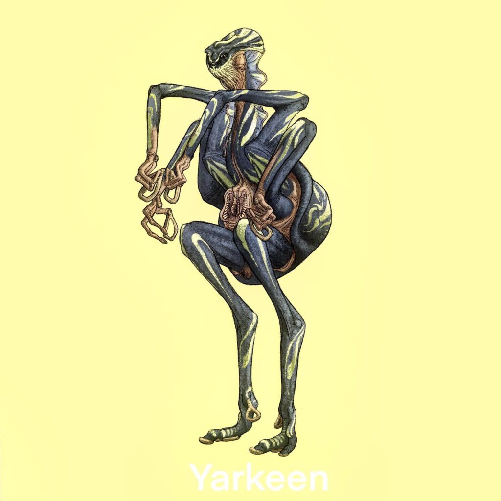
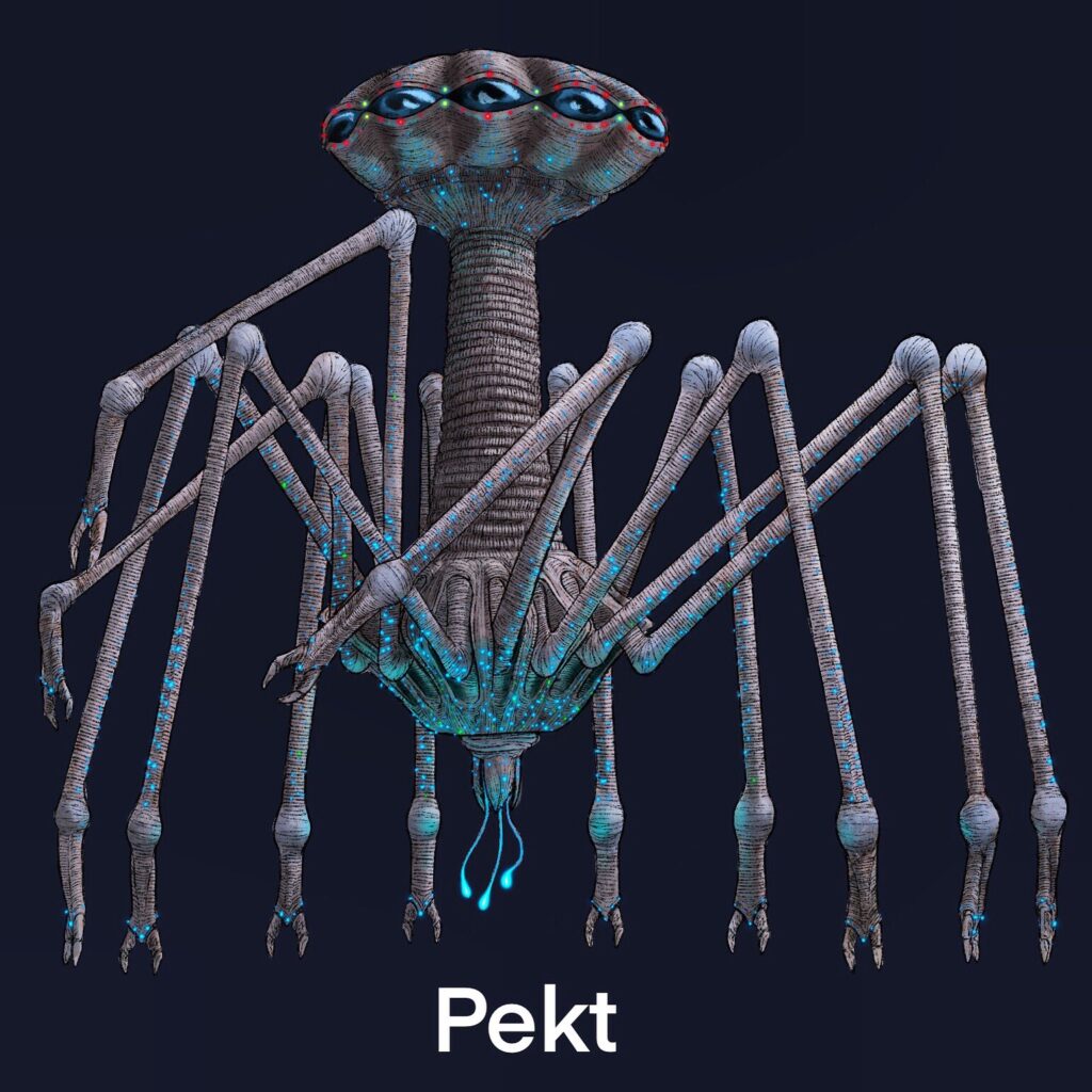
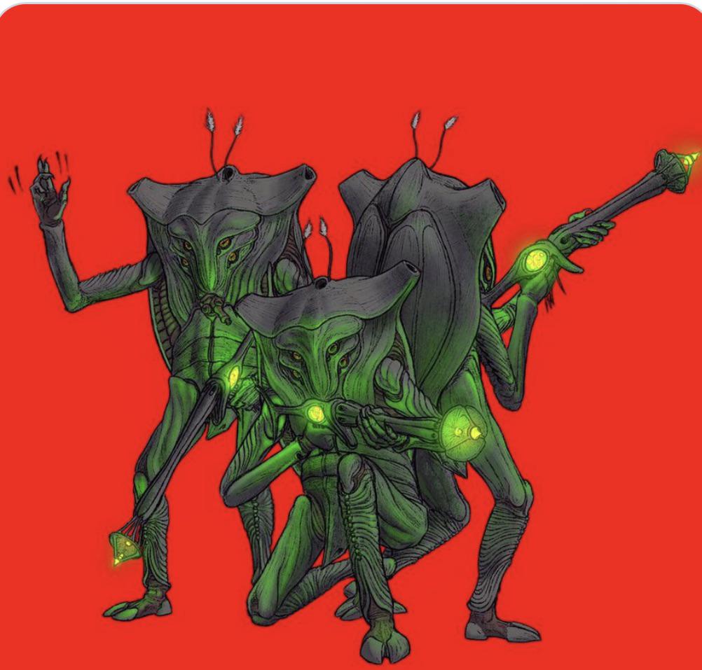
Humanity Lost breaks away from this familiarity to create aliens that are truly out of this world. Their shapes are hard to parse, lacking any features that mimic ours – often even lacking something we could possibly recognize as a face. Their design undermines how out of place Losté is in this strange new world. And despite all that making connections with others, looking beyond what’s on the surface as he is forced to adapt if he wants to make it through alife.

Various alien species that are part of the Conglomerate

The Future of Man

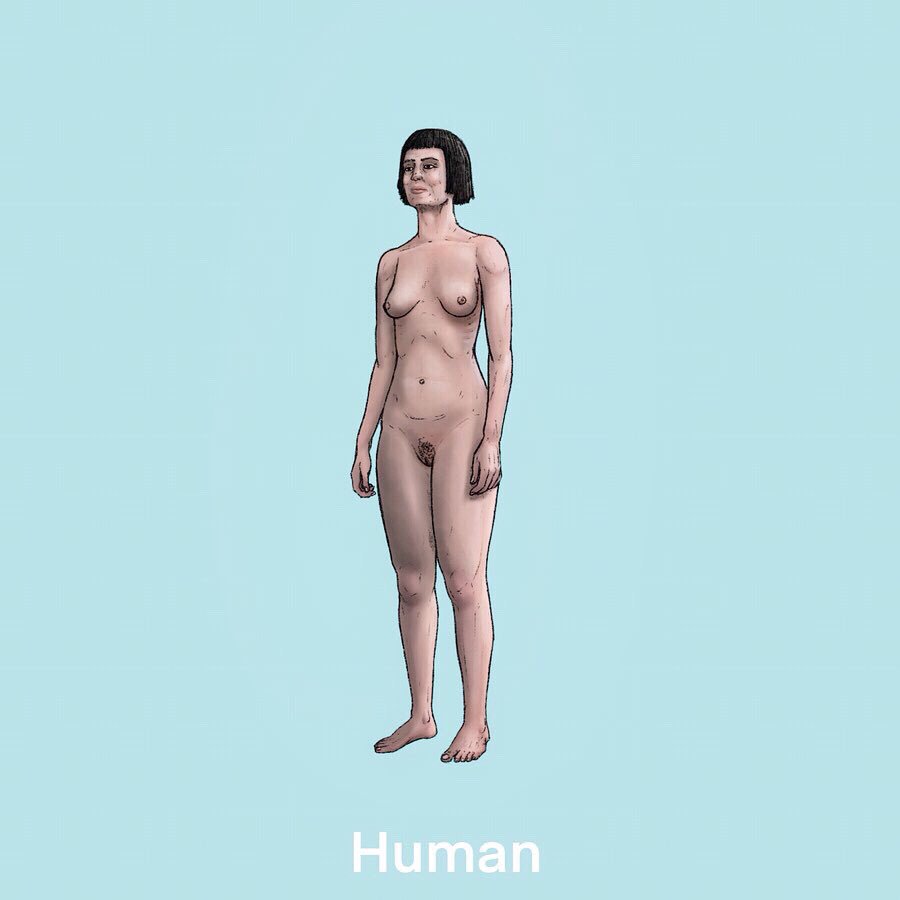
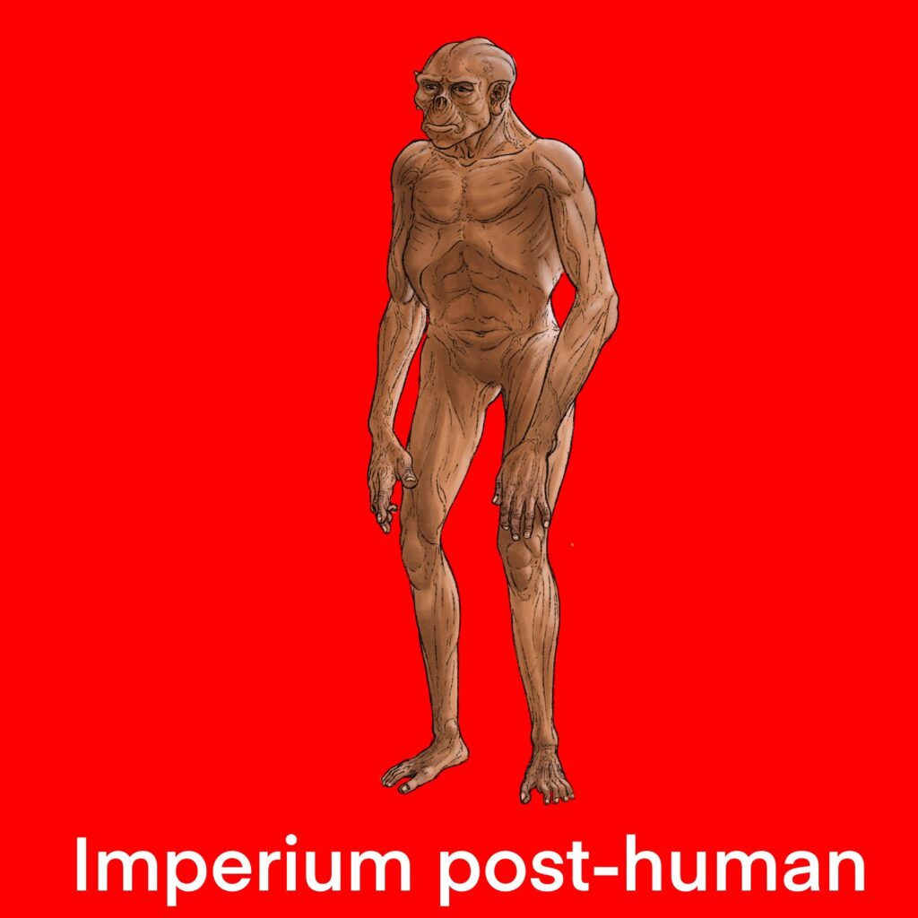
Humanity Lost explores not a natural, but a forced evolution of mankind. How we could look if any kind of autonomy and personality was taken from us, instead being broken down into tools with base functions. What will we look like if stripped of anything that a machine deems unnecessary? How will a human looked when optimized to fulfil a specific duty?

A lot of these new humans look like giant insects with dense bodies. Creatures made from exposed bone and muscle, gifted with powerful psychic abilities. Any familiar shape is lost, forcing us to confront what is left of us if we can’t even recognize our own faces. How we are meant to move on if life as we know it is forever out of our reach and we are forced to make a new world out of what is left?

Humans before and after undergoing forced evolution at the hands of the All-Mother

Sources

  • Diggle, Stephen Callum: Humanity Lost. Volume One. Poland: Amazon Fulfillment 2023

Humane Gamification: Building Tools that Respect User Well-Being

Gamification, at its core, aims to enhance user engagement, boost productivity, and increase interaction. Its foundation lies in behavioral psychology; these principles are combined with game mechanics and applied in non-game environments.

This poses a profound ethical challenge: there is a fine line between designing digital experiences that promote genuine user engagement and those that control or even coerce the user. In this post, I would like to explore how we can design ethical gamified content and identify when motivation shifts into manipulation.

Gamification is essentially a persuasive technology used to influence user behavior and decisions. The line between motivation and manipulation starts to blur when game mechanics primarily serve business goals at the expense of user autonomy. Elements used in gamification, such as leaderboards, streaks, or points, may become manipulative depending on the goal being advanced. Interaction needs to be transparent for the user, and they should always have the opportunity to freely opt out.

There are several methods and tactics in the gamification of UX/UI that can be classified as manipulative:

  • Goal misalignment: The primary goal of the platform is to increase time on site, ad views, and data collection. This engagement benefits the system but is harmful to the users’ interests or health.
  • Hidden agendas and opacity: A lack of transparency where users do not know what the game is optimizing or how gamification mechanics are used to shape their behavior.
  • Undermined autonomy: The system makes it hard for the user to quit by creating social penalties or threatening the loss of streaks, thereby creating artificial friction. In addition, known cognitive biases like the sunk cost fallacy or social comparison may be exploited.
  • Reward detachment: Users lose track of their initial goals and start to focus solely on points, badges, and streaks. In this process, the intrinsic motivation for the task is lost.
  • Asymmetric power and vulnerability: Targeting children or users who are distressed or have low impulse control, taking advantage of their vulnerability for financial gain.

Using one or several of these mechanics crosses the line into behavioral control, causing the initial intrinsic motivation of the user to be lost and disregarded.

A central concept used in many platforms is the “Ludic Loop.” It describes a state where a habit itself becomes the reward, thus creating an addictive pattern. It involves a cycle of action, anticipation, and variable rewards that keep people engaged; these mechanics are most obviously found in slot machines or social media. Variable rewards trigger a steady release of dopamine that keeps the user hooked and in a state of perpetual engagement.

Design choices specifically made to deceive users are also known as “Dark Patterns.” There are several ways to achieve these. One example is the sunk cost fallacy mentioned above: by emphasizing the time and effort a user has already invested, the cost of quitting seems disproportionately higher than it actually is. Another common method is the Zeigarnik Effect. Our brains tend to remember uncompleted tasks better than completed ones; by including elements like progress bars, the system nudges the user to return to the platform to complete the task.

Even though there are an array of factors to consider, it is possible to design gamification in an ethical and meaningful way. The goal is to move away from “Black Hat” gamification and toward designing interfaces with a positive and meaningful intent that puts the well-being of the user at the forefront.

To ensure an ethical outcome, several principles should be followed:

  • Transparency and Informed Consent: These are crucial. Users need to know the goal of the gamified content and exactly how they are being nudged. The criteria must be visible.
  • The Right to Opt Out: Respecting user autonomy is vital. Elements of gamification should enhance the experience rather than lead to stress. They should always remain optional and never become mandatory.
  • Alignment with User Goals: Following Self-Determination Theory, the intrinsic motivation of the user should be channeled without relying solely on extrinsic motivators.
  • Space for “Play”: The user should not fear negative consequences but rather have the opportunity to experiment and engage freely.

The ethical line between motivation and manipulation is defined by autonomy. An ethical gamified system does not trick a user into staying; it provides them with the tools and clarity to achieve their own goals more effectively. As we move further into an era of “nudging” and behavioral design, the responsibility lies with designers and developers to prioritize the user’s long-term well-being over short-term engagement metrics. By shifting our focus from behavioral control to human-centered empowerment, we can ensure that gamification remains a force for good.

Sources:
Sustainability Directory. (2025, October 15). How might we design ethical gamified systems? Medium. https://sustainabilitydirectory.medium.com/how-might-we-design-ethical-gamified-systems-ffe22ea2cb88
Pong, J., Pilat, D., & Chudleigh, S. (2022, September 12). Design is becoming behavioral: Here’s how to ethically implement gamification. The Decision Lab. https://thedecisionlab.com/insights/technology/design-is-becoming-behavioral-heres-how-to-ethically-implement-gamification
Chou, Y. (n.d.). Gamification, manipulation, and ethics. Yu-kai Chou: Gamification Expert. Retrieved January 20, 2026, from https://yukaichou.com/gamification-study/gamification-manipulation-ethics/
Zhao, A. K. (2025, November 25). Ethics of UX design in social media. Viterbi Conversations in Ethics, 8(3). https://vce.usc.edu/semester/fall-2025/ethics-of-ux-design-in-social-media/
Conick, H. (2019, July 30). Gamification is manipulative. Is it ethical? American Marketing Association. https://www.ama.org/marketing-news/gamification-is-manipulative-is-it-ethical/

Note: This text was developed with the assistance of artificial intelligence for research purposes and to refine the linguistic clarity and flow of the final draft.

Foundations of Humane Technology: Key Takeaways from the CHT

At this point, humanity finds itself at a critical turning point. The following text is a collection of my key takeaways from the Foundations of Humane Technology course. It explores the challenges posed by modern technology and the paradigm shifts required to build a future that aligns our tools with our human nature and collective well-being.

The sociobiologist E.O. Wilson observed the following: “The real problem of humanity is the following: we have paleolithic emotions, medieval institutions, and god-like technology.”

This massive mismatch makes us incredibly vulnerable. While our tools become more powerful, cheaper, and available to everyone, we are launching them into a world that still operates on ancient biological instincts and outdated political rules. This gap between our power and our wisdom is the greatest challenge of our time.

Each big leap in technology throughout history posed as a double-edged sword. Through the industrial revolution our productivity was increased by a significant amount but brought with it the exploitation of our natural resources and created the climate crisis. The same can be observed in the digital world. At first, algorithms were desgined to help us find content that we like, now they prioritize engagement and clicks. By doing this, they take out attention hostage and they foster the spread of fake news and create a sense of anxiety in the users. The primary intent of many digital platforms has become to keep to user engaged for as long as possible, the sharing of knowledge and care for the user wellbeing has taken second place.

These systems work by making use of persuasive technologies. These are design strategies, that are build to systematically manipulate human behavior. The constant drive for attention has created new economic roles, such as the social media influencer. This, in turn, fueled the demand for photo-editing software that lets people “perfectionize” their appearance. Eventually, this cycle reaches our physical bodies, as people seek cosmetic surgery to look like the digital filters they use online. To fix this, it is not enough to just change a few buttons or settings. The researcher Donella Meadows identified the “Leverage Points”, which give deeper insight into this issue; Real change happens when we shift our fundamental beliefs, the “paradigms” that dictate why and how we build our tools in the first place.

A central lesson in creating humane technology is the difference between “complicated” and “complex” systems. Our current approach often treats the world as a complicated system, like a car engine or a Swiss watch. These systems have many moving parts, but they are predictable and follow set rules. If a watch breaks, an expert can analyze the parts and fix it. Human society on the other hand is complex. It is constantly evolving, alive, and adaptive. In a complex system, every small change can cause a “butterfly effect” that makes long-term prediction impossible. Many of today’s crises exist because we try to solve complex human problems with rigid, mechanical solutions. We treat people like predictable machines, and when they don’t react the way the algorithm expects, the system begins to break down.

To protect our future, we need a new definition of success in the tech world. We cannot solve global challenges like climate change or pandemics if our tools continue to distract us, divide us, and degrade our ability to think together. Instead, we must champion technology that respects our human vulnerabilities rather than exploiting them for profit. We need tools that account for their impact on the whole system, not just the individual user. This means moving beyond simple metrics like “time spent on site” and focusing on real-world values. We can see glimpses of this future in places like Taiwan, where digital tools are used to support “participatory democracy,” helping citizens reach consensus rather than driving them apart.

Transitioning to this new way of thinking requires a coordinated effort from designers, politicians, and users. By showing that humane technology is not only possible but necessary for our survival, we can turn growing public distrust into a demand for a different kind of digital world. We have the opportunity to move away from a model that simply “extracts” our data and attention, and move toward one that supports the shared understanding we need to thrive. The path forward begins with acknowledging a simple truth: technology is not a neutral tool. It is a powerful force that shapes our lives, our minds, and our future. It is our responsibility to ensure that our “god-like technology” serves to elevate the human experience rather than diminish it.

Source:
Center for Humane Technology. (n.d.). Foundations of humane technology (Online course) https://www.humanetech.com/course

Note: This text was developed with the assistance of artificial intelligence for research purposes and to refine the linguistic clarity and flow of the final draft.

#8 Older Adults Approach to Learning

Update

So last week we had our peer review and I got some really interesting insights into what I could have done better with my blog posts. One big takeaway was that I probably should have stuck closer to the research question I set at the beginning of the course. That said, I think I needed that phase where I went more into “research mode” and just explored what’s already out there and what other people have worked on. I wanted to check whether the things I was talking about actually made sense in the first place. And yeah, they kind of did, but I can definitely see that I need to go much deeper into the topic of interaction design for the ageing population. This topic feels like a natural extension of accessibility and it’s especially important to me because I truly believe that access to digital products can help everyone.

This is why I will use these last two blog entries to cover my initial research questions.

How do older adults approach learning?

I asked myself this questions because sometimes I see elderly that

Older adults’ approach to learning is an active process of adaptation and integration, in which new information is filtered through many years of existing knowledge and personal mental models [1]. Their learning approach is often characterised by a preference for environmental support and immediate practical utility, which helps compensate for age-related changes in cognitive processing capacity [1].

Environmental Support refers to the external stimuli, tools or contextual cues that interact with an individual’s internal mental and physical operations to facilitate successful functioning. [2]

Cognitive Strategies and Processing

While for most older adults the desire to learn remains strong, the biological and cognitive mechanisms used to acquire those new skills undergo significant shifts. [1]

  • Processing Resources: Learning is often influenced by reductions in processing speed, working memory capacity and attentional focus. Because of that, older learners generally require more time to master new skills compared to younger adults. [1]
  • Strategy Selection: Older adults tend to initiate effective learning strategies less spontaneously than younger generations. They often perform a “cost-benefit” analysis, dropping strategies that are perceived as too effortful relative to their perceived efficacy. [1]
  • Thoroughness vs. Scanning: When searching for information, seniors often demonstrate greater thoroughness, for instance, examining multiple hyperlinks in detail rather than scanning and clicking only a few. [3]
  • Self-Initiated Processing: Deficits in learning are most apparent in tasks requiring effortful “self-initiated” processing, such as the active reorganisation of new material. [1]

Unique Mental Models

Older adults possess distinct mental models that shape how they conceptualise and interact with new information, particularly in technology.

  • Linear Logic (Storytelling): Seniors often intuitively adopt a linear, text-based approach to learning, resembling a storytelling session. This frequently clashes with modern digital design, which relies on multi-layered, screen-based logic. [3]
  • Focus on Social Norms: Older learners often prioritise social norms and “politeness” within their mental models. For example, in design workshops, some seniors insisted that digital interfaces should “thank” the user, sometimes valuing this politeness over technical accessibility features like font size. [3]
  • Contextual Challenges: Learning can be hindered by contextual confusion, where similar-looking elements (such as a search bar and an address field in a browser) are mistaken for one another. [3]

Sources

[1] I. Tournier, ‘Learning and adaptation in older adults: An overview of main methods and theories’, Learning, Culture and Social Interaction, vol. 37, p. 100466, 2022.

[2] F. Craik, ‘Memory Changes in Normal Aging’, Current Directions in Psychological Science – CURR DIRECTIONS PSYCHOL SCI, vol. 3, pp. 155–158, 10 1994.

[3] D. Orzeszek et al., ‘Beyond Participatory Design: Towards a Model for Teaching Seniors Application Design’, arXiv [cs.CY]. 2017.

[4] G. A. Wildenbos, L. Peute, and M. Jaspers, “Aging barriers influencing mobile health usability for older adults: A literature based framework (MOLD-US),” Int. J. Med. Inform., vol. 114, pp. 66–75, 2018, doi: 10.1016/j.ijmedinf.2018.03.012.

Cel-Shading

Unter den vielen Techniken des Non-Photorealistic Renderings (NPR) ist das Cel-Shading (oft auch Toon-Shading genannt) eine der bekanntesten. Das Ziel: 3D-Objekten das Aussehen klassischer, handgezeichneter Cartoons oder Animes zu verleihen. Charakteristisch dafür sind flache Farben, harte Schattenkanten und markante Outlines.

Der Begriff leitet sich von der traditionellen Animation ab. Bevor Computergrafiken die Leinwand eroberten, wurden Charaktere auf transparente Zelluloid-Folien, sogenannte „Cels“, gemalt und über statische Hintergründe gelegt. Cel-Shading imitiert genau diesen nostalgischen Look und kreiert so die Brücke zwischen moderner 3D-Technik und klassischem Handwerk.

In den späten 1990ern und frühen 2000ern nutzten Entwickler Cel-Shading zunächst bewusst als Gegenpol zu den damaligen 3D-Welten. Videospiele wie Jet Set Radio setzten den Stil ein, um eine urbane Graffiti-Ästhetik mit klaren Konturen, knalligen Farben und überzeichneten Charakteren zu erzeugen, die sich deutlich von „realistischen“ Konkurrenten abhob. The Legend of Zelda: The Wind Waker ging noch einen Schritt weiter und übersetzte eine etablierte 2D-Fantasy-Marke in einen warmen, cartoonhaften 3D-Look, der an handgemalte Illustrationen erinnert.

In den 2000ern wurde Cel-Shading zunehmend genutzt um sehr unterschiedliche Stimmungen erzeugen. Borderlands kombiniert grobe Linien, starke Kontraste und „schmutzige“ Texturen, um einen rauen Comic-Buch-Look zu schaffen, der Gewalt und Humor stilistisch zusammenhält. Okami nutzte ähnliche Grundprinzipien – flächige Farben, harte Schatten und Outlines – aber übersetzte sie in eine Ästhetik, die sich an traditioneller japanischer Tuschemalerei und Holzschnittkunst orientiert. Die stilisierten Pinselstriche, der Eindruck von Papiertexturen und die abstraktere Darstellung der Welt zeigen, dass Cel-Shading nicht an den westlichen Comic gebunden ist, sondern als Rahmen für sehr unterschiedliche kulturelle Bildsprachen dienen kann.

Aktuelle Produktionen wie zum Beispiel Spider-Man: Into the Spider-Verse mischt 3D-Charaktere mit 2D-Linien, Rasterpunkten, vereinfachten Schattenflächen und Comic-Elementen, sodass der Film wie ein bewegtes Comic-Heft wirkt, obwohl er technisch auf moderner 3D-Pipeline basiert.​

Die Beliebtheit von Cel-Shading liegt in seiner reduzierten Komplexität. Anstatt den Zuschauer mit Details zu überfluten, konzentriert sich der Stil auf das Wesentliche: Form, Silhouette und Ausdruck. Das ruft Gefühle von Wärme und Empathie hervor und schafft eine fast beruhigende Klarheit, die den Fokus direkt auf die Story und die Charaktere lenkt.

Für Cel-Shading eignen sich einfache Modelle mit sauberen Silhouetten am besten. Zu feine geometrische Details wirken hier oft störend, da die harten Schatten jede Unebenheit betonen würden. Oft werden Proportionen bewusst überzeichnet, um den Comic-Charakter zu unterstreichen.

Während realistisches Rendering weiche Übergänge anstrebt, nutzt Cel-Shading sogenannte Schrittgradienten (Step Gradients). Das Licht wird nicht sanft abgestuft, sondern in klare Helligkeitsbereiche unterteilt.

Texturen werden beim Cel-Shading sehr bewusst und sparsam eingesetzt. Statt fotorealistischer Oberflächen nutzt man oft handgemalte, reduzierte Texturen. Sie sollen dem Bild Tiefe und Lebendigkeit verleihen, ohne die flächige Wirkung oder die klaren Kanten zu zerstören.

Im letzten Schritt wird auf physikalische Korrektheit verzichtet. Stattdessen werden oft durch Edge Detection Outlines hinzugefügt. Diese schwarzen Linien umranden das Objekt und sorgen für die finale Comic-Ästhetik. Mit Effekten oder gezielter Farbkorrektur wird der stilisierte Look schließlich abgerundet.

Quellenangabe:

Cel Shading: A Comprehensive Guide. (n.d.). https://garagefarm.net/blog/cel-shading-a-comprehensive-guide

How To Do Cel Shading: Techniques & Tools. (n.d.). RebusFarm. https://rebusfarm.net/blog/how-to-do-cel-shading-techniques-tools