Fotorealismus und Abstraktion: Was ist Non-Photorealistic Rendering (NPR)?

Wenn in der Computergrafik von Fotorealismus gesprochen wird, ist das Rendering von Elementen auf Basis physikalischer Prinzipien gemeint. Ziel ist es, ein Bild zu generieren, das von der Realität kaum noch zu unterscheiden ist. Hierbei spielen Faktoren wie anatomische Korrektheit, perspektivische Präzision sowie physikalisch basierte Farben, Texturen und Lichtberechnungen eine wichtige Rolle.

Wie massiv der Fortschritt in diesem Bereich ist, zeigt sich heute in modernen Kinofilmen, High-End-Gaming oder der Werbebranche. Oft fällt es schwer, den Unterschied zwischen digitalen Objekten und realen Elementen zu erkennen. Für Designer bietet diese Technik aber den Vorteil, bereits in der Planungsphase ein visuell finales Abbild eines Produkts zu erstellen.

Mit der Zeit wurde jedoch deutlich, dass der Fortschritt sich auch in die entgegengesetzte Richtung entwickeln kann. Anstatt die Realität perfekt zu kopieren, ermöglichen alternative Rendertechniken einen bewusst stilisierten Look. Dieser wirkt oft erfrischend und vermittelt einen eher nostalgisches, „menschliches“ Gefühl. Häufig lassen sich komplexe Informationen oder emotionale Geschichten illustrativ sogar besser vermitteln als durch einen rein realistischen Look.

Während sich das photorealistische Rendering auf die perfekte Nachahmung einer traditionellen Kamera konzentriert, stellt es die Frage: „Was sehe ich?“. Nichts wird der Vorstellungskraft überlassen; alles basiert auf der Simulation physikalischer Gesetzmäßigkeiten, etwa wie Licht auf verschiedene Oberflächen trifft.

NPR-Techniken gehen einen Schritt weiter. Hier dreht sich die Kernfrage eher um: „Was weiß ich über das Objekt?“. Hier können Parameter bewusst variiert werden: Während beispielsweise die Reflexion eines Objekts physikalisch konstant bleibt, kann seine Größe oder Form abstrahiert werden. Der Rahmen der Physik darf hier zugunsten der künstlerischen Intention überschritten werden.

NPR umfasst alle Verfahren, die Computergrafiken einen stilisierten Look verleihen – von Strichzeichnungen über Ölgemälde bis hin zu Aquarellen. Doch hinter diesem „handgemachten“ Look verbergen sich hochkomplexe Algorithmen, die oft genauso viel Rechenleistung beanspruchen wie fotorealistische Renderings.

Das liegt vor allem daran, dass Techniken wie Cel-Shading, Hatching (Schraffur) oder malerische Effekte eine tiefgehende Analyse der geometrischen Formen erfordern. Der Algorithmus muss Lichtinteraktionen sowie Ecken und Kanten präzise berechnen, um sie anschließend stilisieren zu können. Auch wenn das Ergebnis simpel erscheint, steckt dahinter oft ein enormer Detailgrad, zum Beispiel durch die Simulation einzelner Pinselstriche.

Der finale Look entsteht meist erst durch zusätzliche Schritte wie das Color Grading und die anschließende Animation. In der Hybridanimation entstehen so vielfältige Ästhetiken:

  • 2D-3D-Hybridisierung: 3D-Elementen wird ein klassischer, flacher 2D-Look verliehen.
  • Verbindung von 3D-Raumtiefe mit der Einfachheit der 2D-Animation: Hier werden 3D-Elemente gerendert und anschließend in einer Komposition mit 2D-Elementen vereint.
  • Abstrakte Visualisierung: In der Wissenschaft und Kunst wird NPR genutzt, um komplexe Daten oder Konzepte visuell darzustellen. Durch die Verbindung von Motion Graphics mit der Tiefe des 3D-Raums entstehen so beeindruckende, informative Bilder.

Schlussendlich ermöglicht NPR durch den gezielten Einsatz von Texturen und Stilisierung einen einzigartigen, künstlerischen Look.

Quellenangabe:

The Render Farm for NPR: Beyond photorealistic 3D rendering. (o. D.).

https://garagefarm.net/blog/the-render-farm-for-npr-beyond-photorealistic-3d-rendering?

Geng, W. (2011). The Algorithms and principles of non-photorealistic graphics: Artistic Rendering and Cartoon Animation. Springer Science & Business Media.

Linsenmaier, T. (2011, 22. Dezember). Yen-Jung Chang –

Strategies for a Reduction to 2D Graphical Styles in 3D Computer Graphics with Hybrid

 Aesthetics – Animation Studies. https://oldjournal.animationstudies.org/yen-jung-chang-strategies-for-a-reduction-to-2d-graphical-styles-in-

3d-computer-graphics-with-hybrid-aesthetics/?

Interview findings

Overall Overview 

Across the six interviews it appears that doomscrolling is a habit driven by boredom, free time, fatigue, or a desire to stay informed. While the participants differ in age, many describe similar emotional patterns such as curiosity at first, followed by discomfort, guilt, or mental fatigue. 

Frequency & Intensity 

  • Daily or almost daily doomscrolling: 3 out of 6 participants 
  • 10-year-old 
  • 22-year-old 
  • 61-year-old 
  • Occasional doomscrolling (a few times a week): 3 out of 6 participants 
  • 25-year-old 
  • 60-year-old 
  • 70-year-old 
  • More frequent among people with
  • A lot of free time 
  • Fatigue or low energy 
  • Unemployment or sick leave 
  • Limited alternative activities 

Common Triggers 

Most frequently mentioned triggers: 

  • Boredom / having no planes (4/6) 
  • Fatigue and low energy (3/6) 
  • Loneliness/being alone (3/6) 
  • Major news events (3/6) 
  • Too much free time (2/6) 

Notably, doomscrolling often starts unintentionally, people log on for something else and get pulled in. 

Type of content  

Recurring content categories include: 

  • News & global events (politics, economy, climate) 
  • Comment sections (especially negative ones) 
  • Health-related content 
  • Short-form videos 
  • Drama/conflict-based content (gaming drama, political debates) 

Emotional Experience during and after 

During doomscrolling people commonly reported: 

  • Curiosity or engagement at first 
  • Emotional detachment or numbness 
  • Tension, anxiety, or discomfort 

After stopping the most common feelings were: 

  • Guilt (4/6) 
  • Mental fatigue or heaviness (4/6) 
  • Sadness or discouragement (3/6) 
  • Relief (1/6) 

A repeated pattern is that people continue scrolling even when it already feels bad. 

Purpose and consequences 

Most participants felt doomscrolling serves a purpose in the moment

  • Staying informed 
  • Passing time 
  • Distracting from stress or boredom 

However, 6/6 participants identified negative longer-term effects including: 

  • Increased tiredness 
  • Mental fatigue 
  • Heightened anxiety or fear 
  • Reduced motivation 
  • Difficulty resting or recovering 

Attempts to Reduce Doomscrolling 

  • 4/6 have actively tried to reduce doomscrolling 
  • Common strategies: 
  • Time limits (often ignored) 
  • Switching to podcasts or long-form content 
  • Limiting news intake 
  • Success was mixed, fatigue and habit were common barriers 

External interruptions (meetings, parents, battery dying, physical discomfort) were more often a reducing factor than self control. 

Age-Related Differences 

Younger participants (10–22): 

  • More emotionally affected 
  • More exposed to algorithm driven content 
  • Report fear, pessimism, and negative thoughts 
  • Less effective self regulation 

Older participants (60–70): 

  • More intentional use (news and staying informed) 
  • Less emotionally reactive, but still experience fatigue 
  • More reflective and critical of their habits 
  • More likely to describe heaviness or tiredness 

Surprising or Contrasting Findings 

  • The 10-year-old expressed some of the strongest emotional reactions, including fear and worry about the world. 
  • The 70-year-old reported feeling relatively less affected mentally, despite similar patterns of negative mood afterward. 
  • Several participants described doomscrolling as both a coping mechanism and a source of stress at the same time. 
  • Awareness of the term “doomscrolling” did not reduce the behavior. 

Conclusion 

Doomscrolling shows up across all age groups, and many people experience it in similar emotional ways. However, younger users seem to be more affected by it. Even though people often scroll to stay informed or just to kill time, it usually ends up making them feel worse, showing a clear mismatch between why they start scrolling and how it affects them in the long run. 

The history of aerial silks 

The exact origins of aerial silks are still disputed [1]. Some sources mention that the first mentions of it were in a French newspaper in the 1950s, in which a circus student presented a novel act with long pieces of fabric [1] [2].  

Other sources debate that it was actually invented by André Simard of Cirque du Soleil in 1980s Canada, where he combined his circus and gymnastics training into this new discipline [1]. However, Simard not only focused on the athletic aspect of the sport, but he also transformed silks into the highly performative art form it is today – it’s not just a display of strength, but also a method to convey narrative through performance art [1]. 

Isabelle Vaudelle is also sometimes credited as one of the initiators of the sport, since she performed silks at the Festival Mondial du Cirque de Demain in 1995, where according to some, it was first officially recognized [1]. On the other hand, some say the first official recognition of the sport was when Vaudelle performed silks with Isabelle Chassé in the Cirque du Soleil show Quidam in 1998 [1]. 

Several sources report the following photo being taken in the early 1900s, showing a silks performance at a vaudeville theater by Amy LeVan [1]. 

Image from [1]. 

The origins of the art get even more complicated to pinpoint with some sources citing records of silks being used in ancient Chinese circus performances more than 2,000 years ago [2].  

Whatever the origin, modern aerial silks captivated the audience for its unique storytelling, since earlier circus apparatuses used for acrobatic performances were rigid and unmoving, such as the trapeze [2]. As such, acrobats could now use not only their own bodies but also the apparatus in itself in their narrative pursuits [2]. 

Nowadays, aerial silks are not only used in a circus context, but they have also been introduced as a fun fitness exercise due to the nature of the sport, which requires full-body strength [2]. 

– 

Sources: 

[1] “The Fuzzy History of Aerial Silks,” Aerial Physique, Accessed: Jan. 16, 2026. [Online.] Available: https://www.aerialphysique.com/post/have-you-been-wondering-this-too 

[2] “A Fascinating Guide to Aerial Silks History,” Synergy Gymnastics London, Accessed: Jan. 16, 2026. [Online.] Available: https://www.synergygymnastics.co.uk/a-fascinating-guide-to-aerial-silks-history/ 

Missed Connections and Surprise Conversations

Design & Research | Master Thesis Log 08

Research rarely goes according to plan.

In my last post, I told you I was hitting the “pause” button on the pressure. I promised myself I would stop forcing results and just let the process happen. And honestly? It’s working.

I had planned to share a deep-dive interview this week with a “Hybrid Shooter”—someone who mixes film and digital workflows. Unfortunately, due to scheduling conflicts, we couldn’t make it happen yet. A few weeks ago, that would have panicked me. I would have scrambled to find a backup or faked a conclusion.
But today? I’m okay with it.

Testing Without Pressure Instead of stressing about the missing interview, I’ve been using this time to experiment on my own. I’ve been walking around with just my phone, playing with the AI settings I usually ignore. I’m trying to see exactly what the software is doing to my images—where it helps, and where it takes over. It’s different when you are just “playing” versus “researching.” You notice more.

A Random Encounter: Donnie Jacob Then, something serendipitous happened.

I hopped onto an Instagram Live with Donnie Jacob, the content creator known for approaching strangers and taking their portraits. It wasn’t planned, but I got the chance to ask him directly about his take on AI in photography.

His answer was incredibly grounding.
He reminded me that “AI” isn’t actually new. He pointed out that we’ve had tools like the Magic Brush and content-aware fill in Photoshop for years. The technology has been here a long time; only the terms have changed.

He admitted that while we can’t run from the change—it’s inevitable—it might be too soon to make a final judgment on where it’s all going. But he shared one strong belief that really stuck with me:

He believes we have to embrace the change—we can’t hide from it—but we must never let it take control over us. The photographer has to remain the one in the driver’s seat.

It confirms what I’ve been feeling: The future isn’t about fighting the technology. It’s about knowing who is in charge.

What Is Not a Storyboard?

I researched and thought a lot about what storyboards are, where they come from, and what they could be. The more examples I encountered, the broader the term seemed to become. Film. Animation. Comics. Instruction manuals. Safety cards. Exhibition walkthroughs. Internal diagrams. Suddenly, everything sequential and visual started to look like a storyboard.

At that point, the question is no longer what is a storyboard? It becomes: where is the red line? Because if everything is a storyboard, then the term stops being useful.

This block does not try to define storyboards by listing their features. Instead, it looks at what happens when the concept is stretched too far and where it breaks.

A storyboard is not just a sequence of images. A photo series can be sequential without being a storyboard. A comic strip can use panels without functioning as one. Even an illustrated instruction can fail to be a storyboard if it does not perform a specific role within a process.

The red line appears when use disappears.

If a visual sequence does not support decision making, testing, or coordination, it stops functioning as a storyboard. When images exist only to be consumed, interpreted, or appreciated, they may still be narrative, but they are no longer operative.

This is why not every diagram is a storyboard. Not every visual explanation qualifies. Not every step by step image sequence belongs to this category.

A storyboard must do at least one of the following:

  • anticipate a future situation
  • simulate an experience before it exists
  • expose potential problems
  • align multiple perspectives around a shared sequence

If none of these are present, the storyboard logic collapses.

This also explains why style is irrelevant. A storyboard can be beautifully drawn or barely legible. It can be linear or fragmented. It can include text, symbols, arrows, or none of them. What matters is not how it looks, but what it enables.

Once this red line becomes visible, a shift happens. The question is no longer whether something looks like a storyboard. The question becomes whether it acts like one.

And that distinction matters, especially in communication design, where storyboards are not created to tell stories for an audience, but to coordinate understanding, guide actions, and align collaborators. They make complex sequences legible, anticipate potential miscommunications, and ensure that everyone involved in a project interprets the same visual instructions consistently. In this context, a storyboard is less an artistic product and more a tool for making ideas actionable and interactions predictable.

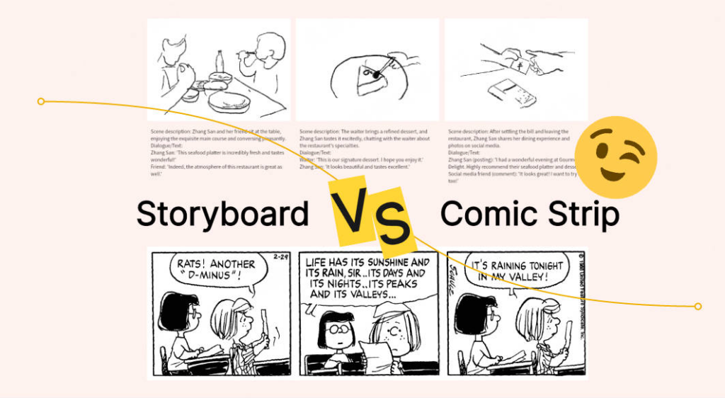
Are comic strips storyboards?

At first glance, the answer feels obvious. Comic strips and storyboards look almost identical. Both rely on panels. Both arrange images in sequence. Both suggest time, movement, causality. Both ask the reader to connect what happens between frames. Because of this visual overlap, many people intuitively assume that storyboards are simply a rough or unfinished version of comic strips.

But this assumption, while understandable, hides a more important distinction. Comic strips and storyboards may share a visual language, yet they exist for very different reasons.

The confusion begins with form. Panels, framing, pacing, and transitions are highly visible elements. When we see them repeated across media, we assume the purpose must be similar. However, in design, form alone rarely tells the full story. Function matters more.

Comic strips are finished artifacts. They are designed to be read. Their sequence is intentional and fixed. The reader is the final destination of the work. A comic strip can afford ambiguity, stylistic excess, visual metaphor, and personal voice. In fact, these qualities are often its strength. The meaning of a comic strip does not need to be resolved into a single interpretation. It can linger. It can invite multiple readings. It can slow down or speed up time purely for emotional effect.

Storyboards, by contrast, are not meant to be read as an end in themselves. They are working tools. They exist inside a process. Their audience is not the public, but collaborators. Designers, directors, curators, engineers, clients. A storyboard does not aim to express a personal voice. It aims to test whether something will work.

This difference changes everything.

A comic strip asks: what is the story?

A storyboard asks: will this story function in the real world?

Because of this, clarity matters more than expression. Ambiguity becomes a problem rather than a feature. Every frame needs to communicate intention. What happens first. What follows. Where attention goes. What the user, visitor, or viewer is expected to do next. If a frame is misunderstood, the storyboard has failed its task.

Another crucial distinction lies in permanence. A comic strip is stable. Once published, it does not change. A storyboard is provisional. It invites revision. It is drawn to be criticized, altered, reordered, or discarded. Its value lies precisely in the fact that it is not precious. It is allowed to be wrong early, so the final outcome can be right.

There is also a difference in authorship. Comic strips often carry a strong authorial presence. Even collaborative strips still speak with a recognizable voice. Storyboards, especially in design contexts, tend to dissolve authorship. They belong to the project, not to the person who drew them. Their success is measured by how well others can use them, not by how expressive they are.

Understanding this distinction is important because it frees storyboarding from the narrow association with entertainment and fiction. Once we stop thinking of storyboards as comic-like drawings, we begin to notice them everywhere. In airline safety cards. In IKEA manuals. In emergency evacuation diagrams. In exhibition walkthroughs. In participatory art instructions. In internal communication documents that were never meant to be beautiful, only effective.

So are comic strips storyboards?

Visually, they can look similar. Structurally, they share a grammar. Historically, they influence each other. But functionally, they are doing different work.

A comic strip is the story.

A storyboard is a tool for asking whether the story, the instruction, or the experience will actually hold together once it leaves the page.

Seen this way, comic strips are not the origin of storyboards, but one visible reference point among many. Storyboarding is less about drawing narratives and more about testing futures.

Refrences
Carter, Mackenzie. “Storyboard vs Comic Strip: Is a Storyboard Similar to a Comic Strip?” Boardmix, April 1, 2025, updated April 11, 2025. https://boardmix.com/articles/storyboard-vs-comcs-strip/.

#7 Decision fatigue

Update

Here’s a small update on the last blog post where I mentioned that elderly people don’t really use technology for entertainment. Some family members recently got a new TV and were complaining that Netflix is installed everywhere. I talked to them about it and they told me they don’t really understand why it’s there at all. They said they don’t need it and would rather just watch whatever is on TV something random, without having to think about it.

They also mentioned that on Netflix they often don’t even know what they would search for, which makes the whole experience feel unnecessary. With TV, something is always already playing. It feels like they just want to watch without having to decide first and the topic itself doesn’t matter that much. This is something i found quite interesting and will do some research on.

I beliefe this phenomenon might be explained by the following:

Reduced Processing Capacity and Cognitive Effort

  1. As individuals age, their available processing capacity and attentional resources decline, meaning they can process fewer discrete bits of information in a given time. [1]
    • Self-Initiated Processing: Digital entertainment often requires “self-initiated” processing, such as navigating complex menus or reorganising information in working memory, which shows substantial losses with age. [1]
    • Cognitive Load: If a digital interface is cluttered or complex, it demands high cognitive effort to navigate. When the effort required to make decisions within an app (such as choosing content or managing settings) exceeds the user’s available resources, it leads to frustration and a desire to stop using the technology. [2]

The Relationship Between Ease of Use and Usefulness

  1. For older adults, perceived usefulness is deeply linked to ease of use.
    • Immediate Benefits: Older adults are less likely to perceive a technology as useful if its benefits do not manifest easily and quickly during actual use. [3]
    • The “Visual Gymnastics” Effect: Users who have already spent a long day performing “visual gymnastics” to focus on digital content may find it harder to engage with non-standard or complex designs. If a digital entertainment platform requires unnecessary cognitive effort to understand its navigation, it disrupts the user’s mental model and erodes trust. [4]

Age Patterns in Entertainment Attitudes

  1. There is a pronounced age effect specifically regarding communication and entertainment devices (such as tablets and social networks), where positive attitudes towards them fall significantly as age increases. [3]
    • Significant Decline: Compared to those in their 50s, individuals aged 80+ are 47 to 48 percentage points less likely to value entertainment devices. [4]
    • Experience vs. Effort: This decline is partly attributed to older generations having less acquaintance and experience with these devices. Consequently, every interaction requires more “learning” effort, which can be exhausting, leading to a lower perception of the technology’s overall usefulness. [4]

Usability Barriers as a Deterrent

  1. Design flaws that increase decision-making friction directly impact perceived usefulness:
    • Navigation Issues: Confusing or cluttered navigation leads to hesitation and abandonment. [4]
    • Information Overload: Seniors are often more thorough in searching for information but are more prone to being distracted by irrelevant details and losing focus. [5]
    • Numeric and Spatial Fluence: A decline in numeracy can make it difficult for older adults to interpret data-heavy interfaces (like those found in complex gaming or streaming settings), further complicating their ability to see the technology as a “help” or “value”. [2]

Summary Table: Effort vs. Perceived Usefulness

BarrierImpact on Perceived Usefulness
Complex InterfacesIncreases cognitive load, leading to user errors and frustration.
Delayed RewardsIf benefits aren’t immediate, the user views the tool as cumbersome rather than useful.
Working Memory DeclineMakes active updating and navigation effortful and “costly” to carry out.
Lack of ConsistencyDisrupts mental models, causing hesitation and a loss of confidence.

Sources

[1] F. Craik, ‘Memory Changes in Normal Aging’, Current Directions in Psychological Science – CURR DIRECTIONS PSYCHOL SCI, vol. 3, pp. 155–158, 10 1994.

[2] G. A. Wildenbos, L. Peute, and M. Jaspers, “Aging barriers influencing mobile health usability for older adults: A literature based framework (MOLD-US),” International Journal of Medical Informatics, vol. 114, pp. 66–75, Jun. 2018, doi: https://doi.org/10.1016/j.ijmedinf.2018.03.012.

[3] N. Halmdienst, M. Radhuber, and R. Winter-Ebmer, “Attitudes of elderly Austrians towards new technologies: communication and entertainment versus health and support use,” European Journal of Ageing, vol. 16, no. 4, pp. 513–523, Apr. 2019, doi: https://doi.org/10.1007/s10433-019-00508-y.

[4] Thefinchdesignagency, “Building User Trust in UX Design: Proven Strategies for Better Engagement,” Medium, Feb. 05, 2025. https://medium.com/@thefinchdesignagency/building-user-trust-in-ux-design-proven-strategies-for-better-engagement-c975aa381516

[5] D. Orzeszek et al., ‘Beyond participatory design: Towards a model for teaching seniors application design’, arXiv preprint arXiv:1707. 05667, 2017.

Creating a survey about migraine

My following approach

To distance myself a bit more from my own experiences and take the role of a User Researcher, i plan to create an online survey about migraine with and without aura. The goal will be to ask participants for the individual experience of aura and gather more insight into what migraineur’s struggles are. Besides, I would like to find out if they use any tools to track their pain days and if yes, which ones. Lastly, it could be interesting to ask them about a way to simulate an attack to raise awareness about migraine and if they can imagine it to be implemented in VR or with an App or an art installation?

Goals

  • collect info about individual experience of aura (migraine profile)
  • personal impact of disease on life areas/ struggles
  • tracking habits/ used tools to track migraine pain days & symptoms
  • identifiying missing features/ improvements in Apps/websites
  • awareness gaps (lack of understanding of people who are not affected)
  • simulation mediums

Target group

First of all, the target group needs to be defined for the survey:

  • migraineurs with aura
  • migraineurs without aura
  • chronic migraine or episodical migraine
  1. Do you experience an “aura” before or during your headache?
  • Yes, always
  • Yes, sometimes
  • No

2. How would you describe your aura symptoms? (Select all that apply)

  • Zig-zag lines or flashing lights
  • Temporary vision loss/blind spots
  • Numbness or “pins and needles”
  • Difficulty speaking or finding words
  • Other:

4. What is the most difficult part of living with migraines for you? (Open text)

5. Which of these life areas is most impacted by your attacks?

  • Career/Work productivity
  • Social life and friendships
  • Family life/Parenting
  • Mental health (Anxiety/Depression)
  • Other:

7. Do you currently track your pain days or symptoms?

  • Yes
  • No
  • I used to

8. Which medium do you prefer, if you track your migraine?

  • Physically (on paper)
  • App
  • Website
  • standard calendar
  • Other:

9. If you use an App or Website, which one do you use? (Open text)

11. Do you feel that people who are not affected by migraines truly understand what you go through?

  • Scale 1–5: 1 = Not at all, 5 = Completely

12. Do you find it helpful to talk to people that also experience migraine?

  • Scale 1-5: 1 = Not at all, 5 = Completely

13. Have you ever seen an “accurate” visualizing or simulation of migraine?

  • yes
  • no

14. Which medium do you think would be most powerful for a migraine aura simulation?

  • Art Installation: An immersive room with lights, sounds, and physical barriers.
  • Virtual Reality (VR): Putting on a headset to see/hear symptoms
  • Mobile App: An AR (Augmented Reality) filter showing “aura” over the real world
  • Other:

Tool

I chose Survey monkey to create my survey since I wanted to try a new tool and after investigating found that it is the best free solution.

VR to simulate migraine with aura?

VR is increasingly used to raise awareness and to bridge the gap between healthcare providers and patients. While traditional medical training focuses on the science of a disease, VR allows users to experience the symptoms and the daily struggle of living with them.

VR disease simulation is typically implemented during medical education and professional development.

Medical School/Nursing School: It is often a mandatory module to help students understand the perspective of the “stigmatized other” before they begin clinical rotations.

Hospital Staff Training: Current healthcare professionals use it to renew their sensitivity toward specific patient groups, such as the elderly or those with mental health disorders.

There is a massive and growing body of research. A 2023 scoping review found that while empathy training used to be limited to actors (Standardized Patients), VR has now become a standard research tool.

The combination of virtual reality and serious games has shown high potential to increase understanding for patients and how symptoms might impact their well-being.

Migraine simulation in VR

During my research about migraine and different aura types I stumbled across a study where VR is used to simulata an aura.

In a study a virtual environment (VE) was used to visualize a migraine using a VR head-mounted display (HMD). The keyfindings after testing it with 32 subjects were:

  • Methods: Researchers split participants into two groups. One group simply tried to picture themselves having a migraine, while the other group used a visualization tool to “see” the symptoms.
  • Empathy: People who actually saw the visual simulation felt a much stronger sense of empathy toward real migraine sufferers than those who just imagined the pain.
  • Immersion: Those who watched the visualization also felt more “present”—meaning they felt more like they were actually experiencing the event—compared to the imagination group.

So in conclusion you could say that VR seems to offer a great possibility to spread awareness, reduce stigma, educate and increase empathy for the ones that are affected.

Sources:

  • S. Misztal, G. Carbonell, L. Zander and J. Schild, “Simulating Illness: Experiencing Visual Migraine Impairments in Virtual Reality,” 2020 IEEE 8th International Conference on Serious Games and Applications for Health (SeGAH), Vancouver, BC, Canada, 2020, pp. 1-8, doi: 10.1109/SeGAH49190.2020.9201756. keywords: {Visualization;Games;Diseases;Visual effects;Resists;Training;virtual reality;empirical studies in HCI;migraine simulation;empathy;presence;perception of illness}
  • Yamada, R., et al. (2025). “A scoping review on the use of virtual patients for enhancing empathy in medical students.” University of Toyama. (Analyzes how “virtual patients” are replacing traditional methods).

User Interfaces in Video Games 5/10

User Interfaces in Video GamesThe quest for genre-appropriate and usable game UI

Now that we have a basic understanding of the different types of HUD and UI elements within video games, I’d like to share some interesting considerations about the the functions and different types of game UI.

During my research the most interesting thing I came across is the idea of diegetic user interfaces. Diegetic is defined as “existing or occurring within the world of a narrative rather than as something external to that world [1]“. This usually refers to cinema with the example of in-universe music, but in the video game context user interfaces can also take on this role. Some UIs feel like they’re slapped on the screen without consideration of the world they’re in, while others barely feel like utilities for the player with how immersive they are.

This four-part framework helps with differentiation and categorisation by asking two questions:

  • Is the UI part of the game world?
  • Is the UI part of the story?
Figure 1: The Four Types of Visual Representations of Interfaces
Source: [2]
Figure 4: Baldur’s Gate 3 UI
Source: [4]
Figure 4: Sims 4 UI
Source: [5]
Figure 4: Killzone 2 UI
Source: [6]
Figure 4: Dead Space UI
Source: [7]