5. The Invisible Bias

Away from the “fidgety boy”: Why our view of neurodiversity is often blind to gender and culture

When we talk about neurodiversity, many people still have a very specific image in their minds: the young student who disrupts class or the brilliant but socially awkward IT expert. These clichés are not only outdated, they are dangerous. They shape how we build simulations, how we design software, and who ultimately gets the support they need and who doesn’t.

In my research, I noticed that most tools that depict “sensory overload” focus on the visible, almost “loud” symptoms. We see someone covering their ears or closing their eyes. But what about those we don’t see?

A key reason for gender bias in diagnosis and design is what is known as masking (or camouflaging). FLINTA individuals in particular often learn at an early age to suppress their neurodivergent traits in order to meet social expectations.

Masking is not simply “pretending.” It is a highly complex, unconscious, and extremely exhausting process. You are constantly scanning your surroundings: Am I laughing at the right moment? Am I staring at the person I’m talking to for too long? Do I seem too absent-minded right now? While you appear completely calm and “functional” on the outside, your brain is racing at 200% in the background.

In terms of design, this means that if we only optimize for visible symptoms, we exclude the entire group of people who mask their symptoms perfectly. A study clearly shows that this camouflaging correlates directly with a higher rate of depression and burnout. So if an interface wants to be “barrier-free,” it can’t wait for a user to “look overwhelmed.” It must assume that stress often occurs internally.

Neurodiversity does not exist in a vacuum. It is inextricably linked to gender, but also to cultural and ethnic origin. Researchers often refer to this as the intersectional gap.

For example, a white child with ADHD symptoms is often seen as “in need of treatment” or “gifted but restless.” Statistically, the same symptoms are far more likely to be misinterpreted as “indiscipline” or “aggression” in Black children or children from marginalized communities. As a result, neurodivergent people from these groups are often diagnosed very late or not at all.

For us designers, this means that when we create personas or look for test groups for our products, we must not only represent “standard neurodivergence.” We have to ask ourselves: How does a person with ADHD use my app who also struggles with racist stereotypes in everyday life and therefore has an even greater need for security and predictability?

And in order to improve it, we first need to understand it better.

Conclusion: Inclusion requires diversity in the database

Accessibility is not an “add-on” that you slap onto a finished product. It is an attitude. Ultimately, greater inclusion helps everyone.

Neurodiversity does not exist in a vacuum. A woman with ADHD experiences barriers differently than a man, as racialized and gendered stereotypes complicate diagnosis and acceptance.

Sources & Links:

  • Hull et al. (2017/2020): Sex/Gender Differences in Camouflaging in Autism. Link to Study (PMC)
  • Hull‑Artikel (Journal)
    Hull, L., Lai, M.-C., Baron-Cohen, S., Allison, C., Smith, P., Petrides, K. V., & Mandy, W. (2020). Gender differences in self-reported camouflaging in autistic and non-autistic adults. Autism, 24(8), 1–13.
  • John Innes Centre Blog (Webseite/Blog)
    John Innes Centre. (2025, 5. August). Exploring neurodiversity through an intersectional lens. Abgerufen von https://www.jic.ac.uk/blog/exploring-neurodiversity-through-an-intersectional-lens/
  • Tiimo App Blog (Webseite/Blog)
    Tiimo. (2024, 12. Dezember). Masking in autistic women and girls: What it is and why it matters. Abgerufen von https://www.tiimoapp.com/de/resource-hub/masking-autistic-women-girls
  • Crenshaw‑Aufsatz (Original 1989)
    Crenshaw, K. (1989). Demarginalizing the intersection of race and sex: A Black feminist critique of antidiscrimination doctrine, feminist theory and antiracist politics.

Note: This text was developed with the assistance of artificial intelligence for research purposes and to refine the linguistic clarity and flow of the final draft.

4. Experiencing the World Differently: Experiential Design as an Empathy Bridge

Another area I want to explore is awareness of neurodiversity. What is it actually like to have a brain that functions differently? To answer this, static descriptions often fall short. This is where interactive simulations, such as VR or AR applications, come into play. There are already impressive tools helping neurotypical people understand sensory processing in autism and ADHD.

In the world of design, we often repeat the mantra: “You are not your user.” But how do you design for someone whose neurological sensory processing is calibrated fundamentally differently? This is where Experiential Design becomes essential. Instead of just reading facts about neurodivergence, simulations allow us to physically bridge the “empathy gap” and experience the Double Empathy Problem (the mutual struggle for understanding between neurodivergent and neurotypical individuals) firsthand.

Simulations: Feeling the Sensory Overload

A “sensory overload” is not just mere discomfort; it is a neurological flood. Interactive systems use visual and auditory distortions to make this state tangible:

  • The Party (The Guardian VR): This VR experience places users in the shoes of an autistic teenager at a birthday party. You experience how harmless sounds—laughter, the clinking of ice cubes—gain the same priority in the brain as the main conversation, eventually leading to a “meltdown.”
  • Too Much Information (National Autistic Society): A simulation of a supermarket visit. It uses extreme contrasts, flickering lights, and amplified audio frequencies to represent the failure of “sensory gating”—the neural filter that normally sifts through stimuli.

The Next Level: Simulating Cognitive Barriers

While sensory input is often the focus, other aspects of neurodiversity remain largely invisible in the design process. It would be fascinating to incorporate concepts like Time Blindness or Object Permanence into these interactive experiences:

  • Time Blindness: A simulation could manipulate the perception of time—perhaps by having a UI clock run irregularly or by delivering notifications in a way that dissolves the sense of “soon” versus “now.” For designers, this highlights the need for clear progress bars and visual timers rather than vague temporal cues.
  • Object Permanence: In the world of ADHD, the phrase “out of sight, out of mind” is often a literal cognitive hurdle. A simulation could demonstrate how quickly vital tasks or tools “cease to exist” once they vanish from the immediate field of vision. This would underscore the importance of persistent navigation and visual anchors.

Why This Matters for Designers

These tools are not built for “spectacle” but for awareness. When we, as designers, experience how paralyzing a flashing banner or a loud autoplay video can be during sensory overload, it permanently shifts our priorities in the UI/UX process.

It’s no longer just about aesthetics or conversion rates; it’s about cognitive accessibility. We learn that accessibility isn’t a “plug-in” or a secondary feature, it is the foundation of an inclusive digital space. It is time we stop designing for a “standard user” who doesn’t actually exist in reality.

This is a really good example of sensory overload. It would be interesting to incorporate other issues, such as time blindness or object permanence, into the experience. It’s something to consider further.

Sources & Links:

  • The Guardian VR (2017): The Party: A virtual experience of autism. Link to Project
  • National Autistic Society (2016): Too Much Information (TMI) Campaign. Link to Campaign
  • Damian Milton (2012): On the ontological status of autism: the ‘double empathy’ problem. In: Disability & Society. Link

Note: This text was developed with the assistance of artificial intelligence for research purposes and to refine the linguistic clarity and flow of the final draft.
Blog Post 9: Survey preparations

As mentioned in the previous blog post, the final step of the project at this stage is to prepare and conduct surveys at at least two train stations in Germany. To achieve this, all preparations for the survey execution must be carefully planned and completed. Once this is done, the questions can be tested in a pilot phase before being used in a public setting.

Locations

To gain a more diverse insight into the opinions and experiences of travelers at German train stations, I plan to conduct surveys at two different locations. If the project is continued at a later stage, this approach could be expanded to include additional stations in order to further broaden the range of perspectives. For the current phase, however, two locations are realistic given the available time and resources. The selected stations are Augsburg Main Station and Berlin Main Station. These two locations differ significantly in terms of size, geographical context, and user demographics, which should provide insights from a wide range of travelers in varying situations.

Questions

There are several types of questions that can be used in a survey, including open-ended and closed-ended questions, as well as formats such as nominal scales, Likert scales, rating scales, and yes-or-no questions. To begin the survey, closed-ended questions are particularly useful because they offer predefined answer options, making them quicker and easier for participants to respond to. They also allow for the collection of clear, comparable data. These questions can then be followed by open-ended questions, which do not restrict responses and give participants the freedom to express their thoughts in their own words, allowing for deeper qualitative insights (Content Square, 2024).

For this project, I will primarily use closed-ended questions, specifically rating-scale questions and yes/no questions. These formats provide participants with clear answer options, making the survey quick and easy to complete while still producing structured and comparable results. In addition, I will include a small number of open-ended questions to gather more detailed and in-depth responses. Overall, the survey will be designed to be brief, keeping the required effort for participants as low as possible. A shorter questionnaire also allows me to approach more people within a limited time frame, enabling the collection of a wider range of perspectives.

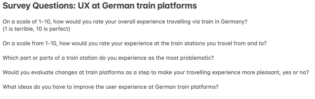
The questions I’m planning to ask are:

Approach

Before finalizing the questionnaire, I will test the questions with people in my immediate surroundings. Based on their feedback, I will make the necessary adjustments to improve clarity and effectiveness. This process will result in a finalized version of the questionnaire, which will then be used at the selected train stations.

I plan to record the interviews after obtaining the participant’s consent. As I do not intend to ask any personal or sensitive questions, data protection regulations should not pose an issue when using the collected information. The interviews will be recorded on my phone and later used to support a more accurate and efficient analysis of the data. I plan to visit each selected location one to two times and approach as many travelers, station employees, and other relevant individuals as possible.

Information Gathered

This week, I was able to develop a more detailed and finalized plan for the survey process. I also deepened my understanding of different question types and identified those most suitable for this project, allowing me to integrate them effectively into my research design.

Next Steps

I will allocate up to two weeks for conducting the surveys, particularly because the research location in Berlin requires travel. During this period, I aim to collect as many responses as possible to analyze the data thoroughly and draw meaningful conclusions.

References

Content Square. (5. November 2024). 24 on-site survey questions to ask your users. Von Content Square: https://contentsquare.com/guides/surveys/questions/ abgerufen

Circadian lights for better sleep quality

a man looking at his phone in bed
Using your phone at night disturbs the sleep cycle, Harvard Health publishing

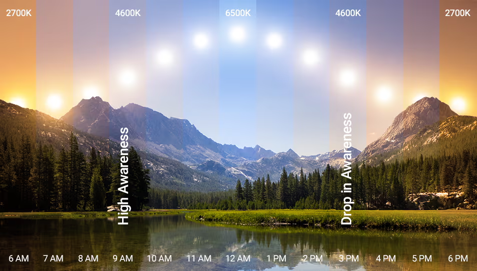
Artificial light, especially from lightbulbs and smartphones, disrupts our sleep cycle and suppresses the production of melatonin. The aspects that disturb us are primarily brightness, temperature and prolonged use during evening hours. This happens because the sun naturally emits intense blue light during peak hours and as smart devices mimic these conditions, our mood is boosted and our body becomes alert

the sun's temperature during the day. 9AM high awareness, 3PM drop in awareness.
Different light temperatures and their effect on humans, Flexfire
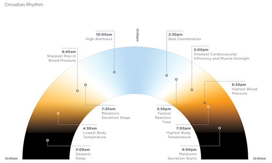
circadian rhytm with times, colours and what they mean for the human body
The cricadian rhytm, Lighting Research Center, Mariana Figueiro, Kassandra Gonzales, and David Pedler. Designing with Circadian Stimulus, October 2016

Calm tells us that a common best-practice for better sleep quality is avoiding screens 12 hours before bed, but if this is not possible, there are other solutions:

  • Using dark mode, to shift screen colors to warmer tones (yellow/orange) 
  • Using blue-blocking glasses, to filter out blue lights
  • Lowering brightness
  • Choosing calm, low-stimulation content 
  • Exposing yourself to lots of bright light during the day, which improves mood and ability to sleep (Harvard Health Publishing)
  • Using dim, indirect lighting in your room, so your eyes are not adjusting between two extremes.
  • Creating rituals to wind down, like sipping tea, stretching gently, dimming lights or playing ambient sounds or calming music

The less your nervous system has to process, the easier it is to relax. Therefore, when using your phone in the evening, you should:

  • Avoid fast-cut editing, suspenseful storylines, or emotionally charged posts that can keep your brain alert long after putting down the phone
  • Avoid answering e-mails, playing games or watching engaging shows
  • Consume slower, more predictable content, like a familiar show or nature documentaries
  • Avoid social media or curate your feed towards slower content
  • Use apps that guide meditation, breathing, or visualization 
  • Listen to white noise, gentle music, or ASMR, with the “Do Not Disturb” mode on and the phone slightly out of reach
  • If you doom scroll, set a timer, a sleep reminder or keep the phone away from you when you are ready to sleep

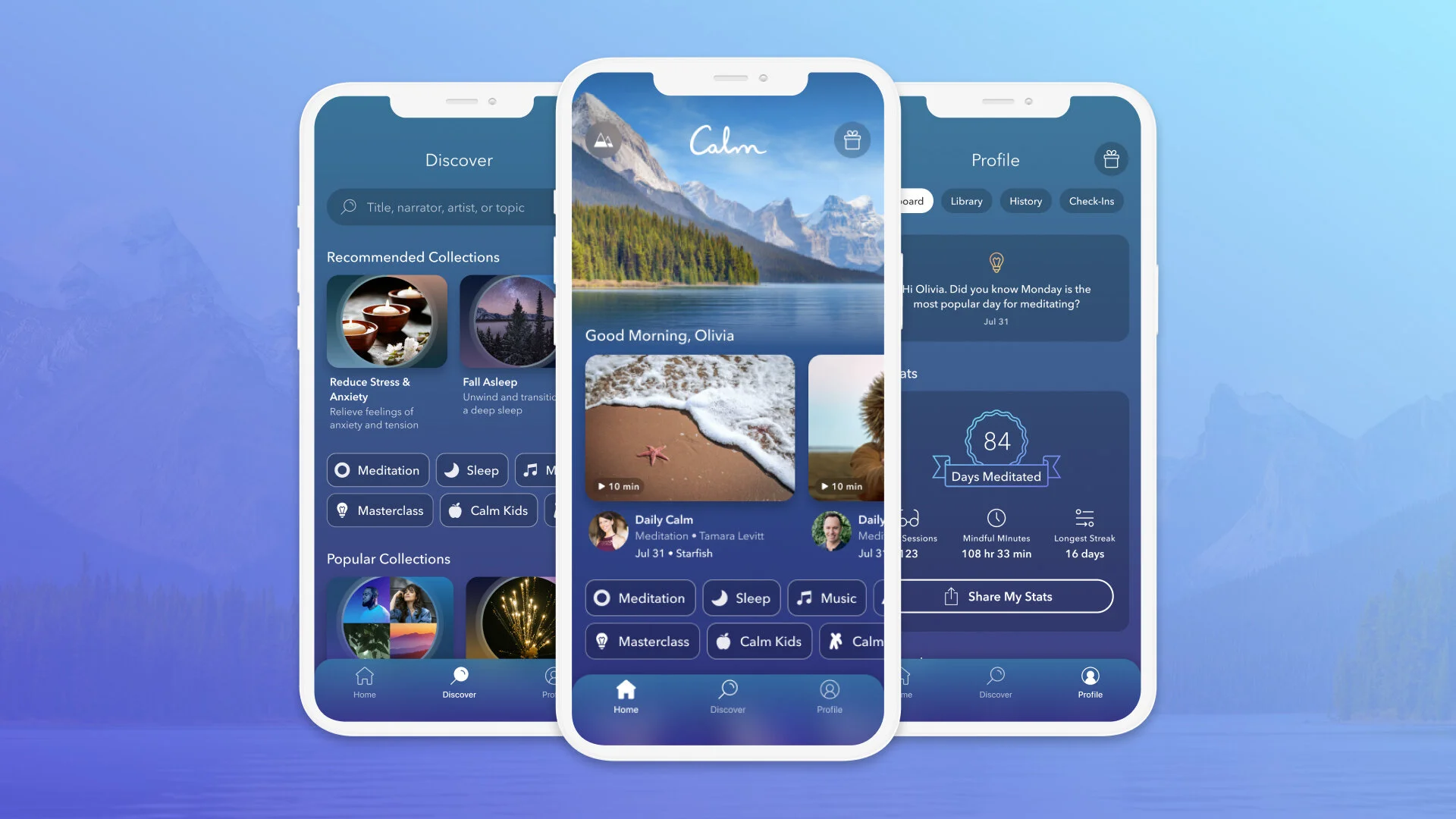
Calm is an app with bedtime stories, guided meditations, relaxing music, soundscapes and the function to track your sleep.

UI of the Calm app
Calm’s library of meditations, Sleep Stories, music, and more, Calm

According to Calm, different light colours can affect the sleep cycle differently:

  • Blue light helps you stay focused but wakes you up in the evening
  • White light supports alert and clarity
  • Yellow and amber light mimics sunset colours and relax the body, telling it to wind down
  • Red light is the least likely to interfere with sleep thanks to its long wavelengths
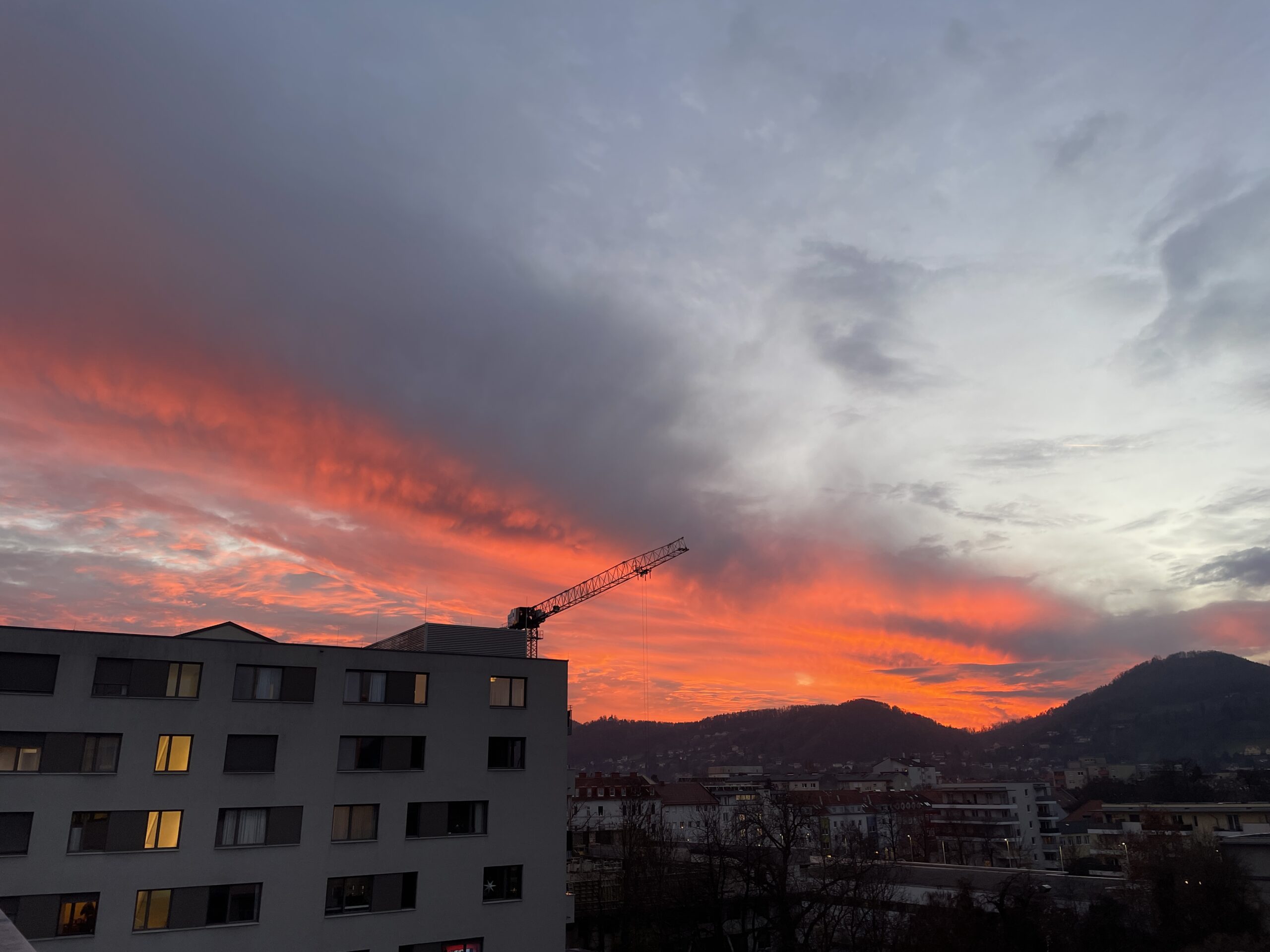
sunset seen from FH Joanneum rooftop
Red light tells us that the day is ending and has a relaxing effect on us

A polysomnographic (PSG) and electroencephalographic (EEG) study published in Sleep Medicine Volume 14, Supplement 1 showed that sleeping with a bedside light on not only causes change in sleep quality , but also has a persistent effect on brain oscillations.

Many companies, such as Ge Lighting are designing Circadian Lighting products. According to their website, Circadian Lighting is a concept that can help support the internal biological clock and sleep. With light the human cycle can be synchronised with the natural cycle of the world. Circadian Lighting does not only improve health, but also reduces fatigue and improves productivity, concentration, cognitive health and physical and emotional wellness. 

Circadian Lighting considers color temperature, time, duration, and angle of light. The methods used are intensity tuning, colour tuning and Correlated color temperature (CCT). Intensity tuning is a controlled dimming system that sets the light’s intensity to match the brightness of the sun. Colour tuning and correlated colour temperature match the light’s temperature to match the colour of the sun. Values range between 1000K and 10000K. The lower, the warmer and the higher, the cooler. 

woman interacting with a Circadian Lighting interface installed beside her bed
Circadian Light system that allows personalisation on a small interface on the side of the bed, Interact Lighting

Below you can find some Circadian Lights. These products are connected to the Internet and allow a schedule and settings personalisation through an app or other interface.

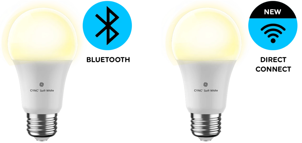
lightbulb
CYNC Soft White LED Light Bulbs allow you to set schedules, control away from home, control with your voice, save preferences and dim/brighten lights. You can connect them to your smartphone via Bluetooth or Wi-Fi and they work with Alexa and Hey Google. In addition, you can use the Cync App to create custom scenes, set schedules, and control multiple bulbs at once, even remotely.
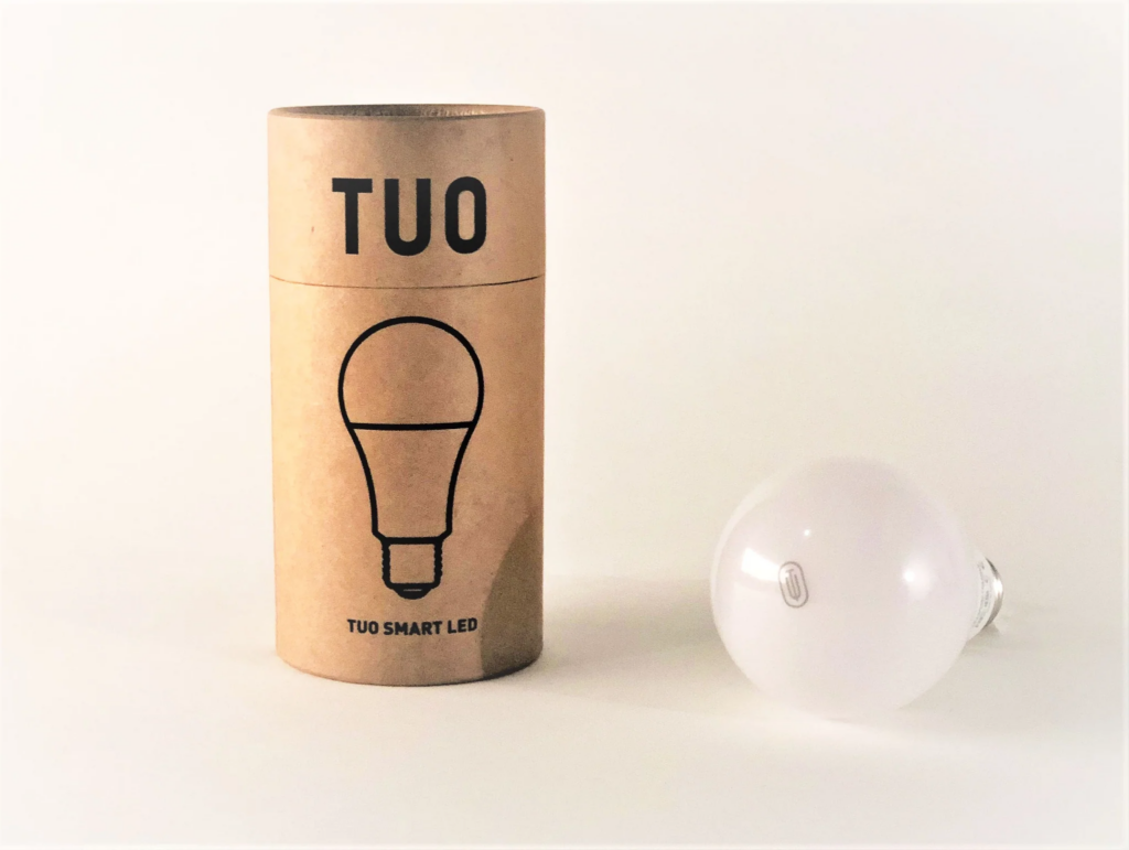
lightbulb with cardboard box
TUO Circadian Smart Bulb allows customized schedules with fade to wake you up in the most natural way. It works with the TUO Life App, compatible with iOS and Android. It features three modes: wake, active and calm.
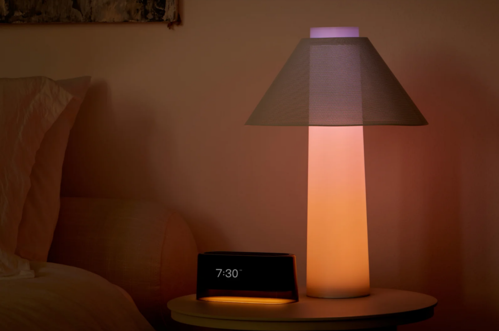
a modern-looking beside light with a calming hue
The Loftie Lamp features sunrise wake ups, bedsignal bedtime reminders, sunset dimming, custom colours and gradients, night light mode, reading light mode and adjustable brightness. It can be connected to the Internet, pairs with the Loftie Clock (Optional) and can be controlled with the Loftie App. Functionality is combined with a modern design and intuitive physical buttons.

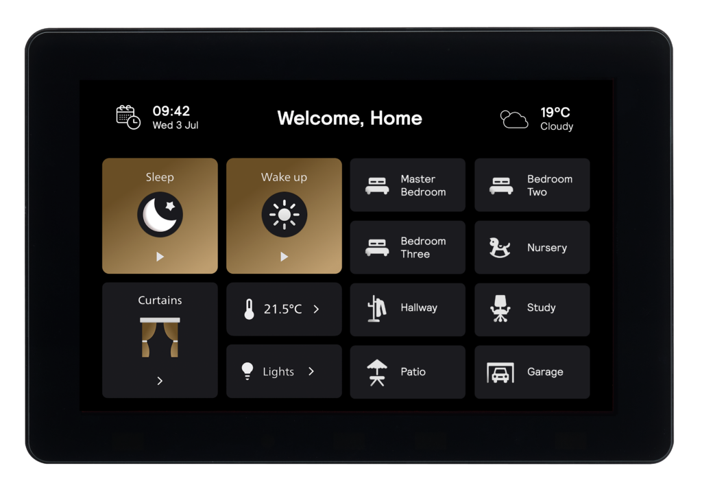
Philips has developed a lighting management platform called Dynalyte. It allows users to create different lighting scenes to suit a variety of tasks and occasions, schedule scenes according to sunrise and sunset, seasonal changes and and public holidays and also the function to group luminaires. To manage their space, users can choose between browser-based software and mobile apps. The system includes user profiles and access control.

home screen of Dynalite
The interface is customisable in terms of language and iconography and allows easy scene selection, Dynalite

Calm Tech Institute Awards – Part II

In the last blog entry I looked into the calm alarm clock “Dreamie”. Another two award-winning examples are the Luma³ breathing companion and the Mudita Kompakt smartphone.

Luma³ breathing companion

While most meditation apps add screen time and complexity, Luma³ is designed to guide conscious breathing without screens or apps, making it a calm and accessible tool for any environment. The device offers multiple scientifically backed breathing programs to support relaxation, balance, and stress relief, all delivered through light rather than screens or audio instructions.

Luma³ informs users and creates calm by guiding breathing without cognitive overload. It communicates without speaking, using light pulses to convey rhythm while allowing users to focus entirely on their breath. Its SteadyGlow™ mode provides a subtle presence in peripheral vision when not actively in use, creating a gentle, calming effect in the room. By leveraging ambient light, peripheral awareness, and simple physical presence, Luma³ demonstrates how devices can support mindfulness without adding mental strain.

Mudita Kompakt

The Mudita Kompakt represents an attempt to create a calm smartphone, also recognized by the Calm Tech Institute. Unlike conventional smartphones designed to maximize engagement, the Kompakt focuses on focus, privacy, and freedom from digital distractions.

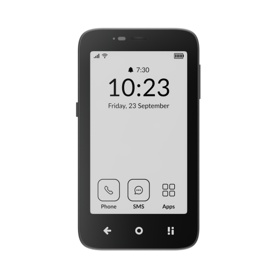
At its core is a paper-like E Ink display, which reduces blue light exposure, minimizes eye strain, and discourages prolonged screen time. Instead of offering endless apps and notifications, the phone runs on MuditaOS K, a minimalist operating system that includes only essential functions: calls, messages, calendar, notes, music, and offline maps—without ads, tracking, or attention-grabbing features.

A key feature is Offline+ Mode, allowing users to intentionally disconnect. Connectivity features such as cellular data, Wi-Fi, Bluetooth, microphones, and the camera are disabled, making disconnection a deliberate and trustworthy choice rather than a temporary workaround. This mode is controlled via a physical switch, so no unnecessary interaction with the screen is required, and it can even be engaged through passive, peripheral interaction, allowing users to disconnect without actively focusing on the device. By combining E Ink, minimal software, peripheral-friendly controls, and intentional offline modes, the Kompakt exemplifies how smartphones can support calm and attention-aware interaction.

Design Tools for Calm Technology

All three product examples use deliberate design tools to create calm interactions. Ambient light, E Ink displays, tactile physical controls, and peripheral cues help reduce cognitive load and minimize unnecessary engagement. Features such as light-guided breathing and an Offline Mode controlled by a physical switch allow users to interact naturally without being drawn into constant foreground attention, enabling interaction through the periphery rather than the screen.

In addition, the reduction of content and functionality, as seen in both the alarm clock and the smartphone, plays a key role. By keeping only the necessary features, these products remove extra choices users would otherwise have to make while trying to achieve a goal. This reduction in decision-making helps lower mental load and supports more focused, intentional use. Together, these design tools translate calm technology principles into concrete, user-centered experiences that genuinely support well-being.

Calm Tech Institute Awards as a Benchmark Tool

As the Calm Tech Institute Awards specifically focus on products designed with human attention in mind and curate them in a collection of awarded examples, they can serve as a valuable benchmark tool for technologies that serve the principles of calm technology. 

References:

AI Assistance Disclaimer:

AI tools were used to improve grammar and phrasing. The ideas, examples, and content remain entirely the author’s own

BRANDING POLITICS: How branding strategies are implemented in political communication

If politics look like brands, protests act like campaigns, and social media functions as the main distribution channel – then political communication today is, at its core, strategic branding. Just with significantly higher stakes. But who’s counting, eh?

Political actors have long understood the importance of image, messaging and symbolism. What has changed is not whether branding exists in politics, but how central it has become. Research in political marketing shows that voters increasingly relate to parties, movements and leaders through emotional identification rather than detailed policy alignment (Scammell, 2014). Before arguments are processed rationally, signals are already doing the work.

Colours, typography, slogans, tone of voice, platform choice – these elements function as shorthand. They communicate values instantly. Authority. Relatability. Stability. Urgency. Hope. Fear. Branding allows political actors to compress ideology into something immediately recognisable.

This is visible across ideological spectrums. Progressive movements often employ inclusive language, participatory aesthetics and softer colour palettes. Their visuals emphasise community, openness and horizontality. Conservative political communication, on the other hand, frequently relies on visual stability, national symbols, traditional typography and authoritative tone. These differences are not ideological coincidences – they are branding strategies designed to resonate with specific audiences (Lees-Marshment, 2019).

What makes this especially powerful is that branding operates before conscious evaluation. You don’t have to agree with a message to feel something about how it looks. Political branding bypasses rational debate and moves straight into affect.

The parallels to commercial branding are impossible to ignore. Political identities are consumed, displayed and defended in ways strikingly similar to lifestyle brands. People wear slogans, share logos, defend movements with brand-like loyalty. As theorist Arjun Appadurai argues, consumption has become a primary site for identity construction in modern societies – and politics is no exception (Appadurai, 1996).

This does not mean politics are fake, hollow or superficial. It means they are communicated through the dominant cultural logic of our time. Branding becomes a translation tool – turning abstract ideologies into emotionally resonant visuals, narratives and experiences.

But branding also simplifies. It creates coherence by excluding complexity. Political movements must decide what to highlight and what to leave invisible. Which stories become central. Which identities are foregrounded. Which contradictions are smoothed over.

This is where power enters the design process.

Who controls the branding of a movement often determines whose realities are represented. Marginalised voices can be aestheticised without being empowered. Radical demands can be softened for broader appeal. Branding can unify – but it can also erase.

And yet, opting out is rarely an option. In a media environment saturated with visuals and competition, unbranded politics risk invisibility. The question is no longer whether politics should be branded.
They already are.

The real question is who gets to design them – and who is forced to live with the consequences.

Sources:
• Appadurai, A. (1996). Modernity at Large. University of Minnesota Press.
• Lees-Marshment, J. (2019). Political Marketing. Routledge.
• Scammell, M. (2014). Consumer Democracy. Cambridge University Press.

BRANDING POLITICS: I’m liking this! About political movements in the 21st century and the role of social media in modern protest

If protest movements were once built in meeting rooms, universities and city squares, today they are built in comment sections, reddit forums and for-you-pages. The architecture of political participation has shifted dramatically – not away from collective action, but into platforms designed primarily for entertainment, advertising and endless scrolling. Likes, shares, reposts and saves have become political tools, and whether we like it or not, social media has fundamentally reshaped how movements grow, who participates, and what “political engagement” even means.

Social media platforms enable mobilisation and global visibility on a scale that would have been unimaginable to earlier protest movements. A single video, image or hashtag can circulate across continents in minutes. Research on digital activism highlights how platforms lower participation thresholds, allowing individuals to engage politically without formal membership, organisational structures or physical presence (Bennett & Segerberg, 2012). This shift has profoundly altered who gets to participate in political discourse.

Movements like Black Lives Matter illustrate this transformation clearly. Initially propelled by user-generated content – videos, eyewitness accounts, personal testimonies – BLM bypassed traditional media gatekeepers entirely. Social media did not just document protest, it produced it. Visibility became a catalyst. Outrage became connective tissue.

But this transformation comes at a cost. What “cost“, you might ask?

Online political engagement is often criticised as shallow or performative. The term “slacktivism” captures the fear that low-effort actions – liking a post, sharing a story, changing a profile picture – replace sustained political involvement (Morozov, 2011). Clicking “like” feels political, but its tangible impact remains contested. Does engagement translate into change, or does it simply generate metrics?

This critique is not unfounded. But it is incomplete.

What it often ignores is how political identity itself is formed today. Political participation is no longer confined to voting, protesting or party membership. It is deeply entangled with self-presentation. According to media scholar Zizi Papacharissi, online political engagement operates through affect – emotion, visibility and personal expression – rather than through formal political action alone (Papacharissi, 2015). In other words, sharing is not just communication, it is meaning-making.

Your feed becomes a political space. Your reposts signal alignment. Your follows imply morals and values. Your silence is read as a statement. Political movements now exist not only as collective struggles but as curated presences within individual timelines. Activism becomes part of personal branding – whether intentionally or not. There’s always that one influencer unwilling to comment on relevant political matters for the sake of their following, and on the other side there will be another influencer ditching their content niche and giving protest a platform, seemingly selfless, but alas also for the sake of their following.

This is where social media fundamentally reshapes protest logic. Movements must now be algorithmically legible. They must perform well within systems designed to reward speed, emotional intensity and visual clarity. Anger spreads faster than nuance. Images outperform text. Moral clarity outperforms ambiguity.

As a result, political movements increasingly adapt their messaging to platform logics. Protest becomes content. Messaging becomes modular. Visual identity becomes essential not just for recognition, but for survival.

Yet social media is not a neutral stage. It actively shapes what kinds of politics are visible, rewarded or suppressed. Algorithms prioritise engagement over accuracy, virality over complexity. Protest movements do not just fight institutions anymore – they fight platforms. They fight shadow bans, content moderation, demonetisation and algorithmic invisibility.

And sometimes, they win.

Digital platforms have allowed marginalised voices to bypass traditional power structures, challenge dominant narratives and build global solidarities. But they have also fragmented movements, encouraged internal policing and intensified performative pressure. To be political online is to be constantly visible – and constantly judged.

Modern protest exists in this contradiction. It is both empowered and constrained by the platforms it depends on. Participation is easier than ever, but sustaining momentum is harder. Engagement is measurable, but impact is not.

Social media did not make politics superficial. It made visibility unavoidable.

Sources:
• Bennett, W. L., & Segerberg, A. (2012). The Logic of Connective Action. Information, Communication & Society.
• Morozov, E. (2011). The Net Delusion. PublicAffairs.
• Papacharissi, Z. (2015). Affective Publics. Oxford University Press.

BRANDING POLITICS: The visual representation strategies of modern protest

Fast forward to today, where protest no longer lives exclusively in the streets. It lives on your phone. In your feed. On your explore page. On posters designed to be photographed rather than read in real life. And with this shift in space, the visual strategies of protest have evolved too. They’ve become sharper, faster, more recognisable and sometimes painfully on-brand.

Modern protest exists in a visual economy defined by platforms. In what communication scholar Manuel Castells describes as the “networked public sphere,” political messages compete for attention across fragmented digital spaces (Castells, 2009). Visibility is no longer guaranteed by physical presence alone. It must be designed.

Climate protest offers one of the clearest examples of this transformation. Movements such as Fridays for Future and Extinction Rebellion rely on strong, cohesive visual identities to ensure instant recognition across platforms, countries and contexts. Research on contemporary activism shows that consistent visual branding significantly increases media attention, message recall and participant identification (Doerr, Mattoni & Teune, 2013).

The neon green hourglass symbol of Extinction Rebellion is a particularly telling case. Its design is deliberately simple, almost crude. High contrast. Easy to reproduce. Instantly recognisable even at small scales on a phone screen. Combined with bold typography and a seemingly “handmade” aesthetic, the movement balances urgency with accessibility. It looks disruptive, but not alienating or strange.

This aesthetic is not accidental. It reflects an awareness of digital circulation. Protest imagery today must function simultaneously as political communication and as content. It must be photographable, shareable and adaptable across formats – from banners and posters to Instagram posts and press images.

However, this raises critical tensions.

When visual simplification becomes necessary for visibility, what happens to complexity? Critics argue that highly aestheticised protest risks reducing politics to digestible symbols, prioritising visibility over substance (Dean, 2010). A message designed for quick consumption could lose nuance, or be easily detached from its original context. And it’s not like we don’t witness things like that every single day – between reaction videos where you can only see a short clip of the original video, screenshots and Ai-images, it’s easier than ever to take things out of context.

There is also the risk of co-optation. Once a protest aesthetic becomes recognisable, it can be absorbed by institutions, corporations or political actors seeking to signal alignment without committing to structural change. The line between resistance and trend becomes dangerously thin.

And yet, dismissing branded protest entirely overlooks its democratic potential. Visual branding lowers the barrier to participation. It allows individuals to identify with a cause instantly, without requiring extensive prior knowledge or ideological literacy. Sociologist Paolo Gerbaudo describes visual symbols as “emotional shortcuts” – tools that enable rapid collective alignment in moments of political urgency (Gerbaudo, 2012).

In a media environment defined by speed, overload and the attention span of a goldfish, these shortcuts matter.

Modern protest visuals operate in a space of constant negotiation: between authenticity and strategy, emotion and design, resistance and recognisability. They must be legible enough to travel, but flexible enough to adapt. Radical enough to disrupt, but coherent enough to endure.

This tension is not a flaw. It is the defining condition of political expression in the digital age.

Just like earlier movements, contemporary protests rely on visual language to create belonging, signal values and sustain momentum. The difference is not whether protest is branded – it’s where that branding circulates, and how quickly it can be reproduced, reshaped and most importantly reinterpreted.

From the street to the screen, protest has always needed a look.
Now, it just needs to load fast. And be at least a little funny.

Sources:
• Castells, M. (2009). Communication Power. Oxford University Press.
• Dean, J. (2010). Blog Theory. Polity Press.
• Doerr, N., Mattoni, A., & Teune, S. (2013). Advances in the Visual Analysis of Social Movements. Emerald.
• Gerbaudo, P. (2012). Tweets and the Streets. Pluto Press.

BRANDING POLITICS: A short trip down memory lane – how branding defined the most well-known protest movements

If politics have a design – and by now we’ve established that they very much do – then protest movements have been running full-scale branding campaigns long before Instagram story templates, Canva activism or coordinated profile-picture drops ever existed. The tools were different, slower, often analogue, but the logic behind them was strikingly similar. So, before we dive head-first into modern, hashtag-fuelled protest culture, it’s worth rewinding a little.

Think of this as a nostalgic slideshow – but instead of blurry holiday photos, it’s historical outrage with insanely strong visuals.

When we think of the most influential protest movements in history, what often comes to mind first isn’t a manifesto, a policy demand or even a speech. It’s an image. A moment frozen in time. Rosa Parks seated on a bus. A lone man standing in front of tanks. Rows of women dressed in white. A clenched fist raised against the sky. Scholars of social movements have long argued that visual symbolism plays a central role in mobilising collective identity and sustaining political momentum (Eyerman & Jamison, 1998). Images condense ideology into something immediately legible. They allow movements to travel – across borders, languages and generations – without needing translation.

These visuals were not accidental. They were strategic, curated and often carefully staged. Long before branding was a buzzword, protest movements understood the power of recognisability and repetition. To be politically effective, a movement needed to look like something.

The Civil Rights Movement in the United States offers one of the clearest examples of visual strategy as political communication. Protesters frequently dressed in formal attire – suits, pressed dresses, polished shoes. This was not simply a reflection of social norms at the time, it was a deliberate choice. Media scholar Martin A. Berger describes this as a “politics of respectability,” where visual presentation was used to counter racist stereotypes and assert moral legitimacy (Berger, 2011).

The resulting imagery was powerful precisely because of its contrast. Peaceful, well-dressed demonstrators facing police brutality, creating a visual narrative that required no explanation. The images communicated injustice instantly. Clothing became a political tool. Respectability became resistance.

What’s important here is not whether this strategy was flawless – it has been criticised (rightfully so) for reinforcing respectability politics – but that it demonstrates an early understanding of branding mechanics. The Civil Rights Movement crafted a coherent visual identity that aligned appearance with message, reinforcing its political goals through aesthetics alone.

Similarly, anti-war protests of the 1960s and 70s relied heavily on graphic symbols to communicate opposition. The peace sign, originally designed for the British nuclear disarmament movement, is perhaps one of the most successful political symbols of all time. Its simplicity, adaptability and ease of reproduction allowed it to spread rapidly across national and cultural boundaries. Design historian David Crowley describes it as an early example of effective protest graphic design – a logo before logos were a thing (Crowley, 2013).

What made the peace sign so powerful was not just its meaning, but its usability. Anyone could draw it. Anyone could wear it. Anyone could reproduce it on a sign, a badge or a wall. It functioned exactly like a strong brand asset: flexible, recognisable and emotionally charged.

Women’s suffrage movements also demonstrate the intentional use of visual consistency. Suffragettes adopted a specific colour palette (white, purple and green), each colour symbolising purity, dignity and hope. White dresses became a recurring visual motif, later revived by feminist politicians decades later as a deliberate historical callback. Once again, branding created continuity across time, linking past struggles to present ones through aesthetics.

What these movements had in common was consistency. A shared visual language allowed participants to recognise one another, communicate values instantly and feel part of something larger than themselves. Benedict Anderson famously described this sense of shared belonging as an “imagined community” – a collective identity formed through shared symbols and narratives rather than direct personal connection (Anderson, 1983).

Visual branding made these imagined communities visible.

Importantly, this consistency also helped movements survive moments of repression or fragmentation. When leadership structures were attacked or communication channels disrupted, symbols remained. The image outlived the moment. Protest branding functioned as memory.

This historical perspective complicates the idea that contemporary activism is uniquely aestheticised or overly concerned with appearance. Protest movements have always relied on visual strategy. The difference today is speed, scale and saturation – not intent.

So no, branded protest isn’t a Gen Z invention. We’ve just upgraded the tools.
And maybe – just maybe – the pressure to look good while being angry was always there.

Sources:
• Anderson, B. (1983). Imagined Communities. Verso.
• Berger, M. A. (2011). Seeing Through Race: A Reinterpretation of Civil Rights Photography. University of California Press.
• Crowley, D. (2013). Graphic Design and Protest. Design Issues, 29(3).
• Eyerman, R., & Jamison, A. (1998). Music and Social Movements. Cambridge University Press.

BRANDING POLITICS: An introduction as to why everything is political and Donald Trump a brand

Lately it feels like whichever newspaper I read, social media platform I look at or comment section I open, there’s something on about politics. And don’t get me wrong, I’m not saying it’s a bad thing. More so, I would say that this shows how deeply political engagement is implemented in our generation and our interests. One could argue that this is due to the current state of the world (which, yikes, let’s be honest) and how us young people experience it in times of social media. And I would know, as I consider myself part of the young people experiencing the current state of the world through social media.

Of course, this lively discourse is something that I might witness due to the online bubble I’m in, or my personal interest in our planets somewhat-ish wellbeing. But one thing that is definitely noticeable, no matter the bubble you’re in, is the uprising of both subtle and in-your-face political opinions. How couldn’t you, in times of a Cheeto with a bad hair transplant ruling Americas oyster, the world’s most perfect woman making literally anything from scratch in a couture dress or Austrian politicians selling their country out on their trip to Ibiza. And while all of these seem really funny (in a way), when you look a little closer, they vividly represent how modern politics work. They feel more like a lifestyle, a social media statement, a content source, a meme, maybe even a clothing style. The way you display yourself is a choice. A choice, rooted in politics. Because let’s be real, you can almost always tell the political orientation of someone – just by looking at them.
And that sparks an important question: What do politics look like?

Because last time I checked, it’s about where you make your cross at vote-o-clock, not whether you buy the black or the white shirt at H&M. Right?
And it’s not like we don’t hear it all the time. “Don’t make this political”, “This is too political”, “Their death shouldn’t be politicised,” especially when someone from a marginalised group is violently killed. Yet such statements are impossible, because everything is political. It starts with the way you consume your news, and it ends, you guessed it, with whether you buy the black or the white shirt at H&M. Politics is all around us. Activist and journalist Brianna O’Reilly even defines it as a tool to understand and address problems, measure right and wrong, what we deem to be moral or immoral and how we think of everyday challenges and happenings both individually and collectively.

Going back to my question – What do politics look like? – I’m certain you can think of a few stereotypes, or giveaways rather, of different political directions. And I’m not just talking about how people dress or the age that they are. It’s also about different communication tactics, colours, trends or social medias certain groups choose to use. Or that the clothing stores you go to fund different political parties one way or another, or that the kind of clothes you buy makes you part of a visually identifiable group or that the lifestyle choices you make influence the political situations in other countries. That Avocado you bought had to come from somewhere, right? And the shirt you got had to be made somewhere – probably not Austria… right?  The price of the shirt you’re willing to pay, depends on the social-political situation somewhere else. Did it feel political when the choice was made to follow these stereotypes? Probably not. It doesn’t make them any less political though!

In short: There’s a certain design to politics, not just on the outside. Let’s take Donald Trump for example. He is using a certain colour (red), with a certain font, using certain words in his talks and only posting on certain social medias using certain hashtags. Him and his political party are branded in a very specific way, so that the people sharing his ideals can follow this branding and form a visual collective. This visual collective keeps the loop going, by consuming not just the brand on the outside, but also everything that comes with it. If you think about it, where’s the difference between a Trump Supporter and an Adidas fan? Other than their choice of brand to follow and the personal ideals they have, of course. Designing politics “the right way” is every inch as important as actually following up on these political beliefs.

This means, that graphic design as a tool of the visual language of protest is so powerful that it creates the ability to promote and pass on change-messages and allows it to work its way into our everyday lives creating a mass movement that can shake up political regimes (Yinks0067, n.d.). Not just from the outside, but the inside as well. At the end of the day, everything is political.
And that’s a good thing.

Sources:
• O’Reilly, B. (n.d.). Like it or not, everything is political. The Black Project.
• Yinks0067. (n.d.). The visual language of protest: How graphic design can fuel protest and change government. Medium.