User Interfaces in Video Games 4/10

User Interfaces in Video GamesThe quest for genre-appropriate and usable game UI

After getting a bit more familiar with how the need for UI in games emerged through a bit of history, I want to get more theory focused now with some definitions. I’ve already mentioned HUDs in my last post so let’s get it all on paper, as well as clear up any abbreviations that may keep popping up.

Figure 1: Battlefield HUD
Source: [5]

In this section I would like to make a distinction between HUD UI elements and other game screens, since all of this is part of the UI, the difference being that HUDs are active during gameplay. As games have evolved, these elements have became staples of the user interfaces within them.

The following are some visual examples of individual HUD elements as well as game screens (on the example of the 1999 game Metal Gear Solid), providing a short overview of the elements.

  • Health bar – shows the current life the player has remaining, often abbreviated as HP (Hit Points), which came from the tabletop role-playing game Dungeons & Dragons [6].
    • health
  • Score – shows the current or final score accumulated.
  • Ammunition gauge – shows the number of bullets/projectiles available, important for shooters.
  • Inventory – shows items possessed/equipped, important for role-playing games.
  • Map/Radar – assists player with navigation by providing an on-screen means of navigation with “you are here” indicators.
  • Context-Sensitive Prompt – text or icon that appears when the player is near an object that can be interacted with [7].

Figure 2: Elements of a HUD
Source: Own Production, referenced from [7]

  • Title Screen/Start Screen
  • Pause Screen
  • Options/Settings
  • Save/Load Game
  • Controls
  • Game Over Screen
  • Loading Screen
  • Legal/Copyright
  • Credits
Figure 3: MGS Title Screen
Source: [8]
Figure 4: MGS Pause Screen
Source: [8]
Figure 5: MGS Options
Source: [8]
Figure 6: MGS Load Screen
Source: [8]
Figure 7: MGS Controls
Source: [8]
Figure 8: MGS Game Over
Source: [8]

User Interfaces in Video Games 3/10

User Interfaces in Video GamesThe quest for genre-appropriate and usable game UI

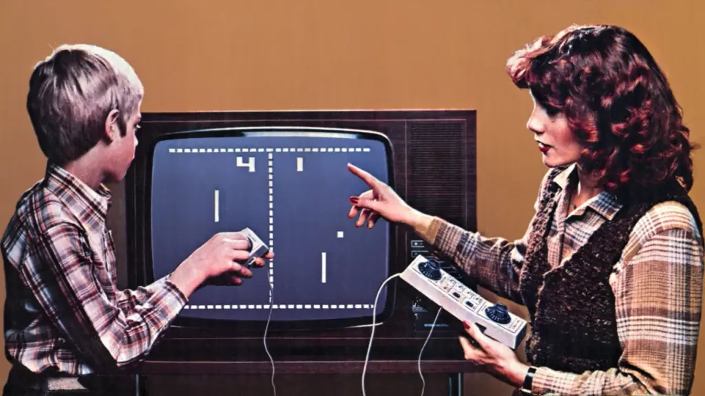
Last time I answered the question of what the first video games were, namely Tennis for Two and Spacewar!. Today, I’ll be taking a step further and covering the universally known earliest video game Pong, as well as taking a quick look at the progression of games and their interfaces further.

Yes! Games finally became commercially successful and available to the general public outside of science fair and university contexts thanks to the shift away from giant computers that weighted dozens of kilos and cost thousands.

Figure 1: Pong on the TV
Source: [1]

Pong was developed by Atari which was a company formed by Nolan Bushnell and Ted Dabney, and programmed by Al Alcorn. It used dials for vertical movement of paddles where players competed to hit the ball back and forth [2]. This is where we notice the first truly UI element of a game, which is the score counter on the top of the screen.

Figure 1: Space Invaders Cabinet
Source: [3]

Released 20 years after Tennis For Two, Space Invaders was developed by Tomohiro Nishikado and it marks the rise in popularity of arcade games, with two buttons for moving left and right and one for firing projectiles [4]. In this new age of arcades, one of the very first innovations in game interface design, the high score and the high score screen, were born [5]. The high score was a different motivation compared to the other games mentioned so far which were based on competition between two players. Space Invaders and many popular arcade machines featured single player experiences, where the high score screen would incentivize not only beating your friends but also beating your own score. Arcades were the place where HUDs were born, with more and more permanent UI elements aiding players emerging.

As much as I would love to talk about the entire history and progression, and go all the way from Pac-Man to modern games, I’ll keep it to these two blog posts. They will serve as a sort of starting point for when I dive deeper into the history for my actual thesis.

3. Designing for ADHD vs. Designing for Awareness

Okay, I’m wondering where I want to go with my research. Do I want to do something for neurodivergent people, or do I want to raise awareness among neurotypical people about what it’s like to be neurodivergent?

I have ideas and approaches for both directions, which I would like to discuss here one by one in the hope of being able to make a decision afterwards.

Direction 1: Tools for people with ADHD

The aim here is to make everyday life easier. As I mentioned in my last blog post, executive dysfunction is a big issue. Tasks can feel very daunting for people with ADHD, so it can help to break large tasks down into smaller subtasks.

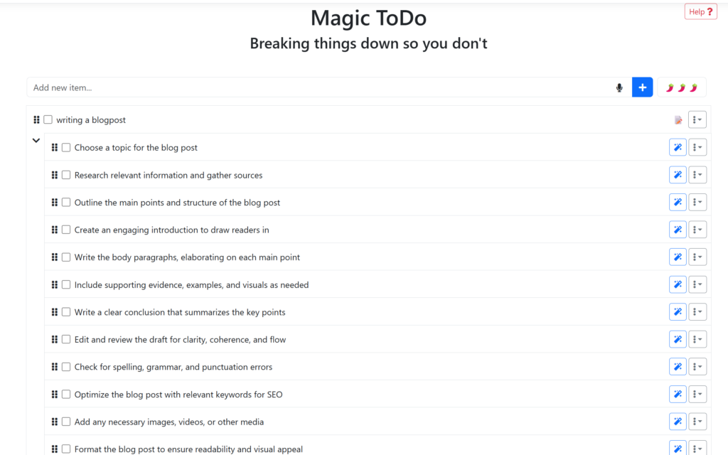
There is already a tool called gooblin.tools that breaks a large to-do list down into many small subtasks.

But here’s where it gets tricky: if I break a task down into twenty small steps, I suddenly have twenty tasks instead of one. For an ADHD brain, this can be just as paralyzing. You get lost in the details, the list seems endless, and your focus wanes. Real interaction design for neurodiversity must therefore go beyond simply “breaking things down.”

Where my research comes in: Three ways beyond the list

I ask myself: How can interfaces help us without overwhelming us with new information? In the specialist literature, there are strategies that I want to examine as design principles:

1. Adaptive scaffolding Instead of immediately showing the user all 20 subtasks, a system should only highlight the zone of next development. This means that I only ever see the next step. The interface keeps the rest of the list “invisible” in the background so as not to overload the working memory. Only when step A has been completed does step B appear.

2. Externalization & visual anchors Executive dysfunction often means that you cannot keep track of the time and sequence of tasks in your head. Design can act as an “external cognitive support” here.

• Instead of text: visual roadmaps or timers that show where I am in the process.

• Instead of lists: interactive boards that make priorities tangible through color or size.

3. Digital body doubling: An exciting approach from practice is “body doubling”. The mere presence of another person helps you stay in the flow. How can interaction design simulate this feeling?

•    Through focus spaces where you can see that others are also working.

•    Through interfaces that create a kind of “gentle presence” or social commitment without building up pressure.

It requires a balance that still allows for autonomy and does not come across as patronizing. A tool like this would have to function as a “breathing scaffold”: providing structure when task paralysis kicks in, but discreetly retreating as soon as you are hyperfocused,

It’s not about taking the user by the hand like a child, but rather making the interface flexible enough to adapt to the current cognitive load.

References & Further Reading

  • Vygotsky, L. S. (1978): Mind in Society. The foundational work on the “Zone of Proximal Development” (ZPD). It explains why effective support (Scaffolding) must be placed just beyond a person’s current independent ability to help them reach the next level of action.
  • Schmidt-Pott, H. (2024): Executive Dysfunction & The Action-Gap. A deep dive into why neurodivergent individuals often struggle to translate complex internal plans into physical steps. It highlights the specific need for tools that bridge this “initiation gap.” (Link)
  • Bien-être Autiste (2023): Understanding Task Paralysis. This research discusses how “Choice Overload” and unorganized information lead to mental freezing. It advocates for reducing visible options to prevent the brain from becoming overwhelmed by its own to-do lists. (Link)
  • Maier, G. (2024): Externalization and Body Doubling Strategies. An exploration of how external cues (visual timers, roadmaps) and the presence of others (Body Doubling) can bypass executive blocks and create a sustainable flow state. (Link)

Note: This text was developed with the assistance of artificial intelligence for research purposes and to refine the linguistic clarity and flow of the final draft.

Neuroadaptive Interfaces and EEG Research in Interaction Design

During a recent workshop in the university, I was introduced to consumer EEG devices and had the opportunity to experiment with them in a hands-on setting. The focus was not on clinical accuracy, but on understanding how basic brainwave signals can be captured using lightweight devices such as Muse. While the setup was clearly far from laboratory-grade neuroscience equipment, the experience raised an important question for me as an interaction designer: what happens when interfaces respond not only to explicit user input, but also to signals that reflect the user’s internal state?

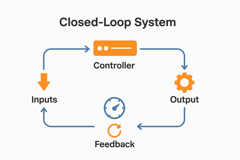
I started doing more about these devices and this question led me to something called “closed-loop biocybernetic systems”. At a basic level, these systems continuously monitor physiological signals from the user, interpret them in real time and adapt system behavior accordingly. Unlike traditional interfaces, where interaction flows in one direction (from user action to system response) closed-loop systems operate through constant feedback. The system observes the user, adapts its behavior and then observes again, forming an ongoing loop rather than a sequence of separate interactions.

What makes this idea particularly relevant for interaction design (and also my research) is not it’s scientific precision, but it’s interaction logic. Closed-loop systems treat the user as a dynamic participant whose cognitive state changes over time, rather than as a stable user performing isolated actions. This aligns closely with earlier discussions in my research around interruption, cognitive load and recovery, where the timing and context of interaction matter as much as the interaction itself.

In existing UX and HCI practice, adaptation is usually based on explicit signals such as clicks, taps, scrolling behavior or settings chosen in advance. Closed-loop systems introduce a different layer of interaction, where adaptation can be driven by indirect signals like workload, engagement or stress. EEG becomes one possible alternative among others, not because it offers direct access to mental states but because it provides a continuous stream of data that reflects change over time. For interaction design, this continuity is more valuable than accuracy, especially when the goal is to sense transitions rather than define precise cognitive states.

Research I have found on adaptive automation has explored closed-loop systems in high-stakes contexts such as aviation and safety-critical environments. For example, work conducted by NASA examined how EEG-based indicators of engagement could be used to dynamically adjust task allocation between human operators and automated systems. While these studies are far removed from everyday digital products, I think they demonstrate that closed-loop interaction is not just theoretical. It has been operationalized in environments where managing attention and workload is critical and where poorly timed interaction can have serious consequences.

What is a Closed Loop System

From an interaction design perspective, the most compelling aspect of closed-loop systems is not automation, but responsiveness. A system that becomes quieter when cognitive demand increases, delays non-urgent information during moments of strain or supports recovery after disruption behaves very differently from one that treats all moments as equal. This resonates strongly with earlier discussions in my research about interruptions and emotional side of it. Instead of optimizing for constant engagement, such systems acknowledge that users have unpredictable capacity.

This ideas also connects closely to something called “polite or neuroadaptive interfaces”. These interfaces aim to adapt subtly and respectfully, without drawing attention to the adaptation itself. Rather than aggressively pushing notifications or optimizing for responsiveness, polite interfaces adjust their behavior quietly, often by waiting rather than acting. Framed this way, politeness is not a metaphor but a design stance that prioritizes cognitive boundaries and timing.

At the same time, there are clear limitations. Consumer EEG devices (like the one we experienced, Muse) do not provide reliable or countable measurements of complex mental states such as attention or flow. Brain signals are noisy, highly context-dependent and difficult to understand even under controlled conditions. Treating EEG data as ground truth would be misleading. However, closed-loop interaction design does not require perfect measurement.

References

  1. Freeman, F. G., & Mikulka, P. J. (1993). Effects of a psychophysiological system for adaptive automation on performance, workload, and situation awareness. Human Factors, 35(3), 413–434. https://doi.org/10.1177/001872089303500302
  2. Gevins, A., & Smith, M. E. (2003). Neurophysiological measures of cognitive workload during human–computer interaction. Theoretical Issues in Ergonomics Science, 4(1–2), 113–131. https://doi.org/10.1080/14639220210159717
  3. NASA. (n.d.). Biocybernetic adaptation and mental workload assessment. National Aeronautics and Space Administration.
  4. Polite Interface Research. (n.d.). Neuroadaptive interfaces.
  5. Pope, A. T., Bogart, E. H., & Bartolome, D. S. (1995). Biocybernetic system evaluates indices of operator engagement in automated task. Biological Psychology, 40(1–2), 187–195. https://doi.org/10.1016/0301-0511(95)05116-3

    AI Assistance Disclaimer:
    AI tools were used at certain stages of the research process, primarily for source exploration, grammar refinement and structural editing. All conceptual development, analysis and final writing were made by the author.

Focusing on the Design Process


Since, I want to focus more on the design process of playgrounds. While doing so, I have come across several definitions that are closely related to one another, such as co-creation, participatory research, co-design, and participatory design. In today’s post, I will talk about these concepts and explore how they connect to my research topic.

Participatory design is one of the earliest of these approaches and has its roots in democratic design movements. Its core idea is that users should actively participate in the design process, especially when the outcomes directly affect their lives. In the context of playgrounds, this means involving children not just as users, but as contributors whose experiences and perspectives matter. However, participation does not always imply equal power; designers often still guide decisions and structure the process.

Co-design is closely related but places stronger emphasis on collaboration. In co-design, designers and users work together as partners during specific phases of the design process, such as ideation or prototyping. Rather than designing for users, designers create with them. When applied to playground design, co-design can take the form of workshops, drawing sessions, or playful activities where children help shape ideas for play environments.

Co-creation is a broader term that describes collective creativity shared by designers and non-designers across the entire process. Unlike co-design, which often refers to concrete design activities, co-creation can include generating ideas, defining problems, and imagining futures together. In this sense, co-creation is more of a mindset than a method, emphasizing shared ownership and creativity.

Participatory research, on the other hand, focuses more on how knowledge is produced rather than on design outcomes. It aims to include participants—such as children, parents, or educators—not only as subjects but as contributors to the research itself. This approach is particularly relevant when trying to understand children’s experiences of play, as it values their voices as a source of insight rather than data to be interpreted solely by adults.

References

Morrow, J. (2019). Co-creation, participatory research, co-design or participatory design — which is it? Medium.
https://medium.com/@Josh.Morrow.1/co-creation-participatory-research-co-design-or-participatory-design-which-is-it-fa14a7f542c1

UX Collective. (2018). The difference between co-design and participatory design.
https://uxdesign.cc/difference-between-co-design-participatory-design-df4376666816

Design Vocabulary for Playground Research


For this blog post, I wanted to create a small personal dictionary that I can return to whenever I feel a little lost in my research process. After the Christmas break, I decided to focus more on the early stages of playground design and, on how children can be included in this process. This dictionary serves as a way to clarify my thoughts, organize key concepts, and guide me when the topic starts to feel overwhelming.
I will try to write down some key words and explore their meanings, both in a general sense and in relation to my own research topic.

Creativity

  • Creativity refers to the ability to generate original ideas, actions, or interpretations.
  • In playgrounds, creativity is supported by open-ended environments that allow children to use space and objects in multiple, unpredictable ways rather than following fixed instructions.

Curiosity

  • Curiosity is the intrinsic motivation to explore, discover, and ask questions.
  • Playgrounds that stimulate curiosity often include elements of surprise, variation, and challenge, encouraging children to investigate their surroundings freely.

Open-Ended Play

  • Open-ended play describes play experiences without predefined outcomes or single correct ways of use.
  • Design elements such as loose parts, natural materials, and flexible structures enable children to shape their own play narratives.

Risky Play

  • Risky play involves thrilling and challenging activities that include a degree of physical or emotional risk.
  • Research shows that manageable risk is essential for children’s confidence, resilience, and motor development, even though it is often minimized in traditional playground design.

Standardization

  • Standardization refers to the use of repetitive, regulated design solutions that prioritize safety and efficiency.
  • While standardization ensures consistency, it often limits diversity, creativity, and local adaptation in playground environments.

Adult-Centered Design

  • Adult-centered design occurs when spaces for children are designed primarily based on adult assumptions, fears, and control needs rather than children’s actual experiences and behaviors.

Child-Centered Design

  • Child-centered design places children’s needs, perspectives, and experiences at the core of the design process. It emphasizes observation, empathy, and participation rather than top-down decision-making.

Participatory Design

  • Participatory design is an approach that actively involves users—in this case, children—in the design process. Through workshops, drawing activities, prototyping, or play-based methods, children contribute ideas and insights that shape the final design.

Co-Design

  • Co-design is a collaborative process in which designers and users work together as equal partners.
  • In playground design, co-design allows children to become co-creators rather than passive users.

Affordances

  • Affordances describe the possible actions that an environment or object suggests to its users.
  • A well-designed playground offers multiple affordances, allowing children to climb, hide, imagine, balance, or rest in different ways.

Inclusive Design

  • Inclusive design ensures that playgrounds are accessible and meaningful for children of different abilities, ages, and backgrounds. Rather than designing separate solutions, inclusion aims to create shared play experiences.

Embodied Interaction

  • Embodied interaction focuses on learning and interaction through the body.
  • Playgrounds are inherently embodied environments, where movement, touch, balance, and spatial awareness shape children’s experiences.

References

Gill, T. (2007). No Fear: Growing Up in a Risk-Averse Society. London: Calouste Gulbenkian Foundation.

Hart, R. (1992). Children’s Participation: From Tokenism to Citizenship. Florence: UNICEF Innocenti Research Centre.

Brown, D. M. Y., Ross, T., Leo, J., Buliung, R. N., Shirazipour, C. H., Latimer-Cheung, A. E., & Arbour-Nicitopoulos, K. P. (2021). A Scoping Review of Evidence-Informed Recommendations for Designing Inclusive Playgrounds. Frontiers in Rehabilitation Sciences, 2, 664595.

Lester, S., & Russell, W. (2010). Children’s Right to Play: An Examination of the Importance of Play in the Lives of Children Worldwide. Play England.

Nicholson, S. (1971). How NOT to Cheat Children: The Theory of Loose Parts. Landscape Architecture, 62(1), 30–34.

Frost, J. L., Wortham, S. C., & Reifel, S. (2001). Play and Child Development. Upper Saddle River, NJ: Prentice Hall.

Sanders, E. B.-N., & Stappers, P. J. (2008). Co-creation and the New Landscapes of Design. CoDesign, 4(1), 5–18.

Norman, D. A. (2013). The Design of Everyday Things (Revised and Expanded Edition). New York: Basic Books.

Calm Tech Institute Awards – Part I

As I started researching product examples that demonstrate how interactions could be designed in a calm and respectful way, I came across the Calm Tech Institute Awards. Through this initiative, the Calm Tech Institute recognizes products, services, and technologies that are designed according to the principles of calm technology. Products are evaluated through a 81-point criteria covering categories such as:

  • attention: Products are evaluated on how they work with (or against) human attention.
  • periphery: How does the product engage other senses through peripheral attention?
  • durability: How does the product break down? Does it offer support to customers in some way?
  • light: Does the product use warm lighting or harsh, blue lights?
  • sound: How does the product sound? For products with moving parts, what actions have been taken to prevent excess noise?
  • materials: What kinds of materials are used?

The award spans a wide range of product and service domains, including:

  • Smart Appliances
  • Transportation
  • Electronics
  • Artificial Intelligence
  • Automotive
  • Health
  • Homes
  • Vacation Rentals
  • Museums
  • Education
  • Websites and Apps

This framework shifts the focus away from novelty and constant engagement, instead emphasizing thoughtful, human-centered design.

In this and the next blog entry, I want to take a closer look at some of the products that have received this award and explore how they translate calm technology principles into real-world design.

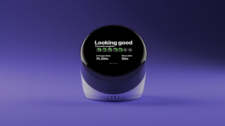
“Dreamie” by Hello Ambient

Last year’s highest certified product is a bedside sleep companion called Dreamie. The device is designed to reduce phone usage in the bedroom. A space that should ideally be reserved for rest and recovery. Looking at sleep behavior research from the American Academy of Sleep Medicine (AASM), it quickly becomes clear why this is such a relevant use case for calm technology.

ccording to the AASM, 87% of adults keep a phone in their bedroom, and the majority of them report not getting enough sleep due to phone usage. Other studies show that just one hour of screen time after going to bed increases the likelihood of insomnia symptoms by more than 50%. Screen use at night is also associated with an average loss of 24 minutes of sleep. These numbers highlight a clear opportunity for a device that keeps technology present, but firmly in the background—supportive rather than disruptive.

Based on their research, the AASM recommends several habits to improve sleep quality:

  • Disconnect from devices at night
  • Leave your phone in another room
  • Follow a relaxing nighttime routine
  • Have a sleep schedule
  • Turn off push notifications

Dreamie, developed by Hello Ambient, directly addresses these recommendations and turns them into design requirements. Instead of asking users to rely on willpower alone, the device offers an alternative that fits naturally into existing bedtime routines.

At its core, Dreamie is more than a smart alarm clock—it is a carefully considered design solution. Recognizing how hard it can be to resist media consumption before sleep, the device provides calm, sleep-focused audio content. This creates a gentle alternative to scrolling through a bright, distraction-filled phone screen, helping users wind down rather than stay engaged.

In addition, Dreamie tracks sleep patterns without requiring wearable devices, reducing friction and discomfort. It also features a daylight-based alarm, which is widely considered to be a more natural and less jarring way to wake up compared to traditional sound alarms. Interactions are handled through tactile, physical controls, allowing for eyes-free adjustments in the dark—an intentional design choice that avoids bright screens and supports a calm, sleep-friendly environment.

Taken together, these features strongly align with calm technology principles. Dreamie avoids competing for attention, supports healthy sleep habits, and stays in the background when not needed—showing how research-driven insights and calm interaction design can address a widespread problem.

References:

AI Assistance Disclaimer:

AI tools were used to improve grammar and phrasing. The ideas, examples, and content remain entirely the author’s own.

Why I’m Hitting Pause

Design & Research | Master Thesis Log 07

I sat down tonight to write a very different blog post.

My plan was perfect. I was going to show you the charts from my latest interviews. I was going to explain the difference between “active” and “passive” users. I was going to act like I had everything figured out.

But if I am being completely honest with you? I don’t.
Right now, I am stuck.

They tell you that research is a straight line. You have a question, you find data, and you get an answer. But nobody tells you about the “Fog.” The Fog is where I am right now. It is that messy, confusing middle part where you have too much information and no idea where to put it.

Drowning in Data Over the past few weeks, I have collected so much. I have hours of conversations with photographers. I have folders full of notes about AI, automation, and the history of the camera.

But instead of making things clearer, the data has made everything harder.
Should I focus on the art itself?
Should I focus on the psychology of the photographer?
Should I focus on the interface design of the camera?

Every time I look at my notes, I see a million different paths I could take. It feels like standing in the middle of a busy intersection with traffic coming from every direction. I am paralyzed by the possibilities.

Losing the Joy Somewhere along the way, I think I lost the fun of this project.

When I started, I was excited. I loved the question: “Does automation kill the artist?” It felt important. But lately, the pressure to produce “results” has taken over. I found myself rushing through the research just to get to the finish line. I stopped listening to what the data was telling me because I was too busy trying to force a solution.

I was trying to design the final product before I even understood the problem.

The Power of the Pause So, this blog post is my stop sign.

I am giving myself permission to stop running. I realized that if I keep sprinting in the dark, I am just going to hit a wall. I need to stop frantically searching for the “right” direction and just let the information sink in.

I need to go back and listen to those interviews again—not to extract quotes for a presentation, but to actually hear the emotions in their voices. I need to look at the photos again. I need to remember why I cared about this topic in the first place.

I don’t know exactly what my next step is. I don’t know if the final result will be a new camera mode, a manifesto, or a physical prototype. And to be honest, that uncertainty is really scary. It feels like I am failing.

But maybe feeling lost is just proof that I am actually exploring something new. If I knew the answer already, it wouldn’t be research, right?

For now, I am going to turn off my “analyst brain” and just breathe. The answers will come, but only if I give them space to arrive.

    Proprioception: the 6th sense

    Proprioception, defined as “the awareness of the mechanical and spatial state of the body and its musculoskeletal parts” [1], or in plain English, the sensation of inhabiting your body, is an ineffable sense, as [2] states. How do we describe in words the internal physical feelings of our body’s physical state? Not only that, but how do we communicate to create the same physical sensation to another person, when proprioception is an inherently internal sense? [2] points out that other senses like vision and hearing allow for a shared sensory experience between different people, due to the fact that they deal with the external environment. In contrast, proprioception deals with the internal body sensations and is thus individual and excluded from the collective conscious perception [2].  

    [1] states that “proprioceptive signals include peripheral inputs from muscle spindles, Golgi tendon organs, cutaneous, and joint receptors, along with central inputs from efferent motor commands (i.e., corollary discharges)”. All of these stimuli are then processed by our brains in order to be able to tell what position our body is in, what kind of movement is happening, how much effort is being made by our muscles (and which ones), and how heavy objects we lift are [1]. 

    An important thing to note is that researchers have found is that there are 2 different senses related to how we perceive the position of our bodies, which measure the following, respectively [1]:  

    1. Limb position relative to our bodies [1] 
    1. Limb location relative to the outside world [1] 

    [1] also introduces the concept of high-level proprioceptive judgements, defined as “judgments made in a different frame of reference.” In this context, the latter refers to the different spatial maps (or mental representations of a person’s physical environment) that the brain can process since each has a distinct frame of reference [1][3]. Some of these maps are enumerated as follows [1]: 

    1. Retinotopic (mapping of the visual world [4]) 
    1. Somatotopic (mapping of the body to the central nervous system [5]) 
    1. Egocentric (self-to-object [3]) 
    1. Face-centered  
    1. Object-centered  
    1. World-centered  

    Furthermore, [1]’s framework is shown graphically in the following excerpt from the paper, including [1]’s own self-described caption. 

    Image from [1] 

    – 

    Sources: 

    [1] M. E. Héroux, A. A. Butler, L. S. Robertson, G. Fisher, and S. C. Gandevia, “Proprioception: a new look at an old concept,” Journal of Applied Physiology, vol. 132, pp. 811-814, February 2022. 

    [2] J. C. Tuthill and E. Azim, “Proprioception,” Current Biology, vol. 28, pp. R194-R203, March 2018. 

    [3] M. Kozhevnikov and J. Puri, “Different Types of Survey-Based Environmental Representations: Egocentric vs. Allocentric Cognitive Maps,” Brain sciences, vol. 13, May 2023. 

    [4] O. Braddick, “Occipital Lobe (Visual Cortex): Functional Aspects,” International Encyclopedia of the Social & Behavioral Sciences, pp. 10826-10828, 2001. 

    [5] K. B. See, D. J. Arpin, D. E. Vaillancourt, R. Fang, and S. A. Coombes, “Unraveling somatotopic organization in the human brain using machine learning and adaptive supervoxel-based parcellations,” NeuroImage, vol. 245, November 2021. 

    Emotional Design: Why Interruptions Are Never Neutral

    Up to this point in my research, I have mostly been discussing interruptions in terms of attention, performance and also recovery. However, interruptions are never purely cognitive events. Every interruption also carries an emotional signal, whether intentional or not. In interaction design, this emotional layer often remains indirect, yet it strongly shapes how interruptions are perceived, tolerated or resisted.

    Research in emotional design and affective HCI consistently shows that emotion is not something that happens after interaction, but something that actively shapes it.1 From this perspective, interruptions are not just breaks in task flow; they are moments where systems communicate priorities, urgency and value to the user. These moments can generate calm, trust, irritation, anxiety, or stress depending on how they are designed.

    Donald Norman’s framework of emotional design is particularly useful here, as it separates interaction into visceral, behavioral, and reflective levels.4 Interruptions operate across all three. Viscerally, a sudden sound, vibration, or visual alert can trigger immediate affective reactions such as startle or irritation. Behaviorally, interruptions interfere with ongoing action and can either support or hinder smooth task continuation. Reflectively, users interpret interruptions as signals about importance, social obligation or system intent. Together, these layers explain why two notifications with the same content can feel completely different depending on timing, modality and context.

    In HCI research, affect is increasingly understood as intertwined with cognition rather than opposed to it. Beale and Peter argue that emotional responses influence attention, decision-making and control, especially in interactive systems that demand frequent shifts of focus.1 From this view, emotionally charged interruptions can narrow attention and reduce cognitive flexibility, while calmer or well-aligned interruptions may support reorientation and recovery.

    This relationship becomes especially relevant under conditions of high cognitive load. When users are already mentally engaged, interruptions do not just compete for attention; they amplify emotional responses such as stress or frustration.3 Emotional overload can therefore compound cognitive overload, increasing the perceived cost of interruption even when task disruption is minimal.

    Recent work in emotional design and user experience also highlights that emotional responses to interaction accumulate over time. Dybvik  shows that repeated exposure to small design decisions can shape long-term user experience, even when individual interactions seem insignificant.2 Applied to interruptions, this suggests that notification systems are not evaluated moment by moment but as part of an ongoing emotional relationship between user and system. Persistent feelings of pressure, obligation or loss of control can emerge even when no single interruption feels severe.

    This perspective helps explain why users often describe notification-heavy systems as “stressful” or “exhausting” rather than merely distracting. The issue is not only frequency, but emotional tone and predictability. Lottridge et al. emphasizes that affective interaction design must account for how systems signal intent and respond to user state. Interruptions that ignore context or emotional readiness risk being perceived as intrusive or hostile, regardless of their functional relevance.3

    From an interaction design standpoint, emotional design reframes interruptions as relational events rather than technical events. Designing for interruption therefore involves more than reducing frequency or optimizing timing. It requires attention to how interruptions feel, what they imply and how they position the user within the system. Calm transitions, respectful signaling, and clear recovery cues can all reduce emotional friction, even when interruptions are unavoidable.

    Within the broader trajectory of this research, emotional design connects cognitive disruption with lived experience. Interruptions fragment not only tasks but also emotional continuity. Understanding this layer is essential for moving toward design strategies that support flow, recovery and long-term engagement without treating users as purely rational or purely efficient actors.

    References (APA 7)

    1. Beale, R., & Peter, C. (2008). The role of affect and emotion in HCI. In Affect and emotion in human–computer interaction (pp. 1–11). Springer. https://doi.org/10.1007/978-3-540-85099-1_1
    2. Dybvik, H. (2022). Experiences with emotional design. Master’s thesis, Norwegian University of Science and Technology.
    3. Lottridge, D., Chignell, M., Jovicic, A., & Riekhoff, J. (2011). Affective interaction: Understanding, evaluating, and designing for human emotion. Reviews of Human Factors and Ergonomics, 7(1), 197–217. https://doi.org/10.1177/1557234X11410309
    4. Norman, D. A. (2004). Emotional design: Why we love (or hate) everyday things. Basic Books.
    5. Mueller, J. (2004). Review essay: Emotional design by Donald A. Norman. ACM SIGCHI Bulletin, 36(3), 12–16.

      AI Assistance Disclaimer:
      AI tools were used at certain stages of the research process, primarily for source exploration, grammar refinement and structural editing. All conceptual development, analysis and final writing were made by the author.