Design & Research II – 6/6

Design & Research 2 | For: Birgit Bachler

Building this really helped me see how much impact interaction design can actually have on a massive, real-world problem. Dealing with the Austrian visa system is usually just a nightmare of heavy cognitive load and confusing legal German, but working through this project showed me how we can systematically break that down.

The main goal of this prototype wasn’t to have a 100% finished product todayit was really just to see if it’s even possible to take a system this complex and push it in a totally new, human-centered direction. I wanted to prove that transparency and good design can exist in government tech.

Obviously, it’s still a work in progress. I’m going to keep polishing it, refining the UI, and making it a lot better moving forward. But for now, this video shows the core vision of what a stress-free Residence Portal could actually look like.

Check out the video below to see it in action

Click here to see the prototype

Design & Research II – 5/6

Design & Research 2 | For: Birgit Bachler

In my last post I mentioned that I created a prototype for an online portal to help with the residence permit process. Recently I brought this concept into class and tested it with my classmates to see what they actually thought.

Putting my wireframes in front of real people was incredibly helpful. Since my prototype was mainly focused on the initial application process from your home country, the overall reaction was very positive. Everyone agreed that just having a clear list of required documents and knowing exactly how the whole process is going to happen takes away so much of the anxiety.

They also gave me some really solid suggestions for improvement. One big request was having clear language options and translation features so students can actually understand the complex legal terms instead of just guessing. Another major piece of feedback from people was to simply reduce the amount of steps in the portal. We discussed how to track serious deadlines and manage supporting documents, plus some other features I will explain during my final video.

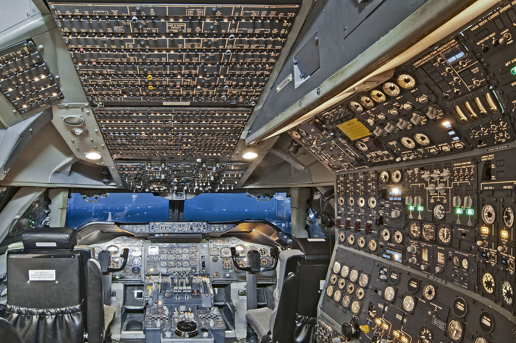
DESIGN SHOULD BE APPROPRIATE

Image source: “Why was Concorde’s cockpit so complex?”, Aviation Stack Exchange (https://aviation.stackexchange.com/questions/16808/why-was-concordes-cockpit-so-complex)

I want to talk more about that feedback regarding reducing the steps. It makes sense because people always say design should be easy to understand, quick, and have fewer steps. But the thing is, something I learned during my bachelors was that design should be appropriate.

Sometimes stuff is actually supposed to be complex and detailed, especially when lives or major life events depend on it. Look at the cockpit of an airplane. It is incredibly complicated and full of buttons, but it has to be that way because flying a plane is a serious, high stakes task. The residence permit journey is similar. It is a major life event. We cannot just delete steps to make it look cleaner if those steps are legally required. The goal is not to hide the complexity, but to make that complexity transparent and manageable for the user.

One thing I want to make clear is that this current prototype is solely focused on the user side. It is designed to help the students and ease their emotional load. But a real working service design cannot just exist in a vacuum. To actually make a system like this work, we would need to keep everyone in the loop. That means eventually understanding the other side of the screen too, like the magistrate, the MA35, and the embassy staff, to see what their constraints actually are.

This whole testing phase opened up so many bigger questions for me to follow up on in the future. As I dig deeper into this, I cannot help but wonder why this problem is even there in the first place. What is actually causing all these massive delays? Is this friction intentional, or is it just a byproduct of a really old and overwhelmed bureaucratic system?

I will definitely take a look into those questions down the road. But for now, my focus is on polishing this user facing prototype based on the feedback and getting my final video ready.

Design & Research II – 4/6

Design & Research 2 | For: Birgit Bachler

Let’s suppose you just graduated from your Bachelor’s program and you are planning to go outside of your country for higher studies. You look around on the internet, figure out exactly what you want to do, and find a university that teaches exactly what you want to study. You decide to apply, you get your admission, and you get ready to move to a new country and meet new people. Sounds incredibly smooth right?

Well there is a catch. If you want to study in Europe as a non EU student, and especially if you are from a third world country, I really wish it was that smooth.

A Year of Paperwork

Let me take you through my personal journey. After doing my Exchange Semster here, I saw exactly what I wanted to pursue. I decided to apply for my Master’s in Interaction Design at FH JOANNEUM because I believed it was the right decision. But just coming to Austria meant going through a year long process. For some people it takes even longer than a year.

First I had to get all my documents attested by local courts in Pakistan. Then I had to get them attested again by every single authority that originally issued them. Then they had to be stamped by the Ministry of Foreign Affairs. After waiting four to five months, you finally get an appointment at VFS Global just to have the Austrian embassy legalize your documents to prove they are not fake. Once that is done, you try to get an appointment at the embassy to actually apply for your permit. That part is a total nightmare in itself.

After you finally submit your application, you have absolutely no clue what is happening or what is going on behind the scenes. Then suddenly, I got an email from the Magistrate in Graz. They told me I needed to submit my police clearance certificate, fully legalized by the Austrian embassy, because they suspected my current one was fake. And they gave me exactly 14 days to do it.

I wish I had known this beforehand so I could have legalized that document early. But I did not know because there is no proper channel or guide available to tell you these things. It was physically impossible to make it happen in 14 days. I emailed the embassy four times and could not get a response. I even showed the Magistrate my emails, asking for more time and showing that I was trying my absolute best to cooperate.

Their response? The Magistrate rejected my residence application. In their official rejection document, they literally used the term that I was a “security threat to Austria.”

Going to Court to Study Design

I had to file an appeal in court in Graz against this decision. According to Austrian law, they cannot reject your application for being unwilling to cooperate or call you a security threat just because things are out of your hands when you are trying your best. The case went to court, and thank god I won. They granted me my residence permit.

Because of all this chaos, I was a month and a half late to start my studies. I was so stressed that I almost emailed the university to ask for a refund on my fee because I thought I might not be able to make it anymore even after that much effort.

And just so you know, this was my experience as someone who actually has an Austrian embassy in their home country. Just imagine what happens to students from Bangladesh. They do not even have an embassy in their country and have to travel to a completely different country like India just to get their documents checked.

How Do We Fix This Broken System? This whole experience is exactly why I moved to this topic. The system is fundamentally broken. It places a massive emotional weight and cognitive load on students before they even step foot in a classroom.

I want to see if there is any way to fix this problem and figure out what the best way to do it would be. For my next steps, I am exploring the world of service design to see how we can make this journey more humane and transparent. I tried making a prototyping idea of an online portal and a digital status tracker that might actually solve this issue. I recently tested it with my class fellows and colleagues, and I will tell you all about their feedback in my next post.
Design & Research II – Elevate Pitch

Design & Research 2 | For: Katerina Sedlackova

In our last class of Design and Research II with Katerina Sedlackova, we practiced crafting elevator pitches using a structured framework. Here is the pitch I developed for my concept:

We’re living in an era where everyone is a ‘photographer,’ but nobody actually knows how to use a camera. We’ve traded the craft of photography for a ‘smart’ button that does all the thinking for us.

The problem is that cameras are now so good, they’ve made the person behind the lens irrelevant. The AI chooses the light, the blur, and the mood. It’s a great image, but it isn’t your craft — it’s just a software output.

I’m building Photography Co-Pilot. It’s an AI that stops taking the photo for you and starts teaching you how to do it yourself. It explains the manual settings in plain English, in real-time, so you can take back creative control.

While everyone else uses AI to replace the artist, I’m using it to empower the artist. I’m giving the craft back to the person behind the lens.

I’m a designer and photographer. I believe technology should help us learn a skill, not replace the need for one.

Design & Research II – 3/6

During this semester I got a chance to visit CERN for a course called I2P. I was introduced to a lot of exciting concepts which were quite new and fascinating for me. Although I learned a lot and picked up so much stuff from there, one thing really stuck with me. It really helped me think and helped me narrow down my block on my topic later when I was stuck and feeling like I hit a dead end.

That concept was ‘kill your darlings’. Sometimes we are so obsessed with our topic or what we are creating that we start to get attached. We get biased about our own ideas. But the best approach is to know when to stop. Killing your darlings basically means letting go of an idea you love when it stops serving the project. You have to drop your own attachment so you can actually move forward.

Implementing this on my research made me realize that hitting a dead end might not be the end. It is actually an opportunity to divert to another topic. I have been actively looking for a new direction and the thing is I think I finally have a topic which is very close to my heart, or my brain, or my struggles honestly. It is about immigration in Austria as a non EU student, especially coming from a third world country. It feels like an absolute nightmare for a student.

I discussed this with my supervisors and they were super helpful and supportive of me pivoting from my initial idea, as this can be the basis for my work in the future. I do not want to use this post to explain exactly what my concept is just yet. I just want to mention that I will focus a little bit more towards service design right now. I will explain my new topic in detail in my next post.

Design & Research II – 2/6

Hitting a Roadblock

I have been working on this topic for a long time now, almost a semester and a half. But after the first prototype session, I am starting to have a lot of self doubts. I really do not know what the right approach is here. I see so many opportunities and so many dead ends at the exact same time. It feels like maybe I jumped to a solution way too quickly, or maybe the core problem is not even what I identified before.

The reasons for these doubts are quite natural. They come from looking at social media, observing the people around me, and watching the rapid shifts in current technology and AI. I know there is no perfect solution and no magical balance between all these concepts. Right now, we have the AI based, fully polished stuff on one side. On the other side, the totally raw and unfiltered film camera still exists for making pure art. What I was visioning was a middle medium. But I am realizing that a transition from film to digital to AI based photography is not quite what I assumed it would be.

When I research creative freedom, the thing is that many advanced cameras already have options for using total film settings or creative modes. If those already exist, do people still actually need a new medium? And then what about modern phone cameras? How are they supposed to fit into this? Should my solution just be for the phone? Is there really a one size fits all answer, or should this project just focus on one specific user base, like only phone photographers or only dedicated camera users? Even if someone really just wants to practice and learn, there are already so many websites where you can try out photography and different lighting setups for free.

So in this post, I really just want to explain that I am having doubts. I am not sure if moving forward with this concept or research question is the appropriate direction to take anymore. I am going to try to research more and discuss it with my supervisors. There is a very real chance I might have to stop this journey right in the middle.

Design & Research II – My Product & Business Strategy

Design & Research 2 | For: Katerina Sedlackova

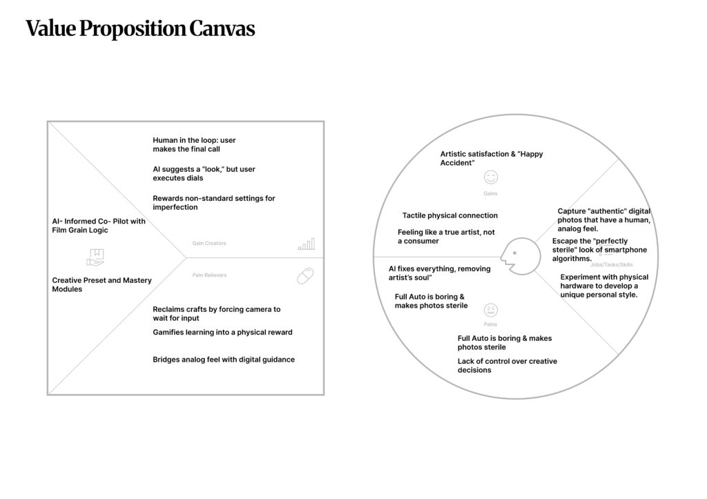
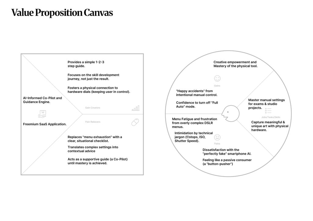
After spending a lot of time mapping out the “system,” I’ve finally landed on a solid plan for what this project actually is and how it works as a business. Here is the breakdown of the Photography Co-Pilot.

Cameras today are too much. You either have a professional DSLR with 100 confusing menus, or a smartphone that does everything for you. This “Automation Gap” means people never actually learn how to take a real photo. They just push a button and hope the AI makes it look good.

Photography is an art. If the computer does everything, the “human” part of the art dies. Plus, so many young people are buying old cameras because they want that “analog” feel, but they give up because the settings are too hard to learn. We’re losing the craft.

Think of it as a bridge. Instead of the AI fixing the photo for you, it talks to you. It looks at what you’re trying to shoot and gives you a simple 1-2-3 checklist (on your phone or in the viewfinder). It says: “To get this look, turn this physical dial to f/2.8.” You still do the work; the AI just points the way.

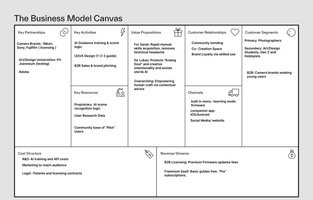
The main users are students and hobbyists (like the Gen Z “analog” crowd). The people who will actually pay for this are the big camera brands like Nikon or Sony who want to make their gear easier for new people to use.

We move from being “Passive Button-Pushers” to “Active Pilots.” It turns frustration into that “Aha!” moment when you finally get a manual shot right.

We license the “Logic” to camera brands so they can put a “Learning Mode” in their cameras. We also have a pro version of our app for people who want even more advanced guides.

To make sure this actually works, I looked at two types of people who really need this help.

This is the “behind-the-scenes” look at how the project stays sustainable. To make this a real-world product, I’ve mapped out a strategy that involves partnering with the big players in the industry while keeping the focus on the student community.

Design & Research II – System, Impact, and Inclusion

Design & Research 2 | For: Katerina Sedlackova

Following my prototypes, I am now looking at how my project fits into the bigger world. I have broken this down into three parts: the system, the change it creates, and who can actually use it.

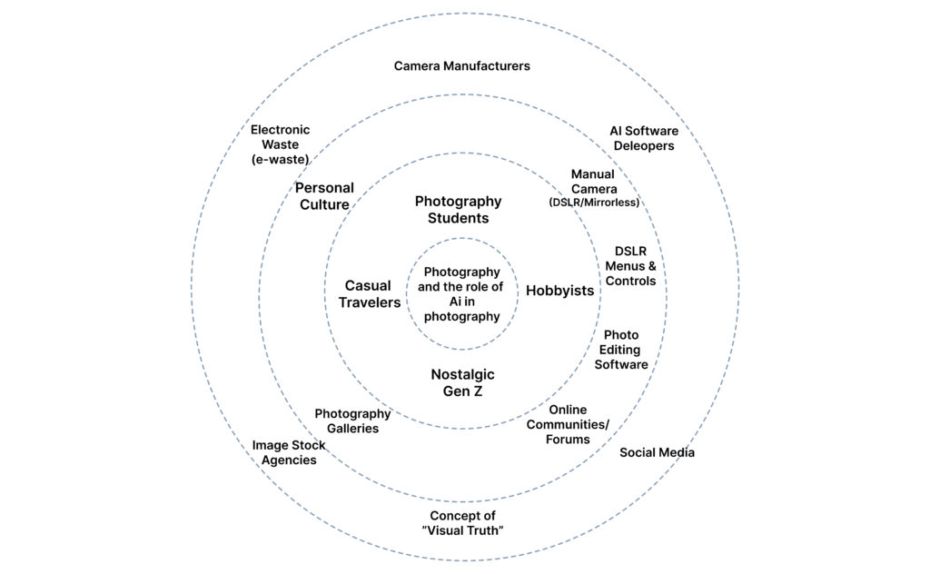
This diagram illustrates the broader ecosystem surrounding my camera-AI guidance system. I have mapped it from the core outwards to show how the project connects to the world.

The Core: The interaction between the Photographer and the Manual Camera.
Direct User Context: Students, hobbyists, and “Nostalgic Gen Z” looking for a creative rhythm.
External Ecology: The heavy hitters—Nikon/Sony (Hardware), Adobe/Midjourney (AI), and Instagram (Social). I also included E-waste, as the sustainability of our gear is part of the system.

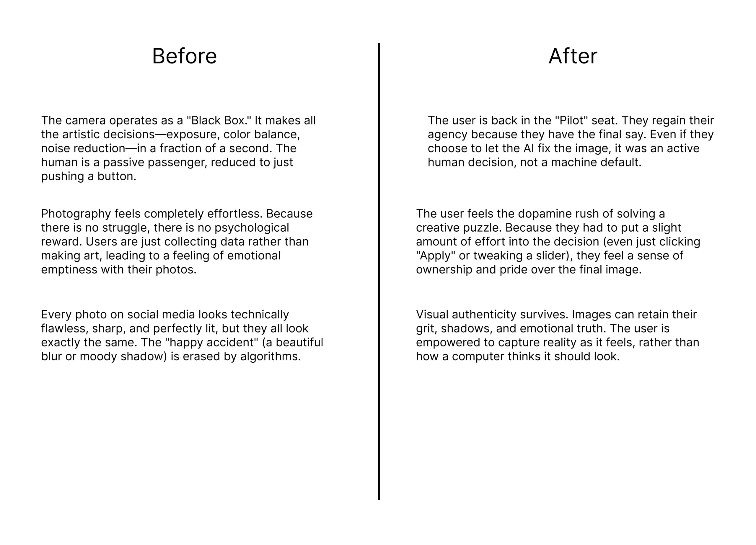
This comparison highlights the shift from automation-first snapping to learning-aware photography.

The Goal: The goal is to move the user from being a passive passenger of an automated process to an active “Pilot” who understands their tools.

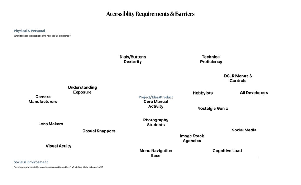
Accessibility in photography is not just about “talent”; it is a systemic issue. Using the floating barrier map, I identified the physical and cognitive hurdles that stop people from mastering manual photography.

Design & Research II – Lo-Fi Prototypes 1/6

Following my research on “Automation in Photography,” I have spent this week diving deeper into my project by creating three different prototype scenarios. Even though I haven’t tested these with real users yet, the act of making them helped me see points I was missing and gave me a better direction for my Master’s thesis.

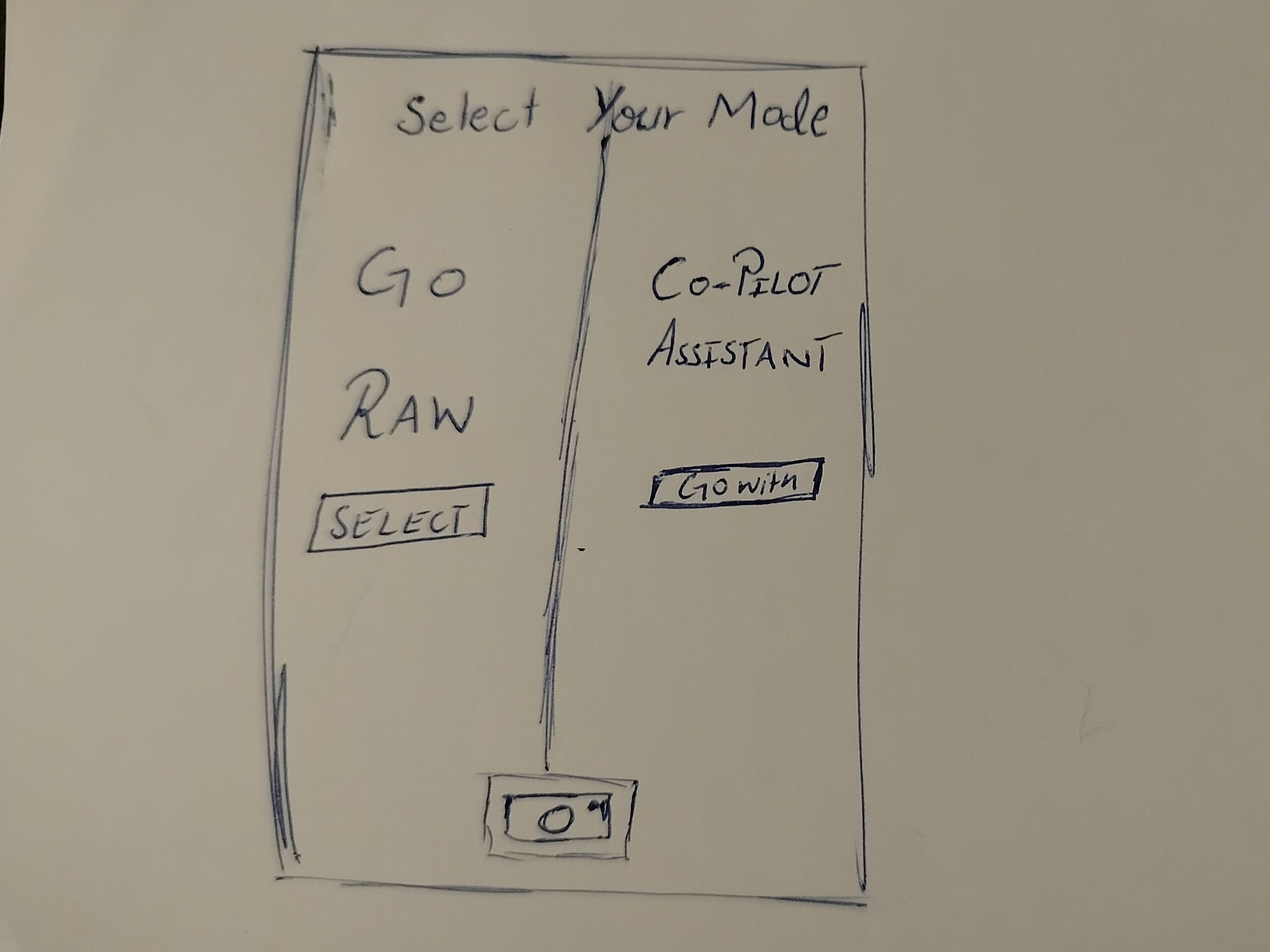
In this one, when the user opens the camera, they have to choose between two options. One is a Raw Mode where the user has all the control, and the other is an AI Automation mode.

The Goal: To see if forcing the user to pick a mode at the start makes them more intentional about how they want to take the photo.

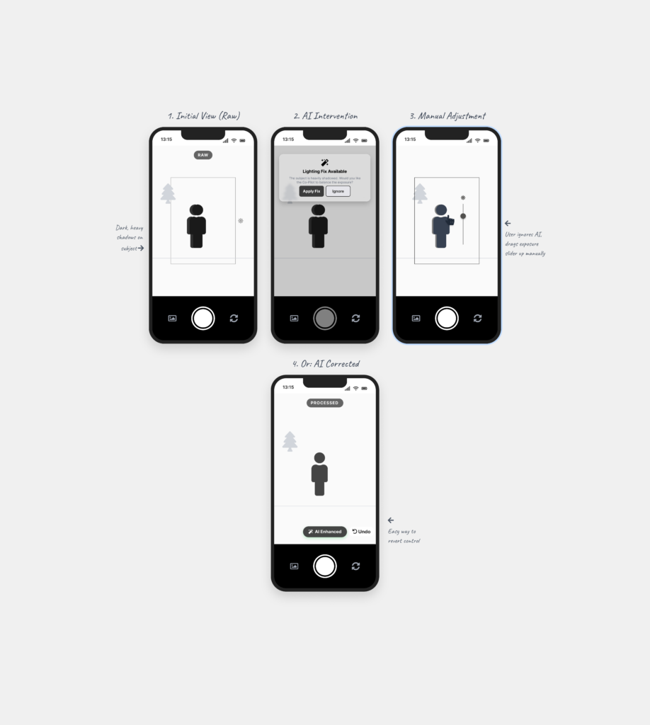
This is a digital assistant that pops up on the screen while you are shooting. It explains what is happening based on the scene. For example, it might say “increase shutter speed because you are shooting action” or “reduce ISO because there is too much light.”

The Goal: To see if giving the user a “why” helps them stay in control instead of the camera just fixing the settings automatically.

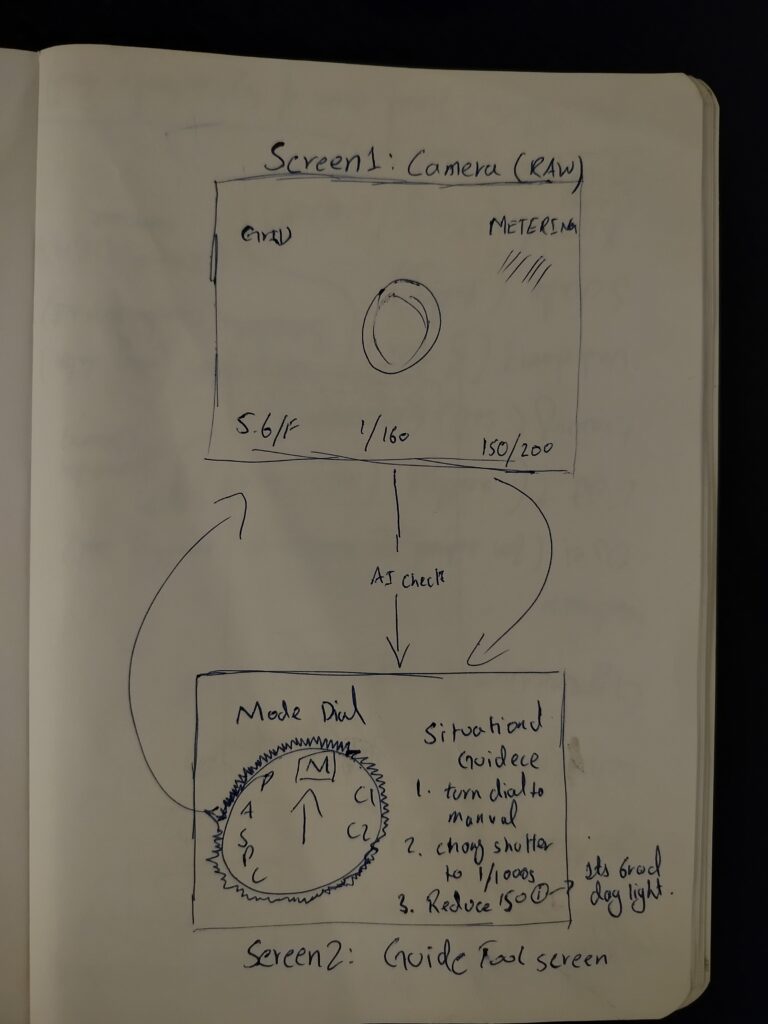
This is for professional cameras. A separate device (like a phone) is attached to the camera to guide the user. It shows suggestions on which physical dials to turn to get the right settings.

The Goal: To see if the AI can act as a teacher that helps the user learn how to use the manual settings on their professional camera.

Creating these scenarios helped me see which directions I might follow, but it also left me with a big question about the design process. I understand that if you have a clear vision, prototyping early can save a lot of time. But when you are still in the early stages of defining and understanding the problem, I found it extremely difficult.

To be honest, it doesn’t make total sense to me to build a solution when I haven’t even fully decided what the actual problem is yet. While I know it is supposed to be beneficial, I personally didn’t find it that helpful at this stage. It felt a bit like guessing. However, the exercise did at least show me which side of the camera-AI idea has the most potential, even if the final direction is still a bit blurry.

ID1 – NIME Article

Authors: Hugh Aynsley, Pete Bennett, Dave Meckin, Sven Hollowell, and Thomas J. Mitchell

For this NIME research task, I chose a paper that sits exactly at the intersection of my Master’s research and the future of interaction design. While many NIME papers focus on sensors or sound synthesis, this 2025 study explores the psychology of the design process when using Generative AI.

The authors conducted workshops to see how Text-to-Image (TTI) tools like Midjourney change how we brainstorm. Instead of the traditional “slow” process of sketching by hand, designers used AI to “materialize” their thoughts instantly.

Visualizing the Abstract: Turning vague feelings (like “granular” or “metallic” sounds) into concrete visual shapes.

The Power of the Pivot: Using AI “hallucinations” or mistakes as a spark for a new, unplanned design direction.

High-Speed Variation: Generating dozens of different “vibes” for a controller in seconds to see what sticks.

Style Mapping: Forcing the AI to blend two unrelated worlds—like a “violin” and a “space station”—to find a new aesthetic.

Boundary Objects: Using the AI images as a bridge to help team members understand a complex concept without long explanations.

As someone who has spent the last semester investigating whether automation “steals the joy” of creativity, this paper gave me a new perspective. I’ve often seen AI as a “thief of the mistake,” but Aynsley et al. argue that the AI’s mistakes are actually its biggest strength in the ideation phase. It provides a “surprise” factor that a human designer might never think of on their own.

What I find missing in this research, however, is the tactile reality. It’s easy to generate a beautiful, “instant” image of a musical instrument, but the paper doesn’t address the massive gap between a 2D AI dream and a functional, ergonomic 3D interface. As interaction designers, we know that how something looks is only half the battle; how it feels in the hand is where the real design happens.

Overall, I think “Instant Design” is a powerful look at how our tools are evolving. It confirms my belief that the future isn’t about the machine replacing the artist, but about the designer becoming a “Curator of Possibilities.” We are still the pilots; the AI is just helping us navigate the “Fog” of the early design phase much faster.

References:
[1] H. Aynsley, P. Bennett, D. Meckin, S. Hollowell, and T. J. Mitchell, “’Instant Design’: Five Strategies for the use of Generative AI in NIME Ideation Workshops,” in Proc. Int. Conf. on New Interfaces for Musical Expression (NIME), 2025.