Why the World Loves Pictograms

The pilot was about one small door story, but the result keeps pointing at something much bigger: pictograms. Now I think I understand why they are everywhere, and the reason is sitting right in my own data.

The drawing in my test won on clarity, on trust, and on ease of reading. People understood it fast and were willing to follow it. A pictogram is just that idea taken to its limit. It is an image reduced until almost nothing is left except the meaning. No specific person, no specific room, no detail to sort through. And that is exactly why it works so well and why it is so popular. When you need someone to understand something in a split second, you do not give them a photograph to study. You give them a reduced sign they can read without thinking.

This is why pictograms run the parts of the world that cannot afford a pause. Exit signs, toilets, road signs, airport gates, the buttons on every device, the warning symbols on a package. All of these need to be understood instantly, often by people who do not share a language, and almost none of them use photographs. A photo of a specific running person pointing to a specific door would be slower and more confusing than the plain figure on a green exit sign. Speed wants reduction. The less there is to read, the faster it reads.

My trust result fits here too. People followed the drawing because it felt deliberate, like a rule rather than a moment. A pictogram feels the same way, only more so. Nobody thinks an exit sign is a photo of one particular escape. They read it as the instruction itself. That sense of “this is telling me what to do” is exactly what an instruction needs, and reduction delivers it better than realism.

But my results also show the other side, and this is the part I find most interesting. The photograph was not worse. It was better at something else. It carried emotion, calm, the feeling of a real person in a real moment. That is the thing a pictogram throws away on purpose. A symbol can tell you to exit, but it cannot make you feel anything about exiting. It is built for speed, not for weight.

So the rule seems to be about what you want from the viewer. If you want them to act fast, you reduce, and you move toward the pictogram. If you want them to pause, to feel something, to stay with the image a moment longer, you add detail back in, and you probably move toward photography. The running figure on the exit sign gets you out of the building. The photograph of a real face on a charity poster is meant to stop you and make you care before you ever read a word.

This is why so much real design uses both at once. A safety leaflet shows a calm photograph to set a tone, then switches to simple icons for the actual steps. An advertisement uses a strong photograph to make you feel something, then a clean logo or symbol to tell you what to do next. The photograph holds you. The pictogram directs you. They are not competing. They are doing two different jobs, the same two jobs that split apart in my little door test.

I did not expect a story about pulling a door to lead here, but it did. The reason pictograms are everywhere is the same reason my drawing won on clarity and trust. Reduction is the fastest way to be understood. And the reason photographs still matter is the same reason mine won on feeling. Detail is how you make someone slow down and care. The next block goes back to the test, the shower and the phone, to see if this same split holds when the story changes.
Reading the Results: Why It Split This Way

The last block was only what came back. This one is me trying to understand it. Three results are worth digging into, and I will take them in order: the trust surprise, the confusion both versions caused, and the clean split between instruction and feeling. The sample is small, so this is interpretation, not proof.

1. The trust surprise

People trusted the illustration more as an instruction, even though the photograph is the more realistic image. That is the result I expected least, and honestly I am still not certain why it happened. But I can see a few possible reasons, and they probably work together.

One is that realistic and clear are not the same thing. A photograph shows one specific person, one specific door, one specific moment, full of detail that the viewer has to sort through. A drawing has already removed all of that. Nothing in the frame is accidental, so it reads as someone deliberately telling you the rule, not as a photo of a thing that happened once. The reduction itself might be what makes it feel like guidance.

Whatever the exact reason, the real world clearly agrees. Airplane safety cards, IKEA manuals, medication leaflets, and exit signs are almost always drawn, never photographed. Not because photographs were unavailable, but because for “do this, then this,” a clean diagram feels clearer and more authoritative than a real picture. My ten people landed in the same place that decades of instruction design already did, which makes me trust the signal even with a small sample.

2. The confusion is itself the finding

Both versions made people reach for words like stupid, confusing, and a plain “huh?”. My first instinct was to treat that as a problem with my images. But the more I look at it, the more I think the confusion is the actual finding, not a flaw to fix.

The story has no words at all. So when something is even slightly unclear, the viewer has nothing to fall back on, no caption, no label, no sentence to rescue them. That is exactly the condition I set out to study: communication when words are removed. The confusion is the cost of going wordless, made visible. It shows where a pure image starts to wobble and where a single word would have instantly steadied it.

You can see the same thing in real pictograms. A toilet sign works perfectly, but plenty of public symbols leave people guessing, which is why airports and hospitals so often pair the symbol with a word. The “huh?” my viewers felt is the same “huh?” everyone has had standing in front of an unlabelled sign. That reaction is not noise. It is the edge of wordless communication showing itself.

3. Instruction versus feeling

Putting the first two together gives the cleanest result of the pilot. The drawing was stronger for the instruction: clarity, trust, ease of reading. The photograph was stronger for the feeling: emotion, calm, the sense of a real person in a real moment. Comprehension was a tie, so neither medium was simply better. They were better at different jobs.

This lines up with how the two are used in the world. Instructions are drawn. Manuals, signs, and diagrams strip a task down to its logic. Emotion is photographed. Advertising, journalism, and portraits use real images to make you feel a real presence. A charity poster uses a photograph of a real face to move you, then often switches to simple icons to explain what to actually do. The medium follows the job.

Where this leaves me

The honest headline is the one I guessed at the start. There is no single winner. The drawing carries the instruction, the photograph carries the feeling, and which one is right depends entirely on what you are trying to say. The confusion sits underneath both, marking the limit of saying anything at all without words. Ten people cannot prove this, but the pattern is clean enough that I want to test it properly on the shower and the phone, with more people, in the next block.

First Results: The Door Story Pilot

I decided not to go all out at the start. I was not sure the testing method would hold up, so instead of sending all three stories to a big group, I ran a small pilot with just the door story. The goal was to see whether the test does what I designed it to do before I scale it up. This block is only what came back. The analysis comes in the next one.

I tested it on 10 people, split into two groups of five. Five saw the illustration first, and five saw the photograph first. Everyone saw both versions in the end and answered about each one, then compared them. The numbers are small, so I treat them as a first signal, not as proof.

What came back

Understanding. Both versions got the story across. Four of the five who saw the illustration correctly mentioned the final push, and four of the five who saw the photograph did too. On pure comprehension, the two were even. The medium did not decide whether people understood the story.

The turning point. The illustration group named the push moment a little earlier and more consistently, which fits, since the arrows point straight at it. The photo group was more spread out. Some sensed it at the confused pause, some only at the last frame.

Feeling. This is where the two parted. The illustration pulled words like funny, frustrating, stupid, and confusing. The photograph pulled serious, funny, calm, and stupid, with a few people writing in a confused “huh?”. Both read as a little silly, which suits a story about failing at a door, but the texture differed. The illustration felt light and funny, but its simplicity also made some people call it confusing. The photograph felt calmer and more serious, more like watching a real person have an ordinary moment.

Trust. People trusted the illustration more as an instruction. This surprised me, because I expected the photograph to feel more credible by default. It did not work that way. For something you are meant to follow, the clarity of the drawing seemed to count for more than the realism of the photo.

Effort. The illustration was rated easier to read. Less visual noise, and attention goes straight to the action. The photograph carries a whole real room, so there is more to take in.

Consistency. This was my fairness check, to see whether one set simply looked more finished than the other. The two came out close, with no clear winner. That was good news. It means the comparison was not obviously unbalanced.

Neither version won overall. The illustration was stronger for clarity, trust, and reading ease, and it carried a light, funny tone. The photograph was stronger for emotion, calm, and the sense of a real person in a real moment. Comprehension was a tie, and consistency was even.

So the early pattern is the one I guessed at the very beginning. There is no single winner. The drawing seems to communicate the instruction, the photograph seems to communicate the feeling. Ten people cannot prove that, but it is a good sign that the split showed up this clearly this early. Why it split this way is the question for the next block.

The Door Story, and the Questions I Will Ask

Both versions of the door story are now made. Both are AI: the illustration as vector code, the photographs from Firefly, which I kept generating and curating until they held together as one set instead of drifting frame to frame. Are they exactly the same quality? I am honestly not sure, and I have decided not to pretend otherwise. That uncertainty is part of the question now, which is why one of the questions below asks the viewer about it directly, so the data can speak instead of me claiming the sets were equal.

The story

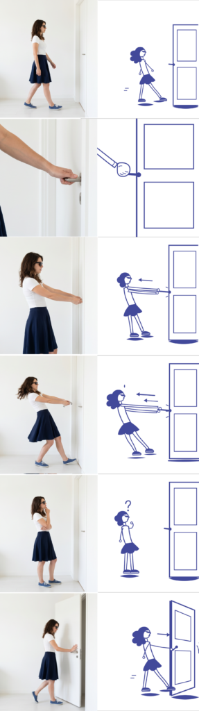
The first of the three stories is the door, the most banal thing imaginable, which is exactly why it works. A woman walks up to a closed door. She grips the handle and pulls. It does not open. She pulls harder, leaning back with real effort, and still nothing. She stops, confused. Then she pushes instead, and the door swings open. The small joke underneath is something everyone has done: when a door does not work, we blame ourselves and pull harder, instead of trying the other direction.

Both versions tell this in six frames. The illustration uses its own language: arrows for the pulling direction, small marks for effort, a question mark for the pause. The photograph uses its own equivalents: the strain in the body, the hair caught in motion, the door actually swinging. Same story, same six beats, two visual languages.

How people will see it

This time everyone sees both versions, not one. But the order is split. One group sees the illustration first, then the photograph. The other group sees the photograph first, then the illustration. The reason for the swap is simple: whichever version you see first can bias how you judge the second, so flipping the order between the two groups balances that out.

The form has two phases. First the solo phase: you see one version and answer about it before the other version ever appears. Those first answers are a clean reaction to that medium on its own. Then the comparison phase: both versions are shown together, and now the comparing questions are easy to answer honestly, because both are right in front of you. So one form captures two things at once, how each medium works alone, and how the two feel side by side.

The questions

Solo phase, asked about the first version before the second is shown. Comprehension always comes first, so the form does not give away the answer.

  1. In one sentence, what is happening in this story? Open text, no hints. The most important question.
  2. How clear was each step? 1 to 5.
  3. At what moment did you understand the door had to be pushed, not pulled? This checks whether the joke landed.
  4. Which words fit the mood? A fixed list, the same for everyone: funny, serious, warm, cold, friendly, technical, calm, frustrating.
  5. How much does this feel like something you would actually follow? 1 to 5.
  6. Did this set feel consistent and finished? 1 to 5. This is the quality check.

Comparison phase, both versions now visible.

  1. Which version was clearer? Which felt warmer or friendlier? Which would you trust more as a real instruction?
  2. Which one stayed in your head more, and why?

The same questions go to both groups, only the order of the two versions swapped. Two forms, spread as evenly as I can, and then the real work begins, which is reading what the two groups did differently. The next block is the shower and the phone, built the same way, and after that the results.

Back on the Path

The last two blocks were detours. A useful one about quality, and a more philosophical one about the variables you cannot measure. Both were worth thinking through, but I can feel the project drifting away from the thing it is actually about. So this block is a reset. I want to restate the real question, keep what the detours taught me, and commit to a direction again.

The question has not changed since the beginning. How do visuals communicate a story when there are few or no words? Everything else, the stories, the styles, the test, is just a way to get at that. It is easy to lose sight of it while fighting with file consistency and AI quality, so I want it back in the center where it belongs.

Here is what the detours gave me, kept short. From the quality problem: the two image sets have to sit at a similar level of finish, or the test measures polish instead of medium. From the variables detour: I can control the expected things and never fully control the human ones, and the human conditions around an image are part of how images really work, not just noise. Both of those are now part of how I think, but neither one is the project. They are guardrails, not the road.

So, the direction. I am pulling the experiment back to its simplest honest form. Same banal stories, two visual languages, but this time quality and consistency are treated as something I actively control before anyone sees the images, not something I hope works out. If I keep using AI, the photographic set has to be curated until it holds together as one coherent thing, at the same standard as the illustrations. If I cannot reach that standard, I switch the photographic side to images I can fully control. The test does not go out until the two sides are honestly comparable. That is the rule now.

And I am keeping the test deliberately modest. Two groups, each sees one version, a short questionnaire, the comparison done by me afterward between the groups. I do not need a perfect study. I need a fair one, small enough to actually finish this semester, clean enough that the result points at the medium and not at my production problems.

But that raises an obvious question: how do I actually measure quality? I had to be honest with myself here. There is no quality score, no single number, and worse, illustration and photography are judged by different standards anyway, so I cannot really put them on the same ruler. Trying to prove one set is as good as the other is a dead end.

So I am dropping that impossible half and measuring something I can actually check: consistency. Not whether each set is good, but whether each set holds together as one coherent thing. Does the same person stay recognizable across all six frames. Is it the same world. Is the level of detail and finish steady. Is there a single frame that looks obviously broken. This is almost a checklist, and it is visible rather than subjective. My illustrations pass it. My AI photographs, right now, do not. That is the bar both sets have to clear before the test goes out.

And I can let the people confirm it for me. If I add one small question to the questionnaire, asking whether the images felt like a consistent set, then I am not just claiming the two sides were fair, I have evidence. If both groups rate consistency about the same, the comparison was fair. If one is much lower, that itself is honest data telling me the sets were not equal. Either way I learn something instead of guessing.

So that is the reset. The question is the same one it always was. The detours are folded in as rules to follow, not problems to keep circling. And the next concrete step is clear: lock the two image sets to the same quality, then finally put them in front of people.

A Detour: What Can and Cannot Be Measured

Before I solve the quality problem from the last block, I want to take a detour. The problem pushed me into a bigger topic that I find more interesting than the fix itself, and it is worth thinking through out loud: the difference between the variables you can plan for and the ones you cannot, and between the things you can measure and the things you simply cannot.

Let me start with the obvious layer. In this experiment there is a whole list of variables I can name in advance and, with enough effort, hold steady. The quality and finish of each set. The consistency between frames. The colour. The amount of background detail. Whether the character reads as the same person. The style inside each medium, since illustration and photography are each huge worlds on their own. These are the expected variables. They are annoying, but they are visible. I can see them coming, and at least in principle I can control them.

Then there is the other layer, and this is the one the detour is really about. There are variables you cannot predict and cannot measure, because they do not live in the design at all. They live in the person.

I learned this the hard way in my previous master’s thesis. I was testing whether lighting alone could tell a story, so I designed four scenarios and let people walk through them and do whatever they wanted. The scenarios were controlled. The people were not. One person came at lunchtime and was so hungry that they could not really engage with anything. Another came last in a long day and was already tired before they started. Their reactions were shaped by hunger and tiredness, not by my lighting. And there was no scenario, no matter how carefully built, that could have accounted for that. I could not have predicted it, and I could not have measured it even as it was happening in front of me.

So this is the food for thought. No matter how clean your test is, there is always something you did not think of, sitting inside the person, quietly bending the result. And the frustrating part is not just that you cannot control it. It is that you often cannot even see it or put a number on it. A questionnaire will never have a field for “arrived hungry.”

There is a simpler lesson hiding in this too. Sometimes as designers we get so deep into a project that we forget we are designing for real people, and not just for a rectangle on a monitor. We tune the file, the colours, the spacing, and we forget that the thing will eventually be seen by a person who is hungry, or tired, or distracted, or sad, a person with feelings and a whole day behind them. The work does not live on the screen. It lives in front of someone.

For a while this felt like a reason to despair about testing at all. But I am starting to think the opposite. Maybe the messiness is not noise to be deleted. Maybe it is part of what is actually being studied. When I show someone an image and ask what it means, their hunger, their tiredness, their language, their mood are not contamination. They are the real conditions under which images are actually read in the world. Nobody looks at a picture in a perfect vacuum. People look at things while distracted, rushed, hungry, half paying attention. An image that only communicates to a calm, rested viewer is arguably a weaker image than one that survives a tired one.

I am not resolving this here. The expected, measurable variables I will still try to control, because that is just good practice. But the unexpected and unmeasurable ones might be worth turning toward instead of away from. Maybe the question is not how to eliminate the human conditions around an image, but how much an image can carry despite them. That feels closer to the real life of visual communication than any perfectly controlled test would be.

For now this stays an open thought. But it changes how I see the quality problem from the last block. Control what you honestly can, accept that something will always escape, and consider that what escapes might be telling you something too.

I Cannot Test It This Way

I finished the illustration set and started on the photographic side, and somewhere in the middle I realised I cannot run this test the way I planned. The reason is simple, and it took me a while to see it clearly. The illustrations and the photographs are not at the same level of quality, and because of that, any result I got would be about quality, not about the medium.

That is the whole problem in one sentence. I set out to compare illustration and photography. But if the two sets do not match in quality, then the thing people actually react to is which one looks better made, not whether it is drawn or photographed. The comparison quietly stops being about what I wanted it to be about.

And the mismatch is not in one direction. It is not that the illustrations are good and the photographs are bad, or the other way around. Each set is uneven in its own way. The illustrations are very consistent but clearly stylised. The photographs look real but shift from image to image and never quite hold together as one thing. So I cannot even say one medium is winning. They are simply unequal in different ways, and that is enough to break the test.

This is where I have to be honest about quality itself. I had been treating it as a background detail, something I would clean up later. But it is not a detail. Quality is one of the variables in this experiment, maybe the most important one, and I had not been controlling it at all. As long as it floats freely, it sits on top of everything else people see, and it drowns out the difference I am trying to measure.

So the real question is not finished, it is just beginning. If quality is a variable, then I have to find a way to hold it steady before I can fairly compare anything. Both versions would need to sit at a similar level of finish, so that the only thing left to react to is illustration versus photography. Right now I do not know how to guarantee that, and I would rather admit it than run a test I already know I cannot defend.

I do not have the answer yet. What I have is a clearer question. Before I can test what each medium does, I have to figure out how to make the two sides equal enough that the test is actually fair. That is the problem the next block has to deal with.

What Am I Actually Asking?

The plan is set. Three banal stories, two visual languages, two groups. But before building the test, I have to be precise about what I am actually asking. A questionnaire can only answer the questions that are put into it, so this post is about the questions themselves.

The main question of the semester is what each visual language does to the same message. That is too big to ask directly, so I broke it into three core questions.

The first is understanding. Did the message arrive? If someone looks at the images and cannot say what the story was, nothing else matters. This is the baseline of all communication design.

The second is feeling. Images carry mood before they carry information. The same simple action can feel warm, cold, funny, or official depending on how it is shown. I want to know what atmosphere each style creates, and whether the drawn version and the photorealistic version of the same story produce different feelings.

The third is trust. Which version feels more credible, more like something you would actually follow? This question has become especially interesting today, when photorealistic images can be generated without a camera ever being present. Does the photographic look still carry its old authority, or does a clear drawing feel more honest?

Around these three, I added four smaller lenses. Appeal: how much do people simply like what they see? Perceived effort: does the image feel easy or hard to read? Memorability: which version stays in the head after the form is closed? And one question that comes directly from my storyboarding semester: does the image make you want to see the next frame? A sequence only works if each image creates a pull toward the following one. Last semester I studied how sequences carry meaning. Now I can ask whether the visual language itself changes that pull.

One rule shapes how all of this will be asked. Since each group sees only one version, nobody can compare anything. So I can never ask which one is better. Every question must work on a single version standing alone: describe it, rate it, react to it. The comparison happens later, in my analysis, between the answers of the two groups. This is less comfortable than a side-by-side test, but cleaner. People judge the image in front of them instead of choosing a favorite.

Order matters too. The understanding question has to come first, as an open answer, before anything else. If I ask first how clear the instruction was, I have already told the participant that it was an instruction. A questionnaire can leak information through its own wording, so its sequence has to be designed as carefully as any other piece of communication.

Finally, the participants. The forms stay anonymous, but I will ask three things: age, whether the person has a design background, and which languages they speak. The last one matters most to me. My whole interest in wordless communication comes from living between languages. If people who move between several languages read these images differently from people who live in one, that is exactly the trace I want to follow in the next semester.

The next post will show the test itself: the three stories, and how the questionnaire is built so that seven questions do not turn into an exhausting form.

The Plan: Same Story, Two Visual Languages

In my last post I marked a turning point. The question of this semester is no longer how to master one medium, but what each medium actually does to a message. This post explains the plan and the goal behind it.

The goal is simple to say and hard to answer. I want to find out what kind of information each visual language suits best. When a story is told through illustration, what does it gain and what does it lose? When the same story is told through photographic imagery, what changes? I do not expect a single winner. My expectation, written down here before any testing, is that each language will be useful in different situations. I also know that illustration and photography are both enormous worlds. A technical line drawing and an expressive painting are both illustrations, but they behave completely differently, and the same is true for photography. So I will not compare the two worlds. I will compare one defined style from each: a flat, reduced illustrative style on one side, and a clean photorealistic style on the other. Whatever I find will only be true for these two styles, and I want to be honest about that limit from the start.

The plan looks like this. I will take three very simple, everyday stories. Stories so banal that nobody has to think about the content itself. This is intentional. When the content is trivial, the only thing left to react to is the image. Each story will be told twice, once in each style. The two versions will then go to two separate groups through an online questionnaire, and I will compare how each group understood the story and how they felt about it. Which stories I will use, and how the questionnaire works, will come in the next posts.

One decision needed the most thought: how to produce the images. My first idea was to draw the illustrations myself and to photograph the photographic versions myself. But the more I thought about it, the more problems appeared. My drawing skills and my photography skills are not on the same level, so the comparison would partly measure me instead of the medium. Photography also needs a person, a place, and time that I do not have this semester. And keeping three stories visually consistent across two media, alone, within a few weeks, is not realistic. So I decided to generate both versions with AI. This keeps the production conditions identical. Same maker, same tool, same amount of effort. The only variable left is the visual language itself. To be precise, this also means the photographic versions are not photographs. They are photorealistic images, and I will call them that. The decision also continues a thought from my first semester research on AI and storyboarding: the role of the designer is shifting from the one who draws to the one who directs, selects, and judges. This semester I will practice exactly that role.

So this is the plan. Three banal stories, two visual languages, two groups, one questionnaire. The next post will define the exact research questions I am trying to answer.

Let’s Start Over and Reflect

Before beginning this master’s program, my work already revolved around questions of storytelling and communication. Coming from a background in interior and exhibition design, I became interested in how people understand narratives through space, atmosphere, and visual cues rather than through long textual explanations. In my previous thesis, I explored how lighting can support storytelling and guide perception within an installation. The project focused on how visitors interpret meaning through sensory experience, even when verbal guidance is limited.

Alongside this academic interest, communication has also been a personal challenge in my everyday life. Living and studying in a country where my mother tongue is not spoken means a constant negotiation between languages. I move between Persian, English, and German depending on the situation. Certain thoughts are easier to express in one language than in another, and sometimes I struggle to find the right words even when the idea is clear in my mind. Because of this, communication is something I am highly aware of. It is not simply a neutral tool but something that requires constant adjustment and creativity.

This experience gradually led me to search for ways of expressing ideas that depend less on words. Music was one of them. Part of my motivation for learning the violin was the desire to express emotions that are difficult to articulate verbally. Drawing and painting have been a lifelong and often frustrating challenge, but one that kept my interest in visual language alive. Photography taught me to pay attention to gestures, light, and composition as carriers of meaning. Even baking, through my small project Dot Pastry, became a way of thinking about how taste, color, form, and presentation can communicate without a single word.

In the first semester of this program I explored storyboarding as a method of visual communication. I examined how a narrative can be conveyed with as few words as possible, relying on images, sequence, and context. Looking back at that research, I notice something important. Storyboarding was never really my topic. It was my first case study. The actual question underneath all nine blocks was larger: how do images communicate when words are reduced or removed entirely? Storyboarding answered the part about sequence, about how images work together. What it did not answer is the part about the image itself.

This is where my plan has changed, and I want to document it openly, because the change is part of the research. My original intention was to spend this semester deepening my illustration skills and to leave photography for the following semester. But while planning, a sharper question appeared. If the same simple story is told once through illustration and once through photographic imagery, what does each visual language actually do to the message? Does one version feel clearer, more trustworthy, or warmer than the other? Treating the two media separately, one in each semester, would never answer this. A direct comparison is the only way.

How I will explore this comparison, with which stories and what kind of test, will come in the next blocks. Here I only want to mark the turning point. The direction has shifted from learning one medium at a time to asking what each medium actually does.

The direction is now more structured than a few months ago, but the thread is the same one I keep returning to. It is the ongoing search for ways to express meaning when words alone are not enough. This semester, I am turning that search into a question that can be tested.