At this stage in my research, I feel the need to move away from speaking about illusion only in theoretical or artistic terms and begin testing it through real commercial examples. If illusion, ambiguity, and layered meaning are truly relevant to contemporary visual communication, then they should be visible not only in galleries, installations, or experimental design, but also in branding systems, advertising campaigns, product packaging, and promotional strategies that compete for attention in everyday life.
What interests me here is not simply whether commercial design can be clever, but whether visual cleverness actually does something. Does it make people remember a brand more easily? Does it reward attention in a way that strengthens emotional connection? Or does it sometimes stop at the level of spectacle, creating visibility without meaning? These questions have led me to look more closely at examples in which illusion or layered perception is used not as decoration, but as part of communication itself.
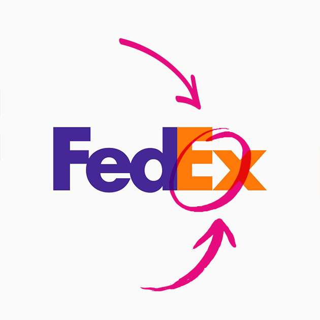
Some of the most well-known logo examples suggest that hidden meaning can be effective when it is both subtle and conceptually aligned with the brand. The FedEx logo is perhaps the most obvious example. Its hidden arrow, formed in the negative space between the “E” and the “x,” has become iconic because it communicates movement and direction without interrupting clarity. It works not because the viewer notices it immediately, but because it remains there as a quiet second layer, one that feels satisfying once discovered. The same can be said for the Toblerone logo, where the mountain contains a hidden bear that refers to Bern. In this case, the image does not simply function as a visual trick. It ties geography, identity, and storytelling together in a compressed and memorable form.
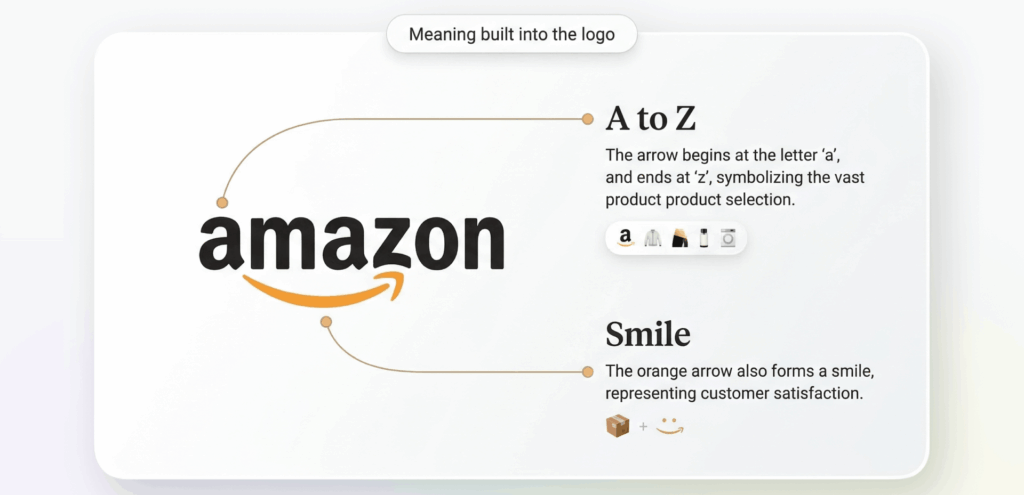
Other brands operate in a similar way, though with slightly different intentions. Amazon’s arrow connects the “A” to the “Z” while doubling as a smile, combining range and customer satisfaction in a single gesture. The older Formula 1 logo famously created the number “1” through negative space, showing how speed and reduction could work together. What links all of these examples is that they do not use ambiguity to confuse. They use it to deepen the message without sacrificing legibility.

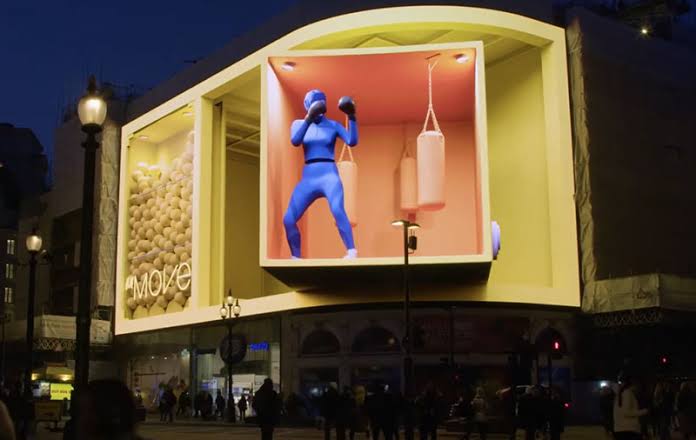
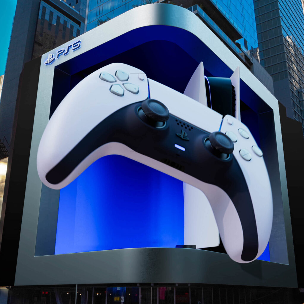
What becomes even more interesting is what happens when illusion leaves the logo and enters space. Anamorphic billboards and large scale 3D out of home campaigns have turned visual surprise into a public event. Their success depends on perspective, scale, and digital illusion, but also on something more social: people stop, film, share, and circulate them. In that sense, illusion here is not just about perception. It becomes a strategy for attention and participation. The campaign exists both in physical space and in the secondary life it gains online.
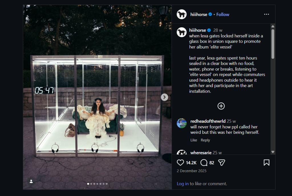
This is where more performative promotional work also becomes relevant. A case that stayed with me is Lexa Gates’ transparent box listening stunt in Union Square, where she placed herself inside a clear box for hours while people gathered around, watched, and engaged with the performance. What makes this especially interesting is that it is not an illusion in the classic visual sense, yet it still relies on spectacle, framing, containment, and public curiosity. These examples push the research into a broader territory, where visual surprise is no longer only about hidden forms, but also about staged visibility and controlled public attention.