The Invisible Scaffold:
Order as a Design Principle:
In the field of communication design, a grid is the underlying structural system that governs the placement, proportion, and spatial relationships of all visual elements within a composition. Although the grid itself is rarely visible to the reader or viewer – it is removed before printing or hidden beneath the final design – its presence is continuously felt through the consistency, rhythm, and visual balance it produces. Far from being a simple set of guidelines, the grid functions as a sophisticated organisational language: it converts an undefined, empty surface into a structured environment in which information can be arranged with clarity and intention. The intellectual roots of this practice extend considerably further back than the formal birth of graphic design as a discipline. During the Renaissance, artists and architects employed mathematical principles – most notably the rules of linear perspective established by Filippo Brunelleschi around 1420 – to achieve a regulated, harmonious organisation of pictorial space. These proportional methods were transmitted into book culture through the work of early typographers. Johannes Gutenberg’s 42-line Bible of approximately 1455, often cited as the first major work of Western movable type, was set in a two-column layout with margins that followed precise proportional relationships – an early, if intuitive, application of columnar grid thinking. In the 13th century, the architect and geometer Villard de Honnecourt produced a diagram – preserved in his surviving Portfolio, held today in the Bibliothèque nationale de France – demonstrating a method for dividing a page into a text area with fixed-ratio margins. His system relied on diagonal constructions drawn across the full page and across the text area simultaneously, and the intersections of these diagonals defined the corners of the type area with mathematical precision. The resulting proportions, which placed the inner margin at approximately one-ninth of the page width and doubled that measure for the outer margin, produced a layout that felt both economical and restful – qualities that remain the ambition of book designers more than seven centuries later. The formalisation of grid thinking as a consciously theorised practice came in the early 20th century, shaped significantly by the political and social upheavals of the period. During and after the First World War, neutral Switzerland became a refuge for intellectual and artistic communities from across Europe, and the country’s design culture absorbed and synthesised diverse influences – from the Constructivism arriving from Russia to the Bauhaus principles emerging from Germany. It was within this context that the grid began to be understood not merely as a practical convenience but as an ideological position: a commitment to objectivity, rationality, and a democratic clarity of communication. Significantly, the term “grid” itself did not enter common professional usage in this sense until this period, when it was adopted to describe the systematic column-and-module structures that Swiss designers were beginning to codify.
Müller-Brockmann’s formulation is significant precisely because it resists the reduction of the grid to a mechanical formula. It positions the grid as a disciplined framework that demands creative intelligence in its application – not a constraint that eliminates individual expression, but a shared language that makes meaningful individual expression possible. This tension between system and freedom, between universal order and personal vision, remains the central philosophical debate in grid theory to this day.
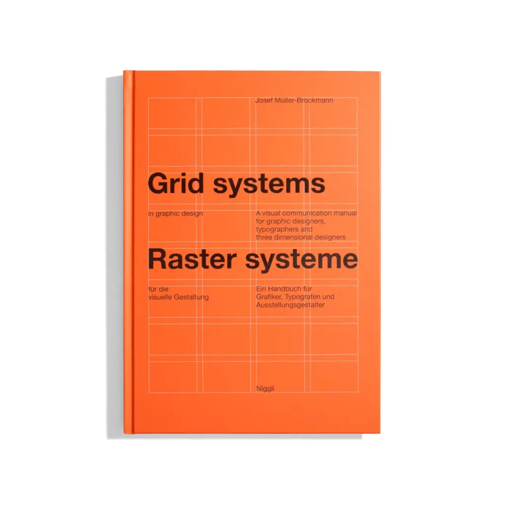
“The grid system is an aid, not a guarantee. It permits a number of possible uses and each designer can look for a solution appropriate to his personal style. But one must learn how to use the grid; it is an art that requires practice.”
– Josef Müller-Brockmann, Grid Systems in Graphic Design, 1981.
Anatomy of the Grid:
The Mechanics of Space: A grid system is not a single element but a carefully calibrated ensemble of interdependent components, each of which carries specific functional, perceptual, and ergonomic responsibilities. In communication design, these components – margins, columns, modules, gutters, and the baseline – constitute what might be described as the skeletal architecture of a composition. While a reader will never consciously perceive these structures, their cumulative effect is experienced as a sense of ease, coherence, and trust. Conversely, when these relationships are poorly calculated, the reader experiences a low-level perceptual discomfort that – while difficult to articulate – reliably reduces engagement with the content. Margins perform a dual role that is simultaneously aesthetic and physiological. As a visual “frame,” they create the breathing space necessary for the eye to approach the text area without distraction. As a physical provision, they account for the mechanics of how a printed object is held and handled. Research conducted in the context of ergonomic book design has established that if the inner (gutter) margin of a book page is less than approximately 12-15mm, the reader’s thumbs will habitually obscure the inner columns of text, causing both physical and perceptual interruption. The outer margin must be sufficient to prevent the sense that the content is pressing against the page’s edge – a condition described in classical typography as the composition “falling off” the page.The column is the fundamental vertical unit of the grid, and its width is not a matter of visual preference alone. Readability research – most extensively documented in the work of Miles Tinker, whose studies at the University of Minnesota during the 1950s and 1960s examined the eye movements of hundreds of readers – established that a line of text containing between 45 and 75 characters (including spaces) produces the highest reading speed and lowest fatigue in continuous prose. Lines significantly shorter than this force too many line-returns, interrupting the reader’s forward momentum; lines significantly longer require the eye to travel so far across the page that locating the beginning of the next line becomes effortful. Column width, therefore, is a variable directly determined by the type size in use and the target character-per-line count – not by an independent aesthetic decision. The gutter – the gap between adjacent columns – is among the most technically exacting elements of the grid. A gutter that is too narrow causes the eye to read across the column boundary, inadvertently connecting the last word of one column with the first word of the next and producing confusion. A gutter that is too wide weakens the visual unity of the page, making the columns appear as separate, unrelated elements rather than parts of a single coherent composition. In professional book and magazine design, the gutter is typically calculated as a proportion of the column width – commonly between one-quarter and one-third of the column measure – rather than as an arbitrary fixed value. Leading – the vertical distance between the baseline of one line of text and the baseline of the line below – is the component that most directly governs the readability of the type area as a whole. The term itself derives from the strips of lead alloy that compositors inserted between lines of movable type to increase the vertical spacing. When leading is set too tightly, the ascenders of one line visually interfere with the descenders of the line above, and the eye struggles to distinguish individual lines, slowing reading speed and increasing fatigue. When leading is excessive, the lines of text lose their visual connection to one another, and the paragraph ceases to function as a unified reading unit. In digital environments, the CSS property line-height is the direct equivalent of leading and is subject to precisely the same optical principles.
Beyond the individual components, the grid’s most important function is the establishment of what typographers call “vertical rhythm” – the sense that the page has a consistent, measurable beat running from top to bottom. This is achieved when the leading of the body text, the spacing above and below headings, and the heights of images and other block elements are all multiples of the same base unit. When vertical rhythm is maintained, a reader’s eye moves through the page with an unconscious sense of predictability and ease, in the same way that a listener navigates a piece of music whose rhythmic structure is clear and regular. Jan Tschichold and Josef Müller-Brockmann both argued, separately and emphatically, that this rhythmic quality – achieved through the precise, systematic application of the grid’s proportional relationships – was not merely an aesthetic refinement but a fundamental condition of legible, humane communication.
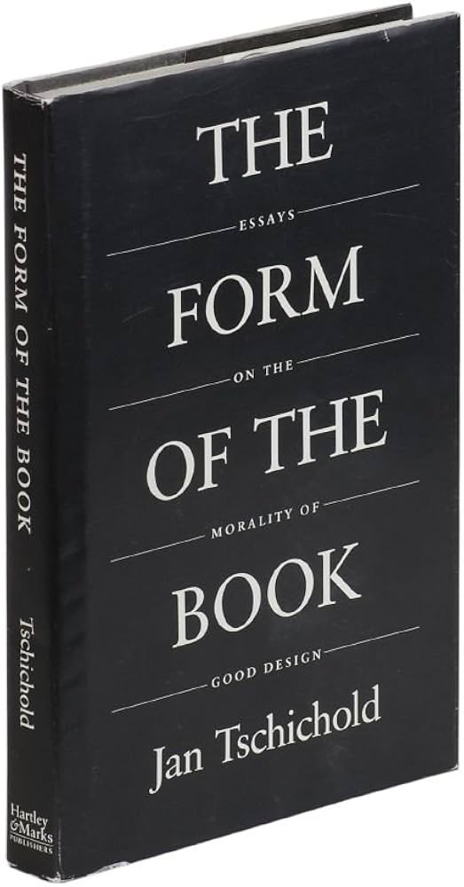
“Perfect typography is certainly the most elusive of all arts. Sculpture in stone alone comes near it in obstinacy.”
– Jan Tschichold, The Form of the Book, 1975.
The Swiss International Style:
When the Grid Became a Movement:
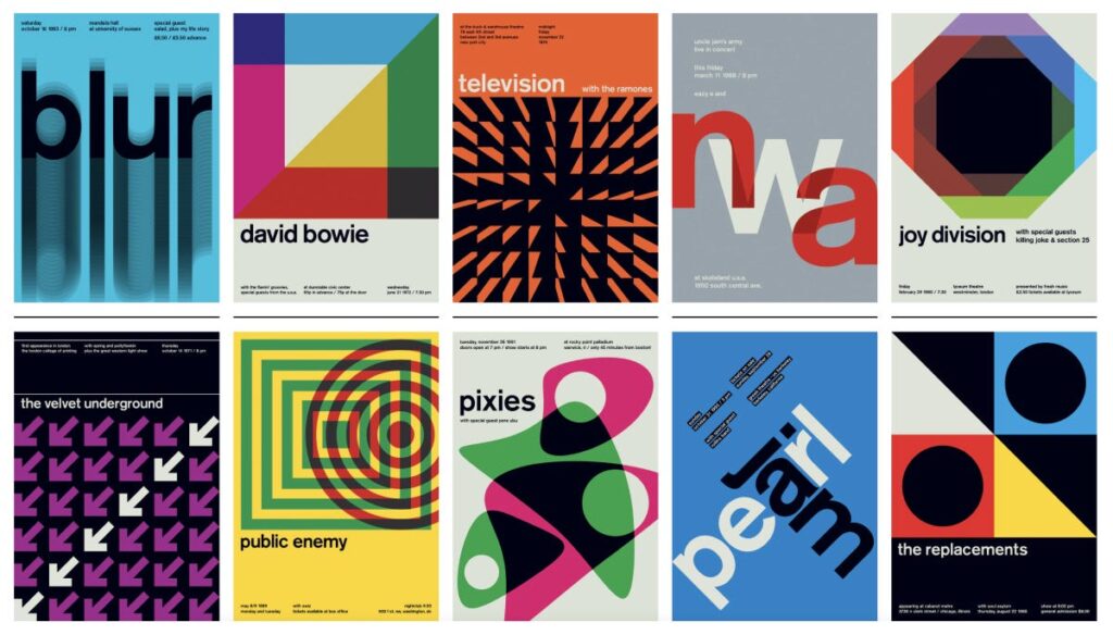
No discussion of grid systems would be complete without examining the Swiss International Typographic Style, often simply called the International Style or Swiss Style. This movement emerged formally in the late 1940s and 1950s, primarily in Zurich and Basel, and it transformed the grid from a personal working tool into a philosophical statement about objectivity, clarity, and democratic communication. The movement’s key figures – Josef Müller-Brockmann, Emil Ruder, Armin Hofmann, and Max Bill – shared the belief that design should not impose the personality of the designer onto the viewer. Instead, design should present information in the most neutral, readable, and logical form possible. The grid was their primary instrument for achieving this ideal. Müller-Brockmann’s famous series of concert posters for the Zurich Tonhalle (1950s-1970s) remain among the most studied examples of grid-based design in history: pure geometric shapes, a strict typographic hierarchy, and no decorative elements whatsoever. The practical result of this ideology was a set of very specific formal decisions. Designers favoured sans-serif typefaces – Helvetica, designed by Max Miedinger in 1957, became the unofficial typeface of the movement – flush-left, ragged-right type alignment, and generous white space. Each of these choices was directly linked to the grid. Flush-left alignment, for instance, respects the vertical axis of the column and avoids the uneven word spacing that justified text can create, which disrupts the clean horizontal rhythm of the grid module.
“The use of the grid as an ordering system is the expression of a certain mental attitude inasmuch as it shows that the designer conceives his work in terms that are constructive and oriented to the future.”
– Josef Müller-Brockmann, Grid Systems in Graphic Design, 1981.
The Swiss Style’s influence spread globally through the 1960s, particularly after Neue Grafik (New Graphic Design) magazine, launched in 1958, began publishing the movement’s principles in three languages simultaneously. By the 1970s, corporations across Europe and North America – including major airlines and international exhibitions – were adopting Swiss-based grid systems for their visual identities, recognising the grid as a sign of trustworthiness and international reach.
The Baseline Grid:
Typography’s Hidden Ruler:
Among all the components of a grid system, the baseline grid is arguably the most invisible and yet most deeply felt. A baseline grid is a series of evenly spaced horizontal lines that align to the baseline of text – the invisible line upon which letters “sit.” Its purpose is to ensure that every line of text across every column of a page aligns horizontally, creating what designers call “vertical rhythm.”
To understand why this matters, consider a standard magazine spread. On the left page, there may be a block of body copy in a 9pt typeface set at 12pt leading. On the right, a pull quote in 18pt and a caption in 7pt. Without a baseline grid, these three text elements would each obey their own internal rhythm and would almost certainly not align across the page. The result is a subtle but constant visual vibration – a sense of disorder that the reader cannot quite name but definitely feels. With a baseline grid, every text element, regardless of size, “snaps” to the same horizontal lines, and the spread reads as a unified whole.The baseline grid has deep roots in manuscript culture. Medieval scribes used a tool called a rastrum – a multi-nibbed pen that could rule several lines simultaneously – to create perfectly even baselines across vellum pages. The consistency this produced was not only aesthetic but also practical: it allowed multiple scribes to work on the same book and maintain a unified appearance. In digital tools like Adobe InDesign, the baseline grid function is a direct descendant of this centuries-old practice.
Jan Tschichold, in his 1975 essay “The Form of the Book,” argued that the baseline grid was inseparable from good typography. He noted that in classical book design, the lines of text on the front of a page should always “back up” precisely to the lines on the reverse – meaning the baselines should align through the paper. This is not only a visual requirement but a practical one: it prevents the “show-through” of ink from the opposite side creating visual interference with the reading experience.
The Golden Section and Mathematical Harmony in Page Design
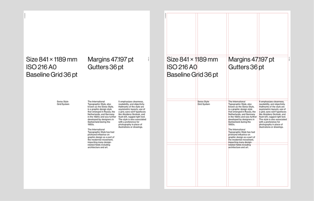
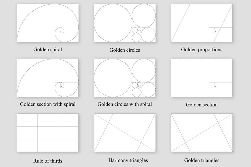
Long before the word “grid” entered the design vocabulary, designers and architects relied on a set of mathematical ratios to create compositions that felt naturally balanced. The most famous of these is the Golden Section (also called the Golden Ratio, represented by the Greek letter φ, approximately 1:1.618). This proportion appears throughout nature – in the spiral of a nautilus shell, the arrangement of seeds in a sunflower, and the proportions of the human face – and has been used consciously in design since at least ancient Greece.
In page design, the Golden Section can be applied at every level. The overall page dimensions can follow the ratio (a page 210mm wide would be approximately 340mm tall in Golden Section proportion). The text block can be positioned on the page according to the same ratio. Even the internal division of columns can reflect it. The medieval “Van de Graaf Canon,” rediscovered in the 20th century by Jan Tschichold, demonstrated that many manuscripts from the Middle Ages – including those of Gutenberg himself – were constructed using a page layout in which the text block occupied exactly one-ninth of the page width from the spine and two-ninths from the outer edge, creating proportions very close to the Golden Section.
A less well-known but equally important ratio is the “secret canon” described by the architect and geometer Villard de Honnecourt in the 13th century. His system divided the page using diagonal lines drawn from specific corners, and the intersections of those diagonals defined the corners of the text block. This created a text area whose proportions were in a fixed, harmonious relationship with the page – regardless of the page’s absolute size.
“A book is good when its text area, its margins, and the relationship between these parts create an impression of natural harmony and necessity, as if they could not be otherwise.”
– Jan Tschichold, The Form of the Book, 1975
These classical proportional systems are not merely historical curiosities. Contemporary designers – particularly in editorial and book design – continue to use them. The A-series paper standard (A4, A3, A5), adopted internationally in the 20th century, is itself based on a ratio of 1:√2, a number with similar aesthetic properties to the Golden Section. Every time a designer works on A4, they are, unknowingly or not, working within a mathematically harmonious framework that has roots stretching back over two thousand years.
Multicolumn Grids and the Language of Magazines
Newspapers and magazines presented a design problem that books never had: the need to display multiple unrelated stories – each with different lengths, different levels of importance, and different visual material – on a single page, simultaneously. The solution was the multicolumn grid, which divided the page into a series of narrow vertical columns that could be combined in different ways to create a flexible but consistent visual language.
The standard broadsheet newspaper typically uses between five and eight columns, while tabloids use between four and six. These are not arbitrary numbers. A narrower column forces shorter line lengths, which is essential for the small type sizes used in newspapers (typically 8-9pt). Research by Colin Wheildon, published in his book Type and Layout (1995), demonstrated that body copy set in columns of 35-55 characters per line is read up to 70% more accurately than text in wider measures. This directly informed the column counts of every major newspaper in the 20th century.
Magazines developed a more sophisticated approach. The American art director Alexander Liberman, who joined Vogue in 1943 and eventually became its editorial director, pioneered a grid system that allowed extreme visual flexibility while maintaining a consistent page architecture. His grid for Vogue used a base of three columns, but images could span across column boundaries to create dramatic horizontal movement. This system of “spanning” – where an element breaks the column boundaries to occupy one and a half or two columns – became a cornerstone of magazine design worldwide.
The magazine grid also introduced a key innovation: the modular text-image relationship. On a book page, images were traditionally subordinate to text, placed wherever the text required. In magazine design, the grid established a system of equal “modules” – rectangular units of fixed size – that could contain either text or image. This created a page architecture in which images and text were formally equal, each occupying the same structural unit. This innovation would later become fundamental to web design, where the concept of the “card” – a fixed rectangular unit containing mixed content – is a direct descendant of the magazine grid module.
The Grid in Corporate Identity:
Systems Thinking at Scale
Perhaps nowhere is the power of the grid more practically evident than in corporate identity design, where a single visual system must function consistently across thousands of applications – from a business card measuring 85 × 55mm to a billboard measuring 12 × 4 metres, from a digital banner to an annual report with hundreds of pages. In this context, the grid is not merely a compositional tool; it is a governance system that ensures every communication an organisation produces is immediately and unmistakably recognisable as belonging to that organisation.
The most celebrated example of grid-based corporate identity is the visual system designed for the New York City Transit Authority (NYCTA) by Massimo Vignelli and Bob Noorda in 1970. The Vignelli Associates team created a comprehensive signage system based on a strict grid that determined the size, position, and spacing of every piece of information in every subway station. The system used Helvetica exclusively, a limited palette of colours, and a grid that was so rigidly defined that signage could be produced by multiple contractors across decades without visible inconsistency. Vignelli famously stated that he could have designed the New York City subway map on a grid so pure that it would need no revision for a hundred years – a statement that reflects both the ambition and the confidence that the grid system inspired.
The landmark 1960s-1970s Lufthansa visual identity, created by Otl Aicher with the design group HfG Ulm, went even further. Aicher’s system included a “grid bible” – a document specifying exact measurements for every element on every possible application format. The system specified not only column widths and margins but also the precise angle of shadows, the exact weight of rules, and even the maximum number of font weights permitted in a single document. This level of codification meant that the Lufthansa brand could be applied consistently by designers across four continents, none of whom had ever met or communicated directly.
“A system is only as strong as its weakest detail. If the grid is defined, the designer is freed from making decisions and can concentrate on the content.”
– Otl Aicher, The World as Design, 1991
Today, this approach is codified in what are known as “design systems” – documents that global companies like IBM, Google, and Airbnb publish publicly, specifying the exact grid, spacing units, and layout rules for all digital products. IBM’s Carbon Design System, for instance, defines a 12-column fluid grid with a base-8 spacing system, meaning that every margin, padding, and gap in every IBM digital product is a multiple of 8 pixels. This ensures mathematical harmony across thousands of screens and dozens of product teams working simultaneously around the world.
Breaking the Grid:
When Disorder Becomes the Message
If the grid is a set of rules, then breaking it is an act of communication. Throughout the history of design, some of the most powerful and memorable work has been produced not by following the grid but by deliberately violating it – using the grid as a known reference point so that its disruption carries meaning. This approach requires, paradoxically, a deep understanding of the grid. One cannot break a rule effectively without first knowing exactly what that rule is.
The first significant movement to weaponise grid-breaking as a design strategy was the Dada movement of the 1910s and 1920s. Designers such as Tristan Tzara and El Lissitzky produced typographic compositions – particularly in their journals and manifestos – in which type was set at irregular angles, in multiple sizes and weights, and in apparent contradiction of every compositional principle. Yet even in these works, a careful analysis reveals an underlying structure. The chaos was calculated. The “broken” grid was present precisely because its violation created energy, urgency, and a sense of revolutionary disruption that perfectly matched the political message of the work.
This tradition was deliberately revived in the 1980s and early 1990s by the designers associated with the Cranbrook Academy of Art in Michigan, particularly Katherine McCoy, Ed Fella, and their students. Their work – often described as “deconstructivist” design – treated the grid as a target rather than a tool. Text was layered, overlapped, and fragmented. Column structures were visible but violated. The influence of French literary theory, particularly Jacques Derrida’s concept of deconstruction, was explicit: the grid was “present” in the work as a ghostly reference, and the design’s meaning was generated in the tension between the expected order and the actual disorder.
David Carson, art director of the surf-culture magazine Ray Gun from 1992 to 1995, became the most publicly visible practitioner of this approach. In one notorious issue, Carson set an entire interview with the musician Bryan Ferry as an unreadable block of Zapf Dingbats – a typeface consisting entirely of symbols – because he felt the interview was too boring to read. The grid was not merely broken; it was abandoned entirely. Yet Ray Gun‘s circulation grew precisely because of this approach, proving that in the right cultural context, the complete rejection of the grid could itself be a powerful and commercially effective communication strategy.
The Digital Grid:
From Pixels to Responsive Systems
When graphic design moved from the physical page to the digital screen in the late 1980s and 1990s, the grid did not disappear – it transformed. The new medium introduced constraints and possibilities that the print grid had never encountered: variable screen sizes, user interaction, dynamic content, and the fundamental unit of the pixel rather than the millimetre.
The earliest digital grids were rigid and literal. Web designers in the 1990s used HTML tables – structures originally intended for tabular data – as a crude substitute for the column grid. A typical page would be divided into a two or three-column table, with fixed pixel widths assigned to each column. This approach had significant limitations: the layout was inflexible, it broke on screens that were narrower or wider than the designer expected, and it was structurally inaccessible to screen-reader software used by visually impaired users.
The solution came in stages. The introduction of CSS (Cascading Style Sheets) in 1996 separated visual presentation from structural content, allowing grid-like layouts to be created without misusing table markup. The development of CSS float-based grid frameworks in the mid-2000s – most famously the 960 Grid System by Nathan Smith (2008), which divided a 960-pixel page into 12 or 16 equal columns – gave web designers a standardised column system directly analogous to the print column grid. This was a significant cultural moment: for the first time, web designers and print designers were working from the same conceptual framework.
The true revolution came with Ethan Marcotte’s 2011 book Responsive Web Design, which introduced the concept of the “fluid grid.” Rather than defining column widths in pixels, Marcotte proposed defining them as percentages of the total available space. This meant that the grid would automatically reflow and adapt to any screen width – from a 320-pixel smartphone to a 2560-pixel desktop monitor. The mathematical principle was straightforward: divide the target element’s pixel width by the context’s pixel width, and use the resulting decimal as a percentage. The philosophical implication was profound: the grid was no longer a fixed object but a flexible system that maintained its proportional relationships regardless of its absolute scale – exactly as the classical proportional systems of Tschichold and de Honnecourt had always intended.
Modern CSS Grid Layout, introduced to all major browsers between 2017 and 2018, is the most powerful grid system ever available to designers. It allows elements to be positioned simultaneously along both horizontal and vertical axes, enabling complex magazine-like layouts – with overlapping elements, asymmetric columns, and variable row heights – to be implemented directly in the browser. The native CSS grid uses the same conceptual vocabulary as the print grid: columns, rows, gutters, and spanning. This convergence of print and digital grid language represents the most complete realisation yet of Müller-Brockmann’s original vision: a universal system of order that transcends any single medium.
The Future of the Grid:
AI, Motion, and the Question of Invisible Systems
As communication design enters a new era defined by artificial intelligence, motion graphics, and immersive environments, the grid faces its most significant challenges and its most interesting opportunities. The fundamental tension at the heart of grid theory – between order and freedom, between the system and the individual – is now being played out in entirely new contexts, from algorithmic content generation to three-dimensional spatial computing.
Motion design has always had a complex relationship with the grid. Traditional animation, film, and television were governed by the frame – a rigid rectangular boundary analogous to the page – and designers like Saul Bass (whose opening sequences for films such as Vertigo, 1958, and Anatomy of a Murder, 1959, remain benchmarks of typographic motion design) used strict geometric grids as the foundation for dynamic, time-based compositions. As the element moved through the frame, it maintained its relationship to the underlying grid: entering, departing, and traversing the grid lines with precision. The grid provided continuity and coherence in an inherently unstable, moving image.
Contemporary motion design for digital platforms – social media, streaming services, digital out-of-home advertising – has extended this practice but also complicated it. When content is generated automatically and displayed on screens of unpredictable dimensions (a social media post might appear at 1:1 on Instagram, 9:16 on Stories, 16:9 on a web page, and 4:5 on Pinterest simultaneously), the designer can no longer define a fixed grid. Instead, they must define a grid system – a set of proportional rules that can generate an appropriate grid for any given format. This is a significant conceptual shift: the designer is no longer designing a layout but designing the logic that produces layouts.
Artificial intelligence is beginning to operate within and upon grid systems in ways that raise fundamental questions about authorship and intention. Tools such as Adobe Firefly, Figma’s AI layout features, and experimental systems developed in academic research contexts can now generate layout proposals based on content analysis – reading a collection of text and images and proposing a grid-based arrangement that follows established principles of hierarchy, balance, and readability. In some experiments, these systems produce layouts that experienced designers rate as competent or better. The philosophical implication is unsettling: if a system can learn the principles of the grid and apply them without a human designer, what is the designer’s role?
“The grid is not a straitjacket. It is a set of relationships. Understanding those relationships is what makes a designer human – or artificial.”
– Ellen Lupton, Thinking with Type, 3rd ed., 2023
The most forward-looking designers argue that the grid will remain essential precisely because it is, at its core, a human tool. It emerges from the proportions of the human body (the arm’s reach, the comfortable reading distance, the span of the eye across a line of text), the constraints of human perception (the eye’s need for rhythm, for contrast, for a path through information), and the social structures of human communication (the book, the newspaper, the screen). These are not technical problems that can be optimised away. They are expressions of what it means to communicate as a human being, to another human being. The grid, in this reading, is not a limitation on creativity. It is one of the most refined and durable technologies of human expression ever devised – an invisible scaffold that holds the visible world of ideas in a shape that others can receive, read, and understand.
Try It Yourself:
Training the Designer’s Eye: Training the Designer’s Eye Understanding alignment and spatial relationships is not only a matter of theory but also of practice. One useful exercise is It’s Centred That, an online game developed by Supremo. The objective is simple: determine whether a dot is perfectly centered within a shape. While the task appears straightforward, the dots are often positioned extremely close to the center, making accurate judgment surprisingly challenging. The game helps develop visual sensitivity to alignment, spacing, and proportion—skills that are fundamental to working with grid systems. By repeatedly evaluating geometric relationships and identifying subtle inconsistencies, designers can strengthen their ability to detect layout errors and improve their understanding of composition. https://avark.agency/designers-eye?playagain
Discussion Question: After playing the game, did any of the results surprise you? How confident are you in your ability to recognize perfect alignment?
