This post examines an aspect of grid design that is often overlooked: its function as a form of accessibility. Grids are typically discussed in terms of visual appeal, but they also play a meaningful role in helping people process written information, particularly those whose brains process text differently from the majority of readers. For individuals with ADHD, dyslexia, or other learning differences, a clear grid is not simply a stylistic preference; it can determine whether a page is manageable or genuinely exhausting to read. To understand why, it is useful to consider the concept of cognitive load, meaning the amount of mental effort required to process information. Every individual has a limited amount of cognitive resources available at any given time. When a page lacks alignment, consistent spacing, or clear structure, the brain must expend additional effort interpreting the layout before it can engage with the actual content. For most readers, this additional effort is minor and largely unnoticed. For readers with ADHD or dyslexia, however, this effort draws on already limited cognitive resources, making reading considerably more tiring than it would otherwise need to be.
A predictable grid reduces this hidden burden. When margins remain consistent, columns are clearly defined, and text follows a steady rhythm down the page, the brain does not need to interpret the structure before reading can begin. Attention can be directed immediately to the content itself. This is particularly relevant for individuals with ADHD, who often experience difficulty maintaining focus amid visual unpredictability or excessive distraction. A clean, well-organized grid removes an entire layer of potential distraction before reading even starts. For readers with dyslexia, column width carries particular significance. As discussed earlier in this series, Miles Tinker’s research found that lines containing approximately 45 to 75 characters produce the most comfortable reading experience for most people. For readers with dyslexia, this range appears especially important. Lines that are too long increase the likelihood of losing one’s place, rereading the same line, or skipping to an incorrect line. A carefully designed column width, supported by a consistent grid, can meaningfully reduce these types of reading errors.
Spacing plays a more significant role than might initially be assumed. Tight, compressed leading, referring to the space between lines of text, can cause letters and words to visually blur together, particularly for readers with dyslexia. A grid that maintains consistent, slightly generous leading throughout a document helps prevent this visual crowding. This is not a minor stylistic detail; it represents a genuine accessibility consideration, even though it is rarely described in those terms. This reframes the purpose of the grid considerably. Grids are usually discussed primarily in terms of aesthetics, consistency, or brand identity, as in earlier posts in this series. However, a grid also functions as a basic accessibility tool, comparable in some respects to color contrast or font size. A well-designed grid does more than appear organized; it actively reduces barriers that might otherwise prevent certain individuals from accessing information at all. This consideration is especially relevant for designers working on educational platforms, government websites, or healthcare applications, where the audience is likely to include individuals with ADHD, dyslexia, or other learning differences, regardless of whether the designer is explicitly aware of this. In these contexts, a strong grid is not an optional enhancement; it is a meaningful way to ensure that more people can genuinely access and understand the information presented. This connects back to the first post in this series, which discussed how grids create a sense of trust. For individuals with ADHD or dyslexia, that sense of trust carries additional practical weight. A predictable, well-structured page does more than create a general feeling of calm; it can determine whether someone is able to read comfortably or chooses to disengage entirely. Understood in this way, the grid is not merely an invisible design convention, but a quiet and meaningful form of consideration for the reader.
Author: ana.jagaevi
Why Apps Rely on Grids, While Charts Often Depart From Them
Most mobile applications make use of a grid, even when this structure is not consciously noticed by the user. Buttons are aligned neatly, text blocks are evenly spaced, and icons follow a predictable pattern. This is not incidental; it is one of the most fundamental principles of effective app design. However, there is one area where this principle frequently breaks down: charts and data visualization. This post considers why that occurs.
Also,most applications rely on a grid because predictability supports usability. A user opening a banking app expects the navigation menu to remain in approximately the same position each time. A user opening a shopping app expects product images to be arranged in consistent, even rows. This predictability is not simply a matter of appearance; it genuinely allows users to navigate an interface more quickly and with less cognitive effort. Major companies formalize these expectations explicitly. IBM’s Carbon Design System, for example, defines a strict 12-column grid combined with spacing based on multiples of 8 pixels, ensuring that every margin, padding value, and gap across IBM’s digital products follows the same underlying structure, regardless of which team developed it.
Data visualization presents a different challenge. A chart depicting seasonal change, or a network diagram representing relationships between many individuals, often does not correspond naturally to rectangular, grid-based structures. A circular chart may represent a yearly cycle more effectively than a bar chart. A flowing timeline may represent a process more clearly than a series of rectangular boxes. A network graph, composed of multiple interconnected points, frequently needs to depart entirely from a rectangular structure in order to represent relationships accurately.
This creates a subtle tension within many digital products. The application’s overall structure favors a clean, predictable grid, while the underlying data sometimes resists that structure, because the relationships being represented are not inherently grid-shaped. Designers cannot force every type of information into uniform rectangular units without occasionally sacrificing clarity or accuracy.
This issue relates to ideas developed by Edward Tufte, a prominent figure in data visualization. Tufte has long argued that a chart should employ the minimum number of visual elements necessary to communicate its underlying data clearly, an approach he describes as maximizing “data-ink” by removing anything that does not directly contribute to understanding. From this perspective, forcing a chart into a rigid grid simply because the surrounding interface follows one can undermine the goal of clear communication. The shape of a visualization should follow the shape of its data, rather than the reverse.
It likely explains why many well-designed applications adopt a layered approach. The overall structure, including navigation, buttons, text, and spacing, typically follows a strict grid, since users require this consistency to navigate efficiently. Within that structure, however, individual charts or visualizations are often granted greater flexibility to adopt whatever form best represents the underlying data, even when that form departs from the surrounding grid.
This does not imply that grids and data visualization are inherently opposed. Many charts continue to rely on grid lines in the background, the small horizontal and vertical lines that allow accurate comparison of values. The distinction is that these internal grid lines exist to support data comprehension, rather than to dictate the overall shape of the visualization itself.This relationship between grids and data visualization illustrates a broader principle in design more generally. Structure is valuable because it produces comfort and consistency. However, structure should never take precedence over clarity. Effective designers understand when to adhere closely to the grid, and when to allow data to depart from it, since the clearest way to present information is sometimes precisely the one that does not conform to a rectangular structure.
Cities Function as Grids, on a Much Larger Scale
Discussions of the grid typically focus on pages, screens, or magazines. However, there is a considerably larger version of the grid that people navigate daily without necessarily recognizing it: the city street grid. A city’s layout follows several of the same psychological principles as a page layout, simply applied at a much greater scale.
Manhattan provides a clear illustration. In 1811, city planners introduced the Commissioners’ Plan, which divided most of Manhattan into a strict grid of straight streets and avenues. Before this plan, cities typically developed in a more organic, irregular manner, with streets shaped by existing paths, rivers, or agricultural boundaries. The Manhattan grid represented a departure from this pattern: it was designed in advance, on paper, in a way comparable to a designer planning a page layout before the actual content, in this case buildings and people, existed.
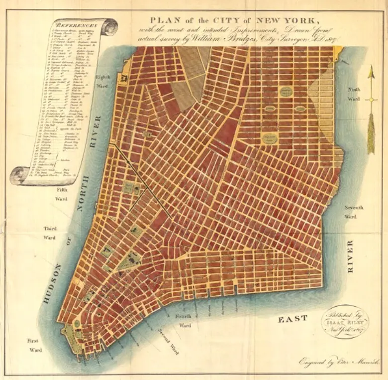
This grid offered practical advantages similar to those found in a page grid. It simplified the division of land into equal blocks, facilitated construction, and made navigation considerably easier. Knowing that streets run in one direction and avenues in another allows a person to estimate their location even in an unfamiliar part of the city. This is comparable to how a reader can anticipate the position of the next paragraph on a well-structured page, based on an understanding of the underlying system rather than conscious analysis.
Architecture extends this principle further. Le Corbusier developed the Modulor system during the twentieth century, a set of measurements based on human body proportions, intended for use in building and furniture design. This bears a notable resemblance to the baseline grid used in typography, where every text element aligns to a consistent unit derived from what is visually comfortable for the human eye. In both cases, the underlying goal is the same: to create a system based on human proportions, producing spaces that feel naturally comfortable rather than arbitrary.
This connection between architecture and typography does not appear to be coincidental. Humans appear to have a consistent psychological need for spatial orientation, whether reading a page or navigating a street. When space follows a predictable pattern, the brain expends less effort determining location or direction. This reduces stress and contributes to a sense of safety, even when the underlying structure is not consciously perceived.
Not every city follows a strict grid, just as not every page does. Many European cities, including Rome and Paris, developed gradually over centuries, with streets shaped by historical circumstance rather than deliberate planning. Such cities can feel atmospheric or distinctive to navigate, but can also feel disorienting, particularly to unfamiliar visitors. This parallels the distinction discussed earlier between a strict Swiss-style layout and a more decorative, complex one. Neither approach is inherently superior; each produces a distinct experience for the person moving through it.
Grid-based cities often face a criticism similar to that directed at grid-based page design, namely that they can feel rigid or impersonal. Critics have noted that an overly strict grid can disregard natural landscape features such as hills, rivers, or coastlines, much as a strict page grid can occasionally feel disconnected from the content it organizes. This may explain why many contemporary urban planners now combine grid structures with more flexible, organic elements, an approach comparable to how modern web designers integrate strict grids with intentional departures from them for visual interest.
In conclusion, whether the subject is a city block or a magazine page, the underlying psychological requirement appears consistent: sufficient structure to provide a sense of orientation and safety, balanced against sufficient flexibility to avoid a sense of confinement. The grid, understood this way, is not merely a design convention but one of the oldest tools used by humans to organize space, whether that space spans a single sentence or an entire city.
How Different Cultures Approach the Grid Differently
This post considers the grid not only as a mathematical structure but also as a cultural choice. The way a design tradition uses grids can reveal something about how that culture understands rules, order, and individual expression.
Switzerland remains the most useful starting point, since modern grid theory originated there. After the First World War, it’s neutrality made it a meeting point for various European artistic movements. From this convergence emerged the Swiss International Style, a movement built almost entirely around the grid. Designers such as Josef Müller-Brockmann regarded a strict, clear grid as more than a practical tool; it represented something closer to a moral position. A clear grid implied honesty, suggesting that the designer was not attempting to manipulate the viewer through unnecessary decoration.
“The use of the grid as an ordering system is the expression of a certain mental attitude inasmuch as it shows that the designer conceives his work in terms that are constructive and oriented to the future.”
Josef Müller-Brockmann, Grid Systems in Graphic Design, 1981
This is consistent with broader aspects of Swiss culture, which is often associated with neutrality, precision, and confidence in systems, evident in punctual trains and precise watchmaking. The strict grid fits naturally within this cultural identity. Order, in this context, is not perceived as restrictive, but as respectful and fair toward the viewer.
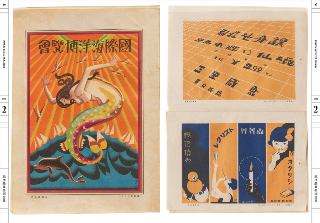
Japanese editorial design offers a useful contrast. Japanese magazines and posters often combine text and images in ways that appear more layered and flexible than the Swiss approach. Vertical and horizontal text frequently appear together on the same page, and images may overlap text in deliberately playful ways. This is not because Japanese designers lack an understanding of grid systems; many demonstrate considerable expertise in this area. Rather, the cultural emphasis on harmony differs from the Swiss preference for highly visible order. Japanese design tends to permit greater visual complexity, provided the overall composition still achieves balance.
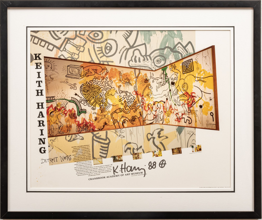
American design culture provides a third example. From the 1980s onward, particularly through schools such as Cranbrook Academy of Art, some American designers deliberately broke grids, as discussed in an earlier post. This did not represent a rejection of structure altogether, but rather treated the grid as something to actively resist. This reflects a broader cultural value placed on individuality and rebellion, evident even in something as specific as magazine layout.
Taken together, these examples suggest a discernible pattern. A culture that values consistency and shared systems, such as Switzerland, tends to produce strict, largely invisible grids. A culture that values harmony and layered meaning, as seen in much of Japanese design, tends to produce more flexible, almost poetic grid structures. A culture that values individual expression and resistance to convention, as in parts of American design history, sometimes treats the grid as something worth deliberately disrupting.
None of these approaches should be considered inherently superior. They represent different responses to the same underlying question: how much order a society wishes to feel, and how much freedom it is willing to allow within that structure.
This distinction is not simply of historical interest; it is also relevant to designers working across global markets. A grid system that feels trustworthy in Switzerland may appear cold or overly rigid elsewhere. A flexible, layered layout that feels balanced in Japan may seem disorganized to someone trained exclusively in Swiss-style principles. Designers working internationally should recognize that a grid is never entirely neutral; it carries cultural meaning, even when this is not explicitly discussed.
In conclusion, every grid reflects, to some extent, the values of the culture that produced it. Strict lines can signal trust and fairness. Flexible layouts can signal harmony and depth. Broken grids can signal freedom and resistance. The structure of a page, in this sense, is never purely formal; it is a quiet expression of how a culture conceives of order itself.
Why a Disorganized Layout Reduces Trust
This post considers a more psychological dimension of grid design: why a well-organized grid tends to increase trust in a brand or website. This is a reaction most people experience without examining it consciously.
Consider visiting a website that feels poorly designed: crowded text, buttons placed inconsistently, elements that fail to align. Most users would trust this website less, even without being able to explain precisely why. This reaction is not arbitrary; it reflects how the brain responds to visual order, or the absence of it.
As discussed in earlier posts, a grid is the underlying structure that determines how elements are arranged on a page. When the grid is well constructed, it typically goes unnoticed; the page simply feels correct. When it is poorly constructed or absent, the result is a subtle discomfort that is difficult to articulate precisely. This effect relates to what researchers call processing ease. Predictable patterns require less cognitive effort to interpret. A page with a clear grid is easier for the brain to process, and this ease is often experienced as comfort. Comfort, in turn, tends to be associated with reliability, even though the two are not logically connected.
This likely explains why banks, airlines, and government websites consistently use strict, simple grids. These organizations need to establish trust quickly, often within seconds of a user arriving on the page. A chaotic layout would generate unease immediately, regardless of whether the underlying information was accurate. A clean grid communicates, implicitly, that the organization is competent and organized.
A frequently cited example is the New York City subway signage system, designed in 1970 by Massimo Vignelli and Bob Noorda. Every sign followed an identical, strict grid: the same typeface, spacing rules, and color palette throughout. Because of this consistency, users could trust the signage immediately, even in stations they had never visited before. In this case, the grid functioned not merely as decoration, but as a mechanism for building confidence in a system relied upon by millions of people daily.
“A system is only as strong as its weakest detail. If the grid is defined, the designer is freed from making decisions and can concentrate on the content.”
Otl Aicher, The World as Design, 1991
Otl Aicher, designer of the Lufthansa identity, expressed a similar view. A strong grid does more than improve appearance; it removes uncertainty. When every component of a system follows consistent logic, users stop attending to minor inconsistencies and can focus on the intended message.
However, not every brand seeks to convey calm reliability through this kind of structure. Some brands aim instead for excitement, rebellion, or youthfulness. For these brands, an excessively neat grid may appear artificial or overly cautious. Streetwear brands, music festivals, and underground publications frequently use broken grids and irregular angles deliberately. This is a strategic choice rather than an error; conveying the message “we do not follow conventional rules” can be precisely the intended effect.
A strict grid is therefore not inherently superior to a looser one; the appropriate choice depends on the impression a brand wishes to create. A bank seeks predictability and safety, and accordingly adopts a tightly controlled grid. A skateboarding brand may seek individuality and resistance to convention, and may therefore avoid that same structure deliberately. Both decisions can be considered effective, though they are designed to produce different psychological responses.
This suggests that a grid functions, in part, as an emotional signal rather than purely a structural tool. Consistency tends to produce a sense of safety, while disorder tends to produce a sense of energy or, depending on context, unease. Designers do not always articulate this explicitly, but the decision to use a tight or a broken grid is, in effect, a decision about how an audience should feel before they read any of the actual content.
From Pixels to Algorithms: The Grid’s Transition to the Digital World
When design moved from the printed page to the screen during the late 1980s and 1990s, it might be assumed that the grid would lose its relevance, given how different screens are from printed pages. In fact, the grid did not disappear; it adapted to a new set of constraints, including variable screen sizes, interactivity, dynamic content, and the pixel as a unit of measurement in place of the millimetre.
Early attempts at digital grids were relatively crude. Web designers in the 1990s used HTML tables, a structure originally intended for displaying data, as a workaround for creating column-based layouts. This produced pages divided into two or three columns with fixed pixel widths. The limitations were considerable: layouts broke on screens narrower or wider than expected, and the structure was largely inaccessible to screen-reader software used by visually impaired users.
Improvements followed gradually. The introduction of CSS in 1996 separated visual presentation from underlying structure, allowing designers to avoid relying on table markup for layout purposes. In the mid-2000s, float-based CSS grid frameworks emerged, most notably Nathan Smith’s 960 Grid System (2008), which divided a 960-pixel-wide page into 12 or 16 equal columns. This represented a significant development, since it gave web designers and print designers a shared conceptual framework for the first time.
The more substantial shift came with Ethan Marcotte’s 2011 book Responsive Web Design, which introduced the concept of the fluid grid. Rather than defining column widths in fixed pixels, Marcotte proposed defining them as percentages of the available space, allowing a layout to adapt automatically to any screen size, from a 320-pixel smartphone to a 2560-pixel monitor. The calculation involved is straightforward: an element’s width is divided by its container’s width to produce a percentage. The broader implication, however, was significant: the grid was no longer a fixed structure, but a flexible system that preserved its proportional relationships at any scale, echoing the same principle used centuries earlier by Villard de Honnecourt and Jan Tschichold, though expressed here in percentages rather than diagonals.
Modern CSS Grid Layout, supported across all major browsers between 2017 and 2018, represents the most advanced version of this system to date. It allows elements to be positioned along both horizontal and vertical axes simultaneously, enabling complex, magazine-like layouts with overlapping elements and asymmetric columns directly within the browser. It also uses the same conceptual vocabulary as print design: columns, rows, gutters, and spanning. In many respects, this represents the fullest realization of Müller-Brockmann’s original vision, a single coherent system of order that applies consistently across different media.
The grid is currently encountering a further development in the form of artificial intelligence. Tools such as Adobe Firefly and Figma’s AI layout features can analyze a collection of text and images and propose a grid-based layout that follows established principles of hierarchy and balance, largely without human intervention. Notably, some studies have found that experienced designers rate these AI-generated layouts as competent, and in some cases superior to human-made alternatives. This raises an important question: if a system can learn the principles of the grid and apply them independently, what role remains for the human designer?
“The grid is not a straitjacket. It is a set of relationships. Understanding those relationships is what makes a designer human, or artificial.”
Ellen Lupton, Thinking with Type, 3rd ed., 2023
A reasonable answer is that the grid was never purely a technical problem to begin with. It originates from elements such as the natural reach of the human arm, a comfortable reading distance, and the eye’s need for rhythm. These are not problems that can simply be optimized away by improved software; they are closer to durable facts about how humans communicate with one another. Understood in this way, the grid is not an outdated design convention, but one of the most enduring tools developed for transmitting an idea from one mind to another.
This concludes the first half of this research series. The following posts extend the discussion of the grid into adjacent fields, including trust, culture, urban planning, and accessibility.
Rules and Rule-Breaking: Editorial Grids and Their Deliberate Destruction
Before examining designers who deliberately broke the grid, it is useful to understand the specific version of the grid they were reacting against: the multicolumn grid developed for newspapers and magazines.
This was a problem that books had never faced: how to present multiple unrelated stories, each with a different length, level of importance, and visual material, on a single page at the same time. The solution was to divide the page into narrow columns that could be combined in different configurations while still forming a coherent visual system. Standard broadsheet newspapers typically use between five and eight columns, while tabloids use between four and six. These figures are not arbitrary. Narrower columns produce shorter lines, which suit the small type sizes typically used in newspapers, usually around 8-9pt. Research by Colin Wheildon, published in Type and Layout (1995), found that body copy set in columns of 35-55 characters per line was read up to 70% more accurately than text set in wider columns. This finding directly informed the column structure used by most major newspapers throughout the twentieth century.
Magazines developed this approach further. Alexander Liberman, who joined Vogue in 1943 and later became its editorial director, built a grid system based on three columns, but allowed images to span across column boundaries to create more dynamic layouts. This technique, known as spanning, in which an element deliberately breaks the column lines to occupy one and a half or two columns, became a defining feature of magazine design. It also introduced a more conceptual innovation: treating text and images as equally weighted modules, rather than treating images as secondary elements placed wherever space allowed. This modular approach is generally recognized as a direct predecessor of the “card” layout widely used in contemporary web and app design.
If the grid functions as an agreed set of rules, then breaking it deliberately becomes its own form of communication. However, this requires a thorough understanding of the grid; without that understanding, the result is simply disorder rather than a meaningful disruption.
The Dada movement of the 1910s and 1920s was the first to use this approach systematically. Designers such as Tristan Tzara and El Lissitzky produced typographic compositions in which text appeared at irregular angles, in inconsistent sizes and weights, seemingly violating every principle of composition. Closer analysis, however, reveals an underlying structure beneath this apparent chaos. The disorder was deliberate rather than accidental, intended to generate a sense of urgency and disruption that matched the political content of the work.
This approach was revived intentionally during the 1980s and early 1990s by designers associated with the Cranbrook Academy of Art, particularly Katherine McCoy and Ed Fella. Their work, frequently described as deconstructivist, treated the grid less as a tool and more as an object of critique. Text was layered, overlapped, and fragmented, while the underlying column structure remained visible, though clearly disregarded. This work drew explicitly on Jacques Derrida’s concept of deconstruction: the grid remained present as a kind of structural ghost, and meaning emerged from the tension between the expected order and the actual disorder presented.
David Carson, art director of Ray Gun magazine from 1992 to 1995, became the most widely recognized practitioner of this approach. In one well-known issue, he set an entire interview with the musician Bryan Ferry in Zapf Dingbats, a typeface composed entirely of symbols and therefore unreadable as text, reportedly because he considered the interview too uninteresting to merit a conventional layout. In this case, the grid was not merely altered but abandoned entirely. Notably, Ray Gun‘s circulation increased during this period, suggesting that in the right cultural context, a complete rejection of the grid can function as an effective communication strategy in its own right.
This post indicates that the grid is best understood not as a binary opposition between order and chaos, but as a stable reference point. Whether a designer constructs a rigid corporate identity or deliberately renders a page unreadable, the grid remains the structure against which both decisions are measured. The next post moves into digital design, examining how the grid was adapted for screens and, more recently, for artificial intelligence.
When the Grid Became a Movement, and Then a Branding Strategy
The term “Swiss design” is often associated simply with minimalism and the typeface Helvetica. However, behind this aesthetic lies a more developed philosophy, one that becomes visible once its principles are understood.
This movement is known as the Swiss International Typographic Style, or simply the Swiss Style, and it developed primarily during the late 1940s and 1950s in Zurich and Basel. Its most significant figures include Josef Müller-Brockmann, Emil Ruder, Armin Hofmann, and Max Bill. What connects these designers is the belief that design should not express the personality of the designer, but should present information as neutrally and clearly as possible. The grid was the primary instrument used to achieve this goal.
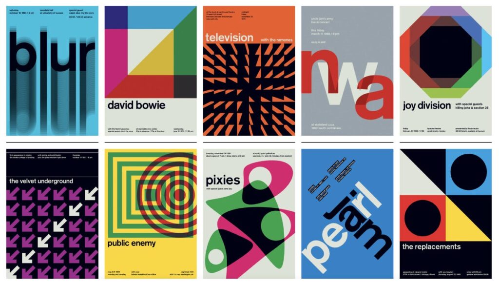
Müller-Brockmann’s concert posters for the Zurich Tonhalle, produced between the 1950s and the 1970s, remain a frequently cited example of this approach: pure geometric shapes, a clear typographic hierarchy, and no decorative elements. Observing these posters closely reveals how deliberate every placement is.
This philosophy produced specific and consistent design choices that are still recognizable today. Designers favored sans-serif typefaces, particularly Helvetica, designed by Max Miedinger in 1957, which effectively became the unofficial typeface of the movement. They also favored flush-left, ragged-right text alignment rather than justified text, along with generous use of white space. These choices were not incidental. Flush-left alignment respects the vertical structure of the column and avoids the uneven word spacing that justified text can introduce.
“The use of the grid as an ordering system is the expression of a certain mental attitude inasmuch as it shows that the designer conceives his work in terms that are constructive and oriented to the future.”
Josef Müller-Brockmann, Grid Systems in Graphic Design, 1981
The influence of the Swiss Style spread considerably, particularly through the magazine Neue Grafik, launched in 1958, which published the movement’s principles simultaneously in three languages. By the 1970s, corporations across Europe and North America, including major airlines and international exhibitions, had adopted Swiss-based grid systems for their visual identities. The grid became a recognizable symbol of professionalism and reliability.
This is the point at which the grid moved beyond aesthetic preference and became closely tied to corporate strategy. Maintaining brand consistency across a wide range of formats, from a small business card to a large billboard, from a digital banner to a lengthy annual report, presents a considerable challenge. At this scale, a grid functions not only as a layout tool, but as the underlying system that holds an entire brand identity together.
A clear example is the signage system designed for the New York City Transit Authority by Massimo Vignelli and Bob Noorda in 1970. Their team developed a strict grid that determined the size, position, and spacing of every piece of information across every subway station, using Helvetica exclusively and a limited color palette. Because the system was so precisely defined, different contractors could produce signage decades apart without introducing visible inconsistency. Vignelli reportedly believed the subway map could remain relevant for a century without requiring revision, a claim that reflects the confidence the system inspired.
Otl Aicher’s identity for Lufthansa, developed during the 1960s and 1970s, extended this approach even further. Aicher produced what is sometimes called a “grid bible,” a document specifying exact measurements for nearly every visual element, including column widths, margins, shadow angles, and the maximum number of font weights permitted in a single document. This level of detail allowed designers across four continents, who had never communicated directly, to apply the Lufthansa identity consistently.
“A system is only as strong as its weakest detail. If the grid is defined, the designer is freed from making decisions and can concentrate on the content.”
Otl Aicher, The World as Design, 1991
This same logic continues today in a digital form. Companies such as IBM publish public design systems, such as IBM’s Carbon Design System, which define a strict grid and consistent spacing units, often based on multiples of 8 pixels. This represents essentially the same principle behind Aicher’s grid bible, simply expressed in code rather than printed specifications.
Grid functions is used not only as an aesthetic choice but as a mechanism for building trust at scale. The next post in this series turns to designers who deliberately broke the grid, and considers why this can be just as effective a form of communication.
Anatomy of a Grid: The Components That Hold It Together
The previous post examined the historical origins of the grid. This post looks at what a grid actually consists of in technical terms. A grid is not a single element but a combination of smaller components: margins, columns, gutters, leading, and the baseline. None of these components are remarkable on their own, but together they determine whether a page feels comfortable or uncomfortable to read.
Margins are often assumed to be simply empty space surrounding the text, but they perform two distinct functions. The first is perceptual: margins give the eye room to approach the text without distraction. The second is physical, and somewhat less expected. Research on ergonomic book design has shown that if the inner margin, the one closest to the spine, is smaller than approximately 12-15mm, a reader’s thumb will tend to cover part of the text while holding the book. Margins, therefore, are not purely a matter of appearance; they also account for how a printed object is physically handled.
The column is the basic vertical unit of a grid, and its width is determined by more than visual preference. Miles Tinker conducted eye-movement studies at the University of Minnesota during the 1950s and 1960s, and found that lines containing between 45 and 75 characters produce the highest reading speed and the lowest fatigue. Lines that are too short interrupt the reader too frequently, while lines that are too long make it difficult for the eye to locate the beginning of the next line. Column width, in this sense, is a calculation based on font size and an ideal character count, rather than a purely aesthetic decision.
The gutter, meaning the space between two columns, requires particularly careful calculation. If it is too narrow, the eye may read across the gap, accidentally merging the final word of one column with the first word of the next. If it is too wide, the columns lose their visual connection and appear as separate, unrelated blocks. In professional design, the gutter is usually calculated as a proportion of the column width, commonly between one-quarter and one-third of the column measure, rather than chosen arbitrarily.
Leading refers to the vertical space between lines of text, and its name originates from the strips of lead that printers once inserted between lines of metal type. When leading is too tight, the ascenders of one line begin to interfere visually with the descenders of the line above, making the text harder to read. When leading is too loose, the lines lose their sense of belonging to the same paragraph. In digital design, the CSS property line-height follows the same underlying principle.
These individual components work together to produce what designers call vertical rhythm: the sense that a page has a consistent, predictable structure from top to bottom. This occurs when the leading of body text, the spacing around headings, and the height of images are all based on the same underlying unit. Jan Tschichold and Josef Müller-Brockmann both argued that this rhythmic quality was not simply a stylistic refinement, but a fundamental requirement for legible communication.

“Perfect typography is certainly the most elusive of all arts. Sculpture in stone alone comes near it in obstinacy.”
– Jan Tschichold, The Form of the Book, 1975.
It means typography is closer to craft than to mechanical specification. Margins, columns, gutters, and leading may sound like small technical details, but even a minor error in one of them can make an entire page feel slightly wrong, in a way that is difficult to describe precisely. The next post examines how this body of technical knowledge developed into an explicit design ideology: the Swiss International Style.
The Invisible Scaffold:Where Grids Come From
In communication design, a grid is the underlying structure that organizes a page. It controls where text is placed, how wide the margins are, and how different elements line up with each other. The grid itself is usually not visible to the reader. It is removed before printing, or it remains hidden beneath the final design. However, its effects are easy to notice. A page that feels calm and easy to read almost always has a careful grid behind it. A page that feels disorganized, even if the reason is not obvious, is usually missing one.
What stands out in this research is how old this idea actually is, much older than graphic design as a profession. Renaissance artists were already interested in mathematical order long before the term “grid” existed. Around 1420, Filippo Brunelleschi established the rules of linear perspective, giving artists a method to construct space on a flat surface using geometry rather than guesswork. This same way of thinking soon influenced book design. Gutenberg’s Bible, printed around 1455, used a two-column layout in which the margins followed strict proportional rules. This can be seen as an early, intuitive version of the column grid, even though the concept had no formal name at the time.
A particularly clear example comes from Villard de Honnecourt, a 13th-century architect. His portfolio, preserved today at the Bibliothèque nationale de France, contains a diagram that shows how to divide a page using diagonal lines. He drew diagonals across the entire page and across the text area at the same time, and the points where these lines crossed determined the corners of the text block. This method required no measuring tools, only geometric construction. The resulting proportions placed the inner margin at roughly one-ninth of the page width, with the outer margin set at double that amount. Designers have continued to use similar ratios for more than seven centuries, since the result feels both economical and visually restful.
The grid did not become a formally theorized practice until the early twentieth century, and the historical context behind this is significant. After the First World War, Switzerland’s neutrality made it a meeting point for artists and intellectuals from across Europe. Russian Constructivism and German Bauhaus principles converged within a single design culture. From this mixture, the grid stopped being merely a practical convenience and became closer to an ideological position. Order was no longer simply attractive; it represented honesty, objectivity, and a form of fairness in how information was presented. It is also during this period that the term “grid” began to be used in the sense that designers use it today.
One point worth emphasizing is that the grid was never intended to eliminate creativity. Josef Müller-Brockmann, author of the foundational text Grid Systems in Graphic Design (1981), was explicit that the grid should be understood as a tool rather than a fixed set of rules:
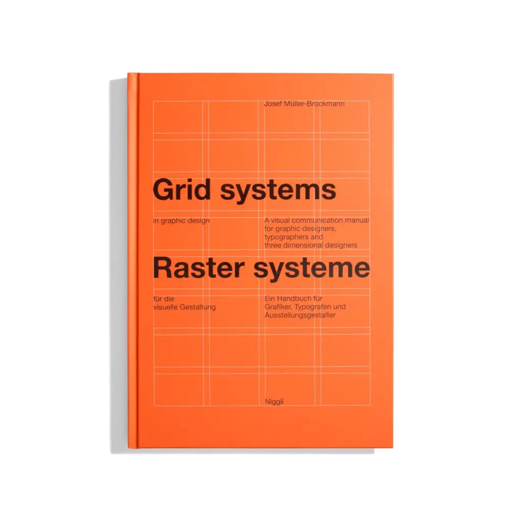
“The grid system is an aid, not a guarantee. It permits a number of possible uses and each designer can look for a solution appropriate to his personal style. But one must learn how to use the grid; it is an art that requires practice.”
– Josef Müller-Brockmann, Grid Systems in Graphic Design, 1981.
This quotation captures a tension that recurs throughout the history of grid theory: the balance between a shared system and individual expression. This is also the question that the next post in this series addresses in more detail, by examining the technical components that make up a grid.