In communication design, a grid is the underlying structure that organizes a page. It controls where text is placed, how wide the margins are, and how different elements line up with each other. The grid itself is usually not visible to the reader. It is removed before printing, or it remains hidden beneath the final design. However, its effects are easy to notice. A page that feels calm and easy to read almost always has a careful grid behind it. A page that feels disorganized, even if the reason is not obvious, is usually missing one.
What stands out in this research is how old this idea actually is, much older than graphic design as a profession. Renaissance artists were already interested in mathematical order long before the term “grid” existed. Around 1420, Filippo Brunelleschi established the rules of linear perspective, giving artists a method to construct space on a flat surface using geometry rather than guesswork. This same way of thinking soon influenced book design. Gutenberg’s Bible, printed around 1455, used a two-column layout in which the margins followed strict proportional rules. This can be seen as an early, intuitive version of the column grid, even though the concept had no formal name at the time.
A particularly clear example comes from Villard de Honnecourt, a 13th-century architect. His portfolio, preserved today at the Bibliothèque nationale de France, contains a diagram that shows how to divide a page using diagonal lines. He drew diagonals across the entire page and across the text area at the same time, and the points where these lines crossed determined the corners of the text block. This method required no measuring tools, only geometric construction. The resulting proportions placed the inner margin at roughly one-ninth of the page width, with the outer margin set at double that amount. Designers have continued to use similar ratios for more than seven centuries, since the result feels both economical and visually restful.
The grid did not become a formally theorized practice until the early twentieth century, and the historical context behind this is significant. After the First World War, Switzerland’s neutrality made it a meeting point for artists and intellectuals from across Europe. Russian Constructivism and German Bauhaus principles converged within a single design culture. From this mixture, the grid stopped being merely a practical convenience and became closer to an ideological position. Order was no longer simply attractive; it represented honesty, objectivity, and a form of fairness in how information was presented. It is also during this period that the term “grid” began to be used in the sense that designers use it today.
One point worth emphasizing is that the grid was never intended to eliminate creativity. Josef Müller-Brockmann, author of the foundational text Grid Systems in Graphic Design (1981), was explicit that the grid should be understood as a tool rather than a fixed set of rules:
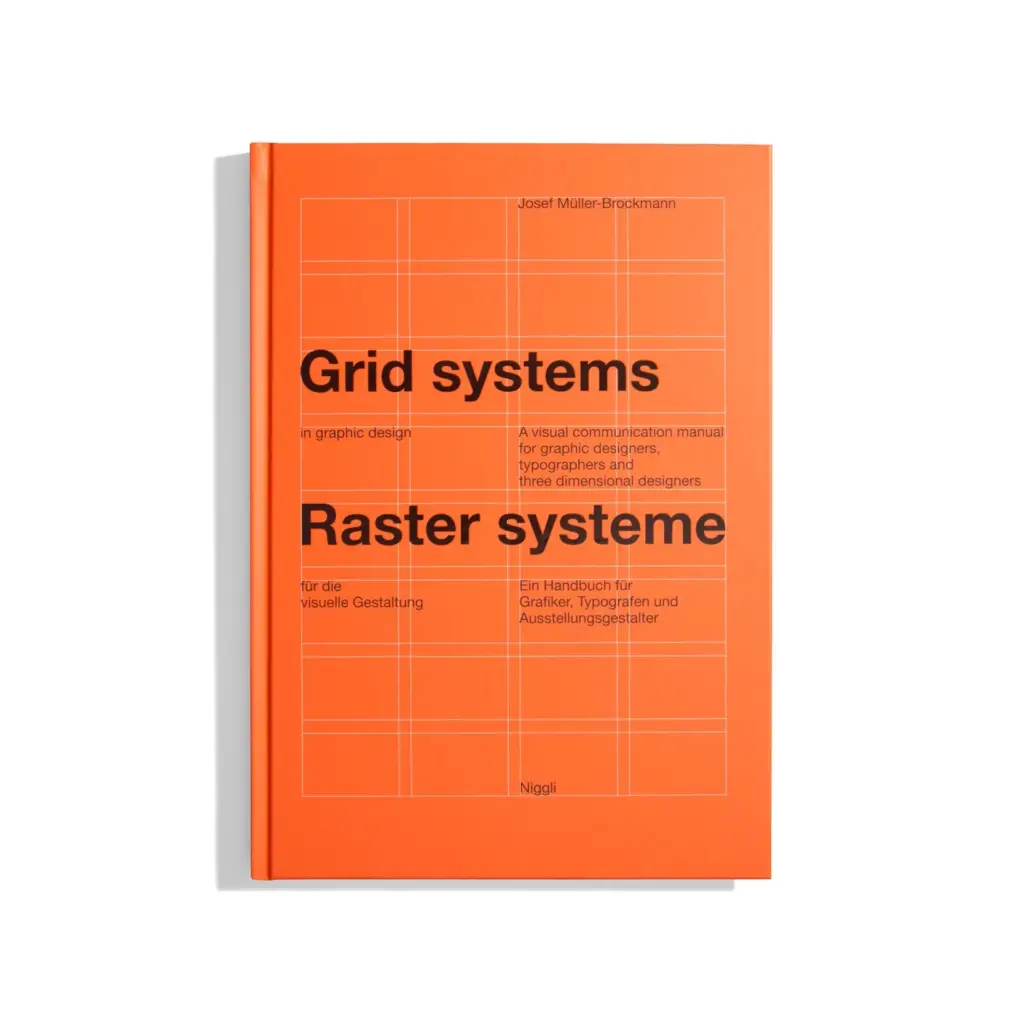
“The grid system is an aid, not a guarantee. It permits a number of possible uses and each designer can look for a solution appropriate to his personal style. But one must learn how to use the grid; it is an art that requires practice.”
– Josef Müller-Brockmann, Grid Systems in Graphic Design, 1981.
This quotation captures a tension that recurs throughout the history of grid theory: the balance between a shared system and individual expression. This is also the question that the next post in this series addresses in more detail, by examining the technical components that make up a grid.
