The previous post examined the historical origins of the grid. This post looks at what a grid actually consists of in technical terms. A grid is not a single element but a combination of smaller components: margins, columns, gutters, leading, and the baseline. None of these components are remarkable on their own, but together they determine whether a page feels comfortable or uncomfortable to read.
Margins are often assumed to be simply empty space surrounding the text, but they perform two distinct functions. The first is perceptual: margins give the eye room to approach the text without distraction. The second is physical, and somewhat less expected. Research on ergonomic book design has shown that if the inner margin, the one closest to the spine, is smaller than approximately 12-15mm, a reader’s thumb will tend to cover part of the text while holding the book. Margins, therefore, are not purely a matter of appearance; they also account for how a printed object is physically handled.
The column is the basic vertical unit of a grid, and its width is determined by more than visual preference. Miles Tinker conducted eye-movement studies at the University of Minnesota during the 1950s and 1960s, and found that lines containing between 45 and 75 characters produce the highest reading speed and the lowest fatigue. Lines that are too short interrupt the reader too frequently, while lines that are too long make it difficult for the eye to locate the beginning of the next line. Column width, in this sense, is a calculation based on font size and an ideal character count, rather than a purely aesthetic decision.
The gutter, meaning the space between two columns, requires particularly careful calculation. If it is too narrow, the eye may read across the gap, accidentally merging the final word of one column with the first word of the next. If it is too wide, the columns lose their visual connection and appear as separate, unrelated blocks. In professional design, the gutter is usually calculated as a proportion of the column width, commonly between one-quarter and one-third of the column measure, rather than chosen arbitrarily.
Leading refers to the vertical space between lines of text, and its name originates from the strips of lead that printers once inserted between lines of metal type. When leading is too tight, the ascenders of one line begin to interfere visually with the descenders of the line above, making the text harder to read. When leading is too loose, the lines lose their sense of belonging to the same paragraph. In digital design, the CSS property line-height follows the same underlying principle.
These individual components work together to produce what designers call vertical rhythm: the sense that a page has a consistent, predictable structure from top to bottom. This occurs when the leading of body text, the spacing around headings, and the height of images are all based on the same underlying unit. Jan Tschichold and Josef Müller-Brockmann both argued that this rhythmic quality was not simply a stylistic refinement, but a fundamental requirement for legible communication.
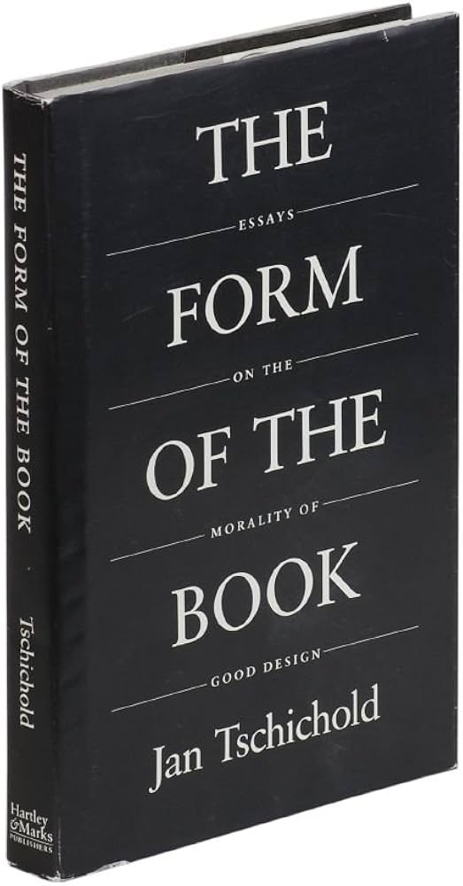
“Perfect typography is certainly the most elusive of all arts. Sculpture in stone alone comes near it in obstinacy.”
– Jan Tschichold, The Form of the Book, 1975.
It means typography is closer to craft than to mechanical specification. Margins, columns, gutters, and leading may sound like small technical details, but even a minor error in one of them can make an entire page feel slightly wrong, in a way that is difficult to describe precisely. The next post examines how this body of technical knowledge developed into an explicit design ideology: the Swiss International Style.
