The term “Swiss design” is often associated simply with minimalism and the typeface Helvetica. However, behind this aesthetic lies a more developed philosophy, one that becomes visible once its principles are understood.
This movement is known as the Swiss International Typographic Style, or simply the Swiss Style, and it developed primarily during the late 1940s and 1950s in Zurich and Basel. Its most significant figures include Josef Müller-Brockmann, Emil Ruder, Armin Hofmann, and Max Bill. What connects these designers is the belief that design should not express the personality of the designer, but should present information as neutrally and clearly as possible. The grid was the primary instrument used to achieve this goal.
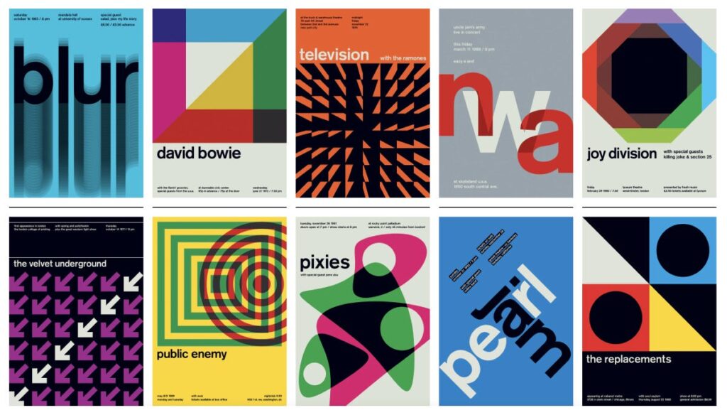
Müller-Brockmann’s concert posters for the Zurich Tonhalle, produced between the 1950s and the 1970s, remain a frequently cited example of this approach: pure geometric shapes, a clear typographic hierarchy, and no decorative elements. Observing these posters closely reveals how deliberate every placement is.
This philosophy produced specific and consistent design choices that are still recognizable today. Designers favored sans-serif typefaces, particularly Helvetica, designed by Max Miedinger in 1957, which effectively became the unofficial typeface of the movement. They also favored flush-left, ragged-right text alignment rather than justified text, along with generous use of white space. These choices were not incidental. Flush-left alignment respects the vertical structure of the column and avoids the uneven word spacing that justified text can introduce.
“The use of the grid as an ordering system is the expression of a certain mental attitude inasmuch as it shows that the designer conceives his work in terms that are constructive and oriented to the future.”
Josef Müller-Brockmann, Grid Systems in Graphic Design, 1981
The influence of the Swiss Style spread considerably, particularly through the magazine Neue Grafik, launched in 1958, which published the movement’s principles simultaneously in three languages. By the 1970s, corporations across Europe and North America, including major airlines and international exhibitions, had adopted Swiss-based grid systems for their visual identities. The grid became a recognizable symbol of professionalism and reliability.
This is the point at which the grid moved beyond aesthetic preference and became closely tied to corporate strategy. Maintaining brand consistency across a wide range of formats, from a small business card to a large billboard, from a digital banner to a lengthy annual report, presents a considerable challenge. At this scale, a grid functions not only as a layout tool, but as the underlying system that holds an entire brand identity together.
A clear example is the signage system designed for the New York City Transit Authority by Massimo Vignelli and Bob Noorda in 1970. Their team developed a strict grid that determined the size, position, and spacing of every piece of information across every subway station, using Helvetica exclusively and a limited color palette. Because the system was so precisely defined, different contractors could produce signage decades apart without introducing visible inconsistency. Vignelli reportedly believed the subway map could remain relevant for a century without requiring revision, a claim that reflects the confidence the system inspired.
Otl Aicher’s identity for Lufthansa, developed during the 1960s and 1970s, extended this approach even further. Aicher produced what is sometimes called a “grid bible,” a document specifying exact measurements for nearly every visual element, including column widths, margins, shadow angles, and the maximum number of font weights permitted in a single document. This level of detail allowed designers across four continents, who had never communicated directly, to apply the Lufthansa identity consistently.
“A system is only as strong as its weakest detail. If the grid is defined, the designer is freed from making decisions and can concentrate on the content.”
Otl Aicher, The World as Design, 1991
This same logic continues today in a digital form. Companies such as IBM publish public design systems, such as IBM’s Carbon Design System, which define a strict grid and consistent spacing units, often based on multiples of 8 pixels. This represents essentially the same principle behind Aicher’s grid bible, simply expressed in code rather than printed specifications.
Grid functions is used not only as an aesthetic choice but as a mechanism for building trust at scale. The next post in this series turns to designers who deliberately broke the grid, and considers why this can be just as effective a form of communication.
