Individual Colours in a Cultural Comparison: The colour BLACK

In human culture, black is one of the most potent and paradoxical colours. It can embody supreme authority, profound mystery, intense sorrow, or stark simplicity. Like the absence of light, black absorbs every wavelength, forming a void that causes both fear and fascination. This post investigates the concept of black across various domains, including history, religion, and daily culture, as well as examining significant cultural differences between Europe/USA, East Asia, and other areas.

History

Black’s journey starts with fundamental materials: charcoal, soot, and burnt ivory formed some of the earliest pigments used by humans in Palaeolithic cave art dating back to around 30,000 BCE. In ancient Egypt, the colour black represented the fertile soil of the Nile and resurrection; Osiris, the underworld god, was depicted with black skin as a symbol of renewed life. Black kohl eyeliner was employed by pharaohs for safeguarding and to gain the favour of the divine.

During the classical periods of Greece and Rome, the colour black came to have two meanings. Philosophers put on black coats as symbols of wisdom and detachment, whereas Roman magistrates wore black togas in mourning. In medieval Europe, the colour black was raised as a symbol of power: nobles and priesthood wore luxurious fabrics made from velvet and silk that were dyed with expensive gallnut and iron, resulting in deep, enduring blacks. During the Renaissance, black emerged as the peak of fashion – it was put on by Spanish nobility and Italian traders to signify wealth, moderation, and refinement.

In Asia, the colour black took various directions. In the context of Five Elements theory in imperial China, black symbolized water and was linked to the north, winter, and the potency of the unknown. Warrior attire and ceremonial robes often incorporated black to symbolize strength and mystery. Black polished armour was highly valued by Japanese samurai, as it was associated with resilience and the void of Zen philosophy.

Due to Victorian mourning customs, black became the universal grief colour in the West, and in the 20th century, the “little black dress” turned it into a symbol of timeless elegance. Today, the colour black is prevalent in minimalist design, technology branding, and high fashion.

Religion

Black is filled with significant spiritual significance in various traditions, frequently associated with mystery, judgment, and transformation.
In Christian symbolism, the colour black represents death, sin, and penitence. During funerals and on Good Friday, priests put on black attire, while demons and hellfire are portrayed against black backdrops in medieval art. But black also signifies humility, as monastic robes highlight a separation from worldly vanity.

In the context of Islam, the colour black has a multifaceted meaning. The Kiswah, a black silk cloth embroidered with gold, drapes the Kaaba in Mecca and symbolizes the divine mystery and unity of God. A sacred relic is the Black Stone set into its corner. Nevertheless, certain extremist parties have also employed black flags, resulting in unfavourable contemporary associations.
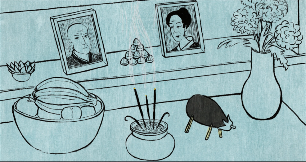
In the context of East Asian Buddhism, black is associated with developing emptiness and ultimate wisdom. The black robes worn by Zen monks symbolize the void from which enlightenment arises. In Chinese folk religion, black paper offerings serve as guides for spirits during ancestral rites, connecting the world of the living with the afterlife.

In Hinduism, the colour black is linked to Kali, the ferocious mother goddess of time, destruction, and regeneration. Her black skin signifies the absorption of all colours into herself, embodying both fear and ultimate protection.

Everyday Culture

Daily life in the West embraces the flexibility of black. It occurs in professional dress – black suits convey authority, competence, and self-control in business environments. Fashion positions black as always in style: the “LBD” continues to be a wardrobe essential. While black coffee embodies raw power, black smartphones and cars are symbols of polished modernity.
However, black also brings to mind fear. Terms such as “black magic,” “blacklist,” and “black market” have evil meanings. Threats that lurk in horror films are represented by black shadows, which strengthens their connection to the unknown.

In East Asia, the colour black represents authority and cleverness. In Chinese business culture, black suits and pens are preferred for meetings, as they are linked to dignity and the depth of water. Japanese fashion enhances the colour black with iro-iro (subtle dark tones) found in kimonos and streetwear. Calligraphy is dominated by black ink, representing a disciplined mastery.

Contrast to Europe/USA

In Europe and the USA, black is mainly associated with sophistication, authority, and mourning. Black suits are dominant at weddings, funerals, and in boardrooms, combining a sense of formality with emotional detachment. The culture surrounding the “little black dress”, praises its elegant versatility and slimming effect. However, widespread negative expressions such as “black mood” and “black day” link it to disaster and depression.
In East Asian contexts, the colour black is associated with strength, depth, and philosophical significance. In China, the colour black represents a strong power and mystery, being used in luxury brands and official uniforms rather than in everyday attire. Japanese black embodies Zen restraint, as seen in calligraphy, ink wash paintings and formal attire, where disciplined simplicity is favoured over Western loudness. Black steers clear of potent grief connections and concentrate on resilience instead.

Islamic cultures contribute a sacred mystery. The Kaaba’s black cloth raises it above associations with mourning, symbolizing divine unity. Western designers may choose for matte black in a minimalist style, not realizing that it evokes associations with sacred architecture for certain observers.
These differences pose actual dangers. While a Western brand’s elegant black packaging carries premium quality worldwide, it may come off as excessively serious or evocative of a funeral in informal Asian settings. For Western viewers expecting villainy, a Chinese film that employs black shadows to convey heroic weight may come across as a sinister menace. Filmmakers have to manage these layers: while black’s universal absorption gives it emotional weight, it is also culturally specific.

Conclusion

Black goes beyond basic classifications – absence or strength, sorrow or sophistication, wrongdoing or knowledge. It has embraced the most thoughtful contradictions of humanity, ranging from prehistoric coal to contemporary minimalism. For designers and filmmakers worldwide, black requires precision: Western restraint meets Asian depth, while sacred unity tempers ominous shadows. Misuse can lead to a chilling aloofness or accidental despondency, while mastery reveals an authoritative presence that transcends borders. Grasping the multiplicity of black culture changes its role from that of a standard setting to that of an intentional emotional power.

Quelle:​​
Color Psychology. Black: Meaning and emotional impact. https://www.colorpsychology.org/black/
ReligionFacts. Black in world religions. https://religionfacts.com/black
Kokoon Silks. Cultural color symbolism in Asia. https://www.kokoonsilks.com/blogs/news/cultural-color-symbolism-in-asia-the-meaning-behind-timeless-shades
Adobe. Sind Schwarz und Weiß Farben? https://www.adobe.com/at/creativecloud/design/discover/is-black-a-color.html
Britannica. Black colour: symbolism and cultural meaning. https://www.britannica.com/art/black-color

Individual Colours in a Cultural Comparison: The colour GREEN

Green is among the most complicated colours across global cultures. It can represent life, healing, and hope, but also poison, envy, or something creepy. Positioned between warm yellow and cool blue, it can feel natural and calming in some situations, while appearing artificial or unsettling in others. This text examines the concept of green throughout history, religious contexts, and daily culture, focusing on the distinctions between Europe and the USA, East Asia, and the Islamic world.

History

Since ancient times, green has been associated with nature and growth. In ancient Egypt and Mesopotamia, green minerals like malachite adorned jewellery, cosmetics, and wall paintings, symbolizing fertility, rebirth, and the life-giving forces of rivers and agriculture. In ancient Rome, the colour green was linked to youth, love, and Venus, as well as to chariot racing factions, imbuing it with meanings of vitality, competition, and social identity.

During the Middle Ages in Europe, green was a favoured colour, although it was hard to create. As stable green dyes and pigments were uncommon, fabrics and paintings frequently faded or changed over time. Green symbolized spring, love, youth, and changeability, as well as the supernatural. In medieval literature, figures clad in green could embody romance, mischief, or danger, illustrating the colour’s association with both safety and risk. During the 18th and 19th centuries, synthetic greens like Scheele’s green and Paris green became popular, yet many were highly toxic because of their arsenic content. The legacy of “beautiful but dangerous” continues today with the use of yellow green to indicate poison or radiation.

In the 20th century, the meaning of green changed due to safer pigments and growing environmental awareness. It turned into a visual shorthand for nature, ecology, and sustainability. Green was adopted by parks, recycling symbols, organic food labels, and environmental movements to suggest harmony with the natural world. Branding and graphic design increasingly turned to green as a symbol of freshness, health, and ethical responsibility.

Religion

Religion imbues the colour green with a robust spiritual significance, although interpretations differ greatly.
In Christianity, the colour green is used during “Ordinary Time” in the liturgical calendar, representing growth, hope, and gradual spiritual development rather than dramatic change. To suggest tranquillity, divine guardianship, and the notion of a renewed Eden, Christian art frequently situates biblical depictions within verdant settings.

Green is particularly esteemed in Islam. Paradise is depicted in the Qur’an as a realm of verdant gardens, green cushions and garments, with subsequent traditions associating this colour with the Prophet Muhammad. Consequently, the colour green is often seen in flags, mosque adornments, and religious calligraphy. In numerous cultures where Muslims are the majority, green is imbued with sacredness or deep respect and cannot be considered a neutral design option.

In East Asia, green and blue often share linguistic boundaries, but the symbolism of green is distinct. Within the framework of Chinese Five Elements theory, the colour green blue is associated with wood and springtime, symbolizing growth, energy, and renewal. Subtle greens dominate gardens, tea ceremonies, and traditional arts in Japan, symbolizing calmness, humility, and respect for natural cycles and impermanence.

Everyday Culture

In the context of Western daily culture, green is seen as very adaptable. On the positive side, it is linked with health, sustainability, and nature. Brands of organic foods, outdoor products, and green energy companies – as well as environmental political movements – depend on the colour green to signify naturalness and accountability. Traffic lights emphasize green as a symbol of permission and progression, whereas darker greens in fashion and interior design evoke feelings of stability, tradition, and subtle sophistication.

Nevertheless, Western idioms convey negative connotations. Expressions such as “green with envy” or “greenhorn” connect the colour to jealousy and lack of experience. In horror and science-fiction films, games, and visual effects, sickly yellow greens are commonly employed to imply poison, disease, or contamination. Neon green illumination is often a sign of something unnatural, toxic, or extraterrestrial.

In East Asia, green is deeply associated with food, health, and refinement. Green tea, matcha, and leafy vegetables contribute to its association with balance and well-being, leading many food and cosmetic brands to use green as a sign of gentle, natural advantages. Muted, desaturated greens are favoured in traditional arts over bright tones. However, certain symbols hold significance: in Chinese culture, a “green hat” suggests that a man’s partner is cheating on him, rendering it a strong social taboo despite the generally positive connotations of green.

In the Middle East and North Africa, green is frequently seen in flags, textiles, and shop signage. It often encompasses the meanings of national identity, prosperity, hope, and religious devotion. Combining deep greens with gold or red can evoke sensations of both the earthly and the spiritual. Green can lend an air of dignity or solemnity to everyday designs due to its religious connotations.

Contrast to Europe/USA

In Europe and the USA, green is mainly associated with nature, health, and environmental responsibility. “Going green” suggests ethical advancement and sustainability. However, certain shades can still imply feelings of jealousy, lack of maturity, or harmfulness, particularly in visual narratives.
In Islamic contexts, the same shade of green may hold sacred or political significance, evoking notions of paradise, religious history, or national pride. Designers who regard green as a purely neutral eco-colour may unintentionally evoke deeper associations.
In East Asia, the colour green is more often associated with notions of refined health, renewal, and cultivated taste than with overt environmental activism. Nonetheless, symbols that are specific to a culture can transform its meaning completely. A design decision that seems innocuous to Western audiences may embody humour, shame, or taboo in other contexts.
These contrasts play a crucial role in global design, branding, and film. The meaning of green varies across cultural contexts, rendering it one of the colours most sensitive to emotion and symbolism.

Conclusion

Green represents much more than just the hue of vegetation. Throughout history, it has symbolized fertility, renewal, and hope, as well as poison, jealousy, and danger. While religions imbue it with concepts of paradise, progress, and divine approval, daily cultures exploit it for a wide range of things, from healthful tea to radioactive slime. For filmmakers and designers, green is a potent yet double-edged tool. When used with care, it conveys a sense of balance, healing, and renewal; however, when used carelessly, it can imply illness, envy, or unintended religious connotations. By comprehending these layers, green can communicate clearly and respectfully with a variety of audiences.

Quelle:
Wikipedia Contributors. Green. Wikimedia Foundation. https://en.wikipedia.org/wiki/Green​​
Pravossoudovitch, K., Cury, F., & Young, S. G. (2014). Is green the colour of good health? Frontiers in Psychology, 5, Article 1237. https://pmc.ncbi.nlm.nih.gov/articles/PMC4123920/​​
Color Psychology. Green: Meaning, symbolism & branding tips. https://www.colorpsychology.org/green/
Semiology.net. Green – Colors and Symbolism. https://semiology.net/colors/green/
Soho in China. What Does the Color Green Symbolize in Chinese Culture? https://www.sohoinchina.com/what-does-the-color-green-symbolize-in-chinese-culture/

Individual Colours in a Cultural Comparison: The colour BLUE

History:

In the past, blue was one of the rarest natural pigments and thus a luxury colour that represented scarcity and divinity. Around 2600 BCE in ancient Egypt, Egyptian blue – made from copper and silica – was reserved for pharaohs and deities on temple walls and sarcophagi, symbolizing the heavens and the life-giving waters of the Nile. This synthetic dye made its way to Mesopotamia, where it decorated royal palaces and established blue as a symbol of authority and celestial order.

During the Middle Ages in Europe, ultramarine, sourced from Afghan lapis lazuli, was more expensive than gold and was used for the Virgin Mary’s robes in religious artwork to symbolize purity and divine favour. Masters of the Renaissance, such as Titian, spent vast amounts on it, raising blue from an earthly dye to the status of a sacred treasure. Meanwhile, in China during the Song dynasty (10th–13th centuries), blue took on a different evolution, with cobalt-based porcelain glazes representing immortality and the expansive sky, impacting the global ceramics trade through the Silk Road.

From the 13th century onward, artisans from Persia and the Ottoman Empire in the Islamic world refined turquoise blues for mosque tiles, associating the hue with paradise gardens and spiritual safeguarding from malevolent forces. The historical threads of rarity in the West and harmony with nature in the East establish blue’s dual path as both elite and eternal.

Religion:

The colour blue bears deep spiritual significance in various religions, frequently connecting the earthly and heavenly domains.
In Christian iconography of Mary, blue predominates, as seen in the Virgin Mary’s cloak of deep ultramarine, which represents her celestial purity and status as queen of heaven. Blue-tinted glass in Gothic cathedrals is meant to represent heavenly light coming through the heavens, bolstering faith and transcendence.

In Islam, blue is exalted as the colour of paradise, as reflected in the tiles of the Dome of the Rock and the robes of Sufi whirling dervishes, symbolizing boundless divine wisdom and safeguarding. The blue beads known as the “evil eye” (nazar) repel jealousy, merging elements of folk religion with Quranic principles of humility before Allah.

In both Hinduism and Buddhism, blue represents the infinite. Krishna’s blue skin represents his godly and all-encompassing essence, whereas in Tibetan Buddhism, the Medicine Buddha’s lapis lazuli form embodies healing through compassion. In Japanese Shinto, blue symbolizes purity and is linked to the sea kami; it is employed in shrine architecture to evoke a sacred calm.

These applications underscore blue’s global significance in evoking the transcendent, although the Western focus tends to favour maternal sanctity, in contrast to Eastern perspectives of cosmic boundlessness.

Everyday Culture:

In the West, blue is regarded as a fundamental element of trust and calm in everyday life. It is used for logos by corporate giants such as IBM and Facebook, capitalizing on connections to reliability and professionalism. Originating in 19th-century America, blue jeans embody a sense of casual freedom, while blue skies and oceans give rise to expressions such as “feeling blue,” which denotes mild sadness.

In East Asia, blue represents intellect and calmness while avoiding excess. In Chinese culture, it is associated with the wood element and spring, manifesting in contemporary fashion and technology (such as Huawei blues) to symbolize harmony. The Japanese term “ao” (blue-green) brings together the sky and sea in haiku, as well as in uniforms, fostering concentration in tea ceremonies and workplaces.

The practicality characteristic of the Middle East comes to the fore: turquoise robes and buildings reflect sunlight and evoke a sense of protection. In hot climates ranging from Morocco to India, homes painted blue remain cool, serving both practical and spiritual protection purposes. In Egypt, blue faience is employed in jewellery symbolizing eternal life, reflecting pharaonic heritage.

Contrast to Europe/USA:

In Europe and the USA, blue is seen through a lens of calm rationality and corporate security: skies signal freedom and oceans depth, but overuse suggests cold detachment or melancholy, as in blue-collar worker stereotypes or “blue laws” limiting vice. In advertising, cool blues are used for technology and finance to foster trust; however, a saturated navy can come across as authoritarian, reminiscent of police uniforms.

East Asian interpretations slightly reverse this to focus on vitality and protection. In China, blue ties to immortality and exams (success in scholarly pursuits) are seen in auspicious pairings with red rather than dominating alone. In Japanese culture, “deep blue” is esteemed for its unwavering strength, akin to samurai legends, while Western ideals juxtapose emotional detachment with disciplined determination.

The Middle East and North Africa infuse mystical defence: blue nazar amulets abound to ward off misfortune, while vibrant turquoise markets thrum with vitality, in contrast to the subdued corporate blues of Europe. Western designers find a calming blue interface to be globally pleasing, but it may come off as impersonal in Asian contexts centred on relationships or excessively spiritual in Islamic markets. While a Chinese movie may envelop its heroes in azure for their heroic fate, Hollywood drains the blue from shadows to evoke noir suspicion—showcasing how a single colour can represent protection, wisdom, and seclusion.

Conclusion:

Blue’s evolution from an expensive pigment to a widely recognized symbol showcases its chameleon-like qualities: in the West, it embodies heavenly luxury; in the East, protective infinity; and in Islamic traditions, practical spirituality. Designers have to work their way through these layers: Western blues provide rational comfort, Asian blues energize in a subtle way, and Middle Eastern blues offer a vibrant protection. Errors such as all-blue wedding invitations could dampen European celebrations or conflict with the joyful Chinese reds. When creators respect the context, blue transforms from a backdrop into an emotional bridge, resonating across cultures without causing an unintended chill.

Quelle:
Arts Artists Artwork. “History of the Colour Blue in Art.” ArtsArtistsArtwork.com. https://artsartistsartwork.com/history-of-the-colour-blue-in-art/.​
Interaction Design Foundation: Color Theory Basics – https://www.interaction-design.org/literature/topics/color-theory
Nicholas Wells: Colour Symbolism Blue – https://nicholaswells.com/blogs/blog/colour-symbolism-blue
Color Meanings: Blue in Different Cultures – https://www.color-meanings.com/blue-color-symbolism/
Spiritual Marker. Blue: Meaning, symbolism & psychology. https://www.spiritualmarker.com/color-blue-spiritual-meaning-symbolism-psychology/

Basics of the Colour Theory

The fundamental basis for comprehending the interplay of colours, their impact on perception, and their role in emotional shaping across design, film, art, and daily visual communication is colour theory. It has developed from Newton’s prism experiments in 1666 to contemporary digital uses, offering a systematic method for forecasting and utilizing the power of colour. In this extensive blog post, we take a closer look at the fundamental tenets of the subject – from physics and wheels to psychological and cultural dimensions – providing creators who work across different mediums, particularly in cross-cultural scenarios such as film, with useful perspectives.

The Origins and Evolution of Colour Theory

The beginnings of colour theory can be traced back to scientific investigation. Newton showed that white light divides into a spectrum through prisms, establishing the basis for the colour wheel – a circular organization of hues derived from their mixing connections. Subsequently, figures such as Johann Wolfgang von Goethe underscored the importance of subjective perception in his 1810 Theory of Colours. He contended that emotional reactions to colour stem from contrasts with black and white rather than solely from wavelengths.
During the 19th century, experts such as Michel Eugène Chevreul honed subtractive mixing techniques for textiles and prints, impacting Impressionist artists like Claude Monet. Today, digital tools leverage these foundations, merging physics and psychology to direct everything from UI design to cinematic grading.

Mastering the Colour Wheel

At its heart, the traditional colour wheel uses the RYB (Red-Yellow-Blue) pigment model. Primaries – red, yellow, blue – cannot be mixed from others. Secondaries emerge from pairs: red + yellow = orange, yellow + blue = green, blue + red = violet. Tertiaries like red-orange or blue-green bridge them, creating a 12-spoke circle.

This tool reveals key relationships:

  • Analogous: 3–5 adjacent hues (e.g., blue-green, blue, blue-violet) for serene unity, evoking ocean waves or forest canopies.
  • Complementary: Direct opposites (red-green, blue-orange) for maximum tension and vibrancy, perfect for action scenes.
  • Triadic: Evenly spaced (red, yellow, blue) for balanced energy.

Filmmakers like Wong Kar-wai use analogous palettes in In the Mood for Love for nostalgic intimacy, while complementary clashes in The Matrix heighten digital unease.

Additive and Subtractive Colour Models

The mixing of colours varies depending on the context. The additive (RGB) method begins with black, stacking red, green, and blue light – when they fully overlap, white is created. This applies to screens, where pure RGB results in cyan, magenta, yellow, and white for vibrant displays.
Subtractive (CMYK) starts with a white paper base, employing cyan, magenta, yellow, and black inks to absorb light. When all approximates are mixed, the result is black. This colour is suitable for printing, but without the addition of black (K), it lacks depth and can become muddled. A frequent mistake: designs created in RGB format appear dull when printed in CMYK. Cross-medium creators experiment with both aspects, making sure that a film’s poster reflects its on-screen intensity.

Core Colour Attributes

Three properties define every hue:

  • Hue: The colour’s identity (e.g., crimson vs. navy).
  • Value: Lightness/darkness. Tints (white added) brighten for hope; shades (black added) darken for drama.
  • Saturation: Purity vs. greyness. High-saturation reds pulse with urgency; desaturated ones suggest decay or memory.

Temperature adds dynamism: warms (reds, yellows) advance, energizing viewers; cools (blues, violets) recede, calming spaces. In Chinese cinema, saturated reds amplify communal joy during festivals, contrasting Western uses for isolated passion.

Advanced Harmonies and Schemes

Build cohesive palettes with proven schemes:

  • Monochromatic: Variations of one hue (e.g., navy to sky blue) for elegance, as in Apple’s branding.
  • Split-Complementary: A hue plus the two neighbours of its complement (blue with yellow-orange, orange) for contrast without harshness.
  • Tetradic: Two complementary pairs (red-green, blue-orange) for rich complexity, risking chaos if values don’t align.

Optical illusions like simultaneous contrast – where a grey square lightens against black – show context alters perception. Filmmakers exploit this: gradually desaturating a scene signals emotional decline.

The Psychology of Colour

Humans developed quick colour responses. Red stimulates adrenaline, associated with blood and ripeness; yellow grabs attention the fastest but strains the eyes; blue reduces heart rates, reminiscent of skies and water. These universals are layered with culture: in the West, white symbolizes purity (as seen in wedding dresses), while in East Asian traditions, it is associated with death [conversation history].
Context is paramount – a red rose symbolizes love, but blood signifies violence. In movies, colour palettes evoke feelings: In Schindler’s List, a red coat stands out in the black-and-white nightmare, drawing intense attention.

Cultural Symbolism in Global Design

Culture is not overlooked by any theory. Your series on white and yellow emphasizes this point: in China, yellow conjures images of imperial power, while in the West, it suggests cowardice. In Chinese New Year films, Red celebrates, but in thrillers, it warns. Creators from around the world investigate local codes – Netflix customizes posters according to region to align with emotional expectations.
Accessibility is important as well: colour-blind viewers (which includes 8% of men) require adequate contrast, following WCAG standards.

Tools and Practical Workflows

Begin with Adobe Colour or Coolors for generation based on a wheel. Use DaVinci Resolve to examine films on a frame-by-frame basis for palette mapping. Evaluate under D50 illumination for precision. Thumbnail sketches, digital mocks, and physical prints are to be iterated.
In the case study, it is noted that Zhang Yimou’s Hero employs chapters marked by colours (red for passion, blue for peace) to add depth to narrative emotions, merging Chinese symbolism with universal harmonies.

Bringing It All Together

Colour theory enables creators to use colours intentionally rather than at random. Spanning science, art, and emotion, it connects everything from Newton’s wheel to AI palettes. Experiment with boldness: combine a warm analogous scheme with cool accents to create tension or desaturate complements for a more subtle effect. In the realm of cross-cultural cinema, such as the comparison of Hollywood reds to wuxia golds, theory uncovers the ways in which traditions can enhance or undermine emotions.
Once you master these fundamentals, colours can become allies in storytelling, evoking feelings of joy, dread, or nostalgia with precision. Whether crafting a poster or evaluating a masterpiece, intentionality transforms visuals into emotional experiences that transcend borders.

Quelle:
Adorama. “How to Utilize the Adobe Color Wheel.” Adorama Learning Center. https://www.adorama.com/alc/adobe-color-wheel/.
Pixflow. “The Matrix Green Color Scheme: Symbolism, Impact & Meaning.” https://pixflow.net/blog/the-green-color-scheme-of-the-matri
Interaction Design Foundation. Color Theory: The Ultimate Guide. https://www.interaction-design.org/literature/topics/color-theory
Smashing Magazine. Color Theory for Designers: The Meaning of Color. https://www.smashingmagazine.com/2010/01/color-theory-for-designers-part-1-the-meaning-of-color/
Creative Bloq. Colour theory: a complete jargon-free designer’s guide. https://www.creativebloq.com/colour/colour-theory-11121290

Individual Colours in a Cultural Comparison: The colour YELLOW

History:

Yellow is among the oldest pigments known to humanity, featuring in prehistoric cave paintings at Lascaux and other locations, where early artists utilized yellow ochre sourced from natural earth minerals. Yellow was considered blessed in Ancient Egypt, as it was thought that the gods’ bones and skin were made of gold. To draw nearer to the divine, priests would sometimes paint their skin yellow. Yellow pigments such as ochre and the risky yet vibrant orpiment were widely employed in tomb paintings, with women frequently illustrated as having yellow or golden skin to set them apart from men.

During the time of Imperial China, yellow was regarded as the most prestigious colour. In the context of Chinese Five Elements theory, it was linked to the element “earth” and represented stability, equilibrium, and being at the centre of the cosmos. Starting with the Tang dynasty (7th century), yellow became the emperor’s exclusive colour – only he was allowed to wear it, and yellow-glazed roof tiles adorned imperial palaces. Commoners who are found using the colour could incur harsh punishments.

During the Middle Ages in Europe, yellow’s standing changed significantly. Although it was initially advantageous due to its resemblance to gold and its use in heraldic symbols, from the Late Middle Ages it began to develop negative connotations related to envy, heresy, and betrayal. In 1415, when the Czech reformer Jan Hus was found guilty of heresy, he was adorned in yellow robes for his execution. In France, houses of traitors were occasionally painted yellow, and those accused by the Spanish Inquisition put on yellow robes as a public indication of their guilt. This signified yellow as a hue of disgrace and dishonour in the Western psyche.

Religion:

Yellow carries deep yet divergent significances in different religious traditions.
Yellow, especially saffron, holds the greatest symbolic significance in Buddhism. The robes of saffron hue, worn by criminals before, were chosen by Gautama Buddha to symbolize humility and a distancing from the materialist society. The hue symbolizes giving up, lack of desire, wisdom, and the “middle path” to enlightenment. Yellow is associated with the earth element as well, representing rootedness and composure. In the context of Chinese Buddhism, yellow symbolizes freedom or a release from grief.

In the context of Hinduism, yellow symbolizes knowledge, education, and enlightenment. It is the hue of Vishnu, the god who preserves the cosmos, and symbolizes prosperity and harmony. During sacred festivals such as Holi, yellow is donned as a symbol of celebration and receptiveness to divine light. The yellow-coloured turmeric is deemed a sacred herb.

Yellow’s history in Christianity is more ambivalent. Although it can represent the divine presence and God’s light, it became closely linked to Judas Iscariot, who was portrayed wearing yellow garments in medieval art – even though this is not described in the Bible. Through this visual tradition, yellow became firmly linked to treachery, avarice (the hue of gold coins), and timorousness in Christian iconography.

Everyday Culture:

In the context of daily life in the West, yellow has two meanings. Positively, it symbolizes sunshine, happiness, optimism, and visibility – hence its application in taxis, school buses, and cheerful decorations. Nonetheless, yellow is also heavily associated with caution and warnings: it is used in traffic lights, hazard signs, and safety gear due to its high visibility.

Language continues to carry these negative implications: in English, to label someone as “yellow” is to suggest they are cowardly, a usage rooted in the colour’s past links with fear and betrayal. In certain Central European cultures, such as that of the Czech Republic, yellow is still strongly associated with jealousy, deceit, and illness.

In cultures of East Asia, the everyday meaning of yellow is much more favourable. In China, despite the historical imperial restrictions, yellow is still linked to prosperity, luck, vitality, and stability. In Japanese culture, yellow is associated with sunshine and bravery, especially within samurai traditions. Yellow is regarded as a lucky colour in Thailand. In Bali, the colour yellow symbolizes prosperity and is included in religious offerings as a gesture of thanks to the Supreme God.

In the Middle East, yellow is associated with nature, desert landscapes, wealth (due to its similarity to gold), and success. In Egypt, however, yellow is specifically associated with mourning – a notable divergence from interpretations in both Western and East Asian contexts. This association of mourning can also be found in various Latin American countries.

Contrast to Europe/USA:

In Europe and the USA, yellow is associated with visibility, caution, and a slight sense of discomfort: it is used for road signs, school buses, and hazard labels to draw attention, while phrases like “to be yellow” echo old-fashioned links to treachery and cowardice that arose from medieval representations of Judas and heretics dressed in yellow. Simultaneously, in Western branding, pastel yellows that are softer in hue tend to convey messages of friendliness, low cost, and a playful, childlike optimism—particularly within the realms of food, toys, and fast fashion.

In numerous cultures of East Asia, the meanings change considerably. In China, the colour yellow is associated with imperial heritage and the earth element, as well as notions of centrality and authority. Thus, it can be perceived as auspicious and prestigious rather than cheap or alarming. In Buddhist contexts, yellow and saffron robes represent wisdom and renunciation, imbuing the colour with a calm, spiritual dignity rather than a warning tone.

The Middle East and parts of North Africa add further complexity: yellow can signify sunlight, gold, and success, but in Egypt it is also a mourning colour, which can conflict with Western associations of bright yellow with light-hearted celebration. This implies that for designers from Europe or the USA, a cheerful or “budget” yellow concept that is acceptable at home might evoke feelings of imperial prestige or religious seriousness in East Asia, or even grief in Egypt. Meanwhile, a luxurious gold-tinted yellow that is admired in Asian markets may still be associated with illness, jealousy, or deceit in Western cultural memory.

Conclusion:

Yellow illustrates how a single colour can convey warmth, caution, and even tragedy, depending on its context. In Europe and the USA, its contemporary application for attention, caution, and low-cost friendliness still carries echoes of historical associations with Judas, disease, and cowardice. In East and Southeast Asia, the same colour can denote imperial prestige, wealth, and spiritual wisdom, whereas in Egypt and certain regions of Latin America it may suggest mourning or ill omens instead of happiness.

For designers, filmmakers, and brands operating in multicultural contexts, yellow transcends the simplistic notions of being merely “cheerful” or “eye-catching”; it is filled with complex associations tied to power, betrayal, enlightenment, and loss. In order for yellow to boost a message rather than subtly weaken it, it is crucial to thoughtfully combine it with other colours, pay careful attention to local customs, and conduct targeted testing. Visual creators can utilize yellow to capture attention and convey messages that are respectful, precise, and emotionally resonant across various cultural contexts by acknowledging these deeper narratives.

Quelle:
HunterLab. (2025) The Color Yellow – History, Meaning and Facts. HunterLab Blog. https://www.hunterlab.com/blog/the-color-yellow/
Melissa Rath Millinery. (2024). History of the Colour Yellow. https://melissarathmillinery.com/blogs/colour-theory/history-of-the-colour-yellow-december
Hyperallergic. (2025). The Complex History of Yellow, a “Mediocre” Color. https://hyperallergic.com/the-complex-history-of-yellow-a-mediocre-color/
ReligionFacts. (2016). Yellow. In: Colors in Religion and Spirituality. https://religionfacts.com/yellow
KOKOON Silks. (2025). Cultural Color Symbolism in Asia: The Meaning Behind Timeless Shades. https://www.kokoonsilks.com/blogs/news/cultural-color-symbolism-in-asia-the-meaning-behind-timeless-shades

What Makes a Villain? The Big Five Coding Sheet: How I Actually Use It (Part 3)

The last blogpost of this series was the “tool” post: the actual coding sheet. This final part is about whether that tool is worth using. The first big question is reliability: what happens if two people watch the same villain and still end up with completely different Big Five scores? If this framework is supposed to support systematic comparison and statistical analysis, it can’t rely entirely on one person’s subjective intuition. It needs to be stable across observers.

Making it trustworthy: coder agreement explained step-by-step

The solution is inter-rater reliability testing. That’s standard scientific practice: you get two different people to code the exact same character independently, and then you measure how similar their results are. The simplest way to understand it:

Imagine Coder A and Coder B both rate the Joker’s Neuroticism using the four Neuroticism items from the sheet.

Coder A gives scores of 7, 6, 7, 7 (average 6.75).
Coder B gives scores of 6, 6, 7, 6 (average 6.25).

Their final trait scores are only 0.5 points apart on a 1–7 scale. That means both people basically saw the same emotional profile: high instability, visible distress, volatility, and conflict. Small differences like this are normal. The “scientific way” (takes 30 seconds in Excel): Put the five averaged trait scores (E, A, C, N, O) from Coder A into one row and Coder B into the row below. Then use the formula:

=CORREL(A1:A5,B1:B5)

This returns a number between 0.0 (total disagreement) and 1.0 (perfect agreement). Research shows that values above 0.70 are usually considered acceptable (Gosling et al., 2003). If you clear that threshold consistently, your measurement is stable enough to trust. What this looks like in the analysis database Once you start building a database, you can add coder agreement as a quality-control column:

Character | Media | E | A | C | N | O | Coder Agreement

Joker | The Dark Knight | 6.5 | 1.5 | 2.0 | 7.0 | 7.0 | 0.82

Thanos | MCU | 5.0 | 2.5 | 7.0 | 3.0 | 6.0 | 0.91

Thomas Shelby | Peaky Blinders | 6.0 | 3.5 | 7.0 | 6.25 | 6.5 | test needed

Why this works across every type of antagonist and antihero

The entire point of this coding sheet is universality. I designed the 20 items to work across different genres, archetypes, and narrative roles. They don’t require special rules for “crime boss vs. fantasy villain vs. horror monster.” They simply capture observable patterns.

Mastermind types (Thanos, Hannibal Lecter, Littlefinger)

These tend to cluster around extremely high Conscientiousness, high Openness, and rock-bottom Agreeableness.

Chaos tricksters (Joker, Loki)

Usually high Openness, high Neuroticism, low Conscientiousness.

Silent brutes (Michael Myers, Grundy)

Low Extraversion, low Openness, low Neuroticism.

Tragic antiheroes (Walter White, Anakin Skywalker)

Often show changing profiles over time – especially rising Conscientiousness and surging Neuroticism as their arc progresses.

Same sheet, same math, different profiles. Perfect for pattern-finding. Thesis-ready and scalable.
From a project-planning perspective, the method is built for scale:

Time investment:

  • 10 – 15 minutes per main character/antagonist
  • 3 – 5 minutes for minor villains

Minimum viable sample: ~20 characters for early pattern detection and basic clustering

Reliability target: coder agreement above 0.70

Evidence confidence rating: I also plan to track evidence confidence based on screen time (e.g., 1 star = limited screen time, 3 stars = full narrative visibility).

That’s it for the Big Five part of the framework for now.

With the Personality Profile layer operationalized, I now have a concrete way to compare villains by personality structure without turning every analysis into a full essay. Next up, I’ll return to the other layers of the framework – especially Observable Traits (ACIS/visual coding) and Symbolism & Motivation – and then eventually start applying the full combined method to actual villains.

Until then — see ya!

Literature:

  1. Costa, Paul T., and Robert R. McCrae. Revised NEO Personality Inventory (NEO PI-R) and NEO Five-factor Inventory (NEO-FFI). Psychological Assessment Resources (PAR), 1985.
  2. Gosling, Samuel D., Peter J. Rentfrow, and William B. Swann Jr. “A very brief measure of the Big-Five personality domains.” Journal of Research in personality 37.6 (2003): 504-528.
  3. John, Oliver P., Laura P. Naumann, and Christopher J. Soto. “Paradigm shift to the integrative big five trait taxonomy.” Handbook of personality: Theory and research 3.2 (2008): 114-158.
  4. Soto, Christopher J., and Oliver P. John. “The next Big Five Inventory (BFI-2): Developing and assessing a hierarchical model with 15 facets to enhance bandwidth, fidelity, and predictive power.” Journal of personality and social psychology 113.1 (2017): 117.

What Makes a Villain? The Big Five Coding Sheet: How I Actually Use It (Part 2)

In the last post, I explained why the Personality Profile layer of my framework needed a practical method. In theory, it’s easy to say “use the Big Five.” In practice, it’s a lot harder to apply it consistently to fictional characters, especially if you want the results to be comparable across a large sample. This post is the core of the entire Big Five part of my project: the universal 20-item coding sheet. The goal here is not to capture every nuance of a character’s psyche. That would take an entire dissertation per villain or antagonist. The goal is to create a fast, repeatable profile that can be compared, visualized, and eventually used for statistical clustering.

The universal coding sheet: 20 concrete questions

The system is simple:

  • 20 positively worded behavioral statements
  • 4 items per trait (Extraversion, Agreeableness, Conscientiousness, Neuroticism, Openness)
  • Rated on a 1-7 scale:
    1 = never or almost never shown on screen
    7 = this behavior strongly defines the character

After rating all 20 statements, I average the four items per trait. The result is five values between 1 and 7. And the best part: no reverse scoring, no confusing “this is high but actually means low.” I wanted the sheet to be usable without a calculator brain.

How I code in practice

When I analyze a character, I watch the scenes that best represent their defining moments: majorconfrontations, negotiations, emotional breakdowns, moral dilemmas, power displays, andinterpersonal dynamics.Then I rate the statements using only observable evidence:

  • What the character says (dialogue, monologues, tone)
  • What the character does (decisions, violence, restraint, strategy)
  • How they behave physically (gestures, posture, movement)
  • How they react emotionally (fear, anger, guilt, stress)

If I genuinely can’t judge an item because there isn’t enough evidence, I assign a 4. That’s not “average personality.” It’s “neutral / unknown.” This keeps the data usable even when screen time is limited, which matters a lot for minor antagonists.

Time investment

In practice, this takes about 10–15 minutes for a major character with enough screen time.For minor villains with limited scenes, it can take 3–5 minutes. That efficiency is not a bonus. It is the entire point. Without it, this project wouldn’t scale. Now, here is the actual coding sheet.

Extraversion: Commands Attention or Lurks in Shadows?

Extraversion in personality research refers to energy, assertiveness, dominance, and the tendency to seek attention and control social situations. For villains and antiheroes, this trait often manifests in how they physically enter scenes, whether they dominate group conversations, and how they position themselves spatially relative to others.

1. Does the character draw or hold the attention of others during group scenes, negotiations, confrontations, or standoffs? Think of someone who interrupts conversations, makes everyone turn toward them, or commands the room simply by their presence.

2. Does the character naturally take control of situations and begin giving orders or directions to other people? This includes leading meetings, expecting obedience from subordinates, or stepping into leadership roles without hesitation.

3. Does the character dominate conversations and interactions through strategic use of their voice, whether through threats, persuasion, speeches, or memorable monologues? They control the verbal flow rather than reacting to others.

4. Does the character use physical presence, gestures, posture, or dramatic movement to intimidate, impress, or assert dominance? Examples include looming over others, expansive hand gestures during speeches, or deliberate slow strides into a room.

Agreeableness: Shows Loyalty to Someone, or Hurts Everyone Indiscriminately?

Agreeableness measures cooperation, empathy, concern for others’ feelings, and willingness to compromise. Low Agreeableness correlates with antagonism, manipulation, and callousness. What makes this trait fascinating for character analysis is that many sympathetic villains score low overall but show intense loyalty or protectiveness toward a small in-group, family members, loyal followers, or even pets, which creates audience empathy.

5. Does the character demonstrate genuine concern, worry, or protectiveness when specific allies, followers, subordinates, or family members are threatened, injured, or in danger? This goes beyond strategic necessity; they seem personally invested in these people’s well-being.

6. Does the character ever compromise their plans, hold back from violence, or adjust their behavior because they actually care about maintaining a specific relationship, rather than purely for tactical advantage? Genuine relationships influence their decisions.

7. Does the character display any understanding, mercy, forgiveness, or empathy toward an opponent, enemy, rival, or even subordinate at any point during their arc? Even a single authentic moment counts as evidence.

8. Does the character demonstrate moral boundaries by avoiding sadism, gratuitous cruelty, or unnecessary suffering, suggesting there are certain things they simply will not do? They have limits, even if those limits seem strange to us.

Conscientiousness: Calculated Long-Term Operator or Impulsive Reactor?

Conscientiousness encompasses organization, self-discipline, persistence, reliability, and goal-directed behavior. Mastermind-type villains and antiheroes typically score extremely high here, while chaotic or rage-driven antagonists score lower.

9. Does the character construct plans, schemes, or strategies that clearly involve multiple deliberate steps, phases, or moving parts working together? Their actions follow structured logic rather than random violence.

10. Does the character demonstrate persistence by continuing to pursue their long-term objectives even after experiencing major failures, betrayals, or significant setbacks? They adapt but don’t quit.

11. Does the character maintain or create organized operations, structures, or systems, such as gangs, armies, criminal networks, political machines, or conspiracy plots, that function with clear hierarchy and coordination? Chaos suggests low Conscientiousness.

12. Does the character deliberately delay or sacrifice short-term victories, immediate gratification, personal revenge, or easy wins in order to position themselves for larger strategic payoffs later? Classic long-game thinking.

Neuroticism: Emotionally Stable Machine or Cracking Under Pressure?

Neuroticism tracks proneness to negative emotions including fear, anxiety, anger, guilt, sadness, and emotional instability. High Neuroticism often humanizes villains by making their pain and vulnerability visible to the audience.

13. Does the character show visible signs of fear, hesitation, panic, emotional distress, or internal conflict during high-pressure situations? Physical tells like trembling hands, wide eyes, or frozen reactions count.

14. Does the character express or voice concerns, worries, or paranoia about threats to their safety, power, control, relationships, or position? They articulate vulnerability.

15. Does the character experience noticeable emotional volatility including rage outbursts, crying, sudden mood shifts, or unpredictable changes in behavior? Emotional control breaks down.

16. Does the character appear burdened or haunted by guilt, traumatic memories, past failures, regrets, or moral conflicts that visibly affect their present actions? Flashbacks, brooding, or haunted expressions provide evidence.

Openness to Experience: Creative Schemer or Simple Brute Force?

Openness measures intellectual curiosity, creativity, imagination, appreciation for complexity, and willingness to explore new ideas. High Openness villains often speak philosophically and use clever, unconventional tactics.

17. Does the character employ creative, indirect, or unconventional tactics and strategies rather than relying solely on straightforward violence or simple brute force solutions? They solve problems in unexpected ways.

18. Does the character demonstrate curiosity or fascination with new ideas, technologies, cultures, philosophies, weapons, or unusual alliances that fall outside their familiar world? Intellectual engagement with novelty.

19. Does the character use symbolic, visionary, philosophical, metaphorical, or abstract language rather than only concrete, literal descriptions? They think and communicate in complex conceptual terms.

20. Does the character demonstrate mental flexibility by adapting effectively to completely unfamiliar situations, environments, rules, worlds, or technologies without becoming confused or rigid? They roll with the strange.

So what’s next?

Now that the coding sheet exists, the next obvious question is: how do we know it actually produces stable results? In the next post, I’ll explain how I make this trustworthy through coder agreement and why this sheet works across very different villain archetypes without needing special rules for genre or medium.

See ya!

Literature:

  1. Costa, Paul T., and Robert R. McCrae. Revised NEO Personality Inventory (NEO PI-R) and NEO Five-factor Inventory (NEO-FFI). Psychological Assessment Resources (PAR), 1985.
  2. Gosling, Samuel D., Peter J. Rentfrow, and William B. Swann Jr. “A very brief measure of the Big-Five personality domains.” Journal of Research in personality 37.6 (2003): 504-528.
  3. John, Oliver P., Laura P. Naumann, and Christopher J. Soto. “Paradigm shift to the integrative big five trait taxonomy.” Handbook of personality: Theory and research 3.2 (2008): 114-158.
  4. Soto, Christopher J., and Oliver P. John. “The next Big Five Inventory (BFI-2): Developing and assessing a hierarchical model with 15 facets to enhance bandwidth, fidelity, and predictive power.” Journal of personality and social psychology 113.1 (2017): 117.

What Makes a Villain? The Big Five Coding Sheet: How I Actually Use It (Part 1)

If you’ve read my first five Blogposts, you already know the basic structure of what I’m trying to build here: a framework that lets me systematically analyze villains and antiheroes, compare them across genres, and eventually gather enough data to find patterns in the kinds of “bad characters” audiences actually root for.

So far, I’ve defined four layers that make up a complete villain profile:

  1. Observable Traits (visual/audio presence, presentation, measurable surface-level coding)
  2. Personality Profile (Big Five values, used for comparison and clustering)
  3. Symbolism & Motivation (what the character represents, why they act)
  4. Creation Context (when and why this character exists culturally)

In theory, that framework is solid. But after writing the first five posts, I noticed something uncomfortable: the Personality Profile layer still sounded a little too clean on paper. The Big Five is the one part of my model that is unquestionably “scientific.” It has decades of empirical support. It has well-established measurement tools. It is widely used across psychology. And it gives me exactly what I need for statistical analysis: five distinct values that can be averaged, compared, visualized, and fed into cluster analysis.

But when it comes to fictional characters, the Big Five has a problem. It is usually measured through self-report questionnaires. Real people are asked how they feel, how they behave in everyday life, what they believe about themselves, and how they react across contexts. Fictional characters don’t get that luxury. They don’t fill out surveys. They don’t have off-screen daily routines. And even if they did, we wouldn’t see them. So the question I kept running into was simple: how do you measure a scientifically established personality model using nothing but on-screen behavior?

The problem with existing approaches: Before I wrote this post, I did what anyone would do: I searched online for examples. I wanted to see how others used the Big Five to analyze characters in movies or TV shows. And what I found was… not great.

Most examples fell into two categories:

  1. Clinical questionnaires copied and pasted into fandom analysis.
    These were the classic “100-item Big Five test” formats. They technically work for measuring personality, but they are absolutely unusable for my goals. If I want to analyze 50 villains, I cannot spend hours per character. I need this to be fast.
  2. Vague descriptive labels without method.
    This was the opposite extreme: people saying things like “this character is high in Neuroticism” or “this villain has low Agreeableness,” but never explaining why, never showing which scenes count as evidence, and never providing a replicable scoring system.

For casual fandom discussion, that’s fine. But for a framework that aims at building a database and eventually running comparisons and statistical clustering, it’s a dead end. What I needed was something in between: a system that is scientifically grounded, but also practical enough to apply repeatedly.

Where it comes from: the science, explained simply

The key breakthrough came when I stopped looking for “character Big Five analysis” examples and instead went straight back to the original research and measurement tools. And what I found there was surprisingly reassuring: you don’t need 100 items to get a meaningful Big Five profile. The Big Five is not a single test. It’s a trait taxonomy. The tests are just tools for measuring it. My coding sheet is built around four cornerstone sources that are basically unavoidable in Big Five research:

Costa and McCrae (1992) – NEO-PI-R Manual

This is the professional manual for one of the most widely used personality inventories. What makes it useful here is that it breaks each trait down into facets and ties them to concrete behavioral examples. It is much easier to translate “makes detailed plans and follows through” into a screen-observable indicator than to translate something like “I often feel stressed.”

Gosling, Rentfrow, and Swann (2003) – Ten-Item Personality Inventory (TIPI)

This paper was essential for confidence. It showed that extremely short Big Five measures can still be reliable. They used only two adjectives per trait and still got valid results. That doesn’t mean longer measures are useless – it just means that brevity doesn’t automatically destroy reliability.

John, Naumann, and Soto (2008) – Handbook chapter

This is one of the clearest descriptions of high vs. low Big Five traits in everyday life. It helped me sharpen the difference between “low Agreeableness as cold manipulation” versus “low Agreeableness as blunt tough-mindedness,” for example. Those nuances matter a lot for villains.

Soto and John (2017) – BFI-2 update

Their work reflects a modern approach: wording items to reflect observable behavior rather than vague self-perception. This is exactly what fictional character analysis needs. When you can’t ask someone what they feel, you focus on what they do. So the idea behind this coding sheet is not to reinvent the Big Five. It’s to translate it. And since my entire framework already emphasizes observable traits (especially through ACIS), this fits perfectly into the “only code what is on screen” logic I’ve been using from the start.

So what’s next?

In the next post, I’ll finally present the actual 20-item coding sheet and explain how I rate characters in practice – including what “neutral” looks like when evidence is missing, and why I use a 1-7 scale instead of a simple yes/no.

Until then – see ya!

Literature:

  1. Costa, Paul T., and Robert R. McCrae. Revised NEO Personality Inventory (NEO PI-R) and NEO Five-factor Inventory (NEO-FFI). Psychological Assessment Resources (PAR), 1985.
  2. Gosling, Samuel D., Peter J. Rentfrow, and William B. Swann Jr. “A very brief measure of the Big-Five personality domains.” Journal of Research in personality 37.6 (2003): 504-528.
  3. John, Oliver P., Laura P. Naumann, and Christopher J. Soto. “Paradigm shift to the integrative big five trait taxonomy.” Handbook of personality: Theory and research 3.2 (2008): 114-158.
  4. Soto, Christopher J., and Oliver P. John. “The next Big Five Inventory (BFI-2): Developing and assessing a hierarchical model with 15 facets to enhance bandwidth, fidelity, and predictive power.” Journal of personality and social psychology 113.1 (2017): 117.

Media about the festives

Those are the most relevant movies/media I could find – if anyone has other ones where the rites are a central part of the plot, don’t hesitate to tell me.

Obon (2018)

Obon is a 2D animated short-film documentary by André Hörmann and Anna Samo, drawn in a sumi-e Esque style. It depicts Akiko Takakura, one of the last remaining survivors of the atomic bomb attack on Hiroshima. She tells her life story during the Obon, doing traditional activities like building an eggplant cow, praying at the family altar, visiting her families grave, leaving flowers and candies and releasing a floating lantern. Akiko Takakura is one of only 10 people within a radius of 500 meters from ground zero to have survived the atomic bomb blast. While her colleague and friend Satomi Usami died from burns and a broken back, Ms. Takakura survived the catastrophe by sheer luck. She remembers extraordinary details and is able to bring them to life in her stories. The scenes described in the script are based solely on her experiences.

The present is rendered in cool blues while her memories are brown and earth‑toned; visually, this reverses the intuitive association of colour with life and grey with the past. The blue present is quiet, reflective, almost suspended while the brown flashbacks feel dense, scorched and grounded in the physical trauma of Hiroshima.

http://obonfilm.com/

https://vimeo.com/916775026

The book of Life (2014)

The story is told by Mary Beth, a museum tour guide, that takes a group of students serving detention on a secret tour, telling them the story of a Mexican town called San Angel from the Book of Life, which holds every story in the world. She uses wooden puppets to tell the story, which is why the story has the same style in the movie.

Manolo, a young man whose world shatters when Maria – his beloved – appears to die before his eyes. Consumed by grief, he makes a fateful choice: to follow her into the Land of the Remembered.

Mary describes the Land of the Remembered like this: “The land of the Remembered was vibrant and joyous. Everything was like the land above, but it was more colourful. It was more beautiful. It was more festive. And on the Day of the Dead, that place was bursting with endless parties and spectacular parades.”

The dead who are remembered live in saturated hues and perpetual fiesta; this aligns with the festival’s idea that remembrance keeps the dead socially “alive.” By contrast, the Land of the Forgotten is desaturated, rough and desolate, a world where colour has drained away because memory has failed. The binary between these two realms literalises a key idea from the festival: that the true death is to be forgotten.

The Halloween Tree (1993)

Moundshroud explains to a group of kids what Halloween really is about while searching for their friend Pipkin, who’s suffering from appendicitis, which brings him to the verge of death. He shows them what their costumes symbolize.

The group builds a kite that sends them back in time, first to Ancient Egypt, where they learn about  the celebration “the Feast of the Ghosts” and about the significance of mummification. Then they arrive at Stonehenge in the Dark Ages in England. There, Celtic druids harvest straw to make into brooms, they discover a coven of witches chanting and celebrating the new year. Then in France, they arrive at Notre Dame in Paris where they learn about gargoyles and demons. Finally in Mexico, they learn about the significance of skeletons during “Día de los Muertos”.

As they travel, Halloween shifts from an evening of fun to a kind of educational rite of passage in which the children learn that their play is rooted in older, more serious practices of appeasing, honouring or understanding the dead.

Pipkin’s illness anchors these lessons in a concrete fear of losing a friend. The children’s journey, and the “bargain” they ultimately strike for his life, turns the festival into a negotiation with death rather than a simple celebration or a purely solemn vigil. Visually, the film uses seasonal colours to tie its global tour back to Halloween’s own palette: autumnal, liminal, tied to harvest and encroaching darkness.

Colours and Death

The visual languages of death festivals are grounded in cultural semiotics, where colours and symbols reflect how societies imagine life, death, and transition rather than any inherent property of the hues themselves. Colour semiotics (the study of colour as a sign system) shows that meanings emerge through repeated associations within specific traditions, especially in ritual contexts. During liminal periods such as death rites, visual markers like colour and dress make the threshold visible, signalling that individuals and communities are temporarily removed from ordinary social structures.

East Asia: White
In many East Asian cultures, particularly China, Korea, and Japan, white is the traditional colour of mourning and funerals, a practice shaped by Confucian hierarchies and Buddhist ideas of death as transition. In imperial China, undyed white cloth signified purity, asceticism, and humility, and was linked to the philosophical notion of wu (無), “non‑being” or “void,” emphasising withdrawal from worldly status during mourning. Confucian mourning codes prescribed white or plain hemp garments for specific kin relationships and periods of grief, visually marking the mourner’s temporary removal from ordinary social roles. Buddhism further reinforced white as a colour of release and spiritual purity, framing death as liberation from suffering rather than an absolute end.

Día de los Muertos: Colourful
By contrast, Mexico’s Día de los Muertos embraces death with vibrant colours that turn mourning into celebration. The festival reframes loss as a joyful reunion with departed loved ones. Families build ofrendas (altars) adorned with marigolds, whose orange and yellow hues and strong scent are believed to guide spirits back home, alongside candles, sugar skulls, and favourite foods of the deceased. Pinks, purples, yellows, and blues reject the sombre austerity associated with Western mourning, framing death as part of a cyclical continuity of life rather than a definitive rupture.

The West: Black
The Western association of black with death and funerals is so ingrained that it appears natural, yet it is the product of specific historical developments. In ancient Rome, mourners wore the dark toga pulla, establishing a link between dark garments and grief. The consolidation of black as the default mourning colour gained momentum from the 14th century onward as deep, uniform black dyes became more technically feasible and symbolically desirable, signifying seriousness, restraint, and status.

Sumptuary laws

Sumptuary laws in late medieval and early modern Europe helped standardise mourning colours by regulating which fabrics and hues different social classes could wear, including in mourning. These laws made grief visibly legible and socially controlled: dark, sober clothing signalled both the mourner’s emotional state and their place in the social hierarchy.

Victorian performance of grief
In the nineteenth century, industrial dye production and expanding middle‑class cultures of respectability turned black mourning dress into a rigidly codified system. Cheaper, consistent black fabrics allowed a broader range of people to adopt what had previously been aristocratic mourning styles, using clothing to display moral seriousness and social propriety. Etiquette manuals and fashion norms elaborated phases of mourning: “deep mourning” in matte black crepe with minimal ornament, followed by “half‑mourning” in greys, lavenders, and mauves – so that colour tracked the socially acceptable timeline of grief.

Boundaries between worlds
Across cultures, the colours of death festivals mark liminality. The threshold between the domains of the living and the dead. In Samhain’s descendants and related autumn festivals, the contrast between firelight and seasonal darkness, combined with harvest foods, symbolises protection and shared abundance as ancestral and otherworldly presences draw near. On All Saints’ Day in Catholic Europe, candlelight at graves and in churches creates a soft, warm glow that frames prayer and remembrance as ways of bridging the gap between the living and the departed. In Obon, paper lanterns and floating lights on water guide ancestral spirits back to the other world, visually mapping their journey through illuminated paths. In Guatemala’s Día de los Difuntos, giant, brightly coloured kites ascending into the sky make the vertical connection between earth and heaven visible, turning the air itself into a communicative space.

Objects of remembrance: skulls, shrouds, lanterns, and kites
Symbolic objects give colour a tangible presence in these rituals. In Día de los Muertos, sugar skulls, marigold petals, candles, and colourful papel picado materialise the idea that the dead are honoured guests rather than terrifying intruders. In Famadihana in Madagascar, white cloth shrouds renewed and wrapped around ancestral remains stress purity, continuity, and the ongoing obligations between generations. Obon’s lanterns, spirit boats, and small animal figures made from cucumbers and eggplants embody guidance, speed, and care, suggesting that the living are responsible for safely escorting spirits. In Guatemalan kite festivals, the vast paper kites serve as both messages to the dead and canvases for communal memories and political commentary, mixing mourning with visual statements about identity and history.

Private or public rites
The organisation of colour and objects within a festival shapes whether grief is primarily private, communal, or public. Famadihana emphasises intimate, family‑centred grief: exhumation, rewrapping, and dancing with ancestors draw the living into direct physical contact with the dead, reinforcing kinship bonds. All Saints’ Day combines quiet family visits to graves with shared liturgical structures, blending personal remembrance with collective ritual time. Día de los Muertos moves remembrance into public space through parades and communal ofrendas, where vibrant colours and abundant offerings transform mourning into an openly shared celebration. Halloween, though no longer a mourning ritual, converts death imagery into a spectacle of play and fear: black and orange decorations, jack‑o’‑lanterns, and costumes invite people to engage with the idea of death as entertainment rather than sorrow.

A spectrum of grief

Taken together, these traditions show that grief is not a single emotion but a spectrum, ranging from austere reflection to exuberant celebration and from domestic ritual to public protest. White mourning in much of East Asia encodes death as purity, withdrawal, and spiritual focus; black funerals in the West emphasise solemnity, loss, and controlled display; and the brilliant hues of Día de los Muertos highlight continuity, joy, and ongoing relationships with the dead. Within these colour frameworks, participants can move between roles: hosts to the dead in Mexican ofrendas, intimate mourners in Famadihana or All Saints’ Day, playful spectators in Halloween, or activists in Guatemalan kite ceremonies. The colours, objects, and gestures at work are not mere decoration but active elements shaping how societies imagine, express, and live with the universal experience of loss.

Sources

Rao, A. (2025, October 28). Beyond black: the colours of death across cultures. Meer. https://www.meer.com/en/98241-beyond-black-the-colours-of-death-across-cultures

Altima SFI. (2024, October 1). Colours of bereavement: Cultures and religions. https://www.altima-sfi.com/en/blog/colours-of-bereavement

Anubis Cremations. (2025, August 14). Funeral traditions in East Asian religions: Buddhism, Taoism and Confucianism. https://anubiscremations.com/funeral-traditions-in-east-asian-religions-buddhism-taoism-and-confucianism/

Eterneva. (2016, May 27). The history of mourning dress and attire in the West. https://www.eterneva.com/resources/mourning-dress