Storyboards are traditionally seen as linear sequences for films, advertisements, or exhibitions. Each frame represents a step in a predetermined flow. But what if we push their form beyond these conventions? Can storyboards be applied in unexpected contexts, such as seminars or workshops about everyday topics, public transport instructions, medicine leaflets, or procedural guides, to make processes and interactions clearer and more engaging?
Could corporate manuals, participatory art instructions, or flat-pack assembly guides benefit from a storyboard approach? Can breaking down steps visually make complex or mundane tasks more intuitive? And when it comes to detail, how much is too much? Do unnecessary details risk overwhelming the viewer or diluting the story, or can they still serve the narrative?
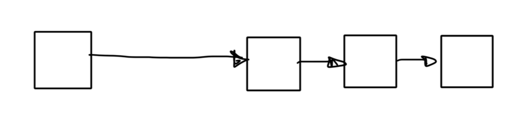
Beyond linear sequences, could storyboards experiment with order, perspective, and time?
Can we change the order of frames to explore different flows?
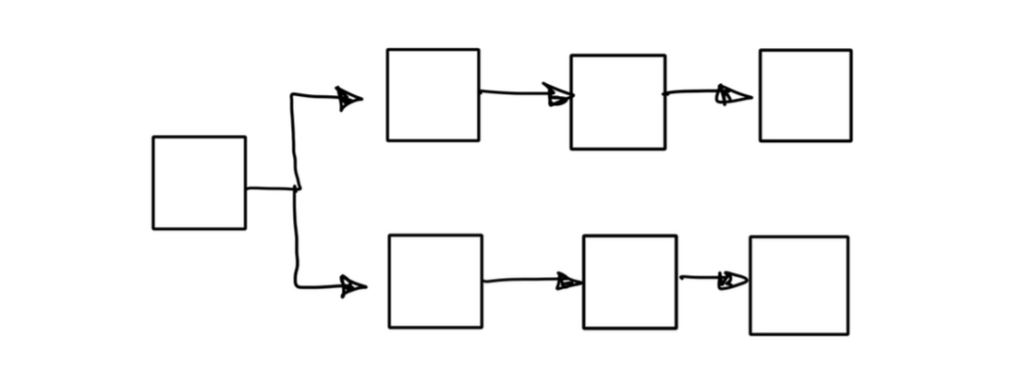
Could stories unfold as parallel universes, showing multiple outcomes at once, or as many possibilities, branching from a single decision point?
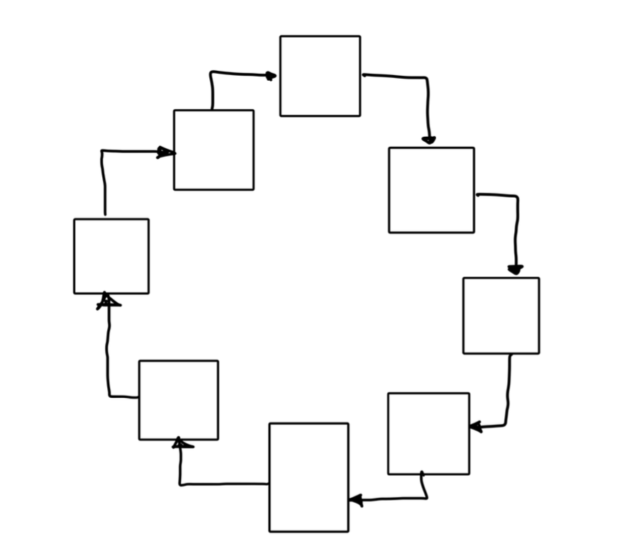
Could loops repeat sequences to emphasize cycles or recurring events?
Is there value in leaving some moments untold, letting the audience imagine or interpret them?
Can a single story be shown from two perspectives, revealing new insights? Can frames jump backward and forward in time, compressing or stretching moments to highlight emotional or narrative shifts? Could storyboards go beyond straightforward sequences, exploring alternative structures, rhythms, and timing with visual elements?
If these variations make sense for our purposes, storyboards could become more than planning tools. They could transform into experimental narrative media, capable of representing complexity, abstract processes, and alternative interpretations. Could this flexibility allow storyboards to thrive in educational, creative, or communicative contexts, where linearity and simplicity are not required? Could they become a versatile tool for thinking visually, revealing processes, possibilities, and narratives in ways that words or diagrams alone cannot?
By exploring these questions, we can reconsider the form of storyboards. If used creatively, they could move from simple instruction to instruments of imagination, communication, and exploration, opening new ways to represent stories, interactions, and experiences visually.
Storyboards are not limited to internal design processes or early concept development. In many fields, they exist as finished, published artifacts created to guide action without explanation, dialogue, or supervision. In these cases, the storyboard functions as a public interface, a condensed visual language designed to be understood across cultures, ages, and levels of experience.
Instruction-Based Storyboards in Everyday Life
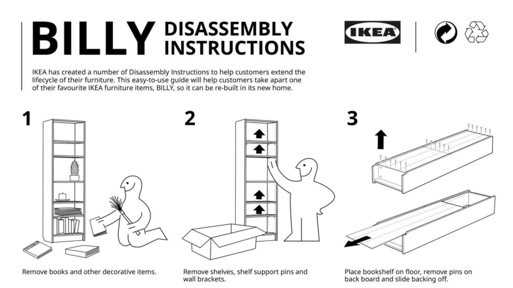
Common examples are IKEA and LEGO instructions. These are not narrative illustrations, but sequential frames that anticipate human action. They describe how a body moves, how hands orient objects, and in which order decisions should occur. The storyboard does not guarantee correct use, but it establishes a preferred sequence of interaction. Its effectiveness is measured by how well it reduces confusion, errors, and hesitation.
A similar logic applies to airline safety cards. These storyboards must work under stress, language barriers, and limited attention. They rely on simplified figures, clear gestures, and strict sequencing. Accuracy of representation is less important than legibility of action. What matters is not realism, but clarity. These examples underline that storyboards do not describe what will happen, but propose what should happen.
Instructional Storyboards in Public Space
In public environments, storyboards appear as evacuation diagrams, emergency instructions, or public transport guidance. These systems assume users who may be unfamiliar with the space and possibly emotionally affected. Here, the storyboard replaces verbal instruction entirely. Sequence, orientation, and visual hierarchy become critical.
Exhibitions and museums also rely on storyboard-like instruction systems. Interaction diagrams explaining where to stand, what to touch, or how to activate an installation are often communicated through short visual sequences rather than text. In participatory or hands-on exhibitions, these storyboards shape visitor behavior before architectural or graphic elements take effect. They define the rules of engagement with the space.
Participatory art installations push this further. In many cases, the artwork only exists through visitor action. The storyboard becomes a minimal visual script that explains how the work is completed through participation.
Storyboards Beyond Design Disciplines
Storyboard logic is also present in medicine leaflets, which use pictograms to explain dosage, order, and restrictions. These visuals must be unambiguous and culturally neutral, prioritizing comprehension over expression.
Children’s books without text rely entirely on visual sequencing to construct meaning. The reader learns how to interpret cause and effect, rhythm, and progression through images alone. Similarly, cookbooks focused on technique use step-by-step visuals to translate abstract instructions into embodied action.
Storyboards as Designed Expectations
Across these examples, a shared principle emerges. Storyboards are tools for aligning expectation and behavior. They reduce complexity by abstracting actions into readable sequences. Rather than predicting reality, they frame intention. This makes storyboards particularly relevant for exhibition and spatial design, where behavior cannot be controlled but can be anticipated.
After the first four previous blog posts I reached a point where I was unsure of how to move forward. Personally I found it difficult to see where I could contribute through interaction design – although there are plenty of possibilities. I struggled mostly with finding a direction that I felt comfortable with and doable for me to go through with for my thesis, given my current motivation, knowledge and interest. Therefore I have decided to go back to scratch.
Through a conversation with a professor from my home university, NTNU, I aired the idea of an application and/or website that would gather events into one platform, making the search for the weekend plans a bit easier. She further added the thought of looking at it from a student perspective, for example also as an erasmus student. This reminded me of the talk about a “loneliness” epidemic, and the hostel app where you can join activities of other solo travellers.
There are many questions that could be asked around this “topic” or idea. How big is the need for a system that gathers events and happenings into one app, from the users perspective? As all kinds of events would be available for all kinds of people, how would the event hosts feel about this in regards to the target group they are trying to reach? And for the environment they are trying to create? Would it work well practically? How could one ensure safety for the users wanting to join an event with strangers?
In a publication by the Joint Research Center it was written that loneliness was more common among students compared to working people (Berlingieri, Colagrossi & Mauri, 2023). A survey done on students in the US in spring in 2025 by NCHA found that 46.7% scored positive on the UCLA loneliness scale (American College Health Association, 2025). A press release from the UK government stated that almost all participating students had felt lonely at least once during their academic year. 52% of the participants also said loneliness was one of their concerns at university, 48% were concerned with “fitting in” (UK Department for Culture, Media and Sport, 2023). In a study done at the Carinthia University of Applied Sciences (CUAS) in Austria 31.7% reported moderate loneliness, while 4.8% were severely lonely. Where most felt socially lonely (29.4%) (Limarutti, Maier & Mir, 2023).
These statistics show that loneliness is a concern and problem amongst students, and specifically socially. When starting university, especially when moving cities it can be difficult to integrate and find people who share your interests. Currently there exists apps like Bumble BFF and Hostelworld’s features for meeting people while travelling, whether or not these can help battle the feeling of loneliness would be something to further look into.
A problem with such “meeting” apps is related to privacy and safety. Dating apps are a similar way to meet people, however people are concerned whether or not this is a safe way to meet. Pew Research center found that 46% of US adults saw dating apps as “not too safe or not at all safe way to meet people” (Anderson, Vogels & Turner, 2020). Some “meeting” apps have implemented ways of making users feel more secure in meeting through their apps by adding ID verification. Although it can create a sense of safety for others, many seem to be skeptical about giving these app companies their personal information through ID verification (Hendrickson, 2025). There are various other features these apps offer to prevent unsafe situations. The dating app Hinge offers users a way to report users if they experience discomfort or find a fake profile. Finding a balance between safety and privacy is an important goal.
Of course there exists ticketing apps that offer tickets to events of all kinds in one, such as Ticketmaster and Eventim. But how well these work and if there is a need for an improvement of these can be looked further into. Although they have no particular target group in itself other than a high focus on concert goers. If there is a need for these features to merge and to target students, could be questioned and researched further through the use of surveys.
Limarutti, A., Maier, M. J., & Mir, E. (2023). Exploring loneliness and students’ sense of coherence (S-SoC) in the university setting. Current Psychology, 42(11), 9270-9281.https://doi.org/10.1037/xge0000528.
Kein anderes Werbemittel für einen Film ist so effektiv wie der Tailer. In Hollywood Produktionen macht dieser nur wenige Prozent des gesamten Werbebudgets aus, tragt aber massiv – bis zu 30% – zum Einspielergebnis bei. [1]
Ein Trailer ist auch sehr effektiv dabei, Lust auf einen Film zu machen. Er zeigt Ausschnitte, Musik, grafische Elemente, Schauspieler:innen und Sprecher:innenstimmen, damit Zusehende einen Einblick bekommen. Diese kurze Version des Filmes verrät jedoch nicht die ganze Handlung. Vielleicht werden Fragen aufgeworfen, Mysterien gezeigt, jedoch nicht aufgelöst. Ein guter Trailer erweckt das Verlangen im Zuseher diese Wissenslücken zu schließen und sich den Film anzusehen. Manche Trailer enden mit einem Cliffhanger, einem Witz oder einer Actionszene. Besonders das Ende ist ausschlaggebend. Je „bombastischer“ das Ende eines Trailers, desto positiver wird sich daran erinnert. [2]
Es gibt auch andere Arten von Trailer. Auch viele Games werben mit Previews. Dabei wird aber selten das eigentliche Gameplay gezeigt, als eher eine Filmsequenz, die die Story und das Gefühl des Spieles rüberbringen soll. (Ich möchte hierbei aber zwischen diesen lästigen Werbeschaltungen von Handyspielen absehen und spreche in weiterer Folge von nicht kostenfreien Games, wie etwa für Konsolen oder Computer.)
Die Trailer von Games sind eigentlich richtige Lügner. In manchen Game-Trailern werden vermeintlich Szenen aus dem Game gezeigt, die so jedoch nie vorkommen. Klar, das führt zur Frustration, wenn Erwartungen der Käufer:innen nicht getroffen werden. Andererseits wirkt so ein Story-Trailer viel aufregender, als 2 Minuten pures Gameplay. Beim Bewerben eines Produktes geht es darum ein Gefühl zu vermitteln, Emotionen anzuspielen. Und diese werden durch Storyelemente am besten angesprochen. [2]
Und dann wäre da auch noch der Buch-Trailer. Ein etwas weniger verbreitetes und recht neues Medium. Zum Vergleich: Im Jahr 2005 wurden im deutschsprachigen Raum circa 10 Buchtrailer veröffentlicht. Nur 5 Jahre später waren es bereits 500. [3] Dieser rasante Anstieg zeigt, dass das Prinzip des Trailers „in kurzer Zeit viel Emotion und Inhalt vermitteln“ sehr gut funktioniert, auch jenseits der Kinoleinwand. Der Trailer ist ein Werkzeug der Aufmerksamkeit.
Und wo ist Aufmerksamkeit noch wichtig? In der Schule. Wie wäre es also das Prinzip eines Trailers dafür einzusetzen Spannung, Erwartung und Emotion in den Unterricht zu bringen?
Der didaktische Trailer
Warum sollte der Trailer mit all seiner Funktion nur als Werbemittel betrachtet werden? Wenn es Buchtrailer gibt, warum nicht auch Schulbuch-Trailer, die den Ruf der Schullektüre aufwerten und modernisieren? Ein Trailer komprimiert Inhalte und verpackt sie in eine emotional aufgeladene Form. Genau das, was im Unterricht Herausforderungen darstellt: Aufmerksamkeit und Motivation erwecken.
Ein Trailer, in solch einer Form, wie oben im Text beschrieben, kann laut seiner eigenen Definition inhaltlich nicht komplette Fachkapitel abdecken, könnte aber einen humorvollen oder spannenden Einstieg in ein Thema bieten. Ein Trailer für das nächste Kapitel im Biologiebuch könnte die Stimmung heben und die Einstellung der Schüler:innen auf das Lernen bessern.
Dabei kann auf das oben genannte „Kochrezept“ eines guten Trailers zurückgegriffen werden: Offene Fragen und Mysterien, Humor, actionreiche Szenen und am Ende ein Cliffhanger.
Didaktisch spannend kann der Trailer dann werden, wenn Lernende selbst ihn gestalten müssen. Denn beim Gestalten entstehen gleich mehrere Lernkompetenzen:
Priorisierung und Vereinfachung der Inhalte
Zusammenhänge müssen verstanden werden
Kommunikation und Sprachkenntnisse. [4]
Warum Bildung Spannung braucht
Lernen braucht Emotion. Neurowissenschaftlich gesehen werden Inhalte, die mit Emotionen, Spannung, Humor oder Überraschung verknüpft werden tiefer verarbeitet. Dadurch kann sich auch besser daran erinnert werden. [4]
Trailer zielen genau das an. Sie erzeugen Vorfreude und einen inneren Drang nach Auflösung. In der Didaktik nennt man das eine „motivationale Aktivierung“ – ein Faktor, der nachhaltig das Lernen verbessert. [5]
Der Trailer macht also sichtbar, was der Unterricht versucht: Aufmerksamkeit herstellen. Dies jedoch viel gezielter und dadurch äußerst effektiv. Ob nun als Einstieg in ein neues Unterrichts-Kapitel, als Projektaufgabe, als Präsentation oder als Lernstrategie: Ein Trailer vereint das Lernen mit Kommunikation, Kreativität und Spannung.
So gesehen ist ein Trailer das Miniaturformat des eigentlichen Lernens: Ein Versprechen auf das Verstehen.
Quellen
Hediger, Vinzenz: Der Trailer, das Schlüsselelement jeder Filmwerbekampagne. In: Hediger, Vinzenz; Vonderau, Patrick: Demnächst in Ihrem Kino. Grundlagen der Filmwerbung und Filmvermarktung. Marburg: Schüren 2005, S. 272-281.10.25969/mediarep/12039
Immordino‑Yang, Mary Helen; Damasio, Antonio: We Feel, Therefore We Learn: The Relevance of Affective and Social Neuroscience to Education. Mind,BrainandEducation 2007, 1(1), 3–10.
Krapp, Andreas. Interesse, Motivation und Lernen: Neue Entwicklungen der pädagogisch‑psychologischen Interessenforschung. Beltz 2010.
Digital interruptions are often discussed as a problem of timing or frequency, but research on cognitive load suggests that the deeper issue lies in how much mental capacity is already in use when an interruption occurs. From an interaction design perspective, interruptions are not neutral events: they directly compete with limited cognitive resources and shape whether users can maintain focus, recover (or resumption) or disengage entirely.
Cognitive Load Theory provides a useful foundation for understanding this problem. Originally developed in educational psychology, the theory distinguishes between intrinsic load (the complexity of the task itself), extraneous load (unnecessary demands imposed by the system) and germane load (effort that supports learning or task completion).1 While this framework is not specific to interaction design, it becomes highly relevant when applied to digital systems that constantly introduce new stimuli.
Interruptions almost always add extraneous load. Notifications, alerts, pop-ups, and task switches force users to allocate attention away from their primary task, even if the interruption is brief. Importantly, this cost is not limited to the moment of interruption. Research on fragmented work shows that once attention is broken, users often struggle to fully return to the original task, resulting in longer completion times and reduced efficiency.3
This effect becomes clearer when cognitive load is examined alongside attention control. Lavie’s load theory of attention shows that distraction behaves differently depending on what type of load is dominant.2 When perceptual load is high, irrelevant stimuli are more easily filtered out. However, when cognitive control or working memory load is high, people become more vulnerable to distraction. In other words, users performing cognitively demanding tasks are precisely the ones least able to handle interruptions.
For interaction design, this creates a structural problem. Many digital systems interrupt users during moments of high cognitive demand; writing, problem-solving, decision-making, when working memory is already saturated. Under these conditions, even small interruptions can produce disproportionate disruption, increasing error rates, stress and resumption time. The interruption itself may appear minor, but its cognitive cost is not.
Recent reviews further reinforce this point. Koundal et al. (2024) synthesize evidence, showing that interruptions significantly increase mental workload, particularly in complex or time sensitive tasks. Their review highlights that performance degradation is not simply a result of distraction, but of accumulated cognitive demand that exceeds users’ capacity to recover smoothly.4
From a design perspective, I think this shifts the problem away from whether interruptions are useful and toward when and under what cognitive conditions they happen. An interruption that might be manageable during low-demand activity can become harmful during high-load tasks. This suggests that static notification rules or generic “best practices” are insufficient. Without accounting for cognitive load, even well-intentioned designs risk undermining user performance.
Rather than treating interruptions as isolated UI elements, I think they should be understood as events that interact with users’s cognitive state. Designing for interrupted experiences therefore requires attention to task complexity, working memory demands, and recovery support, not just visual hierarchy or timing thresholds.
In this sense, cognitive load is not a background theory but a central constraint. Any system that interrupts users without considering their mental workload is effectively designing against sustained attention. For interaction design, acknowledging this constraint is a necessary step toward more humane, resilient and interruption-aware systems.
Lavie, N. (2010). Attention, distraction, and cognitive control under load. Current Directions in Psychological Science, 19(3), 143–148. https://doi.org/10.1177/0963721410370295
Mark, G., Gonzalez, V. M., & Harris, J. (2005). No task left behind? Examining the nature of fragmented work. Proceedings of the SIGCHI Conference on Human Factors in Computing Systems, 321–330. https://doi.org/10.1145/1054972.1055017
Koundal, D., Sharma, A., & Kumar, S. (2024). Effect of interruptions and cognitive demand on mental workload: A critical review. Applied Ergonomics, 114, 104158. https://doi.org/10.1016/j.apergo.2023.104158
AI Assistance Disclaimer: AI tools were used at certain stages of the research process, primarily for source exploration, grammar refinement and structural editing. All conceptual development, analysis and final writing were made by the author.
Optical Truth vs. Emotional Truth: Why a blurry photo often tells the truth better than a sharp one.
Design & Research | Master Thesis Log 05
In computer science, “noise” is an error. In art, “noise” is texture.
In my last blog , I discussed how the lack of “anticipation” is killing our creativity. Now, I want to drill down into the definition of Authenticity. If we are going to design a camera that resists AI perfection, we need to understand exactly what we are trying to preserve. I propose that photography serves two opposing masters: Optical Truth and Emotional Truth.
Optical Truth: The Algorithm’s Goal
Optical Truth is objective. It is data. It asks: “Did I capture every photon correctly?”
Modern smartphones are obsessed with this. They want zero noise, maximum sharpness, and perfect white balance. The result is what we see below: technically flawless, but emotionally sterile.
Optical Perfection: Clean, sharp, and cold. The AI removed all the shadows where the mystery used to hide. (Photo: Joel Filipe)
The problem is that memory doesn’t work like a 4K sensor. Memory is blurry. Memory is warm. Memory has vignetting. When an AI “cleans up” a photo, it often cleans away the feeling of the memory itself.
Emotional Truth: The Human Goal
The Glitch is the Gift: The blur creates the sensation of spinning. An AI would try to “fix” this face, destroying the moment. (Photo: William Klein, 1955
Emotional Truth is subjective. It is messy. It asks: “Does this feel like it felt?”
Consider the work of Daido Moriyama or William Klein. Their photos are often grainy, out of focus, or tilted. By the standards of an AI Algorithm, these are “bad photos.” The AI would try to fix them.
But the “badness” is the point. The blur is the motion. The grain is the grit of the street.
The Crisis of Code: The fundamental issue in Interaction Design is that we have trained our machines to view human imperfection as a “bug” to be squashed. But in art, the imperfection is often the “feature.”
Designing for “Wabi-Sabi”
This leads me to the Japanese concept of Wabi-Sabi—the acceptance of transience and imperfection.
How do we code Wabi-Sabi into a camera?
If I am building an “Honest Interface,” it cannot just be a “Raw Mode” (which is still just data). It needs to be a “Mood Mode.” We need controls that allow the user to tell the system: “Do not fix this. I want the blur.”
Currently, “Portrait Mode” fakes a blur (bokeh) to look expensive. I am interested in a mode that allows Motion Blur to look alive. I want to design an interface where the user can prioritize Atmosphere over Resolution.
Next Steps: Validating the Theory
I have now established a strong theoretical framework: 1. AI creates Zombie Formalism. 2. Screens kill Anticipation. 3. Algorithms prioritize Optical Truth over Emotional Truth.
But this is all just my opinion. To turn this into a Master’s Thesis, I need to get out of the library and into the field. Next week, I will be conducting Qualitative Interviews with photographers to see if they actually feel this loss of agency, or if I am just a nostalgic romantic yelling at a cloud.
References & Reading List
[1] R. Barthes, Camera Lucida: Reflections on Photography. Hill and Wang, 1981. [2] L. Koren, Wabi-Sabi for Artists, Designers, Poets & Philosophers. Stone Bridge Press, 1994.
AI Declaration: This blog post reflects my own research, writing, and arguments. An LLM was utilized solely to assist with the structure and organization of the content.
From “Mental Construction” to Digital Consumption: How the ‘Live View’ screen killed our ability to see.
Design & Research | Master Thesis Log 04
“A photograph is not created in the camera. It is created in the mind.”
This concept, famously articulated by Stephen Shore [1], is known as Mental Construction. Shore argues that the physical act of pressing the shutter is just the final step of a long psychological process. The photographer looks at the chaos of the world, organizes it mentally into a frame, and then uses the machine to capture that thought. But today, this order of operations has been reversed.
The “Live View” Lobotomy
In my research into camera interfaces, I have identified a critical shift in how we interact with the image: the shift from the Viewfinder to the Screen.
The Sea of Screens: We no longer look at the event; we look at the verification of the event. (Source: Unsplash)
The Viewfinder (Traditional): When you look through an optical viewfinder, you are looking at reality. The camera is just a window. You have to imagine (Pre-visualize) how the film will interpret that reality. You are active.
The Screen (Modern): When you look at a smartphone screen, you are looking at a processed simulation. The HDR is already applied. The colors are already boosted. You don’t need to imagine the photo because the computer has already finished it for you.
This interface design encourages Post-rationalization instead of Pre-visualization. We shoot first, and ask questions later. We treat the world as raw data to be harvested, rather than a subject to be understood.
The Death of the “Latent Image”
Active Seeing: The restriction of the viewfinder forces the eye to focus. (Source: Unsplash)
Ansel Adams wrote extensively about “visualization”—the ability to see the final print in your mind’s eye before the exposure is made [2].
Digital interfaces have killed this skill. Because the feedback loop is instant (0.01 seconds), there is no gap for the imagination to live in. In film photography, there was a “Latent Image”—the invisible period between shooting and developing. That invisibility forced the photographer to trust their vision.
By removing the latency, we removed the anxiety. But we also removed the intent. If I can take 1,000 photos in a minute and delete 999, I stop caring about the 1.
Implications for Interaction Design
This leads to a radical question for my thesis: Can we design for blindness?
If the screen is the problem, maybe the solution is to take it away. I am beginning to conceptualize an interface that re-introduces “digital latency.”
Imagine a camera app that doesn’t show you the photo immediately. Imagine a tool that forces you to define your parameters (Mood: Melancholy? Lighting: High Contrast?) before it opens the shutter.
By delaying the gratification, we might restore the “Mental Construction.” We might force the user to become an architect of the image again, rather than just a consumer of it.
Next Steps: Defining Authenticity
If we strip away the instant gratification and the AI perfection, what is left? Next week, I will finally tackle the definition of “Authenticity.” I will look at the debate between “Optical Truth” (what the lens sees) vs. “Emotional Truth” (what the human feels), and how we can code that difference into a system.
References (IEEE)
[1] S. Shore, The Nature of Photographs. Phaidon Press, 2007. [2] A. Adams, The Camera. Little, Brown and Company, 1980.
AI Declaration:This blog post was drafted with the assistance of an LLM to explore the psychological concepts of ‘Mental Construction.’ The connection to Interface Design and the ‘Latent Image’ theory are my own research.
To continue this project, my next step is to define the primary areas of focus more clearly. By narrowing down the scope, I aim to clarify the overall goal of the project and establish a stronger foundation for the next research phase. This will include conducting interviews, initially with people in my immediate surroundings and later with travelers directly at train stations.
Problem zone train station
In 2024, six of the lowest-ranked train stations in Europe were located in Germany. According to the annual train station ranking published by the international Consumer Choice Center (CCC), the bottom six positions out of 50 evaluated stations were occupied by Bremen Hauptbahnhof, Munich-Pasing, Berlin Zoologischer Garten, Berlin-Gesundbrunnen, Berlin Ostkreuz, and Essen Hauptbahnhof. The ranking evaluates criteria such as information management, the availability of elevators and escalators, and overall accessibility (Gang, 2024). These aspects are essential for a positive user experience, yet they remain insufficiently addressed at many German train stations. As a result, Germany continues to perform poorly in European-wide comparisons, highlighting the urgent need for improvement in this area.
Fokus area
Given the scope, time constraints, and available resources of this project, it would not be realistic to redesign every aspect of a train station. Concentrating on a specific area allows for deeper analysis and more meaningful outcomes. Based on my recent observations in Hamburg and Augsburg, I identified train platforms, along with their entry and exit points, as the areas where the highest number of recurring pain points and challenges occur. Therefore, this project will primarily focus on the user experience of train platforms, while still considering the broader station context in which they are embedded.
Current status
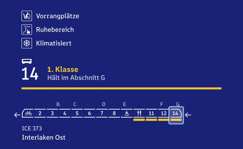
Today, passengers can access a wide range of information about their train both before and during their journey. Prior to arrival at the station, users can consult platforms such as Bahnhof.de, which provide details about train stopping positions, carriage formations, and onboard equipment. Travelers can see where specific carriages will be positioned on the platform, including family compartments, bicycle areas, wheelchair-accessible spaces, priority seating, dining cars, first-class sections, and sleeping cars. Additional information such as the availability of air conditioning, Wi-Fi, or onboard services is also provided (DB, 2025).
DB. (2025). See the stopping position, train formation and train equipment at a glance. Von DB: https://www.bahnhof.de/entdecken/wagenreihung abgerufen
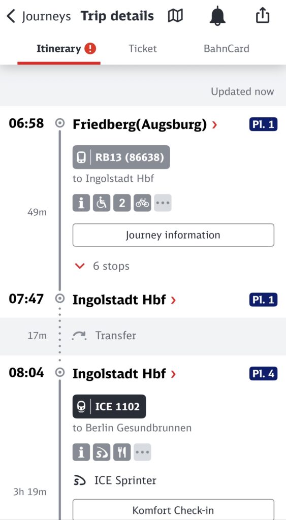
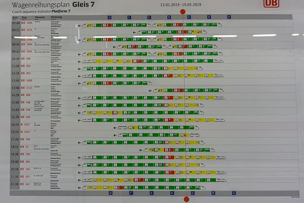
Upon arrival at the station, further guidance is available. Large information boards in entrance areas indicate the platforms assigned to each train, while digital displays on the platforms themselves provide updates on arrival times, delays, and platform changes. This information can also be accessed via the DB Navigator app or through Deutsche Bahn’s online portals. Platform sections where trains are expected to stop are typically displayed on boards, online, or in the app. In addition, many platforms feature carriage plans that show which trains will stop there and where individual carriages will be located. However, this analog system works best for regularly scheduled trains and often fails in cases of last-minute platform changes (Wagner, 2022).
Wagner, J. B. (2022). An Easy Guide to Deutsche Bahn – Navigating German Train Travel. Von Hamburg Beyond: https://hamburgandbeyond.com/an-easy-guide-to-deutsche-bahn-navigating-german-train-travel/ abgerufen
Overall, a large amount of information is already available to help make train travel more structured and predictable. However, a major challenge is that many travelers are unaware of these resources or do not know how to use them effectively. Another issue is the inflexibility of certain systems, which can quickly become confusing or ineffective when schedules change. While digital platforms are more adaptable, they can still be outdated or incomplete. Existing information systems therefore need to be communicated more clearly and made more accessible to all users.
Information Gathered
Through this blog post, I clarified which areas of the train station I want to focus on and gained a better understanding of the current status quo at many German stations. This forms a solid foundation for the next phase of the project.
Next Steps
The next phase will involve designing and preparing surveys to be conducted in January. This includes selecting appropriate locations, defining participant groups, and developing targeted questions. Once the survey results are collected, I will combine them with the insights gathered so far and begin developing concepts aimed at improving the user experience at German train stations.
References
DB. (2025). See the stopping position, train formation and train equipment at a glance. Von DB: https://www.bahnhof.de/entdecken/wagenreihung abgerufen
Gang, M. (01. January 2024). Die sechs schlimmsten Bahnhöfe Europas sind alle in Deutschland. Von 24 Rhein : https://www.24rhein.de/leben-im-westen/verkehr/bahn-schlechtesten-bahnhoefe-europas-deutschland-ranking-bremen-hbf-berlin-essen-hbf-nrw-deutsche-92713050.html abgerufen
Wagner, J. B. (2022). An Easy Guide to Deutsche Bahn – Navigating German Train Travel. Von Hamburg Beyond: https://hamburgandbeyond.com/an-easy-guide-to-deutsche-bahn-navigating-german-train-travel/ abgerufen
There is a common phrase repeated in tech reviews today: “Everyone is a photographer.”
The logic goes like this: We all have 200-megapixel sensors in our pockets. We have stabilization that defies gravity and Night Modes that turn midnight into noon. Therefore, because the output is technically high-quality, the act must be photography.
I disagree. In fact, for my thesis, I am proposing the opposite: As cameras get “better,” photography is getting worse.
We are not witnessing a renaissance of creativity; we are witnessing the rise of “Zombie Formalism”—images that look alive (sharp, colorful, perfectly exposed) but are internally dead because they lack human intent.
The Flusser Trap: Are You the Master or the Servant?
To understand why this is happening, I turned to the media philosopher Vilém Flusser. In his seminal work Towards a Philosophy of Photography [1], Flusser distinguishes between the “tool” and the “machine.”
A tool (like a paintbrush) serves the human. The human decides every stroke. A machine (like a camera) has a “program.” It has pre-set rules.
The “Black Box”: When the camera makes 90% of the decisions, the user becomes a functionary, not an artist. (Source: Unsplash)
Flusser argues that most photographers are not artists; they are “Functionaries.” They simply press a button to trigger the machine’s program. In 2025, this is more true than ever. When I lift my phone to take a picture of a sunset, the AI:
Identifies the scene (“Sunset”).
Balances the exposure (HDR).
Sharpens the edges.
Boosts the saturation.
I did not make those choices. The algorithm did. I simply authorized the calculation.
The Aesthetic of “Least Resistance”
Perfection vs. Emotion: Sometimes the blurry shot tells the truth that the sharp shot hides. (Source: Unsplash)
The result of this automation is a homogenization of our visual culture. We are drowning in what I call the “Aesthetic of Least Resistance.”
Look at Instagram. The images are stunningly clear, but they all look the same. They lack the “friction” of reality. In Interaction Design, we are taught to remove friction—to make things seamless. But in art, friction is essential.
Film photography was full of friction. You had to measure light. You had to focus manually. You could fail. And because you could fail, your success meant something.
Wim Wenders recently critiqued this phenomenon, noting that the inflation of images leads to a deflation of meaning [2]. When a camera cannot take a “bad” picture, the “good” picture loses its value. It becomes a commodity, not a memory.
Reframing the Approach
In my initial research plan, I considered conducting a visual audit of smartphone interfaces this week. However, as I dove into Flusser’s theories, I realized that analyzing the surface of the interface (the icons and buttons) is premature if we don’t first question the structure beneath it.
The core issue isn’t just how the buttons look, but how they shape our thinking. If modern AI cameras are designed to provide answers, my research is now shifting to understand how we can preserve the user’s ability to ask questions.
Closing Thought: The Search for Friction
We are building cameras that solve problems we didn’t have. The problem of “focus” was never just technical; it was artistic. When we remove the struggle, we remove the satisfaction.
As I continue this research, I am looking for the “sweet spot”—where the tool helps us, but doesn’t replace us. The goal isn’t to destroy the technology, but to find the human heartbeat buried underneath the algorithm.
References (IEEE)
[1] V. Flusser, Towards a Philosophy of Photography. London: Reaktion Books, 2000. [2] W. Wenders, “The Act of Seeing,” in The Pixels of Paul Cézanne: And Reflections on Other Artists, 2018.
AI Declaration:This blog post was drafted with the assistance of an LLM to structure the theoretical analysis. The research selection, case study choice, and final arguments regarding ‘Indexicality’ are my own.
Since its invention, photography has held a unique promise: the promise of truth. Unlike a painting, which is an interpretation, a photograph was historically seen as an “index”—a physical trace left by light hitting a sensor.
But what happens when the sensor stops recording light and starts predicting it?
In my previous post, I asked if photography is dead. This week, I conducted a deep dive into the Samsung “Space Zoom” Controversy. This event is not just a consumer tech scandal; for my thesis, it serves as “Ground Zero” for the ontological shift in image-making. It proves we have moved from capturing the world to generating a statistical average of it.
Part 1: The Experiment
The controversy erupted when Reddit user u/ibreakphotos designed a clever stress test for Samsung’s “100x Space Zoom.” The user hypothesized that the camera wasn’t actually optically powerful enough to see the moon’s craters.
The Methodology:
They downloaded a high-res image of the moon.
They downsized it and blurred it until it was an unrecognizable, glowing white blob.
They displayed this blob on a monitor in a dark room.
They stood back and photographed the monitor using the Samsung S23 Ultra.
The hardware limitation: A tiny smartphone sensor cannot defy physics, yet the software claims it can. (Source: reddit)
The Results:
The phone produced a sharp, detailed image of the moon, complete with craters and surface textures.
This was physically impossible. The source image (the blurred blob on the screen) contained zero texture data. The camera had effectively “hallucinated” the craters because its AI recognized the shape of a moon and overlaid a texture map from its internal database.
Part 2: The Death of Indexicality
Why does this matter for Interaction Design? Because it breaks the fundamental contract between the user and the tool.
In media theory, Charles Sanders Peirce defined the photograph as an “Index”—a sign that has a physical connection to its object (like a footprint in the sand). When you look at a traditional photo, you know that the light actually touched the subject.
The Samsung Moon is no longer an Index. It is a Simulacrum. As the philosopher Jean Baudrillard argued, a simulacrum is a copy without an original. The image on the user’s phone is “hyperreal”—it looks more real than the blurry reality the user actually saw with their eyes, but it has no connection to the physical moment.
The friction lies here:
The User thinks: “I captured this.” The System knows: “I generated this.”
This creates a gap in agency. The user believes they are the creator, but they are merely the “prompter.” The camera is no longer a tool for documentation; it is a tool for optimization. It prioritizes a “beautiful lie” over an “ugly truth.”
My Perspective: The Case for “Honest Interfaces”
After analyzing this case, I do not believe the solution is to ban AI. Most users do want a clear photo of the moon, even if it is fake. However, from an Interaction Design standpoint, the failure here is not technological—it is ethical.
The Failure of “Silent Substitution” The interface lied. It presented a generated image as a captured one. My take is that we need to redesign the camera interface to be “Honest.”
My Proposal for Future Research: We need a UI that distinguishes between “Documentation Mode” (Optical truth, flaws included) and “Simulation Mode” (AI enhanced).
If the user knows they are painting with data, the agency is restored. They become a “Director” rather than a duped consumer. The current design trend of hiding these choices behind a single “Shutter Button” is what I call “Agency Laundering”—the machine takes the credit, but lets the user feel like the artist. My thesis aims to challenge this specific pattern.
Key Questions Arising from this Case:
Transparency: Should AI-enhanced photos carry a visible watermark or metadata tag indicating “Generative Content”?
The “Raw” Mode: Is “Pro Mode” the last bastion of authenticity, or is AI seeping into the raw data as well?
User Consent: Did the user consent to having their blurry moon replaced? Or did the interface assume their intent?
References (IEEE)
[1] u/ibreakphotos, “Samsung ‘Space Zoom’ Moon Shots are Fake,” Reddit, 2023. [2] J. Vincent, “Samsung’s Moon photos are fake—but so is a lot of mobile photography,” The Verge, 2023. [3] J. Baudrillard, Simulacra and Simulation. University of Michigan Press, 1994.
AI Declaration:This blog post was drafted with the assistance of an LLM to structure the theoretical analysis. The research selection, case study choice, and final arguments regarding ‘Indexicality’ are my own.