In an industry governed by the relentless speed of the algorithmic feed, images have become inherently ephemeral. The lifespan of a promotional photograph or a meticulously styled music video is often measured in seconds before the user inevitably scrolls past. How, then, do you build a lasting, coherent narrative world in an environment designed for constant visual turnover? The answer often lies in one of the most fundamental, yet overlooked, tools of communication design: typography.
In the context of contemporary music world-building, typography ceases to be mere text and becomes infrastructure. It is no longer about selecting a pleasing font to sit neatly on an album cover; it is about engineering a typographic system that acts as the primary visual anchor for an entire era. When a custom typeface or a strict typographic cage is applied obsessively across every single touchpoint—from Spotify canvases and stadium billboards to Instagram stories and physical merchandising—it transcends its linguistic function. It becomes the logo, the architecture, and the geographical boundary of that specific narrative ecosystem.
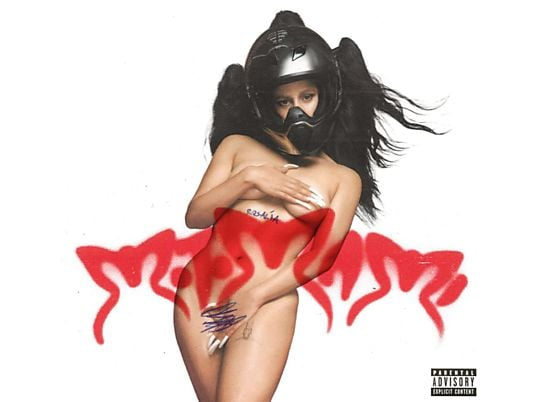
A striking example of this dynamic is Rosalía’s Motomami era. The communication design for this project was not primarily anchored by a single photographic portrait, but by a highly specific, custom-designed typographic treatment. The lettering was aggressive, scratched, spiky, and unapologetically chaotic. It was not just a title; it was the exact visual translation of the album’s sonic contrast—the friction between the vulnerability of “mami” and the industrial hardness of “moto.” Whenever fans encountered that specific spiky lettering—even as a simple black-and-white graphic, completely stripped of the artist’s face—they instantly knew they had stepped inside the Motomami world.
This approach elevates type design from a functional necessity to a core world-building strategy. We can observe this methodology functioning across various genres and aesthetic paradigms. Whether an art director employs the rigid, grid-based precision of Swiss Style typography to construct a cold, dystopian electronic narrative, or utilizes the raw, unpolished, and anti-aesthetic layouts of Brutalist design to signal disruption within the underground urban scene, the principle remains the same. The typographic grid becomes the spatial boundary of the artist’s world.
Ultimately, in contemporary music marketing, typography is spatial. It is the architectural framework that holds the narrative together when the imagery itself is forced to constantly mutate to feed the algorithm. By designing a proprietary typographic language, the communication designer ensures that the artist’s identity remains instantly recognizable, providing a sense of stability and permanence within a digital ecosystem defined by chaos.