Im vorherigen Semester habe ich mich bereits theoretisch mit dem Thema Self-Branding im künstlerischen Kontextbeschäftigt. In diesem Semester möchte ich den Fokus auf praktische Experimente legen und untersuchen, wie sich eine künstlerische Identität aktiv entwickeln und kommunizieren lässt.
Der experimentelle Teil meines Projekts besteht aus mehreren Elementen:
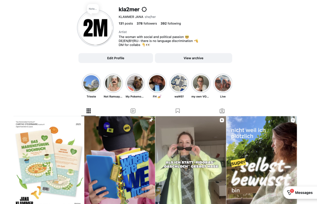
Ein wichtiger Schritt ist die Analyse meines bestehenden Instagram-Accounts. nstagram ist für viele junge Künstler:innen eine der wichtigsten Plattformen, um ihre Arbeiten zu präsentieren, Kontakte zu knüpfen und eine eigene visuelle Identität aufzubauen. Deshalb möchte ich zunächst den aktuellen Stand meines Accounts analysieren.
Dabei werde ich untersuchen, welche Inhalte ich bisher poste, wie sie visuell aufgebaut sind und wie sie von meinem Publikum wahrgenommen werden. Besonders interessieren mich Fragen wie: Welche Beiträge bekommen die meisten Reaktionen? Welche Art von Content funktioniert besser – zum Beispiel fertige Arbeiten, Einblicke in den Prozess oder persönliche Inhalte? Außerdem möchte ich analysieren, wie konsistent meine visuelle Sprache ist und ob mein Profil bereits eine klare künstlerische Identität vermittelt.
Auf Basis dieser Analyse plane ich, verschiedene Content-Formate und Präsentationsweisen auszuprobieren. Das kann zum Beispiel bedeuten, unterschiedliche Arten von Posts zu testen, neue visuelle Strategien zu entwickeln oder stärker Einblicke in meinen kreativen Prozess zu geben. Durch diese Experimente möchte ich beobachten, wie sich meine Online-Präsenz verändert und welche Formen der Darstellung besonders positiv aufgenommen werden.
Zusätzlich möchte ich Gespräche bzw. kleine Interviews mit Menschen führen, die mich aus unterschiedlichen Kontexten kennen. Ziel ist es herauszufinden, wie andere meine Persönlichkeit und meine kreative Arbeit wahrnehmen. Dadurch möchte ich besser verstehen, ob meine Außenwirkung mit meinem eigenen Selbstbild übereinstimmt.
Durch diese Experimente möchte ich untersuchen, wie Self-Branding praktisch funktioniert und welche Strategien jungen Künstler:innen helfen können, ihre Arbeit sichtbarer zu machen.
Ein weiterer Teil des Projekts sind Gespräche mit Menschen aus meinem Umfeld, die mich aus unterschiedlichen Kontexten kennen. Ziel ist es herauszufinden, wie andere meine Persönlichkeit und meine kreative Arbeit wahrnehmen. Dadurch möchte ich besser verstehen, ob meine Außenwirkung mit dem Bild übereinstimmt, das ich selbst von mir habe.
Bis dann 🫲
UPD: Falls DU Gedanken oder Feedback hast, kannst sie gerne in die Kommentare schreiben 🙂 Oder mir auch persönlich sagen, ich freue mich! 🐝
Last, but not least I am going to focus on some more material of activist poster design. Then I will add my next steps for my thesis, so you know what I will be doing in the future and how I will add to my collection of materials and research.
The topic I already focused on in part 6 of my blog posts was global warming and the environment. Therefore, I want to add some more posters here that focus on this exact topic.
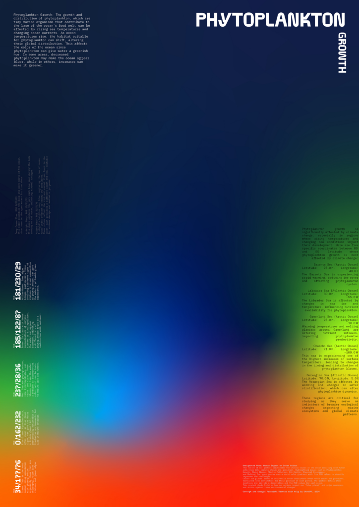
“Unexpected Hues – Human Impact on Ocean Colors” is an interesting poster series by Franziska Stetter. It wants to raise awareness on certain oceanic problems the environment is facing. There are six posters on the topics: “[…] Phytoplankton Growth, Algal Blooms, Plastic Pollution, Oil Spills, Ocean Acidification, and Melting Ice […]” (Stetter, 2026) Each of the posters
“[…] using a vivid gradient of five RGB color values to represent changes in ocean color caused by environmental disruptions. These colors are placed based on real-world coordinates where these issues are prevalent, translated into their position on each poster. Accompanying each visual are detailed descriptions that explain the context, data, and meaning behind the chosen hues, creating a blend of scientific data and visual storytelling.” (Stetter, 2026)
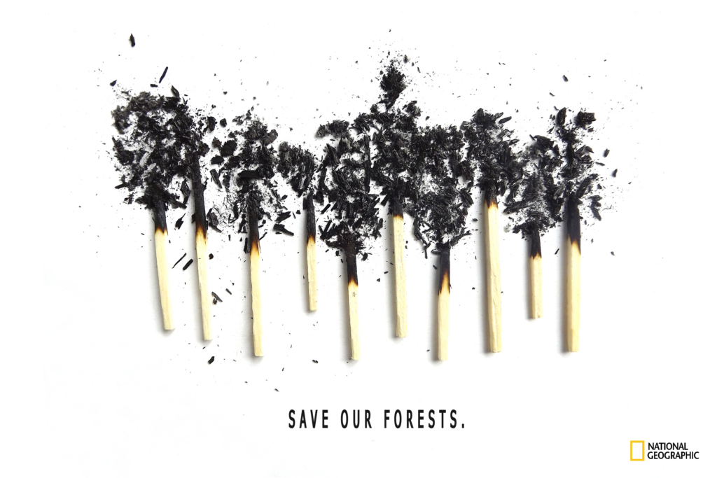
In this poster Brynn Seitzman has focused on one of the effects of global warming. The typography is a call to action and makes us aware that our forests need saving. Through this quote the picture becomes alive, we do not only see burnt out matchsticks anymore, but trees, a whole forest that was burnt down by wildfire, caused by global warming and climate change.
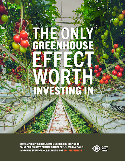
This next poster was created by Jack parker, Evan Hamilton and Gabe Salas, students from the Texas State University. It focuses on showing what can be done against climate change within the field of agriculture through new technology. Since the greenhouse effect is a phenomenon tied to climate change, it is interesting to use this quote to advertise for new agricultural greenhouse solutions that help us live in an environment that is constantly getting hotter.
To summarize, these were some examples of advocating for change in caring more for the environment. The next steps of my thesis will be to synthesize my findings and tie them together more closely, as well as, to find even more examples that help me make choices to create my own design activist works. In the end, I want to apply the results of my research to my own practice as a designer. This will make it easier for me to create alongside my personal values and connect them to my future brand. It will add more value to my work and hopefully steer my portfolio and my future work life into directions I am interested in that make people think twice about their actions.
Thank you all for your interest in my research journey. I have still got quite a way to travel with this, but I’m more sure than ever to start creating on my own, seeing what I can do with all the insights I have gained into this broad and extremely important issue.
The focus of my previous post was on the Black Lives Matter Movement and racism. And in Part 6 of my series, I analyzed a poster on US politics, as well as, one on global warming. Therefore, I will add to both of these to have more examples of similar topics.
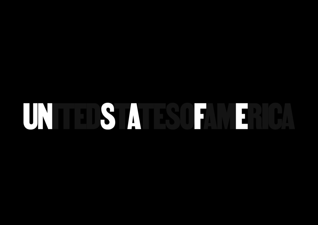
Jean Quarcoopome created this poster to connect US politics and the danger they pose towards Black lives. The background colour is black to show that it is about Black people and death. In the background a transparent typography shows ‘UNITEDSTATESOFAMERICA’. Within these words some letters are emphasized in white colour, that makes one read the word unsafe. This shows that america is an unsafe place for Black people. The intention behind using the font Martin by VOCAL Type Co, was to hint towards “lettering used on placards and posters during a Memphis sanitation strike, organized by Black people protesting against unsafe working conditions in the 1960s.” (Quarcoopome, 2021)
Coco Cerrella focused on a more graphical approach to depict one big problem going on around the world, which is also strongly emphasized in the US. Namely, immigrant’s rights. The passports of different nations are cemented into a wall. They look like bricks holding society together, but walls can eventually crumble. Cerrella states that “[t]he passport that serves as the entry key for many people is at the same time a wall for migrant minorities, in a world increasingly closed.” (Cerrella, 2021) This poster is also a nod to building walls between nations, which again is a link to Trump building a wall towards Mexico, for instance.
This poster by Karen Crawford also merges topics. It combines the famous last words by George Floyd that fuelled the Black Lives Matter Movement with a face mask, marking the COVID19-pandemic. The words form a mask and are also situated exactly on mouth and nose, where the breath of the Black person shown as a silhouette should be, but is not anymore. It also shows the struggles of the pandemic that many people said they cannot breathe under their masks. But using a mask and struggling to breathe because one is being killed are two entirely different things. This shows that many struggles of mainly white people do not translate similarly to the struggles of Black people. Surely, the Black people that have died would have preffered to wear a mask instead.
To summarize, these examples combine different topics that I have already focused on in previous posts. In my next and last post I am going to show some final examples of design activist posters and then elaborate my next steps for my thesis. Thank you to everyone that has read until here.
In my last post I have analyzed some mainly typographic posters about war. In this post I will be focusing on racism and the black lives matter movement, since there are still so many different topics out there that add to the variety and diversity of activist topics.
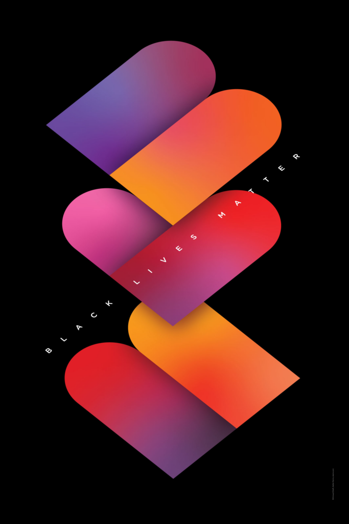
This poster by Arnaud Ghelfi was created for the Black Lives Matter Movement. The structure of the letters BLM is especially round, which creates the illusion that the ‘L’ is a heart. The colours help this notion, because the ‘L’ is mostly red and pink, the typical colours associated with graphics of hearts. The black background adds to the fact that this is about Black people. To add to that the shapes of the three letters seem to be built out of the same two components. The colour gradients within the type show that Black people are diverse as well and this diversity adds flavour to society, which is why they are as important as everyone else. (cf. Ghelfi, 2021)
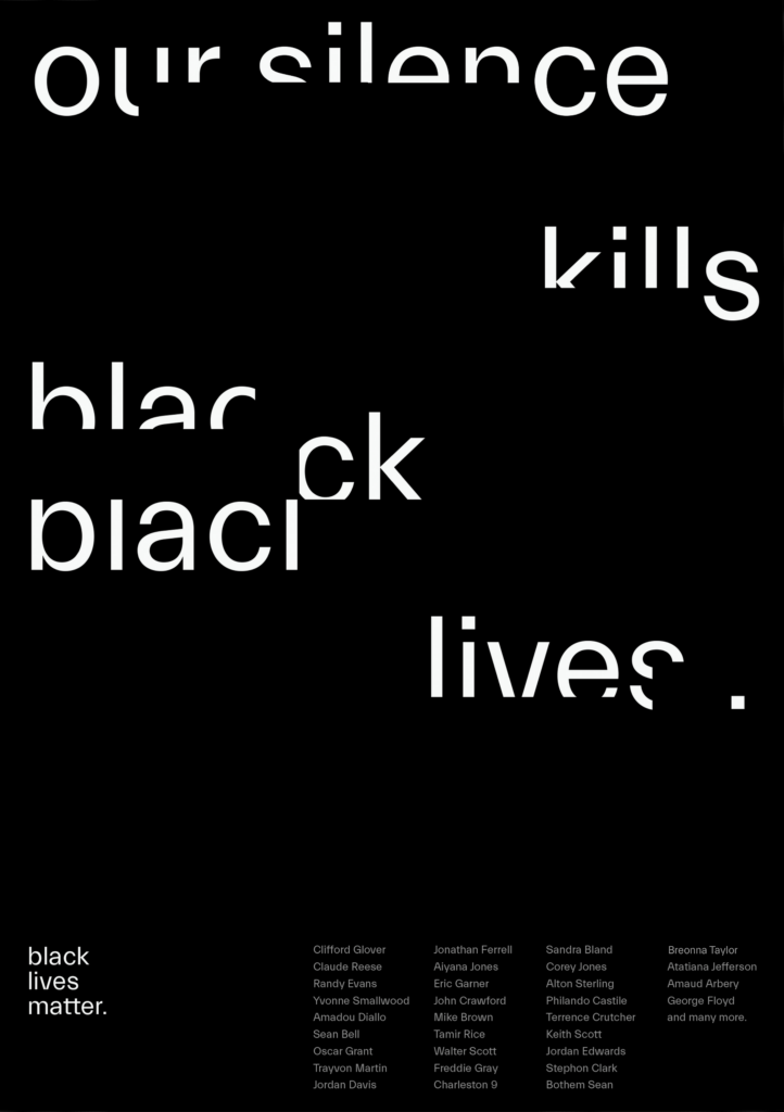
In this second poster about the Black Lives Matter Movement Anna Sera Garcia shows how white space can be used to show reactions of people. The typography is cut out by empty space to show that when white people (that are the majority group) do not speak up about injustice, their silence makes them complicit in the killing of Black people, since they have the power, but do not do anything about these injustices. Other than the whole sentence the word ‘black’ gets not only erased, but torn apart as well, this shows the brutality Black people have to face, by being killed without doing anything wrong. To add to that the sentence ends with a single point, this shows that it is a fact and also emphasizes the finality of the statement. At the bottom of the page the names of Black people that have been killed during this time are listed to not let them be forgotten and show that it is not just an individual case, but a pattern.
This poster by Underline Studio shows the same problem that the previous one did. The two words ‘silence’ and ‘violence’ are merged, by showing their similarities. The whole construct shows the visual of an hourglass, making evident that each second of silence adds to the violence that is happening.
Last but not least, Selcuk Ozis has created a typographic poster showing again that racism kills. The letter ‘i’ stands for black people as can easily be seen. This shows that racism as a construct is fueled by white people, one white person seems to be killing the Black person as is depicted by the ‘s’ that seems to be kneeling on top. The other white people ‘r’, ‘a’, ‘c’, ‘m’ just seem to be watching or are probably silent as they see the scenario unfold. The three colours used remind us of the Nazi flag and show that racism is timeless and, therefore, has to be fought by the roots.
In this blog post I have analyzed some posters about racism, focusing especially on the Black Lives Matter Movement. This shows again how much is possible using just typography.
Adding onto my previous post, I will continue to analyze some design activist posters to show that there are different topics out there and what the consensus is about interesting and impactful activist posters.
This poster shows a clever usage of typography. Barbara Galinska wants to inspire action against war. The message is clear: Stop war! The continuos outlines fusing the message together shows that one of the words cannot be without the other. The red and black colours make an aggressive combination to show the importance of the message and refer to the topic of war the explosions, burning, blood as well as, death and darkness that comes with war. The sharp edges of the outlines leave no room for doubt, this is a serious matter. The end of the ‘S’ and the space between the ‘P’ and the exclamation mark seem to have extremely sharp ends, similar to scalpels. This design has not only been used as a poster, but also as a base for murals and demonstration signs.
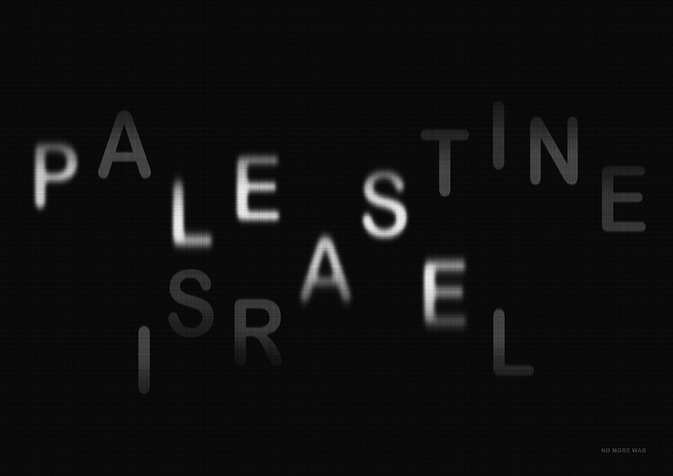
This poster shows a similar approach, also just through typography, but focuses on the war between Israel and Palestine. It shows that both names together create the word please and very small in the right hand corner the small print states “NO MORE WAR”. This already clearly transports the plea of designer Hoon-Dong Chung. To be able to read both the names Palestine and Israel, as well as, the word ‘please’ the transparency effect has been used. While the first two are transported into a second layer by being barely visible, the word please is highlighted by having more opacity. Therefore, the first thing one reads is ‘please’. Afterwards the words Palestine and Israel come into focus and if the message is not clear enough already, then only when analyzing the poster closely the rest of the message becomes visible.
In this poster the main message also comes from typography. This time the text can be interpreted in several ways. The message is: “war does not determine who is right only who is left”. In this case one can either interpret it in the way that during war it can be seen, which people advocate for right parties and which for left ones. Or you can see that, even though someone might be ‘right’ in war (meaning to have the correct opinion), the only thing that matters in the end is who is left after the war (so who is still here in the end). Interestingly, the background shows clouds and a sunny day and the last row of text becomes slightly transparent, showing that not much is left after the war. This poster was designed by Emerson, Wajdowicz Studios.
These three posters summarize well that there does not have to be a lot going on in a design to get a message across. Usually typography is enough if it is applied in a creative way, by combining different words and meanings to get the point across.
In the previous post, the focus was on ways to design (design, co-design, collaborative design), as well as, language. How do we interpret words such as activism and activist? What feelings can they evoke when used in a design context? How do we want to design?
Now, I want to focus on the more practical side a bit and see what activist design projects are out there (focusing more on the field of communication design). What topics are designers especially fond of using to inspire action? And how do they integrate design elements?
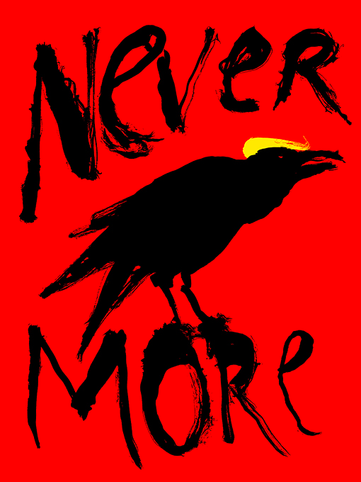
One poster I found that won gold at the UNMUTED poster award, is by Jan Šabach. It shows a raven with a blonde wig and scrawled on top and on the bottom of the page is the word “nevermore”. It is a political poster that refers to a famous poem by Edgar Allan Poe called “The Raven”, which is a gloomy poem where the narrator is slowly drifting into madness. Therefore, it makes sense that the raven on the poster looks like it has come straight out of a nightmare. The word “nevermore” is used quite a few times to depict the finality and hopelessness of the loss the narrator is facing (namely the death of his beloved Lenore). Jan uses this already famous depiction to mention Donald Trump’s politics. He manages to give the raven Trump’s personality with just one yellow brushstroke to create a wig that looks like his hair. This time the word “nevermore” has a slightly different meaning and refers to somehow ending Trump’s career as a politician at least. With this gothic poem reference, the whole poster becomes a gloomy and dark background. Also the seemingly imperfect brushstrokes add to this feeling. The colour red in the background functions as a signal of warning, showing that there is some kind of danger, but with the red the whole raven image also seems show more anger.
The next poster I am going to analyze is on a different topic, namely, climate change and global warming. This shows how diverse the field of design activism can be, designers can inspire action for topics that are important to themselves and should be to society, from their point of view at least.
In this case the poster uses Hemingway’s iceberg theory as a reference. This theory was originally created for the new prose, showing that on the surface everything seems to be really simple, while there are hidden depths to the story. This theory was later applied to many different ideas as well. (cf. Johnston, 1984) The poster was created by Leo Lin and as one can see on the bottom it is on the topic of global warming. Even the typography looks as though it is melting. Instead of an iceberg it shows a white human body close to drowning. Similar to the iceberg theory, as well as, the accident of the Titanic, we know that icebergs are usually much bigger underwater than they are on top of the water surface. This is exactly what happens in the image on one hand the iceberg seems to be melting, as can be seen by the rounded edges and only a very small amount of the face being above water. On the other hand the depths of the iceberg still seem to be unknown and unclear since no end can be seen. Therefore, it relates to global warming. The poster was already created in 2009 and is still true today with the global warming, the ice is melting and someday the humans will probably be drowning because of it.
To conclude, these posters have several implied meanings and are extremely interesting to analyze, in my next posts I will focus on searching a few more examples, since it is important to find some common ground within ideas for design activist work.
Sources:
Johnston, Kenneth G.: Hemingway and Freud: The Tip of the Iceberg. In: The Journal of Narrative Technique, vol. 14, no. 1, 1984, pp. 68-73. URL: http://www.jstor.org/stable/30225083. Accessed 26 Jan. 2026. Lin, Leo: Global Warming. In: Graphis Online, 2009. URL: https://graphis.com/entry/05855441-8b20-4131-bb6a-a4e0cefc1832. Accessed 26 Jan. 2026. Šabach, Jan: Never More. In: Graphis Online, 2019. URL: https://graphis.com/entry/8795f518-2b51-4ca5-b9aa-3c769d34bcb6. Accessed 26 Jan. 2026.
Hallo wieder! Ich hoffe, eure Weihnachtszeit war schön und ihr seid wieder bereit für wissenschaftliches Zeug 🙂 Heute habe ich mit der Analyse begonnen, genauer gesagt damit, wie sich andere Künstler:innen nach außen präsentieren.
In den Analysen werden die visuelle Identität, Persona und Narrativ, die mediale Präsenz sowie Haltung und Werte untersucht. Im heutigen Beitrag wird die Künstlerin Ellen Sheidlin analysiert.
Wie sie angefangen hat?
Ellen Sheidlin wurde im Jahr 1994 in Russland geboren. (Sheidlin, o.J. a) Ellen Sheidlin begann ihre öffentliche Präsenz nicht im klassischen Kunstkontext, sondern auf digitalen Plattformen, insbesondere über einen YouTube-Kanal, mit einer der populärsten Videoreinen “Das Geheimnis meiner Fotos” in dem die Künstlerin Prozess ihrer Arbeit gezeigt hat. Bereits in diesen frühen Arbeiten zeigte sich ein starkes Bewusstsein für Bildkomposition, Farbigkeit und Inszenierung. Auch wenn der Content formal noch näher an Influencer-Formaten lag, wurde der eigene Körper früh als zentrales Ausdrucksmittel eingesetzt. Die Plattform YouTube fungierte dabei als Experimentierraum, in dem visuelle Identität, Persona und Erzählweise schrittweise entwickelt wurden. (Sheidlin, o.J. b)
Die frühe YouTube-Phase kann somit als Fundament verstanden werden, auf dem Elen Sheidlin ihre spätere künstlerische Identität aufbaute. Sie ermöglichte Sichtbarkeit, Selbstexperiment und Publikumsinteraktion und schuf jene mediale Kompetenz, die später zu einem zentralen Bestandteil ihrer künstlerischen Praxis wurde.
Hat sie ihr eigenes Stil?
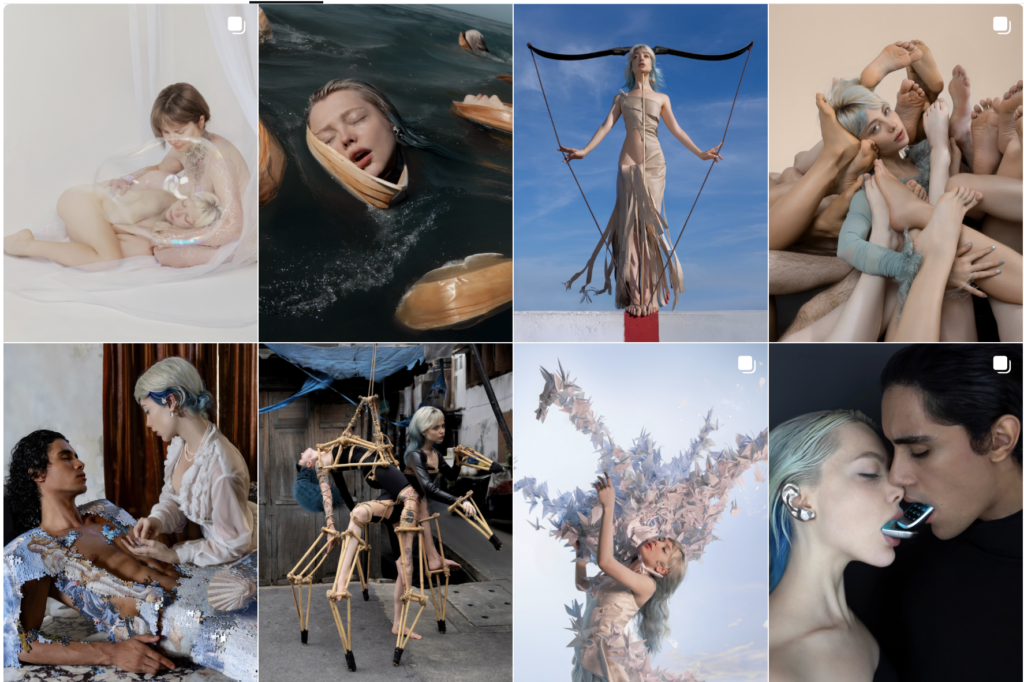
Ellen Sheidlin arbeitet mit einer hochgradig konsistenten visuellen Sprache, die sich durch intensive Farbigkeit, surrealistische Bildwelten und digitale Inszenierungen auszeichnet. Wiederkehrend sind vor allem kräftige, teils künstlich wirkende Farben, glatte Oberflächen sowie die Kombination aus Körper, Objekt und digitalem Raum.
Sie arbeitet in unterschiedlichen Medien: painting / photography / digital video art / sculpture / illustration (Sheidlin, o.J. a)
In den Arbeiten von Elen Sheidlin ist der eigene Körper nahezu durchgängig als zentrale visuelle Figur präsent. Die Künstlerin positioniert sich in ihren Fotografien und Inszenierungen bewusst im Mittelpunkt der Bildkomposition und übernimmt damit gleichzeitig die Rolle von Subjekt, Objekt und Medium der Darstellung (Sheidlin, o.J. c):
(sheidlina, 2020 a)
(sheidlina, 2020 b)
(sheidlina, 2020 c)
Durch die wiederholte Verwendung des eigenen Körpers entsteht eine hohe Wiedererkennbarkeit, die wesentlich zur Markenbildung beiträgt. Gleichzeitig erlaubt diese Strategie eine kontinuierliche Variation der erzählten Inhalte, ohne die visuelle Identität zu destabilisieren. Der Körper wird damit zum konstanten Anker innerhalb wechselnder Themenfelder.
Besonders relevant ist, dass Elen Sheidlin ihren Körper nicht im Sinne eines idealisierten oder normativen Schönheitsbildes einsetzt, sondern ihn bewusst als Projektionsfläche für Spannungen, Widersprüche und innere Zustände nutzt. Dadurch verschiebt sich der Fokus von Selbstdarstellung hin zu Selbstverhandlung: Der Körper wird zum Ort, an dem individuelle Erfahrungen mit kollektiven Problemen verschränkt werden.
Narrativ
Die Künstlerin selbst steht im Zentrum ihrer Arbeiten. Ellen Sheidlin agiert nicht nur als Produzentin der Kunst, sondern zugleich als Figur, Medium und Performance. Ihre Persona ist bewusst konstruiert und changiert zwischen Überzeichnung, Ironie und emotionaler Offenheit.
Ihr pseudonym hat sie von ihrem damaligen Ehemann Evgeniy Sheidlin genommen, mit dem sie 15 Jahren lang zusammen war und vor kurzen ihre Partnerschaft beendet hat. Über ihr privates leben hat Ellen Sheidlin viel in interviews erzählt und oft die interviews mit ihrem Man zusammen gegeben hat. Ihr Ehemann hat sie von Anfang sehr unterstützt und als erster Fotograf für ihre Kunstwerke diente. (vdud, 2023)
Das Narrativ ihrer Marke speist sich aus einer Spannung zwischen Intimität und Inszenierung. Einerseits zeigt Elen Sheidlinemotionale Zustände, persönliche Erfahrungen und subjektive Wahrnehmungen, wodurch beim Publikum der Eindruck von Nähe und Authentizität entsteht. Diese Offenheit ermöglicht Identifikation und verstärkt die Bindung zwischen Künstlerin und Rezipient:innen.
Andererseits bleibt diese Intimität stets ästhetisch kontrolliert und strategisch gerahmt. Die gezeigten Emotionen sind Teil einer bewusst konstruierten Bildsprache, die weder spontane Selbstenthüllung noch dokumentarische Unmittelbarkeit anstrebt. Stattdessen wird Nähe inszeniert, ohne die Grenze zwischen privatem Selbst und öffentlicher Persona aufzulösen. Die Distanz bleibt gewahrt und wird zum konstitutiven Bestandteil ihres Self-Brandings.
Gerade in dieser kontrollierten Balance zwischen Offenheit und Abgrenzung liegt die Stärke der künstlerischen Markenbildung: Intimität fungiert nicht als Selbstzweck, sondern als kommunikatives Mittel, das Sichtbarkeit erzeugt, ohne Autonomie aufzugeben.
Haltung & Werte
In der Arbeit von Ellen Sheidlin dienen persönliche Erfahrungen wiederholt als unmittelbarer Ausgangspunkt für künstlerische Arbeiten. (vdud, 2023) Private Lebensereignisse werden dabei nicht narrativ erklärt oder öffentlich kommentiert, sondern in verdichteter Form visuell verarbeitet. Die Künstlerin nutzt ihre eigene Bildsprache, um innere Zustände sichtbar zu machen, ohne diese explizit zu kontextualisieren.
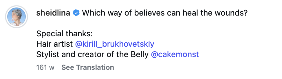
Ein prägnantes Beispiel dafür ist die Phase nach einer Trennung, in der Ellen Sheidlin zwei Fotografien veröffentlichte, die deutlich von einer veränderten emotionalen Tonalität geprägt sind:
“It’s been like learning to breathe again – shedding an old skin that no longer fits, finding myself in a world I’ve never known before. I was 15 when I first fell in love, and at 30, I’ve discovered what it means to rebuild yourself after losing something that defined you for half your life.”
(sheidlina, 2025 a)
(sheidlina, 2025 b)
Anstelle von erklärenden Texten oder direkten Aussagen über das Ereignis wird der innere Zustand über Körperhaltung, Blick, Komposition und Atmosphäre vermittelt. Der eigene Körper fungiert dabei als Träger von Verlust, Leere und emotionaler Spannung, ohne dass das private Ereignis selbst ausgesprochen wird.
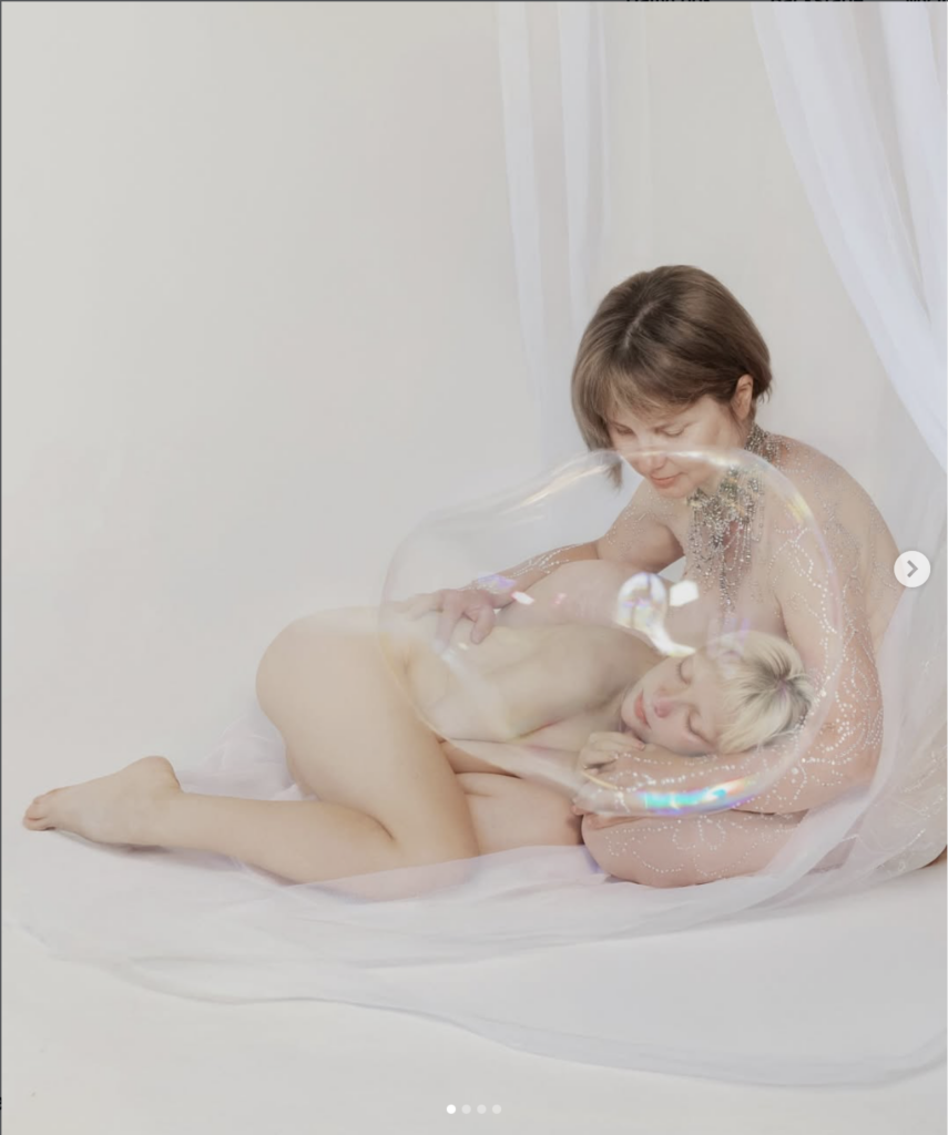
Ein weiteres Beispiel lässt sich in Arbeiten erkennen, die im Kontext einer langen räumlichen Trennung von ihren Eltern entstanden sind. In einer Fotografie, die diesen Zustand thematisiert, wird körperliche Nähe nicht gezeigt, sondern vielmehr ihr Fehlen visualisiert. Während der Körper Nähe und Geborgenheit vermittelt, ist ihr Kopf von einer transparenten Blase umschlossen. Dieses Element erzeugt eine visuelle Trennung zwischen physischer Nähe und innerer Wahrnehmung.
Die Blase steht dabei für emotionale Distanz und das Gefühl innerer Abgeschlossenheit, das trotz des Wiedersehens bestehen bleibt. Persönliche Erfahrung wird nicht erklärt, sondern über Körper, Raum und Symbolik in eine allgemein lesbare Bildsprache übersetzt:
(sheidlina, 2025 c)
Charakteristisch ist, dass Elen Sheidlin persönliche Krisen nicht isoliert oder dokumentarisch darstellt, sondern sie in ihre bestehende visuelle Identität integriert. Auch in Momenten emotionaler Verletzlichkeit bleibt die ästhetische Kontrolle erhalten. Die persönliche Erfahrung wird nicht zum Bruch mit der Marke, sondern zum Bestandteil ihres kontinuierlichen künstlerischen Narrativs.
Neben der Verarbeitung persönlicher Erfahrungen greift Elen Sheidlin in ihren Arbeiten auch gesellschaftliche Themen auf und integriert kommerzielle Aufträge in ihre visuelle Praxis:
(sheidlina, 2022)
(sheidlina, 2021)
Öffentliche Diskurse und Werbekampagnen werden dabei nicht getrennt von ihrer künstlerischen Identität behandelt, sondern in dieselbe ästhetische Sprache überführt. Dadurch verschwimmen die Grenzen zwischen persönlichem Ausdruck, öffentlicher Kommunikation und kommerzieller Inszenierung.
Soziale Netzwerke
Wie bereits erwähnt, begann Elen Sheidlin ihren öffentlichen Weg auf YouTube, wo sie zunächst persönliche und visuell experimentelle Videoformate veröffentlichte. Diese frühe Phase diente als Ausgangspunkt für die Entwicklung ihrer medialen Kompetenz und ihres Gespürs für Inszenierung. Mit der Zeit verlagerte sich der Schwerpunkt jedoch zunehmend auf Instagram, das sich als zentraler Ort ihrer künstlerischen Praxis etablierte.
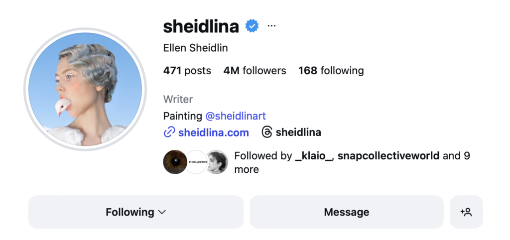
Ein weiteres zentrales Element ihres Self-Brandings ist der bewusste Einsatz ihres echten Nachnamens. Sie tritt konsequent unter ihrem realen Namen auf, den sie sowohl für die Benennung ihres Instagram-Accounts als auch ihrer Website nutzt. So wird der Name zur Marke: Er steht nicht primär für eine private Person, sondern für eine kuratierte künstlerische Identität. Die Konsistenz in der Namensverwendung über verschiedene Plattformen hinweg verstärkt die Wiedererkennbarkeit und sorgt für eine klare Zuordenbarkeit der Arbeiten.
Auf Instagram fungiert die Plattform nicht lediglich als Präsentations- oder Marketinginstrument, sondern als integraler Bestandteil des künstlerischen Werks. Einzelne Beiträge sind selten isoliert zu betrachten, sondern entfalten ihre Bedeutung im Zusammenspiel mit anderen Bildern, Serien und zeitlichen Abfolgen. Der Feed wird zu einer kuratierten Erzählfläche, in der visuelle Kohärenz, Wiederholung und Variation gezielt eingesetzt werden.
(Sheidlin, o.J. c)
Persönliche Themen, gesellschaftliche Fragestellungen und kommerzielle Inhalte werden innerhalb desselben ästhetischen Rahmens verhandelt. Auch bezahlte Kooperationen oder Werbekampagnen unterscheiden sich formal kaum von freien Arbeiten. Dadurch werden kommerzielle Inhalte nicht als Bruch wahrgenommen, sondern als Fortführung der bestehenden visuellen Identität. Werbung wird Teil der künstlerischen Erzählung, nicht ihr Gegenpol.
Instagram lässt sich somit als hybrider Raum beschreiben, in dem Kunst, Öffentlichkeit und Kommerz bewusst miteinander verschränkt werden. Die Plattform ist nicht nur Distributionskanal, sondern prägt maßgeblich die Form, Rezeption und Bedeutung der Arbeiten und wird damit selbst zu einem aktiven Bestandteil des künstlerischen Self-Brandings.
Elen Sheidlin nutzt in der Regel keine Hashtags und die Bildbeschreibungen sind meist sehr kurz gehalten oder bestehen lediglich aus einzelnen Worten oder knappen Aussagen. Diese reduzierte Textpraxis lenkt den Fokus konsequent auf das Bild selbst und vermeidet eine inhaltliche Vorinterpretation. Die Bedeutung der Arbeiten wird nicht erklärt, sondern bleibt offen für individuelle Lesarten.
(Sheidlin, o.J. c)
Auch der Instagram-Header von Ellen Sheidlin folgt einer bewusst reduzierten Branding-Strategie. Anstelle einer ausführlichen Selbstbeschreibung oder erklärender Texte beschränkt sich die Profilbeschreibung auf wenige Informationen sowie auf Links zu ihrer Website und weiteren sozialen Netzwerken. Der Fokus liegt nicht auf verbaler Selbsterklärung, sondern auf Weiterleitung und Struktur.
sheidlina (26.03.2020 b): Selbstisolation. Geschichte Nummer eins. [Instagrampost]. In: Instagram, https://www.instagram.com/p/B-NIJUCKrAA/ (zuletzt aufgerufen am 05.01.2026)
sheidlina (04.09.2020 c): Ms Scarecrow, you look messy. [Instagrampost]. In: Instagram, https://www.instagram.com/p/CEt6s6knuBv/ (zuletzt aufgerufen am 05.01.2026)
Sheidlin, Ellen [@sheidlina] (o.J. c): Instagram‐Fotos und ‐Videos [Instagram‐Profil]. In: Instagram, https://www.instagram.com/sheidlina/ (zuletzt aufgerufen am 05.01.2026)
sheidlina (09.03.2025 a): How do you exist alone after fifteen years as two? [Instagrampost]. In: Instagram, https://www.instagram.com/p/DG-z1-czMv9/ (zuletzt aufgerufen am 05.01.2026)
sheidlina (19.03.2025 b): Casting for contenders is now open.[Instagrampost]. In: Instagram, https://www.instagram.com/p/DHY6jCnz12N/ (zuletzt aufgerufen am 05.01.2026)
sheidlina (08.12.2025 c): Before leaving, I created a photograph with my mother..a small inner shelter made from her love. [Instagrampost]. In: Instagram, https://www.instagram.com/p/DSAoyVPk78s/?img_index=1 (zuletzt aufgerufen am 05.01.2026)
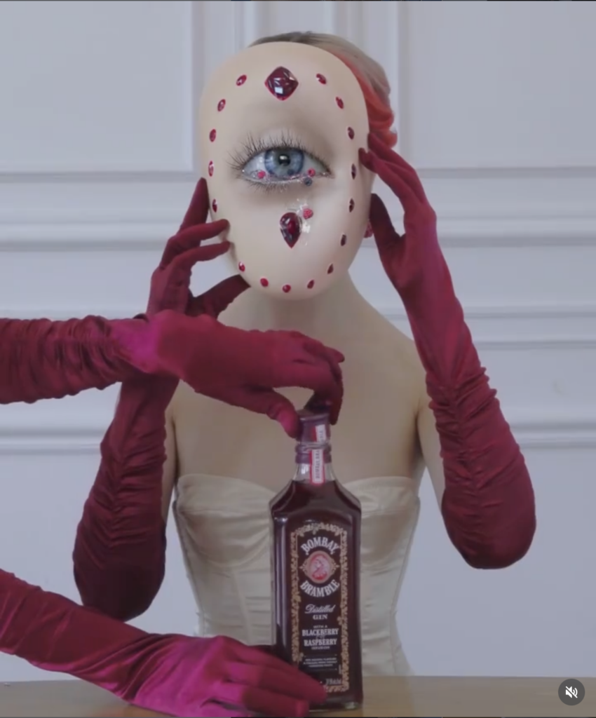
sheidlina (16.11.2021): A special ritual of berry picking, a beauty that can only fit in the new Raspberry-Bramble [Instagrampost]. In: Instagram, https://www.instagram.com/p/CWV1tCYK-Fy/ (zuletzt aufgerufen am 05.01.2026)
Welcome back to my blog, in my last post I focused on the importance to know that everything designed is in some way political and it is the job of the designer to think about this before publishing your own work. Besides, it is crucial to give people the opportunity to share their voices through your work. Do not speak for them, because you might not be able to express things in the same way as affected people.
Nick Adam, Associate Partner and Director of Span, shares:
Working across networks is powerful, and bringing people into the design process can help level the playing field. When done well, this work engages people who may not have had access to designers and are understandably unsure of what they need or how to participate. While this can extend a project’s timeline, a slower, more generous process often yields richer outcomes. A collaborative designer’s role must include guiding people to engage and participate meaningfully. (Meharry 2024, p. 21)
With this citation the persona of the collaborative designer is added to the mix. This shows that designers can use different methods to go about their work. They can either work on their own, just finishing projects for their customers, share their knowledge and skills through co-design or work collaboratively, which might add new dimensions to the design if done in a meaningful way.
This idea of collaborative design is a form of activism, as well. It gives a voice to people and involves them in the design process to which they usually do not have any access. Dave Pabellon, Associate Professor at the Columbia College in Chicage, argues that the word activism often has certain connotations and is viewed as something extreme, when sometimes it is just about connecting with affected communities. (cf. ibid. p. 22)
Language is important in every aspect of our lives, therefore, we have to think about how certain words make us feel, which connotations they might have. This can give us access to different groups of people. Similar to activism is “[…] the word activist, because in many ways, everyone is an activist – it just depends on what they’re activating and working toward.” (ibid. p. 22) He mentions that it does not make him more of an activist than another designer just because he is working with communities and they are working with big corporations, they just promote different things through their work. (cf. ibid. p. 22f)
It is interesting how easy it is to initiate a shift in mindset. Language is power, is a crucial statement to remember in communication design or all types of design really. And therefore, any designer should think about what kind of activist do they want to be? Do they want to influence a societal change or do they want to make the powerful people and corporations even more powerful?
To conclude, try to think about which kinds of products or services you want to advocate for. What kind of activist designer do you want to be and how will you be able to do that? Try to think about different ways of designing, do you want to work for certain companies, with certain people (co-design) or with communities (collaborative design)?
Source:
Meharry, Jessica (ed.): Design as Acitivsm. September 13-14, 2024. Symposium Proceedings. Institute of Design at Illinois Tech. California: ORO Editions 2024.
In my last post, I started talking about which questions you need to ask yourself as a designer in order to become a design activist and which questions you need to ask about your target group. This is a good starting point to make design that matters and promotes a greater cause.
Anne H. Berry states why it is important to be a design activist:
There are many ways in which design has been a contributor to racism and bigotry and negatively affected people’s lives. So part of our work is to recognize the ways in which these problematic histories and relationships exist, whether or not we’re choosing to identify or acknowledge them. You can stand at a distance, say that you aren’t political, and remain reticent about engaging with politics, but that’s just [not] how our society works. I don’t think it’s a reflection of reality. Designers need to be ready to push back, stand our ground, and say, “No, we’re not going to do that.” We just can’t afford to be silent. There’s nothing neutral about design. Ever. (Meharry 2024, p. 12)
Even though, you might think your designs are not political and do not influence anyone in this direction, by not acknowledging problems you might just play right into the plans of some politicians or parties you might not want to help. And if you are doing this on purpose then be aware of the ideals you are conveying to others.
To be able to change society you have to be aware of where the power lies and what power is. Sara Cantor from the Greater Good Studio thinks power has “the ability to change someone else’s reality, or maybe even your own.” (ibid. p. 13) She talks about power being inherently neutral, only society interprets it as being either good or bad, but it is necessary if you want to bring about equitable social change. (cf. ibid. p. 13)
Furthermore, she talks about designers being involved in decision-making processes. This means, they are able to influence clients and stakeholders to a certain degree and, therefore, able to redistribute power. (cf. ibid. p. 14) For instance, powerful people usually want to stay powerful on their own, but if you tell them that their power will increase, if they share with others, because they have people behind them they can trust and work together with it could help shift their mindset slightly. (cf. ibid. p. 16)
Ahmad Jitan, Director of Organizing and Advocacy in the Inner-City Muslim Action Network, adds that it is important to remember: “[…] that I don’t need to be the voice for the voiceless. You just pass the mic. That’s where, at its base, it becomes a values conversation.” (ibid. p. 16) Do not try to speak for the people, but be their amplifier and give them the stage they need to be heard.
To conclude, be aware that each work you put out is somehow political and think about how you can strengthen the causes you want to support. Additionally, do not try to speak for others, give them the room they need and let their voices be heard.
Source:
Meharry, Jessica (ed.): Design as Acitivsm. September 13-14, 2024. Symposium Proceedings. Institute of Design at Illinois Tech. California: ORO Editions 2024.
Hello, and welcome back to my research. I will now focus on some of the sources I found in my last post, therefore the main part of the research is now on the field of design activism.
From the 13th to the 14th of September in 2024 there was a symposium called “Design as Activism” in Chicago. Because there are already numerous designers in the city that create design activist pieces, they invited people to start a discussion, inspire others to engage with design activism and share their thoughts and experiences. Jessica Meharry describes:
The word activism comes from the Latin word actus: “a doing, a driving force, or an impulse.” In many ways, this is perfectly suited for design. We understand design as activism: as taking action, putting theory into practice, and learning through doing and making. Yet design is also deeply entangled with capitalist systems, with many designers working in service of clients that prioritize profit, growth, and extraction. What space is there for activism, for social and political change within those contexts? (2024, p. 7)
To be able to create design activist projects that matter and go in the direction you want them to go it is important to ask yourself the right questions. “Design activists must consider how we do or don’t reinforce power differentials. This includes how we engage with conflict and dissensus versus consensus and collaboration.” (Meharry 2024, p. 8) These questions often require continuous reflection, as well as, awareness where you position yourself as a designer and as a human being. Anything about your identity can have an influence on this.
Moreover, activism is a driving force that connects people, also designers, as they tend to share a similar vision of a better world. It is essential that the communication on these topics does not stop and evolves instead through learning and having an open mind. (cf. ibid. p. 9)
Anne H. Berry, the director of the School of Design from the University of Illinois Chicago, mentions that even though we mostly do not think about things in this way our everyday lives are highly political. (cf. ibid. p. 10) The question she asks is: “If you think about the things or experiences in your life that have influenced you, that have changed you, how are those [sic!] are tied to politics or democracy?” (ibid. p. 10) This is indeed a question that makes you more aware of how politics often influence even small decisions in our daily lives.
We as designers have the power activate people to use their voting rights or advocate for other important changes in our communities, countries or in the world. It is our responsibility as citizens to not just turn a blind eye on politics and everything that is going on in the world, because it is also changing our own daily lives. The question is, how do we get to the people we want to mobilize? To be able to do this it is important to start asking the right questions and to discern what drives these people that we want to reach. (cf. ibid. p. 11) And who is our target group in this specific case.
To conclude, in order to be able to become a design activist it is crucial to ask the right questions about yourself as a designer, as a human being and your target group. To add to that, it is essential to know that even if you do not want to be everything you do will always be political to some degree, therefore, it is important to be aware of politics and how they influence our daily lives and the things we want to promote as designers.
Source:
Meharry, Jessica (ed.): Design as Acitivsm. September 13-14, 2024. Symposium Proceedings. Institute of Design at Illinois Tech. California: ORO Editions 2024.