Design Activism Sun Printing

Last time, I did an experiment with ironing beads or ‘Bügelperlen/Steckperlen’, this brought me right back to my childhood. But since I have been doing many things for my Print Production submission, I thought that trying out a printing technique would nicely fit my experiments, since I’m trying to do more different analogue work. I decided on doing sun printing, because this was shown as a technique that is also a fun experiment for children, so I thought if they can do it then surely I can do it too. Since I had never done this technique before I thought that I would do it in a fairly simple way, but of course for future experiments I might be able to try out a few more complex things in this direction.

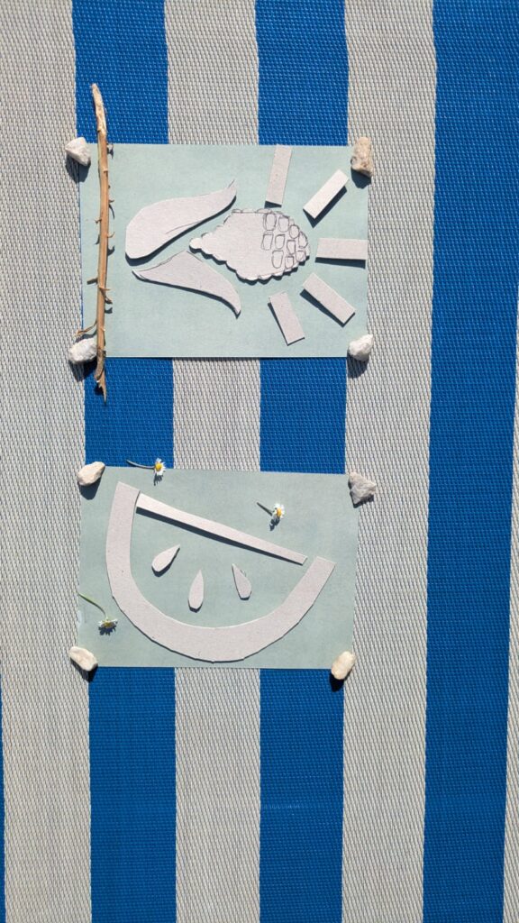
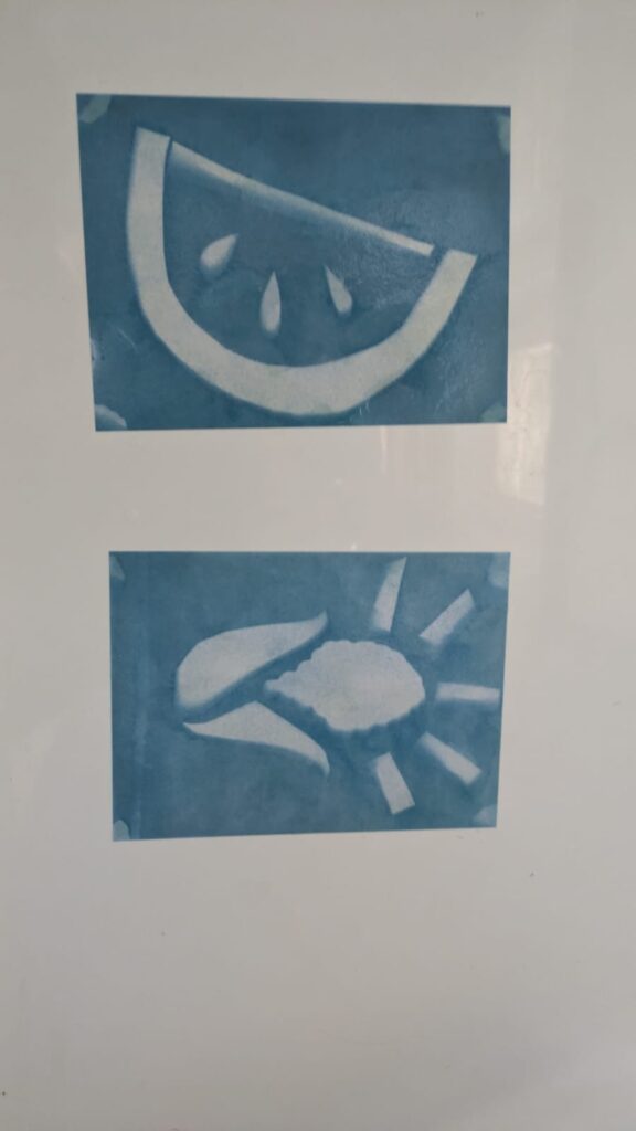
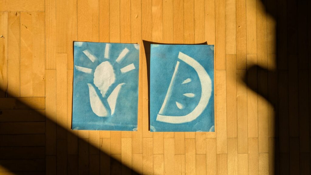
So, without further ado, I will explain how sun printing works, what the challenges were and show you how my own process went. Basically the kind of sun printing that I chose (there are several different types and options to choose from) is cyanotype. However, as I already mentioned, I did the simple version of it and just bought some pieces of paper that were already chemically treated. I had to take the piece of paper out of its light-proof packaging, there is one side that is slightly blue, this is the side that you’re supposed to work with, since this is the side with the chemicals. Then you take some bits and pieces, it can be natural materials like plants or any other material that you can think of. The important thing is to tape the pieces in place so they don’t move too much, when you put the piece of paper outside. Then you leave it there for a while around 30 mins, you take all of the pieces off and wash the paper. The colour turns into a darker blue and the part where the pieces were turns into a negative image due to the UV-rays. Then the paper dries and you have your final print.

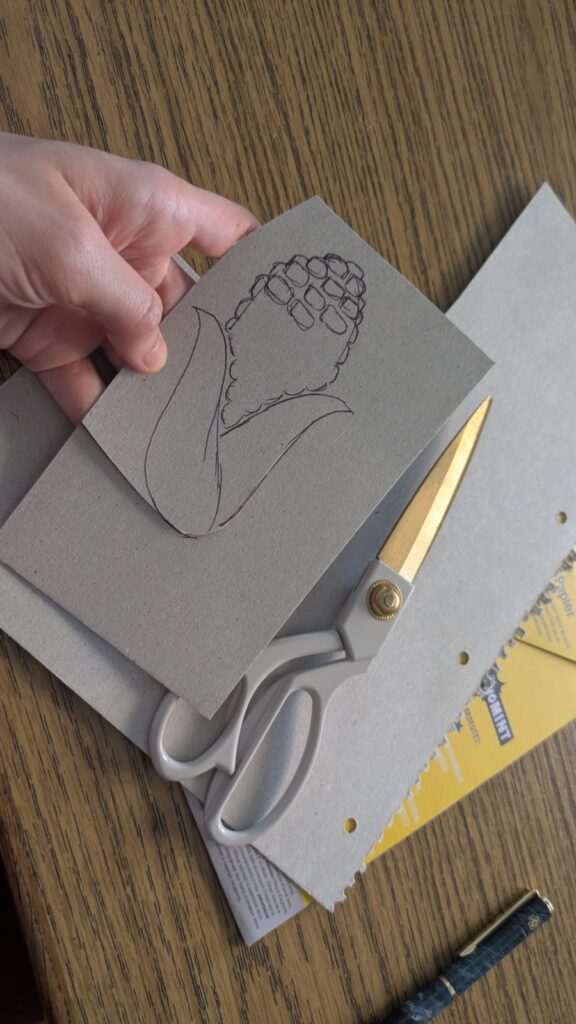
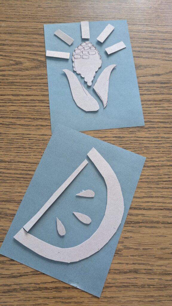
This was a very fun process for me and I also learned a few things on what to really do ideally. I chose to just work with cutting out pieces from a piece of cardboard and then stick it to the paper with tape. When I put it outside I decided to put some stones in the corners of the paper, even though it would show up on the print, because otherwise my project would have been blown away by the wind. Then I decided to spontaneously try out putting some small natural materials on top, like a stick and some daisies, for instance. However, I was too lazy to also tape them to the paper, therefore they moved and they don’t really show up on my print, even though, some of them were still on the paper in the end. It was a nice process, I will definitely do it again and try out some more things. I again decided to stick with the topic of food as a political symbol for certain cultures. This time I chose some corn as a symbol for native americans that were and still are brutally driven out of their own lands and I chose the watermelon as a symbol for palestine again.
Design Activism “Bügelperlen/Steckperlen”

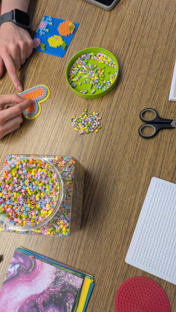
Since I wanted to try out some very different methods for this process of experimenting with different things, I decided to take a trip back down to memory lane and experiment with “Bügelperlen/Steckperlen”. I couldn’t really find the right english equivalent for this word, but maybe it is ironing beads or something similar. These are small plastic beads coming in different colours that you can form shapes with and then put some paper between them and the iron and iron them flat so that they melt together. With this technique you can make coasters out of them or charms or anything that is flat and comes to mind really.

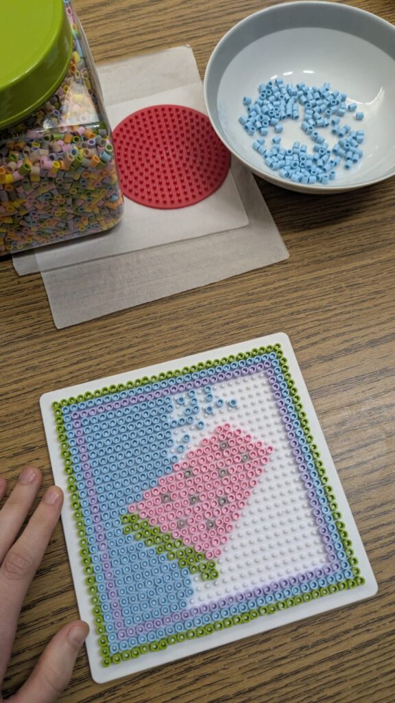
The process is quite simple and repetitive, depending on the motive that you’re trying to make and the size that you want to make it in. You have a plate that is specifically made for these beads that has several elevated areas. The beads are not round, but cylindrical and have a hole right through the middle. This hole is supposed to be put on the elevated area in the plate so that the motive stays in place when you’re building it and especially also when ironing later on. Then you can either think about how to make something on your own or try to find some examples in the internet. I tried both methods, in order to see how each one works. The more creative approach is of course trying out how to create your own motive. It is a simple process, but it can take a while and needs a lot of patience, when the pattern that you want to make is quite big. Below you can see two pictures of my process. However, I also had to seperate the beads by colour since the packages that you can buy are always mixed. This added even more time to the process. But it is still fun and takes me back to my childhood, you might also want to retry some things that you’ve done in your past, it is quite fun.

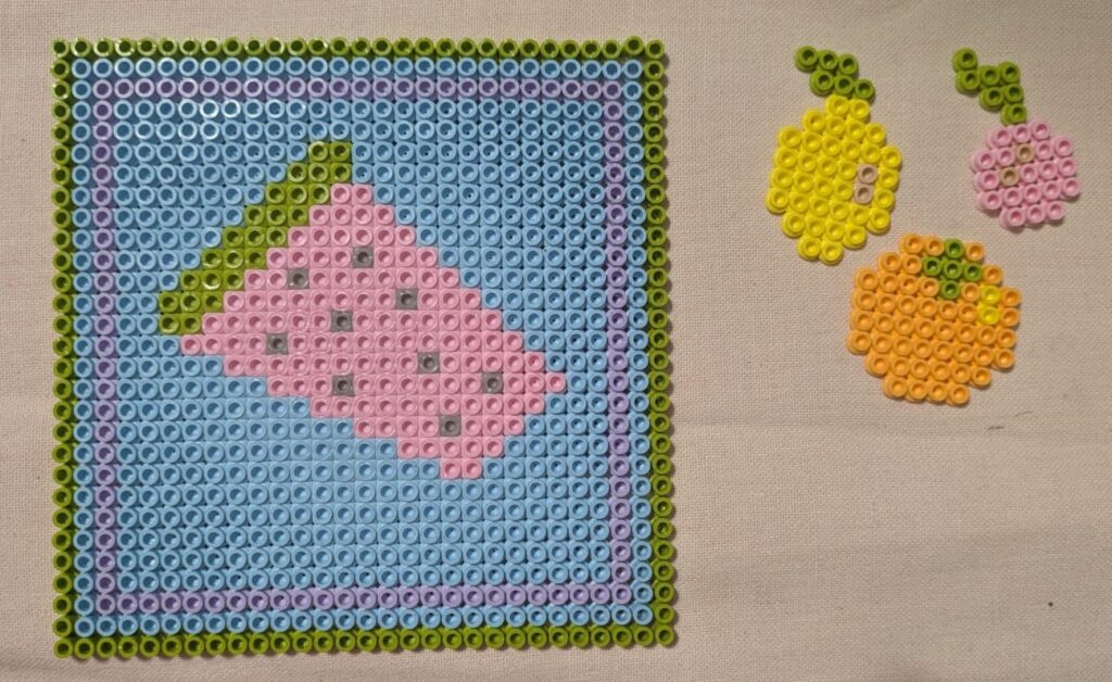
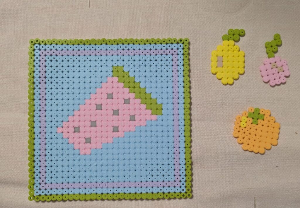
The topic that I’m working on for these experiments is still the same as you can see: “food is political”. I decided to stay with the watermelon motive from the free palestine mouvement and also made some other fruits, an orange, a lemon and a cherry. The crab and the heart was just something I added for fun. The longest of these was the watermelon, which took ages and also shows some of the limitations of this medium. It looks quite pixel based, since you also only have limited ways to place the beads and filling large areas can take quite a while and be tedious, since the beads are small and you need to be able to work very precisely if you don’t want all the other beads to fall.

The last step in the process is the ironing and this ties it all together, since the beads melt into a flat mass that can later also be hanged on a window or used as a coaster, for instance, as I’ve already mentioned in the beginning. See below how my pieces turned out, front and back view.

Design Activism Silkscreen Printing

I had the chance to join a silkscreen printing workshop and decided that it would be a nice addition to my experiments. I was only able to do one print, since you have to prepare the silkscreen accordingly and I only had the option to use one screen, therefore I really had to think about how I could get the best out of it.

In the beginning, we were told how the process works. On the first day we had to prepare a black and white image or text that we wanted to print and then we had to start prepping the screen. Each one of us were given a screen according to the size of our image. It was already prepared and had a paste on it that was reactive to light. We then placed our images on top and went into the dark room, where we exposed it to light. She mentioned that it needed at least 8 hours, so we had to start the rest of the printing process on the next day.

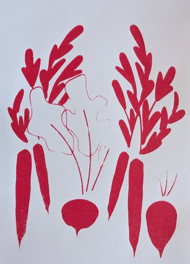
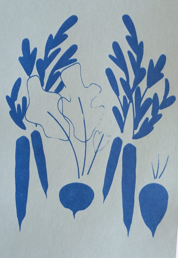
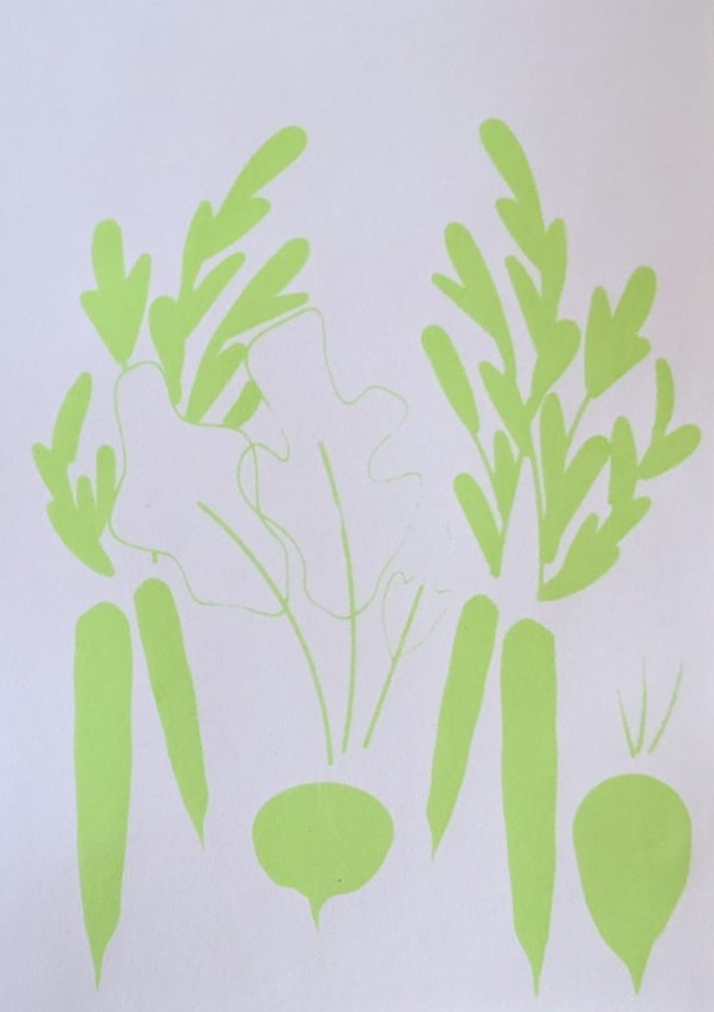
Therefore, when we came back in the morning, we took our screen and washed it carefully with a pressure washer, so that our motifs became visible, since the paste only stayed in the areas without the image. When we were done with this part everyone got to mix some colours I decided on doing a light green, a red, a yellow and a dark blue, to get some different print options in the end.

Then we were able to start printing, all of us got a ‘Rakel’ (the tool that you use for the printing) and she explained the process once more. First, you put some colour just above your image, but you have to be careful that it is not too much and then you use the Rakel in the right angle and put a certain amount of pressure on it while filling the whole image with colour. Once you are finished, you take the rest of the colour that is left on your screen and put it back into the container. If you want your images to look well-made and clean it is advised to wash the screen after each print or after two prints in a row. This is a little tedious, but the results really showed the difference. I also realized that it will take a bit of time to get the hang of it, since you can easily tell when you’ve used too much colour and when you’ve not washed the screen enough, since the colour that is still on it then dries.

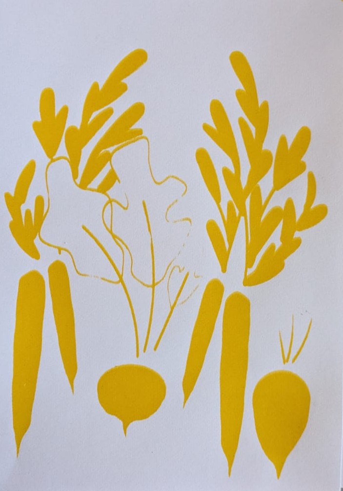
I decided to use make a similar print to what I’ve already tried out with the collage experiment. I made a vegetable print that featured carrots, a beet and a radish (on the topic of “food is political” as I’ve already mentioned in the blogposts before). The dark blue ended up on a mint green paper since the colour came out much nicer in this combination. Below you can see my results. Even though the process was sometimes a bit tedious it was a lot of fun and I also learned that the lines should not be too thin when doing silkscreen printing.

Design Activism Collage Part 2

If you’ve been reading my blog posts you know that my last experiment was focused on doing collages on the topic: “food is political”. In my last post I got a bit into how my process started and talked mainly about how I was able to find my topic and which factors make the sentence true on several different levels. I focused on privileges and the accessibilty of food, as well as how food is tied to survival and can be tied to cultural identity. To add to that, I already started mentioning that food has been used either as a symbol for political mouvements or as a way of dealing with historical pieces of art or statues of questionable people, when vandalizing these with food.

As I’ve already mentioned in my last blog post, my process was rather messy, but I think with collages this is mostly the case anyways. I started to search my box of scraps to find some things that might be used for food, first I started to search for certain colours that remind me of specific vegetables. But I also searched for pieces of food and things associated with food. In the following picture you can see just how messy my process really was.

I decided to focus on doing three collages that were focusing on different aspects of “food is political”. In one of them I wanted to show different types of vegetables as a symbol for farmers implying the different accessibilty of food over time. In the second one I wanted to show how charged it has become to see objects that are associated with watermelons, and how easily the Free Palestine Mouvement can be implied, when adding a view conceptual changes to it. In the last one I tried to show that food connects people and is also a symbol of identity, people tend to identify themselves through food, especially in Europe a table full with different types of foods shows wealth that isn’t only measurable in money.

As I’ve already mentioned, with the collage you can see on the left below, I was trying to find ways to show vegetables without cutting them out as finished versions already. I searched for different colours and thought about whtat they reminded me of and then proceeded to find the leaves or other parts that might match and make sense for the composition. In the collage you can see a tomato, an aubergine, a carrot, a beet and a zucchini all perched upon a cutting board. These are supposed to show an everyday situation, implying the accessibility of food, as well as, the history of farming.

The poster in the middle is focusing on palestinian identity, as well as the free palestine movement. The watermelon set of tableware just came at the exact right time, to clearly show that it is supposed to make sense in a palestinian context, I added some tiles that reminded me a bit of the palestinian fabrics that also show elaborate patterns. To add to that, the stars above showase freedom and to fight for freedom usually some tools are needed, in this case the cutlery.

Finally, the poster on the right explores cultural identity through food. It showcases a table filled with food, and adds some botanical details reminding that food always somehow comes from nature. This again features the question of accessibilty and that in certain areas of the world having a table filled with food can be considered normal, even if it shows great privilege.

All in all, this experiment was a really fun process and it opened my eyes to making collages in a simpler way that is really fun and also creates outcomes that really make sense and work for certain projects.

Design Activism Collage Part 1

In my second experiment for my Design Activism topic I decided to go for the classic approach of trying out some collages. For this I first had to decide on a topic, since Design Activism can come in many different forms and it would’ve been harder to work on several different topics at once. So for this first try in collage, because I haven’t done them in a while and I also haven’t liked my previous tries at collage very much, I have to say that I’m quite happy with my process, as well as, the outcome.

Firstly, I gathered some materials, luckily since I cannot seem to throw away stuff easily, I’ve already been preparing for doing collages for years, in case I someday want to do them. Therefore, I had a big box full of magazine scraps and textured papers that I wanted to scour for some useful things that I might be able to integrate in my collages. To add to that, I prepared some differently coloured papers as a background for my collages.

It took me quite a while to think about what kind of topic might be the right approach for these experiments that I’m doing, therefore I decided on trying it with the topic: “food is political”. Food is something important to every human being, since it is necessary for survival and, therefore, one of the central topics of life, whether we want it to be or not. Some people eat food to have energy to do the things they enjoy or have to do in life and some see food as something that can be enjoyed and does not only serve to keep the body functioning. As we all know, food is something that can put countries in crisis since it is so very necessary for our survival, this means that food has always been and will always be political, even if many people might not want to see it that way. Even in earlier times, farmers could not freely decide, who gets their food, because there was always someone else they had to listen to and they had to serve to even be able to afford having their own fields. Nowadays, access to food is also not certain for everyone. Depending on how privileged you are, in which country you live and what kind of work you are able to do already changes the accessibility that you might have to daily goods for survival. Usually it also depends on how much money you have, whether you can afford to make healthier choices or have to stick to whatever is available for cheaper prices. To add to that, many cultures build their identity based on typical foods, which makes different types of vegetables or grains culturally loaded and also victims to colonization, as can be seen by researching African plants, for instance.

Food has also been used as a symbol for several different political mouvements. Whether it is by throwing different kinds of food at pieces of art or vandalizing statues of people that have been doing questionable things during history or just using a certain type of food for a certain mouvement, e.g. watermelon for Palestine. These are all things that I have kept in mind during my collaging process. If you’re interested and want to follow along and see what kinds of collages I made, there will be a part two of this long process. 🙂

Design Activism Interview

I know I am quite late to be starting with my blogposts for this semester, but I’m trying. I’m currently in one of the hardest periods of my life so far, so please, bear with me.

I decided to do an interview for my topic of Design Activism, but since I’m still missing my research question, finding interview questions turned out a little harder than I thought. For this exact reason, I currently only interviewed one person, because I wanted to find out if the questions would work and what results I could get. For my master’s thesis I will probably be reworking the interview, in order to make it more specific and accurate for my future research question. I decided to focus on how Design Activism is viewed by people within the Design industry. For this I decided to interview Lena, who turned out to be a really good interviewee and confirmed many of the thoughts that I had about designers dealing with Design Activism, so thank you for that.

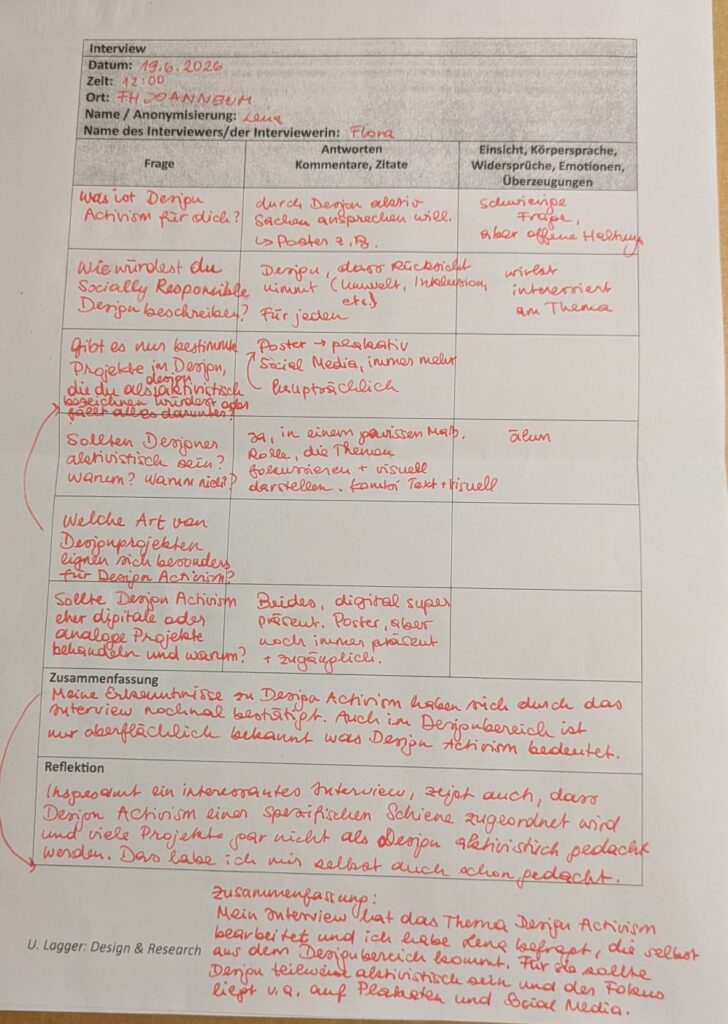
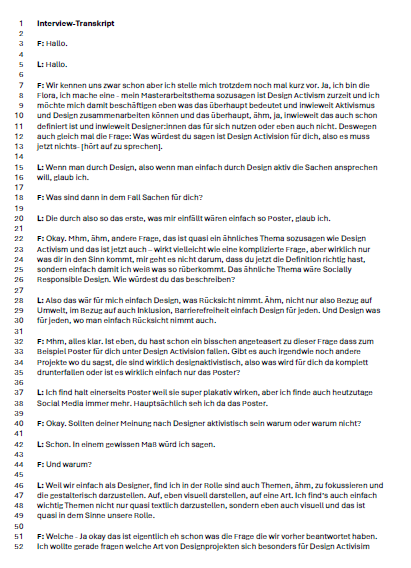
In the beginning I instantly wanted to start with some hard questions, because it gives me a better idea what designers might know about Design Activism without having spent time researching it in-depth. So my first two questions were: What is Design Activism for you and how would you describe Socially Responsible Design? Lena told me that Design Activism is when someone actively talks about things through design, while Socially Responsible Design is design that takes things into consideration (for instance, environment, inclusion, accessibility, etc.) it is Design that is for everyone.

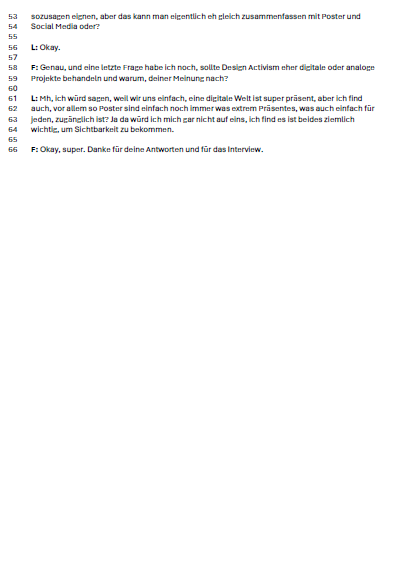
In the next step I asked her which types of design projects she would describe to be design activist and she said that she mainly thinks posters and social media are platforms people use to show design activist work. This showed me that, as I thought, the main idea of activist work nowadays (excluding demonstrations, of course) is being presented and spread throughout social media or posters. Lena mentioned that although many things happen on social media nowadays, posters still have a lot of power and are sometimes even more accessible to people than social media. This is also why she thinks that both the digital and the analogue space are important for Design Activism, since they are accessible for different people and the message can be spread in numerous ways depending on the area, where it is shared.

Last but not least, I wanted to know if designers should show activist work or not and Lena answered that to a certain degree designers should add activist works, because they are responsible for focusing on and showing certain topics in a visual and easily understandable manner, so people might be able to understand some causalities better.

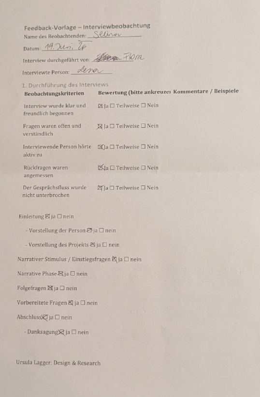
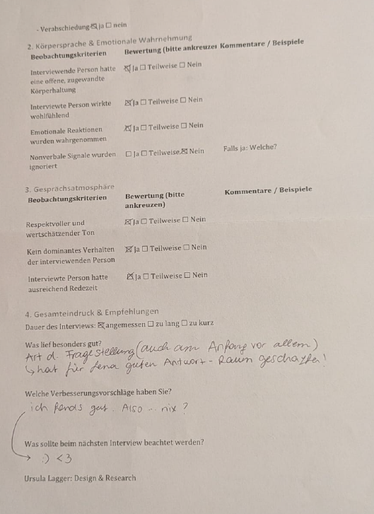
Thank you Lena for the interview and for the experience of professionally creating and conducting an interview! And thank you Selina for the observations concerning my interview. Below this blogpost you can see my interview notes, a short summary and reflection on the interview, the observation sheet from Selina, a Feedback from Lena and the transcript of the interview. Keep in mind that it was conducted in German so all the mentioned documents are in German too, sorry.

Was Menschen denken? (Part 8)

Hey!

Wie ihr euch vielleicht noch erinnern könnt, habe ich vor einiger Zeit eine Umfrage verschickt, um herauszufinden, wie andere Menschen mich als Person und Gestalterin wahrnehmen. Zuerst einmal: Danke an alle, die sich die Zeit genommen haben, mitzumachen! Die Antworten waren teilweise sehr überraschend, teilweise bestätigend und insgesamt unglaublich spannend zu lesen.

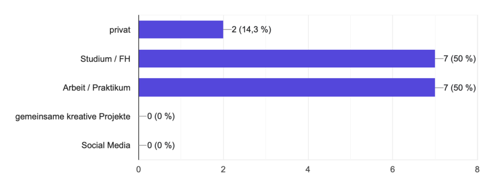
Da Menschen aus ganz unterschiedlichen Bereichen meines Lebens teilgenommen haben – Studium, Arbeit, Praktikum und Privatleben – war ich besonders neugierig, ob sich ein gemeinsames Bild ergeben würde.

Bei der Frage, ob ihr mich eher als Künstlerin oder Designerin wahrnehmt, wurde am häufigsten „Künstlerin“ gewählt. Viele von euch haben aber auch geschrieben, dass meine Arbeiten irgendwo zwischen Design und Kunst liegen oder beides gleichzeitig sind. Einige sehen mich eher als Designerin. Besonders spannend fand ich die Antwort einer Person, die meinte, ich sei noch auf dem Weg und deshalb nicht eindeutig einzuordnen. Mehrere von euch haben außerdem geschrieben, dass meine Arbeiten für sich selbst sprechen – ein Kommentar, über den ich mich besonders gefreut habe.

Auch bei den persönlichen Eigenschaften haben sich einige klare Tendenzen gezeigt. 86,7 % von euch haben mich als freundlich beschrieben. 64,3 % verbinden mit mir die Eigenschaften fähig, selbstsicher und vertrauenswürdig. Ebenfalls häufig genannt wurden witzig, verlässlich und komplex (jeweils 57,1 %).

Eine Erkenntnis, die mich besonders gefreut hat: 71,4 % von euch verbinden mit mir als Person und mit meinen Arbeiten sehr ähnliche Gefühle. Die Begriffe Freiheit, Stärke und Freude kamen dabei immer wieder vor. Das zeigt mir, dass viele von euch meine Persönlichkeit und meine kreative Arbeit als etwas Zusammengehöriges wahrnehmen.

Auch bei den Farben gab es ein überraschend klares Bild. Blau wurde am häufigsten mit mir verbunden, generell aber auch kräftige, leuchtende Farben. Was dabei auffällt: Keine einzige Person hat Pastellfarben genannt. Offenbar werde ich eher mit starken Kontrasten und ausdrucksstarken Farben assoziiert.

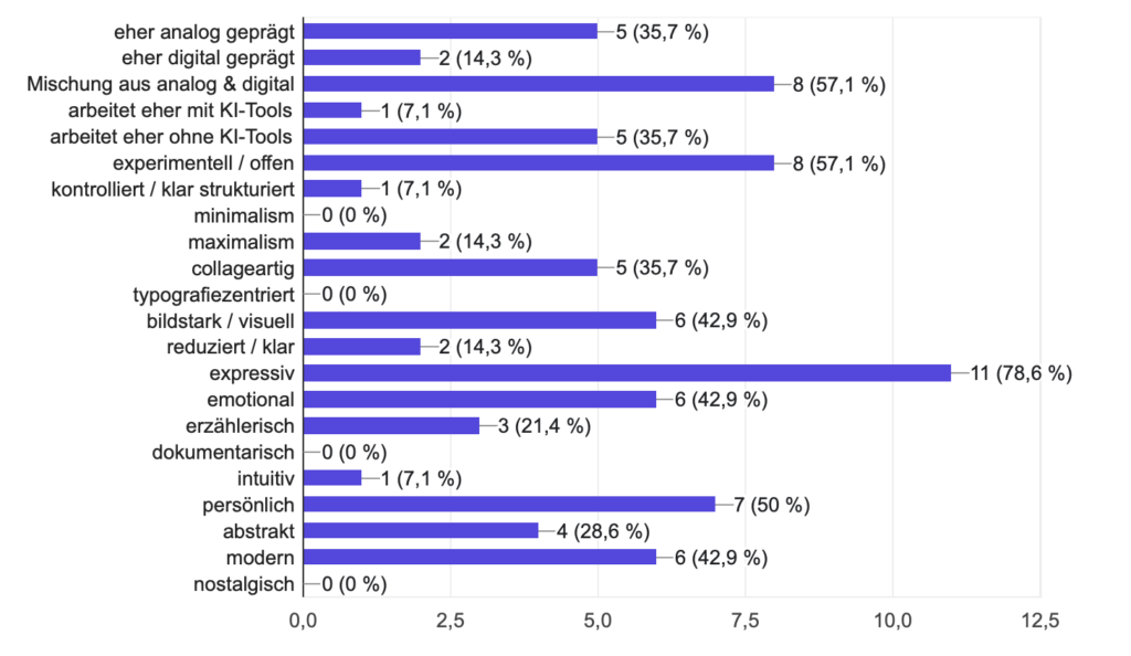
Meinen kreativen Stil haben 78,6 % von euch als expressiv beschrieben. Viele sehen ihn außerdem als experimentell sowie von einer Mischung aus analogen und digitalen Arbeitsweisen geprägt (jeweils 57,1 %).

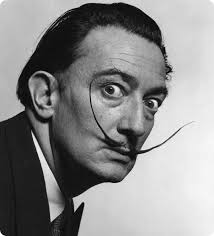
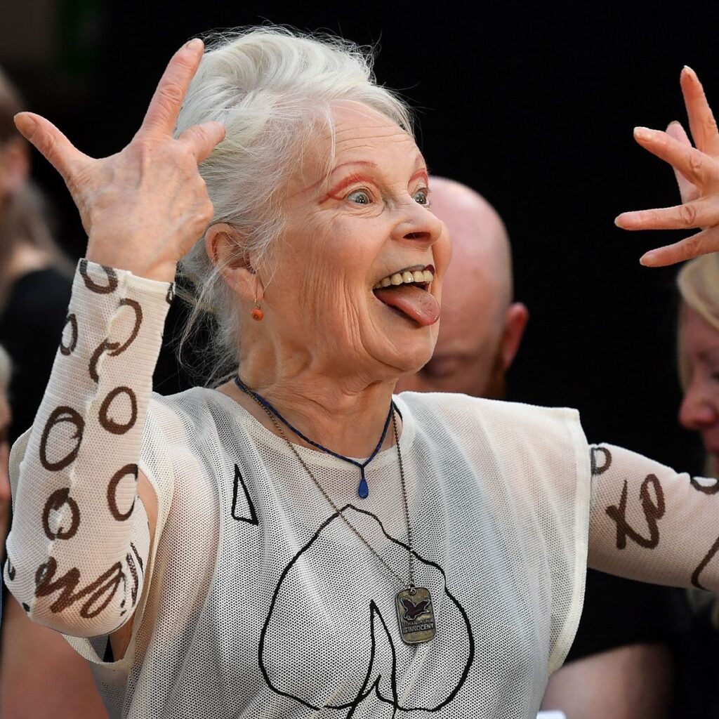
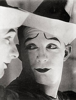
Besonders neugierig war ich auf die Frage: „Wenn meine Arbeiten eine Person wären – wie wäre diese Person?“ Die Antworten reichten von konkreten Persönlichkeiten wie Dalí oder Vivienne Westwood bis zu Beschreibungen wie „nicht zu übersehen :)“ oder „ein Weißclown: scheinbar ruhig, aber tiefgründig und voller Überraschungen“. Allein diese Antworten zu lesen hat unglaublich viel Spaß gemacht.

Auf die Frage, was an mir besonders authentisch wirkt, wurden meine Art und mein Auftreten am häufigsten genannt. Mehrere von euch haben außerdem meine mutigen Farbkombinationen erwähnt. Eine Antwort ist mir besonders in Erinnerung geblieben: Dass ich meine Haltung und Persönlichkeit nicht von meiner kreativen Arbeit trenne und dadurch das Gefühl entsteht, dass das, was ich gestalte, wirklich zu mir gehört.

Ein Feedback, das sich durch viele Antworten gezogen hat, war, dass ich mein Selbstbewusstsein noch stärker zeigen könnte. Das fand ich interessant, weil gleichzeitig auch Selbstsicherheit häufig als Eigenschaft genannt wurde. Vielleicht bedeutet das einfach, dass noch mehr davon sichtbar sein darf.

Zum Schluss noch ein kleiner Fun Fact: Bei der Frage nach Musik, Filmen oder Objekten, die an mich erinnern, haben viele von euch sehr persönliche Insider genannt, die wahrscheinlich nur wir verstehen. Daneben wurden aber auch Filme wie „Alice in Wonderland“ von Tim Burton, „Volver“ von Pedro Almodóvar oder „Ronja Räubertochter“ genannt. Damit hätte ich ehrlich gesagt nicht gerechnet. Noch überraschter war ich bei „Rachmaninow“. Falls die Person, die das geschrieben hat, das hier liest: Ich würde wirklich gerne wissen, was die Gedanken dahinter waren haha

Insgesamt fand ich es unglaublich spannend zu sehen, welche Gemeinsamkeiten sich durch die Antworten gezogen haben und welche Aspekte von mir offenbar besonders stark wahrgenommen werden. Danke euch allen fürs Mitmachen und für eure ehrlichen, kreativen und teilweise sehr schönen Antworten!

✋ au revoir

*12 Auswertung

Im heutigen blogpost geht es um die Auswertung der Umfrage: 


Der Großteil der Teilnehmer:innen waren Eltern mit 77,8%, 22;2% sind Großeltern und ebenfalls 22,2% Verwandte. Zusätzlich haben auch einige pädagogische Fachkräfte und Babysitter:innen teilgenommen. Die Kinder, über die berichtet wurde, waren überwiegend im Alter zwischen zwei und sieben Jahren, also genau die Altersgruppe, für die das Buch gedacht ist. 

Was das Leseverhalten betrifft, zeigt sich ein gemischtes Bild: Rund 40% der Befragten lesen täglich mit Kindern, etwa 20% mehrmals pro Woche und der Rest eher selten. Das hat mich daran erinnert, dass ein Buch auch dann funktionieren muss, wenn es nicht jeden Tag in die Hand genommen wird, es sollte also beim erneuten Aufschlagen sofort wieder einladen. 

Besonders interessant war die Frage, was ein Kinderbuch zu einem guten Buch macht. Hier kamen sehr ähnliche Antworten: Die Geschichte soll spannend sein, die Illustrationen ansprechend und die Sprache kindergerecht, aber nicht kindisch. Mehrere Personen betonen außerdem, dass das Buch auch für die vorlesenden Erwachsenen angenehm sein soll. Ein Punkt, der mich persönlich sehr gefreut hat, ist der Wunsch, dass Kinder als Publikum ernst genommen werden und der Text nicht übertrieben vereinfacht oder verniedlicht wird. 

Beim Thema Inklusion und Diversität war die Übereinstimmung besonders eindeutig. Ungefähr 75% der Befragten haben bereits Bücher zu diesem Thema genutzt oder kennen zumindest welche. Hier wurden Beispiel wie die Conny Geschichten genannt aber auch spezifische Bücher zu Körper, wie Jeder hat einen Popo, Familienformen wie das Mädchen mit den vier Namen oder Bücher über Beeinträchtigungen. Eine Sache die dabei am häufigsten positiv hervorgehoben wurde ist, dass Diversität in diesen Büchern als selbstverständlich vorkommt, ohne es jedes Mal explizit zu betont zu werden. Eine Person brachte es besonders gut auf den Punkt, denn wenn inklusive Details jedes Mal extra hervorgehoben werden müssen, verlieren sie ihre Normalität. Genau das ist auch mein Ansatz. 

Die am häufigsten genannten Themen, die Befragten für Kinder als besonders wichtig sehen, waren Gefühle und Emotionen, Beeinträchtigungen sowie Familienformen, diese Themen wurden jeweils von über 80% der Befragten angekreuzt. Auch Hautfarbe und Herkunft, Geschlechterrollen sowie Körper und Aussehen als ebenfalls wichtig eingestuft. Bei der Frage, ob Kindern selber über Unterschiede zwischen Menschen reden haben 88,9% mit Ja abgestimmt und 11,1% mit selten aber niemand mit Nein. Des Weiteren gaben 66,7% an, bereits Kinderbücher zum Thema Inklusion und Diversität zu kennen, 22,2% verneinten und 11,1% meinten, sie kennen nicht so wirklich welche.

Was Erwachsene für Kinder klar ablehnen, war ebenfalls sehr eindeutig, denn das Buch soll auf keinem Fall belehrend wirken. Nahezu alle Befragten sagten das als zentralen Kritikpunkt. Ein Buch zu diesem Thema soll kein Lehrbuch sein sondern eine Geschichte, wo Diversität einfach sichtbar ist und als normal gilt. Diese Rückmeldung hat meine Richtung für das Projekt klar bestätigt 

Bei den interaktiven Elementen war die Begeisterung besonders groß. Alle Befragten gaben an, diese Art von Büchern bereits zu kennen. Entscheidungsseiten, also Seiten auf denen Kinder selber wählen können wie die Geschichte weitergeht, sowie Klappseiten wurden am besten bewertet. Verschieden Texturen und Materialien, Spiegel- und Schiebelemente wurden als durchschnittlich gut bewertet und eher skeptisch waren viele gegenüber Pop-ups und 3D-Elementen. Die meisten Elemente wurden als gut bis sehr praktisch im Kindergartenalltag und Zuhause eingeschätzt, die diese als hinderlich beschrieben wurden. Das sind Wichtige Hinweise für die gestalterische Umsetzung

Im letzten Abschnitt der Umfrage ging es um konkrete Wünsche und Anregungen. Hier zeigte sich, dass sich die Befragten vor allem Lebensnähe wünschen. Kindern sollen Situationen und Figuren begegnen, mit den sie sich identifizieren können, Geschichten erleben die ihre Realität Wiederspiegeln und Dialoge hören die sie selbst anwenden können. Mehrere Personen wünschen sich außerdem, dass Stereotypen aktiv gebrochen werden und eine Vielfalt an Lebensformen, Körpern und Familienformen ganz selbstverständlich abgebildet wird. Eine Antwort hat mich dabei besondre zum Nachdenken gebracht: „Wenn alle Bücher etwas von der Norm abweichen würden und unterschiedliche Familienkonstellationen, Körper etc. abbilden, wären extra Diversitätsbücher nicht notwendig…“ Das ist letztendlich auch da Ziel, ein Buch zu machen, das irgendwann gar nicht mehr als besonders gilt, weil das was es zeigt längst selbstverständlich ist. 


Ingesamt hat mir die Umfrage ein sehr klares Bild gegen, was für diese Zielgruppe passend und gewünscht wird: Ein Buch, was Kinder begeistert und das Vielfalt ganz selbstverständlich gezeigt werden soll, ohne den gesamten Fokus darauf zu legen. Mit diesen Erkenntnissen kann ich jetzt in den gestalterischen Teil des Projekts starten. 

*11 Umfrage Erstellung

In diesem Semester möchte ich mich darauf fokussieren zu recherchieren und vor allem zu testen, wie ich ein Kinderbuch gestalten kann, das für Kinder interaktiv sowie ansprechend und spannend ist. Zudem soll das Buch gleichzeitig Themen wie Inklusion und Diversität für Kindergartenkinder auf eine altersgerechte Art und Weise präsentieren. Die zentrale Frage dieses Semesters ist daher, was brauchen Kinder in diesem Alter wirklich und was interessiert sie überhaupt. Um das heraus zu finden, habe ich zu Beginn des Projekts eine Umfrage erstellt, die an Eltern, Großeltern, Verwandte und pädagogische Fachkräfte gerichtet ist. Also an all jene die tagtäglich mitbekommen, was Kinder begeistert, was sie beschäftigt und welche Themen in ihrem Alltag eine Rolle spielen. Ihre Perspektive ist für mein Projekt besonders wichtig, weil sie nicht nur wissen, was Kinder mögen, sondern auch, was im Alltag wirklich funktioniert. 

Der Einstieg der Umfrage ist bewusst allgemein gehalten, um ein Gefühl für die Zielgruppe zu bekommen. Daher startet die erste Frage mit: „Welche Rolle hast du im Leben eines Kindes? Direkt gefolgt von der Frage nach dem Alter des Kindes. Denn ein Buch, das für einen Dreijährigen funktioniert, sieht ganz anders aus als eines für Sechsjähriger, sowohl inhaltlich als auch gestalterisch. Wo das eine Kind noch klar Bilder und kurze Sätze braucht, kann das andere schon komplexeren Gesichten folgen, Witze verstehen oder Rätsel lösen. Deshalb war es mir wichtig, von Beginn an zu wissen, über welche Altersgruppe die Befragten sprechen.

Von dort aus werden die Fragen etwas konkreter wie beispielsweise: „welche Themen sind im Alltag mit Kinder präsent?“ oder „Was macht ein Kinderbuch zu einem Guten?“. Außerdem wollte ich wissen, was Eltern und Pädagogen:innen bei schon bestehenden Büchern gefällt und was ihnen fehlt. Denn bestehende Bücher können zeigen, wo Lücken sind und wo es vielleicht schon viele Angebote gibt. Beides ist für mein Projekt seht wichtig, denn was fehlt zeigt mir, wo ich ansetzten kann und and dem was bereits gut funktioniert, kann ich mich orientieren.

Der dritte Schwerpunkt liegt auf Inklusion und Diversität. Mit diesen fragen wie: „Welche Fragen Rund um Inklusion und Diversität findest du für Kinder besonders wichtig“ oder „Sprechen Kinder von sich aus über Unterschiede zwischen Menschen“ wollte ich herausfindend, welche Inhalte besonders präsent sind und ob es für mich hilfreiche Referenzmaterialien gibt. Denn das Ziel dieses Projektes ist es, eine Geschichte zu schaffen, die Inklusion und Diversität nicht als belehrendes Thema verpackt, sonder als selbstverständlichen Teil der Handlung. Kinder sollen nicht das Gefühl haben, dass ihnen etwas erklärt wird, sondern sie sollen eine Geschichte erleben in der Vielfalt ganz normal ist. 

Der vierte Abschnitt fokussiert sich auf interaktive Elemente. Mein Ziel ist es, ein Buch zu machen, das nicht nur gut ausschaut, sondern eines, das wirklich begeistert und funktioniert, eines das Kinder neugierig macht, Gesprächsstoff bietet und das im Alltag einfach praktisch ist. 

Im letzten Abschnitt geht die Umfrage noch auf Wünsche und Anregungen ein und drauf was ein Buch auf keinem Fall machen sollte. Mit den Ergebnissen habe ich einen guten Überblick über das Thema gewonnen und kann mit dem gestalterischen Teil  des Projekts starten. 

Umfrage (Part 7)

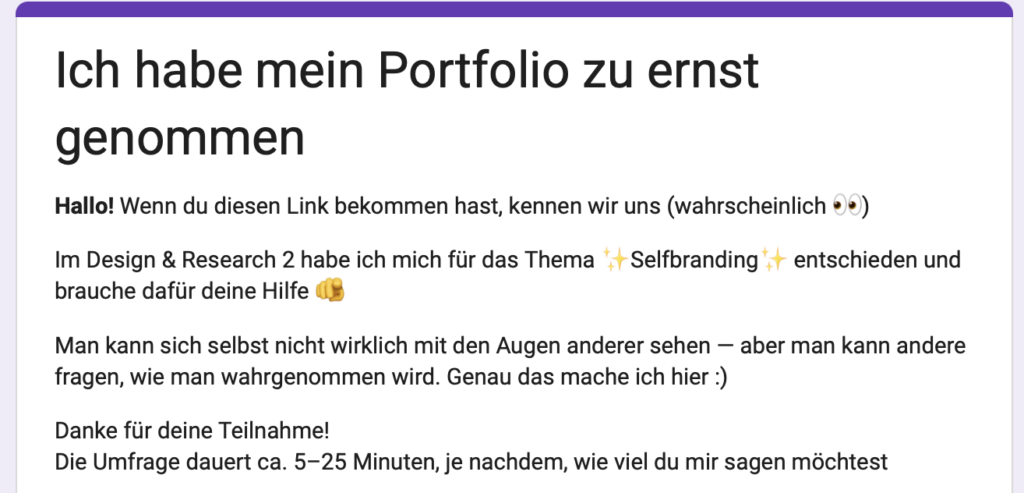
In meiner weiteren Auseinandersetzung mit Selfbranding habe ich eine Umfrage entwickelt, um meine eigene Wahrnehmung von außen zu ergänzen und zu hinterfragen.

Die bisherigen Beiträge haben bereits gezeigt, dass Selfbranding nicht nur eine visuelle Entscheidung ist, sondern stark davon abhängt, wie andere eine Person lesen und interpretieren. Genau an diesem Punkt setzt die Umfrage an.

Selbstwahrnehmung ist immer gefiltert. Man sieht die eigene Arbeit, die eigene Persönlichkeit und den eigenen Stil aus einer sehr persönlichen Perspektive. Genau deshalb wollte ich bewusst eine Außenperspektive einholen: Wie sehen mich Menschen, die mich kennen – und welche Assoziationen entstehen dabei?

Die Umfrage ist so aufgebaut, dass sie verschiedene Ebenen der Wahrnehmung abfragt:
Zum einen geht es um den Kontext der Beziehung – also wie und in welchem Umfeld man mich kennt. Zum anderen um die emotionale Wirkung: Welche Gefühle verbinden Menschen mit mir oder meiner Arbeit?

Außerdem interessiert mich die Frage nach meiner kreativen Positionierung: Wirke ich eher wie eine Designerin oder eine Künstlerin? Welche visuelle Sprache wird mir zugeschrieben? Und sogar so konkrete Dinge wie Typografie oder die Form meines Namens können Hinweise darauf geben, wie Identität visuell und sprachlich gelesen wird.

Mein Ziel ist es, aus diesen Antworten ein besseres Verständnis für meine eigene Position im Designkontext zu entwickeln. Nicht im Sinne einer festen „Marke“, sondern eher als ein offenes Bild davon, wie ich bereits wahrgenommen werde – und wie sich das mit meiner eigenen Selbstwahrnehmung überschneidet oder unterscheidet.

Die Umfrage dauert ungefähr 5–25 Minuten, je nachdem, wie ausführlich die Antworten sind. Jede Teilnahme hilft mir sehr bei meinem Projekt.

Hier ist der Link zur Umfrage:

https://forms.gle/W8KrUXzUsS7sRB4h9

Danke an alle, die sich Zeit nehmen und mir ihre Perspektive geben!!!