I’d been looking for a topic that interested me for a while—and the title itself caught my eye because I was searching by keywords. Of course, I’m not usually interested in much of the technical information related to “music.” But this really caught my attention.
Sonic City is a powerful and innovative project precisely because it presents the city not as some kind of “backdrop” for interaction, but as the interface itself. This certainly resonates with me as someone with a background in architecture. There, we always thought of the city in terms of movement, rhythm, route, atmosphere, and—not least—the physical perception of space. In Sonic City, all these qualities are not just characteristics of the environment, but also part of the interaction. The authors of the article literally propose “playing the city,” transforming everyday movement into a form of musical and spatial experience. This idea is explicitly stated in the project’s main text: the city is viewed as an interface, and mobility as an interaction model.
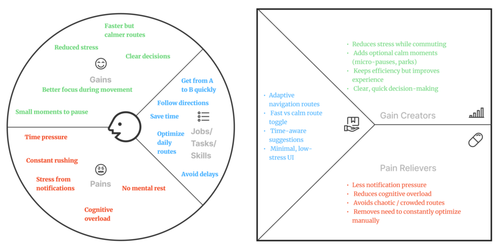
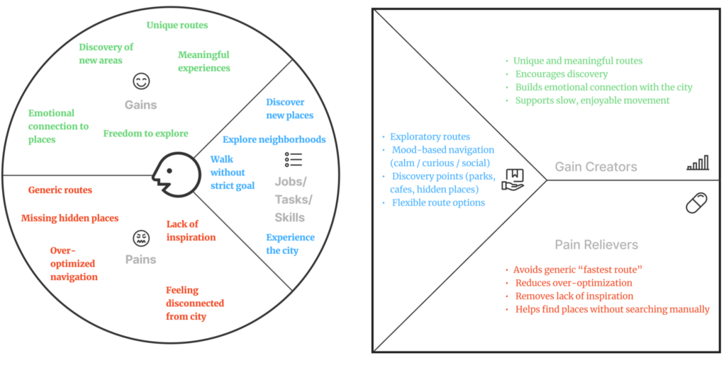
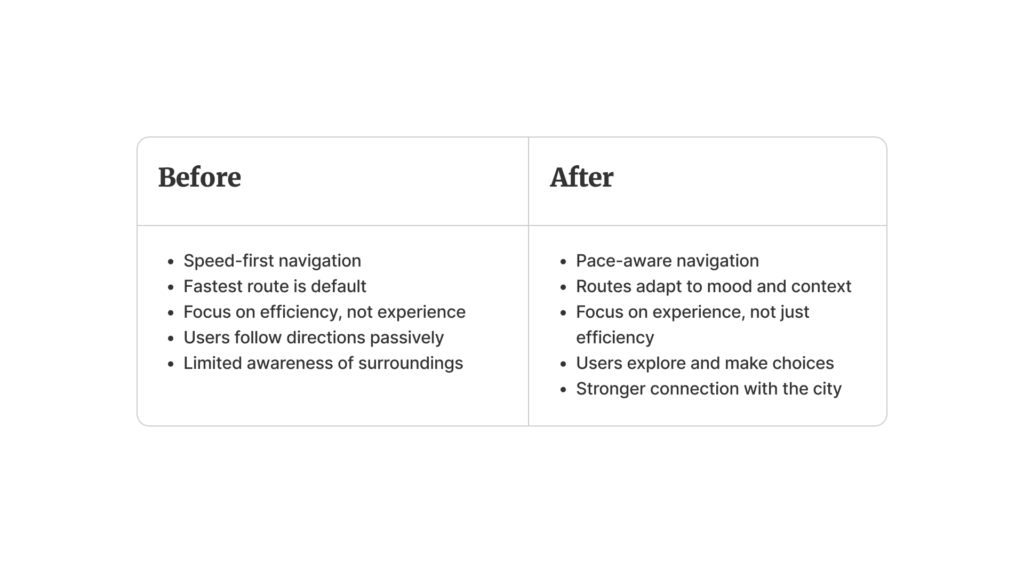
From an interaction design perspective, I find it particularly significant that the project moves away from the conventional screen-based UX. There is no traditional screen, buttons, or graphical interface here. Instead, everything is built around body movements and environmental data—rotations, movement, light, even pollution levels and the presence of metal—as well as pauses and combinations of context and behavior. The authors describe a two-level mapping system, where some parameters influence short musical events and timbre, while others affect the more structural composition of the sound. This makes the interaction less abstract and more situational; the music arises precisely from the connection between a person and a specific place and moment.
The first text “In Duet with Everyday Urban Settings: A User Study of Sonic City“ [1] struck me as a stronger conceptual and design-oriented exploration of the questions ”Why can the city be an interface?“ or ”How does this project differ from a musical performance?”. It was also very interesting to see how they included not only engineers and designers in their team, but also architects and sociologists. The project isn’t just about technology; it’s also about the body, the city, behavior, everyday life, and its aesthetics.
The second text “Sonic City: The Urban Environment as a Musical Interface” [2] is a bit more important to me, since it tests whether the idea works in real-world user experiences. The study was smaller and more qualitative than quantitative. It included people of different ages and lifestyles, and, by the way, none of them considered themselves musicians. This is an important point, since the project was tested on ordinary people. The authors, by the way, asked the right UX question: “Do people perceive Sonic City as a research tool or as a musical one?”
Overall, I consider Sonic City a very important example of how to think at the intersection of architecture, urban experience, and interaction design. For me, the project’s value lies precisely in the fact that it translates spatial perception into an interactive experience, and interactivity back into urban and bodily reality. The papers showcase not just interesting technology, but a different way of thinking about UX: not merely as interaction with a screen, but as interaction with space, the body, the route, and the atmosphere of the city. And that is precisely why this project still seems relevant to me today.
Sources 🛈
[1] In Duet with Everyday Urban Settings: A User Study of Sonic City. Proceedings of the 2004 Conference on New Interfaces for Musical Expression (NIME 2004). Authors: Lalya Gaye, Lars Erik Holmquist. Available at: https://www.nime.org/proceedings/2004/nime2004_161.pdf
[2] Sonic City: The Urban Environment as a Musical Interface. Proceedings of the 2003 Conference on New Interfaces for Musical Expression (NIME 2003). Authors: Lars Erik Holmquist, Lalya Gaye. Available at: https://www.nime.org/proceedings/2003/nime2003_109.pdf