Testing my second prototype

Design & Research 2 with Birgit Bachler

Sketching

After doing the context review and the material studies, I decided to work on my prototype again. I focused on our lecturer’s question “what is the smallest prototype you can create that still touches the issue?”. A specific issue came to my mind: according to A review of invasive species reporting apps for citizen science and opportunities for innovation by Howard, van Rees, Dahlquist, Luikart, and Hand, gamification is not sufficiently used in citizen science apps. With the intention of creating something quick, fun, and gamified, I looked at my initial analogue prototype and the app prototype I created with Ahmed Turk for our app design course. I decided I wanted to focus only on the reporting flow of the app and create a minigame. By focusing on its core feature, I wanted to make it as interesting and seamless as possible. This way, the reporting platform could benefit from a higher engagement.

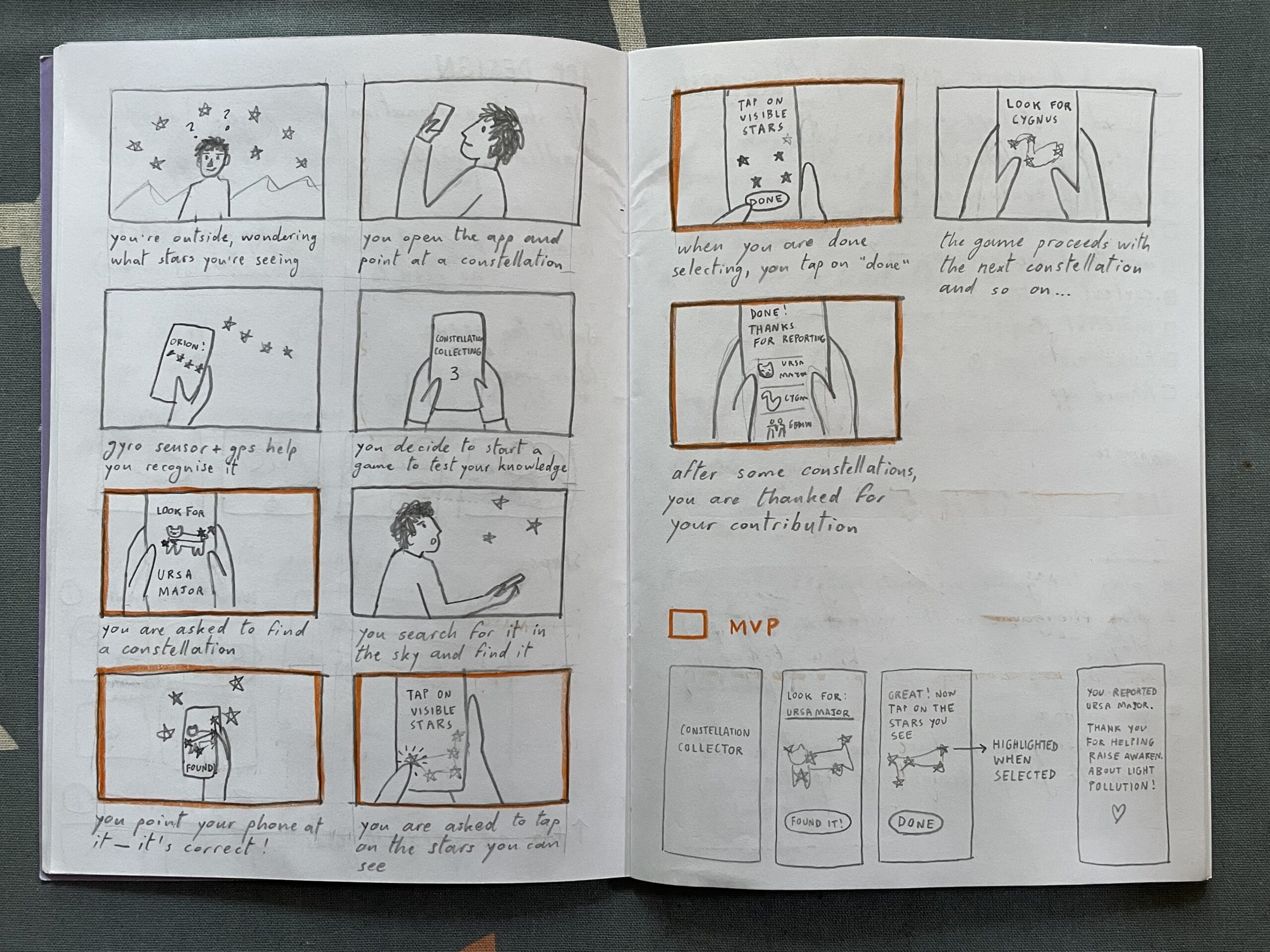
I started my second version of the prototype by sketching a storyboard. Then, I highlighted some scenes that in my opinion are the foundation for the MVP. After that, I sketched some screens and created them on Figma.
Heuristic evaluation

I then went through Jacob Nielsen’s 10 Usability Heuristics for User Interface Design to further refine the prototype. Here you can read my evaluation:

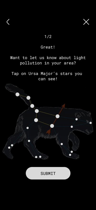
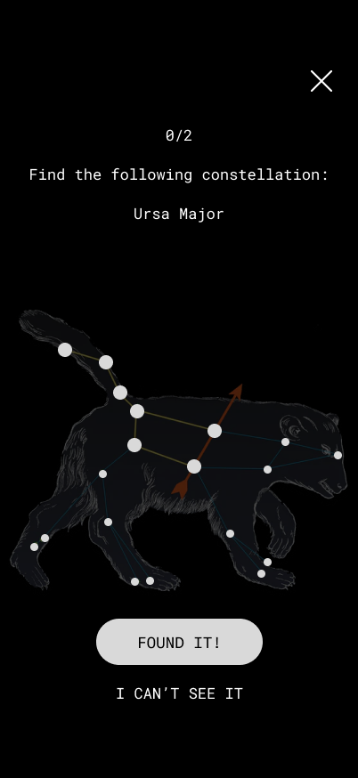
  1. Visibility of system status. At the top of the screen, you can see the progress through the game (0/2); I do not know if it should start with 0/2 or with 1/2.
  2. Match between System and the Real World. The constellation has the same shape and proportions as the one in the sky. The brightness of the stars also mirrors reality. As the app does not use GPS and the gyro sensor yet, the constellation is not rotated in the same direction as it appears in the sky. This could also be a challenge factor that makes the game a little harder. No technical jargon is used, only commonly used words.
  3. User Control and Freedom. There is an emergency exit (X) to exit the game and a back arrow to return to the previous step
  4. Consistency and Standards. The back arrow is located at the top left corner (iOS standard), while the X is at the top right. The latter should ideally also be positioned in the top left corner, but that space was already occupied. The main action is in the white button, while secondary actions are in all-caps. All clickable text is in all-caps.
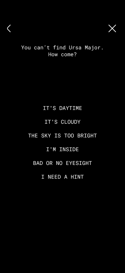
  5. Error Prevention. If the sky is not visible, there are various options that can be selected, which open tips for better observation. This prevents false reports. In the future, once sensors are incorporated, the app should recognise whether you are pointing your phone at the right constellation, to prevent mistakes.
  6. Recognition Rather Than Recall. The name of the constellation is repeated on every screen of the reporting game.
  7. Flexibility and Efficiency of Use. For expert users that already know constellations, there is an option to jump straight to the report and skip the constellation hunting part.
  8. Aesthetic and Minimalist Design. I tried to keep everything minimal; the only thing that could be simplified is the bear illustration and maybe the copy, but in my defense it is intended to have a relatable tone that brings the audience a little closer to a complex topic.
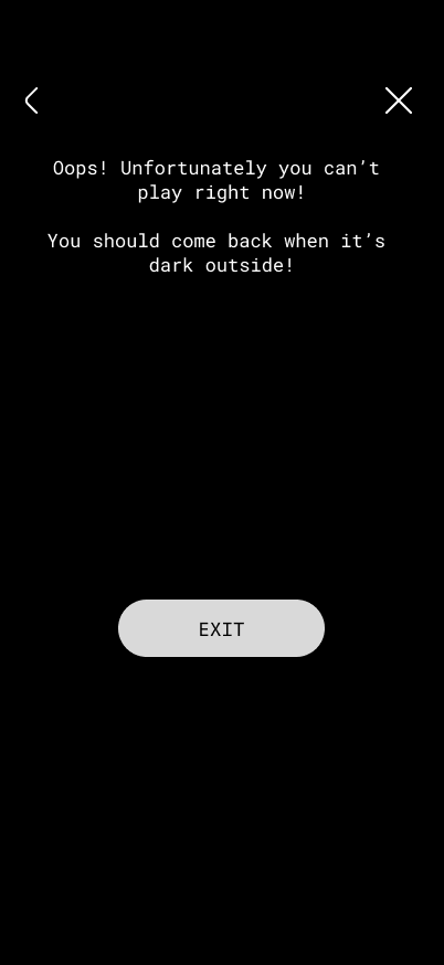
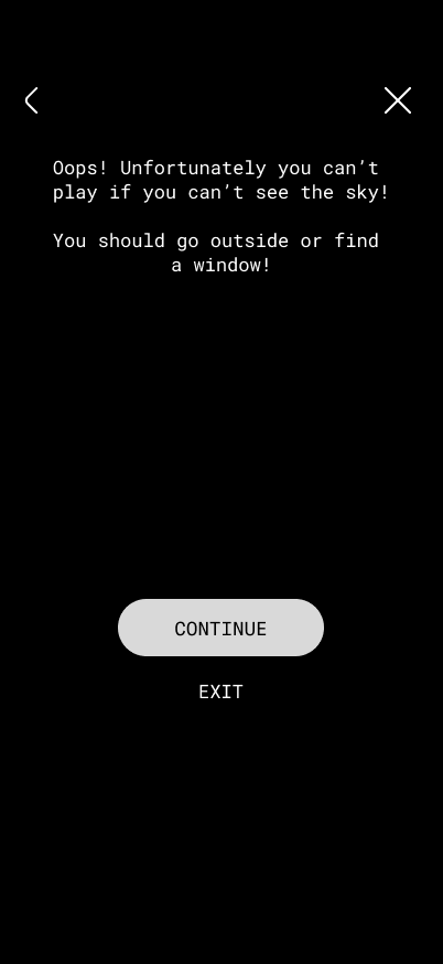
  9. Recognize, Diagnose and Recover from Errors. Error messages are written in a simple language and suggest a solution for a wide variety of issues.
  10. Help and Documentation. If the constellation cannot be located, there is the option to receive a hint.

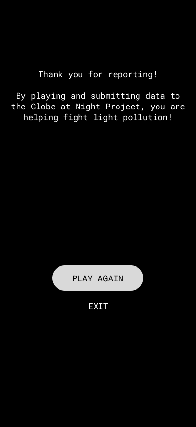
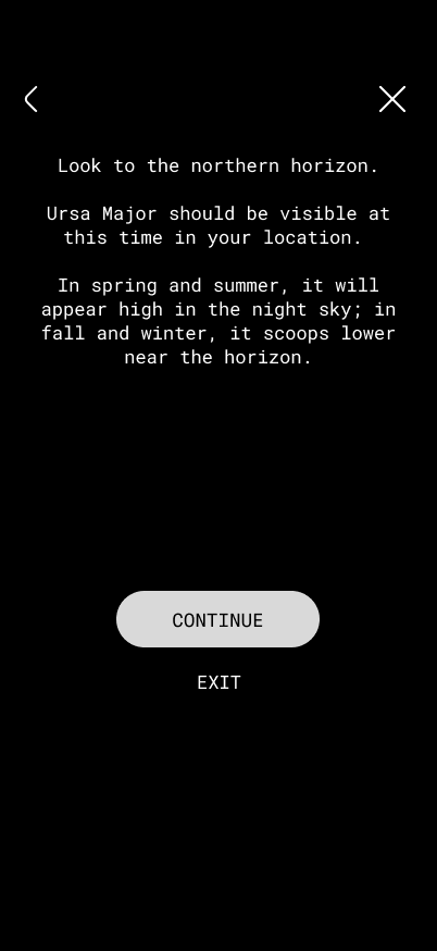
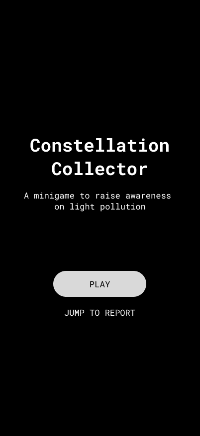
Here are some screens of the minigame. After hitting “play”, the user needs to find a certain constellation in the night sky. Then, they can report the visibility of its stars by tapping on them.
If the user cannot see the app, they can tap on “I can’t see it” and select why. This leads to different tips based on the answer.
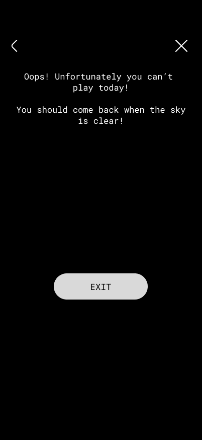
These videos illustrate two possible flows:

Possible improvements

  • Fun facts about the constellation at the end of reporting
  • Getting a badge on your profile
  • Changing tasks
  • Seeing what kind of report you submitted

Context review and material studies

Design & Research 2 with Birgit Bachler

With Katerina Sedlackova we outlined a system map, a business model canvas and a value proposition map. I also created a prototype of the light pollution reporting app with Ahmed Turk and we defined our problem, goals, target audience and user personas.

This post takes a step back and puts together everything written so far about my idea of the app to report and learn about light pollution, to review the context the project sits in and start to think about the materials it involves.

Context review

What is the core concept

Light pollution has a big effect on biodiversity and human health, but it stays mostly invisible as an issue. Most people living in cities have lost contact with the night sky, and this leads to energy waste and to disrupted biological rhythms in humans and wildlife. Compared to other, more visible forms of pollution, light pollution does not have the public awareness, the monitoring tools or the advocacy structures that would let people understand it or act on it.

The core concept of my project is a mobile app that merges reporting and instruction. Users can fill out a simple form about the condition of the sky they see, look at a light pollution map, discover the sky through augmented reality, sign petitions and connect with others through a social media function. The app is meant to make light pollution reporting and research easy and accessible, both for normal citizens and for scientists, in order to raise awareness on the issue and inform people, so the problem can be fought collectively.

Finding the gap

Light pollution is an issue that has been growing invisibly, without the monitoring tools or advocacy infrastructure that more visible pollution types already have. 

Last semester I analysed the Globe at Night Project during a usability test. It is a light pollution awareness campaign, where anyone can submit measurements of the night sky brightness. I focused on discoverability and usability and concluded that people generally do not know where and how to report light pollution when they notice it and that the reporting form of Globe at Night is difficult to understand for people with limited knowledge about astronomy.

I suppose that reporting platforms like the Globe at Night Project are usually used by people with a shared mindset: environmental consciousness, curiosity about science and value placed on outdoor experience. But a lot of people are unaware of the issue, due to their social and geopolitical background.

Patterns and missing areas

Light pollution is not talked about a lot, and there is no central platform to report it. The platforms that do exist are described as difficult to use. This is really the starting gap the whole project is trying to answer: not enough public awareness, not enough easy to use reporting tools, and not enough of a bridge between citizen reporters and the scientists and institutions who could act on the data. 

The project positions itself as trying to close this gap now, giving people a central platform in an accessible form. The goals of the project can be summed up in these points: 

  • Reaching a broad audience, even people who are not environmentally educated or conscious.
  • Educate and map: closing the gap between abstract data and real life experience by presenting information and measurements in a way people understand, free of complex language
  • Citizen advocacy: letting users report light pollution in their community, sign and circulate petitions directly, routing community backed concerns to local institutions
  • Engagement through gamification, social features and education 
  • Behavioral change: motivating people to reduce light pollution in their daily lives
  • User-friendly interface for researchers: possibility to verify reports for data quality, compare them and organise them and export data in standard formats

Material studies

These are the smartphone sensors that the project might include:

  • Phone light sensors, compared to a dedicated hardware like a Sky Quality Meter for measuring sky brightness
  • GPS and compass/gyroscope, for an AR sky view 
  • Camera sensor and its performance in low light, to check if it is a valid measurement tool