If playgrounds are meant for children, an important question arises: how can children be meaningfully included in the design process itself? This is where interaction design plays a crucial role.
Interaction design focuses not only on outcomes, but on processes, experiences, and relationships. It is concerned with how people interact with systems, spaces, and each other. When applied to playground design, interaction design offers tools and methods that make participation possible—especially for children, who may not be able to express their ideas through conventional verbal or written means. Children communicate through play, movement, drawing, and storytelling. Workshops that include playful activities, role-playing, prototyping with simple materials, or drawing exercises allow children to express their thoughts in ways that feel natural to them. Instead of asking children to explain what they want in abstract terms, interaction design creates situations where ideas emerge through action.
By creating playful, inclusive, and flexible design processes, interaction design makes children’s participation more accessible and meaningful. It acknowledges that children are experts in their own experiences and that their perspectives can enrich the design of playgrounds in ways adults alone cannot achieve. In this sense, interaction design is not just a method, but a bridge—connecting children’s ways of thinking with the structured demands of the design process.
References
Sanders, E. B.-N., & Stappers, P. J. (2008). Co-creation and the New Landscapes of Design. CoDesign, 4(1), 5–18.r.
Brown, D. M. Y., Ross, T., Leo, J., Buliung, R. N., Shirazipour, C. H., Latimer-Cheung, A. E., & Arbour-Nicitopoulos, K. P. (2021). A Scoping Review of Evidence-Informed Recommendations for Designing Inclusive Playgrounds. Frontiers in Rehabilitation Sciences, 2, 664595.
Norman, D. A. (2013). The Design of Everyday Things (Revised and Expanded Edition). New York: Basic Books.
Nicholson, S. (1971). How NOT to Cheat Children: The Theory of Loose Parts. Landscape Architecture, 62(1), 30–34.
Playground design is a wicked problem shaped by cultural values, safety expectations, and deeply rooted ideas about childhood. What children need from play differs significantly across societies, as attitudes toward risk, independence, and learning are influenced by social norms and educational systems. This makes it difficult—if not impossible—to design a universal playground that fits all cultural and social contexts.
Recognizing this complexity led me to reflect on the scope of my research and the importance of context. Rather than attempting to address playground design on a global level, I decided to narrow my focus to German-speaking countries, where shared cultural attitudes toward play, education, and risk-taking provide a more coherent framework for investigation. This shift allows for a deeper and more meaningful exploration of design practices within a specific cultural setting.
By moving from a broad, global perspective to a more contextual one, I aim to better understand how interaction design can support the meaningful inclusion of children in the playground design process. Focusing on a defined cultural context not only makes the research more manageable, but also strengthens its relevance, enabling insights that are grounded, reflective, and transferable to similar contexts.
You may ask yourself why I have been mentioning migraine tracking apps since the first blog post. The reason is that as already explained the triggers for migraine attacks are individual and differ in most patients. And since m
Common Triggers
Although triggers are different for everyone who lives with migraine, common triggers include:
Environmental: weather changes, heat, smoking, strong smells, loud sounds, and bright or flashing lights
Hormonal: fluctuations in hormones, which can occur around menstruation, pregnancy, or menopause
Lifestyle: stress or the letdown of stress, too much or too little sleep, poor sleep quality, changes in sleep schedule, neck pain, overexertion, sexual activity
Dietary: skipped meals, dehydration, alcohol, and certain foods
For a state of the art research I will analyze and compare two different migraine apps. In this blog post the first Apps will be analyzed and the second one in the next two to provide a clear overview and comparison.
Migräne App by the pain clinic Kiel
This app was recommended to me by my neurologist since it provides lots of features. It was developed by the pain clinic Kiel which focus on diagnosis, treatment, and research of neurological pain disorders, migraine, and other headaches in order to further improve future treatment. The first feature is the calendar to track migraine attacks and consulation hours with neurologists.
Home screen
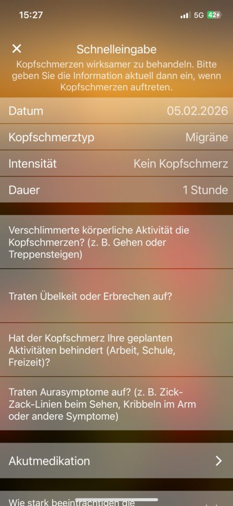
To quickly create an entry of an attack there is a button to open a new screen where the intensity, the type and date, medication data etc. can be filled out.
Quick entry screen
Simulation feature
One feature that caught my attention when I first used it is the simulation feauture the app provides. There are three different ones. The first one uses the phone’s camera to simulate a gradually increasing aura with flashing zig zag figures and pink blind spots that stays at the same spot even when the camera moves.
Aura simulation screen
This feature seems suitable to show a person that has never had a migraine attack before how it looks like when you’re sight suddenly gets blocked by flashing lights and blind spots. However, I personally have to say that my aura doesn’t look as subtle or pinkish but hurts way more when you look at it since the speed of the flashing is so fast that it feels unbearable and uncomfortable. And my aura usually blocks more of my eyesight, mostly the center of where I am trying to look at. But the idea behind this simulation using your camera to put you into the shoes of a migraineur could be a great method to increase emapthy and understanding.
The other two options are video demos that demonstrate the sudden start of an aura while driving a car and while sitting in front of a river. They are great options if you just want to demonstrate two different visualizations in different settings. This idea again seems really convincing since migraine attacks for most migraineurs start suddenly without warning signs so they really could occur in every possible situation such as driving or in the park.
Benefits
fast test feature to identify if your headache is considered migraine by answering questions
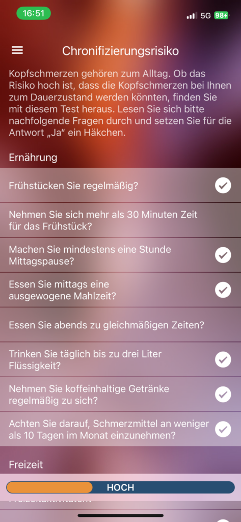
Risk of chronicity test to identify how high the risk of having a migraine attack by answering questions related to nutrition, free time and work
Chronicity test screen
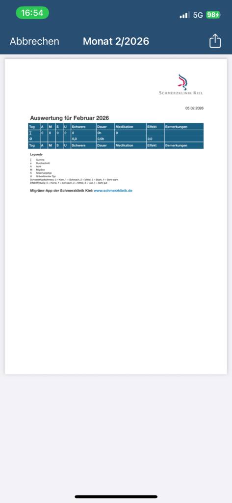
The following feature also seems very useful. Users can quickly create a generated document with an overview of a month within the App to export the data. This action can be found on the Calendar screen and could be very helpful when visiting a neurologist if you have entered your data consistenly in the App!
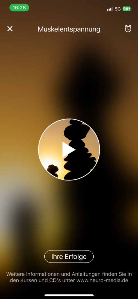
Progressive muscle relaxation feature
A guided progressive muscle relaxation session where the user clicks on play and the audio starts to give instructions on how to breathe and relax your muscles. A very simple feature within the application which I have tried out. But I would prefer to be able to change some settings e.g. the voice or speed of the speaker. After trying this feature a third time I got pretty bored since it was very monotone.
Progressive muscle relaxation screen
Cons
The overall design is very similar to an old Windows version and looks sort of outdated. I don’t know how others perceive this app but it the look of it distracted me from the actual meaningful features.
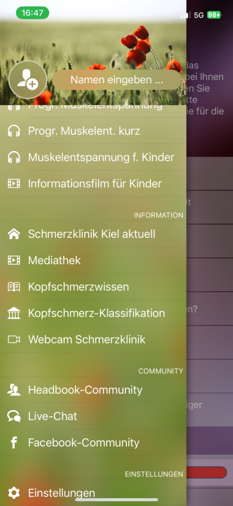
Many information features (“Schmerzklinik Kiel aktuell” media library, “Kopfschmerzwissen”, “Kopfschmerz-Klassifikation, Headbook community, live chat, …) are external links to websites or YouTube which breaks the user flow by pulling users out of the application without prior warning. The links aren’t clearly labeled as links you just see a new tab open after clicking on them.
Menu ScreenQuick entry screen
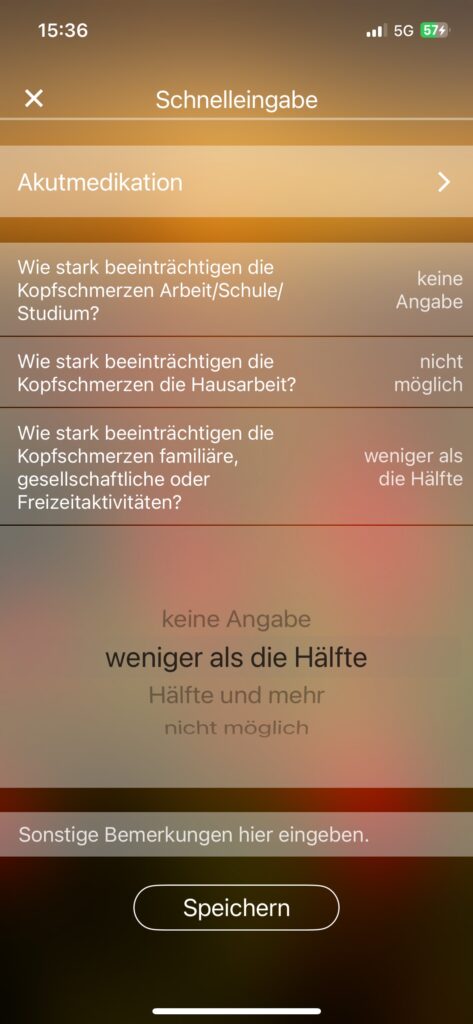
The entry options for the rating of the impact of migraine also was a bit unexpected. I would prefer to rate the impact with numbers from 1-10 or with adjectives and not with “less than a half”, “half and more”, etc.
Conclusion
All in all the features of this app developed by the pain clinic are mostly very meaningful and the benefit for each included feature is clear. The app is intended solely for information, documentation, and personal organization purposes. It helps you keep track of your own entries in a structured way and maintain an overview of your individual progress.
However the design may feel a bit off and not up-to-date to people who use other apps and care about the visual parts as well.
Um mal weg von der digitalen Welt zu kommen und in ein anderes Medium, denn Design geht weit über Interfaces hinaus. Wenn Unternehmen über Inklusion sprechen, landen sie oft schnell bei der Inneneinrichtung. Da stehen dann ergonomische Stühle, bunte Sitzsäcke in der „Chill Area“ und vielleicht gibt es einen Obstkorb. Versteh mich nicht falsch: Ein schönes Büro ist toll und ergonimische Stühle helfen sicher auch bei Rückenproblemen. Aber für einen Menschen mit ADHS, Autismus oder Legasthenie löst ein Sitzsack wenige Probleme, wenn die eigentliche Arbeitsstruktur, die „mentale Architektur“ des Unternehmens, exklusiv auf neurotypische Standardgehirne ausgelegt ist.
Echte neuro-inklusive Unternehmenskultur bedeutet, den Workflow als Service zu begreifen. Es geht darum, Barrieren abzubauen, die oft so tief im System verankert sind, dass wir sie gar nicht mehr als solche wahrnehmen. Wir müssen weg vom Anpassungszwang des Einzelnen hin zu einer Infrastruktur, die vielfältig ist.
Der Albtraum des „Standard-Büros“
Der klassische 9-to-5-Tag im Großraumbüro ist für viele neurodivergente Menschen eine massive Belastungsprobe. Warum? Weil er zwei Dinge gleichzeitig verlangt: maximale soziale Performance und maximale kognitive Konzentration unter vielen sensorischen Bedingungen.
Stell dir vor, du versuchst eine komplexe Code-Zeile zu schreiben oder einen Text zu entwerfen, während neben dir drei Leute über das Wochenende reden, das Telefon klingelt und die Neonröhren über dir in einer Frequenz flackern, die du zwar nicht bewusst siehst, die dein Gehirn aber permanent unter Stress setzt. Für ein neurotypisches Gehirn ist das „Hintergrundrauschen“. Für ein Gehirn mit sensorischen Verarbeitungsbesonderheiten ist das quasi Schwierigkeitslevel 1000 und geht dazu noch auf die Exekutivfunktionen. Jede Ablenkung kostet nicht nur fünf Minuten, sondern oft den gesamten „Flow“, den wir mühsam aufgebaut haben. Es ist viel anstrengeder sich zu konzentrieren, es kostet viel mehr Energie und einmal aus dem “Flow” draußen, fällt es schwer wieder reinzukommen.
Was brauch man für einen neuro-inklusiven Workflow?
Um das zu ändern, müssen wir nicht das gesamte Büro umbauen, sondern die Art, wie wir zusammenarbeiten.
1. Asynchronität Kommunikation
Der größte Feind des ADHS-Hyperfokus ist der Satz: „Hast du mal kurz eine Minute?“ In vielen Firmen gilt es als höflich, sofort zu antworten. Für neurodivergente Menschen ist das ein Produktivitätskiller. Ein inklusiver Workflow setzt auf asynchrone Kommunikation. Das bedeutet: Slack oder Teams funktionieren viel besser, denn Informationen werden so aufbereitet, dass man sie konsumieren kann, wenn das Gehirn gerade im Aufnahmemodus ist. Es gibt keine Erwartung einer sofortigen Antwort, außer bei echten Notfällen. Das gibt Menschen mit ADHS die Freiheit, in ihre tiefen Fokusphasen abzutauchen, ohne Angst zu haben, sozial als „unkooperativ“ zu gelten.
2. Body Doubling als Team-Feature
In meinem Post über ADHS habe ich das Prinzip des Body Doubling erwähnt, also die bloße Anwesenheit einer anderen Person, die uns hilft, bei der Sache zu bleiben. Warum nutzen wir das nicht aktiv im Arbeitsalltag? Unternehmen können „Focus-Rooms“ (virtuell oder physisch) anbieten. Das sind Sessions, in denen sich Leute treffen, kurz ihr Ziel für die nächste Stunde ansagen und dann einfach schweigend parallel arbeiten. Es gibt keinen sozialen Druck zur Interaktion, nur die gemeinsame Energie des Tuns. Das ist Service Design für die Exekutivfunktion.
3. Low-Stim-Zonen
Wenn wir über physische Räume reden, dann gerne auch strategisch, denn eine Idee für inklusive Büros sind klare Zonen. Eine „Low-Stim-Zone“ ist dabei kein Pausenraum, sondern ein Arbeitsraum, in dem absolute Stille herrscht, das Licht gedimmt ist und visuelle Reize minimiert sind. Gleichzeitig brauchen wir Regeln für die Erreichbarkeit. Dieses Mindset ständig erreichbar sein zu müssen, während seiner Arbetiszeit kann auch Druck ausüben. Ein „Do-not-disturb“-Status im Kalender sollte in der Unternehmenskultur so respektiert werden wie eine verschlossene Tür beim Vorstand. Inklusion bedeutet hier, das Bedürfnis nach Ruhe nicht als „Sonderwunsch“ abzutun, sondern zu akzeptieren.
Der „Curb-Cut-Effekt“: Warum alle profitieren
In der Stadtplanung gibt es das Konzept der Bordsteinabsenkungen (Curb Cuts). Sie wurden für Rollstuhlfahrer:innen gebaut. Aber wer nutzt sie heute? Menschen mit Kinderwagen, Reisende mit Koffern, Radfahrer:innen. Genau das passiert bei neuro-inklusivem Design am Arbeitsplatz. Wenn wir Meetings strukturierter gestalten, Informationen asynchron teilen und klare Fokuszeiten einführen, hilft das nicht nur den Neurodivergenten. Es hilft dem Elternteil, das nachts besser arbeiten kann. Es hilft der introvertierten Führungskraft, es hilft letztlich jedem, der in unserer überreizten Welt nach Konzentration sucht.
Fazit: Inklusion ist ein Wettbewerbsvorteil
Neurodivergente Menschen bringen oft außergewöhnliche Fähigkeiten in den Bereichen Mustererkennung, Kreativität und Problemlösung mit. Aber sie werden diese Fähigkeiten nur dort einsetzen, wo sie nicht die Hälfte ihrer Energie darauf verschwenden müssen, so zu tun, als hätten sie ein neurotypisches Gehirn. Auch in der Arbeitswelt kann viel neu designt werden, weg vom Standardmaß, hin zu einer Umgebung, die Flexibilität als Stärke begreift. Denn am Ende des Tages ist ein inklusives Unternehmen nicht nur „netter“, sondern schlichtweg innovativer und leistungsfähiger.
Quellen & Referenzen
The Brain Charity (2024):Neurodivergent-friendly design transforms modern workplaces.
CIPD (2024):Neurodiversity at work guide.
Doyle, N. (2020):Neurodiversity at work: a biopsychosocial model and the impact on working lives. British Medical Bulletin.
Austin, R. D., & Pisano, G. P. (2017):Neurodiversity as a Competitive Advantage.
Note: This text was developed with the assistance of artificial intelligence for research purposes and to refine the linguistic clarity and flow of the final draft.
Aber unter was leiden Menschen mit ADHS überhaupt und was hat das mit Design zu tun? In meinem zweiten Blogpost habe ich beschrieben, wie das ADHS-Gehirn nach Dopamin sucht und oft erst unter extremem Druck handlungsfähig wird. Dieses Wissen über neurologische Prozesse ist mächtig und wie jede Form von Macht kann sie missbraucht werden. In der Tech-Industrie gibt es dafür einen Begriff: Dark Patterns. Das sind Design-Strukturen, die darauf ausgelegt sind, Nutzer zu Handlungen zu verleiten, die sie eigentlich nicht wollen. .
Für Neurodivergente Menschen sind diese Muster sehr ärgerlich. Sie sind eine Form der digitalen Barrierefreiheit im Rückwärtsgang, sie nutzen nämlich die neurologische Veranlagung aus, aber ins negative.
Die Slot-Machine im Handy
Warum ist es so schwer, TikTok pder Instagram nach fünf Minuten wieder zu schließen? Der Grund liegt in einem psychologischen Mechanismus namens Variable Reward Schedule Das Gehirn schüttet am meisten Dopamin aus, wenn eine Belohnung unvorhersehbar ist. Jedes Mal, wenn wir den Feed nach unten ziehen („Pull-to-Refresh“), ist das wie der Hebel an einem Spielautomaten. Kommt jetzt ein lustiges Video? Eine spannende Nachricht? Oder nur Werbung?
Dieses Prinzip trifft neurodivergente Menschen besonders hart. Da das interne Belohnungssystem ohnehin dysreguliert ist, reagieren wir viel stärker auf diese kleinen, schnellen Dopamin-Kicks. Wir geraten in einen „Zustand des Suchens“, aus dem die Exekutivfunktion uns nicht mehr so leicht rausholen kann. Wir wollen aufhören, aber der präfrontale Kortex, unsere interne Bremse ist gegen das hormonelle Feuerwerk, was diese ständigen Dopmaninkicks auslöst, des Belohnungszentrum quasi machtlos.
Dazu habe ich mir mal die Dark Patterns im Detail angeschaut.
1. Der Infinite Scroll
Ursprünglich als Komfort-Feature gedacht, ist der endlose Feed heute eines der effektivsten Werkzeuge zur Aufmerksamkeits-Extraktion. Er eliminiert den sogenannten „Stop-Signal“-Effekt. In der analogen Welt signalisiert uns das Ende einer Zeitungsseite oder das Kapitelende eines Buches: „Hier kannst du eine Pause machen.“ Im digitalen Design wird dieser Moment künstlich entfernt. Für Menschen mit ADHS, die ohnehin Schwierigkeiten mit der Zeitwahrnehmung (Time Blindness) haben, verschwinden so viel zu schnell zu viel Zeit darin.
2. Künstliche Verknappung und die FOMO-Falle
„Nur noch 2 Stunden verfügbar!“, „3 andere Personen schauen sich diesen Artikel gerade an.“ Diese Einblendungen erzeugen künstlichen Stress. Stress führt zur Ausschüttung von Cortisol und Adrenalin, was wiederum, wie wir auch schon beim Deadline Dopamin gelernt haben, das Gehirn in einen Tunnelblick-Modus versetzt. Neurodivergente Menschen, die oft mit Impulskontrolle kämpfen, treffen unter diesem künstlichen Druck Kaufentscheidungen, die sie später bereuen.
3. Der „Daily Streak“
Apps wie Duolingo oder Snapchat nutzen Streaks, um Nutzer:innen zur täglichen Rückkehr zu zwingen. Was wie Gamification aussieht, ist oft psychologischer Druck. Für jemanden mit exekutiver Dysfunktion kann das Versäumen eines Tages zu Schuldgefühlen oder Scham führen, was dazu führt, dass die App entweder zwanghaft genutzt oder aus Frust über das Scheitern komplett gelöscht oder einfach nicht mehr benutzt wird. Es gibt keinen Raum für einen schlechten Tag oder einen Pause Tag. Manchmal ist es sogar so weit, dass Apps dich dazu bringen 3 “viruelle Münzen” zu kaufen, ein paar Münze bekommt man natürlich kostenlos und wenn man keine mehr hat ploppt sofort ein angebot auf mit “Jetzt 10 Münzen kaufen dann kannst du dein Streak einfrieren und eine Münze kostet dann aber echte 2€, was natürlich auch wieder manipuliert. An dieser Stelle lösche ich die Apps meistens komplett, dann wird wohl keine neue Sprache über Duolingo gelernt, weil mich die ständigen Erinnerungen und aufploppen und sonstiges einfach viel zu sehr nervt.
Der Gegenentwurf: Neuro-Ethisches Design
Als Designer tragen wir auch stückweit die Verantwortung für die mentale Gesundheit unserer User. In Los Angeles beginnt jetzt einer von einigen anstehenden Prozessen gegen Social-Media-Konzerne. Es geht um deren Mitverantwortung für psychische Probleme von jugendlichen Nutzern.
Inklusion bedeutet hier, das Gehirn nicht zu manipulieren, sondern es zu unterstützen. Was wäre das Gegenteil von Dark Patterns?
Eingebaute Haltepunkte: Statt Infinite Scroll könnten wir „Load More“-Buttons nutzen oder nach einer gewissen Zeit eine sanfte Erinnerung einbauen: „Du bist seit 20 Minuten hier. Möchtest du eine Pause machen?“
Transparente Benachrichtigungen: Statt eines vagen roten Punktes sollte eine App genau sagen, was passiert ist. „Anna hat dein Foto kommentiert“ erlaubt es mir, die Relevanz einzuschätzen, bevor ich die App öffne.
Vergebendes Design: Inklusive Gamification würde „Pause-Tage“ erlauben oder Streaks nicht sofort auf Null setzen, wenn das Leben (oder die Exekutivfunktion) dazwischenkommt.
Fazit: Ethik ist kein Feature, sondern das Fundament
Wir müssen aufhören, Engagement-Metriken (wie Verweildauer oder Klickraten) als den alleinigen Erfolg eines Designs zu sehen. Wenn ein Design nur deshalb „erfolgreich“ ist, weil es die neurologischen Schwächen einer Person ausnutzt, dann ist es ethisch gescheitert.
Echtes neuro-inklusives Design bedeutet, die Autonomie der Nutzer:innen zu respektieren. Wir sollten Werkzeuge bauen, die Menschen helfen, ihre Ziele zu erreichen und nicht Produkte, die Menschen dazu benutzen, die Ziele von Werbealgorithmen zu erfüllen. Es ist Zeit für eine digitale Welt, in der wir uns nicht ständig gegen unser eigenes Gehirn wehren müssen.
Quellen & Referenzen
Brignull, H. (2023):Deceptive Design (formerly Dark Patterns). H deceptive.design
Note: This text was developed with the assistance of artificial intelligence for research purposes and to refine the linguistic clarity and flow of the final draft.
In diesem Post bin ich nochmal Werg von meiner Idee von einem MR Awareness Tool und habe mir nochmal mehr generell zu Neurodivergenz, Design und Hürden angeschaut.
Hast du schon mal versucht, ein Android-Ladegerät in ein iPhone zu stecken? Es passt einfach nicht. Nicht, weil das Kabel kaputt ist oder das Handy einen Defekt hat, sie nutzen einfach unterschiedliche Protokolle. Genau so fühlt sich Kommunikation oft an, wenn neurotypische und neurodivergente Welten aufeinandertreffen. Lange Zeit galt in der Psychologie das Narrativ, dass neurodivergente Menschen (besonders Autist:innen) ein „Defizit“ in der sozialen Interaktion hätten. Man ging davon aus, dass sie soziale Signale einfach nicht „richtig“ lesen können. Aber was, wenn das nur die halbe Wahrheit ist?
Der Soziologe Damian Milton stellte 2012 eine revolutionäre Theorie auf: das Double Empathy Problem. Er argumentiert, dass soziale Schwierigkeiten nicht einseitig bei der neurodivergenten Person liegen, sondern im Zwischenraum entstehen. Wenn zwei Menschen mit völlig unterschiedlichen neurologischen „Betriebssystemen“ kommunizieren, entstehen Missverständnisse auf beiden Seiten.
Die Illusion der „richtigen“ Intuition
In der Design-Welt ist es immer super wichtig, dass alles intuitiv ist. Wir wollen Interfaces bauen, die man „einfach so“ versteht. Doch hier liegt die Falle: Intuition ist kein biologisches Gesetz. Sie ist das Ergebnis von kulturellen Erfahrungen und von der Art, wie unser Gehirn Reize filtert.
Für ein neurotypisches Gehirn ist es oft „intuitiv“, zwischen den Zeilen zu lesen, Ironie an der Tonlage zu erkennen oder vage Anweisungen durch den Kontext zu ergänzen. Für ein neurodivergentes Gehirn, das Informationen oft bottom-up (also detailfokussiert statt kontextfokussiert) verarbeitet, ist diese Art der Kommunikation nicht intuitiv, sondern ein Ratespiel. Das Double Empathy Problem zeigt uns also Neurotypische Menschen sind oft genauso schlecht darin, die direkten, detailreichen und logikfokussierten Kommunikationsmuster von Neurodivergenten Menschen zu verstehen. Die Empathielosigkeit ist also beidseitig, nur dass die neurotypische Seite ihren Stil als „Standard“ definieren darf. Und alles andere kann dann als “Problem” dargestellt werden.
Design als Dolmetscher: Brücken statt Barrieren
Wenn wir als Designer:innen verstehen, dass Kommunikation keine Einbahnstraße ist, verändert das unsere Arbeit grundlegend. Wir hören auf, User „erziehen“ zu wollen, und fangen an, Brücken zu bauen. Hier sind drei Ansätze, wie wir das Double Empathy Problem im Design lösen können:
1. Explizitheit schlägt implizite Erwartungen
Vermeidung von „Mystery Meat Navigation“: also Icons oder Buttons, deren Funktion man erst durch Raten oder Drüberfahren mit der Maus versteht. Ein inklusives Interface sagt genau, was es tut.
Beispiel: Statt eines vagen „Absenden“-Buttons, der je nach Kontext etwas anderes tut, nutzen wir „Anfrage jetzt zahlungspflichtig abschicken“.
Warum? Es reduziert die kognitive Last der Interpretation. Wenn das System klar und direkt kommuniziert, muss das Gehirn keine Energie für das „Deuten“ von Absichten verschwenden.
2. Multimodalität: Die Freiheit der Wahl
Manche Menschen brauchen das geschriebene Wort, um Informationen in ihrem eigenen Tempo zu verarbeiten. Andere brauchen visuelle Roadmaps, um den Prozess zu verstehen. Ein Interface, das nur auf einen Kanal setzt, schließt automatisch Menschen aus. Inklusion im Webdesign bietet deshalb oft „Easy-Read“ Versionen oder klare visuelle Marker parallel zu Texten an. Das Ziel ist es, dem User die Wahl zu lassen, wie er die Information empfangen möchte.
3. Vorhersehbarkeit
Ein großer Stressfaktor in der Kommunikation ist das Unvorhersehbare. Was meint sie damit? Warum kommt keine Antwort? Im Interface-Design können wir diesen Stress durch Feedback-Loops abfangen. Jede Aktion braucht eine sofortige, eindeutige Reaktion des Systems. Wenn ein Prozess länger dauert, brauchen wir keine vage Ladeanimation, sondern eine klare Fortschrittsanzeige: „Schritt 2 von 4: Wir prüfen deine Daten.“
Warum uns das alle besser macht
Das Spannende ist: Wenn wir für das Double Empathy Problem designen, profitieren alle. Wer mag schon unklare Anweisungen oder versteckte Menüs? Inklusion bedeutet hier, dass es mehr als nur einen „richtigen“ Weg gibt, Informationen zu verarbeiten.
Design sollte nicht der Filter sein, der bestimmt, wer „reinpasst“, sondern das Werkzeug, das Vielfalt ermöglicht. Wenn wir Interfaces bauen, die explizit, multimodal und vorhersehbar sind, senken wir die Barrieren für alle, egal, welches Betriebssystem im Kopf gerade läuft.
Quellen & Referenzen
Milton, D. E. (2012):On the ontological status of autism: the ‘double empathy’ problem. In: Disability & Society, 27(6).
Crompton, C. J., et al. (2020):Autistic peer-to-peer information transfer is highly effective.
Reframing Autism (2023):Double Empathy Problem Explained. Eine großartige Ressource für die praktische Anwendung des Konzepts.
Gernsbacher, M. A., & Yergeau, M. (2019):Empirical Failures of the Claim That Autistic People Lack a Theory of Mind.
Note: This text was developed with the assistance of artificial intelligence for research purposes and to refine the linguistic clarity and flow of the final draft.
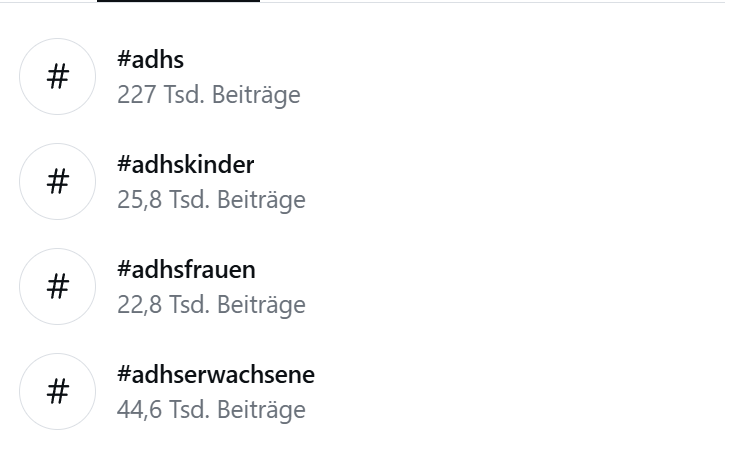
The hashtag #ADHD nowhas over 227,000 posts on Instagram alone. About two years ago, ADHD suddenly blew up online it was everywhere. Videos titled “If you do these five things, you might have ADHD” went viral. People shared stories about late diagnoses, sudden realizations, and a new understanding of their daily struggles.
At first glance, this looks like progress: more visibility, more awareness, and more people recognizing long-overlooked symptoms. And indeed, research shows that women and adults have historically been underdiagnosed, partly because ADHD has often been associated with the stereotypical “hyperactive boy” image. But the viral attention also has a dark side. The more popular the topic becomes, the blurrier the line between self-awareness and self-diagnosis gets.
When Short Videos Oversimplify Complexity
The problem isn’t that social media creators mean harm, most want to inform and destigmatize. But platform logic rewards simplicity. Ninety seconds just isn’t enough to explain the complexity of a neurodevelopmental condition. As a result, catchy “five signs” videos dominate our feeds.
That leads to a paradox: more reach doesn’t mean more understanding. Short clips make information accessible, but they also spread misconceptions. Everyone can relate to being forgetful or disorganized sometimes yet ADHD goes much deeper. It affects attention, impulse control, emotion regulation, motivation, and even time perception, often to a degree that causes real disruption in everyday life.
For many diagnosed adults, the real relief comes from finally understanding how these symptoms interconnect, beyond what an algorithm can compress into a viral soundbite.
Between Self-Diagnosis and Real Support
Another big development is the rise of self-diagnosis culture online. Influencers share their personal experiences, helping others feel seen and less ashamed. In some cases, that sparks genuine reflection and motivates people to seek professional help.
However, a clinical ADHD diagnosis is a multi-step process involving medical, psychological, and behavioral evaluations. Specialists consider case histories, developmental backgrounds, and standardized assessments. In other words: a viral video can’t replace a conversation with a trained professional.
Yet, this digital movement still has a positive side, it signals growing awareness of neurodiversity and a more open public dialogue about it.
Awareness Without Clickbait
Fortunately, there are credible voices online too. Experts such as psychologist Dr. Alina Maerker (host of Psychologie to go!) and neurodivergent educators provide accessible, evidence-based insights to counter misinformation. Still, the algorithm favors emotional, simplified content over detailed explanations.
Psychologically, that makes sense: our brains crave quick rewards and certainty, while accurate education takes time and nuance. The challenge is finding ways to make accuracy engaging.
The Next Step: Experiencing ADHD
Videos inform, but they rarely create deep empathy. What’s missing are interactive tools that help non-ADHD individuals understand what living with this condition feels like.
Recent research is starting to explore this idea. Virtual reality (VR) simulations and learning apps are being tested to recreate experiences such as overstimulation, distractibility, or distorted time perception.
These technologies could redefine how we teach about ADHD, moving from observation to immersion. Understanding wouldn’t just mean knowing the facts; it would mean feeling what daily life might be like for someone with ADHD.
Conclusion
The social media hype around ADHD shows how deeply digital culture shapes our perception of mental health. Awareness is important, but education needs depth. Between trending and therapeutic, there’s a space where real understanding can grow.
Perhaps it’s time to nurture that space, with accurate information, genuine empathy, and new ways to not just talk about ADHD, but to understand it.
References
American Psychiatric Association (2022). Diagnostic and Statistical Manual of Mental Disorders (5th ed., Text Revision). APA Publishing.
Kooij, J. J. S. et al. (2019). European consensus statement on diagnosis and treatment of adult ADHD. European Psychiatry, 56: 14–34.
Messinger, M. A., et al. (2023). Immersive simulations as tools for empathy and education in neurodiverse conditions. Frontiers in Psychology, 14: 1205158.
Maerker, A. (2022). Psychologie to go! Podcast. Spotify.
Note: This text was developed with the assistance of artificial intelligence for research purposes and to refine the linguistic clarity and flow of the final draft.
In research, there is rarely a clean “The End.” There are just checkpoints.
So, this is my checkpoint.
When I started this journey, I was looking for data. I wanted to know how many people use Auto Mode vs. Manual Mode. I wanted to know technical details about sensors and algorithms. But over the last few weeks—through the interviews, the failed experiments, and the late-night confusion—I found something much more important.
I found the emotional core of the problem.
The Thief of Joy My biggest realization so far is not about technology; it’s about psychology.
I have come to believe that AI is a thief. It doesn’t steal our jobs (at least, not yet). It steals something more subtle. It steals the joy of the mistake.
In my experiments, I realized that when the camera makes everything perfect, it robs us of the curiosity in the process. It takes away that “happy accident”—the blurry, imperfect, messy shot that somehow captures the feeling better than a sharp image ever could. When we remove the struggle, we remove the satisfaction.
Where I Am Going Next So, where does that leave me?
I am not done. I still have more research to do. I need to dig deeper into how we can bring that struggle back without making photography impossible. I need to talk to more designers and photographers and maybe even build some prototypes.
But I do have a compass now.
My direction for the next phase of my research is the concept of the “Co-Pilot.” I don’t have the solution built yet. I don’t know exactly what it looks like. But I know that the future shouldn’t be about the machine taking over. It should be about a partnership where the human stays in charge of the art, and the machine just helps us get there.
The blog series for this session ends here, but the work is just getting started.
Thank you for reading my messy, imperfect thoughts. Now, I’m going back to the research.
In an era defined by a constant barrage of pings, buzzes, and red notification badges, our relationship with digital products has reached a breaking point. We have moved beyond simple utility into a state of chronic distraction, where the devices in our pockets function less like tools and more like “dopamine-dispensing machines.” This shift is not an accident of poor design; it is the result of systematic psychological manipulation aimed at maximizing engagement, a corporate euphemism for the capture of human attention. To counter this, a fundamental shift in user experience is required: the move toward Calm Technology. This design philosophy, originally envisioned at Xerox PARC in the mid-90s, prioritizes human attention as a precious, scarce resource that deserves protection rather than exploitation.
To understand the necessity of Calm Technology, we must first confront the “dopamine dilemma” inherent in modern software. Most social media and streaming platforms are built on persuasive design patterns specifically engineered to hijack our reward systems. Features like the “pull-to-refresh” mechanism create a suspenseful delay before content appears to trigger a stronger dopamine hit. Infinite scroll removes the natural “stopping cues” that allow for reflection, while notification badges exploit the Zeigarnik effect, the psychological tension we feel when a task is left unfinished.
The biological impact of these patterns is profound. When we are constantly rewarded with likes, comments, or algorithmic “discoveries,” our brains adapt by raising the baseline for stimulation. This makes everyday, non-digital experiences feel underwhelming, leading to a compulsive need to check devices even when we have no conscious desire to do so. Research shows that if we were to eliminate these persuasive design elements, users estimate they could reduce their screen time by an average of 37 to 65 percent. This reveals a staggering gap between how much time we want to spend online and how much time we are manipulated into spending.
Calm Technology offers an ethical alternative by shifting information into our peripheral awareness. The core principle is that technology should only move to the center of our attention when it is genuinely necessary. Rather than demanding immediate focus through a high-stakes push notification, a calm interface uses subtle, low-resolution signals. Consider the classic example of an “enchanted umbrella” whose handle glows softly when rain is forecasted. This provides a helpful nudge that resides in the periphery; you notice it as you walk out the door, but it never interrupts your conversation or your train of thought.
From a UX perspective, this involves several practical strategies. Designers can implement “constructive friction,” which adds a brief moment of reflection before a user opens a habit-forming app, or “glanceable interfaces” that provide essential data without requiring a deep dive into an addictive feed. It also involves “ambient awareness”, using environmental design or haptic cues that respect human biology. Instead of asking “How can we maximize time on screen?”, designers start asking “What is the minimum amount of technology needed to solve this user’s problem?” This principle of sufficiency is the direct opposite of the feature-bloat often seen in products optimized for addiction.
The shift toward Calm Technology is, at its heart, an ethical imperative. Traditional persuasive design is intrinsically manipulative because it targets psychological vulnerabilities without the user’s explicit knowledge, often for the financial gain of the company rather than the benefit of the individual. This raises serious questions about autonomy and self-determination. Calm Technology respects the user as an autonomous being. It embraces “cognitive sustainability,” the idea that our mental energy is a limited resource that we should be allowed to spend on things that truly matter to us.
While the adoption of calm principles is currently slowed by business models that still reward engagement metrics, the tide is turning. Users are becoming increasingly aware of manipulative patterns, and trust is becoming a more valuable long-term asset than short-term screen time. Furthermore, regulatory bodies, particularly in the European Union, are beginning to call for bans on addictive design techniques, establishing a “digital right to not be disturbed.”
Ultimately, the goal of UX shouldn’t be to see how much of a person’s life we can capture within an app. It should be to facilitate human flourishing. By moving away from dopamine-driven addiction and toward a calmer, more respectful digital environment, we can build products that serve us rather than enslave us. Transitioning to Calm Technology isn’t just a design choice; it is a commitment to a more sustainable and ethical future for the human mind.
Sources:
Humane Tech. (2021, July 15). The social dilemma: Your phone is a slot machine [Video]. YouTube. https://youtu.be/clxm5qW3pao
Note: This text was developed with the assistance of artificial intelligence for research purposes and to refine the linguistic clarity and flow of the final draft.
In the complex architecture of modern digital products, the most successful designs are often the ones that don’t need to shout to be heard. Instead of forcing users down a specific path through rigid constraints, sophisticated designers employ the behavioral-economics strategy of “nudging.” A nudge is a subtle shift in the choice environment that makes a preferred option easier or more attractive, without ever blocking alternatives or removing the user’s freedom of choice. It is the digital equivalent of placing fruit at eye level in a cafeteria, you aren’t banning the junk food, but you are making the healthier choice the path of least resistance. In UI/UX and motion design, nudging is the art of steering attention and reducing friction to encourage “better” actions through layout, defaults, and animation.
The core of digital nudging lies in “choice architecture”, the way options are ordered, grouped, and framed. This begins with the power of smart defaults. Because humans are naturally inclined toward the status quo, pre-selecting options that align with a user’s best interest, such as opting into security alerts or a recommended service plan, serves as a high-impact nudge. Crucially, ethical nudging requires low-cost reversibility. A “canonical” digital nudge, like an auto-enrollment feature, must always be accompanied by a clear and simple “opt-out” control. By making the recommended path the default, designers leverage cognitive biases to help users achieve their goals more efficiently while preserving their ultimate autonomy.
Visual hierarchy and salience play an equally vital role in shaping these decisions. By using stronger contrast, larger typography, or strategic placement for primary actions, designers can guide the eye toward the most beneficial choice. This isn’t about hiding secondary options, but about de-emphasizing them to reduce cognitive load. This management of friction is a delicate balance. We strive to remove micro-barriers for desired behaviors, like Amazon’s 1-Click ordering, while intentionally adding “confirmatory friction” for risky actions. A simple prompt asking, “Are you sure you want to delete your account?” is a nudge toward reflection, preventing accidental or impulsive decisions that the user might later regret.
Motion design serves as a powerful amplifier for these nudges by managing user attention over time. Static interfaces can be overlooked, but the human eye is biologically programmed to follow movement. Subtle animations, such as a gentle pulse on a “Complete Profile” button or a soft bounce when a new recommendation appears, draw focus without being intrusive. Research indicates that these motion-based cues can significantly increase task completion rates by making the intended path visually prominent. Furthermore, motion provides the feedback loops necessary for confidence. A ripple effect when a button is pressed or a checkmark that animates upon form validation reduces “error anxiety,” nudging the user to proceed with certainty.
Beyond directing attention, motion design helps manage the perceived effort of a task. Fluid transitions between states, like a list expanding into a detailed view, maintain spatial continuity. This prevents the disorientation that occurs with abrupt page jumps, effectively nudging the user to stay mentally engaged. Similarly, animated loaders and progress indicators tap into the “goal-gradient effect.” By visually demonstrating that a user is “almost there,” motion makes a wait feel shorter and nudges the user to finish the flow rather than abandoning it. Onboarding experiences frequently use these “teaching animations” to accelerate learning, making complex features feel intuitive and reducing the friction of the unknown.
However, the line between an ethical nudge and a manipulative “dark pattern” is defined by intent and transparency. For a nudge to be ethical, it must genuinely benefit the user, be transparent in its intent, and provide an easy way to undo the action. Motion becomes manipulative when it uses aggressive flashing to over-pressure a sale or distracts from critical privacy settings. Designers must define user-welfare goals upfront—such as helping a user secure their account—and then test these nudges with real users to ensure they are supporting autonomy rather than undermining it.
As we move deeper into the era of hyper-personalized interfaces, nudging will continue to evolve from a static design choice into a dynamic conversation between the system and the user. The most effective nudges are almost invisible; they feel like a helpful suggestion from a reliable partner. By combining the principles of choice architecture with the persuasive power of motion, we can create interfaces that respect the user’s time and intelligence while gently guiding them toward successful outcomes.
Note: This text was developed with the assistance of artificial intelligence for research purposes and to refine the linguistic clarity and flow of the final draft.