For my final post I’d like to talk about the preparation for the guerrilla testing session, as well as the results.
The prime target for this was a dedicated webpage for Resellers on the sprinters.at website. My story from the introductory post was actually based on this outcome. I was already working on some complex interfaces behind the scenes that would be utilised for this feature, such as a completely new address system for multiple recipients. However, when it comes to the informational webpage that serves as the sign-up hub for this feature, a completely AI-generated design was used without my knowledge.
Prototyping
Since my topic is all about how workflows change with the advent of AI, I decided to actually work with the situation instead of wallowing in it. The primary focus of this redesign was to simply use the existing design system and corporate design.
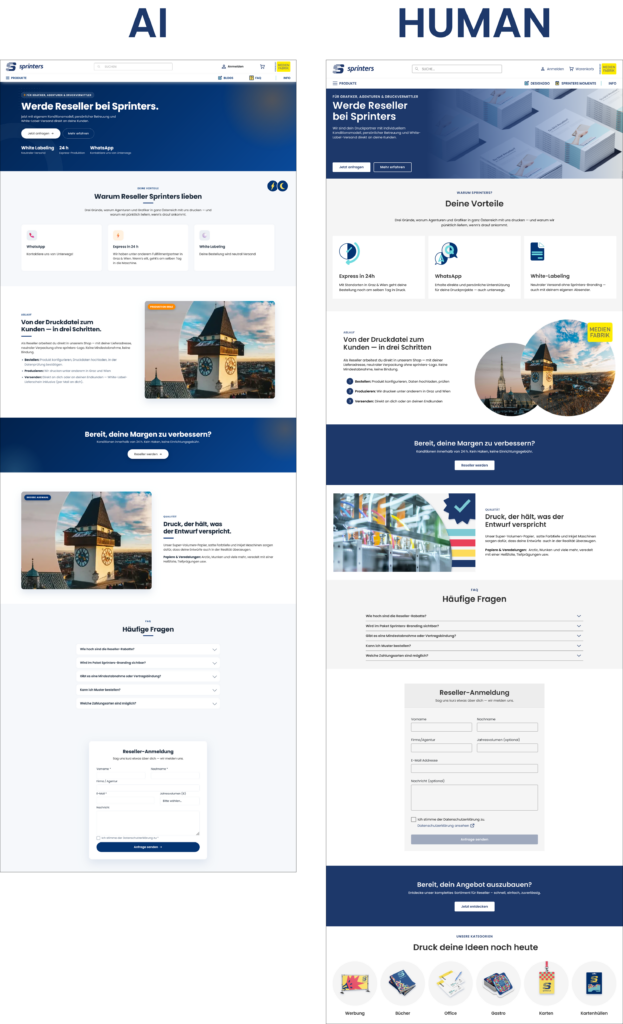
What was a new experience to me about this prototyping session was that I worked with the AI-generated design, keeping the overall structure and content as inspiration but rewording what I thought was necessary as well as keeping the design philosophy in mind. I still made everything from scratch, but used the design as heavy inspiration.
Guerrilla Testing
To test this, I took both the AI-generated and the human-redesigned version and presented them. The test happened with two participants and consisted of simple questions about brand context, visual consistency and a more personal “is this ready to ship?” question.
1. The Brand Context & Transition Feel
When going from the landing page to the reseller page, Participant 1 noted that the AI version felt “cramped and crowded” in the hero section, while the human-redesigned version felt more “clean and organised”. Participant 2 agreed with this, saying that the AI version had “no personality” and was “more business”, while the human one felt “more similar and personal”.
2. Visual Consistency
This question was aimed more at looking more closely at individual components and elements (such as icons, buttons and images). Jakob Nielsen fourth heuristic, Consistency and Standards, describes the need for recurring elements in a user interface like language, icons, symbolism to be consistent across different tasks [1]. This was the biggest blunder of the AI design.
When talking about the AI version, both participants pointed out that “the icons don’t go with it“, “the images don’t look intentional“ and that “spacing was different from the homepage and cramped to the border“. One participant also noticed that the “buttons are rounded, when they’re more square on the main page“. This participant also mentioned that the icons in the human version are “great, because the colours are the same as the brand“.
One thing Participant 1 also mentioned on the machine-translated version of the AI version, was that the texts “tell you to do it, but not what it is“, while Participant 2 said that the text feels generic.
3. Ready to ship?
When the participants were asked if they would consider this as ready to ship as part of the same product (if they were the UX/UI designer responsible), they gave dividing responses. Participant 1 gave a hard “NO!”, pointing to the inconsistent spacing and icons, and added: “Why put something bad online when could can give me some time to improve it?”
Participant 2 gave a more nuanced answer, stating that “if the priority is to ship, then yes, its functional and still intuitive, but not the same brand”. They said they would “feel bad as a designer”, because the first impact of the brand is the most important.
Conclusion/Reflection
In conclusion, I gathered some data on what stands out to designers from two other designers. I particularly found the comments about the “texts telling you what to do, but not what it is” interesting, and for further testing I’m definitely going to take care to provide English versions of my prototype as well so this could be compared. I worked on the Reseller feature for weeks, so I had to understand it myself by asking multiple people within the company. AI didn’t have this simple human advantage, and thus the end result was what it was.
However, this isn’t about “AI being bad”, and I’d like to wrap up my research journey for this semester with this quote from IDEO (the design agency which developed design thinking):
How many things were meant to be great big breakthroughs, but they just don’t work because they don’t take into account what humans want from the technology? […] AI is far too important to leave just to the technologists—human-centered design is a crucial part of it. [2]
References
- [1] Interaction Design Foundation, “What Is Heuristic Evaluation?,” Interaction Design Foundation. [Online]. Available: https://ixdf.org/literature/topics/heuristic-evaluation. [Accessed: Jul. 4, 2026].
- [2] D. Kelley and D. Robson, “In the Age of AI, Human-Centered Design Is More Crucial Than Ever,” IDEO, Feb. 20, 2025. [Online]. Available: https://www.ideo.com/journal/in-the-age-of-ai-human-centered-design-is-more-crucial-than-ever. [Accessed: Jul. 3, 2026].
