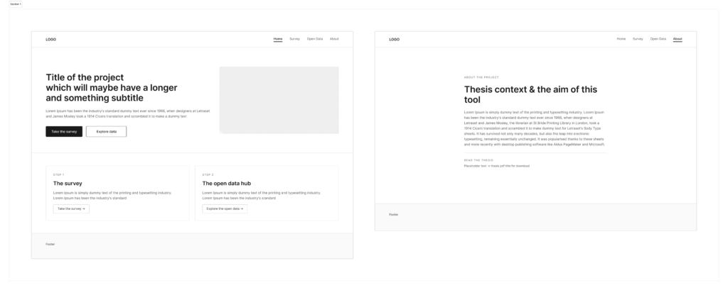
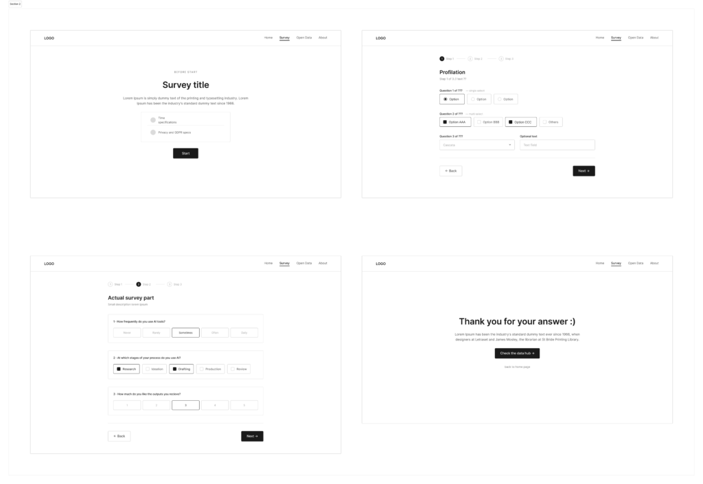
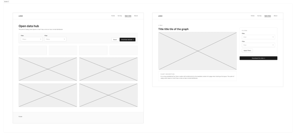
After redefining and adjusting the idea, it was time to give shape to all these thoughts. Before thinking of colours, typefaces or any kind of identity, the first step was to create a base layout for the following designing phase. The wireframes have been made in Figma and kept as basic as possible, with placeholder texts, simple shapes and an overall idea of its web architecture. In this way, the attention remains on what the tool actually does and how the user moves through it, rather than how it looks.
The tool/website is still based on the two main sections mentioned in the previous post: a survey part to gather quantitative data and a page with open access to them. The open data hub was imagined as dashboard where people can browse the results, which visualization will be particularly curated to ensure clarity.
The result I reached was a fine basis for its further development, even if it could have been more detailed in some sections (e.g. downloading process, better about page, more questions typologies) and texts. Indeed, trying to keep the actual copy in the areas I designated in the wireframes was an actual challenge. Maybe in the future would be better to already have texts, or at least the most similar version to the official one.