#6 Final considerations

Carrying out this small project was actually quite challenging, yet it really helped me find an excellent practical application to build on for my actual thesis, which had previously remained purely theoretical. I really enjoyed being able to work on something entirely my own and putting myself to the test with time management and all the stages of the design process. Although I could still improve when it comes to time management!

As for the prototype itself, I was able to have it tested once it was complete. In fact, even though I missed the last lecture, I didn’t want to skip the user testing phase. This was carried out with the help of design students, and the improvements outlined below are ones I’ll be working on over the coming months.

The usability could certainly be improved in several respects, but what everyone agreed on was that the same button to take the survey appears too many times on the home page, given the limited space available. It almost seems as though it is insistently pushing users towards the same action. The need for more information about the research in the pre-survey section was also raised, as users do not necessarily visit the ‘About’ section and the information is not clear in that section.
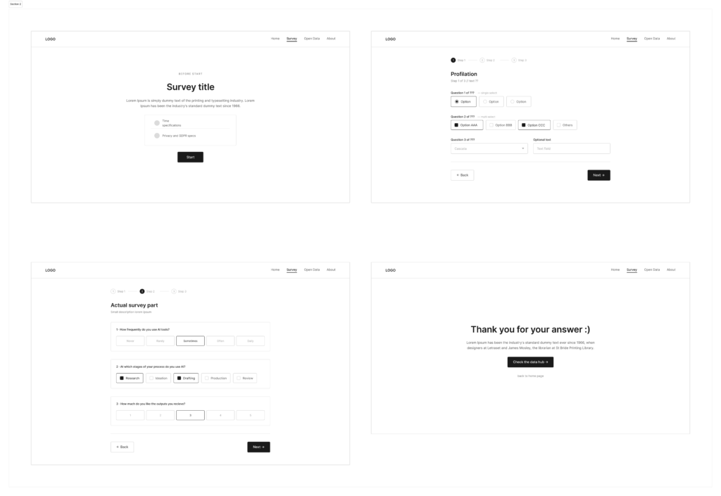
Another small comment was in regards to the survey for not being fully developed, drafting also the third question would have been useful to fully comprehend the user flow and overall effort required.

In general, however, based on the feedback gathered, it can be said that the project’s communication objectives were achieved and that the opportunity to access this kind of data was a well-received idea. The biggest challenge for this type of data collection in the future would certainly be to reach enough people and find ways to keep the responses as unambiguous as possible.
#4 Time for wireframes

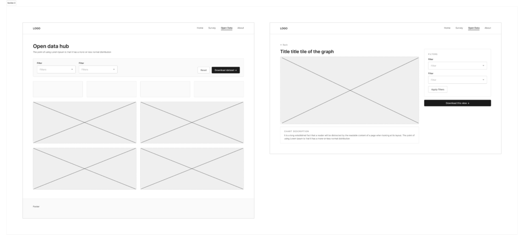
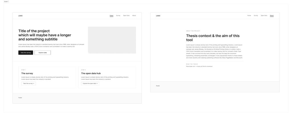
After redefining and adjusting the idea, it was time to give shape to all these thoughts. Before thinking of colours, typefaces or any kind of identity, the first step was to create a base layout for the following designing phase. The wireframes have been made in Figma and kept as basic as possible, with placeholder texts, simple shapes and an overall idea of its web architecture. In this way, the attention remains on what the tool actually does and how the user moves through it, rather than how it looks.

The tool/website is still based on the two main sections mentioned in the previous post: a survey part to gather quantitative data and a page with open access to them. The open data hub was imagined as dashboard where people can browse the results, which visualization will be particularly curated to ensure clarity.

The result I reached was a fine basis for its further development, even if it could have been more detailed in some sections (e.g. downloading process, better about page, more questions typologies) and texts. Indeed, trying to keep the actual copy in the areas I designated in the wireframes was an actual challenge. Maybe in the future would be better to already have texts, or at least the most similar version to the official one.

#3: From literature gaps and sketches to a clear direction

In the previous post I sketched three possible directions for the prototyping phase of the research, with the promise of developing one of them further. This one will start from openings left by the literature review draft of my ongoing thesis and it will explain its possible applicative idea.

Summarising gaps

Reviewing the literature made one absence particularly clear. A considerable amount has been written about how artificial intelligence could, or should, be integrated into the creative process and into data-driven storytelling. Yet, much less has been written about how practitioners actually behave when they sit down and use these tools in their everyday work. The theory on good integration of AI in our work is a lot, but the empirical picture of real habits in the storytelling and data-driven design practices field is almost inexistent.

Sierra Shell makes a related observation in The Human Touch(point), where she notes that understanding the current state of how people use AI features and how they give feedback on them is still an open area for research, rather than settled knowledge. Additionally, the recent surveys on data-driven storytelling and visualization point in a similar direction, treating a human-centred account of the process as an unresolved question rather than as an established one. In other words, before proposing how designers should work with AI, it would be much more useful to document how they are already doing.

Building the idea

To effectively address this empirical gap, there is the need to collect firsthand data. The thesis, therefore, opens up to the need of a survey aimed at students, workers, and experts across communication design, storytelling, and data visualization, with the aim of collecting data and make them later available for further studies and fellow researchers as open source.

The instinctive move would be to reach for a common survey platform. Yet, I would rather build a different tool for ensuring having open data together with the possibility of taking the survey, with also the opportunity of having always updated data in real time. A generic form provider tends to lock results away in a private account, whereas the aim here is the opposite, making the collected evidence a shared and accessible resource.

For the survey section, the priority is currently to define how the tool works and which steps it moves through, not to finalize every question. What remains fixed is the intent: to capture habits of AI usage together with a basic professional profile of who is answering. As for the open data hub, once results begin to accumulate, they will be presented in an aggregated and anonymized form that anyone can consult, without having to complete the survey first and keeping sensitive data out of this public layer.

Encouraging personal reflection

Both parts in this idea, in the end, serve the same purpose, which is to encourage reflection on our behaviours. For the respondent, answering the survey is already a small prompt to consider one’s own reliance on these tools. For a visitor to the open hub, seeing collective patterns laid out invites a comparison with their own practice. The intention is not to lecture nor to attach a score of guilt to anyone’s choices, but to make current habits visible enough to become the source for discussion.

The full bibliography of the thesis will be attached to this documentation, for anyone who wishes to follow the sources behind the literature review.

#2 Sketching ideas and Lo-Fi prototypes

Imagining what could be prototyped for such highly conceptual and unexplored subject was initially challenging, as it required translating something abstract into tangible. Nevertheless, I was able to find two possible directions for further developments of the research, each exploring a different aspect of the topic. As a precautionary measure to ensure a deliverable outcome, I then also considered a separate (maybe more practical) direction as a reliable backup plan and idea 3.
Here follows a description of each idea in detail.

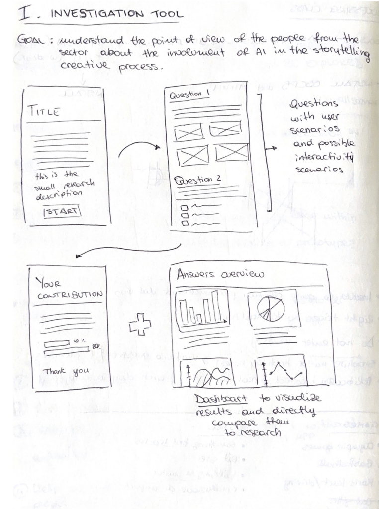
1. Building a tool to conduct research on user behaviour and AI usage

The concept sketched above stems from the need of conducting a survey for the thesis research, which should investigate the behaviour and habits in AI usage in the creative process of people in the field. Instead of relying on common survey tools, the idea here is to build/prototype a tool based on my needs, which could then show in a dashboard the data collected in the survey part. Why a dashboard? Because I would like the results to be always available and accessible to other researchers and designers, even without completing the assessment). This to ensure more open data in real time, that can illustrate our current usage trend ans possibly the environmental impact based on the numbers.

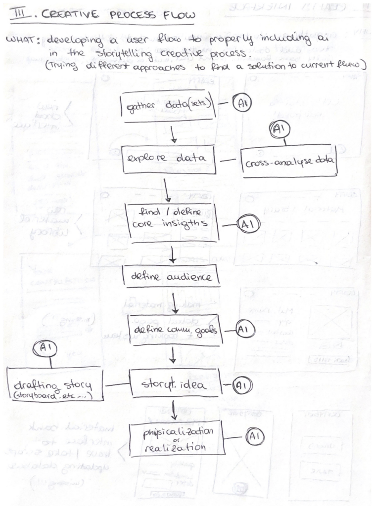
2. Developing a new framework/workflow for the involvement of AI in the data-driven storytelling creative process

This second, more ambitious, idea is to study and develop myself a new (or just different) workflow framework for the community into data-driven storytelling. This would work as a step by step guide to follow for a conscious employment of AI in the creative process, highlighting the steps in which it can actually be helpful and how to properly write our prompts to have answers and outcomes that respect our needs in less requests. The scheme right now shows how our currently AI usage, yet the goal is to offer clearer steps with less involvement of generative models to ensure more human-centered design.

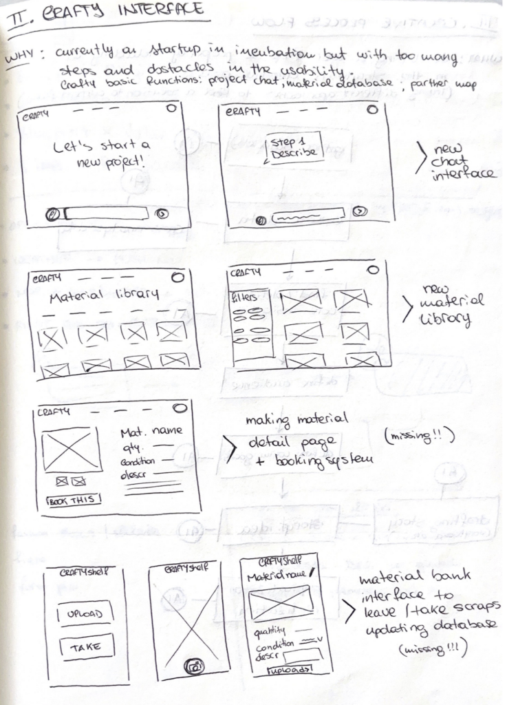
3. Implementing the interface of the website CRAFTY (the plan B)

This concept focuses on a project developed with other students one year ago and currently undergoing a startup competition at Politecnico di Milano. Its name is CRAFTY and it is an AI enhanced website dedicated to creatives, which should help with project development relying on (and suggesting) recycled resources and waste materials collected in storage spaces in universities and Fablabs. The idea drafted in this sketch aim to rethink the whole interface and interaction for the website, to make the usage smoother and more intuitive. In addition, it was considered to develop the missing interfaces for an autonomous warehouse management.

Pitching the project

Here you can watch the pitch for the final idea of the project!

Audio transcription:

I have a question for you, be honest.
How many times you felt lost in your creative process and wished to had a proper framework to help you?

Okay, so we can agree that we surely have issues with that and that we are missing a huge step and also a guide in our daily workflow.

I have another question for you.
How many of you struggle because of AI not doing what you are actually asking for?

Well, what started as a research is now an accessible framework you can follow step-by-step every time you feel lost in your creative process, or just when you feel (ready) to try something new.

But why does this matter?
Because it started from the actual needs of someone who is involved in this field and is also actually experiencing the same frustrations as you, as you.

Because we don’t need to make our work more stressful in parts that could actually be lighter and faster.

Just check this tool and try yourself. Thank you!

The product and business ideas in pills

Starting with a problem statement

Data visualization is a field built on making information accessible, engaging and clear. AI is now present at every stage of that process, but almost no one in the field has a shared framework for how to properly use it. Most creatives are learning by trial and error, which in practice means learning by wasting: wasted prompts, wasted time, outputs that miss the mark because the input was never quite intentional. For newcomers, the barrier is even higher, since the technical language is intimidating and there is no obvious starting point.

Beyond individual frustration, the wider feeling of uncertainty is something real. Unstructured AI use in storytelling can reinforce structural bias, flatten narrative diversity, and quietly shift creative authorship away from the human without anyone deciding that should happen.

The Solution

The methodology this project is building is a practical open framework that guides creatives through the stages of data-driven storytelling, with clear indications of where AI genuinely helps, how to write prompts with purpose, and how to stay in control of the narrative throughout. It can be described as a documented design thinking process, designed to be used as a reference, taught in academic contexts, or adopted by studios building internal guidelines.

It works by breaking the creative process into stages, assigning AI a defined and intentional role at each one, and giving users the vocabulary and structure to make decisions rather than just react to output.

The target audience is anyone working at the intersection of data and narrative: visualization designers, data journalists, researchers, students, and freelancers. The customer, in an academic and institutional sense, could be universities, design programs, and creative organizations looking for a responsible framework to teach or reference.

The change is not dramatic. It looks like a field that slowly develops a common language for something it is already doing.

Should we really talk about money?

Honestly, monetizing this personally feels like the wrong frame for what it is. But if we should consider this option, there are a couple possible paths worth naming. Institutional licensing to universities or design schools that want to integrate the framework into their curricula is the most natural fit. Funded research continuation through academic grants is another. Further down the line, a workshop or short course format built around the methodology could generate income without compromising the open-access nature of the core framework. The goal is not actually profit, yet reach.

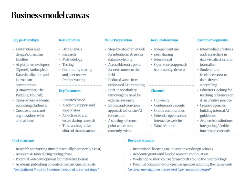
Here follows a possible business model structure that could work for such idea.

Designing for different groups

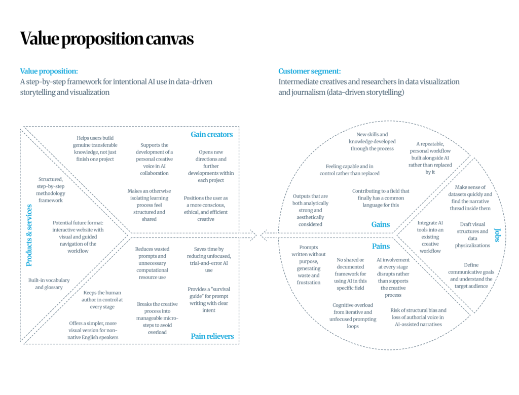
Every research project, at some point, has to find an answer to the following question: who actually needs this, and why would they reach for it? Mapping out the customer profiles and value proposition for this methodology felt like one of the more revealing steps of the process, mainly because it forced me to stop thinking like a researcher and start thinking like someone who has to explain why this matters to a stranger. Two potential users came to mind immediately, and they arrive at the same problem from different starting points.

Profile 1: the intermediate creative or researcher

This person already works in data visualization or data journalism. They know their tools, they have communicative goals, and they have probably already experimented with AI in some part of their process. The frustration is not unfamiliarity. It is the lack of structure. They write prompts without a clear framework, use AI across too many stages, and spend more time correcting output than creating. What they want is a workflow they can repeat, trust, and call their own. A process that saves resources, reduces noise, and keeps their authorial voice intact.

Profile 2: the student or freelancer new to data-driven storytelling

This person has just entered the field. They might be studying design, communication, or journalism, or picking up freelance work that is pushing them toward data narratives for the first time. AI feels both exciting and overwhelming. They do not yet have a reference point for what “good” looks like in this process, and the specialized terminology alone is enough to make them feel like they do not belong. What they need is not just a workflow but something that builds their confidence and knowledge at the same time as it guides their practice.

What this methodology could offer to both

For both profiles, the core offer is the same: a step-by-step framework that makes intentional AI use in data storytelling accessible, documented, and repeatable. For the intermediate user, it brings order to an already active practice. For the newcomer, it lowers the barrier to entry without oversimplifying the field.

The pain relievers are practical: fewer wasted prompts, a clear structure for each stage of the creative process, a built-in glossary so no one has to go looking for definitions elsewhere, and a simpler visual version for those who find dense theoretical language a barrier.

The gain creators go deeper. Both profiles walk away with more than a finished project. They build transferable skills, develop a personal voice in how they collaborate with AI, and become more conscious and ethical users of a tool that is not going away.

Accessibility requirements and barriers

Breaking down the accessibility requirements of this project felt like one of the more hard exercises of the whole research process, because we are used to think everything would have been “easy and smooth” since it’s a niche digital research product. But there was much more behind.

What the user should be capable of

On a physical and personal level, sight would be the most relevant sense, since the experience is largely text-based, but it can be made compatible with screen readers and text-to-speech tools from the start. Hearing is not a requirement at all. Movement needs are minimal too, limited to basic typing, clicking, or scrolling, with voice dictation and keyboard-only navigation as fallbacks.

On the cognitive level is where it gets more demanding. Following an iterative loop of prompting, reviewing, and editing requires sustained mental focus and a willingness to sit with a process that is genuinely not instantaneous. As well as the need for a strong digital literacy to navigate AI tools or terminology, and enough language confidence to work in what are predominantly English environments. Though nowadays everything can be translated in real time.

Financially, the core methodology is designed to be of course a free to access tool, to be used as a starting point or guideline to use AI tools. Infrastructure needs are also few: a device and internet connection.

Who is it meant for and where does this happen

The methodology will be designed for anyone engaging with storytelling on a professional or exploratory level, from researchers and creatives to students and private users. It lives entirely in digital space, which means it can happen in any place and environment.

What it does require is probably the mindset: willingness and awareness to co-create with a machine, and enough critical thinking to question what the machine gives back.

The barriers

Two barriers kept coming up in the entire thinking process. The first was language, since AI tools lean heavily on English, nuance is often the first casualty of translation. The solution here could be to develop a simplified and even more visual version of the methodology that relies on basic English, diagrams, and examples rather than dense theoretical language.

The second barrier was knowledge. The informatics specific terminology involved is genuinely intimidating and not of common knowledge (it was for me too). The solution I thought for this issue was to add a vocabulary directly into the framework itself, so all the basic knowledge can be in the same place as the product.

To conclude, cognitive overload is also worth a mention. When the prompting loop feels endless and the output feels overwhelming, the step-by-step structure of the methodology becomes less of a nice-to-have and more of a way to escape.

Close your eyes and imagine: what’s the future like?

After outlining the actors and affected people and sectors within a possible new direction in the creative process, let’s try to visualize what the current state of things look like and what what it could become after the introduction of a new methodology.

Before

  • involvement of AI in all stages of storytelling generation/ideation/creation
  • no precise and documented knowledge on how to do it in this precice field
  • the prompts to ai tool not well written, without puropose
  • Too many requests = extreme waste and environmental impact
  • Unethical use of AI

After

  • easy to use / step by step methodology to understand and use a correct workflow in the creation process
  • Aware and ethical use of AI tools
  • Less prompts / requests sent with more efficient answers
  • Open a new dialogue
  • Set a standard or starting point for the field

Right now, most creatives are figuring this new directions out alone. A structured methodology could change that and optimize our workflow without making us feel left out of the process. It’s not just about better prompts, yet it’s about reflecting on how an entire field relates to a tool that is now part of our everyday life.