The Authenticity Paradox

Optical Truth vs. Emotional Truth: Why a blurry photo often tells the truth better than a sharp one.

Design & Research | Master Thesis Log 05

In computer science, “noise” is an error. In art, “noise” is texture.

In my last blog , I discussed how the lack of “anticipation” is killing our creativity. Now, I want to drill down into the definition of Authenticity. If we are going to design a camera that resists AI perfection, we need to understand exactly what we are trying to preserve.
I propose that photography serves two opposing masters: Optical Truth and Emotional Truth.

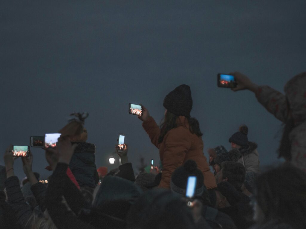
Optical Truth is objective. It is data. It asks: “Did I capture every photon correctly?”

Modern smartphones are obsessed with this. They want zero noise, maximum sharpness, and perfect white balance. The result is what we see below: technically flawless, but emotionally sterile.

Optical Perfection: Clean, sharp, and cold. The AI removed all the shadows where the mystery used to hide. (Photo: Joel Filipe)

    The problem is that memory doesn’t work like a 4K sensor. Memory is blurry. Memory is warm. Memory has vignetting. When an AI “cleans up” a photo, it often cleans away the feeling of the memory itself.

    The Glitch is the Gift: The blur creates the sensation of spinning. An AI would try to “fix” this face, destroying the moment. (Photo: William Klein, 1955

    Emotional Truth is subjective. It is messy. It asks: “Does this feel like it felt?”

    Consider the work of Daido Moriyama or William Klein. Their photos are often grainy, out of focus, or tilted. By the standards of an AI Algorithm, these are “bad photos.” The AI would try to fix them.

    But the “badness” is the point. The blur is the motion. The grain is the grit of the street.

    The Crisis of Code: The fundamental issue in Interaction Design is that we have trained our machines to view human imperfection as a “bug” to be squashed. But in art, the imperfection is often the “feature.”


    This leads me to the Japanese concept of Wabi-Sabi—the acceptance of transience and imperfection.

    How do we code Wabi-Sabi into a camera?

    If I am building an “Honest Interface,” it cannot just be a “Raw Mode” (which is still just data). It needs to be a “Mood Mode.” We need controls that allow the user to tell the system: “Do not fix this. I want the blur.”

    Currently, “Portrait Mode” fakes a blur (bokeh) to look expensive. I am interested in a mode that allows Motion Blur to look alive. I want to design an interface where the user can prioritize Atmosphere over Resolution.

    I have now established a strong theoretical framework:
    1. AI creates Zombie Formalism.
    2. Screens kill Anticipation.
    3. Algorithms prioritize Optical Truth over Emotional Truth.

    But this is all just my opinion. To turn this into a Master’s Thesis, I need to get out of the library and into the field. Next week, I will be conducting Qualitative Interviews with photographers to see if they actually feel this loss of agency, or if I am just a nostalgic romantic yelling at a cloud.

    References & Reading List

    [1] R. Barthes, Camera Lucida: Reflections on Photography. Hill and Wang, 1981.
    [2] L. Koren, Wabi-Sabi for Artists, Designers, Poets & Philosophers. Stone Bridge Press, 1994.

    AI Declaration: This blog post reflects my own research, writing, and arguments. An LLM was utilized solely to assist with the structure and organization of the content.

    The Death of Anticipation

    From “Mental Construction” to Digital Consumption: How the ‘Live View’ screen killed our ability to see.

    Design & Research | Master Thesis Log 04

    “A photograph is not created in the camera. It is created in the mind.”

    This concept, famously articulated by Stephen Shore [1], is known as Mental Construction. Shore argues that the physical act of pressing the shutter is just the final step of a long psychological process. The photographer looks at the chaos of the world, organizes it mentally into a frame, and then uses the machine to capture that thought.
    But today, this order of operations has been reversed.

    In my research into camera interfaces, I have identified a critical shift in how we interact with the image: the shift from the Viewfinder to the Screen.

      The Viewfinder (Traditional): When you look through an optical viewfinder, you are looking at reality. The camera is just a window. You have to imagine (Pre-visualize) how the film will interpret that reality. You are active.

      The Screen (Modern): When you look at a smartphone screen, you are looking at a processed simulation. The HDR is already applied. The colors are already boosted. You don’t need to imagine the photo because the computer has already finished it for you.

      This interface design encourages Post-rationalization instead of Pre-visualization. We shoot first, and ask questions later. We treat the world as raw data to be harvested, rather than a subject to be understood.

      Active Seeing: The restriction of the viewfinder forces the eye to focus. (Source: Unsplash)

      Ansel Adams wrote extensively about “visualization”—the ability to see the final print in your mind’s eye before the exposure is made [2].

      Digital interfaces have killed this skill. Because the feedback loop is instant (0.01 seconds), there is no gap for the imagination to live in. In film photography, there was a “Latent Image”—the invisible period between shooting and developing. That invisibility forced the photographer to trust their vision.

      By removing the latency, we removed the anxiety. But we also removed the intent. If I can take 1,000 photos in a minute and delete 999, I stop caring about the 1.


      This leads to a radical question for my thesis: Can we design for blindness?

      If the screen is the problem, maybe the solution is to take it away. I am beginning to conceptualize an interface that re-introduces “digital latency.”

      Imagine a camera app that doesn’t show you the photo immediately. Imagine a tool that forces you to define your parameters (Mood: Melancholy? Lighting: High Contrast?) before it opens the shutter.

      By delaying the gratification, we might restore the “Mental Construction.” We might force the user to become an architect of the image again, rather than just a consumer of it.

      If we strip away the instant gratification and the AI perfection, what is left? Next week, I will finally tackle the definition of “Authenticity.” I will look at the debate between “Optical Truth” (what the lens sees) vs. “Emotional Truth” (what the human feels), and how we can code that difference into a system.

      References (IEEE)

      [1] S. Shore, The Nature of Photographs. Phaidon Press, 2007.
      [2] A. Adams, The Camera. Little, Brown and Company, 1980.

      AI Declaration: This blog post was drafted with the assistance of an LLM to explore the psychological concepts of ‘Mental Construction.’ The connection to Interface Design and the ‘Latent Image’ theory are my own research.

      The Tyranny of the Perfect Image

      Design & Research | Master Thesis Log 03

      There is a common phrase repeated in tech reviews today: “Everyone is a photographer.”

      The logic goes like this: We all have 200-megapixel sensors in our pockets. We have stabilization that defies gravity and Night Modes that turn midnight into noon. Therefore, because the output is technically high-quality, the act must be photography.

      I disagree. In fact, for my thesis, I am proposing the opposite: As cameras get “better,” photography is getting worse.

      We are not witnessing a renaissance of creativity; we are witnessing the rise of “Zombie Formalism”—images that look alive (sharp, colorful, perfectly exposed) but are internally dead because they lack human intent.

      To understand why this is happening, I turned to the media philosopher Vilém Flusser. In his seminal work Towards a Philosophy of Photography [1], Flusser distinguishes between the “tool” and the “machine.”

      A tool (like a paintbrush) serves the human. The human decides every stroke.
      A machine (like a camera) has a “program.” It has pre-set rules.

      The “Black Box”: When the camera makes 90% of the decisions, the user becomes a functionary, not an artist. (Source: Unsplash)

        Flusser argues that most photographers are not artists; they are “Functionaries.” They simply press a button to trigger the machine’s program. In 2025, this is more true than ever. When I lift my phone to take a picture of a sunset, the AI:

        • Identifies the scene (“Sunset”).
        • Balances the exposure (HDR).
        • Sharpens the edges.
        • Boosts the saturation.

        I did not make those choices. The algorithm did. I simply authorized the calculation.

        Perfection vs. Emotion: Sometimes the blurry shot tells the truth that the sharp shot hides. (Source: Unsplash)

        The result of this automation is a homogenization of our visual culture. We are drowning in what I call the “Aesthetic of Least Resistance.”

        Look at Instagram. The images are stunningly clear, but they all look the same. They lack the “friction” of reality. In Interaction Design, we are taught to remove friction—to make things seamless. But in art, friction is essential.

        Film photography was full of friction. You had to measure light. You had to focus manually. You could fail. And because you could fail, your success meant something.

        Wim Wenders recently critiqued this phenomenon, noting that the inflation of images leads to a deflation of meaning [2]. When a camera cannot take a “bad” picture, the “good” picture loses its value. It becomes a commodity, not a memory.

        In my initial research plan, I considered conducting a visual audit of smartphone interfaces this week. However, as I dove into Flusser’s theories, I realized that analyzing the surface of the interface (the icons and buttons) is premature if we don’t first question the structure beneath it.

        The core issue isn’t just how the buttons look, but how they shape our thinking. If modern AI cameras are designed to provide answers, my research is now shifting to understand how we can preserve the user’s ability to ask questions.

          Closing Thought: The Search for Friction

          We are building cameras that solve problems we didn’t have. The problem of “focus” was never just technical; it was artistic. When we remove the struggle, we remove the satisfaction.

          As I continue this research, I am looking for the “sweet spot”—where the tool helps us, but doesn’t replace us. The goal isn’t to destroy the technology, but to find the human heartbeat buried underneath the algorithm.

          References (IEEE)

          [1] V. Flusser, Towards a Philosophy of Photography. London: Reaktion Books, 2000.
          [2] W. Wenders, “The Act of Seeing,” in The Pixels of Paul Cézanne: And Reflections on Other Artists, 2018.

          AI Declaration: This blog post was drafted with the assistance of an LLM to structure the theoretical analysis. The research selection, case study choice, and final arguments regarding ‘Indexicality’ are my own.

          The Moon is a Lie: A Case Study in Ontological Deception

          Design & Research | Master Thesis Log 02
          #InteractionDesign #AIPhotography #HumanInTheLoop #ResearchJourney #ComputationalPhotography

          Since its invention, photography has held a unique promise: the promise of truth. Unlike a painting, which is an interpretation, a photograph was historically seen as an “index”—a physical trace left by light hitting a sensor.

          But what happens when the sensor stops recording light and starts predicting it?

          In my previous post, I asked if photography is dead. This week, I conducted a deep dive into the Samsung “Space Zoom” Controversy. This event is not just a consumer tech scandal; for my thesis, it serves as “Ground Zero” for the ontological shift in image-making. It proves we have moved from capturing the world to generating a statistical average of it.

          The controversy erupted when Reddit user u/ibreakphotos designed a clever stress test for Samsung’s “100x Space Zoom.” The user hypothesized that the camera wasn’t actually optically powerful enough to see the moon’s craters.

          The Methodology:

          • They downloaded a high-res image of the moon.
          • They downsized it and blurred it until it was an unrecognizable, glowing white blob.
          • They displayed this blob on a monitor in a dark room.
          • They stood back and photographed the monitor using the Samsung S23 Ultra.

          The hardware limitation: A tiny smartphone sensor cannot defy physics, yet the software claims it can. (Source: reddit)

          The Results:

          The phone produced a sharp, detailed image of the moon, complete with craters and surface textures.

          This was physically impossible. The source image (the blurred blob on the screen) contained zero texture data. The camera had effectively “hallucinated” the craters because its AI recognized the shape of a moon and overlaid a texture map from its internal database.

          Why does this matter for Interaction Design? Because it breaks the fundamental contract between the user and the tool.

          In media theory, Charles Sanders Peirce defined the photograph as an “Index”—a sign that has a physical connection to its object (like a footprint in the sand). When you look at a traditional photo, you know that the light actually touched the subject.

          The Samsung Moon is no longer an Index. It is a Simulacrum. As the philosopher Jean Baudrillard argued, a simulacrum is a copy without an original. The image on the user’s phone is “hyperreal”—it looks more real than the blurry reality the user actually saw with their eyes, but it has no connection to the physical moment.

          The friction lies here:

          The User thinks: “I captured this.”
          The System knows: “I generated this.”

          This creates a gap in agency. The user believes they are the creator, but they are merely the “prompter.” The camera is no longer a tool for documentation; it is a tool for optimization. It prioritizes a “beautiful lie” over an “ugly truth.”

          After analyzing this case, I do not believe the solution is to ban AI. Most users do want a clear photo of the moon, even if it is fake. However, from an Interaction Design standpoint, the failure here is not technological—it is ethical.

          The Failure of “Silent Substitution”
          The interface lied. It presented a generated image as a captured one. My take is that we need to redesign the camera interface to be “Honest.”

          My Proposal for Future Research:
          We need a UI that distinguishes between “Documentation Mode” (Optical truth, flaws included) and “Simulation Mode” (AI enhanced).

          If the user knows they are painting with data, the agency is restored. They become a “Director” rather than a duped consumer. The current design trend of hiding these choices behind a single “Shutter Button” is what I call “Agency Laundering”—the machine takes the credit, but lets the user feel like the artist. My thesis aims to challenge this specific pattern.

          Key Questions Arising from this Case:

          1. Transparency: Should AI-enhanced photos carry a visible watermark or metadata tag indicating “Generative Content”?
          2. The “Raw” Mode: Is “Pro Mode” the last bastion of authenticity, or is AI seeping into the raw data as well?
          3. User Consent: Did the user consent to having their blurry moon replaced? Or did the interface assume their intent?

          References (IEEE)

          [1] u/ibreakphotos, “Samsung ‘Space Zoom’ Moon Shots are Fake,” Reddit, 2023.
          [2] J. Vincent, “Samsung’s Moon photos are fake—but so is a lot of mobile photography,” The Verge, 2023.
          [3] J. Baudrillard, Simulacra and Simulation. University of Michigan Press, 1994.

          AI Declaration: This blog post was drafted with the assistance of an LLM to structure the theoretical analysis. The research selection, case study choice, and final arguments regarding ‘Indexicality’ are my own.

          #5 Accessibilty and UI/UX Design

          In the context of technology use among the elderly, accessibility acts as a fundamental pillar of trustworthy design, a facilitator for independent living and a critical bridge between an individual’s diminishing physical or cognitive abilities. [1]

          The Foundation for Trust and Engagement

          Accessibility is one of the four foundational pillars, alongside consistency, transparency and security that build user trust. For elderly users, a lack of accessibility leads to cognitive effort, frustration and hesitation, which are major barriers to trust. If users struggle to find information or complete tasks due to poor accessibility, their confidence in the platform diminishes and often leads them to abandon the technology entirely. [1]

          Four foundational pillars of trustworthy UX

          The four foundational pillars of trustworthy user experience (UX) design are consistency, transparency, security and usability. These elements work in coordination to create a seamless digital experience that helps users feel confident, in control and valued.

          Accommodating the “Aging Barriers” (MOLD-US Framework)

          Accessibility is the primary method for addressing the physical and functional barriers inherent to the ageing process. The MOLD-US framework identifies four key categories where accessibility is crucial:

          • Perception (Vision and Audition): Accessibility features must compensate for the decline in the ability to resolve detail, focus on close objects, and detect contrast. [2]
          • Physical Ability: Aging often leads to slower reflexes, stiffer joints and tremors. [2]
          • Cognition: Because older adults process fewer bits of information at a time, accessible design requires minimizing friction and reducing the number of steps to complete a task. [2]
          • Motivation: If the benefits of a technology are not easily determined through an accessible interface, users become frustrated and unmotivated. [2]

          Promoting Independent Living and “Aging in Place”

          The primary objective of technology for the elderly is to enable them to continue their daily lives independently for as long as possible. Accessibility plays a vital role here by:

          • Resolving Mobility Gaps: For elderly individuals with limited mobility, accessible technology reduces the need for difficult travel for medical treatments. [3]
          • Inclusive Design aims to create designs that are flexible enough to be usable by people with various functional limitations, thereby assisting and prolonging independent living.[3]

          Influencing Attitudes Toward Specific Technologies

          In studies of elderly Austrians, accessibility specifically in the form of functional support was found to drive positive attitudes.

          • Support and Health Devices: Technologies such as personal alarms and tracking systems enjoy high acceptance across all age groups because they provide concrete, accessible help for health-threatening situations. [4]
          • Compensating for Age Effects: Interestingly, while interest in entertainment technology declines with age, the interest in support and health devices does not. [4]

          Sources

          [1] Thefinchdesignagency, “Building User Trust in UX Design: Proven Strategies for Better Engagement,” Medium, Feb. 05, 2025. https://medium.com/@thefinchdesignagency/building-user-trust

          [2] G. A. Wildenbos, L. Peute, and M. Jaspers, “Aging barriers influencing mobile health usability for older adults: A literature based framework (MOLD-US),” International Journal of Medical Informatics, vol. 114, pp. 66–75, Jun. 2018, doi: https://doi.org/10.1016/j.ijmedinf.2018.03.012.

          [3] Y.-Y. Yap, S.-H. Tan, and S.-W. Choon, “Elderly’s intention to use technologies: A systematic literature review,” Heliyon, vol. 8, no. 1, p. e08765, Jan. 2022, doi: https://doi.org/10.1016/j.heliyon.2022.e08765.

          [4] N. Halmdienst, M. Radhuber, and R. Winter-Ebmer, “Attitudes of elderly Austrians towards new technologies: communication and entertainment versus health and support use,” European Journal of Ageing, vol. 16, no. 4, pp. 513–523, Apr. 2019, doi: https://doi.org/10.1007/s10433-019-00508-y.

          Interview preperation

          When i go home for christmas i plan to hold interviews about peoples doomscrolling habits and thougts with my friends and family members. I have a big family that includes people of all different ages, genders and lifestyles, so it is a good group to interview to gain a wider understanding of peoples relationship to doomscrolling.

          How to approach an interview 

          When holding an interview, I think it is important to think of it as a qualitative conversation rather than a strict questioning session. My goal is to understand people’s experiences, perspectives, and meanings in their own words. According to Kvale and Brinkmann (2015), qualitative interviews should balance structure and openness, allowing the interviewer to guide the conversation while remaining flexible and responsive to the person you are interviewing, something I agree with and will try to follow.  

          I will be using a semi-structured interview approach that provides a framework of themes and questions while still leaving room for follow-up questions and unexpected insights. 

          Different approaches for different age groups 

          I will be interviewing people of different ages and will have to adapt to the age and life situation of the participants. Younger participants often respond better to concrete examples and simple language, while adults and older participants may need more time to reflect and may appreciate being given space to elaborate on their answers. Adapting the interview style to different age groups helps ensure that their responses are authentic and that the participants understand the questions. 

          Wording questions 

          The wording of the different interview questions plays a central role in the outcome of the data collected. Open ended questions that begin with howwhat, or can you describe encourage participants to reflect and provide more detailed answers. Leading questions or questions that suggest a “correct” answer should be avoided, as they can influence responses and push people to provide the expected answer instead of their own thoughts (Kvale & Brinkmann, 2015). 

          Interview template  

          As mentioned, for my interviews I will use a semi-structured interview guide. This approach ensures consistency across interviews while still allowing flexibility to explore individual experiences in depth. 

          The interview template includes: 

          1. Introduction:  
          • Brief explanation of the purpose of the interview and content.  
          1. Opening questions:  
          • These questions are meant to ease the participant into the topic and check their knowledge with the term. 
          • Have you heard the term “doomscrolling” before? 
          • If yes: What does it mean to you? 
          1. Main questions:  
          • How often do you find yourself scrolling through negative or distressing news or content? 
            (For example: daily, weekly, occasionally, or rarely.) 
          • What kinds of content do you tend to doomscroll? 
            (News, social media posts, videos, comment sections, specific topics, etc.) 
          • What usually triggers you to start doomscrolling? 
            (Boredom, stress, habits, current events, notifications, or something else?) 
          • Are there certain situations or moods that make you doomscroll more or less? 
            (For example: late at night, during stressful periods, when you’re alone, or when you’re busy.) 
          • How do you usually feel while you’re doomscrolling? 
          • How do you feel when you stop? 
          • Do you feel like doomscrolling serves a purpose for you in the moment? 
          • If yes: What do you think you’re getting out of it? 
          • Have you ever tried to stop or reduce your doomscrolling? 
          • If yes: What strategies did you try, and did any of them work? 
          • What usually pulls you out of a doomscrolling session? 
            (Time limits, emotions, interruptions, physical needs, other people, etc.) 
          • Looking back, how do you think doomscrolling affects your mental health, mood, or daily life overall? 
          1. Follow-up questions: Further questions based on the participant’s responses. 
          1. Closing: Giving participants the opportunity to add anything they feel is important.  

          This structure is widely used in qualitative research because it combines reliability with flexibility and allows for rich, nuanced data collection (Kvale & Brinkmann, 2015). 

          Reference 

          • Kvale, S., & Brinkmann, S. (2015). InterViews: Learning the Craft of Qualitative Research Interviewing (3rd ed.). Sage Publications. 
          • ChatGPT was used to help with grammar and spelling.

          When a Research Topic Feels too Big

          At some point in the research process, a topic can start to feel overwhelming. What once felt exciting and full of possibilities slowly turns into a space of uncertainty, where everything seems relevant and nothing feels clear enough. This is exactly where I currently find myself in my thesis journey.

          My initial interest in playground design came from a simple question: why do most playgrounds still look the same? The more I read and explored, the more layers I discovered—safety regulations, standardization, adult-centered design, lack of child participation, educational values, urban constraints, and social expectations. Each of these aspects felt important, meaningful, and worth investigating. However, instead of clarity, this richness created a sense of being lost.

          This moment of doubt made me question whether I should change my research question or narrow my scope. Should I focus only on school playgrounds? Should I shift my attention from playgrounds as spaces to the design process itself? Or should I concentrate on one specific issue, such as how children can be meaningfully involved in the early stages of design?

          As I move forward, my goal is not to simplify the topic, but to clarify my role as a designer within it. Accepting that a research topic can feel too big is an important step toward shaping it into something focused, intentional, and personal.

          Why Do Playgrounds Still Look the Same?

          Public playgrounds have existed for little more than a century, yet their physical appearance has changed surprisingly little. Swings, slides, and climbing frames arranged on soft surfaces remain the dominant model in cities around the world. While these spaces are widely accepted as “safe,” they are often criticized for being repetitive, predictable, and limited in terms of creativity. This raises an important question: why do playgrounds still look the same despite decades of research on child development and play?

          One key reason lies in the rise of risk-averse attitudes toward childhood. As Tim Gill explains in No Fear: Growing Up in a Risk-Averse Society, parents and institutions have increasingly prioritized supervision and risk elimination over children’s independent exploration (Gill, 2007). Concerns about injury and liability have led to strict safety standards, which strongly influence playground design. As a result, playgrounds became standardized environments optimized to minimize physical risk rather than to support imagination or curiosity.

          Historically, early playgrounds were often supervised and included equipment that would be considered unacceptable today due to injury risks. However, from the mid-20th century onward, safety regulations and cost considerations encouraged uniform solutions. Impact-absorbing surfaces and fixed equipment became the norm, reinforcing a one-size-fits-all design approach. While research shows that the actual risk of serious injury in playgrounds is extremely low, fear continues to shape design decisions more than evidence does (Gill, 2007).

          Another reason playgrounds remain unchanged is their adult-centered design process. Children are rarely involved in early design stages, and decisions are typically made based on adult assumptions about safety, order, and control. Brown et al. (2021) highlight that many playgrounds are designed to meet regulatory and accessibility requirements but fail to consider how children actually experience play. This often results in environments that are inclusive in theory but limited in playful engagement.

          The persistence of similar playground designs is therefore not due to a lack of alternatives, but to a system shaped by fear, regulation, and adult perspectives. Reimagining playgrounds requires shifting the focus from eliminating risk to designing meaningful play experiences, where creativity, curiosity, and social interaction are valued alongside safety. For designers, this opens an opportunity to rethink playgrounds not as fixed installations, but as dynamic environments that support children’s development in richer and more diverse ways.

          References

          [1] T. Gill, No Fear: Growing Up in a Risk-Averse Society. London, UK: Calouste Gulbenkian Foundation, 2007.

          [2] D. M. Y. Brown et al., “A Scoping Review of Evidence-Informed Recommendations for Designing Inclusive Playgrounds,” Frontiers in Rehabilitation Sciences, vol. 2, 2021.

          [3] Future Foundation, Changing Patterns of Parental Time and Supervision, Report, 2006.

          Temporal Experience in UX: How Interfaces Shape Our Sense of Time 6/10

          Taxonomies of Interaction and Why They Matter for Interruption Design

          As interactive systems become more complex, designers need ways to describe and compare interactions beyond individual features or interfaces. One approach that appears repeatedly in HCI research is the use of taxonomies: structured ways of classifying interactions, systems and design choices. Rather than founding direct solutions, taxonomies help clarify what kind of interaction is taking place and under which conditions.

          In the context of interruptions and flow, taxonomies are useful because interruptions are not all the same. A notification on a phone, a system alert in a cockpit or a haptic warning in a wearable device may all interrupt attention, but they do so through different interaction channels and with different consequences.

          Early taxonomies of human–system interaction

          Agah and Tanie propose one of the early comprehensive taxonomies for research on human interactions with intelligent systems. Their framework classifies interaction research along several dimensions: application domain, research approach, system autonomy, interaction distance and interaction media.1

          What is important here is not the specific categories themselves, but the idea that interaction can be analyzed across multiple layers at the same time. For example, an interaction can be local or remote, involve visual or auditory feedback also operate with varying degrees of system autonomy. This already suggests that interruptions should not be treated as a single design problem, but as events shaped by media or system behavior.

          Agah later expands this work into a broader research taxonomy that includes human-computer, human-machine and human-robot interactions.2

          The taxonomy emphasizes that intelligent systems increasingly share space and tasks with humans, rather than operating in isolation. From an interaction design perspective, this is a key shift: interruptions now happen inside shared environments not just between a user and a screen.

          Interaction media and attention

          One part of Agah’s taxonomy that is especially relevant to interruption design is interactionmedia. Interaction can happen through visual displays, audio signals, tactile feedback, body movements, voice or combinations of these. Each medium places different demands on attention.2

          For example, visual interruptions often require users to shift gaze and visual focus, while auditory interruptions can break concentration even when the user is not looking at a device. Tactile feedback may be less intrusive in some contexts but can still disrupt fine motor tasks. Taxonomies help make these differences explicit instead of treating all notifications as equivalent.

          This becomes important when thinking about flow. Flow relies on sustained attention and smooth interaction. An interruption that forces a modality switch (for example, from visual focus to auditory alert) may break flow more strongly than one that stays within the same modality.

          From system-centered to human-centered taxonomies

          While early taxonomies often focused on systems, devices or tasks, Augstein and Neumayr argue for a human-centered taxonomy of interaction modalities. Their framework classifies interaction based on what humans can actively sense and produce, rather than on specific technologies or devices.3

          This shift matters for interaction design because technologies change quickly, but human perceptual capabilities change slowly. By grounding classification in human senses and actions, the taxonomy remains useful even as devices evolve. For interruption design, this suggests that the critical question is not “what device delivers the interruption,” but “how the interruption is perceived by the human.”

          Augstein and Neumayr also highlight that many existing taxonomies reduce interaction to a narrow set of modalities; typically vision, audition and touch.3

          In practice, however, interactions often combine modalities or rely on subtle perceptual hints. Ignoring this complexity can lead to blunt design decisions, such as defaulting to visual notifications in contexts where visual attention is already overloaded.

          Taxonomies as design tools, not checklists

          Across these papers, taxonomies are not presented as rigid classification systems but as thinking tools. They help designers and researchers ask better questions: What kind of interaction is this? Through which sensory system does it operate? How autonomous is the system? How close is it to the user?

          In the context of interruptions, this means moving away from treating notifications as a single UX pattern. Instead, interruptions can be understood as events that vary along multiple dimensions, each with different effects on attention, flow and recovery.

          This perspective supports a more nuanced approach to interaction design. Rather than optimizing interruption frequency or timing in isolation, we as designers can reason about how different interaction modalities and system characteristics shape the interruption experience as a whole.

          Positioning within the research trajectory

          Within this research project, taxonomies provide a structural bridge between research findings on interruptions and later design strategies for recovery and flow. They offer a shared language for describing interaction complexity without reducing it to simple metrics.

          By combining early system-oriented taxonomies with more recent human-centered approaches, interaction design can better account for how interruptions are perceived, processed and integrated into everyday interaction.

          References (APA 7)

          1. Agah, A., & Tanie, K. (1999). Taxonomy of research on human interactions with intelligent systems. IEEE.
          2. Agah, A. (2000). Human interactions with intelligent systems: Research taxonomy. Computers & Electrical Engineering, 27(1), 71–107.
          3. Augstein, M., & Neumayr, T. (2019). A human-centered taxonomy of interaction modalities and devices. Interacting with Computers, 31(5), 451–476. https://doi.org/10.1093/iwc/iwz003


          AI Assistance Disclaimer:
          AI tools were used at certain stages of the research process, primarily for source exploration, grammar refinement and structural editing. All conceptual development, analysis and final writing were made by the author.