Taxonomies of Interaction and Why They Matter for Interruption Design

As interactive systems become more complex, designers need ways to describe and compare interactions beyond individual features or interfaces. One approach that appears repeatedly in HCI research is the use of taxonomies: structured ways of classifying interactions, systems and design choices. Rather than founding direct solutions, taxonomies help clarify what kind of interaction is taking place and under which conditions.

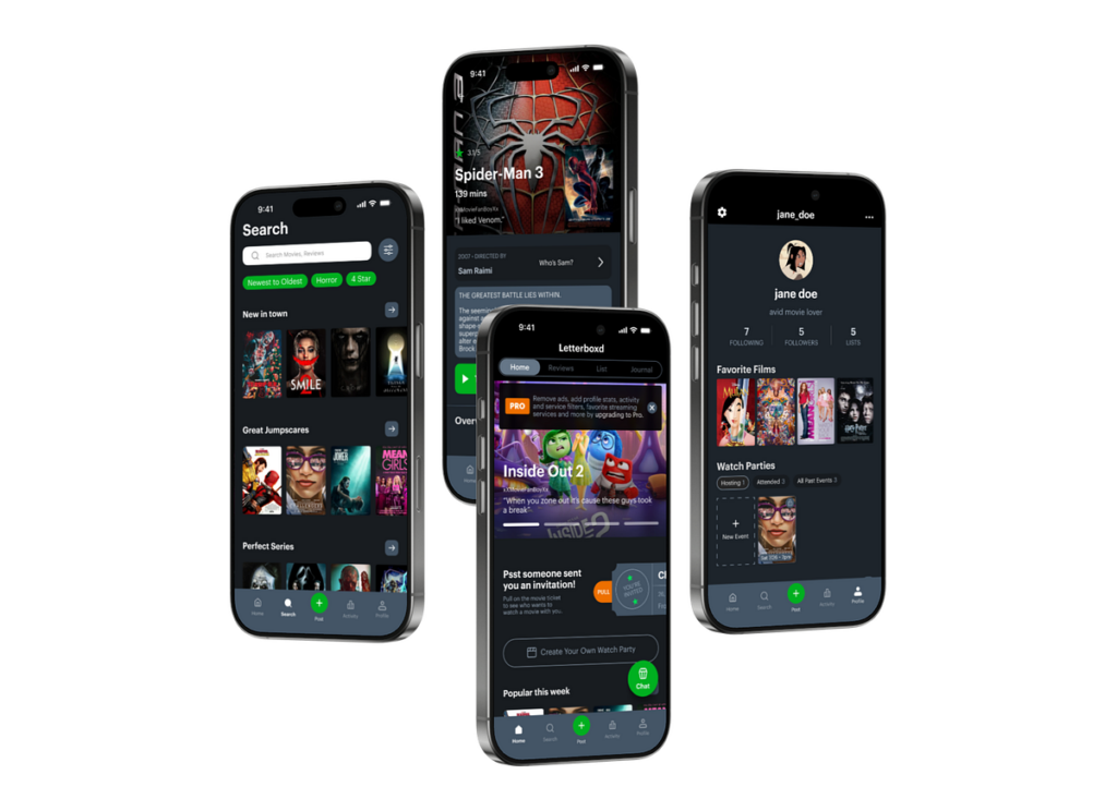
In the context of interruptions and flow, taxonomies are useful because interruptions are not all the same. A notification on a phone, a system alert in a cockpit or a haptic warning in a wearable device may all interrupt attention, but they do so through different interaction channels and with different consequences.

Early taxonomies of human–system interaction

Agah and Tanie propose one of the early comprehensive taxonomies for research on human interactions with intelligent systems. Their framework classifies interaction research along several dimensions: application domain, research approach, system autonomy, interaction distance and interaction media.1

What is important here is not the specific categories themselves, but the idea that interaction can be analyzed across multiple layers at the same time. For example, an interaction can be local or remote, involve visual or auditory feedback also operate with varying degrees of system autonomy. This already suggests that interruptions should not be treated as a single design problem, but as events shaped by media or system behavior.

Agah later expands this work into a broader research taxonomy that includes human-computer, human-machine and human-robot interactions.2

The taxonomy emphasizes that intelligent systems increasingly share space and tasks with humans, rather than operating in isolation. From an interaction design perspective, this is a key shift: interruptions now happen inside shared environments not just between a user and a screen.

Interaction media and attention

One part of Agah’s taxonomy that is especially relevant to interruption design is interactionmedia. Interaction can happen through visual displays, audio signals, tactile feedback, body movements, voice or combinations of these. Each medium places different demands on attention.2

For example, visual interruptions often require users to shift gaze and visual focus, while auditory interruptions can break concentration even when the user is not looking at a device. Tactile feedback may be less intrusive in some contexts but can still disrupt fine motor tasks. Taxonomies help make these differences explicit instead of treating all notifications as equivalent.

This becomes important when thinking about flow. Flow relies on sustained attention and smooth interaction. An interruption that forces a modality switch (for example, from visual focus to auditory alert) may break flow more strongly than one that stays within the same modality.

From system-centered to human-centered taxonomies

While early taxonomies often focused on systems, devices or tasks, Augstein and Neumayr argue for a human-centered taxonomy of interaction modalities. Their framework classifies interaction based on what humans can actively sense and produce, rather than on specific technologies or devices.3

This shift matters for interaction design because technologies change quickly, but human perceptual capabilities change slowly. By grounding classification in human senses and actions, the taxonomy remains useful even as devices evolve. For interruption design, this suggests that the critical question is not “what device delivers the interruption,” but “how the interruption is perceived by the human.”

Augstein and Neumayr also highlight that many existing taxonomies reduce interaction to a narrow set of modalities; typically vision, audition and touch.3

In practice, however, interactions often combine modalities or rely on subtle perceptual hints. Ignoring this complexity can lead to blunt design decisions, such as defaulting to visual notifications in contexts where visual attention is already overloaded.

Taxonomies as design tools, not checklists

Across these papers, taxonomies are not presented as rigid classification systems but as thinking tools. They help designers and researchers ask better questions: What kind of interaction is this? Through which sensory system does it operate? How autonomous is the system? How close is it to the user?

In the context of interruptions, this means moving away from treating notifications as a single UX pattern. Instead, interruptions can be understood as events that vary along multiple dimensions, each with different effects on attention, flow and recovery.

This perspective supports a more nuanced approach to interaction design. Rather than optimizing interruption frequency or timing in isolation, we as designers can reason about how different interaction modalities and system characteristics shape the interruption experience as a whole.

Positioning within the research trajectory

Within this research project, taxonomies provide a structural bridge between research findings on interruptions and later design strategies for recovery and flow. They offer a shared language for describing interaction complexity without reducing it to simple metrics.

By combining early system-oriented taxonomies with more recent human-centered approaches, interaction design can better account for how interruptions are perceived, processed and integrated into everyday interaction.

References (APA 7)

  1. Agah, A., & Tanie, K. (1999). Taxonomy of research on human interactions with intelligent systems. IEEE.
  2. Agah, A. (2000). Human interactions with intelligent systems: Research taxonomy. Computers & Electrical Engineering, 27(1), 71–107.
  3. Augstein, M., & Neumayr, T. (2019). A human-centered taxonomy of interaction modalities and devices. Interacting with Computers, 31(5), 451–476. https://doi.org/10.1093/iwc/iwz003


AI Assistance Disclaimer:
AI tools were used at certain stages of the research process, primarily for source exploration, grammar refinement and structural editing. All conceptual development, analysis and final writing were made by the author.

Notification Experiments and Research

Notifications are one of the most visible and disruptive interaction patterns in contemporary digital systems. They are designed to provide timely information, yet they frequently interrupt ongoing tasks, fragment attention and impose cognitive and emotional costs on users. For interaction design and UX, notifications are not a secondary feature but a main mechanism through which systems attract user attention.

This blog focuses on research that examines how notifications affect productivity, attention and emotional state and also what these findings imply for UX design.

Fragmented work as the default condition

Research by Mark, Gonzalez and Harris shows that modern knowledge work is inherently fragmented. Through observational studies of information workers, they demonstrate that work is characterized by frequent task switching, interruptions and activities rather than long periods of uninterrupted focus.1 Importantly, interruptions are not isolated events; they accumulate and create ongoing reorientation costs as users attempt to resume previous tasks.

From a UX perspective, I think this reframes the role of notifications. Rather than happening in more stable contexts, notifications enter environments where users are already managing multiple cognitive threads. Each interruption forces users to suspend their current task, encode it’s state into memory1, attend to new information then later reconstruct the previous context. This process increases cognitive load and contributes to stress and reduced task efficiency.1

I think that this finding directly challenges notification systems that assume users are always available or inactive. Designing notifications without accounting for fragmented work environments risks applying cognitive strain rather than supporting task continuity.

Removing notifications: productivity versus emotional cost

Pielot and Rello’s “Do Not Disturb” field experiment provides a focused lens on the consequences of push notifications. In their study, participants disabled notification alerts for 24 hours across devices and reported their experiences compared to a baseline day.2

The results reveal a clear tension. Participants reported higher perceived productivity and reduced distraction without notifications. At the same time, they experienced increased anxiety about missing important information and feelings of social disconnection. Notifications therefore serve a dual role: they disrupt focused work, yet they also function as signals of social presence and availability.

Table 1 : Statistical analysis of the responses to the questionnaires that were filled out after the days with and without notifications.2

For interaction design, this highlights that notifications are not merely informational triggers. They shape users’ sense of responsiveness and feeling of obligation to connect. Eliminating notifications entirely is not a viable solution; instead, systems must negotiate between cognitive efficiency and social expectations.

The study also introduces an important systemic concern. When users experience notification overload, they tend to disable notifications broadly rather than selectively. Pielot and Rello describe this as a “Tragedy of the Commons,” where individual applications compete for attention, leading users to withdraw from the notification ecosystem altogether.2 This has long term implications for both usability and trust.

Attention span myths and design justification

Bradbury’s critical review of attention span research addresses a common justification for aggressive notification strategies: the assumption that users inherently have very short attention spans. Bradbury demonstrates that widely cited claims, such as the “8-second attention span,” are often based on weak or misinterpreted evidence.3

He argues that attention is difficult to define, highly context-dependent and strongly influenced by content quality and delivery rather than fixed biological limits. For UX design, I think this is significant. When designers rely on oversimplified attention metrics, interruptions can be framed as necessary adaptations to human limitations rather than as design choices with consequences.

This perspective aligns with notification research that shows attention fragmentation is not inevitable but shaped by system behavior. Treating attention as limited source does not justify constant interruption. It places responsibility on designers to minimize unnecessary competition for it.

Design implications for notification systems

Across these studies, notifications emerge as a design “tradeoff” rather than a neutral feature. Research evidence consistently shows that poorly managed notifications can increase fragmentation, cognitive load and emotional strain while their complete removal introduces anxiety and social friction.

For interaction design, this can suggest several principles:

  • Notifications should be designed as part of a broader attention system, not as isolated prompts.
  • Interruption cost and resumption effort must be considered explicitly, especially in fragmented work contexts.
  • Systems should support user agency in managing availability and responsiveness, rather than enforcing constant real-time interaction.
  • Metrics such as open rates or immediacy should not override cognitive and emotional well-being.

Industry-oriented UX writing points out many of these points by advising for relevance, timing and restraint in notification design.4 5 However, I think without grounding in academic research, such guidelines can risk becoming optimization checklists rather than principled design strategies. The academic literature makes clear that notification design operates at the intersection of productivity, emotion and social norms and cannot be reduced to surface-level best practices.

Positioning within the broader research trajectory

Within the broader scope of my research project, notification experiments provide concrete evidence of how interruptions affect flow, recovery and user experience over time. They establish notifications as a critical case study for understanding interruption as a structural condition of contemporary interaction design.

References (APA 7)

  1. Mark, G., Gonzalez, V. M., & Harris, J. (2005). No task left behind? Examining the nature of fragmented work. Proceedings of the SIGCHI Conference on Human Factors in Computing Systems, 321–330. https://doi.org/10.1145/1054972.1055017
  2. Pielot, M., & Rello, L. (2017). Productive, anxious, lonely: 24 hours without push notifications. Proceedings of the 19th International Conference on Human-Computer Interaction with Mobile Devices and Services, 1–11. https://doi.org/10.1145/3098279.3098506
  3. Bradbury, N. A. (2016). Attention span during lectures: 8 seconds, 10 minutes, or more? Advances in Physiology Education, 40(4), 509–513. https://doi.org/10.1152/advan.00109.2016
  4. Warren, A. (n.d.). The fine art of notifications in UX. Medium. https://medium.com/@thatameliawarren/the-fine-are-of-notifications-in-ux-19a41a0b0c15
  5. Interaction Design Foundation. (n.d.). How to design notifications for better mobile interactions. https://www.interaction-design.org/literature/article/how-to-design-notifications-for-better-mobile-interactions

    AI Assistance Disclaimer:
    AI tools were used at certain stages of the research process, primarily for source exploration, grammar refinement and structural editing. All conceptual development, analysis and final writing were made by the author.

User Interfaces in Video Games 2/10

User Interfaces in Video GamesThe quest for genre-appropriate and usable game UI

To start off with my research I decided to research the history of video games and, by extension, their user interfaces. I’m interested in how people interacted with early interfaces with technical limitations.

My first thought was Pong, a game that many people consider the first game, but upon research I found out that this wasn’t the case and that there’s no clear consensus.

Figure 1: Tennis for Two
Source: [1]
Figure 2: Spacewar!
Source: [2]

Released 14 years before Pong, Tennis for Two was developed by William Higinbotham and it was made using an analogue computer with a oscilloscope screen and two separate controllers [3]. I found a recreation of it you can play in your browser here, which shows well how limited the interaction elements were, namely a pair of dials/control knobs and buttons.

This video also talks about Tennis for Two as the first video game and shows the control scheme

Tennis for Two shows that the way people interact with video games has always involved input devices. These input devices provide the point of interaction between the human and machine. However, some sources argue that it isn’t the first video game because it wasn’t displayed on a video screen, which is a technicality [3]. Other sources argue that “While this appears to be the first interactive game, it is an isolated instance” [4], claiming that the creator of the upcoming game I will mention didn’t know of it’s existence.

Released a few years after Tennis for Two, Spacewar! was developed by Steve Russel and it was made using a PDP-1 computer [4]. This made it the first computer game, originally using toggle switches built into the computer, but eventually getting dedicated remote controllers developed. Spacewar! is widely considered the first video game, showing a very similar interaction principle albeit with more complex controls.

At 13:45 you can see Spacewar! being played

While Tennis for Two had one adjustable knob and one button for aiming and throwing, Spacewar! had much more complex controls with the objective was for each player to maneuver a spaceship and score by firing missiles at their opponent [5].

Whats interesting in observing these interfaces is that they have no traditional visual UI elements, such as high scores or menu screens. The game itself doesn’t guide the player intrinsically, but the aspect of two identical controllers suggests that two players can somehow interact with the game.

The Elements of Hostile Design

Hostile design is design meant to prevent various kinds of usage/interaction with objects, usually by vulnerable groups of people (Rosenberger, 2023). It is perhaps most commonly discussed about designs that prevent the usage of benches etc by the homeless. Robert Rosenberger (2023) presents a classification scheme which talks about the different types of Hostile Design one might come across. 

  1. Physical Imposition

When a design physically prevents certain interactions or engagements with an object. A common example in relation to Hostile Design against homelessness is creating barriers on benches to prevent anyone from laying down on the bench (Rosenberger, 2023), it can be “seats” where one lean against the seat rather than fully sit down, and so on. 

  1. Sensory Interference

Sensory interference includes the use of generating sensory stimuli that is annoying or unpleasant, for example through various usage of light and/or sound. Rosenberger (2023) comes with examples such as playing annoying sounds or loud music in parks and other public spaces have been used to drive away the unhoused. He also writes about the usage of unflattering lights, in the context of driving young people away from underpasses. However, I can also imagine lighting being used to create uncomfortable public spaces to take shelter at. 

  1. Concealment

This is when a certain usage or amenity is available in the public space, just that it is concealed in such a way one must know where it is or how to use it. Rosenberger (2023) brings up the example with public toilets being placed in unusual places and/or having no signage to guide the public to its location. 

  1. Confederacy

This includes the control of a public space, usually through the usage of security guards, police officers, cameras, or others placed to control a public space. For example some public spaces might have a receptionist and a sign in sheet in order to use the space (Rosenberger, 2023), or public rest rooms may have on-site staff controlling the payment gates to enter and exit the rest rooms. Rosenberger (2023) reflects on how the unhoused might not appreciate the monitoring where one needs to sign themselves into the public space, and how camera monitoring can trigger a fear of attracting attention to the authorities.

  1. Self-coercion

Self-coercion is when design makes the public themselves avoid certain behaviour in a public space or refrain from a certain usage of an object. The most straightforward example is signage targeted at certain groups, for example signs that says “No Camping” targets the unhoused to try and prevent them from taking shelter in the area of said sign. Rosenberger (2023) also gives the examples of spikes on surfaces where one perhaps could lie, which is not only a physical imposition, but also an example of self-coercion. It shows the unhoused that they are not welcomed here, which could perhaps lead them away from the area.

  1. Absence

Hostile design in the form of absence is that instead of simply limiting usage in the other ways mentioned, one removes the object altogether. This impacts the unhoused in the ways of leaving no place to rest once benches are fully removed, or lack of public restrooms in public areas (Rosenberger, 2023).

How these hostile designs could be turned to the more positive is something that could be researched further in the next post.

 
Source

Rosenberger, R. (2023). A classification scheme for hostile design. Philosophy of the City Journal, 1(1), 49-70. https://doi.org/10.21827/potcj.1.1.40323

Did you know the Schau auf Graz app?

This week I researched ways to report faults in public lighting in Graz. First I used Google’s AI overview and then checked the information on various websites. The AI overview already gives a complete answer to the question: you can either contact Energie Graz, which manages the public lights in the city, or use the app Schau auf Graz (“look after Graz”).

Schau auf Graz is an Internet service that allows citizens to report problems and suggest improvements about public property, and there is also a section about lighting.

have been living in Graz for almost 3 months, but I had never heard of it and I wanted to know if I am the only one. I asked my colleagues from the Communication, Media, Sound and Interaction Design course how familiar they were with it. Out of the almost 30 people who answered, only 4 people from Graz/Styria knew it, the rest had never heard of it, including 2 people from Graz and surroundings. None of the people who are new in Graz knew the app. I reckon that it is a great way to improve public areas and think that it is a pity that it is not very common. I have never seen an ad about it, but I found it quite well hidden on the Stadt Graz website, under “apps of the city of Graz”.

I downloaded the app to see how it works and pretended I wanted to report a defect light in public space. I found the service to be quite easy to use and efficient, but some improvements could be introduced.

First of all, it is not easily accessible for foreigners living in Graz, because it is only available in German

The navigation bar at the bottom creates 5 different sections, from left to right: my concerns, all concerns, new concern (the biggest and most important button), information and profile.

When creating a new concern, you can choose from various categories, one of which is “Beleuchtung” (lighting). I tapped on it and was then asked to choose what kind of lighting I wanted to report. I was confused about the difference between the two options, but a quick google search and a closer look at the icons made me realise that the option on the left regards lights that illuminate façades and the other one concerns lampposts, which illuminate the streets. After selecting one, I was asked to choose what I wanted to report, and “fault” was the only option to choose from. A status bar and some sort of breadcrumbs menu allows you to track the progress and go back if needed. The second step is choosing the location of the fault, then you are asked to submit a picture. After that the report is ready to be sent.

You can then check the progress of your query on the “my concerns” page. I also took a look at other queries and found it convenient that you can choose if you want to see their status, their position on the map or a list.

Case Study Review: Digital Products That Already Practice Slowness 5/10

How do Ubiquitous Computing and Calm Technology relate to the field of User Experience Design?

In my last blog post, I introduced the idea of calm technology. But what actually makes a technology feel calm? In their 1996 paper, Mark Weiser and John Seely Brown suggest that technology becomes calming when it:

  1. Places information in the periphery, letting us stay aware without being overloaded.
  2. Allows smooth movement from the periphery to the center of attention, giving us control when action or response is needed.

This balance increases awareness while keeping users in control, rather than dominating their attention. Designing for the periphery is therefore a key part of creating calm technology that genuinely supports people.

Weiser and Brown define calm technology through three characteristics:

  1. Smooth transitions between the center of attention and the periphery
  2. Expansion or Enhancement of peripheral perception and awareness
  3. “Locatedness”, which creates calm by fostering a connection to the environment enabling to act confidently within it

Technology feels calm when it works with, rather than against, the way human attention naturally functions. It empowers our periphery by quietly supporting awareness, giving more context and control without demanding attention. This creates a feeling of comfort, familiarity, and “being at home” in our environment. Technology achieves this calmness when it blends seamlessly into its surroundings and aligns with our expectations, allowing attention to flow uninterrupted. Just as grammar mistakes pull us out of a text or a rearranged kitchen disrupts the act of cooking, intrusive or poorly aligned technology breaks our focus. When technology preserves our flow of attention, it naturally feels calm.

How is Calm Technology connected to Ubiquitous Computing?

Both concepts are firstly introduced by Mark Weiser (and John Seely Brown). The early research on Ubiquitous computing inevitably led to the concept of calm technology. So both concepts are closely intertwined. Let me explain why:

Ubiquitous computing enables and requires calm technology at the same time. Once computers are everywhere, it will be crucial to consciously design interactions to ensure they do not overwhelm users. Calm technology is the design philosophy that ensures ubiquitous computing remains unobtrusive and supportive. At the same time, the fact that interactions with digital information can now take place anywhere creates an opportunity to design them in a more supportive way.

This means that ubiquitous computing is the technological vision, and calm technology is the human-centered design principle that guides how that vision should interact with people. They are intertwined because one sets the stage, and the other ensures it’s usable and fits with human needs.

How do Ubiquitous Computing and Calm Technology relate to Today’s field of User Experience Design?

Human Computer Interaction has evolved alongside the evolution of computing, which can be summarized in three stages. In the mainframe stage, computers were rare, expensive, and shared by multiple users. Interaction during this stage was driven primarily by technological possibilities rather than human capabilities. As computers became more accessible, the personal computing stage emerged, establishing one-to-one relationships between individuals and their machines. This shift brought technology closer to people and made user experience a central concern, moving the focus of interaction from the technology itself to the user.

In the following ubiquitous computing stage, people interact with numerous embedded computers throughout their daily lives, making calm technology not just desirable but necessary. The Internet has accelerated this evolution, raising questions about how pervasive technology may impact our environment and everyday experiences. In the state we are currently in, technology constantly competes for our attention. New technology is developed in a high speed and to keep up the pace user-tests are often skipped, resulting in bad user experience and usability (Monse-Maell, 2018). In response, many contemporary design trends have emerged, all based on the same underlying concept: Calm Technology. Within the design field, this idea is commonly framed in terms of attention and presence (Calm UX, Quiet UX, Mindful UX), simplicity and reduction (Minimalist UX, Effortless UX, Invisible Design), spatial and peripheral interaction (Ambient UX, Peripheral Interaction), and human well-being and pace (Well-being UX, Slow Technology).

Sure you already heard of some of those terms and are familiar with the ideas behind it. They all come down to the same main idea. They take the philosophy of Calm Technology and translate them into concrete design practices. Calm Technology gives designers a philosophical and ethical grounding. The specification into one of those terms usually provides concrete methodologies, patterns, use cases and heuristics. That’s why it makes sense to engage with these fundamental ideas, as they form the basis for current design trends and shape much of today’s interaction design thinking.

Now that we’ve covered these fundamentals, I want to take a closer look at human–computer interaction and what types of interactions we can use to achieve calmer, more effortless technologies. In the next blog entry, I’ll explore how we intuitively understand how to use objects, how information is perceived in our periphery, and what this means for designing interfaces.

References:

AI Assistance Disclaimer:

AI tools were used to improve grammar and phrasing. The ideas, examples, and content remain entirely the author’s own.

Update: Why My Doomscrolling Experiments “Haven’t Worked” (Yet) 

Since my last update, I’ve noticed that my screen time has actually increased during December, even though I’ve still been implementing, staying off my phone in the morning, 30-min dedicated scroll time, and time limits on certain social media apps. At first, this felt frustrating, but looking closer, the increase makes sense when I consider what the past few weeks have looked like. (The picture shows my screentime from the week before i started the experiment, the first week of experiments, and last week)

December has been dominated by exam stress, deadlines, and a heavy workload. Instead of using my phone less, I’ve often been using it more, particularly when I’m supposed to be working. Doomscrolling has become closely tied to procrastination. When schoolwork feels overwhelming, scrolling offers a quick way to avoid the discomfort of starting or continuing a task. The more pressure I feel, the easier it is to reach for my phone. 

Time limit: 

One week after setting time limits on my most-used social media apps, my average screen time initially went down by about 54 minutes. However, that change didn’t last. As stress increased, so did my tendency to ignore the limits. I would hit â€œignore,” and keep scrolling, or switch to another entertainment app once I reached my limit. This was also reflected in my screen time categories, where “entertainment” replaced “productivity and finance” in the top three. Instead of reducing screen use, I was simply redirecting it. 

30 min dedicated scroll time:  

The 30-minute scroll time experiment has been especially difficult to follow during this period. When I’m calm and focused, setting boundaries feels manageable. But when I’m stressed or exhausted, doomscrolling shifts from being a habit to being a coping mechanism. In those moments, the goal isn’t entertainment or information, it’s distraction. That’s why the limits feel easy to ignore, the short-term relief of scrolling feels more important than long-term intentions. 

Learnings: 

This has made me realize that doomscrolling gets worse under pressure. Exam stress lowers my ability to regulate my behavior, and procrastination feeds into scrolling, which then increases stress even further. It becomes a cycle: stress leads to doomscrolling, doomscrolling leads to guilt and lost time, and that lost time creates even more stress. 

Although my screen time going up feels like a setback, it has actually helped me understand my behavior and doomscrolling more clearly. These experiments haven’t failed, they’ve shown me that technical solutions like app limits aren’t enough on their own in all cases. To truly reduce doomscrolling, I also need to address the stress and avoidance that push me toward it in the first place. 

I’m still not where I want to be with my screen time, but I’ll continue experimenting and reflecting on what works, especially once the exam period is over and my stress levels are lower. I’ll update again as I keep testing these tools and learning more about doomscrolling habits. 

Aura simulator to give an insight into the experience of a migraine attack

Trigger warning: Flashing lights and aura simulation

This week’s goal was to focus on investigating more about the visual part of an aura and whether there is a way to simulate aura.

The German pain clinic in Kiel developed an aura simulator for users to experience what an aura could look like. Their app needs access to th phone’s camera, and gradually the flickering zigzag-shaped flashes, streaks and veils appear at the edge of the field of the user’s vision.

The idea behind is to identify and understand auras, to distinguish them from other visual disorders and to treat them specifically.

Below you can take a look yourself at one of the simulations. This one takes place on a highway while driving.

This simulation includes a rapid expansion of the aura. When comparing it to mine I would say that it expands in a faster way and blocks more of my vision. The flickering is also faster and more intense in my case:

Aura is considered to be a hallucinatory experience that usually lasts between five minutes and one hour. The hallucinations from the aura occur on one side, both eyes or on the same side as the headache pain.

Language and motor auras are less frequently observed. Patients affected by these kind of auras experience difficulties with finding words, dysphasia, or limb or facial weakness.

When I looked a bit deeper into the topic I found following temporary symptoms some migraineurs also experience:

  • Hearing ringing in the ears or other noises
  • Hearing loss
  • Tingling feeling in one hand or on one side of the face that may spread slowly along an arm or leg and may turn into numbness
  • Numbness or tingling of the tongue or mouth
  • Speech or language difficulty
  • Inability to move part of the body
  • Muscle weakness

Benefits of aura simulation

But what are the advantages of simulating aura? Like illustrations of visual aura they can be helpful to distiniguish migraine from other disorders e.g. epilespy and diagnose it correctly. Besides, visualizing migraine symptoms is a helpful tool for raising awareness toward this disease and reducing the stigma. Since it is socially devaluated it has been found to be useful to make such a complex disease observable so that more people are educated.

During my previous studies I have had some touch points with virtual reality and I can imagine a simulation in VR to be quite effective to simulate the aura in a more accurate way. Next week, I would like to investigate if there is existing research on this topic!

Individual experience

I myself, have always struggled to put aura into words and to describe it in a way that a person that has never experienced it would be able to imagine it. When comparing my experience with other migraineurs I have realized that there definetely are similiarities but it tends to be an individual experience. This could be an interesting survey or interview question in following research including other migraineur’s perspective.

Next week – Outlook

Thanks to Stefanie Egger, the lecturer of Project Work- Design Research I was able to connect with a journalist who has chronic migraine and combines science with art while raising awareness about migraine. Since I am still investigating about the neurological disorder and I am still trying to define problems and eventually ideate possible solutions I see our online-meeting as a great opportunity to identify a focus for my research and learn from someone who is affected but also pro-actively doing something for the visibility of migraine.

References:

  • Sutherland, H. G., & Griffiths, L. R. (2017). Genetics of Migraine: Insights into the Molecular Basis of Migraine Disorders. Headache, 57(4), 537–569. https://doi.org/10.1111/head.13053
  • O’Hare, L., Asher, J. M., & Hibbard, P. B. (2021). Migraine Visual Aura and Cortical Spreading Depression-Linking Mathematical Models to Empirical Evidence. Vision (Basel, Switzerland), 5(2), 30. https://doi.org/10.3390/vision5020030
  • https://www.mayoclinic.org/diseases-conditions/migraine-with-aura/symptoms-causes/syc-20352072

Videos:

Calm & Slow Interaction: Key Principles for Designing Attention – Aware Interfaces 4/10