Research update + Doomscrolling and anxiety

Personal experiments:
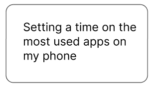
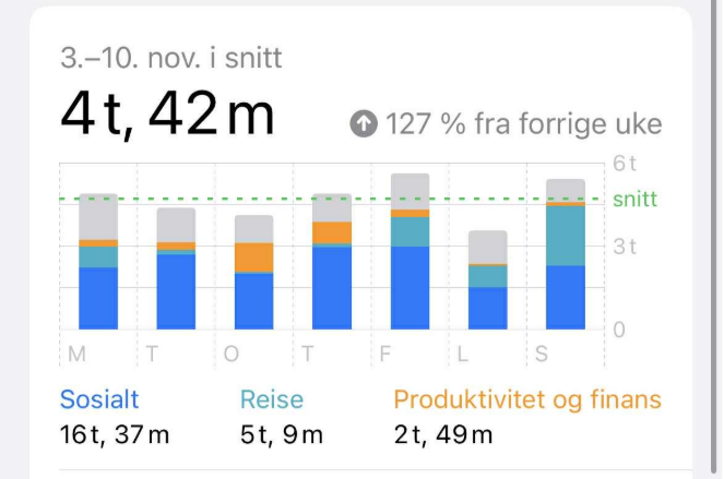
Screentime before:  

What I spend most of my time on is the category “social”. The second one is “travel” which is just when I have gps on my phone while driving to and from my hiking trips. The third category is “productivity and finance”.  

Screentime after setting a time limit on most used social media apps:  

One week into setting a timelimit on my most used social media apps, my screentime went down by 54 minutes on average. The third of the top three categories changed from “Productivity and finance” to “entertainment”.   

As i mentioned in a previous blog post, I didn’t feel like setting the time limit was working due to it being too easy to ignore. The screentime dropping slightly could be an indicator that even though I ignored the limit, maybe it was a little nudge to a little more conscious use of social media platforms and made me limit my use somewhat.  

The third category being changed to “entertainment” shows that when i met my limit for the social media apps, sometimes i just exited that app and opened up another application used for entertainment.  

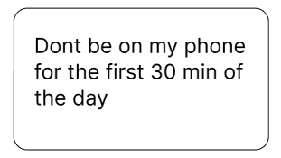
I’m still not where I want to be with my screentime and will continue to implement my tools for reducing it and cupdate later on how also following the 30 min scroll time project affects me.

Secondary research

This week I also conducted more secondary research about the reasons why humans tend to doomscroll and some of the side affects it leads to.

Why do we doomscroll?

Why we doomscroll can be explained by how our brains are wired for threat and novelty. As Harvard Health Publishing explains, the brain’s fight-or-flight response pushes us to scan for danger when we perceive uncertainty or risk, and doomscrolling feeds directly into that impulse. Meanwhile, Newsweek notes that, especially for younger people, social media serves like a “digital pacifier”, a convenient distraction from stress, loneliness and boredom. Which makes doomscrolling feel like a quick way to cope even when nothing has really changed. In these situations it works as a quick fix and not as a long term solution. Because news feeds and apps constantly deliver new content at irregular intervals, each swipe can feel like a small “reward”, encouraging us to keep scrolling in search of the next one.  

How can doomscrolling trigger anxiety?

Constant exposure to negative or alarming content through doomscrolling can have serious repercussions for our mental and physical health. According to Harvard experts, doomscrolling overloads our stress response: extended exposure to distressing news can lead to symptoms like trouble speeling, muscle tension, headaches, irritability, or even elevated blood pressure. A 2023-2024 review even links excessive doomscrolling to decrease overall well-being and increases existential anxiety, a sense of dread of panic about life and the future. Moreover, as Newsweek points out, what feels like staying informed or reducing uncertainty often does the opposite, delivering “fleeting relief” but ultimately reinforces worries because each new negative headline renews anxiety instead of easing it.  

Why doomscrolling is most common with younger people

Doomscrolling appears to be especially widespread among younger age groups. In a 2024 survey cited by Newsweek, around 53% of gen Z respondents identified themselves as regular doomscrollers, a far higher rate than the general adult population. The article explains this by noting how deeply intertwined social media is with younger people’s daily lives: manually use their phone for hours, and social platforms often act as distraction from stress, isolation, or uncertainty. Because younger people are more frequently online and more exposed to algorithm driven content cycles, their risk of falling into habitual doomscrolling (and the mental health consequences that come with it) becomes much greater than for older generations.  

“Anxiety among young adults almost tripled between 2019 and 2023 in the U.S. according to Department of Health and Human Services data cited by the report. ”

Sources:

https://www.newsweek.com/gen-z-doomscrolling-problem-2065999

https://www.health.harvard.edu/mind-and-mood/doomscrolling-dangers

https://www.ipsos.com/en/axa-mind-health-report-mental-health-continues-deteriorate-around-world

https://www.ssb.no/kultur-og-fritid/tids-og-mediebruk/statistikk/norsk-mediebarometer/artikler/dette-er-de-mest-populaere-sosiale-mediene?utm_source=chatgpt.com

https://www.southerncross.co.nz/society/info-hub/members-hub/your-toolbox/wellbeing/thinking-well/the-dangers-of-doomscrolling?utm_source=chatgpt.com

https://www.theguardian.com/society/2022/sep/06/doomscrolling-linked-to-poor-physical-and-mental-health-study-finds

Interview coding: The sellers view

A method in the research phase of Service design is conducting interviews with the target group(s). Due to the short time period, I’ve tried to look for interviews online to gather information. What I wish to figure out is the perspective of the sellers and buyers. How is the experience for the sellers, do they enjoy their job? How do they sell? Are they comfortable and confident in what they are doing? Is it helping them earn money? And how is it for the buyers? Where and why did they buy the newspaper? Did they read it? How did they find the content? and so on.

In this blogpost I will focus on the sellers. I looked through a few Norwegian seller interviews I found on Erliks website as well as a couple of other global interviews from big issues websites and arab news. None of the interviews included the same questions. I copied the interviews into a document and marked “codes” of what I thought was important to the questions I would like to answer. After that I took the codes into post-its on FigJam and used affinity mapping to group the codes. The groups I created were location, time, sales tactic, magazine feedback, customer behaviour, selling difficulties, seller outcome, suggestions for improvements, and sellers experience with the service itself.

Let’s start with location, where the sellers would tend to locate themselves while selling. The sellers would choose strategic locations that are busy, such as metro stations, near a university, a touristy neighbourhood and shopping malls (Arab News, 2025; Skyrud, 2025a; Bu, 2025). Two of the people also spoke about their tactic in walking around instead of simply standing still, this was how one of them stood out (Arab News, 2025; Hetherington, Lu & Terzić, 2021). Another would stand in the middle of the crowd so that people had to pass by and would be unable to “ignore” them (Bu, 2025). When it comes to the time the sellers would sell, it wasn’t much mentioned in the interviews. One would say they sold when they needed the money (Bu, 2025). As the street newspaper service functions by letting the sellers choose where to sell and their working hours (INSP, n.d.). 

Sales tactics were also quite often mentioned. Being kind and spreading a good mood through smiling and thanking and not letting your own irritations affect customers were mentioned (Arab News, 2025; Skyrud, 2025a, 2025b). One mentioned how he would let customers know that buying it is supporting them and the makers of the paper. The importance of not asking for more money or nagging the customers was also mentioned. As for the feedback of the magazine, one mentioned they would receive positive feedback and that people liked to read about the sellers of the magazine, but that some also buy it and seem to not read it. The same person also commented on how a magazine with a drawing on the frontpage sold really well and thought that people might like drawn frontpages.

As for the customer behaviour the sellers tend to experience, it seemed mostly positive, but some would experience poor behaviour (Bu, 2025; Skyrud, 2025). Two also talked about how they had put a mark on the area they were selling and how people would be well aware of who they are (Arab News, 2025; Hetherington, Lu & Terzić, 2021). Regular customers was also a point that was mentioned. As for difficulties when selling, one had a problem with people struggling with the digital payment method (Vipps) which seemed to cause stress as they seem to not have time to go through the payment method (Skyrud, 2025b). Another commented on the price that people should be able to afford it as it’s only the price of two coffees (Skyrud, 2025a). The interviewee from Paris had also experienced a big drop in sales over his long career as a newspaper seller (Arab News, 2025). 

As for the sellers’ experience with the street newspaper service, one talked about how they were a mentor for new sellers and that the mentor program had great success (Bu, 2025). As a mentor they would teach new sellers how to sell the magazines, giving tips on small things such as how to hold it, or help with language. In one of the interviews one came with tips for improving the service as a whole by promoting the magazine more online – since that’s where the people are (Skyrud, 2025a). For sellers, getting a sense of dignity, interacting with others and doing something that helped them share their story with others were positive outcomes mentioned (Arab News, 2025;  Bu, 2025; Hetherington, Lu & Terzić, 2021).

What could we take with us from these interviews? Well it seems as though figuring out how and where the sellers should position themselves for best sales could be interesting to look at, for example they tend to place themselves in busy areas, while one mentioned that they felt like customers were in a rush and did not feel like they had time to figure out the payment method. The payment process is also important, as people tend to carry less cash, other payment methods might be more time-consuming or impractical for street newspaper sales. Further we have the design of the magazine and its content itself. Some people like reading the stories of the sellers in the magazine, while people seem to buy it to support, yet they do not seem to read the magazine. Then there is the aspect of the design of the magazine itself if that could help start a talking point or promote sales. Which leads to the marketing of the magazines and its exposure online in order to promote more sales and open up another channel to support and communicate.

References

Not just rainbows and pretty patterns

This week I dived into research about the neurological disorder to gain a better understanding of it.

Challenges

When researching about a health-related topic, I’ve faced some obstacles while trying to do a superficial research. While writing my Bachelor thesis I learned the importance of understanding that I as a Designer won’t be able to understand every information I come across since most sources are of the medical and therefore full of latin and scientific terms that are hard to understand. But the lesson I learned is to never forget the reason of why I am reading those scientific papers in the first place. The goal isn’t to understand every single detail but to gather a basic understanding of the topic. This base will then enable me to proceed with more knowledge about it and continue with the Design work. As I started reading papers about migraine I kept reminding myself to remember this lesson in order to prevent myself from feeling too lost in detailed sections. Trying to be selective with my sources is also helpful since I am the person choosing them and deciding which sources or sections are diving too deep into neuroscience.

With this in mind I started asking myself which questions could be relevant for a superficial investigation and collected following results:

Terminology

The word migraine comes from the Greek word hemikrania which means half of a skull. This term was then translated to French: migraine. The reason is that the pain affects one side of the head. [1]

The phases of a migraine attack

A migraine attack is usually characterized by four different phases: [2],[3]

  1. Prodome: occurs hours or days (as early as 3 days) before the headache phase, including symptoms such as appetite changes, thirst, yawning, etc.
  2. Aura: appears immediately before the headache (usually flickering lights, blurred vision,…)
  3. Headache: pain phase (usually pulsating)
  4. Postdrome: after an attack characterized by non-headache symptoms such as cognitive deficits, fatigue, and others

What surprised me most is that the first phase already begins before the one-sided headache pain even starts. The symtoms that are described such as yawyning, appetite changes or thirst also don’t indicate clearly that a migraine attack is about to start. If a person that is menstruating would analyze their symtoms it wouldn’t be easy to identify whether it is due to a migraine or their menstruation. Even mood changes are reported as a symtom which would also cause the same problem.

Migraine can be classified into two categories: Migraine with aura and Migraine without aura.

Visual aura: occurs in approximately 15–33% of patients affected by migraine attacks. I would like to elaborate more on this topic as it is one important aspect of this complex neurological disorder.

Sensory aura: Perceived as pins-and-needles tingling or numbness starting in the lips/tongue, face, or hand, spreading slowly to the arm or body. Positive sensations dominate, feeling like a wave of prickling.

Speech/language aura: Difficulty finding words, slurring or fluent but nonsensical speech, often unilateral and concurrent with other auras

How does visual aura look like?

The experience of visual aura differs. Some people perceive:

  • Zig-zag patterns
  • Sawtooth patterns (see picture below)
  • Geometric shapes
  • Stars
  • Scintillating scotoma (shimmering blind spot that expands)

Image 1: Sawtooth wave form

Some migraineurs experience blind spots or temporary vision loss. (e.g. when I thought I was going blind during sports class). It often begins in the center or periphery of vision and spreads graduall, resembling a so-called “fortification spectrum” or wavy lines.

Example of a migraine aura: This picture illustrates the typical gradual expansion of a migraine aura along with the characteristic fortification spectrum.

The visualizing of aura

When I tried to look for images that depict a migraine’s aura I was a bit underwhelmed. Most of the edited images or drawings create a rather aesthetic looking effect.

The warm colors of this image combined with the pastel and colorful lines create a happy and warm mood. For me as someone who experiences visual aura regularly this image is rather irritating and I wouldn’t associate it with migraine.

This image does illustrate a blind spot that is blocking the viewer’s sight but the colorful elements next to it again are more similar to a beautiful rainbow than an overwhelming sight loss.

It was a challenge to find a realistic depiction that didn’t leave me with a weird feeling while looking at it. A negative consequence could be that viewers might come to the conclusion that visual aura looks harmless and is actually aesthetic.

After reading more neuroscientific research articles I started searching with scientific keywords such as “fortification spectrum” and then found images that resembled my visual aura more.

Conclusion

When sharing experiences about migraine attacks I often struggle with explaining the visual part of it and how deeply it actually it hurts to see those flashing lights. Since you are the only person it is visible for it is hard to describe, especially since it is related to so much discomfort and pain. Now that I learned that migraineurs report different visual aura I feel intrigued to look more into this topic. It could be interesting to ask people that have perceived visual aura to describe it and have a look at aura simulations. As I am personally affected I could even try to visualize my aura myself and aim for a more realistic draft without embellishing it.

References

  • Rose FC. The history of migraine from Mesopotamian to Medieval times. Cephalalgia. 1995 Oct;15 Suppl 15:1-3.
  • Vollesen AL, Benemei S, Cortese F, et al. Migraine and cluster headache – the common link. J Headache Pain 2018; 19: 89.
  • Stankewitz A, Aderjan D, Eippert F, et al. Trigeminal nociceptive transmission in migraineurs predicts migraine attacks. J Neurosci 2011; 31: 1937–1943.
  • Dongen, Robin & Haan, Joost. (2019). Symptoms related to the visual system in migraine. F1000Research. 8. 1219. 10.12688/f1000research.18768.1.

Images

Different Types of Playgrounds and Their Contributions to Children’s Development

Playgrounds have long been recognized as essential environments supporting children’s physical, cognitive, and social development. In the academic literature, playgrounds are commonly categorized into three main types: traditional playgrounds, adventure playgrounds, and contemporary playgrounds (Barbour, 1999; Campbell & Frost, 1985; Hayward et al., 1974). Each category reflects distinct design philosophies, material choices, and forms of play engagement.

1. Traditional Playgrounds

Traditional playgrounds typically consist of standardized, manufactured equipment such as metal swings, seesaws, climbing ladders, and slides. Because these structures are usually mass-produced and selected from catalogues, their design tends to be predictable and uniform.
Although they support fundamental motor activities, research shows that these fixed structures offer limited flexibility and often constrain children’s play to predefined movements. Coffin & Williams (1989), for instance, found that children spent very short periods in areas where equipment lacked complexity and plasticity, suggesting that static structures may not sustain long-term engagement or imaginative play.

Figure 1 (traditional playgroun)

2. Adventure Playgrounds

Adventure playgrounds represent a contrasting philosophy. Originating in Europe and still widely implemented—approximately 1,000 adventure playgrounds exist today, with over 400 in Germany, and many in England, Holland, France, and Denmark—they emphasize flexibility, creativity, risk-taking, and child autonomy (Solomon, 2005; IPA, 2007).

These playgrounds typically include loose parts, such as wood, ropes, tires, and moveable objects that children can manipulate, combine, or repurpose. This dynamic environment “multiplies the opportunities” for exploration and problem-solving. Research strongly supports their value: Hayward, Rothenberg & Beasley (1974) found that children spend more time in adventure playgrounds and display higher levels of cognitive play compared to traditional and contemporary playgrounds. Similarly, Strickland (1979, cited in Hugh, 1995) emphasized that adventure playgrounds facilitate greater cognitive and social development.

Loose parts, in particular, appear central. Both Hayward et al. (1974) and Brower & Williamson (1974) (cited in Maxwell et al., 2008) demonstrated that mobile, manipulable materials are preferred by children and encourage more complex play behaviors than fixed equipment.

Figure 2 (adventure playground)

3. Contemporary Playgrounds

Contemporary playgrounds blend elements of traditional structures with more innovative, multi-functional designs. Barbour (1999) describes these playgrounds as including linked, multi-purpose structures that allow varied points of entry and exit. They often incorporate features that stimulate dramatic play, such as platforms, tunnels, themed structures, or interconnected climbing systems.

Coffin & Williams (1989) observed that multifunctional play structures encourage richer social, verbal, and psychomotor behaviors compared to single-use equipment. These findings indicate that contemporary designs—by expanding children’s choices and encouraging imaginative engagement—occupy a middle ground between the fixed nature of traditional parks and the flexibility of adventure playgrounds.

Figure 3 (contemporary playground)

Across studies, several consistent themes emerge:

  • Flexibility and manipulability support cognitive and social development.
  • Complex, multi-functional equipment fosters richer interaction and longer play duration.
  • Traditional playgrounds, while valuable for basic motor skills, offer limited opportunities for creativity and problem-solving.

References

Barbour, A. C. (1999). The impact of playground design on the play behaviors of children with differing levels of physical competence. Early Childhood Research Quarterly, 14(1), 75–98.

Brower, D., & Williamson, D. (1974). Loose parts and creative play. In Maxwell et al. (2008)

Campbell, S., & Frost, J. L. (1985). The effects of playground type on children’s play behaviors. In J. L. Frost & S. Sunderlin (Eds.), When children play.

Coffin, G., & Williams, G. (1989). The influence of playground equipment on children’s play. Journal of Environmental Psychology, 9(1), 15–20.

Hayward, D. G., Rothenberg, M., & Beasley, R. (1974). Children’s play and urban playground environments: A comparison of traditional, contemporary, and adventure playgrounds. Environment and Behavior, 6(2), 131–168.

Hugh, S. (1995). Play environments and cognitive development.

IPA (International Play Association). (2007). Playground statistics and global overview. IPA Publications.

Maxwell, L. E., Mitchell, M. R., & Evans, G. W. (2008). Effects of play equipment and loose parts on preschool children’s outdoor play. In Children, Youth and Environments,

Solomon, S. (2005). The science of play: How to build playgrounds that enhance children’s development. University Press.

Strickland, E. (1979). Cognitive play in adventure playgrounds. I

#2 Research

Image by chriszwettler from Pixabay

This week I was looking into the Austrian side of things. I was interested how many elderly are using technology in Austria. Based on a survey that was conducted by the Statistics Austria in 2023 the adoption of technology, specifically looking at the internet usage was around 53.8% for people that were aged 75 – 84 years old. [2]

More interestingly that internet use declines as age increases.

  • 63.8% of 75- to 79-year-olds use the internet
  • 42.8% of 80- to 84-year-olds use the internet

The study was also focusing on the attitudes of elderly Austrians towards new technologies and categorized two main groups: Communication and Entertainment and Support and Health. In this case the study was talking about Tablet, Smartphone, Social Networks and Voice-Controlled PC in the first category of Communication and Entertainment. The second category Support and Health contained technology (Devices) like Tracking Systems, Auto Fall Alerts, Personal Alarms and Auto Cookers. [2]

Support and Health Devices

As previously mention this category contains devices like Emergency Tracking Systems. Around 77% of elderly (50+) had a positive attitude towards one of these technologies in this category.

  • 69% of elderly thought positive about the personal alarm systems
  • 62% of elderly thought positive about the auto fall alerts
  • 60% of elderly though positive about the tracking systems

This values indicate, like previously mentioned, that elderly are interested in technology if they see a clear benefit.

Advantages of using technology

Technology can enable the elderly to continue their daily life and be independent for as long as possible. [2]

  1. Support and Health Technology
    • Safety Assistance: Let’s the elderly still life independently and still be save with devices like Auto Fall Alerts. [2]
    • Maintain Health: With aging cognitive, physical and sensory impairments increase, this is where technology can improve mental and physical health. [1]
    • Lessens Medical related travel problems: Technology can help assist elderly that have limited mobility or need to go to medical facilities regularly. [1]
  2. Technology in Communication and Wellbeing
    • Technology can decrease loneliness and improve well-being. [2]
    • Elderly that access to the internet are often socially more connected. [2]
    • The use of ICT has a direct correlation to an improvement of Life Quality and Cognitive Function. [2]

What are ICTs?

Next Steps: Technology Adoption Models

  1. Technology Acceptance Model
  2. Unified Theory of Acceptance and Use of Theory [1]

Sources

[1] Y.-Y. Yap, S.-H. Tan, and S.-W. Choon, ‘Elderly’s intention to use technologies: A systematic literature review’, Heliyon, vol. 8, no. 1, p. e08765, 2022.

[2] N. Halmdienst, M. Radhuber, and R. Winter-Ebmer, ‘Attitudes of elderly Austrians towards new technologies: communication and entertainment versus health and support use’, European Journal of Ageing, vol. 16, 12 2019.

Is Photography Dead? Rethinking Creative Authenticity in the Age of AI

Design & Research | Master Thesis Log 01

The mechanical eye vs. the digital brain. (Source: Unsplash)

I still remember the first time I developed a roll of film. There was a specific anxiety in waiting to see if the shot came out right—the grain, the slightly missed focus, the “happy accidents.”

Today, that anxiety is gone. We are witnessing the death of the “snapshot” and the birth of the “computed image.” With the release of tools like Google’s Magic Editor and Adobe’s Generative Fill, the definition of photography has shifted from capturing light to processing data.

As an Interaction Design student coming from a background where photography was about documenting reality, this shift fascinates and terrifies me. If an algorithm frames the shot, adjusts the lighting, and even generates missing details, who is the creator? The user or the system? My Master’s research topic, “Rethinking Creative Authenticity,” investigates this exact tension.

The Visual Conflict

This image has “noise.” It has grain. It captures a fleeting moment that might never happen again. It feels human because it is flawed. (Source: Unsplash)
Computed Perfection
Clean, optimized, and statistically average. AI tools push us toward this aesthetic—images that look “correct” but feel empty. (Source: Unsplash)

The Research Framework

Central Research Question

How can interaction design redefine or preserve creativity within automated camera systems and AI-enhanced photography tools?

To answer this, I am breaking the problem down into three sub-areas:

  1. Perception: Do users perceive a “technically perfect” AI image as less authentic than a flawed human image? Where is the threshold?
  2. Agency: Can we design interfaces that force the user to make creative decisions rather than relying on auto-pilot?
  3. Collaboration: How can AI act as a “Creative Coach” (guiding composition) rather than a “Servant” (fixing mistakes)?

Why This Matters for Design

In Interaction Design, we often talk about removing “friction.” We want apps to be easy, fast, and seamless. However, in creative tools, friction is often where the art happens. The struggle to get the focus right, or the decision to underexpose a shot for mood—that is creative intent.

If we design cameras that remove all struggle, we risk atrophying human creativity. We create a “Push Button, Get Art” culture [1]. My goal is to find the “sweet spot” where automation supports the user without replacing them.

My Approach: Research through Design

I don’t just want to write about this; I want to build a solution. My approach involves “Speculative Prototyping.” I intend to design a camera interface that resists total automation—a tool that asks you “Why?” before you shoot, rather than just fixing the “How.”

Early phase: Sketching interfaces that bring the human back into the loop. (Source: Unsplash)
  1. Literature Review: Deep dive into “Computational Photography” ethics.
  2. Interviews: Conducting qualitative sessions with photographers to understand their fears regarding AI.

References (IEEE)

[1] L. Manovich, “AI Aesthetics,” Manovich.net, 2018. [Online]. Available: http://manovich.net/index.php/projects/ai-aesthetics

[2] A. Agarwala et al., “Photographic stills from video,” ACM Transactions on Graphics (TOG), vol. 23, no. 3, pp. 585-594, 2004.

[3] H. Steyerl, “In Defense of the Poor Image,” e-flux journal, no. 10, 2009.

AI Declaration: This blog post was drafted with the assistance of an LLM to structure my initial thoughts and ensure academic formatting. The personal motivation, image selection, and research direction are entirely my own.

What does “Slowness” actually mean? 2/10

Exploring Problems & Solutions

Problems

The obvious problems that exist when it comes to homelessness is the need for a roof over their head, food, and access to basic hygiene and healthcare. Another problem is how to prevent homelessness, what to do when someone is at risk of ending up on the street or couch surfing between friends and family. The homeless also face a lot of stigma, where they can often be seen as lazy or dirty (Unity Parenting, n.d.). Some are also worried that the money the homeless are given or earned will be used on drug misuse (Forskning.no, 2017). This creates a barrier that prevents others from helping entirely, or creates a barrier which makes it difficult to know how to best help without indirectly inflicting more harm. Which is the last problem I’ve decided to bring up; the lack of awareness or knowledge on how to help the homeless or people in need. In Norway only 10% said that they understand the current situation regarding homelessness in Norway (Frelsesarmeen, n.d.). 

Limitations

In order to limit the scope of the coming research I have looked at what demographics I wish to focus on. Demographics to consider is location, which environment/group, and age. My interest primarily lies in looking at Norway and/or Austria with a primary focus on looking at the homeless and those of us who are lucky to have a roof over our heads.  

Moving forward I would like to focus on the topic of service design and look at how the services that the homeless are a part of creating help contribute to bringing them back to society and the local community. While also exploring the possible combination of existing design or the design of new services that can make it easier for the local community to help and/or to meet and create connections with those who are in need.

Todays solutions

Stigma and not knowing how to help are two problems that go hand-in-hand, where people are worried where the money will go and not sure what to do instead. In an article from forskining.no Allan Andersen advised one could simply give food instead. Which is a good thing to do, but it does not help them out of the situation more than their current hunger. In some areas there are also food services provided by organizations where the homeless can come in for meals or pick up groceries. Another service that contributes to food distribution is Billas donating scheme where they donate food to partner organizations (Billa, n.d.). In some stores it is also possible for customers to buy and donate food by leaving it in the donation containers in the stores.

However, what I believe could be a possible downside to this food distribution is that it takes away some of their independence. Perhaps they would like to be able to go to a store and buy groceries like everyone else and cook their own meal as any other would do. SNAP in the US allows for this where they are given an electronic card, similar to a credit card, that can for example be used to get food from soup kitchens or to buy groceries (United States Department of Agriculture, n.d.). This is a service that in a way is designed to help people in need to be able to have the freedom and independence to go buy what they need when they need it. However, without a kitchen to cook in, one is limited to buying pre-prepped meals even in the stores. Adding the availability for open community kitchens, where one can come to cook or learn how to cook, would be a good addition to the service as a whole. 

There are also services provided by organizations that allow for homeless or people in need to gain work experience and money. Most commonly is the selling of newspapers on the street. This is a service that is offered to those in need where they can buy magazines for a small price, and sell it for more. This allows those in need to also provide a service for others. In an article Claudia Magallanes-Blanco & Juan Antonio Pérez-Bermúdez (2009) discuss how such a service can help to empower the homeless. It does so through the employment itself, being able to share their story with others, and by creating networks. From the interviews it is brought forward how the selling of the magazines offers a space where they can talk to and meet others, becoming a part of society and integrating with the community surrounding them. Unfortunately for the street magazines in Norway, there has been a decline in the amount of sellers since they first started. Although they are unsure of the cause, the editor of Erlik, who produces the magazine =Oslo, saw that a lot of sellers who weren’t returning were those actively taking drugs (NTB, 2024).

The organization Erlik also runs a coffee shop where the staff primarily consists of people with a background of drug use. In an interview from 2017 the environmental therapist and barista at =Kaffe, Gunvor Hægstad, said that people would usually be quite social and talk with strangers while having a coffee at =Kaffe (Tanase, 2017). In the same interview Hæstag also mentions that they have more employees working at the same time as it might run a little slower than most coffee shops. These are good examples of how they have adjusted their process in order to keep up with demand, and how they have managed to create a welcoming and safe atmosphere. 

References

How do we stop doomscrolling?

19.11.2025, Second research blog

Update on current research:  

Findings: I did not manage to stick to it at all. When you are in the app and you have reached your daily limit a widget pops up saying that you have reached the limit you have set. Then you have two options: “OK” that takes you out of the app, and “ignore” where you can choose how long you wish to ignore it for. For me I found it way too easy to just ignore the limit. Especially when I was in the middle of a video or of reading something, and I did not really feel any consequences of ignoring it in the moment. The time limit did not help me reduce my screen time at all.  

Moving forwards: I will keep the time limit on my phone, but I will extend it to 45 minutes and see if that makes it more manageable to uphold.

Findings: I myself subconsciously reaching for my phone a lot, but in contrast to setting the time limit I moves my phone out of my immediate reach which made it much more effective. I did manage to stick to staying off social media for the first part of my day, and defaulting to reaching for my phone reduced after a while. I found having a phone free morning very nice and freeing, and I started the day feeling lighter. After I while I would have to start using my phone for checking things like emails and messages and stuff, and I would go back to my normal use pretty quickly so it did not really reduced my scrolling through the rest of my day, but for my morning while getting ready and having breakfast it definitely worked.  

Moving forwards: I will continue with this experiment and see if It can affect my daily use over time, and if I can become more aware of my using patterns.  

Upcomming research

This week I will start trying to dedicate 30 min of screen time every evening to see if having a preset time for scrolling makes it easier to stick to only using social media within that frame.

I will also conduct more secondary research about the affects of doomscrolling. I will also research other people who have conducted similar experiments to mine and compare their findings to mine. 

Drink Smart and Keep Calm: Technology that Stays in the Background – Part I

While looking for an idea for my physical prototyping class, I came across a problem that I often encounter: I get myself a glass of water or a cup of tea and forget to drink it. So I designed a smart water glass, that reminds me to drink — but only when I actually forget to drink.

It was only in class that I realized I had subconsciously applied the principles of Calm Technology, enhancing my surroundings with computing in a subtle way. In doing so, I had also created a Tangible User Interface that supports the broader vision of Ubiquitous Computing.

This is a perfect example to dive deeper into my topic and take a closer look at the different concepts and how they come together in my smart water glass to create this type of interaction.

Ubiquitous Computing

Let’s start with the concept of Ubiquitous Computing, a vision first introduced by Mark Weiser.  Its main idea is to embed computation into the environment so seamlessly that computers become “invisible” to users. This vision emerged with the advancement of microelectronics and their widespread availability. Technology should move out of the direct focus and into the background. Instead of interacting with a single desktop device, interaction with technology happens everywhere — in everyday objects and the environment itself. (Weiser 1991)

Mark Weiser (1991, p. 2) describes ubiquitous computing as the opposite of virtual reality: “Virtual reality puts people inside a computer-generated world, ubiquitous computing forces the computer to live out here in the world with people.”

If we look back at the example from the beginning, this concept can be easily transferred. Instead of setting a drinking reminder on my cell phone or smartwatch, I can set the timer directly by interacting with the glass in my environment. This interaction can be designed to reflect the natural ways we as humans handle physical objects. And rather than being interrupted by a sound or vibration, the water glass responds to my interaction, subtly directing my peripheral attention to where it matters — the glass itself — rather than my smartphone.

Tangible User Interface

A concept closely related to ubiquitous computing—and one that fits the type of user interface used in our water glass example — is the tangible user interface, or TUI. While ubiquitous computing provides the guiding vision, TUIs represent a concrete implementation of that vision. In this sense, they can be seen as a subfield or application area of ubiquitous computing.

Inspired by the idea of embedding computation seamlessly into everyday life, TUIs aim to give digital information a physical form. They enable interaction through the real world and draw on modes of engagement that humans naturally use in their physical environments. These interactions are diverse and can involve multiple senses. TUIs are designed to enable the direct perception and physical manipulation of digital information. Their goal is to make computation both graspable and embodied. (Ishii and Ullmer 1997; Ullmer and Ishii 2000; Ishii 2008)

A TUI is a user interface in which the interaction elements are primarily haptic rather than graphical. TUIs link physical representations with digital information, allowing users to manipulate digital data by interacting with the corresponding physical object (Ullmer and Ishii 2000).

Tangible user interfaces enable users to interact through alternative input media, such as speech, gestures, or spatial position or movement. The system can provide feedback in various forms, including text, sound, vibration, or visual cues (Hornecker and Buur 2006).

TUI’s interaction model can be summarized in four key characteristics (Ullmer and Ishii 2000):

  • Physical representations are linked to digital information
  • Physical representations have mechanisms for interactive control.
  • The physical representation is perceptibly linked to the conveyed digital information.
  • The state of physical representation embodies key states of the digital system.

In the case of our smart water glass, the digital information being manipulated is the drinking-reminder timer, which automatically resets when the glass is lifted. By interacting with the glass as our physical object, I simultaneously interact with the digital layer connected to it — perfectly illustrating the essence of a tangible user interface.

This example shows how seamlessly the physical and digital worlds can merge when everyday objects become interactive. Yet as our surroundings grow smarter, an important question emerges: How can these technologies support us without demanding our constant attention?

In the next blog entry, we’ll take a closer look at the principles of Calm Technology and explore how our smart water glass applies them to create a quieter, less obtrusive interaction experience.

References:
  • Hornecker, Eva; Buur, Jacob (2006): Getting a grip on tangible interaction: a framework on physical space and social interaction.
  • Ishii, H., & Ullmer, B. (1997): “Tangible Bits: Towards Seamless Interfaces between People, Bits and Atoms
  • Ishii, H. (2008): “Tangible Bits: Beyond Pixels“, New York, NY: ACM.
  • Ullmer, B.; Ishii, H. (2000): Emerging frameworks for tangible user interfaces. In IBM Syst. J. 39 (3.4), pp. 915–931.
  • Weiser, M. (1991): “The Computer for the 21st Century”, Scientific American.

AI Assistance Disclaimer:

AI tools were used to improve grammar and phrasing. The ideas, examples, and content remain entirely the author’s own.