#slowness #slowliving #slowinteraction #digitalcalm #calmtechnology
A world that moves too fast 🌍
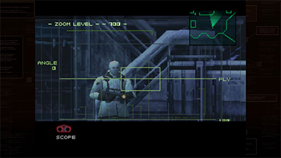
According to statistics, every day about 70-80 percent of people start their day with their phone [1], thus beginning the day with movement—scrolling, constantly moving from one app to another, wanting to see everything at once. Technologies that were once created for our own efficiency, with the aim of helping us simplify our lives, now complicate it and kill our rhythm. We look, we refresh, we respond. We move quickly not because we want to, but because technology forces us to.
And I have long been interested in the question: What if design, especially interactive design, became slower rather than rushing us? What if interfaces helped us to be not only efficient but also more observant?
Slowness as a design attitude 🦥
“Slowness” does not mean inefficiency at all. It means being aware of the passage of time, rather than ignoring it or trying to escape it.
” …slow living is not about living your life in slow motion; it’s about doing everything at the right speed and pacing instead of rushing. By that same logic, slow living is not about losing time by going slowly; it’s about gaining time by doing the things that are most important to you.” — Kayleigh Draynn, “The Philosophy of Slow Living,” Stylist Magazine, 2021. [2]
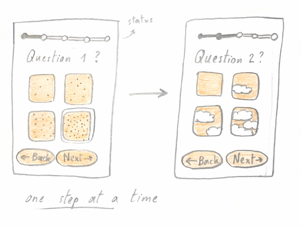
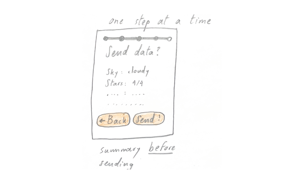
In the world of design, this is referred to as experience optimization. Instead of removing friction, we can design movements that allow the user to reflect: a pause before sending, a fading effect when moving screens, sounds that immerse the user in the environment.
Designing for slowness asks a simple but radical question:
How do our technologies shape our sense of time — and how might we reclaim it?
Early Ideas of Slow and Calm Technology 🗃️
Possible solutions and reflections on this topic have already been described, and systems have even been devised. These are systems that encourage reflection rather than prompting immediate action. More than a quarter of a century ago, Lars Hallnäs and Johan Redström came up with the concept of “Slow Technology” [3]— their idea was revealed in the dominance of logic and speed in human-computer interaction. They created a technology that emphasizes time, arouses interest, and encourages patience.
Later, Mark Weiser and John Seely Brown introduced the concept of “Calm Technology”[4], which allows us to be informed without being overwhelmed or distracted. They promoted the idea that new technologies should be in the shadows and in the background, becoming part of our environment rather than distracting us from our focus.
Beyond Screens: Towards Movement and Presence 🌳
Yes, for me, this question expands even further.
What if slowness can exist not only within the interface but also when we are moving? In the context of walking, cycling, or simply being in one place right now?
As an interface designer, I have to work with interfaces that connect and take into account both digital and physical experiences: maps, navigation systems, sensors that translate movement into data. I want to focus not on speed and efficiency, but on quality.
What if I want to engage a person and choose something beautiful, calm, or rhythmic rather than fast? My motivation is to explore and observe how interactive design can be transformed into a conscious experience—where movement itself becomes the center for awareness and connection, rather than just transportation.
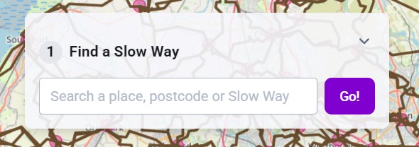
[5] Image source: Slow Ways, a UK-based initiative encouraging slower, more mindful mobility.
Emotional and Sensory Dimensions of Slowness 👀
Slowness is not just about time—it’s also about how we feel.
When movement slows down, we begin to feel better — audio becomes louder and clearer, textures become more visible, and space becomes more tangible. Designing for slowness also means involving the body in the process as well as the mind — allowing users to notice, listen, and feel more than just take action.
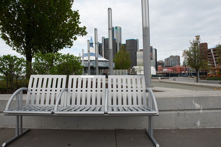
In urban spaces, this means reconnecting people with their surroundings. Something that will make people respond to the present, a navigation app that not only guides them through the streets but also engages their other senses: more sunlight, tranquility, greenery. Through this approach, design becomes a bridge between digital awareness and materialized emotions, turning ordinary movement into a reflective action.
Challenges of Designing for Slowness in a Fast World 😓
Paradoxically, designing for slowness may seem like an act of resistance or some kind of downgrade. After all, we live in a world where success is measured by productivity and the almost immediate demonstration of success when it occurs. I believe that interfaces that pause, delay, or call for awareness challenge not only design norms but also society’s expectations.
The biggest challenge is the balance between calmness and usability. It turns out that a system that is too slow risks scaring users away altogether, while one that is too fast will not fit this philosophy. Another challenge will be assessing how well the design fits the concept of “slowness.” Can we even measure or test success in this case? How can we measure awareness?
Despite all these questions, I see value in this work, which is why I also want to talk about physical space, because I have a feeling that people in it are slower and more aware. Maybe I can get inspired by the physical world and integrate it into the digital one? Designing for “slowness” is about ethical design — recognizing human limitations and restoring a more humane rhythm to everyday life.
Next Steps in My Research 🔍
1.Delving deeper into the concept of “slowness”
I want to learn more about what this really means, especially in terms of interactive design—not only as a lack of speed, but also as a quality of awareness, rhythm, and presence. I want to study this in both theory and practice and how it can help create more conscious design.
2.Comparing urban contexts
In the next part—and possibly in a separate section dedicated to this topic—I want to compare different cities and reflect on their infrastructure and daily rhythms, from the walkable city of Graz to megacities like Vienna and the unorganized chaos of Tokyo. Such comparisons will help me understand how urban design is closely linked to interactive design and how I can contribute to this.
3.Analysis of existing tools and platforms
My research will also include a critical analysis and review of various applications, particularly transportation, map, and taxi apps. The goal is to understand how current systems prioritize speed and efficiency and how they could emphasize the quality of movement, emotional comfort, and sensory experience.
4.Methods and design experiments
Through observation, experiential mapping, and comparative analysis, I want to understand how people interact with navigation apps and urban space.
5.Conceptual framework
Ultimately, I want to define the term “slowness” as a design principle that unites digital interaction, bodily experience, and urban consciousness. The goal is not to resist technology, but to rethink our relationship with it and create a more human rhythm.
Sources 🛈
[1] Deloitte. Irish Mobile Consumer Survey 2024: Smartphone Usage and Consumer Trends. Deloitte Ireland, 2024. Available at: https://www.deloitte.com/ie/en/about/press-room/consumer-trends-smartphone-usage.html
[2] Draynn, K. (2021). The Philosophy of Slow Living. Stylist Magazine. Retrieved from https://www.stylist.co.uk/long-reads/slow-living-lifestyle-stress-nature-three-day-reset-foel-gopyn-conwy-north-wales-national-trust-holiday-remote-countryside-cottage-mindfulness/257646
[3] Hallnäs, L., & Redström, J. (2001). Slow Technology – Designing for Reflection. Personal and Ubiquitous Computing, 5(3), 201–212. https://doi.org/10.1007/PL00000019
[4] Weiser, M., & Brown, J. S. (1996). Designing Calm Technology. Xerox PARC. Retrieved from https://calmtech.com/papers/designing-calm-technology-by-mark-weiser-and-john-seely-brown
[5] Image source: Slow Ways, a UK-based initiative encouraging slower, more mindful mobility.


