Final video showing my prototype:
Tag: designandresearch2
#5 D&R2 user testing
I had two user testings with my figma prototype in the last design and research class. Both of the testers had realy helpful feedback and knowledge I will use to improve my project.
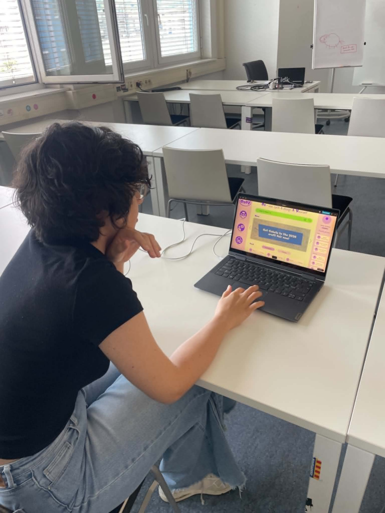
First user test:
Comments:
- “would like to have a filter style / esthetic eks. Cottage core etc for the gallery”
- Should add a way to easily access your saved content
- “Don’t really understand the headline in the home page, feels like a title when it’s actually an explanation”
- Found the tutorial intuitive
Second user test:
Comments:
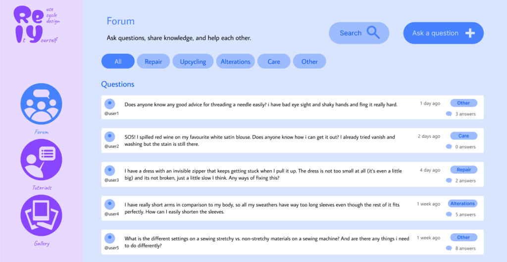
- the forum page is not very intuitive, it does not make sense to have the comment displayed two times, and the one with more content being smaller. Maybe pop down or entering the comments in a new page would be better.
- Maybe add more visualization to the tutorial
- It can be smart to change the selection buttons in the filter from round to square, as the universal rule is that round means that you can only choose one and square means you can choose multiple.
- For the time filter the clock interface feels unnecessary
- Gallery and feed feels similar, maybe combine them?
- Maybe stylize the headline in the home page more would make it more intuitive
Key takeaways from the testings:
- changing bullet points from round to square when you can slect more than one
- fixing the layout of the forum page
- Try to make the headline more intuitive
Based on the feedback, I will prioritize making the prototype overall higher fidelity, redesigning the forum page to create a more intuitive user flow, improving the homepage headline to better communicate the platform’s purpose, and updating the filter components to follow established UI conventions. If I have time I will also try to add visual elememts to the tutorials, making saved content easier to find, and add aesthetic filters in the gallery to make inspiration easier to browse.
Updated wireframes:
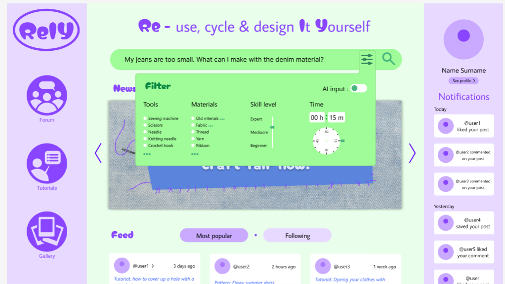
I updated the logo and the header on the homepage. I removed the description from the header and replaced it with “What can we help you with?” to make it clearer what the website is for. I also made the logo more descriptive by adding the “Re-use, Cycle and Design It Yourself” in the logo in the upper-left corner.
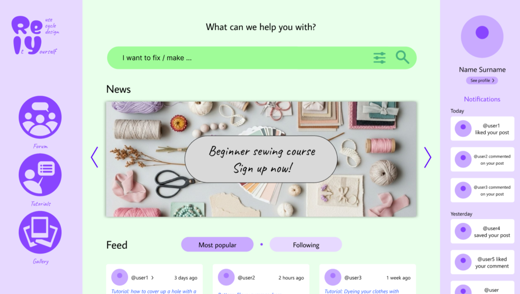
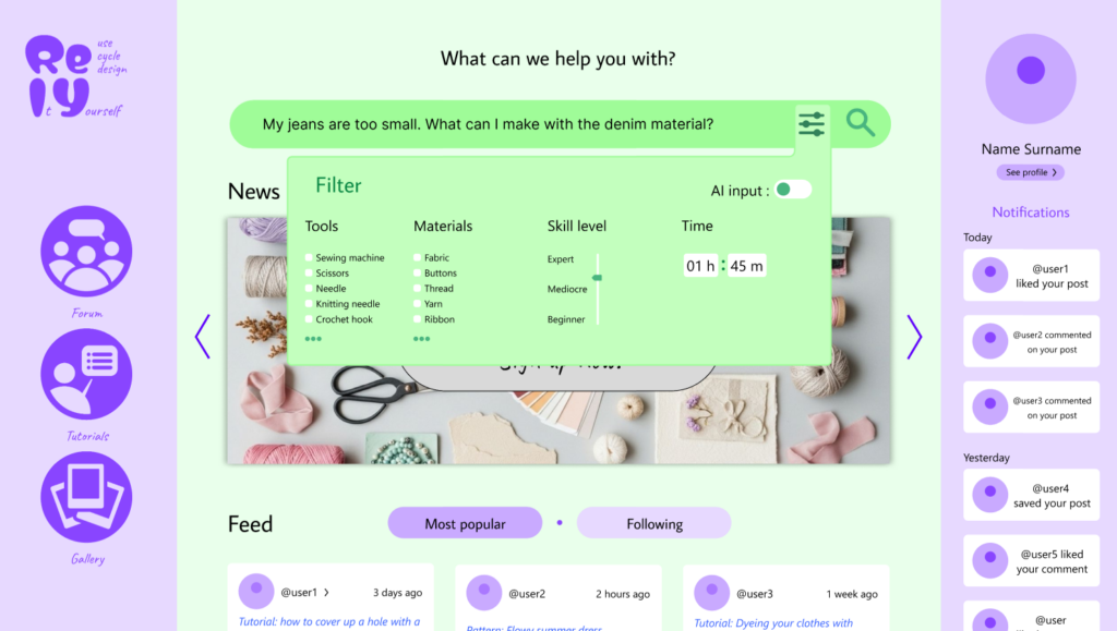
I updated the forum layout to at first display only the question, only showing the replies dropping down when clicked. This simplifies interface, making it easier for users to browse questions and access the information they are looking for.
I added a “saved” option in the header of both the Tutorials and Gallery pages to make it easier to acces.

#4 D&R2 Wireframes
Before I started experimenting in Figma, I sketched a few ideas on paper to find a basic layout for my website. At first, I came up with a layout that closely resembled a typical AI interface.
First Figma wireframes:
I tried to translate my sketches into a digital design while exploring which colors to use. I wanted the website to feel vibrant and playful because it’s meant to support a hobby that people enjoy for fun. I wanted to avoid giving it a serious or overly formal look. I really wanted to incorporate green because I feel like it symbolizes sustainability and a focus on the environment. I also really like how purple and green look together, so those are the two main colors I decided to go with.

Final Figma Wireframes:
I decided to place less emphasis on AI on the website and instead focus more on the community, so I wanted the design to reflect that. I decided to go for an almost social media style layout, where you can access your profile on the right. I also placed the notifications on the right to emphasize the focus on community and helping each other. The search function is placed at the top center of the website to highlight its importance. I also added a news widget where updates about events and other community activities can be displayed to strengthen the community both online and in real life. Below that, as you scroll down, you’ll find a feed of posts from users you follow as well as popular posts. On the right, you can access the forum, tutorials, and gallery.

The filter function is designed to help users find more relevant results. I wanted to make it as easy as possible for people to describe their situation and find exactly what they’re looking for.
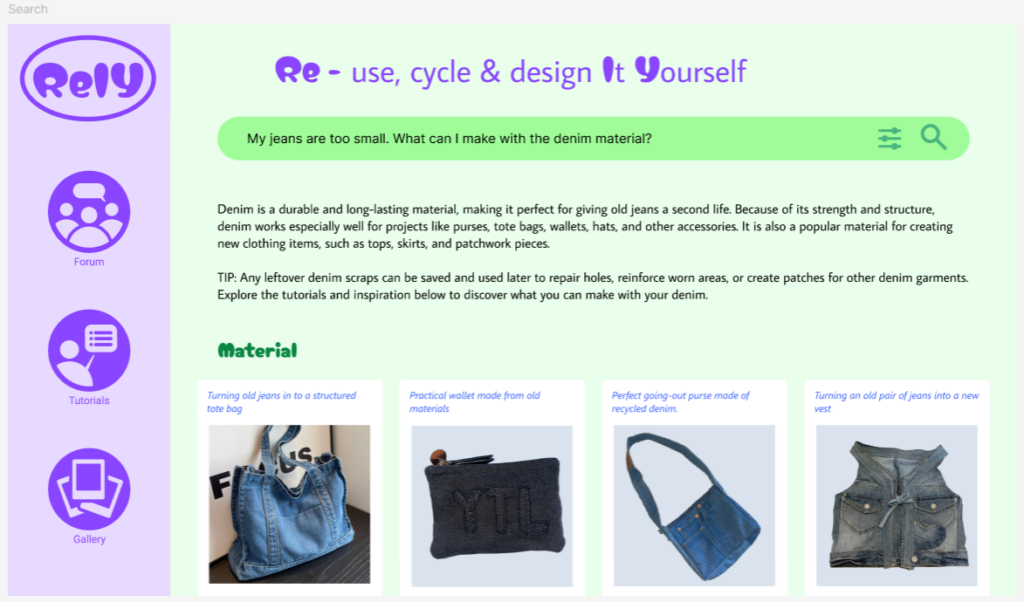
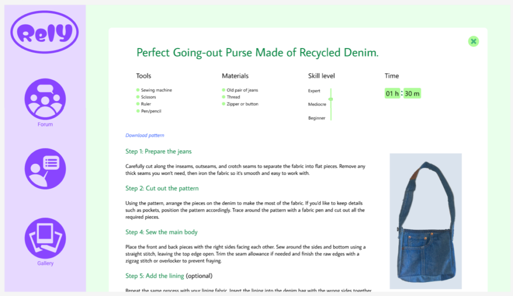
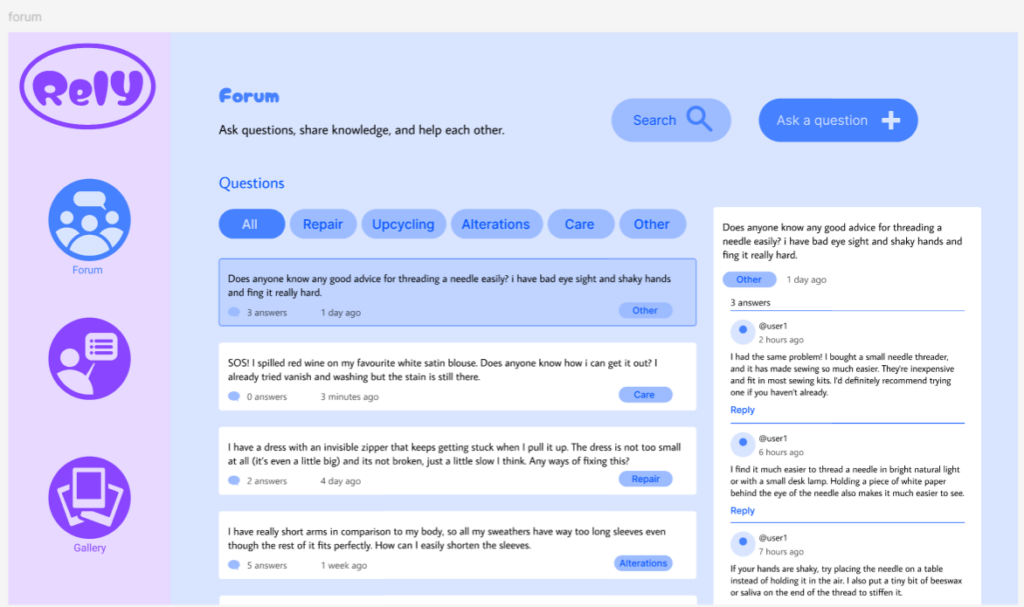
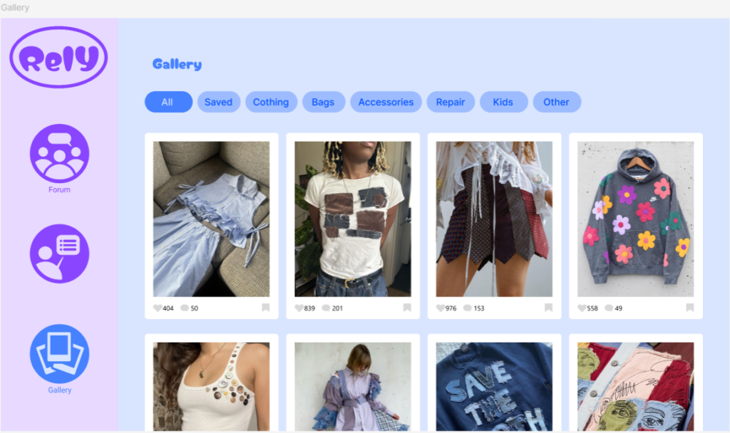
I used a blue color palette for the Forum, Tutorials, and Gallery pages to introduce more color and clearly distinguish them from the search function. While the search feature is designed for finding answers quickly, these pages serve as resources that users can browse and explore at their own pace.
I designed the forum to be simple and intuitive to use. Users can filter posts by category, easily read and comment on other users’ posts, and create their own questions when they need help.

#3 D&R2 Building my idea
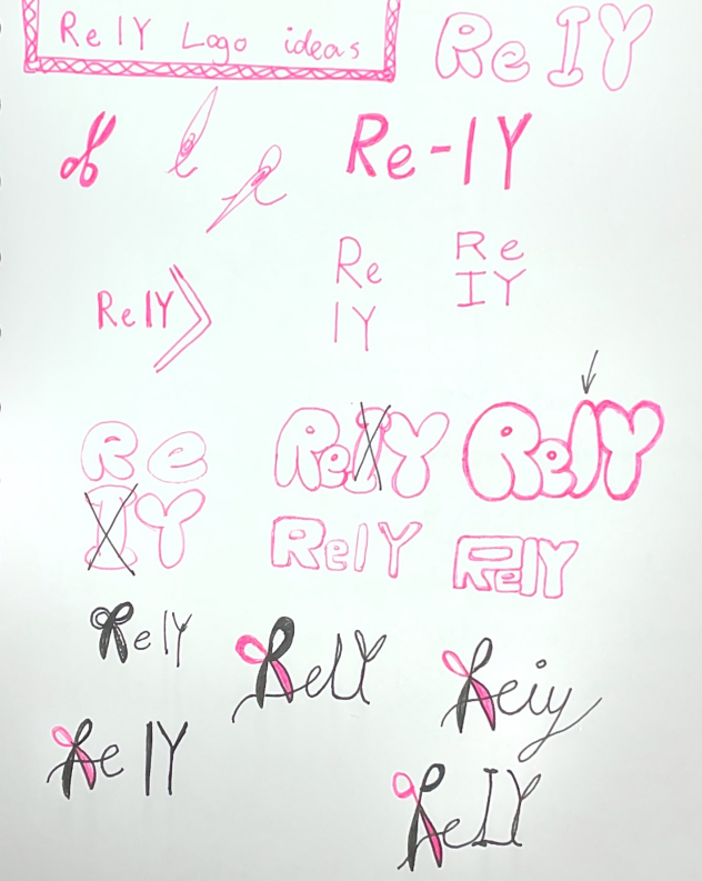
Since the last blog post, I have been working on the branding of my concept. I came up with a name for my website: ReIY. My focus has been on redesigning, reusing, and recycling materials, kind of “re-loving” your old clothes, so I wanted to include “Re” as part of the name.
The point of the website is also that you can use it as a tool to help yourself fix your problem, doing it yourself. Therefore, I thought about using the common phrase DIY (Do It Yourself). That’s how I came up with ReIY: redesign, reuse, and recycle it yourself.
I have been trying to develope the concept for ReIY and figure out what features would actually make sense for the website. And I also had the one-to-one feedback session with Birgit, which helped me think about the project from some new perspectives.
AI or not?
One of the biggest things we talked about was AI. Earlier in the project, I was thinking a lot about having AI as the main feature. being used for things like generateing custom sewing patterns based on measurements etc. While I still think that could be interesting, I started questioning whether AI really needs to be such a big part of the website.
My project is mainly about helping people redesign, reuse, and repair things they already own, and promotes sustainability. It is also about encouraging people to spend less time passively consuming content online and instead spend more time creating things themselves. Because of that, I don’t want AI to become the focus of the platform.
At the same time, AI is something people expect from digital products today, and without it I feel like the website can quickly be outcompeted by other websites. My current idea is therefore to make it an optional feature rather than the main attraction. Instead of generating lots of new content, AI could help users find relevant tutorials, patterns, and projects based on their skill level, available tools, materials, and what they are trying to make or repair.
Sources
Another thing I have been thinking about is where the content on the website should come from. At first, I imagined creating most of the tutorials myself, but after the feedback session I started exploring the idea of making the platform more community-driven.
One comparison that came up was Stack Exchange, where people can ask questions and share knowledge. I like the idea of users being able to post their own solutions, tutorials, and project results. If this were implemented, there would probably need to be some kind of review system to make sure the information is useful and trustworthy.
I have also been trying to narrow down what kinds of problems the website should help people solve. Right now, I am leaning towards focusing on common situations, such as repairing ripped pants, fixing holes in socks, altering clothes, or finding creative ways to reuse old textiles. These are things many people encounter, but often don’t know how to fix themselves.
At the moment, some features I am considering include:
- Search filters for skill level, available tools, materials, and time needed
- Sewing tutorials and repair guides
- Community posts and project sharing
- Reviews and ratings of tutorials
- Tips and tricks for making clothes last longer
- An optional AI assistant that helps users find relevant content
One thing I am still trying to figure out is how to make the website engaging without turning it into another platform that keeps people endlessly scrolling. Since my previous project focused on doomscrolling, I want ReIY to encourage people to get inspired and then actually leave the screen to start making something. Finding that balance is something I want to keep exploring as I continue developing the concept.
Overall, I feel like the project is becoming more focused. Instead of being a website about AI and sewing, it is starting to feel more like a platform that helps people care for their clothes, learn practical skills, and build a stronger connection to the things they own.
#2 D&R2 My passion
Giving used clothes/material new life
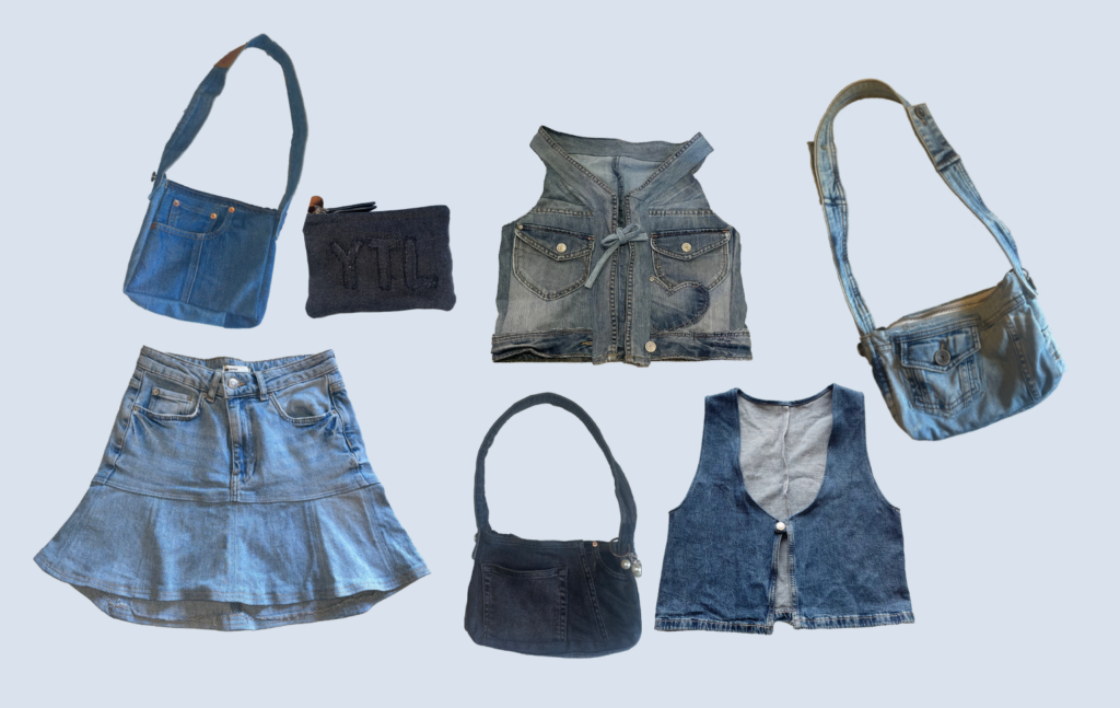
For many years now I have loved using old materials and creating new things with it. I use old materials from things like clothes, beddings or curtains, and I create stuff I need/want like purses, bags, new clothing items, wallets, or even shoes. The picture is a collage of some of my creations from a denim recyceling project i am doing.
Last year, I wrote a research paper about the fashion industrys impact on the environment and explored different approaches to addressing overconsumption. One of my key findings was that being involved in making, customizing, or personalizing clothing makes it much more likely that people will keep and care for their garments over a longer period of time. I also found that while buying second hand or thrifted clothing is better than purchasing new items, it is not necessarily as sustainable as it may seem. If people switch to second hand shopping but continue to consume at the same high rate, they still contribute to the ongoing demand for fast fashion on a larger scale. Ultimately, the most effective way to reduce the fashion industrys environmental impact is to lower overall consumption. This can be achieved by keeping clothes for longer and taking better care of them.
I love how sustainable this practice is, and how the things I make are customized perfectly to me and my needs. I also feel more grateful and attached to the things I make myself because I put time and effort into it. For me, doing these crafts give me some time off from real life, where I can sit and sew for example and suddenly 5 hours have gone by without me even noticing or checking my phone once. I would like to be able to find a way to influence and share this feeling with others.
In design and research 1 I worked with the topic doomscrolling. Researching how social media platforms draw you in and keep you trapped consuming content. I realized that what helps me most of all to stay offline and enjoy the real world are these kinds of physical projects. Therefore, I think a natural continuation into design and research 2 is to explore how i can try to share this hobby with others it might be able to have the same effect on.
My friends and family often ask me if I can please make them something too or teach them how I did it after I show my projects. Maybe there is a way to show, help, and teach this to everyone?
My current idea is to create a website people can use to get help on how they can recycle their own old materials into something new.
Possible features of the website:
- Patterns for upgrades and remakes
- Sewing tutorials
- AI that generates patterns customized to your measurements. (maybe a paid subscription?)
- Search filters for things like : tools, skill level, time, fabric available
- Community forum?
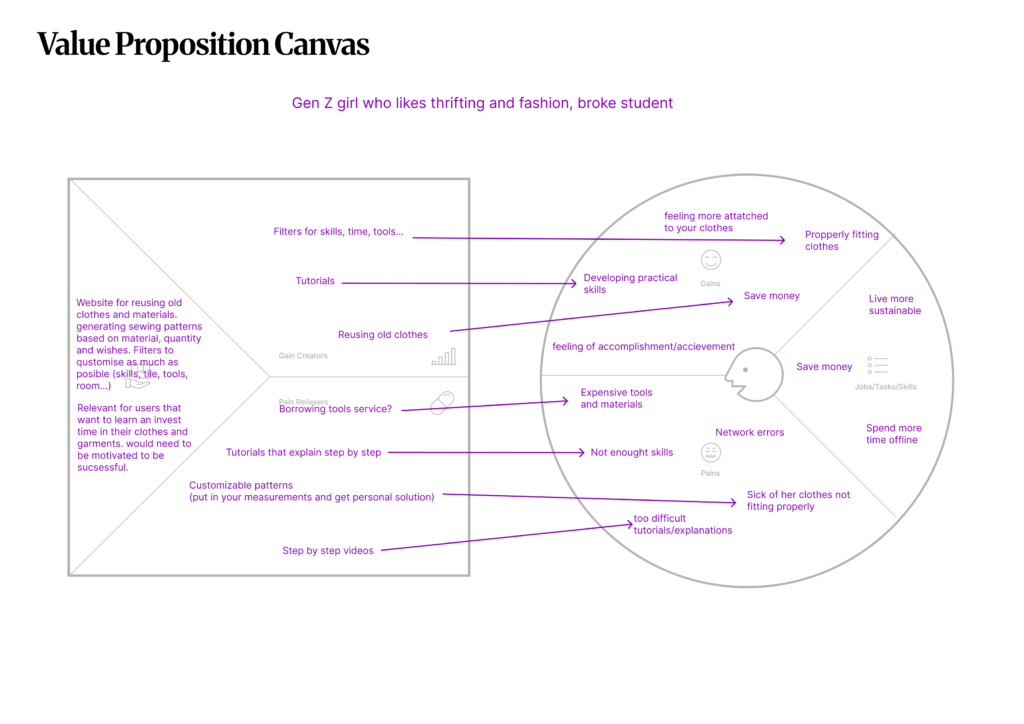
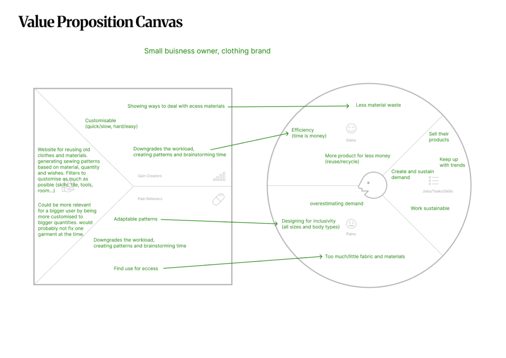
Customer Profiles & Value Proposition Map